The problem with feedback in graphic design may be that, to a large extent, the reception of an artistic “work” is burdened with a very large dose of subjectivity.

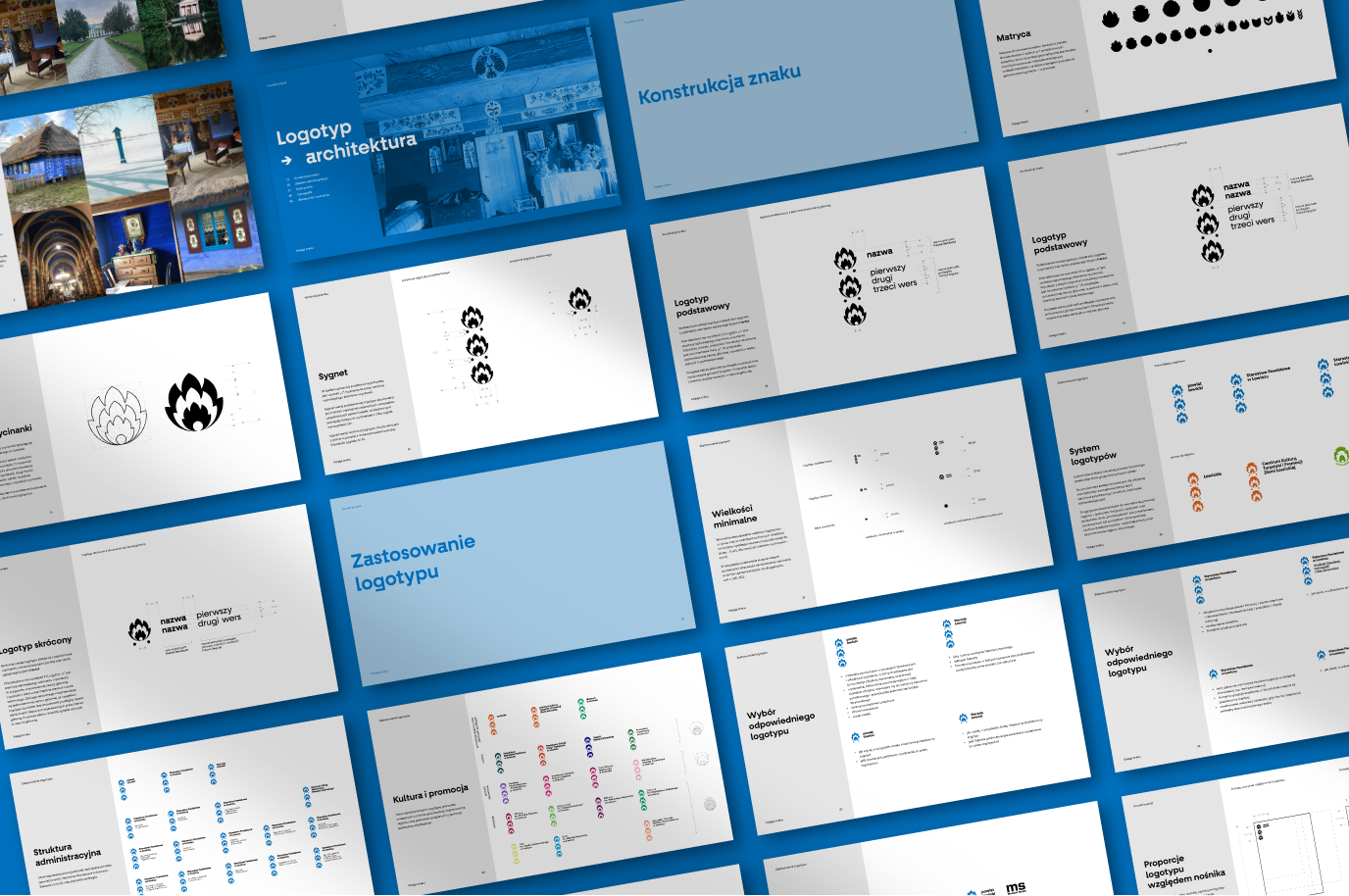
In January of this year, we completed work on the development and implementation of a new visual identity of the Łowicz district. The process was long and complex.
It included, among others: a local vision, strategic workshops in which we precisely defined the vision, goals and mission that the new visual identity was to accomplish; developing several proposals for visual solutions, and then selecting one line; work on the sign and the system, as well as the principles of its functioning. Along the way, there were countless meetings, lots of studies being read and materials being watched, discussions, consultations with specialists, experts in the handicraft art of Łowicz, and iterations. As a result, a coherent, holistic and comprehensive system was created, ready for independent use by the client.


The completion of the work – as a result of a process that lasted over a year – as well as the experience gained along the way, became a pretext for us to look at the delicate subject of feedback.
“This new logo is associated with precisely nothing. Bravo. I’m curious how much this crap cost us and how many years will it take for everyone to get used to the fact that something so bland is supposed to present them”, “The new logo is needed by the people as much as the Łowicz county itself…the rich getting richer”, “Behind this login, emptiness, rolling tumbleweeds, you can wait till the cows come home… only occasionally a bearded old man on a pilgrimage for bread flashes on the event horizon” – these are just some of the colorful opinions that, after the official announcement of the rebranding, could be read on information portals of the Łowicz district.
Leaving aside the issue of ignorance of the brief and assumptions of the project – you can decide if you agree with these statements or not. These are only opinions. They do not change anything in the project itself, they do not serve it in any way, they have no influence on the state of affairs. Someone sees, filters through their sensitivity and shares their impressions with the world. Everyone can have an opinion, and – at least in social media – they will be happy to share it. Hence the first thing worth emphasizing: an opinion is not a feedback.
The Polish version of this term – informacja zwrotna (“reverse information” in literal translation) – on the one hand, does not fully reflect what the English word “feedback” means, on the other hand – reflects well its neutral character: information is not an assessment, reprimand or praise, it is emotionally unmarked.
In the English-language definition of feedback – “information about reactions to a product, a person’s performance of a task, etc. which is used as a basis for improvement” – the last part of the sentence is crucial. In giving feedback, the most important seems to be the answer to the question: How to move the process forward? What can I do to develop the project or push it in the right direction? Feedback has to improve the process, leaving room for development. It also involves observation and comments during the process – information for colleagues about how things are going, what needs improvement, what is on the right way to a specific goal. Feedback should be given at a time when there is occasion and space for changes – at the end of the process it becomes, rather, an evaluation.
There is a lot of material available on how to give good, constructive feedback, some advice seems obvious, some less so, some contradict each other: use the “sandwich approach” because people like to be praised; don’t use the “sandwich approach” because you only confuse people, soften the message and generally undermine your feedback.
The problem with feedback in graphic design may be that, to a large extent, the reception of an artistic “work” is burdened with a very large dose of subjectivity. It’s hard to break away from your own associations or preferences. However, if we burden our feedback with personal aesthetic taste, it will not be helpful. Negative comments can only create tension between the client and the designer, leading to nothing good. In this light, the statements “I don’t feel it”, “Something is missing here” or “There is no ‘wow’ effect” – will help express the speaker’s opinion, maybe he will feel better about it – but objectively speaking, they will not change the situation one iota.
Cultural habits present an additional difficulty in giving productive feedback. In our culture, there is a belief that constructive feedback must be fault-finding. Positive information is not good and valuable feedback, it can only prove our incompetence and ignorance of the subject, or – in the best case scenario – it may turn out that you have not really got acquainted with the subject, so just in case, you will point out something that you didn’t like at a first glance. This reveals our personal ills and lack of self-confidence; however, this is not a topic for graphic designers but for specialists with a degree in psychology or psychiatry, and since I’m not one of such specialists – I am only signaling this topic.
Good feedback from the industry
(those who know)
Mariusz Szczygieł in the book “The Facts Must Dance” (a great read, I highly recommend it) shares the three best pieces of writing advice he’s heard in his life. These apply to other areas – but they can also be successfully translated into a graphic design tip. Szczygieł refers to the Czech composer Antonín Dvořák, who used to lead his students to the railway station and order them to look at locomotives. He advised them to build musical compositions in the same way as the locomotives are constructed: everything serves a purpose; the smallest element has its function. In the same way, every sentence in a reportage should be criticized, every paragraph must be justified.
Similarly: the designer must take responsibility for his decisions in the design process and be able to justify them. Before you make a decision, consider whether the proposed solution is optimal. Instead of only assuming that something would be better this way and not the other – check if it really is better. With such a starting point, with a solid base, you can talk and there is room for constructive feedback, as long as it too is specific.
When giving feedback to a project, we should also be aware of which of its “layers” (yes, the project has layers) we are referring to and try not to mix them up. These layers are the brief, the client and his needs; design principles; trends; aesthetics.
In the brief layer, we mainly take into account whether and how we understand the customer’s expectations, whether they are justified, whether we managed to broaden their perspective (show trends, competition, get to know their audience). If we want to design ethically, in the creative frenzy we must not forget about who commissioned the work and what is commissioned. We like to think that we, not the client, are always right because he doesn’t know about design or doesn’t know what he really wants. But it is up to us to understand the client’s true intention and show him that what we have prepared is what he needs. This is also the place where we must (if I could, I would emphasize “must” three times) take into account the feasibility of our project. It is unacceptable to get the client to be delighted with our wild project, and then it turns out that for various reasons it cannot be implemented, because we have not checked something. The budget will not grow, so the fonts cannot be purchased, the colors in the print will not “shine” as we would like, and the client, no matter how educated he is, will not be able to use the files himself later. This is probably the place for the majority of potential fuckups.

In order to break the rules, we must first know them. We move on to the second layer of feedback. If we decide on specific technical or aesthetic solutions – we must be able to justify them. Let’s use the tools and vocabulary that we are lucky enough to know, let’s make use of the knowledge and experience that we can share. Let feedback be an added value in the process. Let’s focus on the merits, clarity and aim of the comments. As far as it is possible (we are not going into philosophical considerations here, whether it even is possible), let’s try to look at the project objectively. Instead of saying that something “is totally off”, “I don’t feel it at all”, “this is stupid” – let’s talk about composition, its balance, colors, saturation, grid, typefaces – each of these elements, if we work on them, can make a difference (perhaps for the better).
If we are inspired by a trend – first, let’s try to understand it well and use it consciously. Why do we see it this way? What does it connect to? What is it a result of? Can it really be the answer to our task, is it useful to us? And whether we go into it consciously or does the trend influence our decisions?
The most individual layer is the aesthetic one. This is – exceptionally – a place for “I (don’t) like it”, but in the meantime, let’s consider why this is so. Interesting ideas and solutions can arise from an open discussion about personal preferences. If there is another pair of eyes nearby that can look at the project, another brain to confront ideas, it is worth taking advantage of this luxury. For me, as a freelancer-soloist for many years, working in a team is a total revelation. Oh my goodness, everything goes so much faster and more smoothly when you can talk about it with someone!
Good feedback from the client
(those who don’t know)
Let’s adopt some assumptions, in the optimistic-utopian version: the client knows what he is doing and knows what he wants; at the same time, he trusts us as a service provider that we know our work as well.
I have an impression that as a nation we are used to praising solo work – there are many Ordons, Rejtans or Lewandowskis around. Personally, I prefer rugby. Designing is a team sport which, in an ideal world, should be based on partnerships. The customer has some reservations? Well, sure he does. We cannot expect anyone to accept our designs blindly. We should also not require him to speak the same language and know the industry jargon. It is up to the designer to listen carefully, ask questions, and delve into the topic in order to get to the heart of the problem signaled by the client. On the part of the client – it would also be best if he could ask questions instead of barking orders. Let’s imagine a situation (it won’t be difficult) in which we receive a request: make the logo bigger and change it to orange color. How much nicer it would be to hear: “I have the impression that the logo is not exposed enough. How can we highlight it?” This kind of question gives the designer room to do his job. The desired effect can be achieved in many ways that the client may not be aware of. In the case where the client gives orders – the role of the designer is to understand what the problem really is and present solutions. So in the end it comes down to – unfortunately, it’s a cliché – communication and listening skills.
I’m afraid that with this topic there are some issues we can’t avoid: mindfulness, listening, trust and empathy – all these soft skills (yuck!). But without it, we can’t move forward.
Totally not feedback
There are a few situations (you can of course imagine more, the sky is the limit) where an outside perspective is very helpful. If someone gets entangled in a project, it is difficult for them to free themselves from the patterns – a fresh perspective can help to get out of the impasse. However, there is some danger in this. Interestingly enough, this danger is often directly proportional to the level of decision-making that someone (the client, but not only) has in a given project; and it is inversely proportional to the degree of one’s knowledge and one’s previous involvement in the process. In short, it is a situation in which someone without knowledge of the subject and foundations “finds themselves” in the project and changes everything “because they can”. A nightmare for the designer and everyone involved. I don’t have any good advice for that, except, not to do it.
What causes this situation? I don’t know. I’m guessing that it could be a lack of trust, a lack of partnership. I want to emphasize that this is not only about the client-designer relationship. The same misunderstandings can also occur between designers being on the same team. You can probably get out of this alive, I’m afraid not without mutual frustration, though.

Good practices in giving/receiving feedback
From the numerous available materials (the Internet does not disappoint – at the end you will also find links to selected sources) I have selected some useful, in my opinion, tips that can help in creating and receiving feedback. It is quite likely that it is difficult to apply it all in everyday practice, where the deadlines are chasing. They seem reasonable though, so hey – let’s strive for perfection.
Ground rules
1. We respect each other as individuals.
2. We trust our competences.
3. Our relationship is symmetrical – we talk from the same level.
4. We remember about reality check – we verify whether corrections/comments bring us closer to the goal.
5. We talk about specifics, we stick to substantive issues.
6. We use vocabulary that is understandable to both parties.
7. We listen to (not just hear) each other.
8. We give ourselves the right to have different perspectives and experiences – we are aware that there is a cognitive bias (“point of view depends on where you are looking from”).
9. Feedback is not about finding mistakes – we are also not afraid of positive comments.
10. We remember that we are all on the same team.
Decalogue for those giving feedback
1. Match what and how you want to say something, to the person you are saying it to. Everyone reacts differently to different types of messages – for some, a casual, informal conversation is better, others prefer to receive them in writing.
2. Try to make your feedback an added value to the project – maybe you have advice on how to look at a problem differently, maybe you can suggest some helpful tools (brainstorming, application, portal, etc.)
3. Be specific – offer solutions that are within the co-worker’s reach, refer to examples he may know, be realistic about it.
4. Avoid judging the client/designer – talk about the work/project that is on the agenda. I don’t know anyone who is helped by “personal trips”, they only bring frustration and aggression.
5. Find support in the brief – let it be your main point of reference, it is worth returning to (it) at various stages of the project to make sure that we are still responding to key issues for the client.
6. Talk about yourself – it’s a truism, but it turns out that it is worth reminding. If you’re talking about what you see, how you see it, etc., first of all, you’re talking about your own feelings, and that’s hard to argue with; secondly, speaking in the first person, you don’t impose your own interpretation of what others are doing/thinking (for example: “I see you weren’t at the meeting” versus “You don’t care about this project at all”).
7. Your assessment and observations are subjective – remember this, if for no other reason, than to avoid formulating sentences in the form of “absolute truths”; in terms of good/bad.
8. Trust the designer – you commission him to work, you can assume that he knows what he is doing. Trust his knowledge, let him design.
9. Share references – as an inspiration (“do it for me like this” is not a recommended practice, we say a firm “no” to plagiarism), an indication of the direction, your aesthetic preferences, the environment that suits you.10. Let’s respect each other. Escalating from “I don’t like it” to “It doesn’t make sense” to “You suck” won’t help the process.
Tips for getting feedback
1. Listen and watch the brief. It is worth listening and trying to respond to the client’s needs – after all, you are designing for them. It is up to you to understand his needs and help in finding optimal solutions.
2. Be aware who you are designing for. Design is part of the service industry. If we do art for the sake of art or our own glory – to avoid frustration, it is worth considering changing the industry.
3. Comments are about your work, not you. Good feedback is not an assessment of you as an individual or as a designer – it focuses on your work or the effect of your work. In a healthy, symmetrical relationship, remarks are not “personal.”
4. Design consciously. Rethink your design choices – so that you can justify them and defend their existence in the project. It’s good to have factual arguments locked and loaded, not just ones based on subjective impressions.
5. Feedback is not an attack, but a broadening of perspective. Keep an open mind and distance to your design work – do not treat the comments of the client or colleagues as an attack or as pointing out incompetence. We assume we’re all here for the right reasons and that we know what we’re doing. So don’t be dogged in your own approach, treat the comments of others as broadening your perspective.
6. Give yourself time to digest the feedback. Be prepared that the natural, physiological response to critical remarks is to interpret them as threats and to adopt the “fight or flight” response. So if you feel that your blood is boiling but you have the opportunity to wait with the response to feedback – give your emotions time to subside so that you can look at the subject with a clear head.7. Make sure that all stakeholders know the baseline premise. If you ask for feedback from a person unrelated to the project – familiarize them with the initial premise – let everyone have a similar base for evaluation.
Selected sources
https://www.invisionapp.com/inside-design/give-designers-feedback/
https://aira.net/blog/how-to-give-feedback-graphic-designer/
https://www.betterup.com/blog/how-to-give-feedback
https://www.15five.com/blog/9-ways-to-give-effective-employee-feedback/
https://uwaterloo.ca/centre-for-teaching-excellence/teaching-resources/teaching-tips/assessing-student-work/grading-and-feedback/receiving-and-giving-effective-feedback