The best place in space
Info ↘
Ace of Space is a brand offering the highest standard of serviced offices. Ace redefines flexibility. Almost everything about the design of Ace of Space is fluid and flexible.
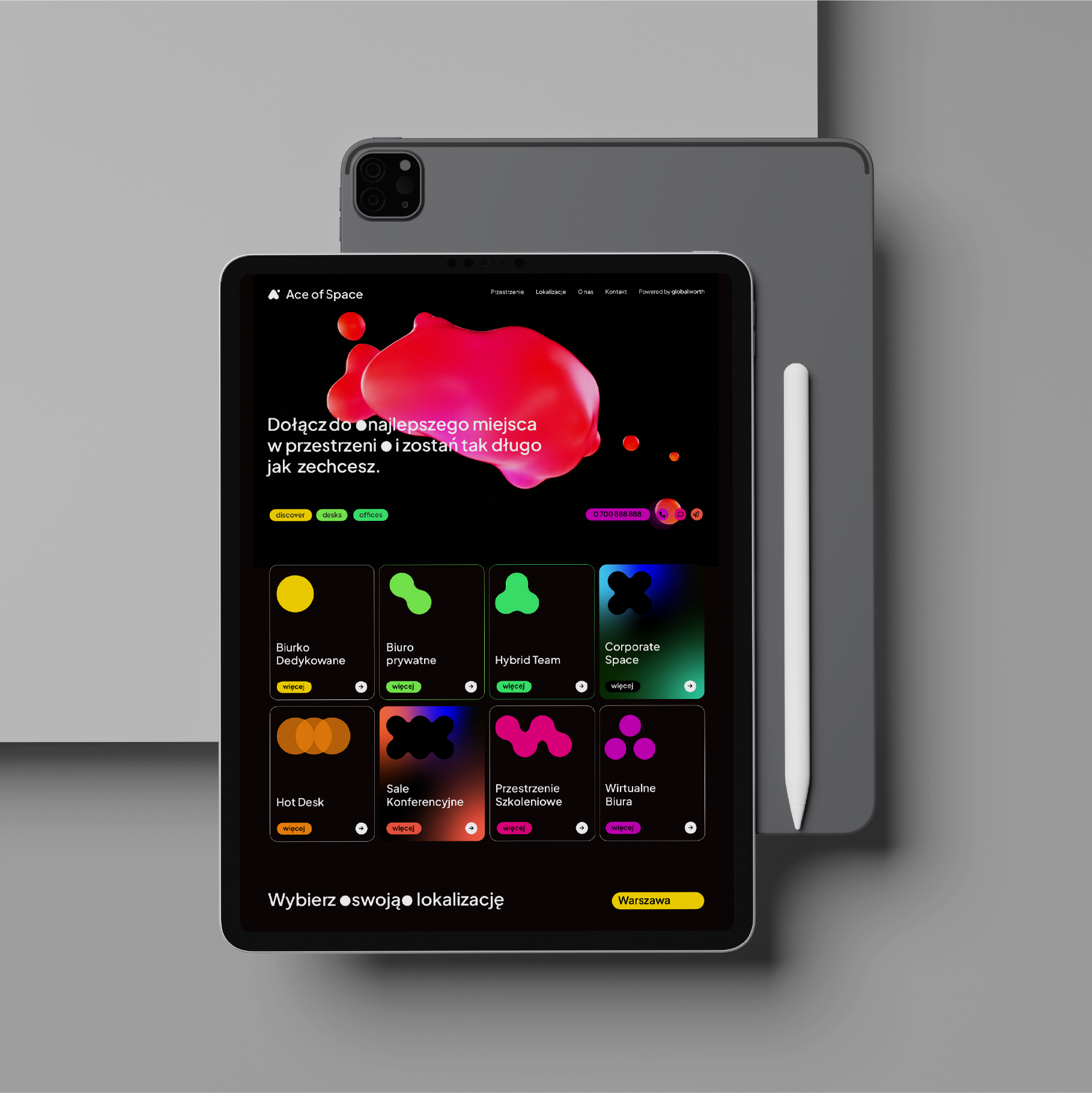
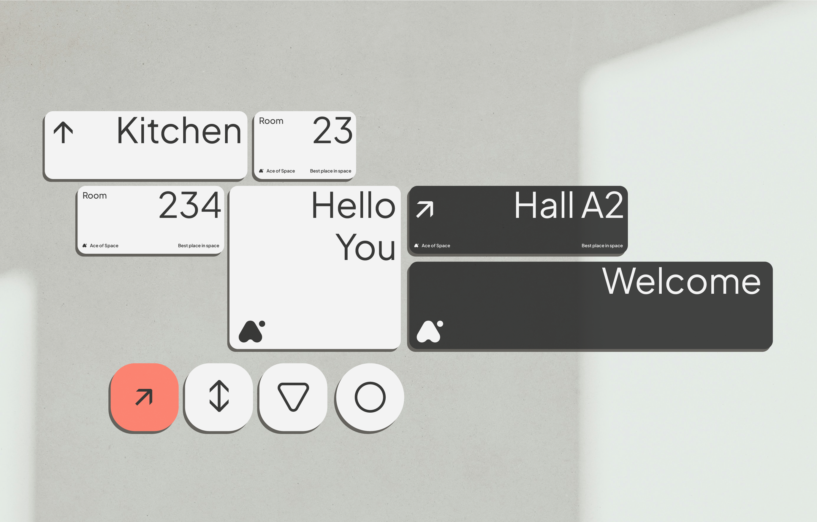
Everything wrapped up in an effective design system based on containers in the shape of rounded rectangles and ultra friendly typography.
Scope
Naming / Branding / Brand Materials /
Communication / UX&UI / Low Code
Tools
Illustrator / Photoshop / Figma
Client
Ace of Space
How to create the best place in space?
If you’ve ever tried to move your office to a flex space (flexible offices), you know how crucial it is to feel good in it. And also – how difficult it is to choose the right space for yourself.
What can distinguish a serviced office brand? We would definitely answer – brand experience.
Globalworth entrusted us with the comprehensive development of a new serviced office brand – from strategy and positioning, through naming and visual identity, to implementation and communication with users.
The brand developed with the Globalworth team is more than just a name and logo – it’s a space we also like to return to.
Strategy
An office is not just a place. If we are to return to it after a long period of home office, we simply have to like it and it must make our work and life easier. That’s why we focused on office as a service here.
Ace of Space spaces are not a substitute for cafes, but also not corporate boxes. It’s a space that from the first step is focused on deep work and pleasant but effective time spent on – well – regardless of the delicious coffee ≠ simply work.
In the strategy, we also took into account the aspect of sustainable development, crucial for the parent brand, as well as the possibility of full scaling and customizing the office service to the needs of tenants.
Scaling – from desk to office. From coffee to full office service.
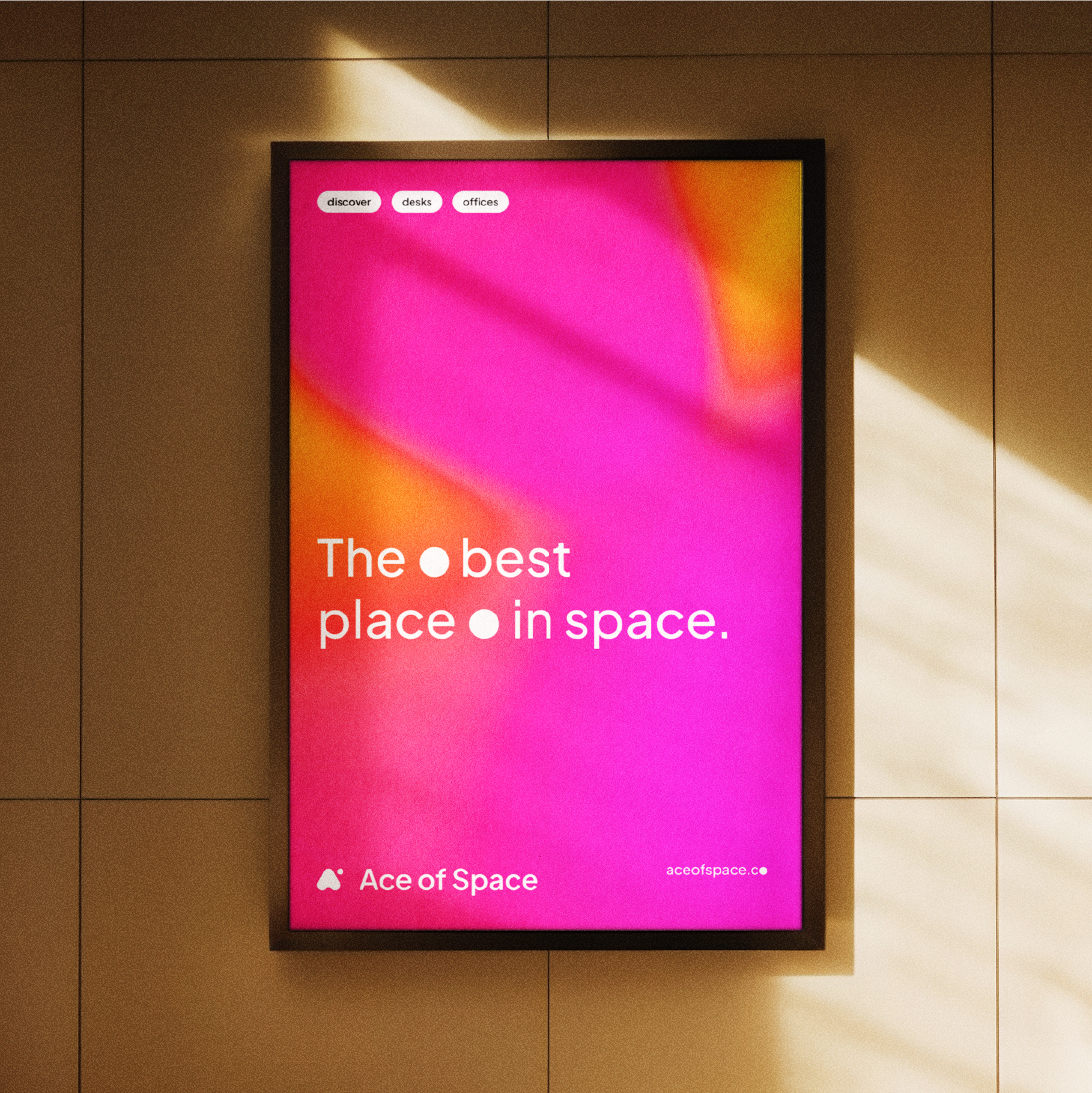
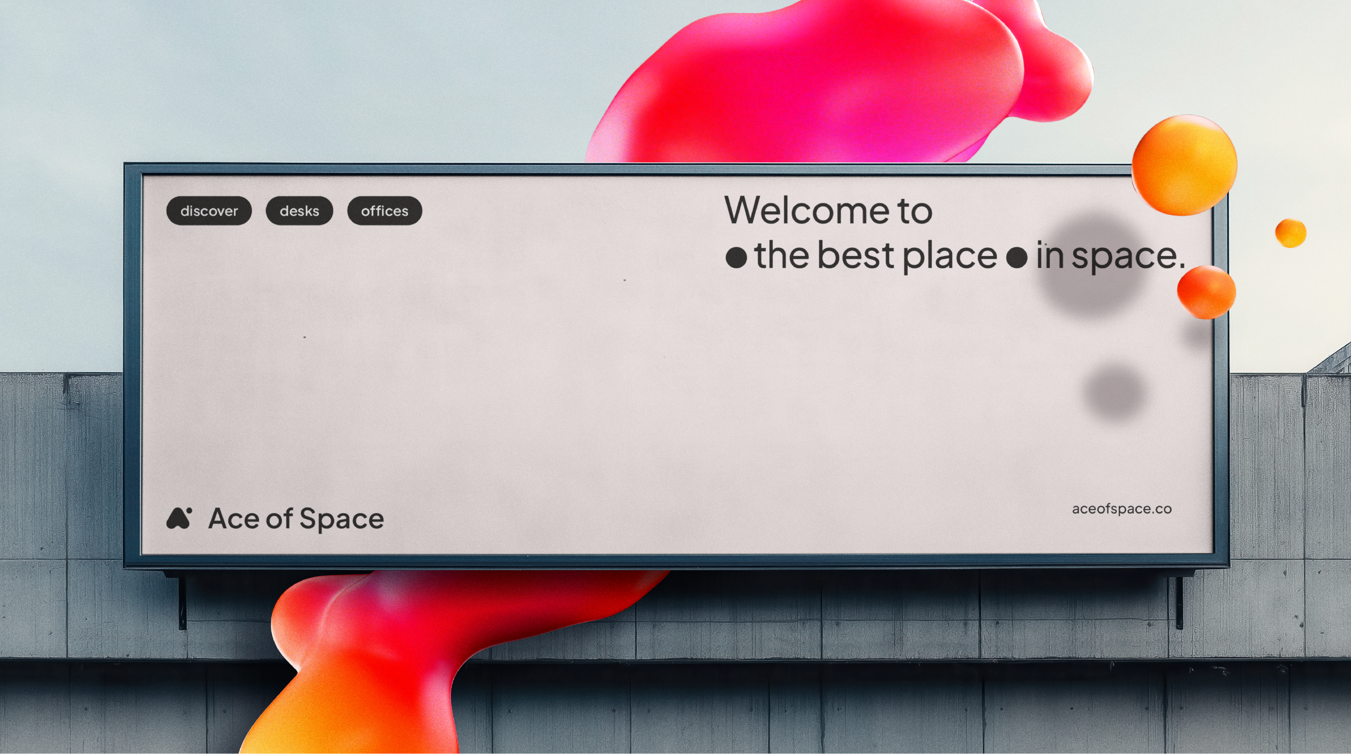
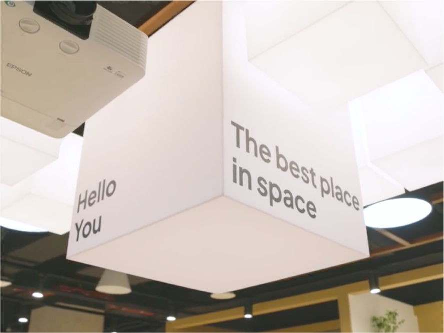
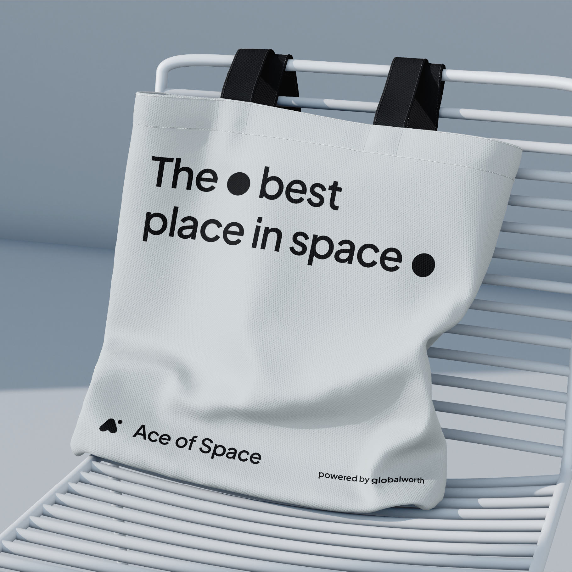
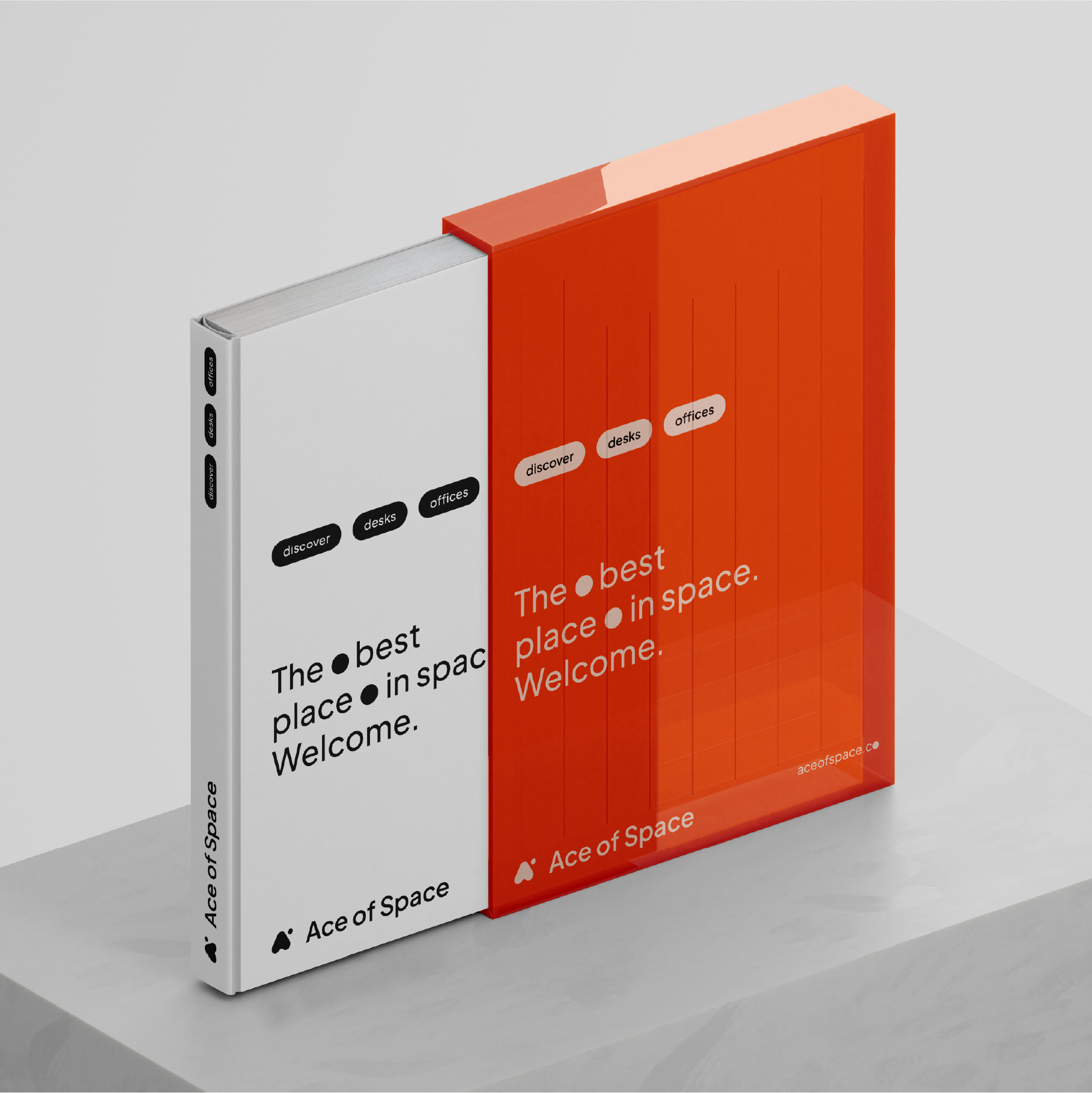
In line with the brand positioning – on the one hand as a serious player in the market, confident of its competitive advantages, on the other hand with a bit of a wink – we had to propose Ace of Space and the supporting slogan Best Place in Space. Yes, it really is the most pleasant place and the best customer service.
Visual Identity
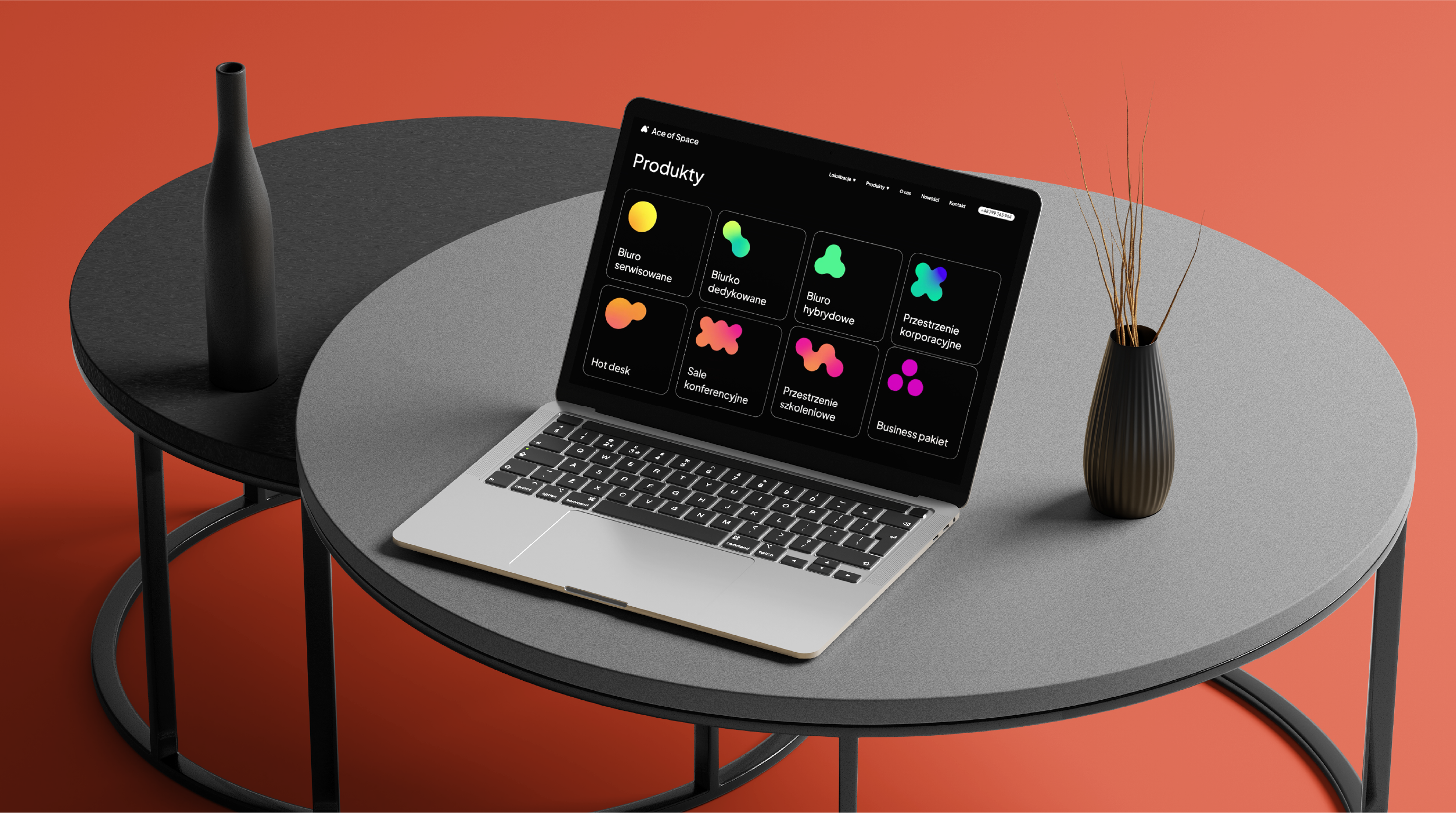
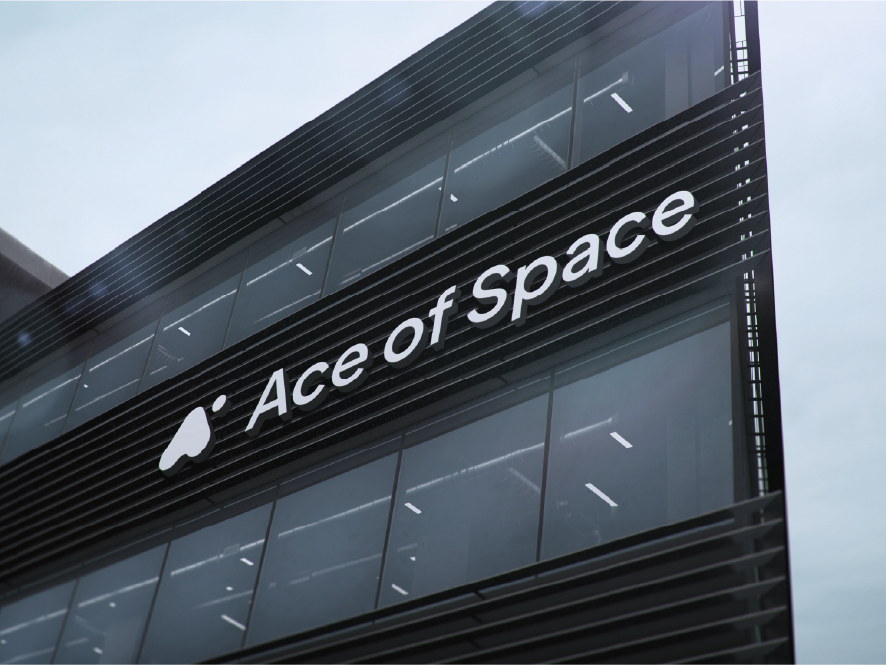
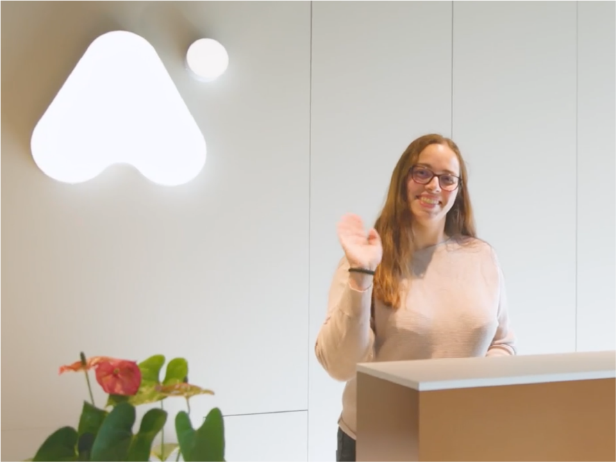
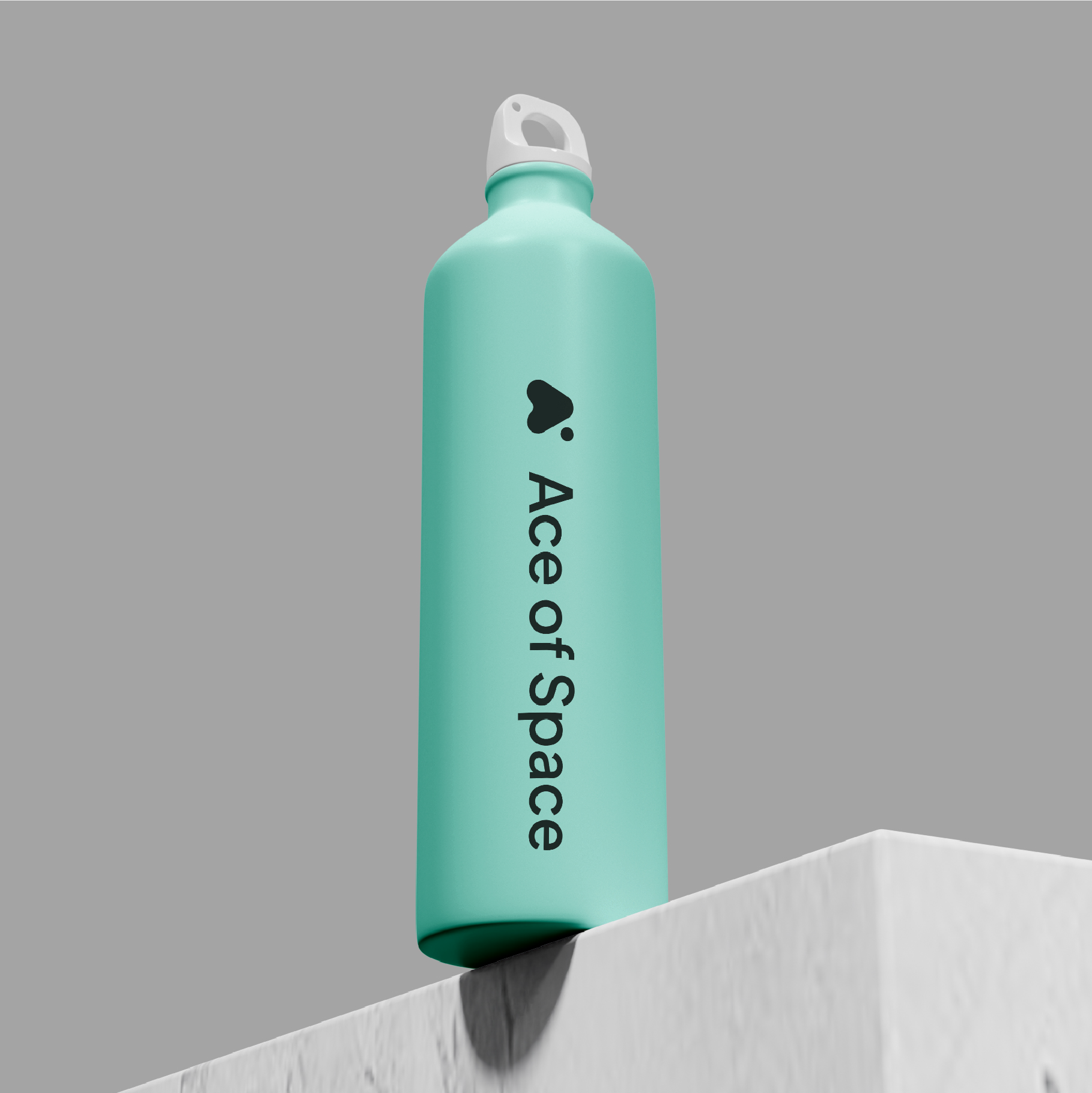
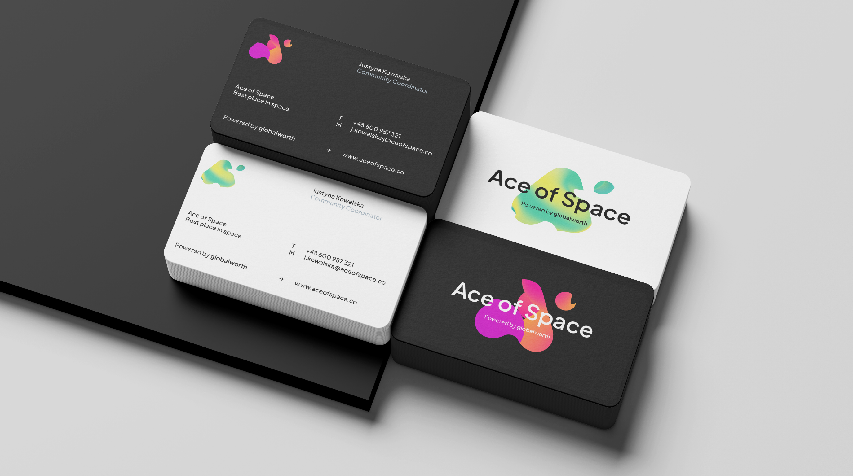
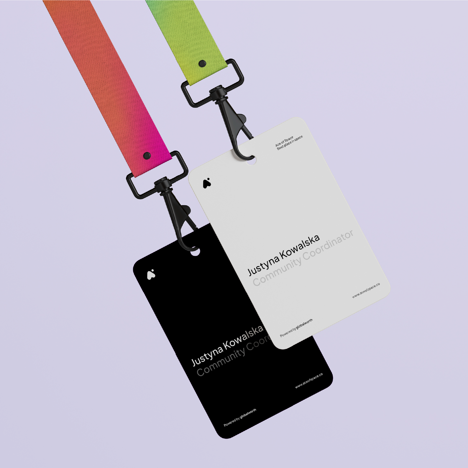
The branding is simple but memorable. Ace of Space offices are located in key cities in Poland. Bold naming, identification based on a distinctive signet. The sign itself takes the form of a stylized “A”, with a dot orbiting around it. The direct inspiration for the form was, of course, the ace of spades (wink, wink).
Together with clear, friendly typography, they create a strong sign. The softness of the signet shapes and apparent movement suggest a space that adapts to our needs. That’s why at the center of visual communication is an animated, friendly, amorphous blob. Specifically, a set of blobs (precisely: metaball) that transfer the idea of flex space to the level of visual abstraction.
It is around this shape that communication is built, it is the supporting element both in online communication, on the website or social media materials, as well as in the spaces themselves. Flowing shapes, changing colors and shades intensify the effect similar to a lava lamp and evoke sympathy.
Metaballs appear in both static and animated form, we designed two dedicated sets By Day and By Night and prepared a design system allowing them to be used in various scales and diverse applications. On our side was the comprehensive implementation of brand materials – from corporate to website creation and templates for social media communication.
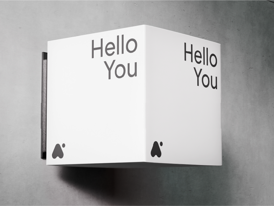

Let’s not forget about language. The name and slogan themselves are somewhat playful. However, the full brand experience is – especially in the case of a business like Ace of Space – daily communication with tenants. Here too, we built a set of communication materials and welcome packages for new tenants.
What does such a process look like?
Comprehensive design of the entire brand experience is possible with close cooperation with the implementation team. Communication only works when it is actually useful for the team.
That’s why we develop our materials together with the client, providing support and preparing ready-made templates and elements for further use. We consider the process successful if the templates actually work and are in use, and we can provide supporting services at key stages.
Credits
Leniva° Studio
Concept & Art Direction: Neon Neonov
Brand Strategy: Lena Mitkowa
UX / UI / LowCode: Michał Witucki
Brand Implementation: Zofia Stybor, Kamil Przybyła
Clients Team
Iwona Walendzik
Ewa Skibińska
Magdalena Śnieżek