Past.
Present.
Future.
Forever furniture
Info ↘
We had a great pleasure upgrading the identity of Hule, an independent furniture brand with a unique approach to what they do. It’s all we always loved and stood for love – their furniture is built to last.
Design process, used materials and production technology allows Hule to develop products that seem timeless, well built, and yes, most likely to outlive you and your children.
Scope
Rebranding / GUI
Tools
Illustrator
Client
Hule

Designer’s Task
Our task was to improve and upgrade Hule in both functional and visual aspects according to the brand’s touchpoints, in order to create a more consistent and compelling experience.
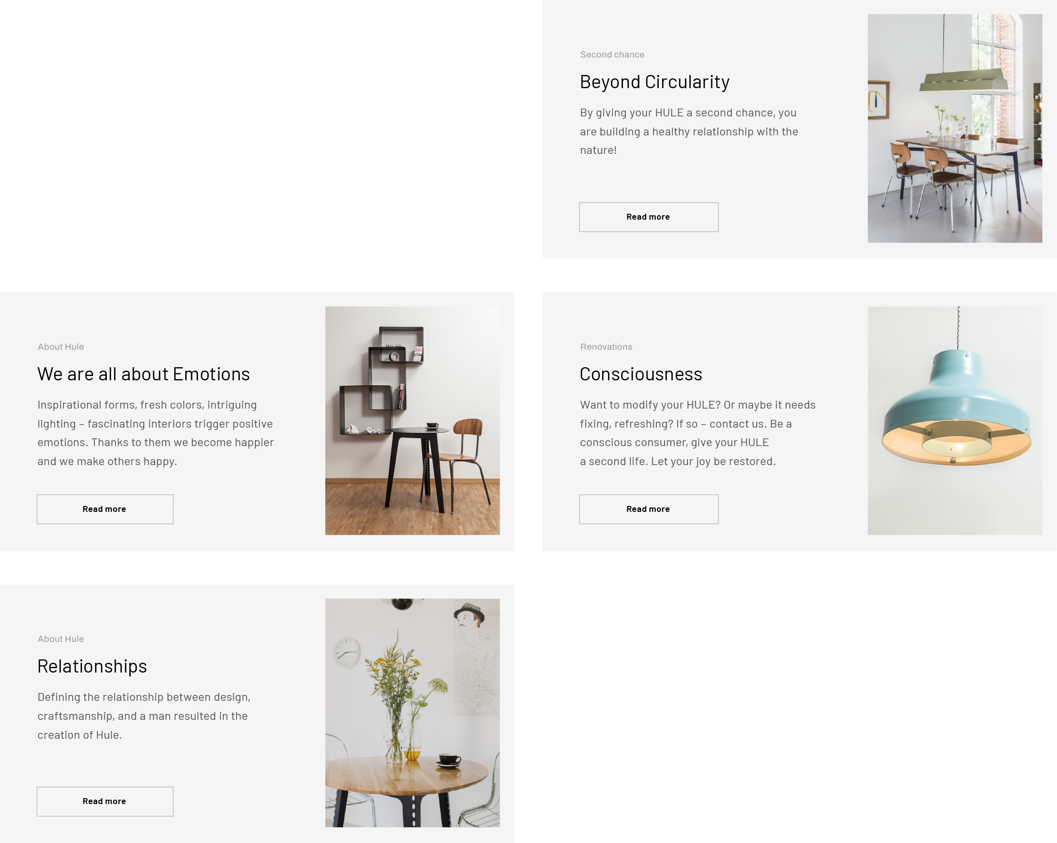
Inspirational forms, fresh colors, intriguing lighting – all this was already available, but lost among not the most happy design decisions.
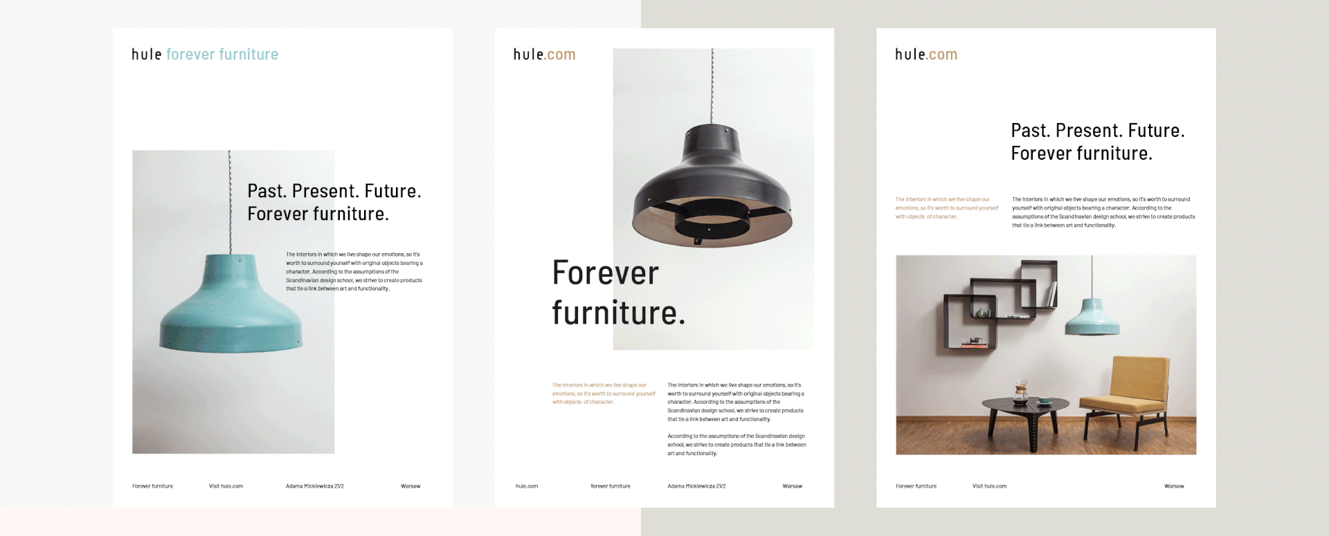
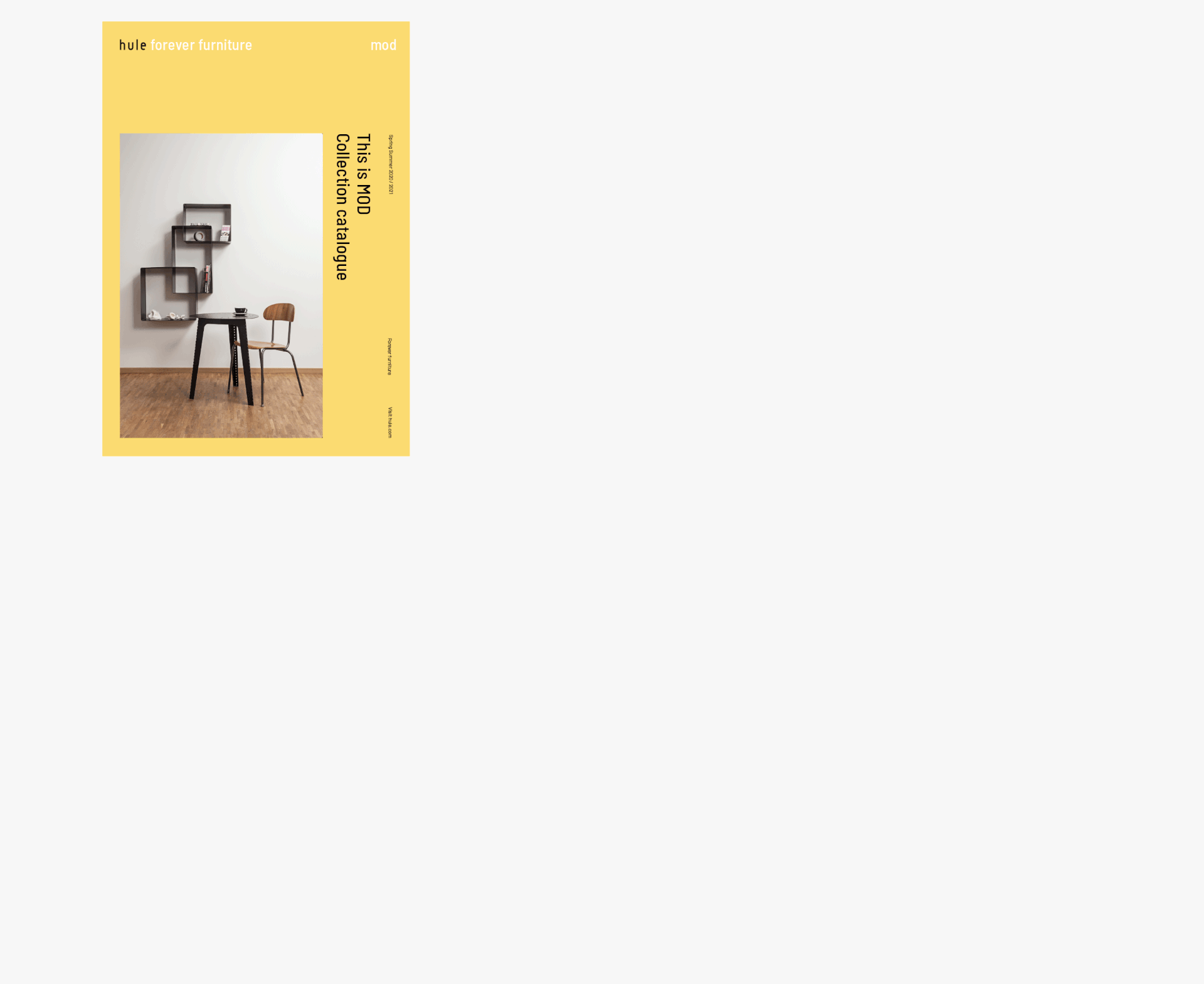
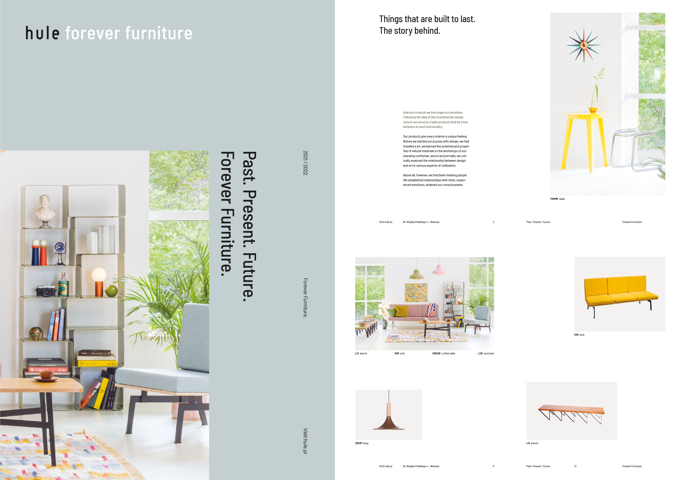
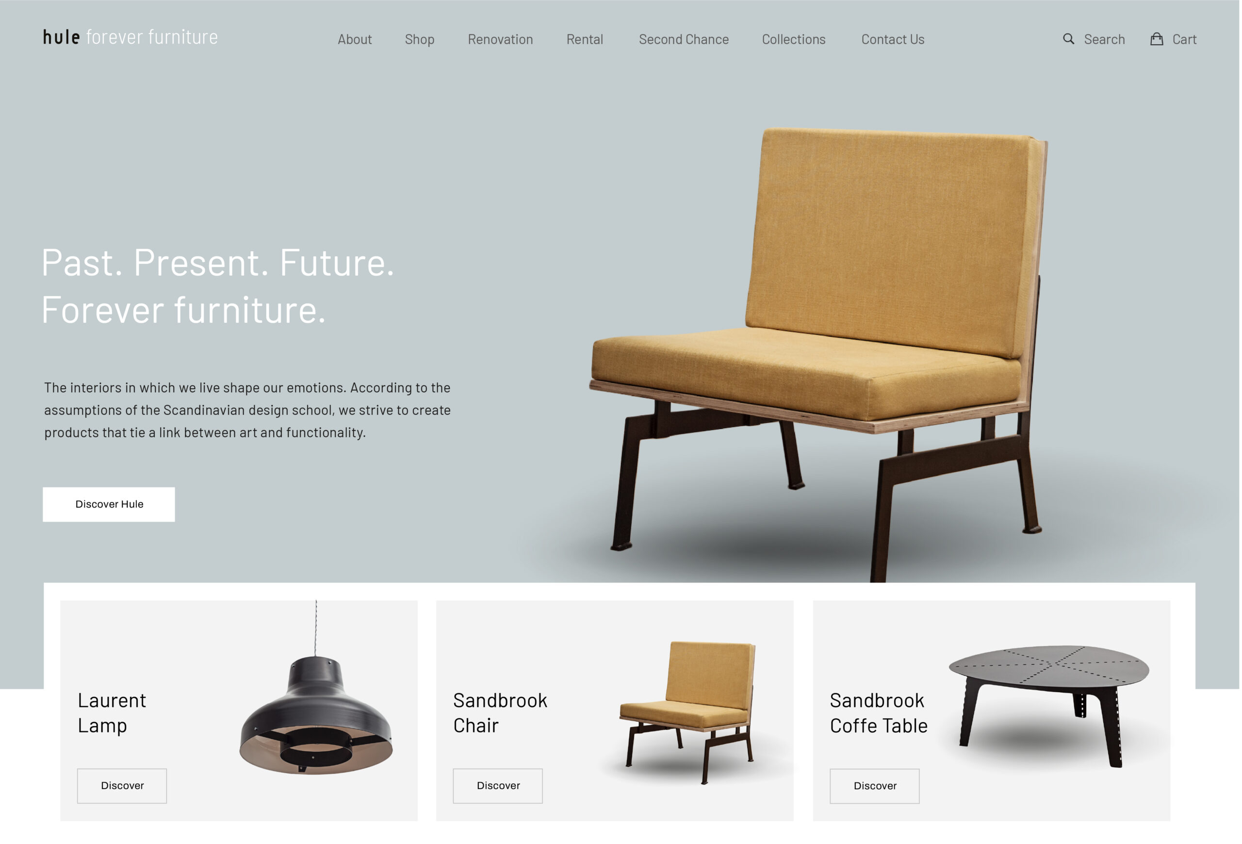
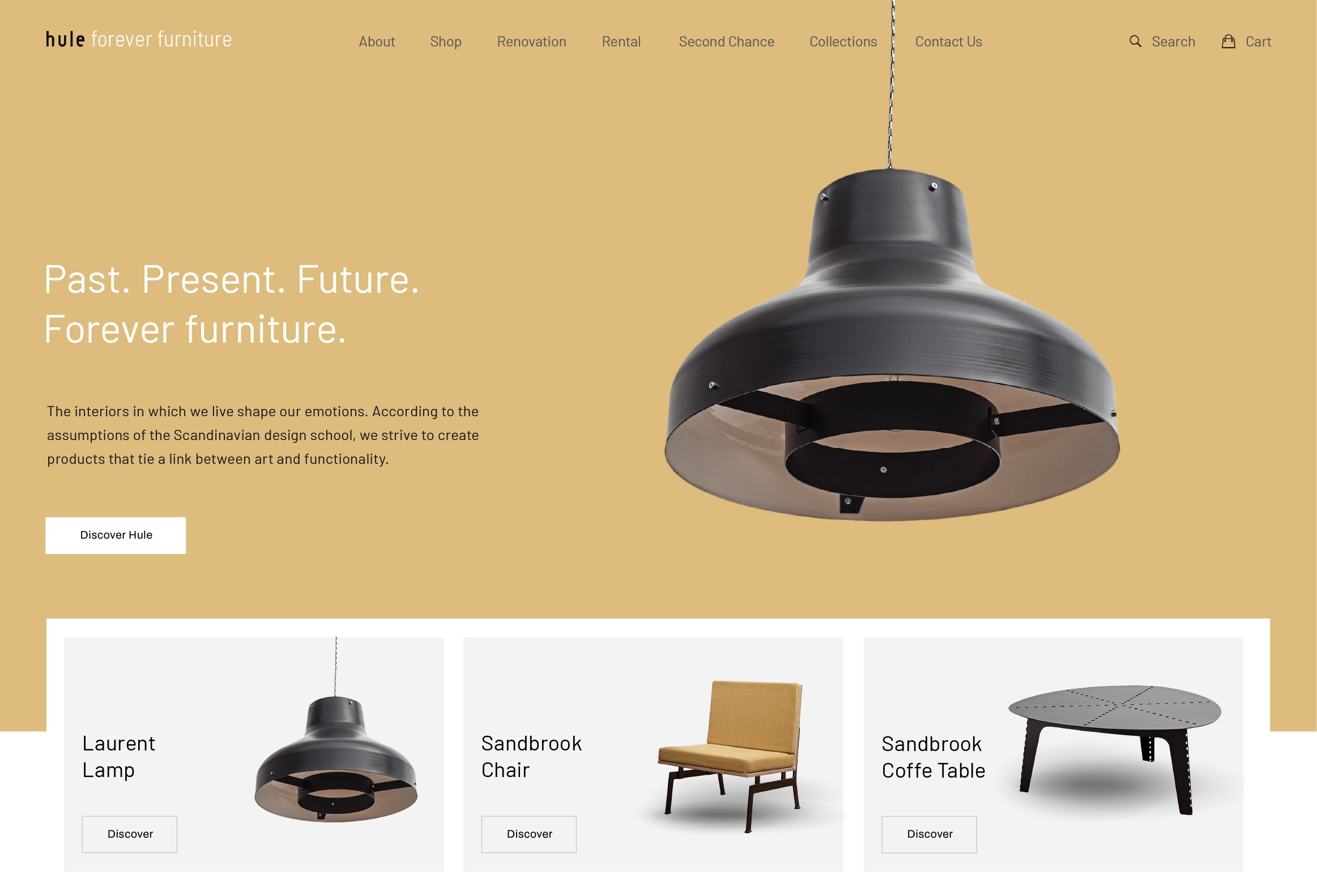
Past. Present. Future.
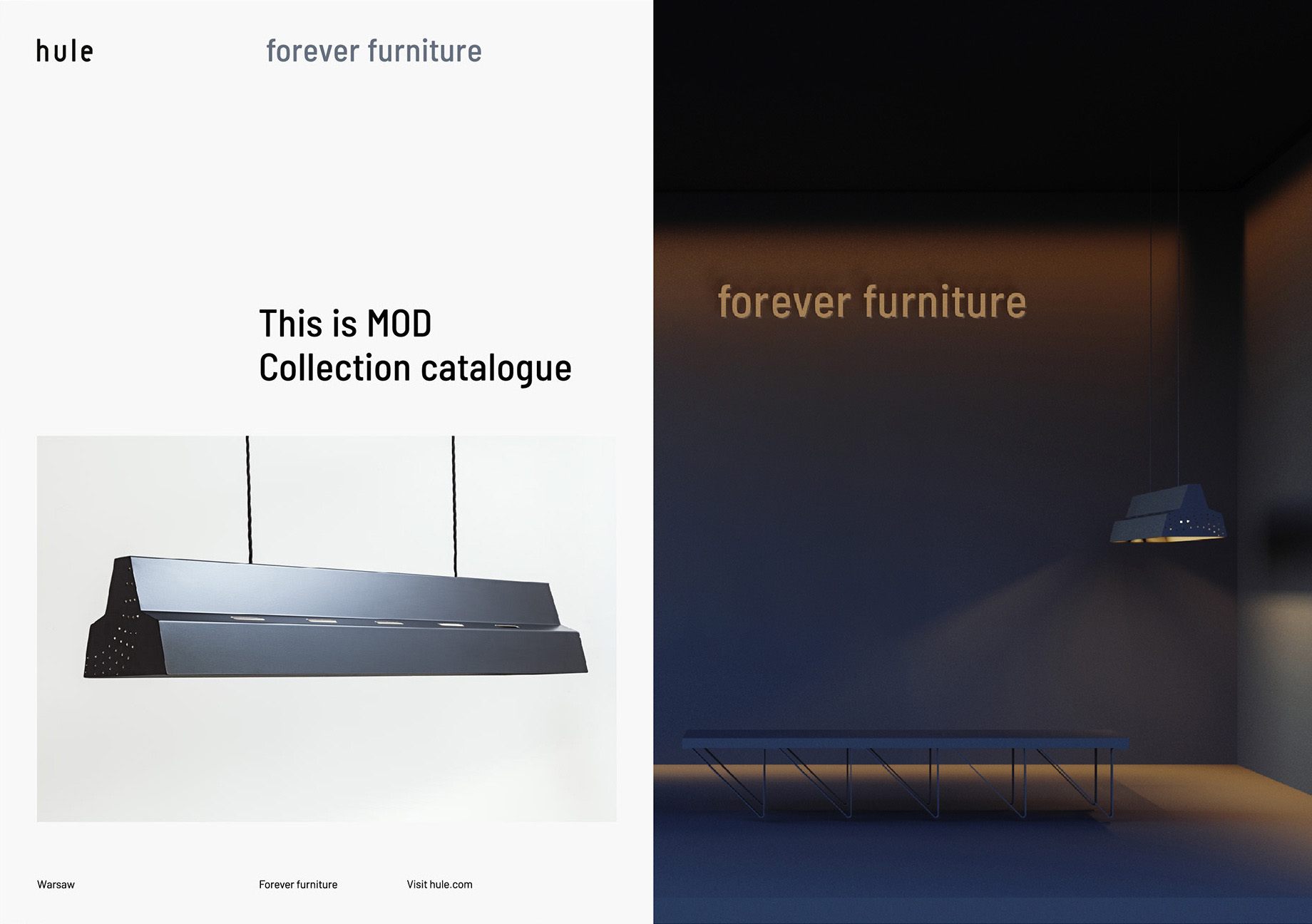
Forever furniture.
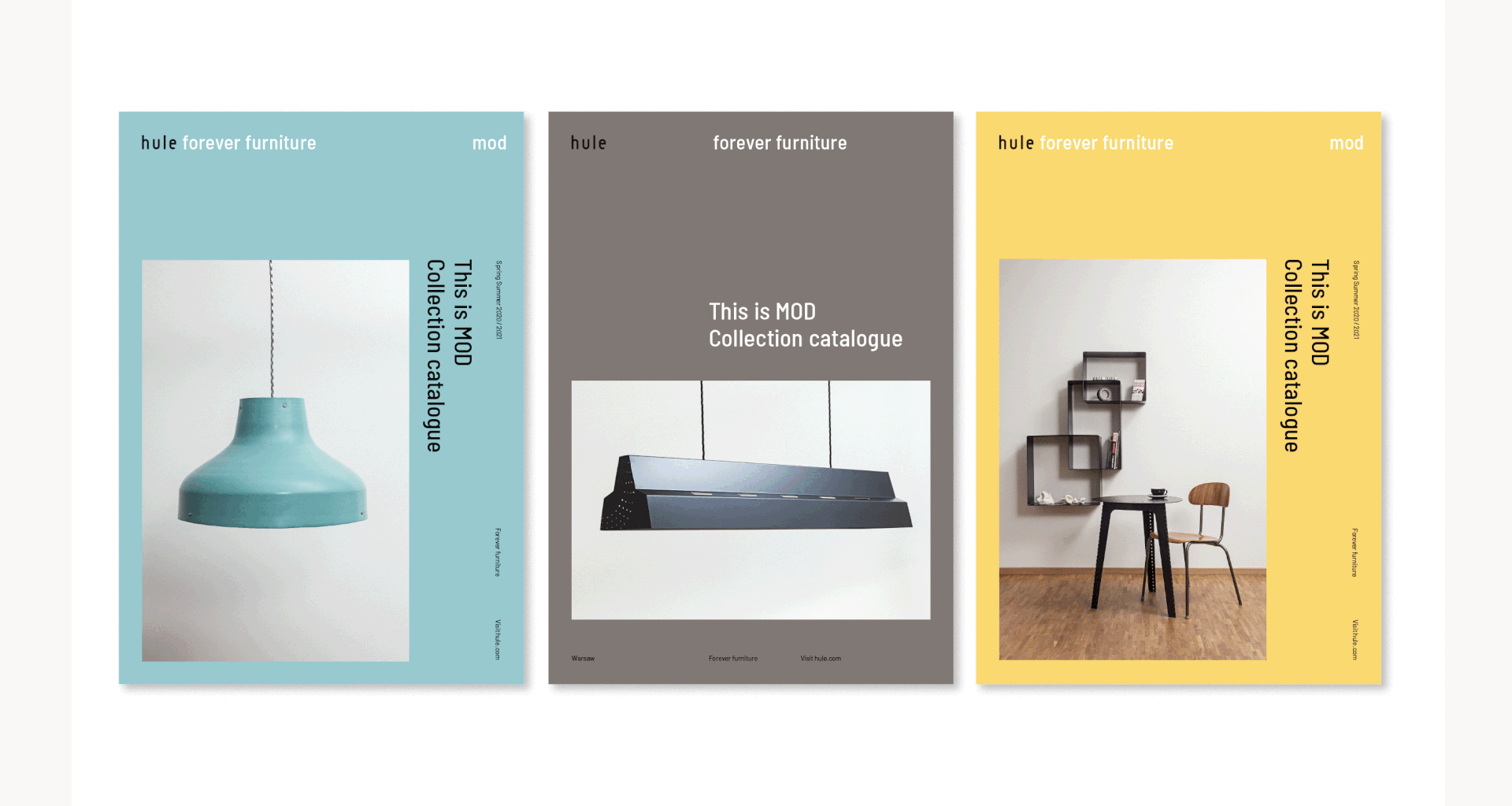
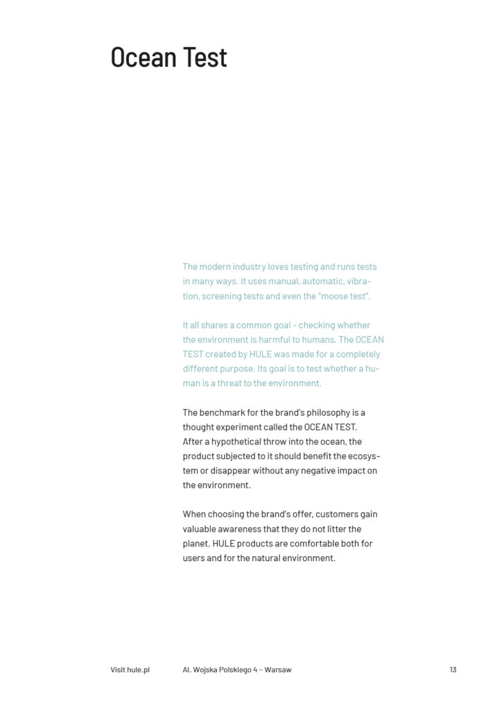
We started from extracting the sheer essence of the brand. Sustainably and responsibly made furniture called for a new tagline. During our research and creative brainstorming we decided to go with Forever furniture.
Not only to show how long lasting it is, but also to inform, that it can be easily customised and repainted if you get bored with it. It also is super easy to recycle and reuse when its life cycle comes to an end.
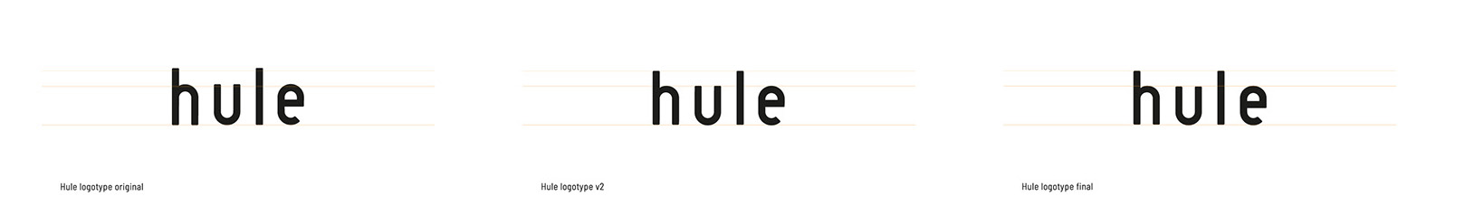
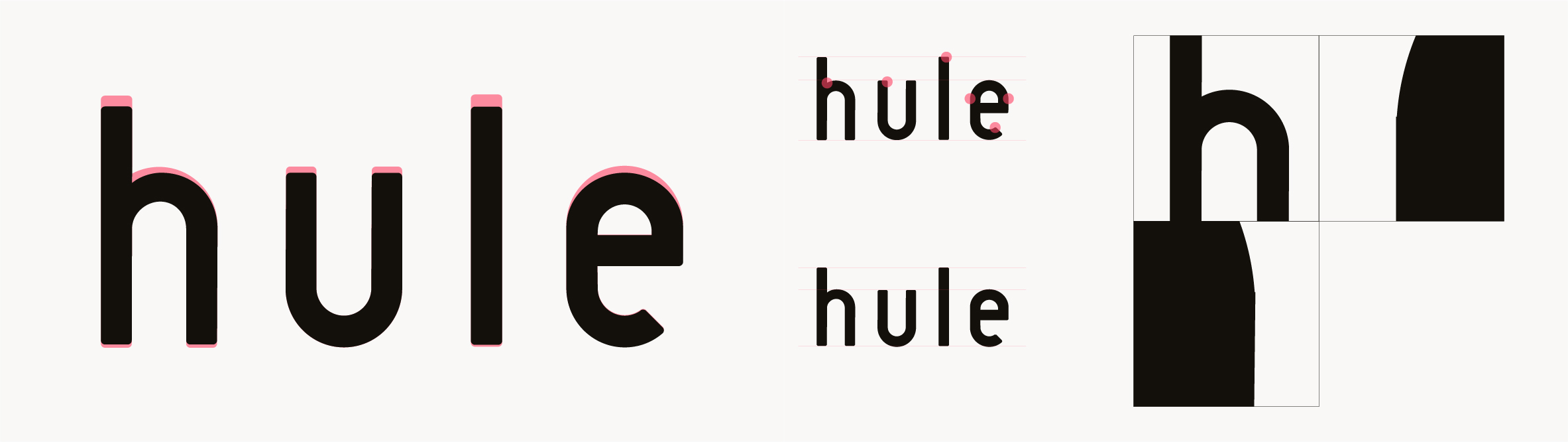
Then came the logo upgrade as it needed some typographic tweaking. We also eliminated all the design flaws and proposed a new type to emphasise Hule’s mission.
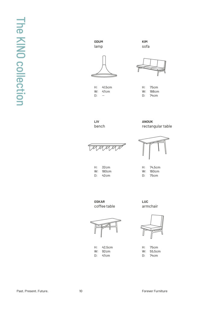
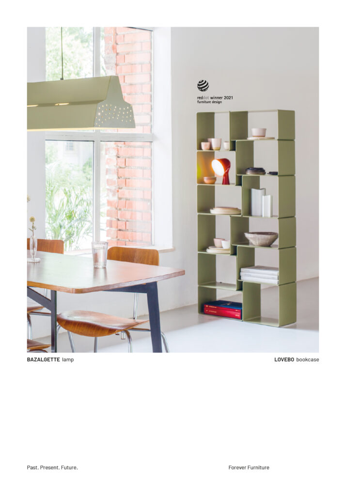
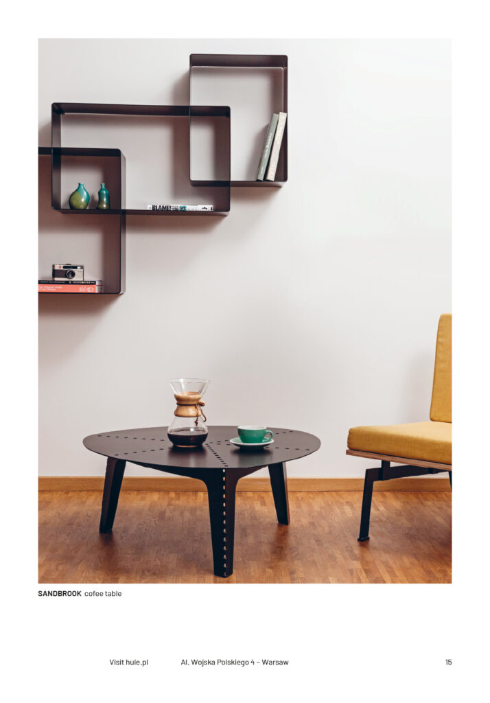
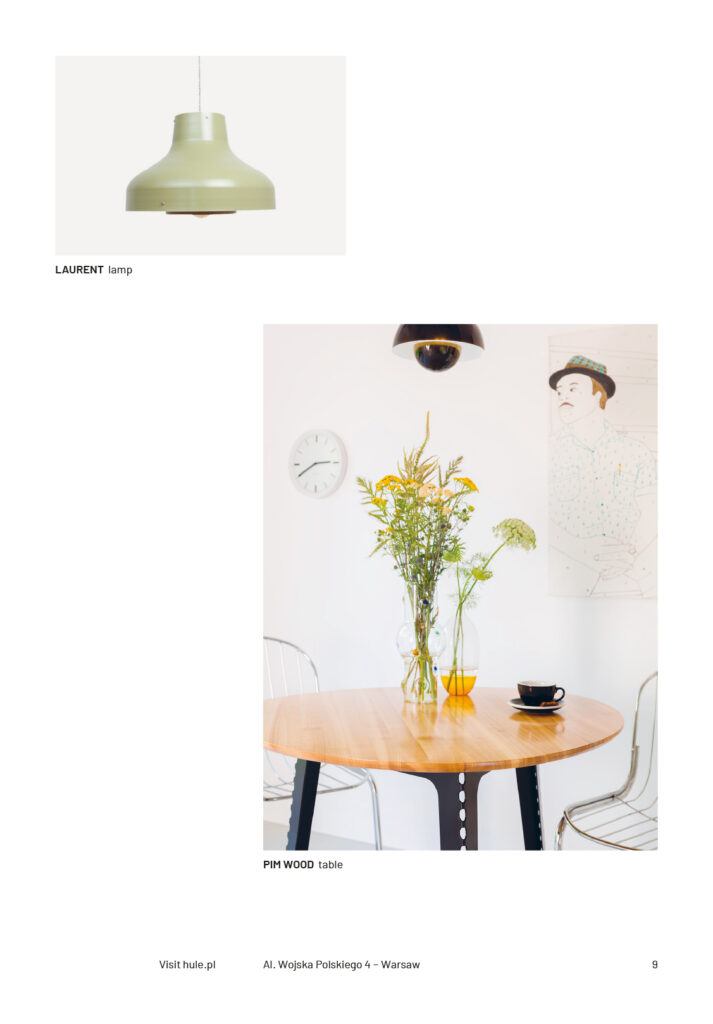
We also designed new key visuals to reflect intellectual roots of Hule – bauhaus and modernistic influences are clearly visible now not only in furniture shapes and forms. You can see it in new catalogues and brochures.


Challenges
The biggest challenge was the limited budget. That’s why we used a customized website template instead of creating everything from scrap..
This resulted in a simple, easy to update web page with an online shop, where you can browse and customize your favourite products.
Easiness of implementation
Small companies should be able to focus on their design process and craftsmanship,
so the whole project was optimised to be easily manageable by the brand owner himself.
Credits
Team Leniva° Studio
Strategy and Production: Lena Mitkowa
Concept and Key Visual: Neon Neonov
Production: Janek Mońka, Kamil Przybyła, Lena Mitkowa
Client’s Team:
Bartosz Hulewicz