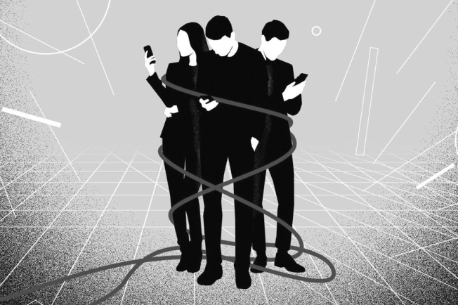
Can the digital world be balanced and focused on people, not technology itself? We deeply believe that it is education that will help us build a more balanced world. Therefore, it was with great satisfaction that we supported the Instytut Cyfrowego Obywatelstwa (Institute of Digital
Citizenship) in building this much-needed brand.
Info ↘
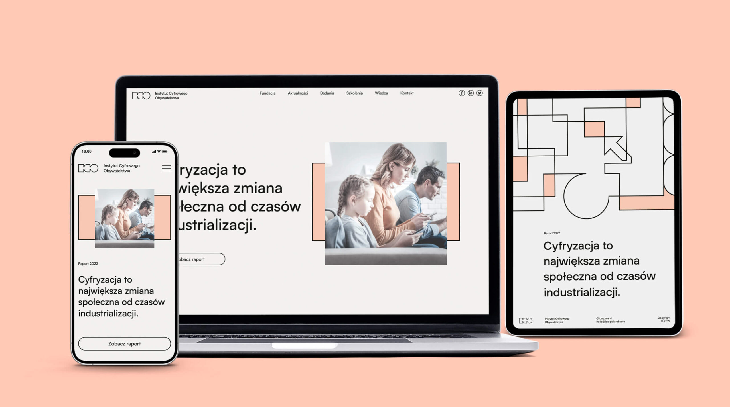
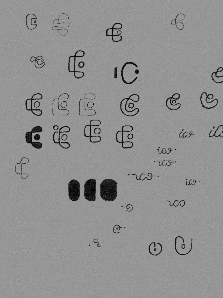
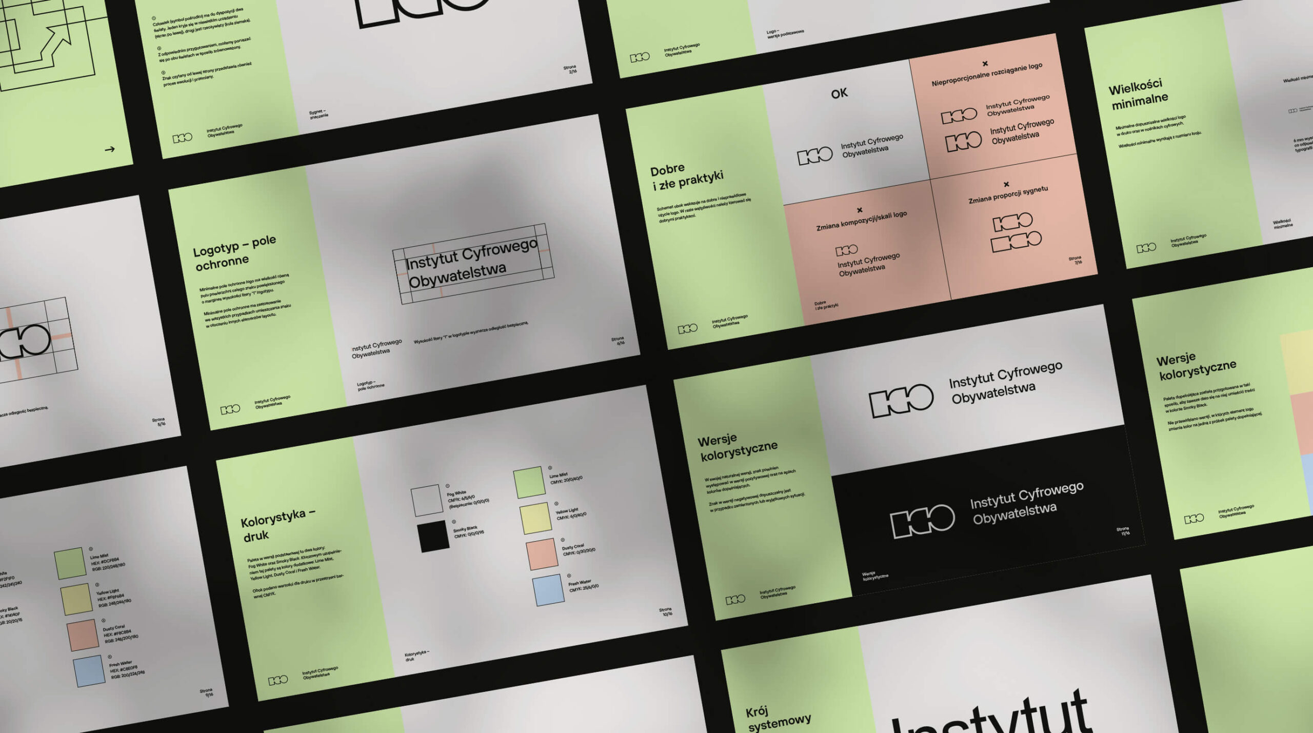
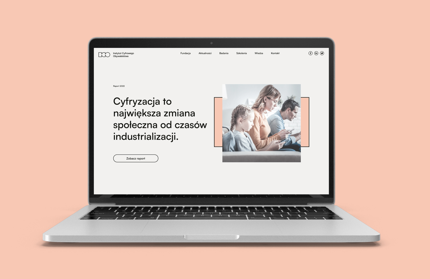
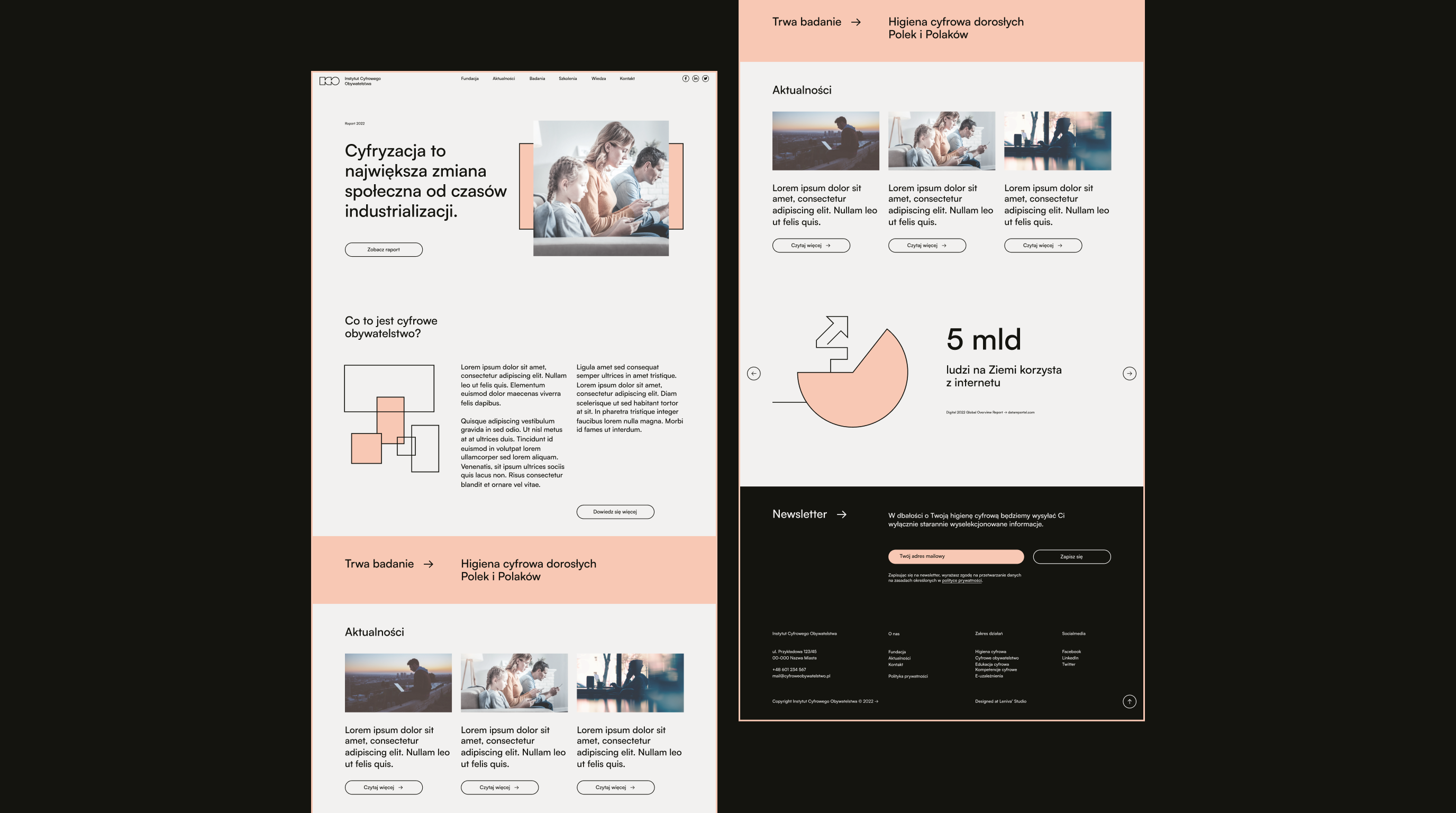
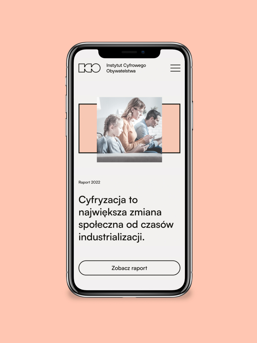
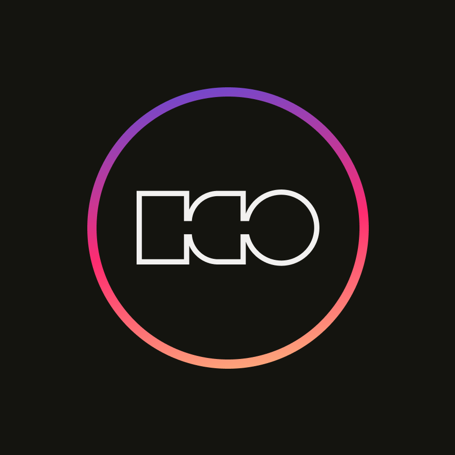
When designing the system for the ICO we knew that we would need a strong, recognizable sign. In the course of in-depth exploration we have developed a strong, block signet ring built on the shapes of letters forming the acronym of the Instytut Cyfrowego Obywatelstwa name. We have supplemented it with modern, minimalist typography, placing particular emphasis on the balance between pictographic and typographic elements.
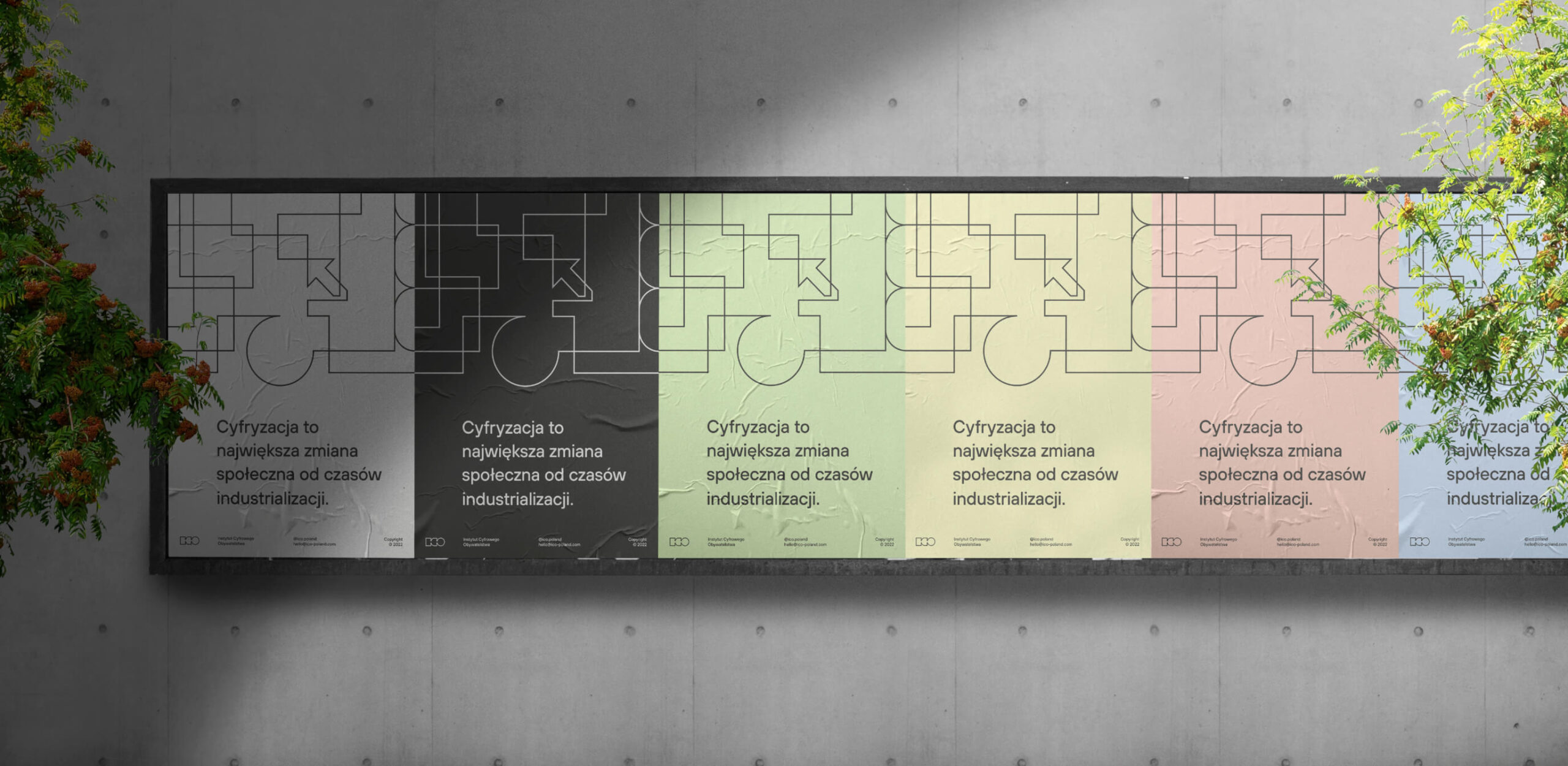
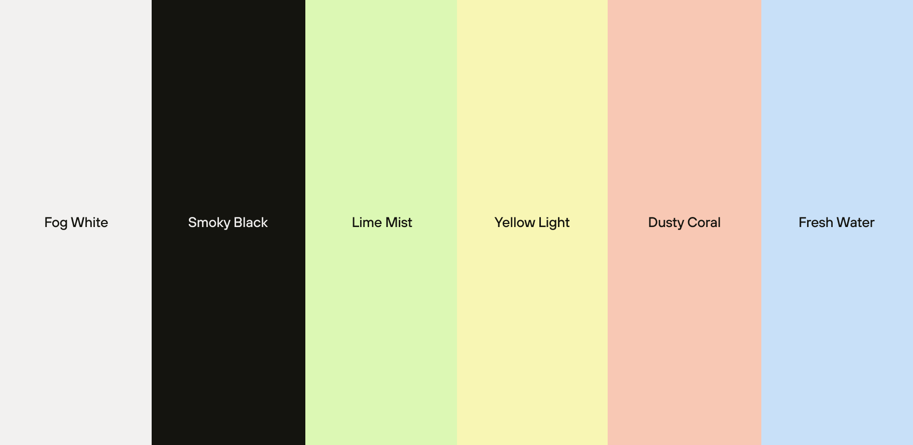
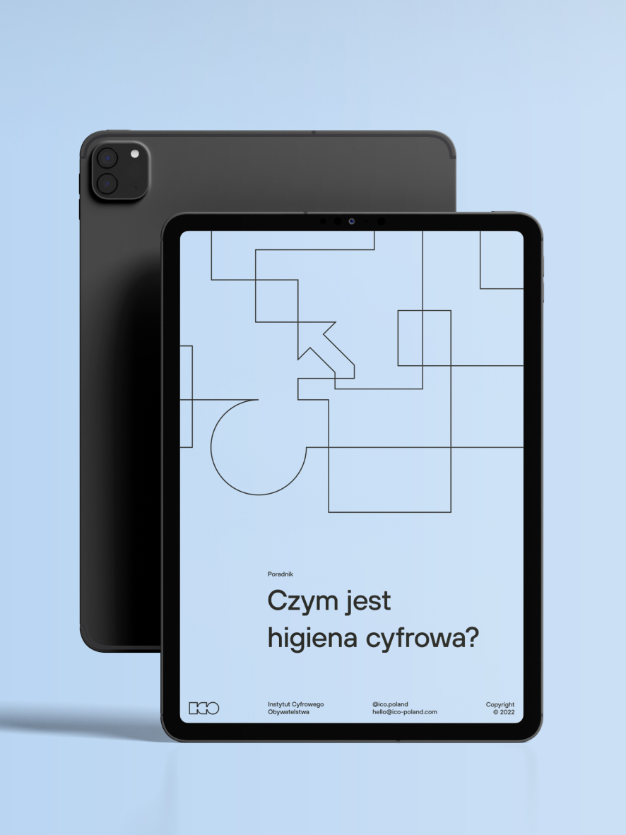
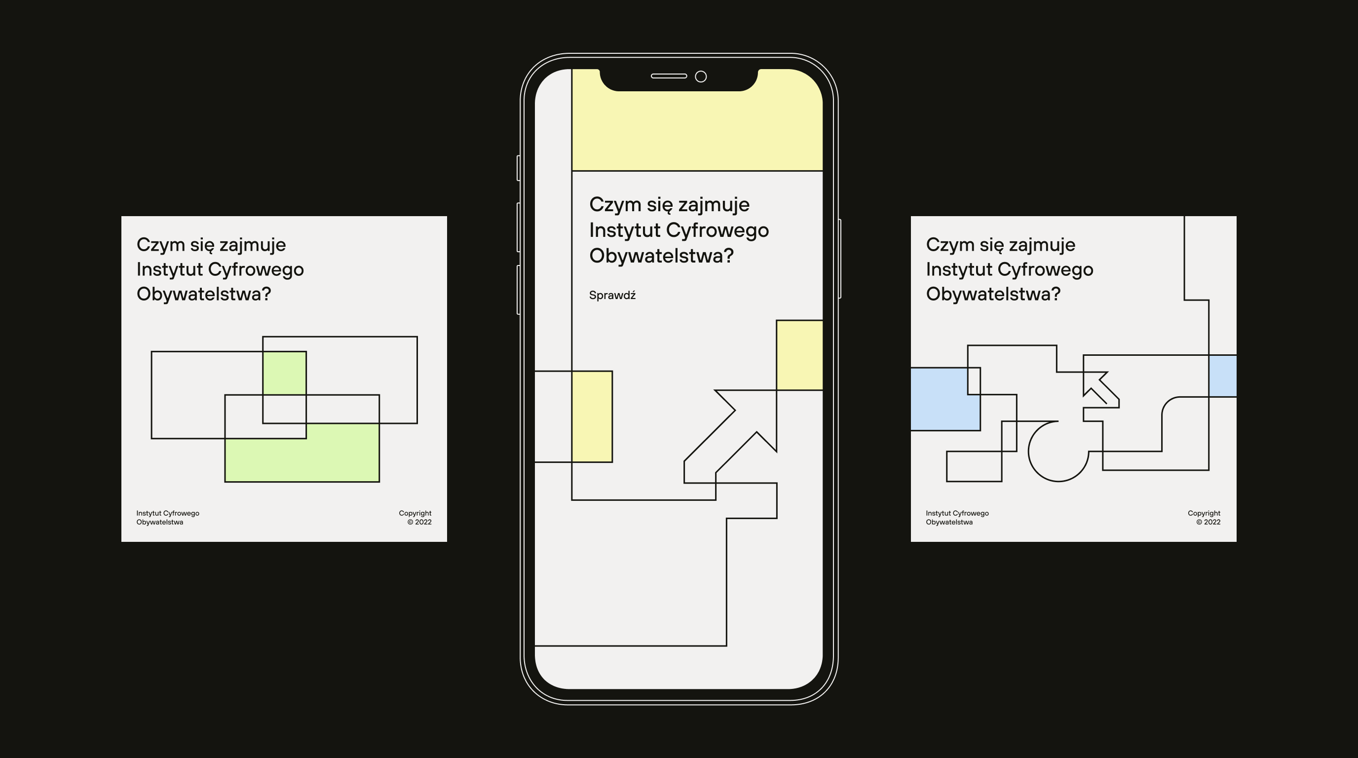
We have built a visual system based on geometric outlines, referring to the screens that surround us. Everything is balanced with soft, eye-pleasing, subdued colors. A set of shapes allows the client for an independent, consistent development of visual communication.
Scope
Branding / UX/UI
Tools
Figma / Illustrator
Client
Institute of Digital Citizenship
Logo meaning
A man (represented by the symbol in the middle) has two worlds at his feet. One is hidden in a small device (represented by the screen on the left), and the other one is real (represented by the globe on the right).
With proper preparation, we can move through both worlds in a balanced way.
The sign read from the left also represents the process of evolution and transformation.


Credits
Team Leniva° Studio
Brand Concept and Key Visual: Kamil Przybyła
Art Direction: Neon Neonov
UX/GUI: Janek Mońka, Kamil Przybyła
Production: Lena Mitkowa, Saskia Mońka
Client’s Team
Magdalena Bigaj