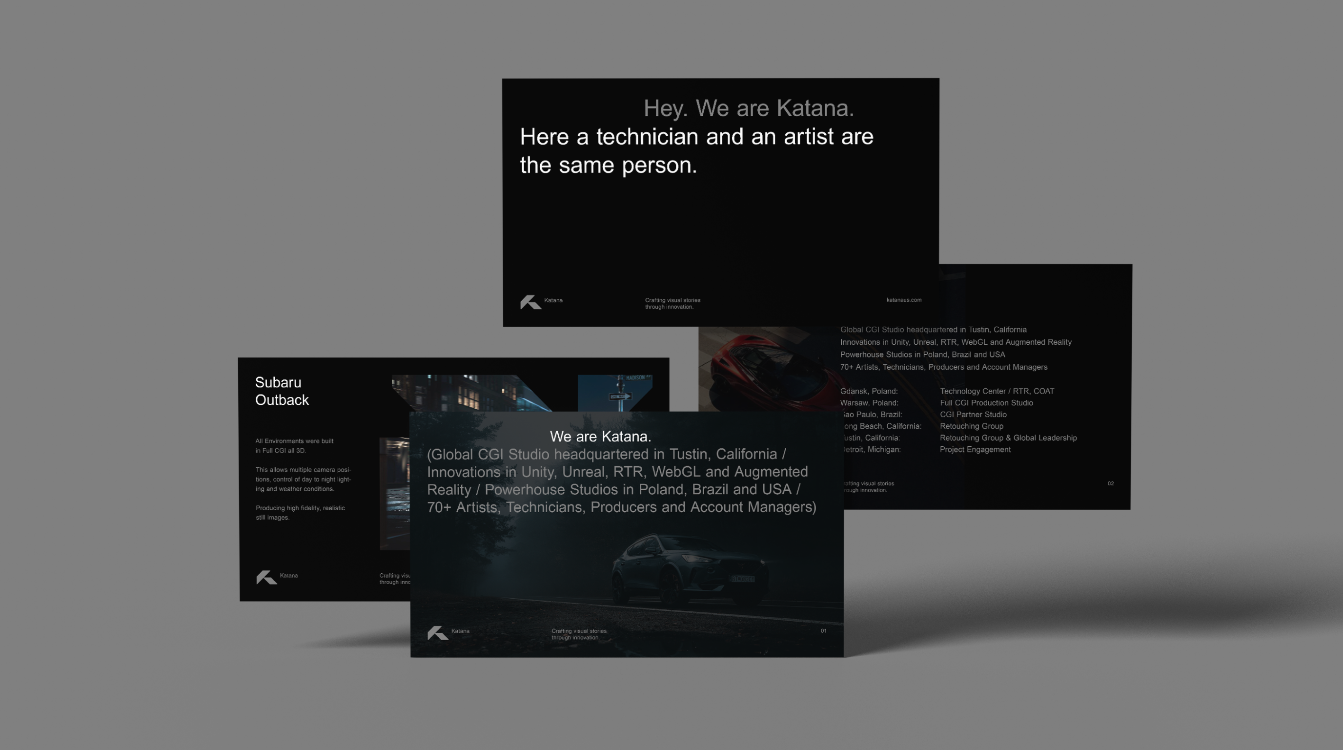
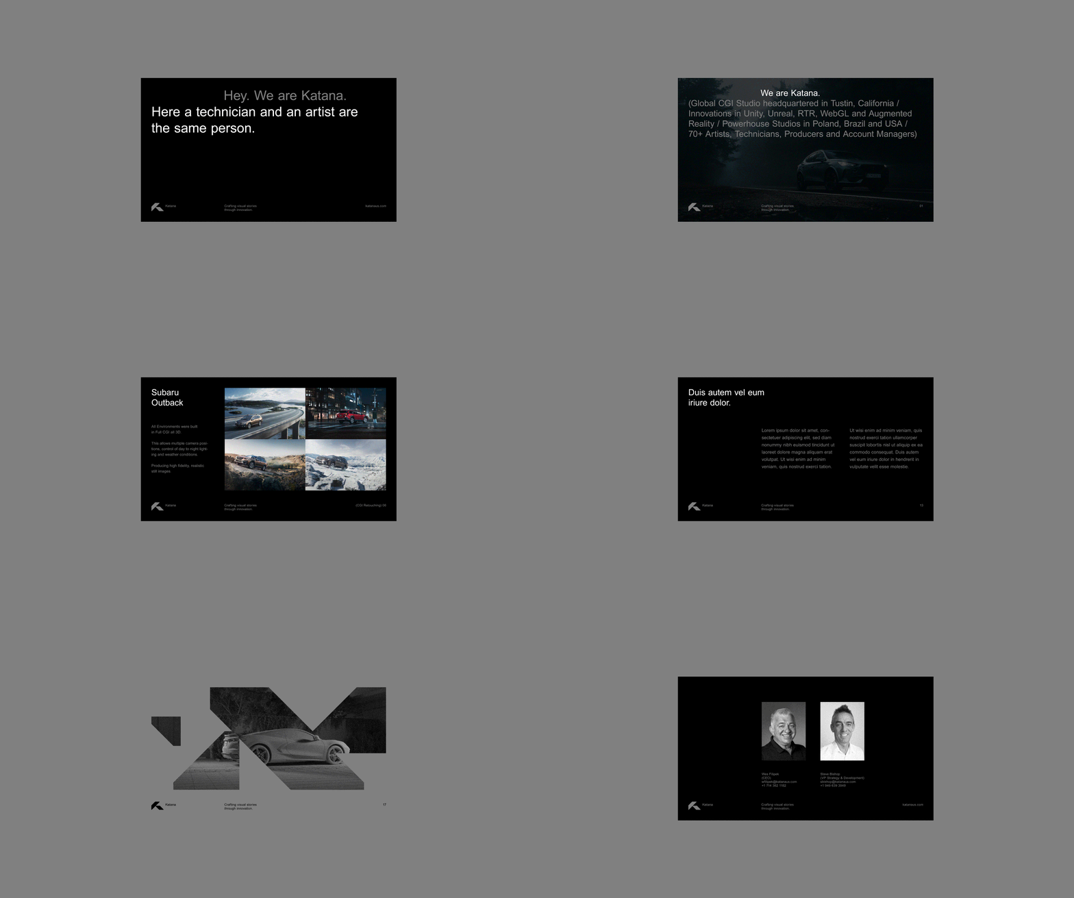
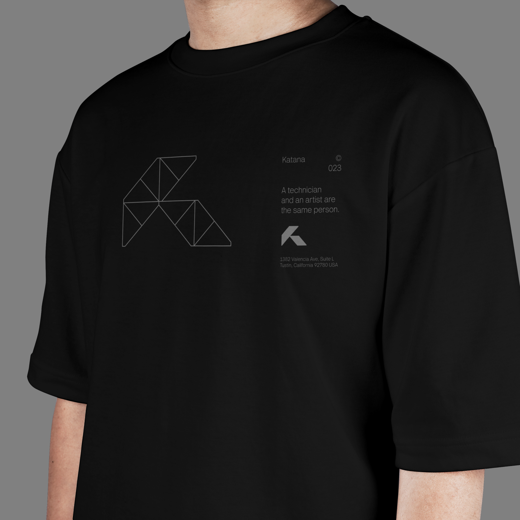
At Katana, a technician and an artist are the same person.
Info ↘
Talented and highly creative individuals doing what they do best.
A safe and collaborative work environment, with challenging tasks and truly rewarding projects.
Katana is about people who know what they are doing: advanced technologies, creative approaches to problem solving, knowledge of the art(s) and the ability to effectively turn challenges into quality projects.
Scope
Strategy / Rebranding / UX&UI
Tools
Figma / Illustrator
Client
Katana
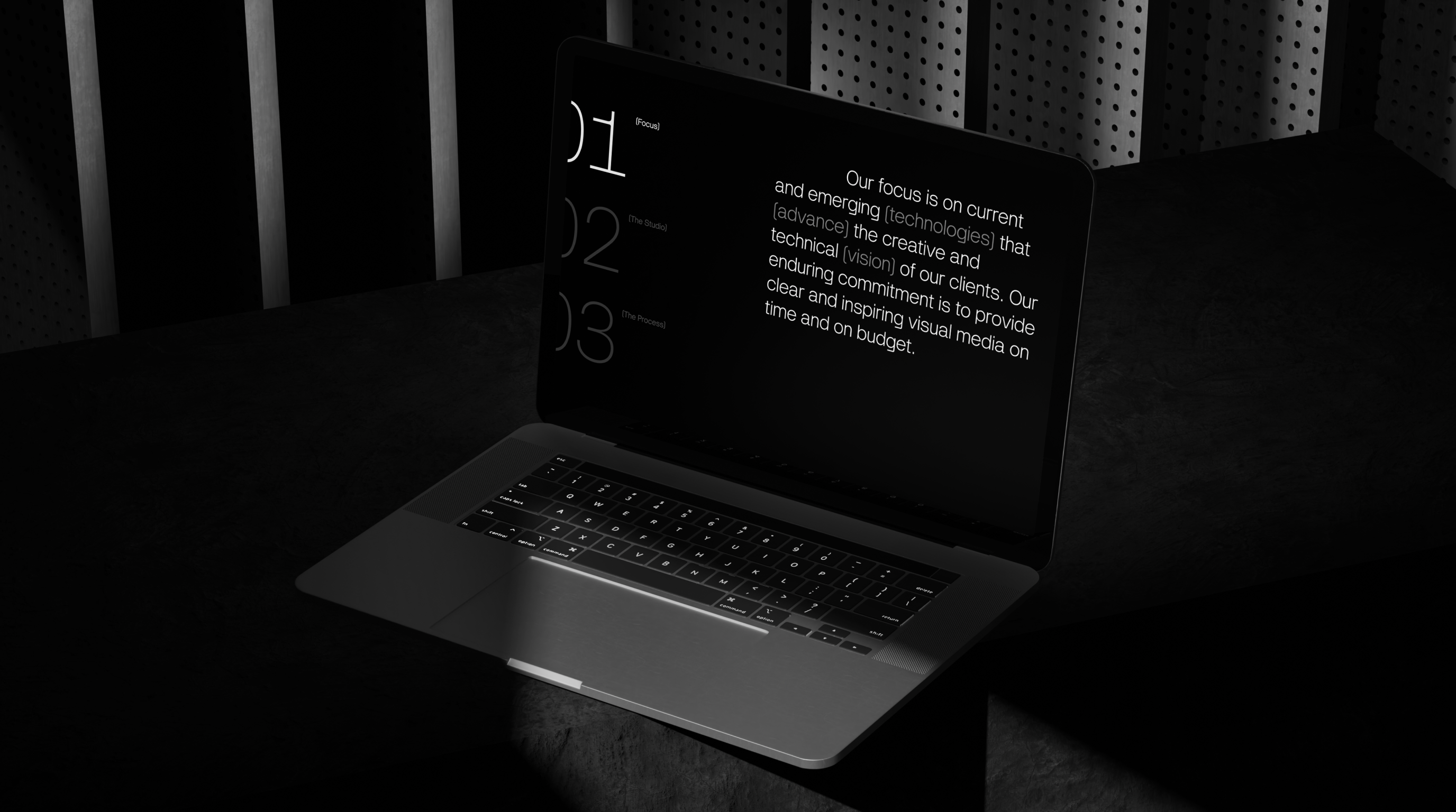
(01) Approach + Attitude
Approach
→
Artistic engineering / Inner strength / Curiosity / Craftsmanship / Commitment / Technology + art / Tech-driven solutions
Attitude
→
Trust / Confidence / Care / Focus / Understanding / Problem solving Honesty / Value system / Innovation
(02) Copy language development
Approach
→
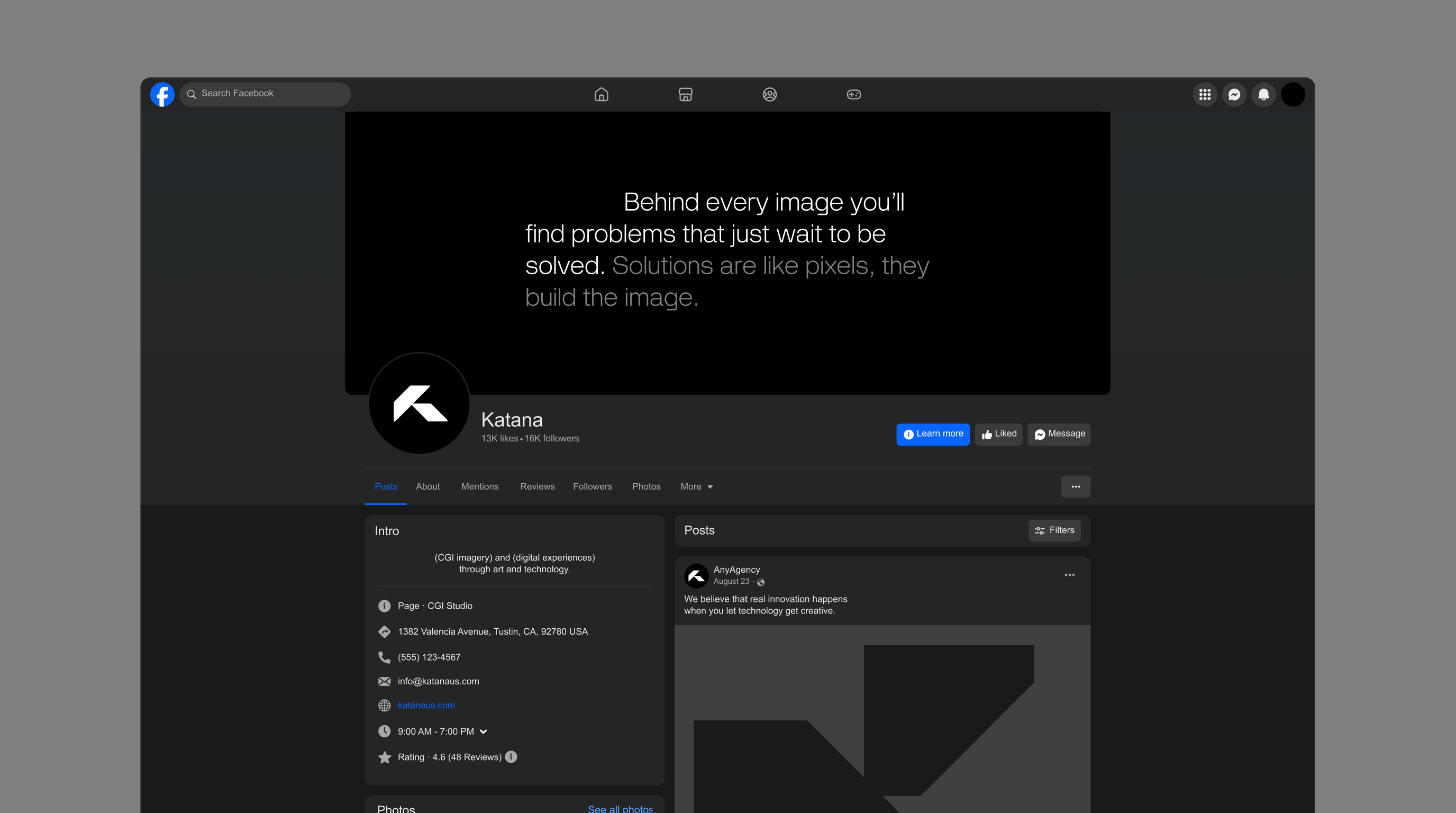
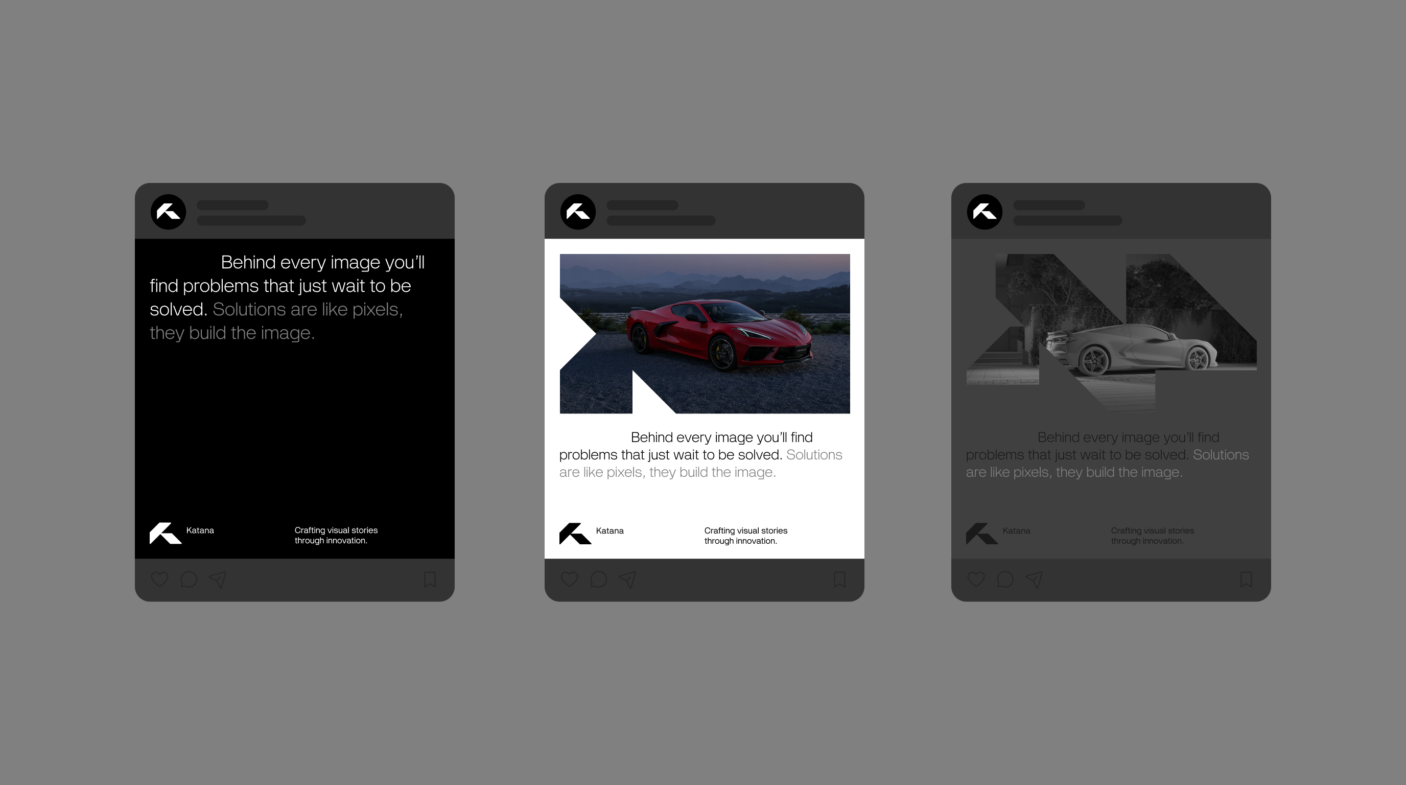
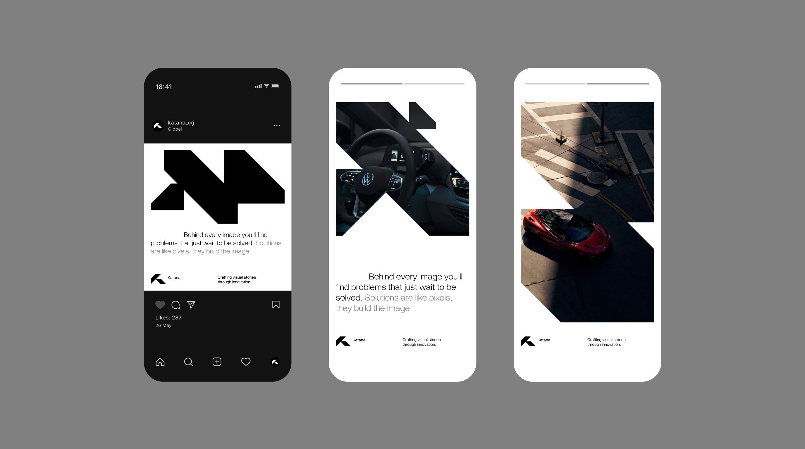
Behind every image you’ll find problems that just wait to be solved. Solutions are like pixels, they build the image.
We believe that real innovation happens when you let technology get creative.
Creative technology and technical artistry.
Attitude
→
It takes both an angineer and an artist to solve a visual problem. We are Katana.
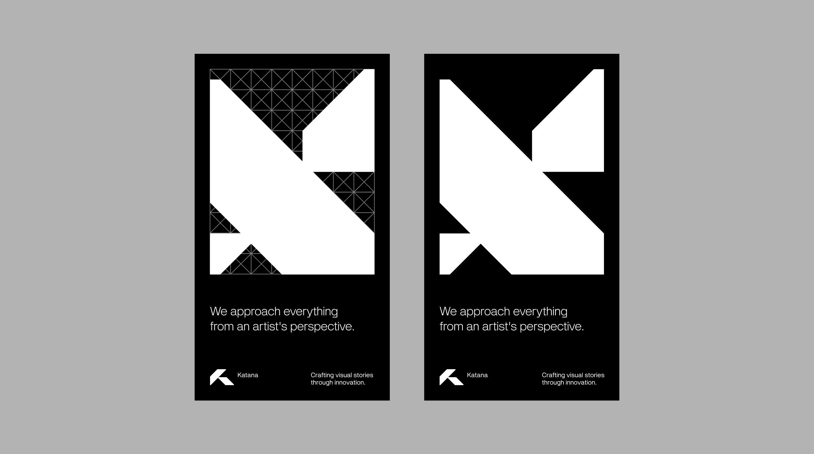
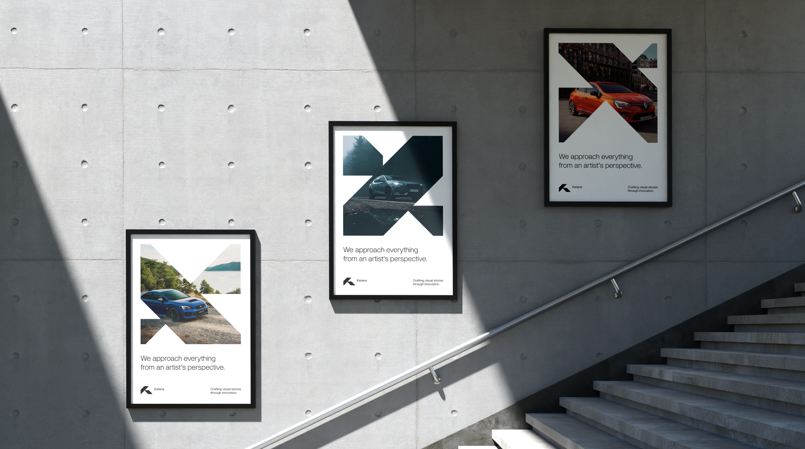
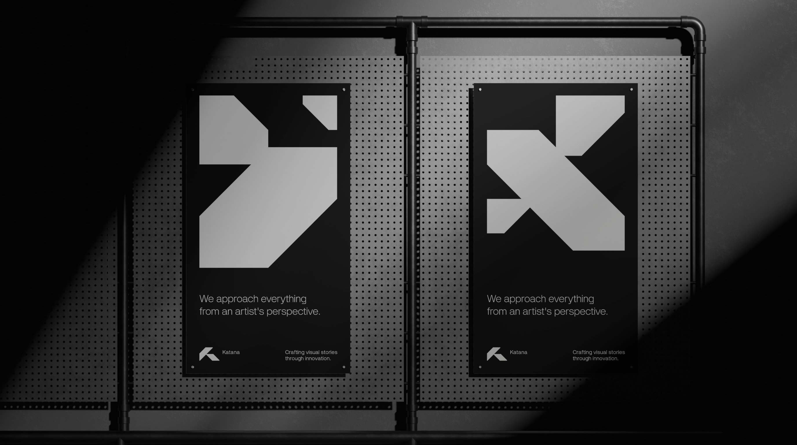
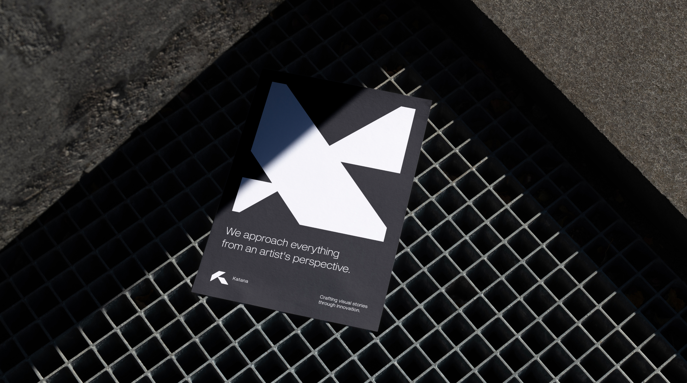
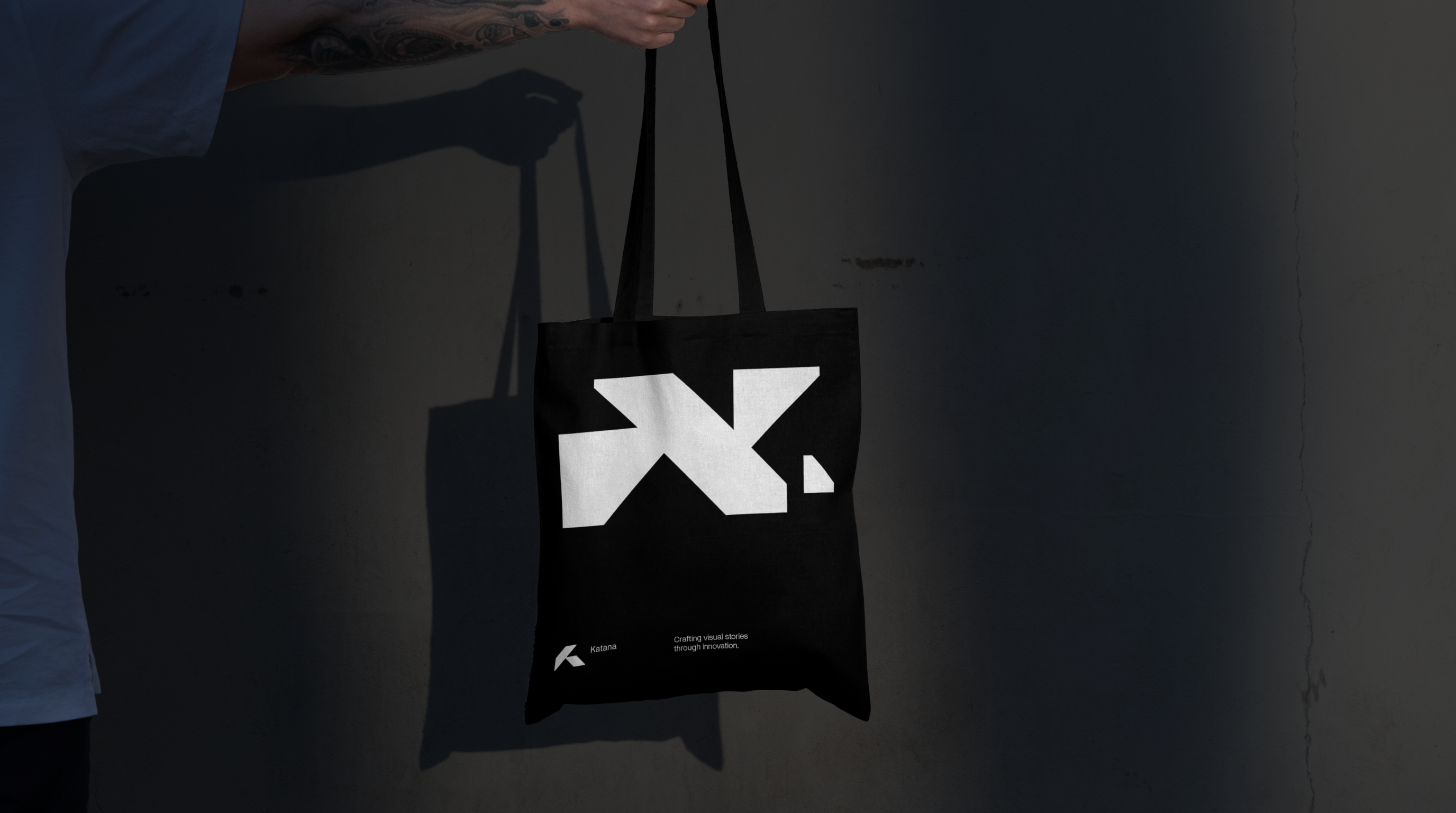
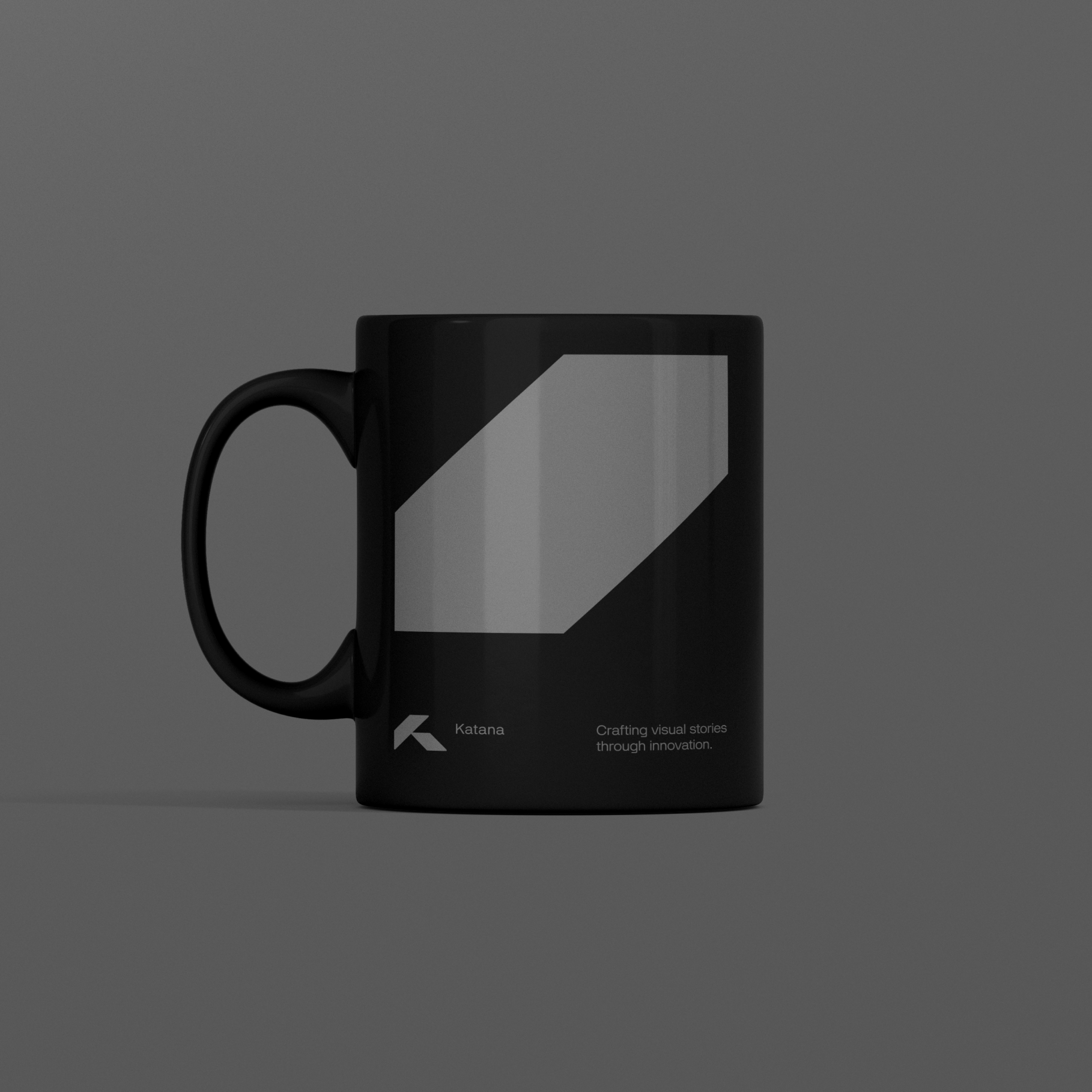
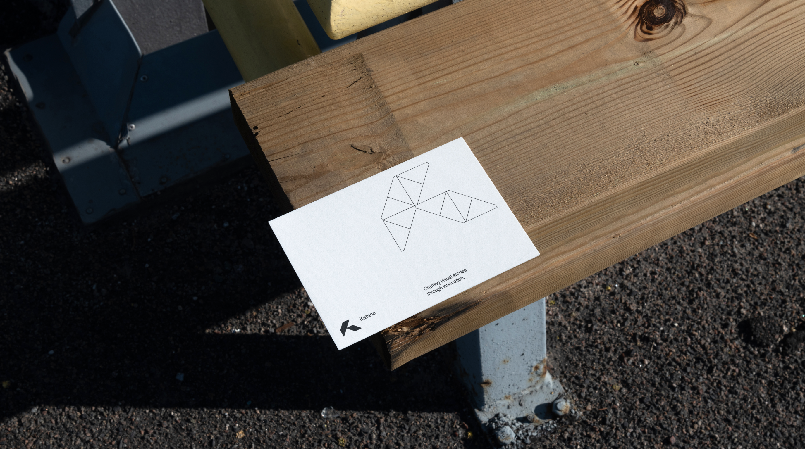
Crafting visual stories through innovation.
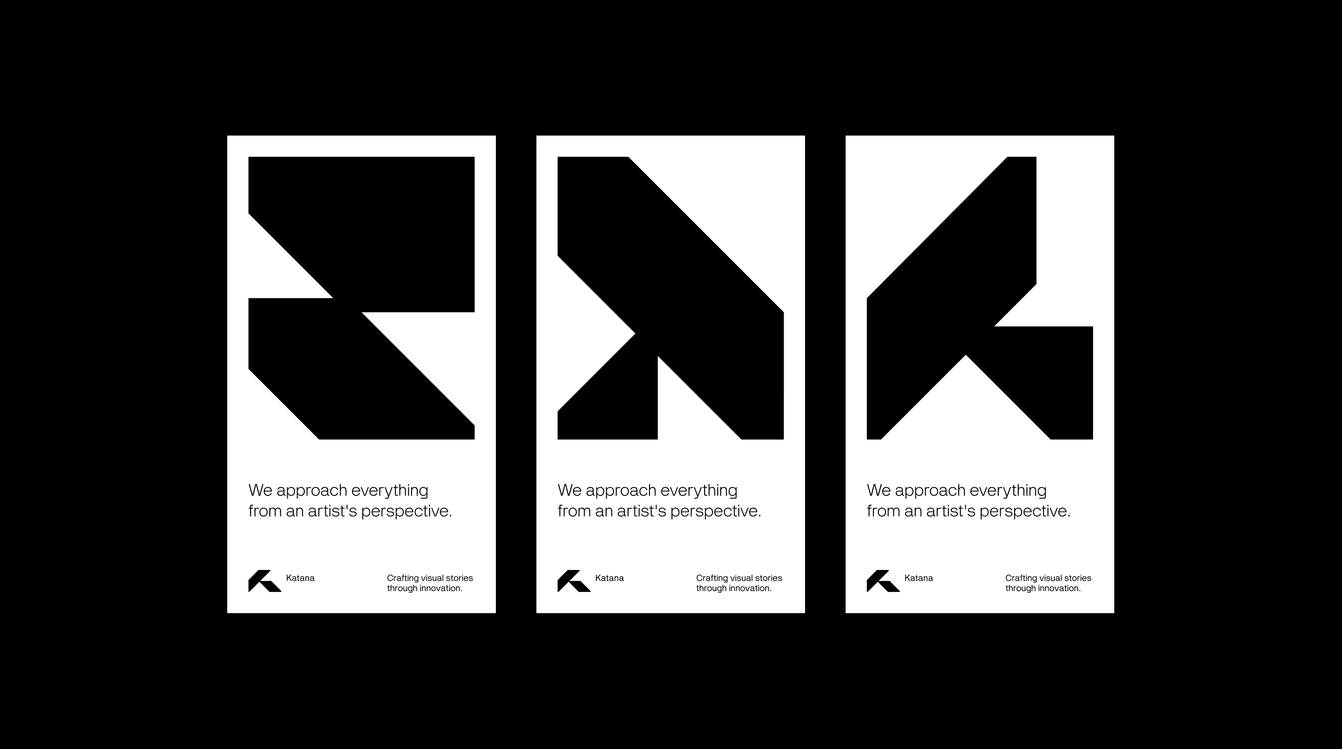
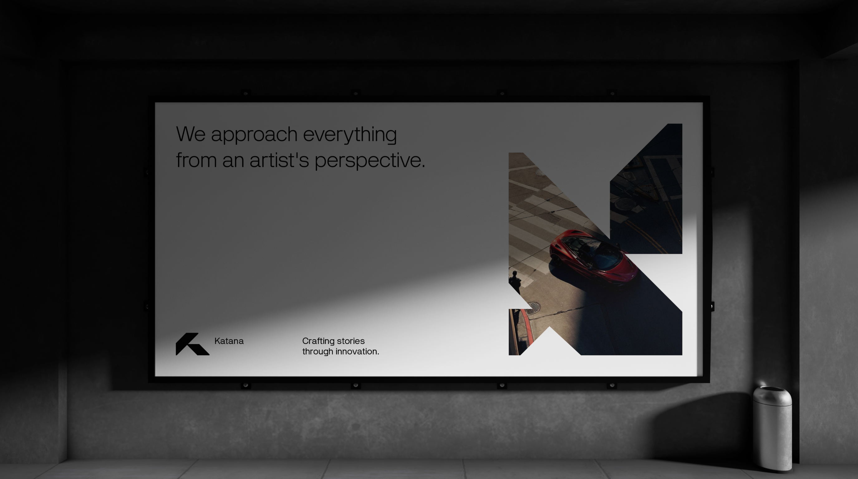
We approach everything from an artist’s perspective. We are Katana.
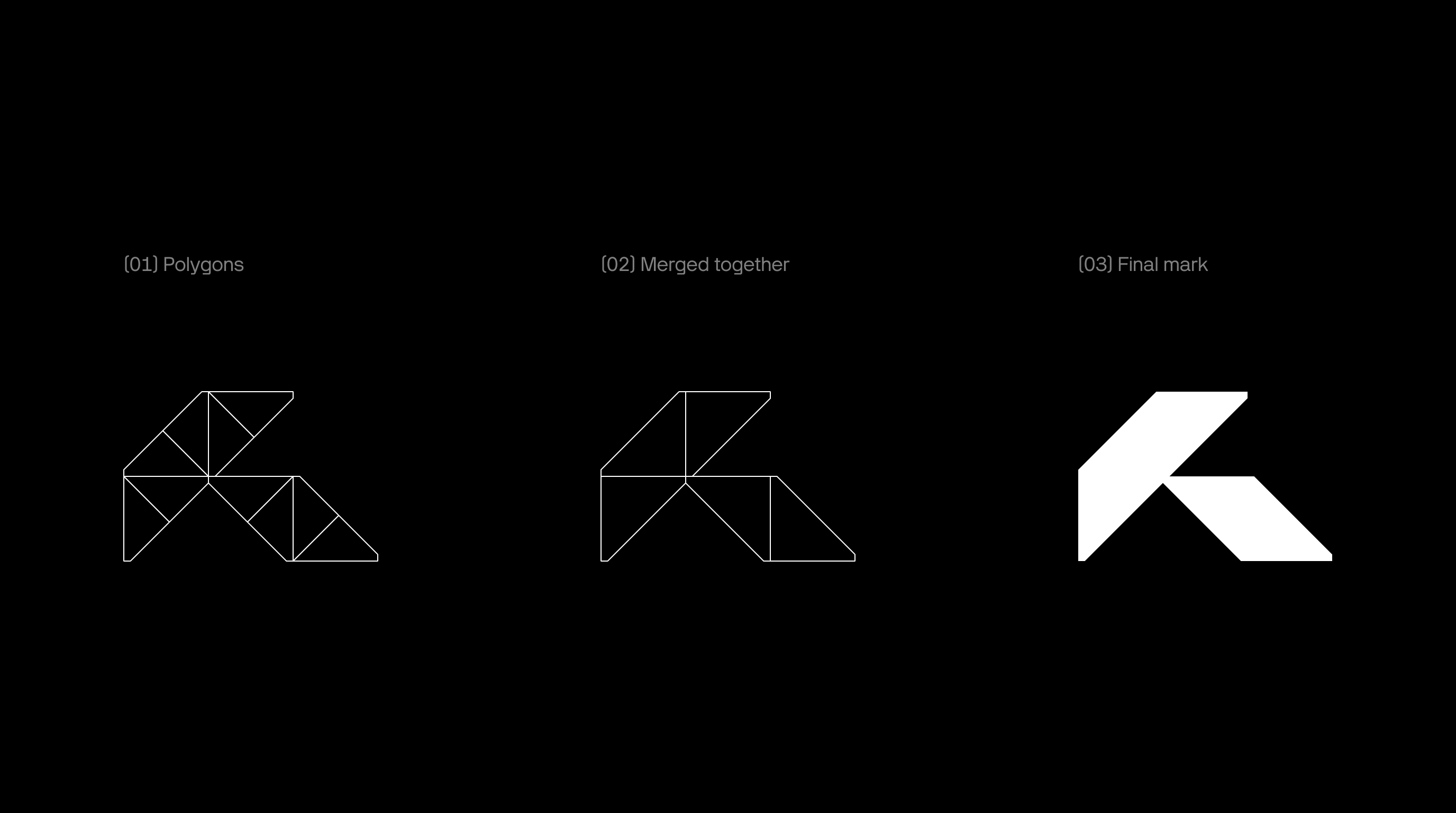
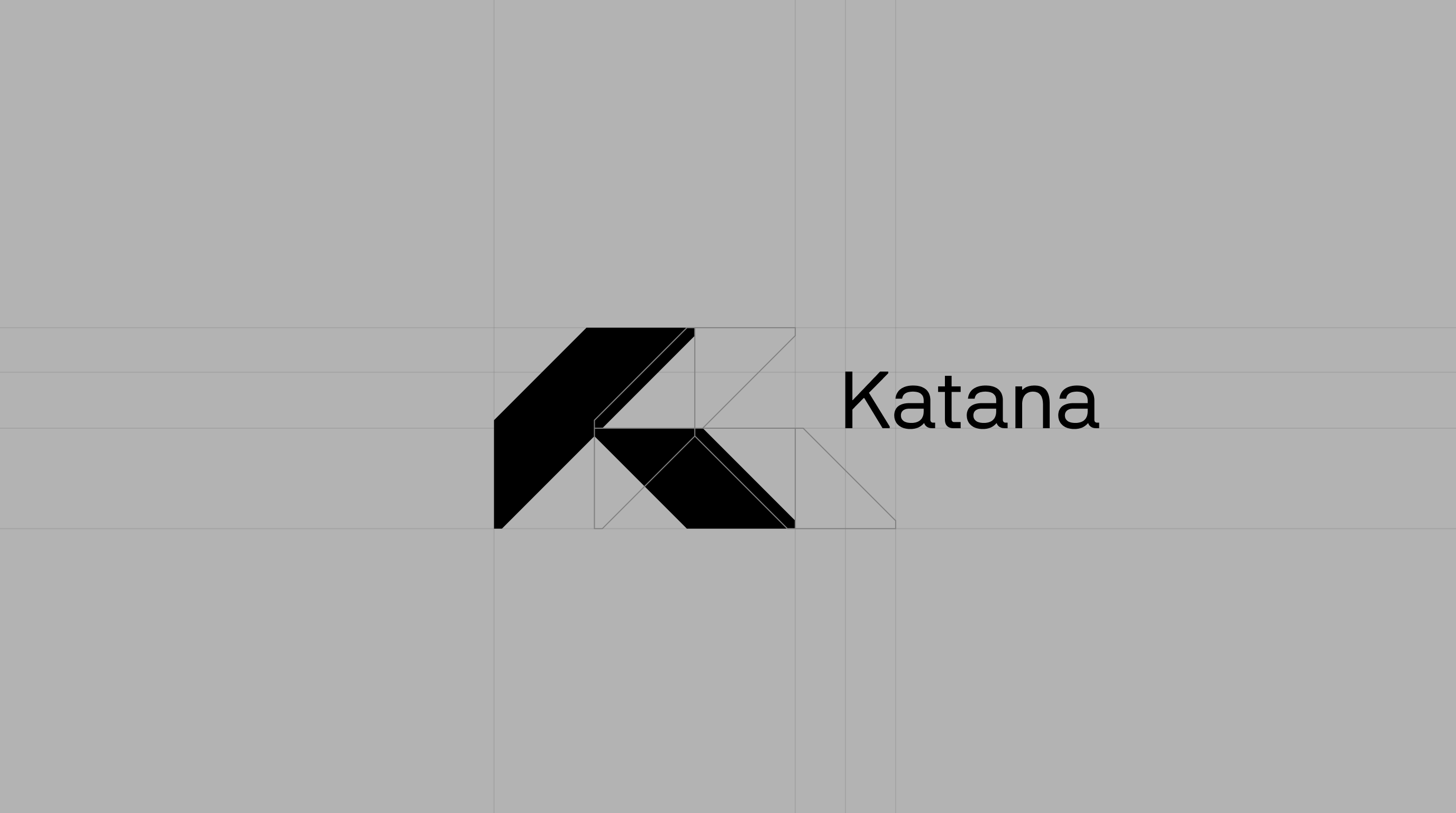
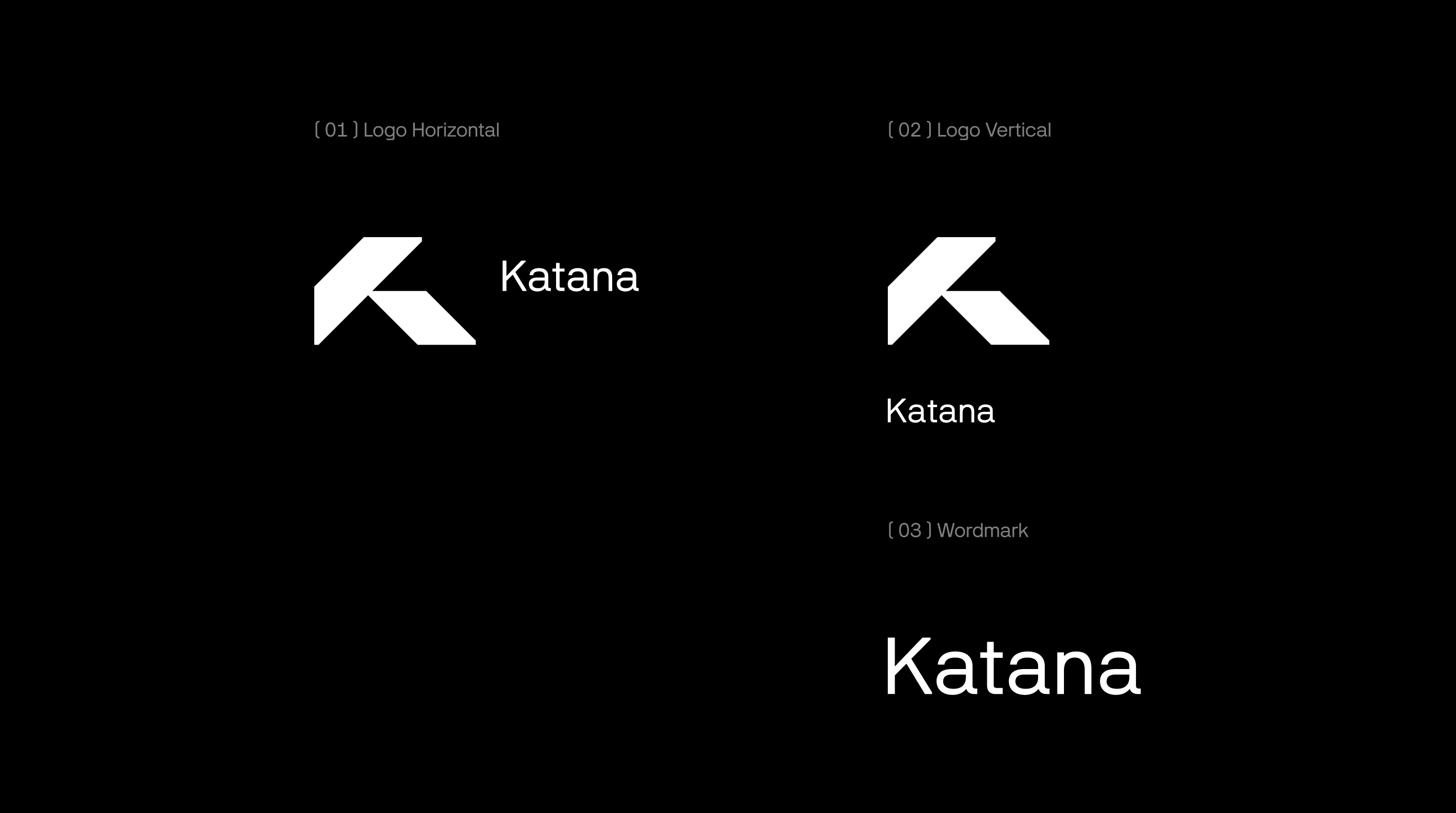
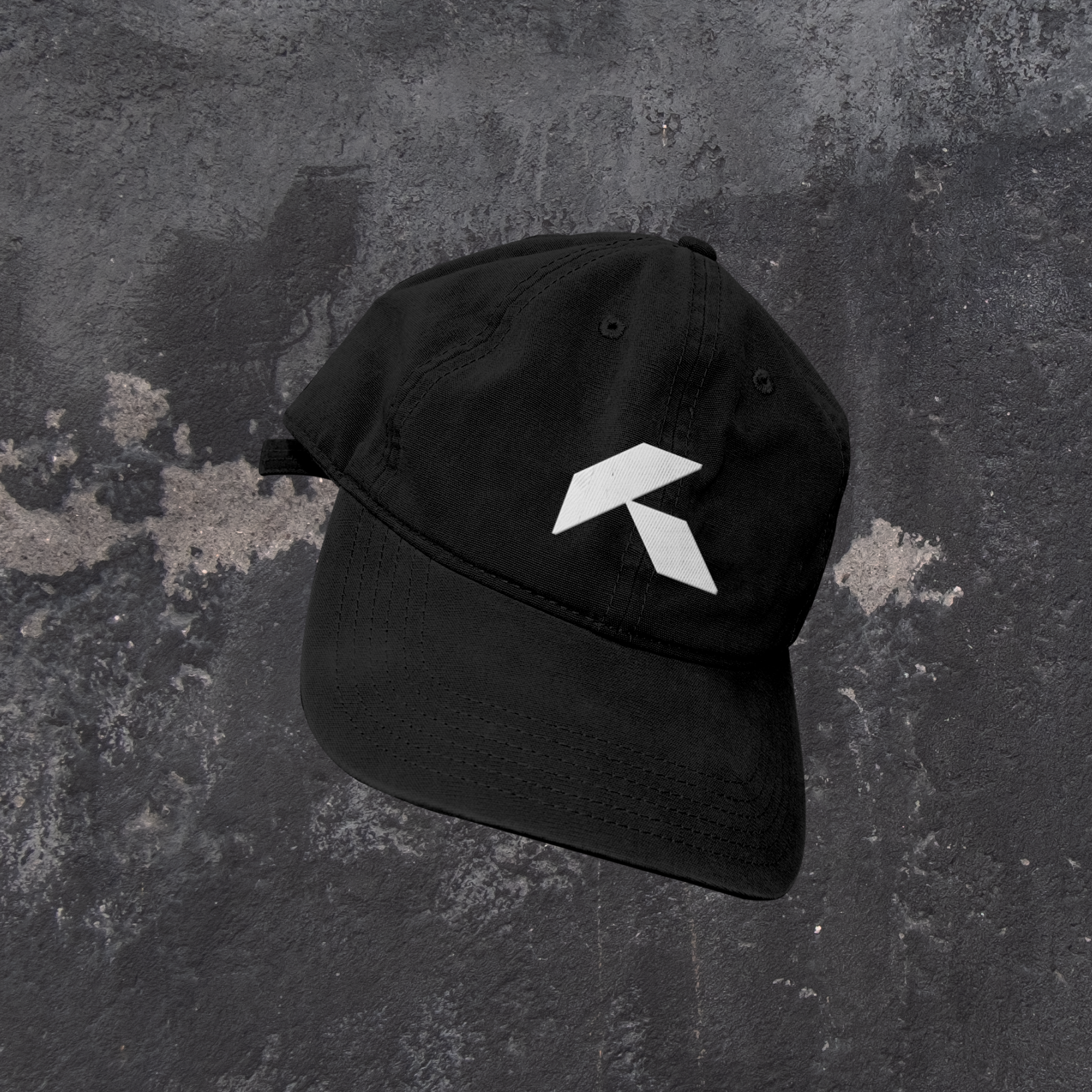
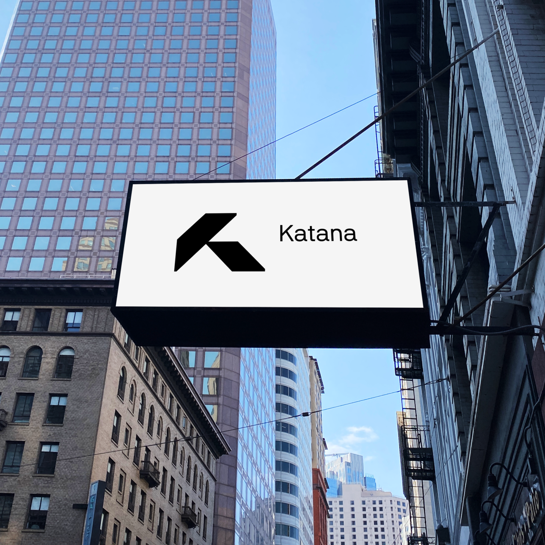
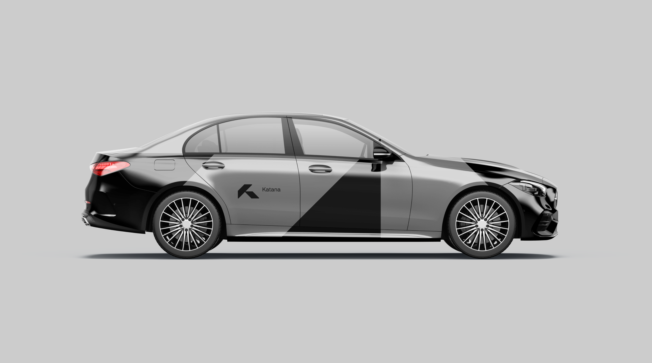
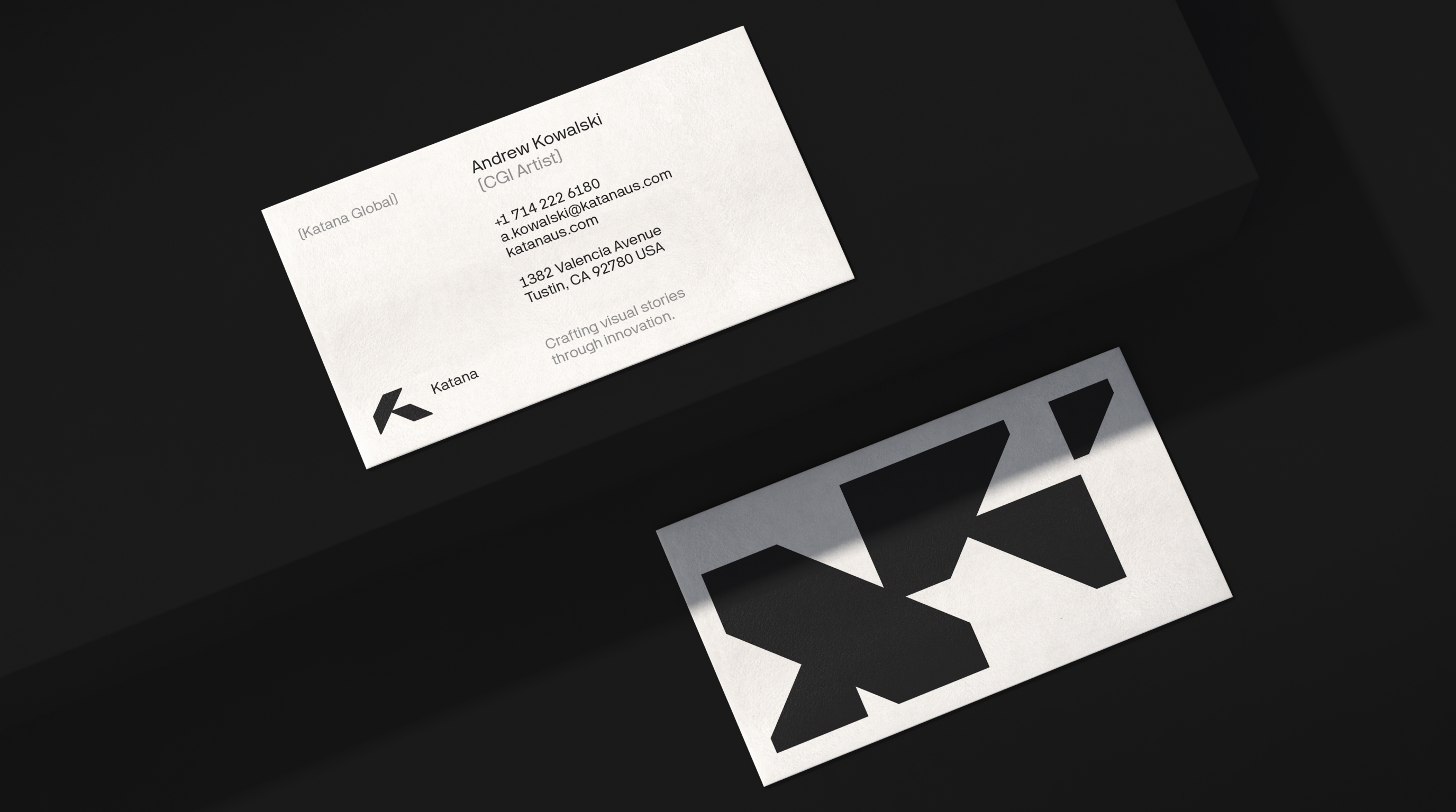
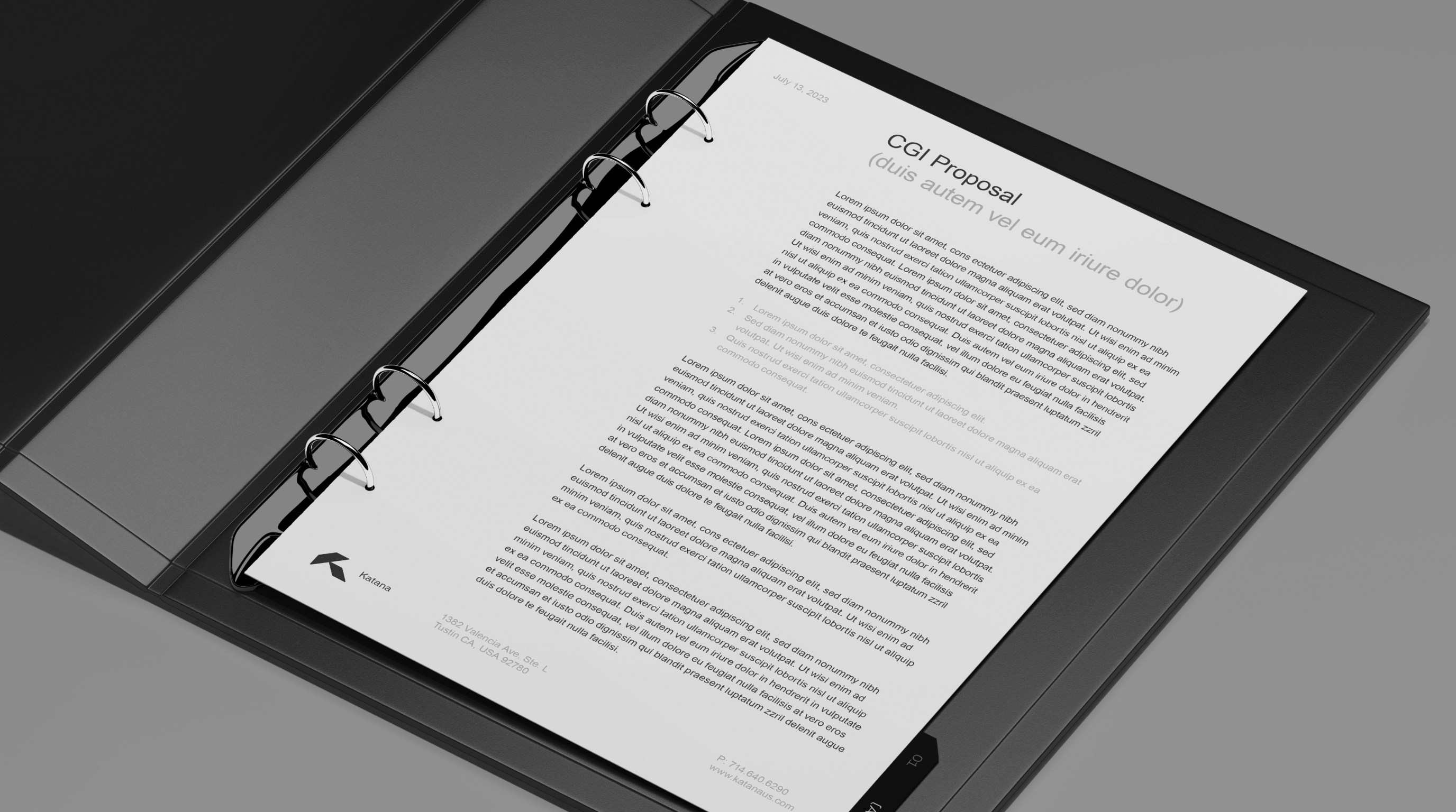
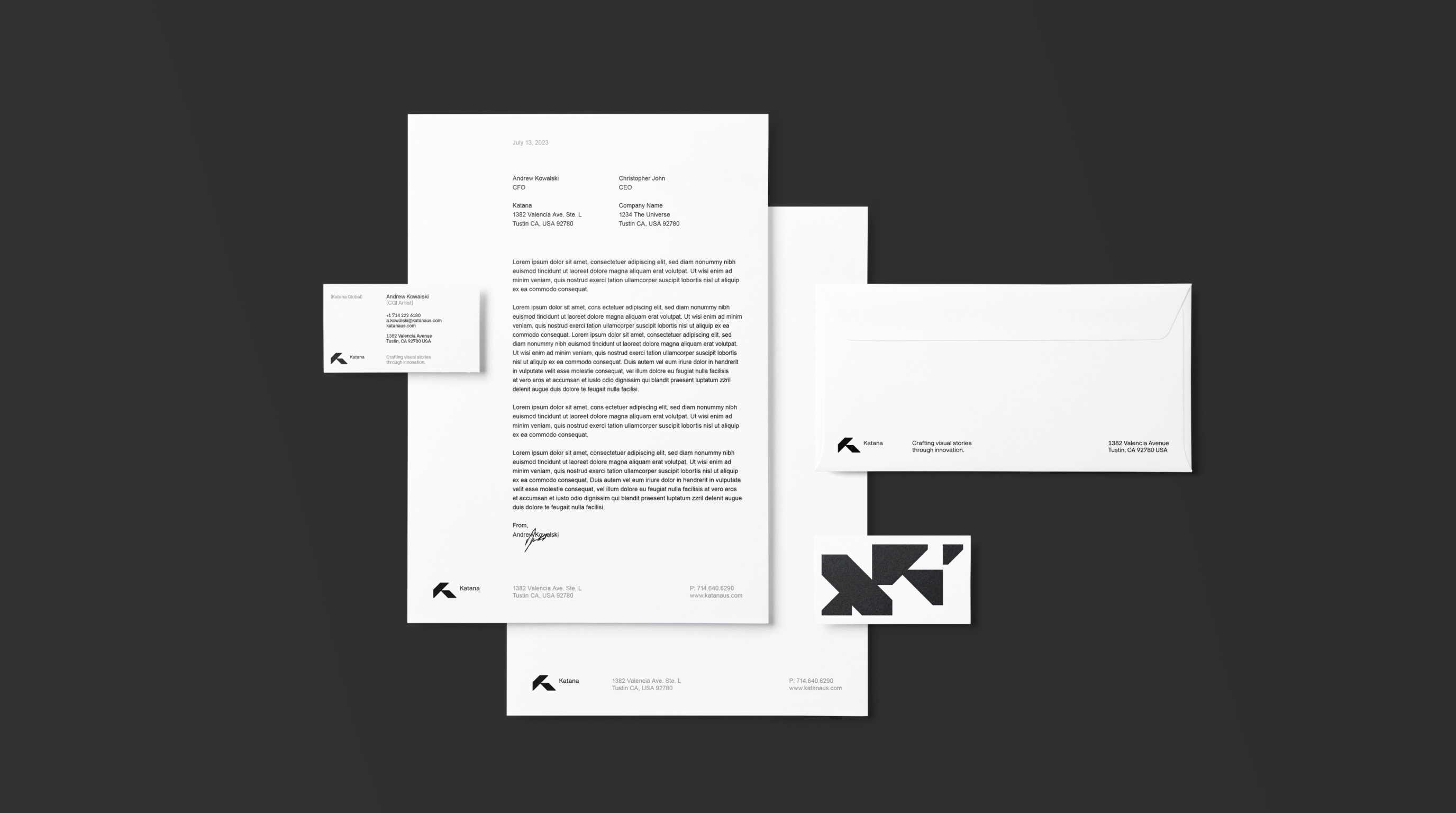
(03) Visual Identity





No items found!


Credits
Leniva° Studio
Art Direction: Neon Neonov
Brand Strategy: Lena Mitkowa
Design: Kamil Przybyła
Design Support: Marta Krzemień-Ojak, Agata Szewczuk
UX/UI: Michał Witucki
Production: Saskia Mońka, Lena Mitkowa
Client
Cappy Childs
Piotr Masiak
Steve Bishop


