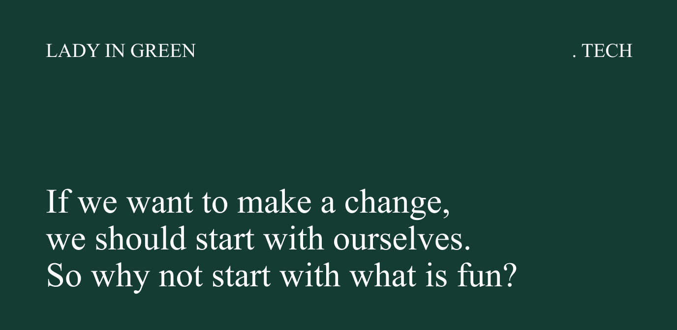
If we want to make a change, we should start with ourselves. So why not start with what is fun?
Info ↘
Lady in Green is a team of female specialists and experts dealing with broad sustainability and modern technologies in the context of green change. They believe that transformation is the domain of women, and they direct their communication to them. What distinguishes them is their purposefulness and ability to bring out the essence.
They create articles about electromobility, inform, give facts, and inspire – with no smoke and mirrors. We developed LadyinGreen.tech’s branding with full respect for their manifesto and in the spirit of sustainability. We formulated a working slogan “No distraction. Focus on what’s important,” which was the main guideline for all design decisions.
Scope
Branding / UX/UI
Tools
Figma / Word
Client
Lady In Green
No distractions
The content conveyed by Lady In Green is specific and concise – therefore the visual side of the communication must be the same. It should be a reflection and illustration of the values it communicates as well, both aesthetically and in terms of use. We placed more importance on the substantive and meaningful layer.
Being well aware of what generates an increase in carbon footprint and to what extent, we limited the time spent in graphic programs. We needed to keep the branding simple, easy to implement and use, and with a minimum number of guidelines applied to the broadest spectrum of materials.
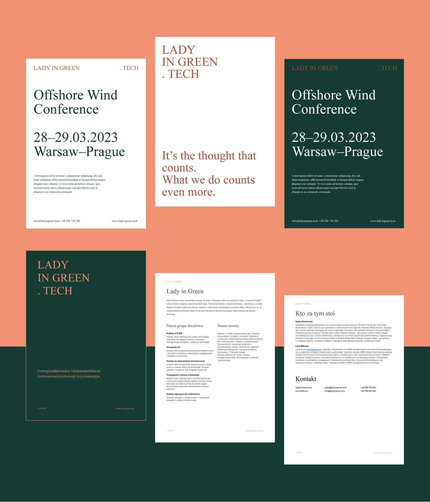
It’s the thought that counts.
What you do counts
even more
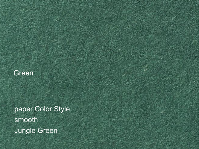
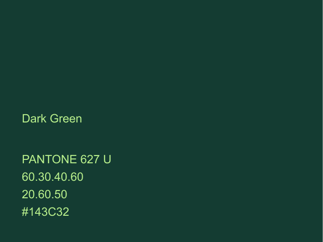
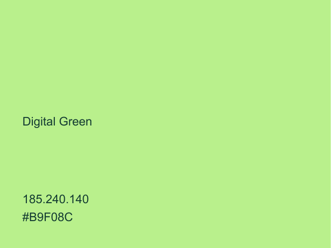
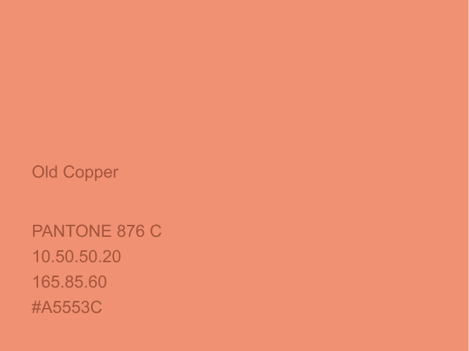
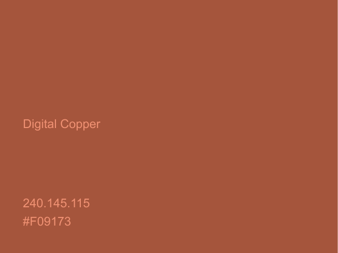
We specified a very restrained color palette, taking into account production possibilities (such as the availability and quality of the paper on which materials could potentially be printed) – so that we could maintain brand consistency. We dispensed with time-consuming image processing – we focus on what the image conveys. Thus, we don’t need any specialized software for design: if an emergency arises, the Google suite is all we need.
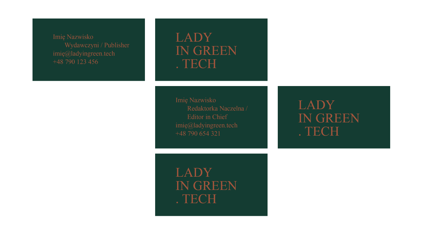
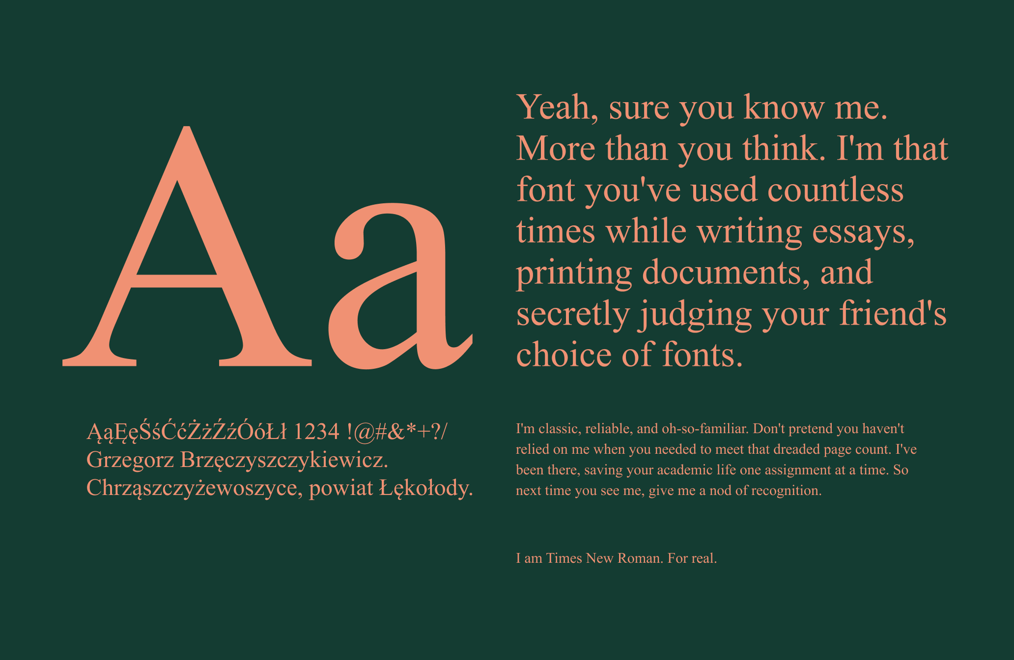
We use a commonly available system typeface – Times New Roman. This avoids the potential problems of installing unconventional fonts. In addition, we are so accustomed to it that it does not distract us and allows us to focus on the content itself. The same font is used for the Lady in Green logo, which avoids importing graphic files into the materials (it is distinguished only by capital letters).
Focus on
what is important
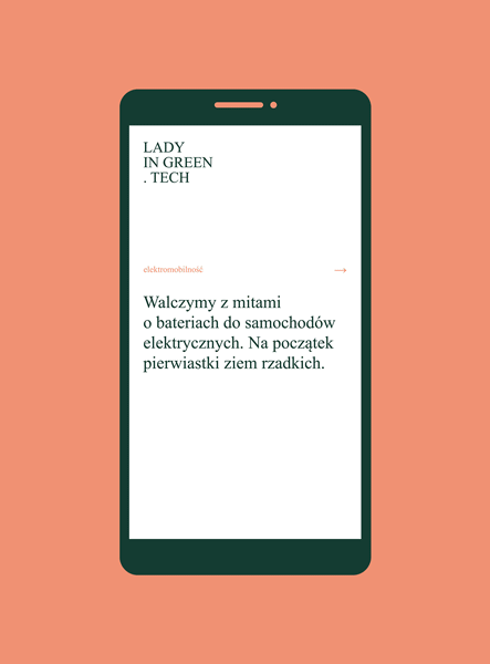
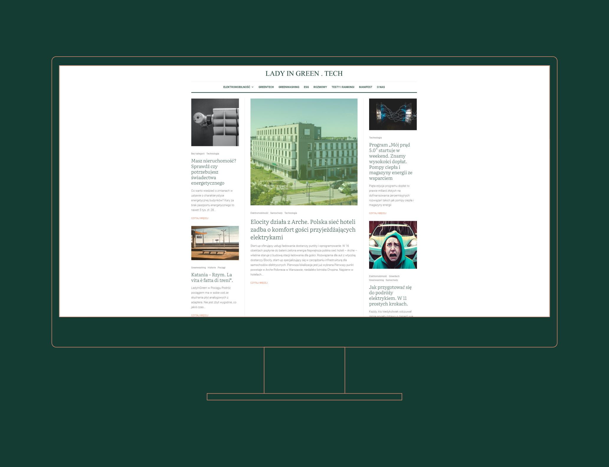
We do not create needs – we respond to them when they appear. That’s why we limited ourselves to producing only key materials at a given time, such as business cards with basic data. We built a structurally simple website, on an available template, using Google Fonts, to put as little strain on the servers as possible and reduce implementation time.
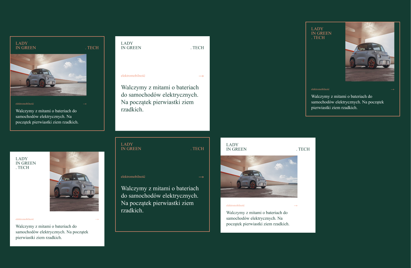
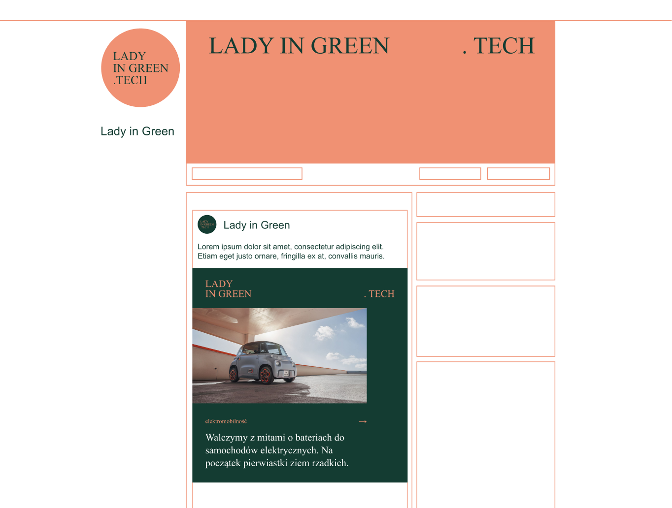
We have developed a design system for all external communication materials, possible for independent use by our client. Rigorous, uniform, and systematic composition guidelines make it easier to work with files.
Credits
Team Leniva° Studio
Strategy and Production: Lena Mitkowa
Concept, Key Visual, Design: Marta Krzemień-Ojak
Web: Rafał Nebelski
Client’s Team:
Agata Rzędowska