When the ArtRage publishing house approaches us with a proposal to prepare another cover, we never refuse.
Info ↘
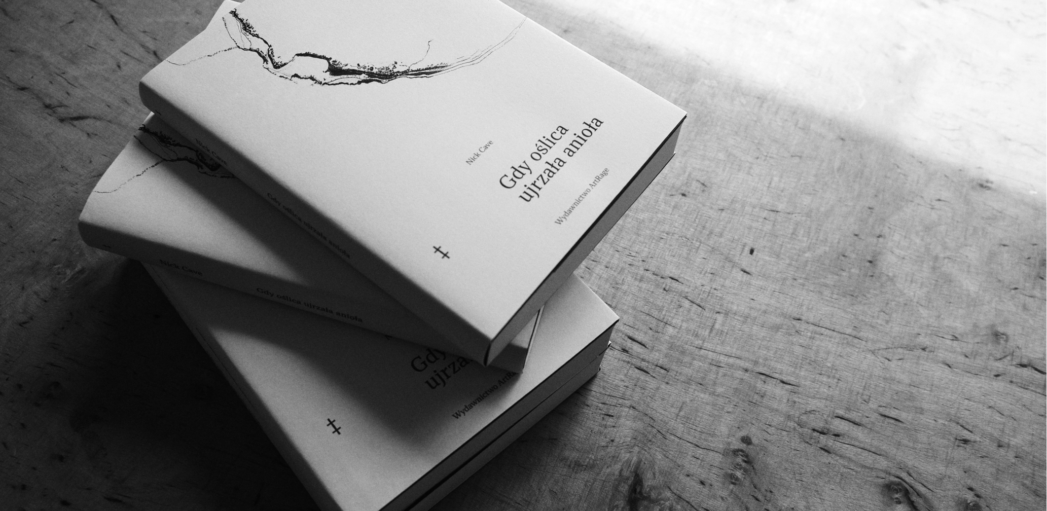
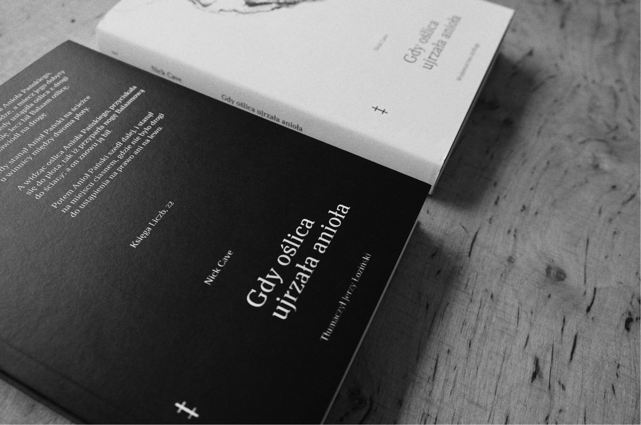
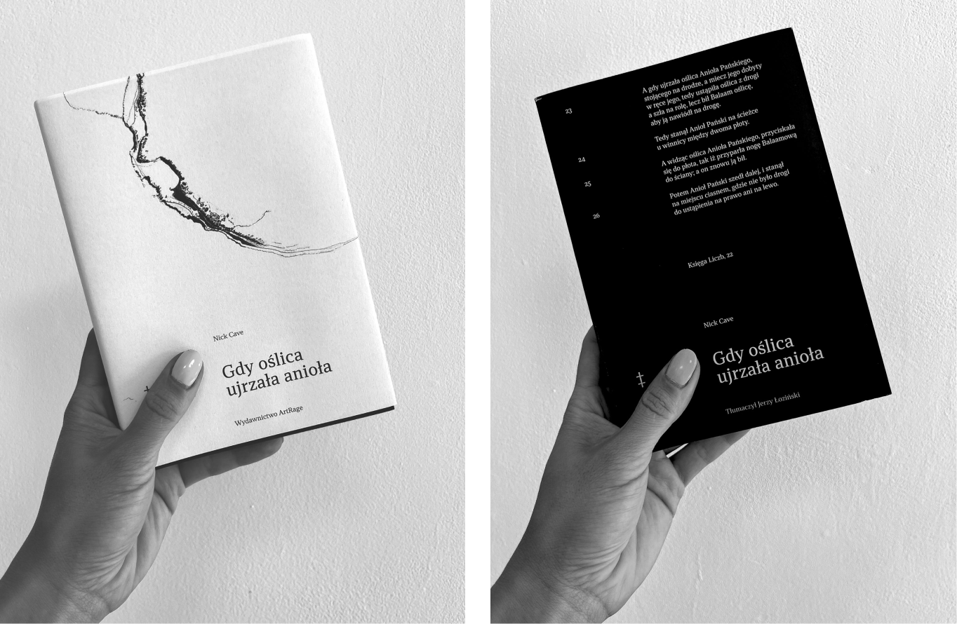
This time it was “And the Ass Saw the Angel,” Nick Cave’s debut novel. The book was prepared in a new translation by Jerzy Łoziński. The new cover was designed by none other than us.
Gdy oślica ujrzała anioła by Nick Cave
Translation: Jerzy Łoziński
Publisher: Wydawnictwo ArtRage
Format: 145 x 205 mm
Scope
Editorial design
Tools
Illustrator / InDesign
Client
Wydawnictwo ArtRage
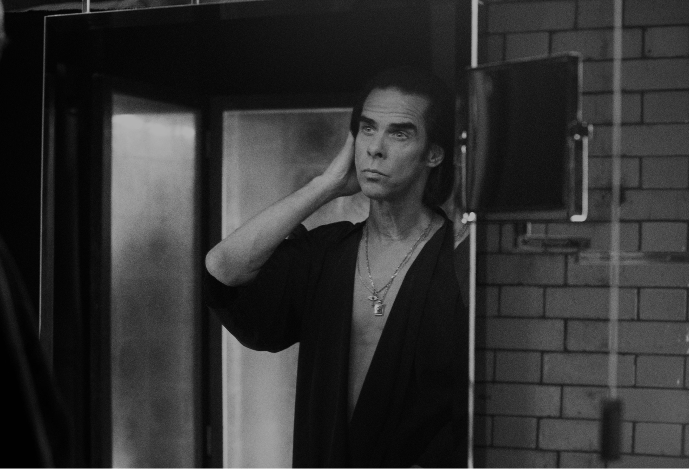
Atmosphere
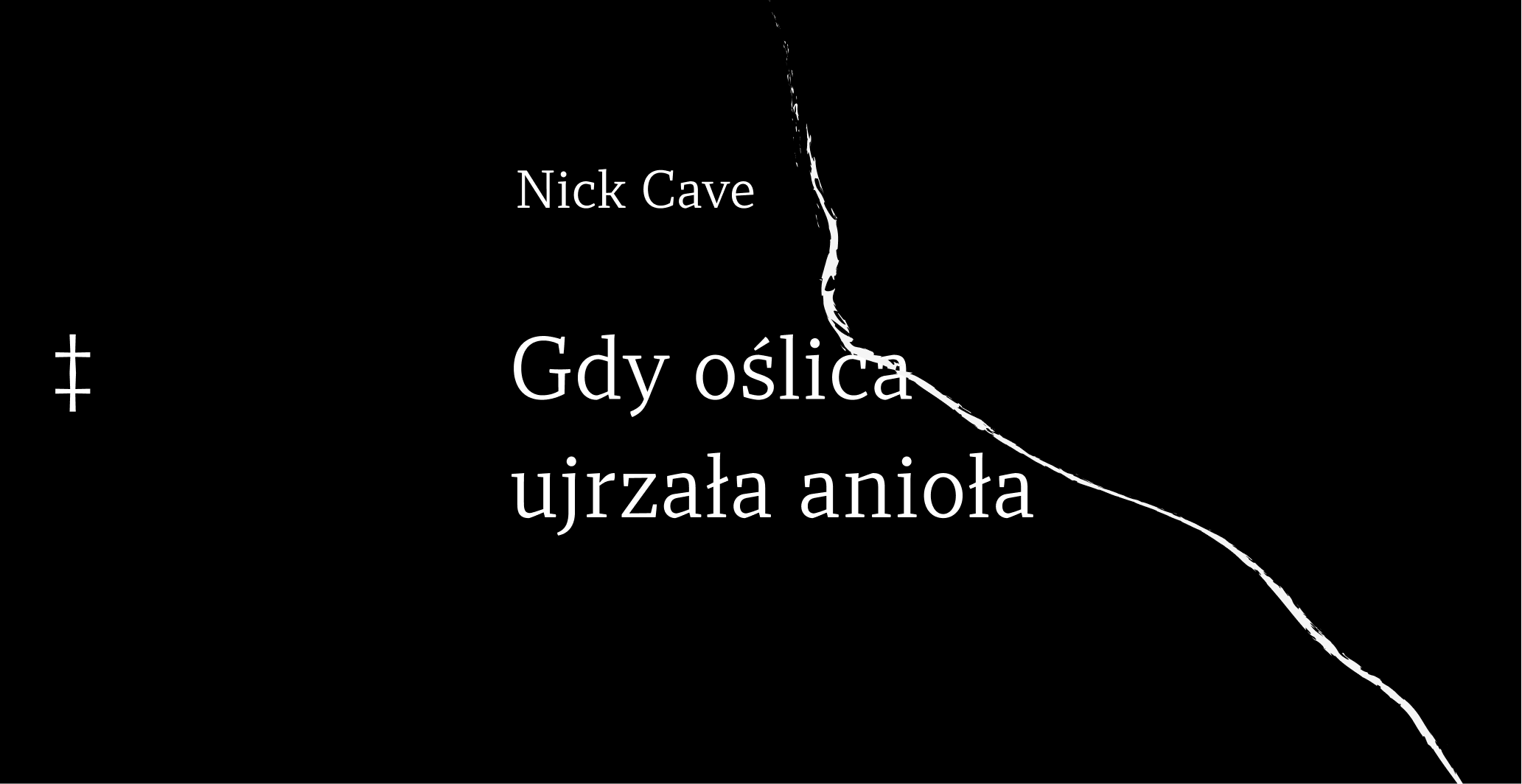
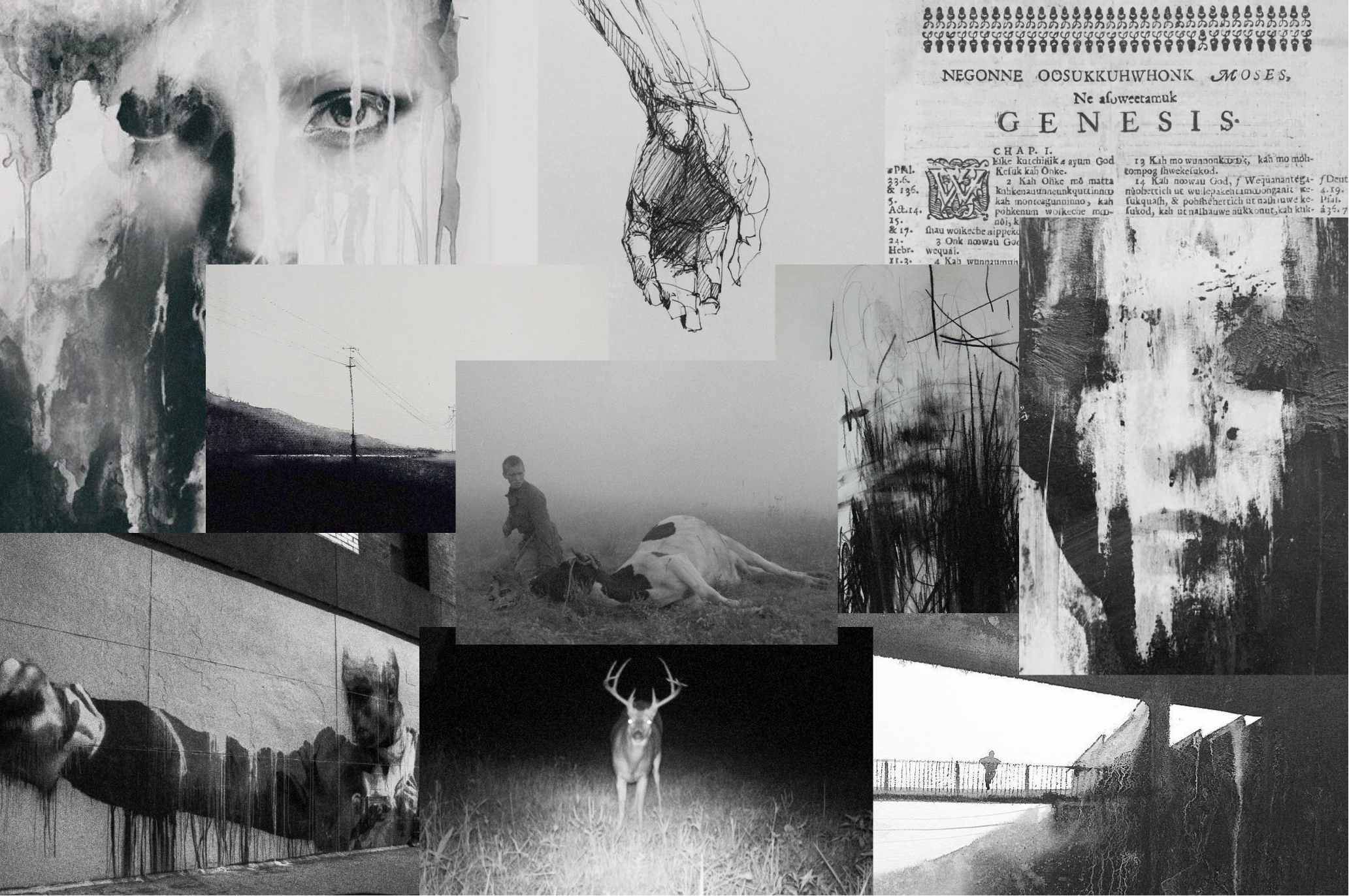
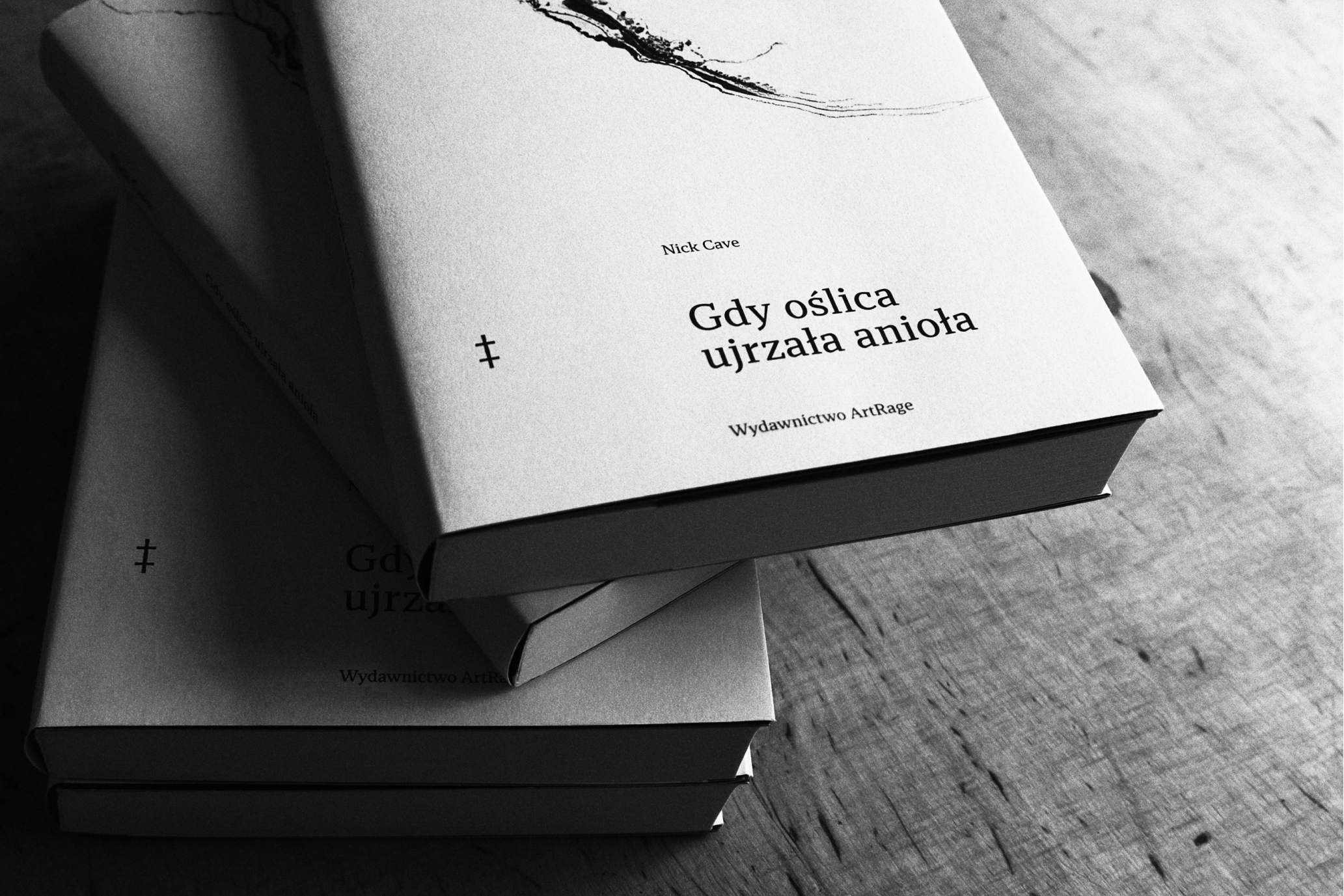
We wanted the cover to make no direct visual reference to the title. Our focus was on an impressionistic approach, capturing the specific language of the author, the atmosphere he created, and its weight. In short, we wanted it to be an accompaniment to the novel, like the music accompanying Cave’s lyrics.
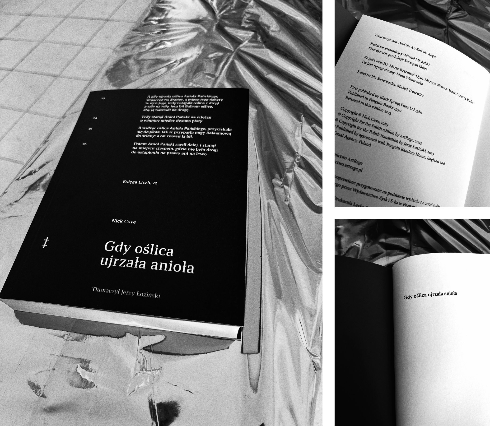
The quotation from the Book of Numbers with which Cave begins the novel was also an obvious reference. It served as our starting point in search of inspiration.
And the ass saw the angel of the Lord
standing in the way, and his sword drawn
in his hand: and the ass turned aside out of
the way, and went into the field: and Balaam
smote the ass, to turn her into the way.
Numbers 22, 23 (King James Version)
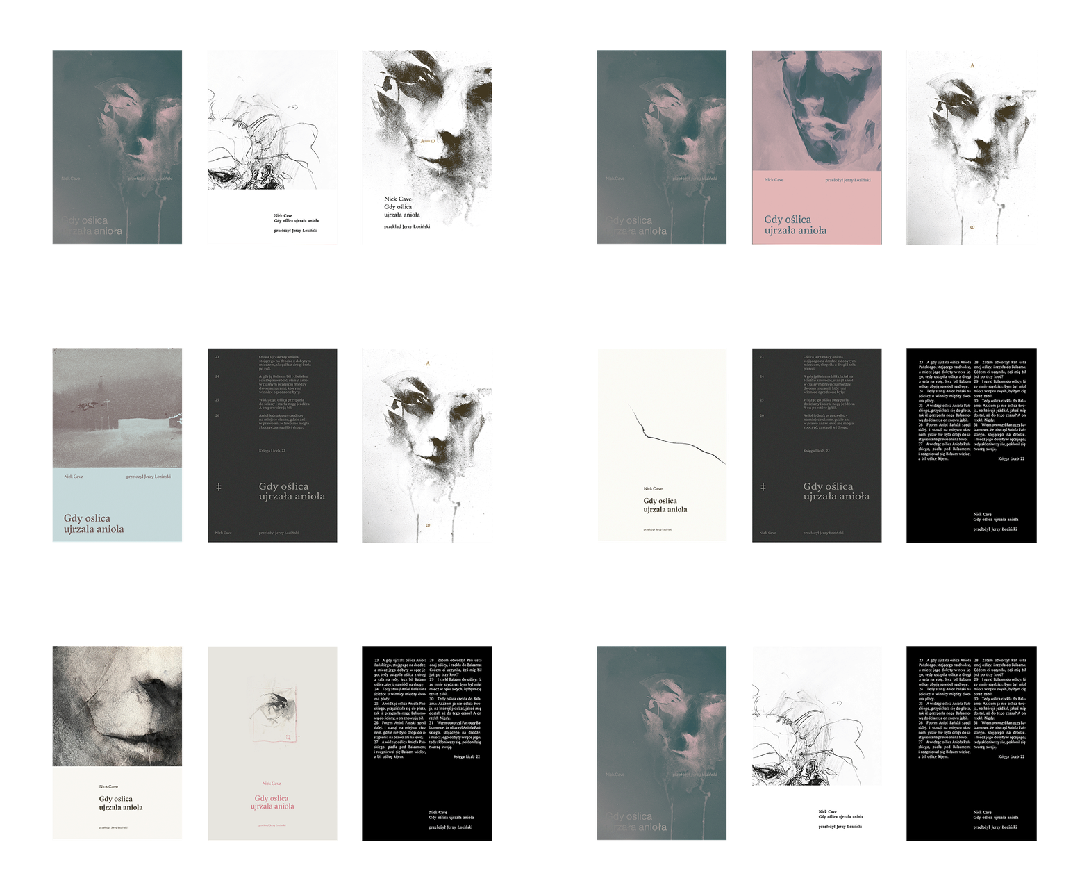
Black and white
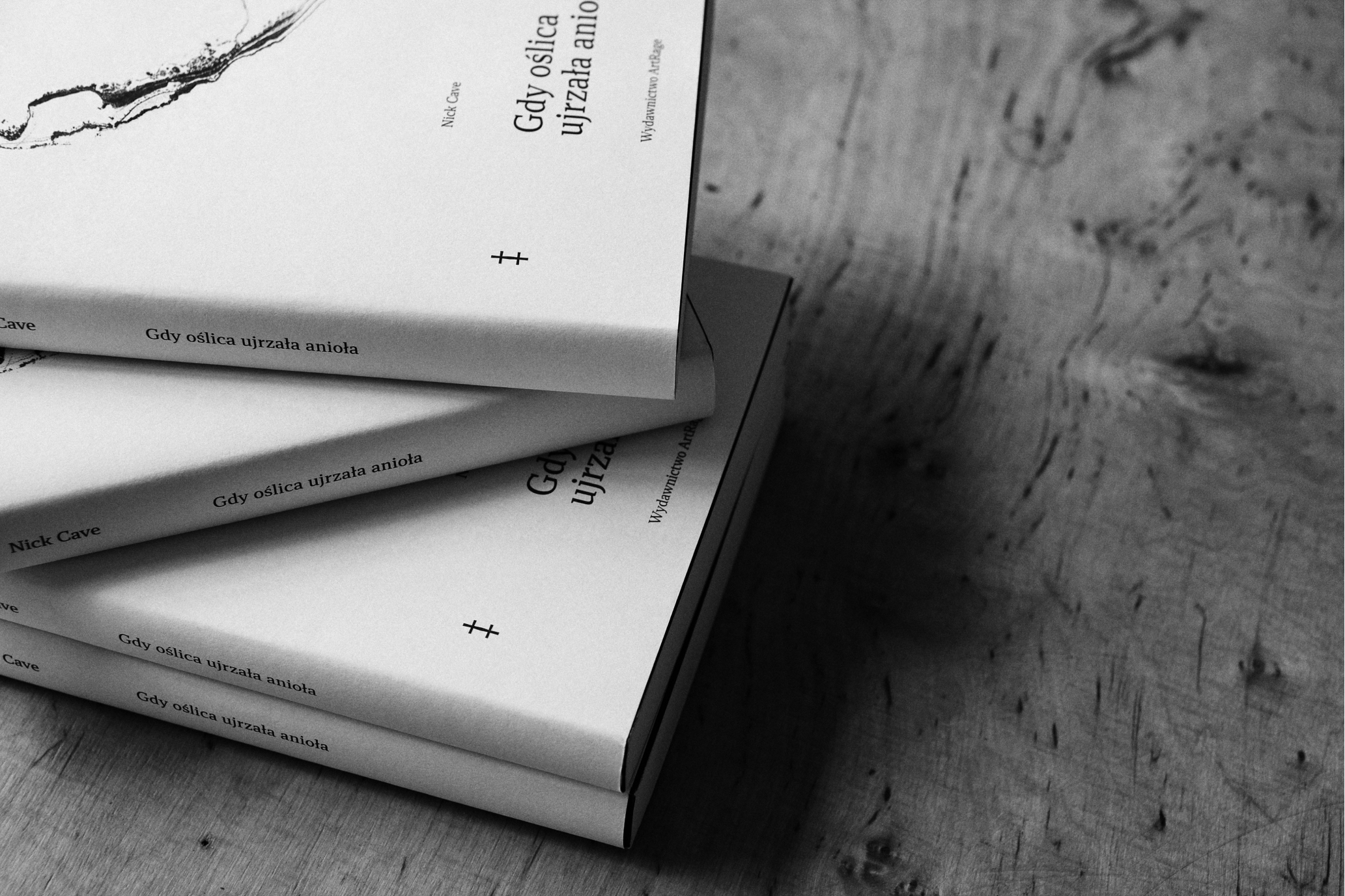
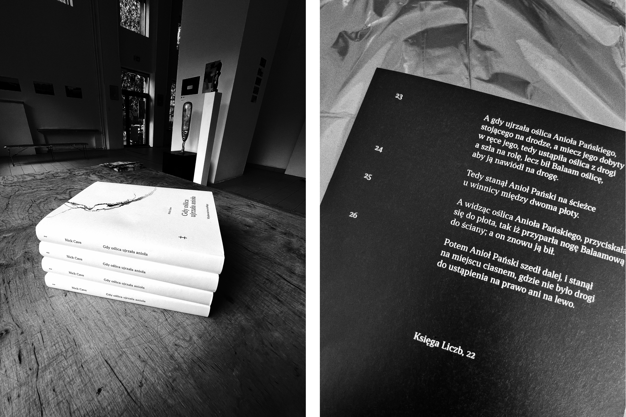
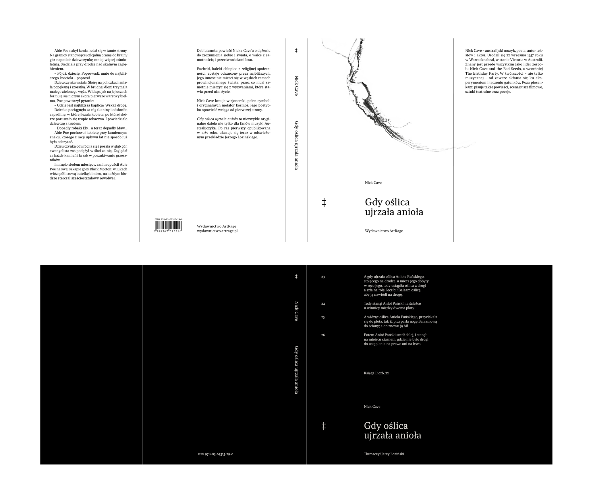
A white jacket with a subtle, suggestive crack conceals a contrasting dark cover, on which we placed a quote from the Book of Numbers. The inner side of the cover is printed in a shade of dusty pink.
Credits
Leniva° Studio Team
Concept and Design: Neon Neonov
Design Support: Marta Krzemień-Ojak
Production: Lena Mitkowa
Client’s Team
Michał Michalski
Szczepan Kulpa
