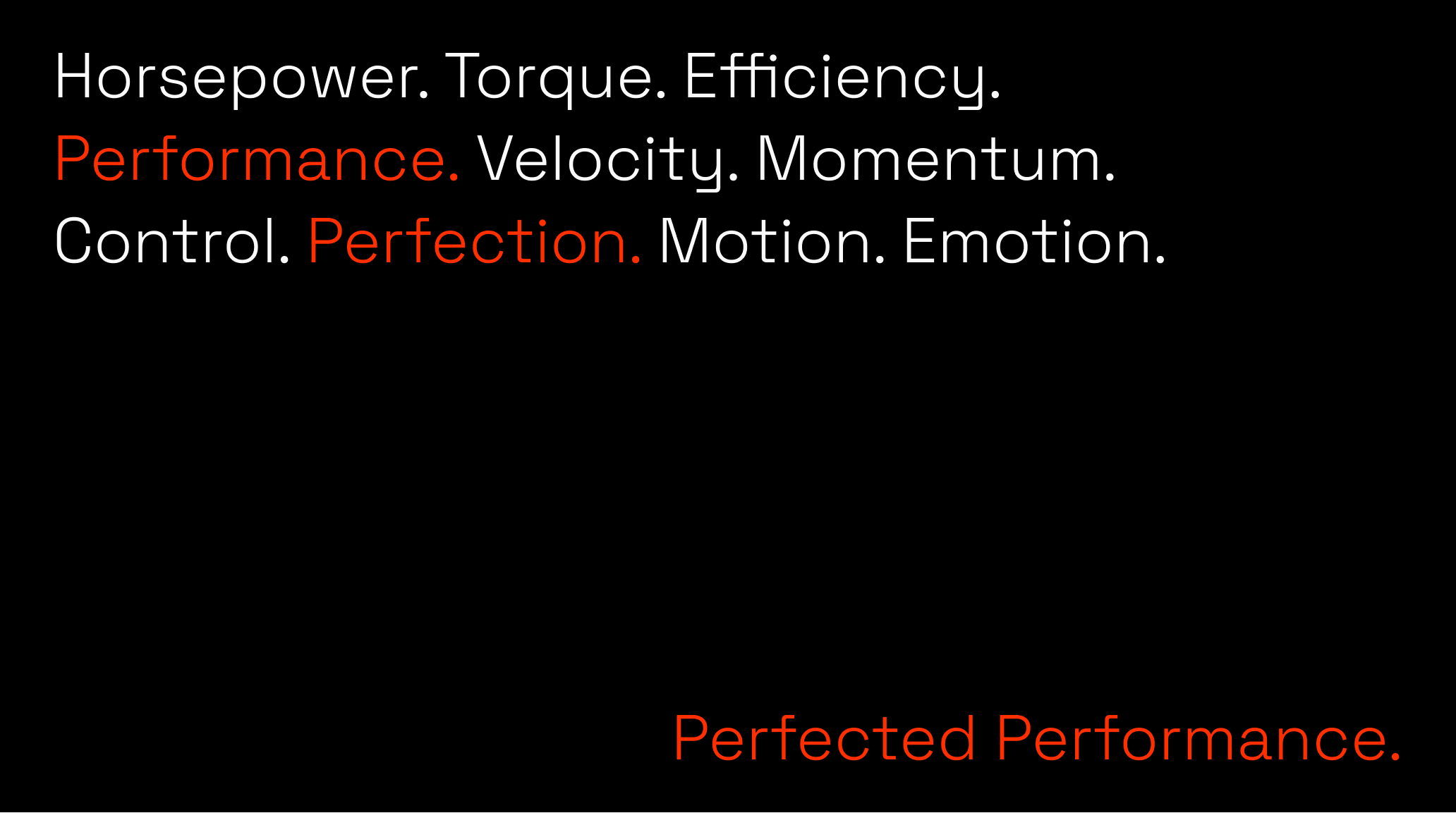
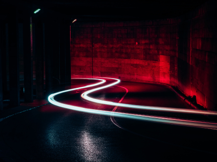
Velocity. Momentum. Control. Perfection
Human. Machine. Emotion
Info ↘
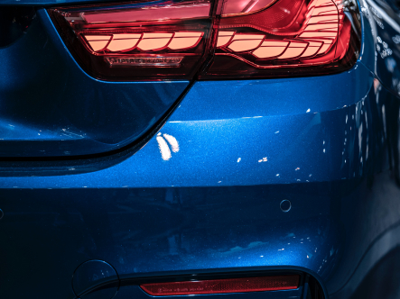
Is it possible to take the relationship between man and machine to another level, beyond purely utilitarian? Perfected Performance (Awaken Performance) by BimmerTech focuses on remote tuning of cars, improving their performance and comfort. Performance seeking and engine tuning seem to be a somewhat manly thing. Emotional language might seem a little discouraging here, to say the least. But who said emotions must be subtle? They can be as rough and brutal as going full throttle.
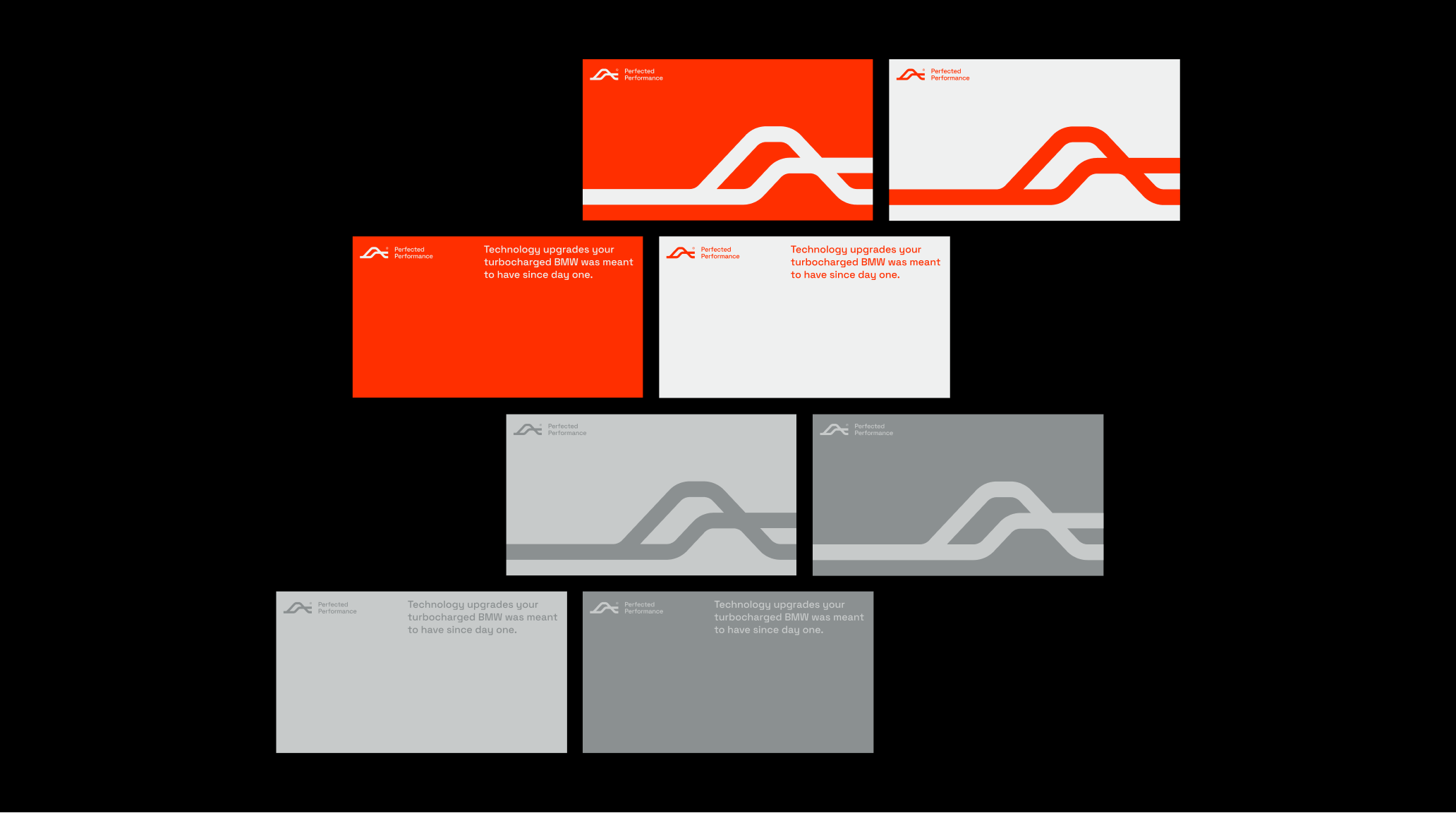
Our task included the creation of a consistent visual identity (starting with the logotype or business cards). We developed a full key visual and tone of voice, i.e. the visual, substantive and emotional way in which the brand will communicate with the audience. We implemented all these elements on the website we designed. At full speed.
Scope
Branding / GUI
Tools
Figma / Illustrator /
Photoshop
Client
Bimmertech
Motion → Emotion
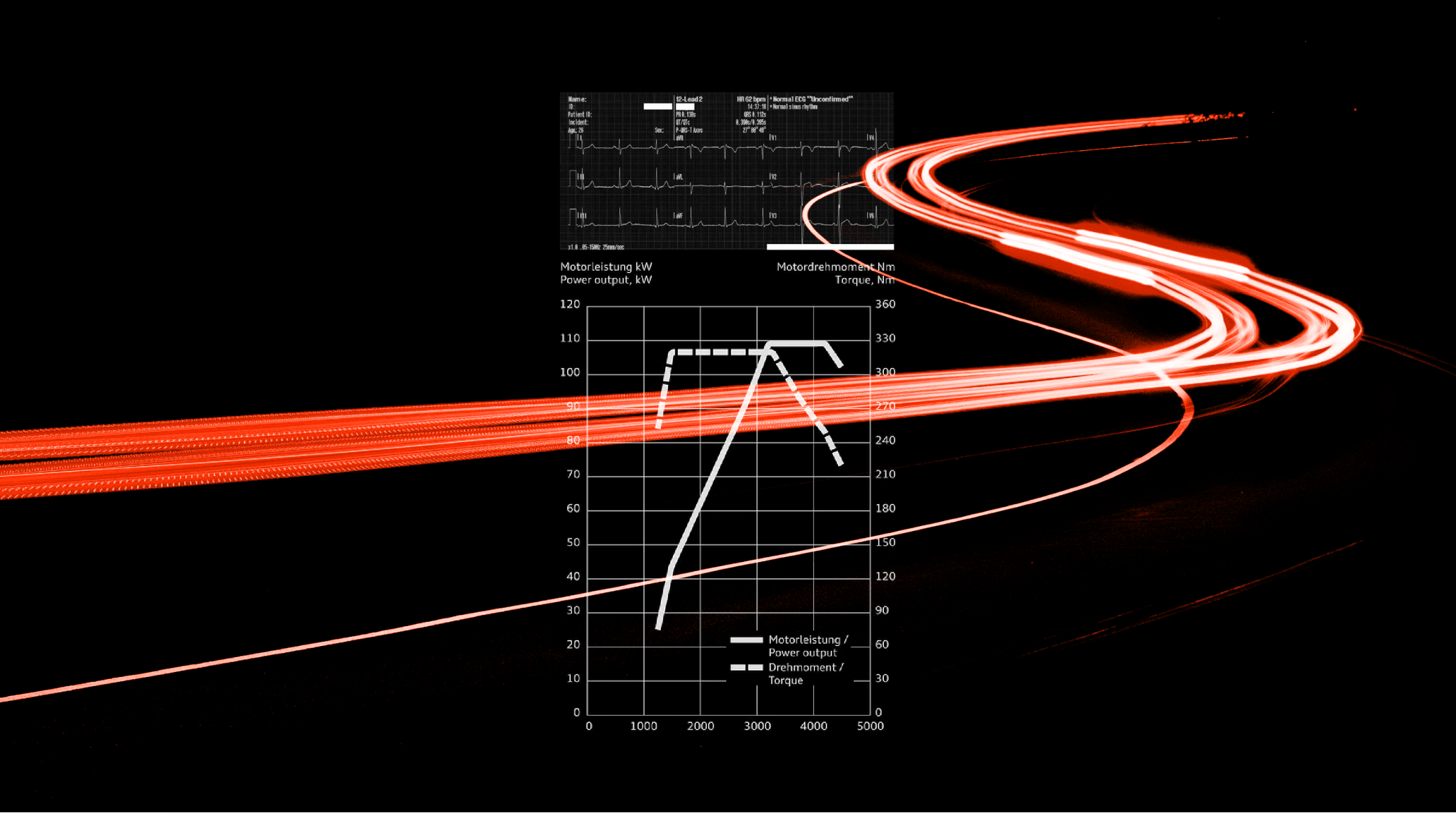
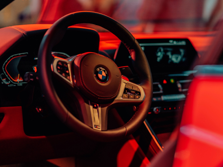
Emotional approach to automotive-related design was always based on a concept of resemblance between human body and machine construction. Basically they both are a «mechanical organism» in some sense.
They both have bodies and organs, they have to be fueled and need care and maintenance to work properly. They move and evoke emotion. They also have a heart that beats in a way peculiar only to oneself.


Approach
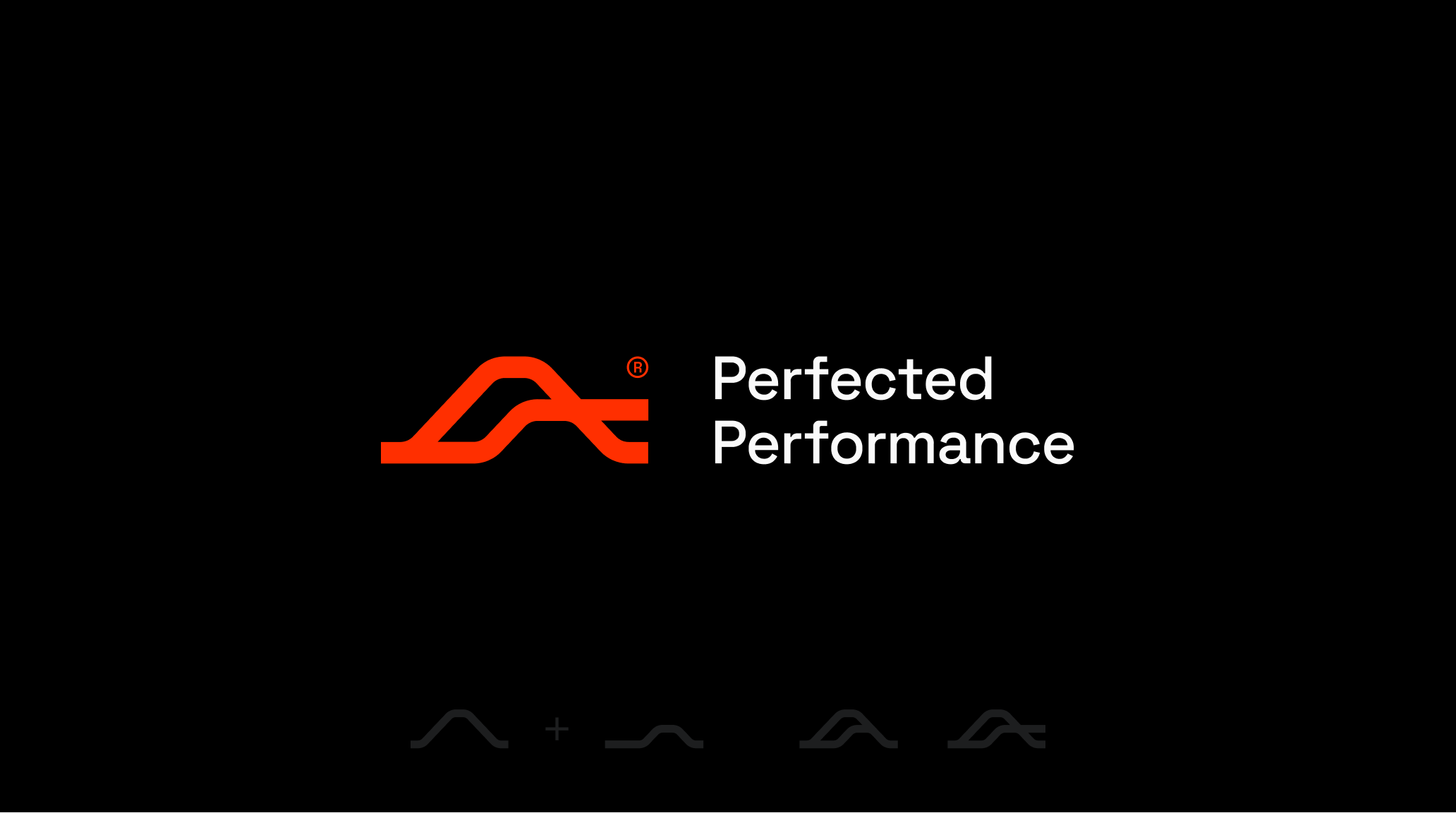
We wanted to focus on the «heart», as its activity is crucial in both cases. Strong and healthy heart lets us go through life at full speed and without fear. It gives us confidence and power to exceed our limitations.
That’s why we decided to create a sign for Perfected Performance based on something you can hear, feel and see how it works. The visual aspect of that heartbeat, a simple graph, tells us everything about its condition and potential to arouse emotions.
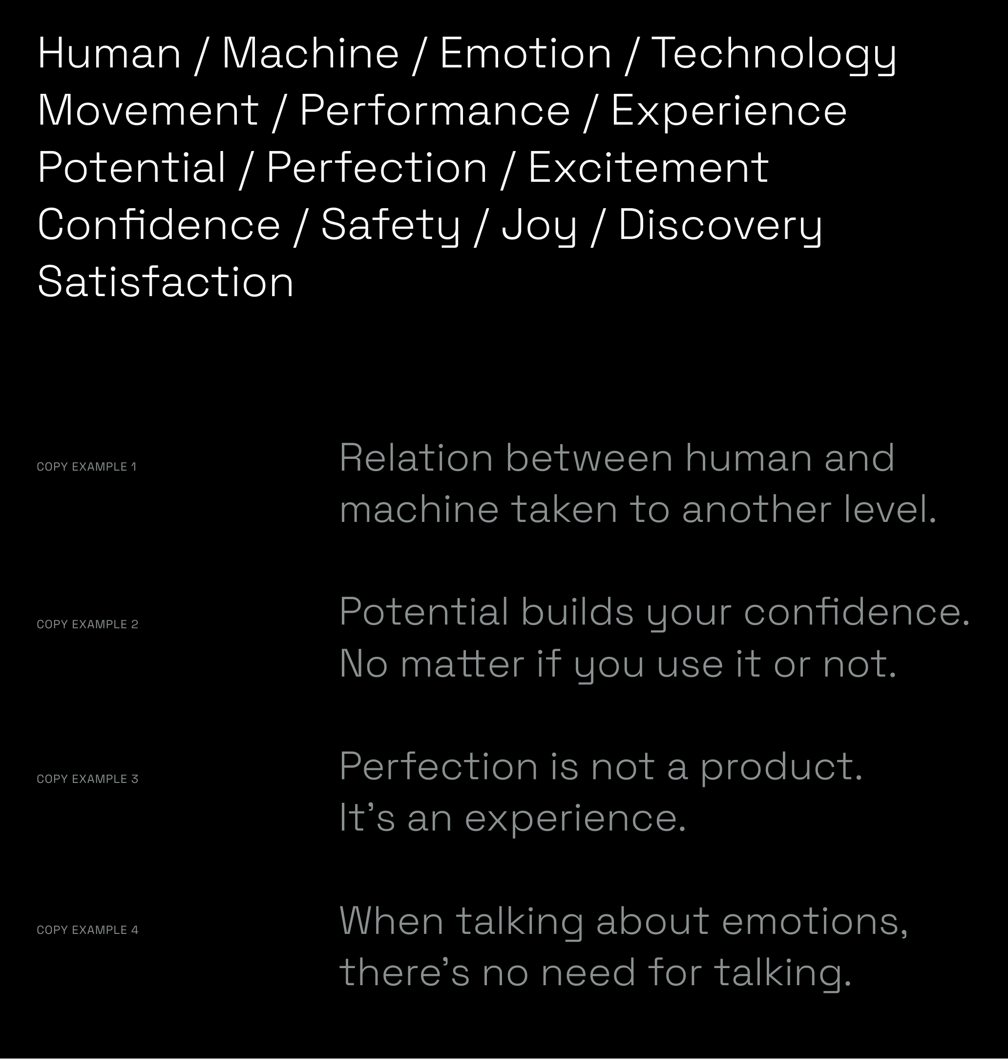
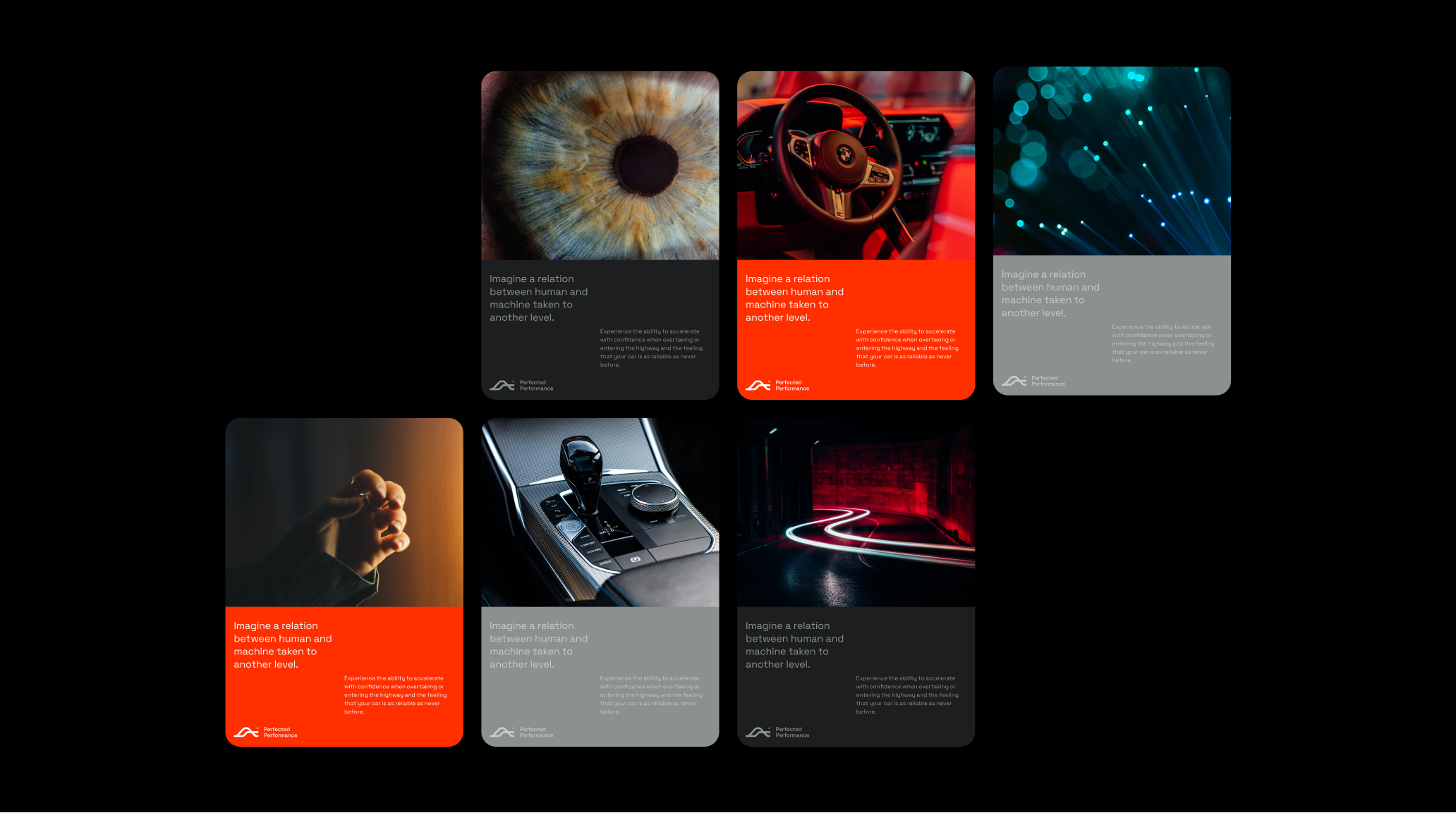
Tone of voice


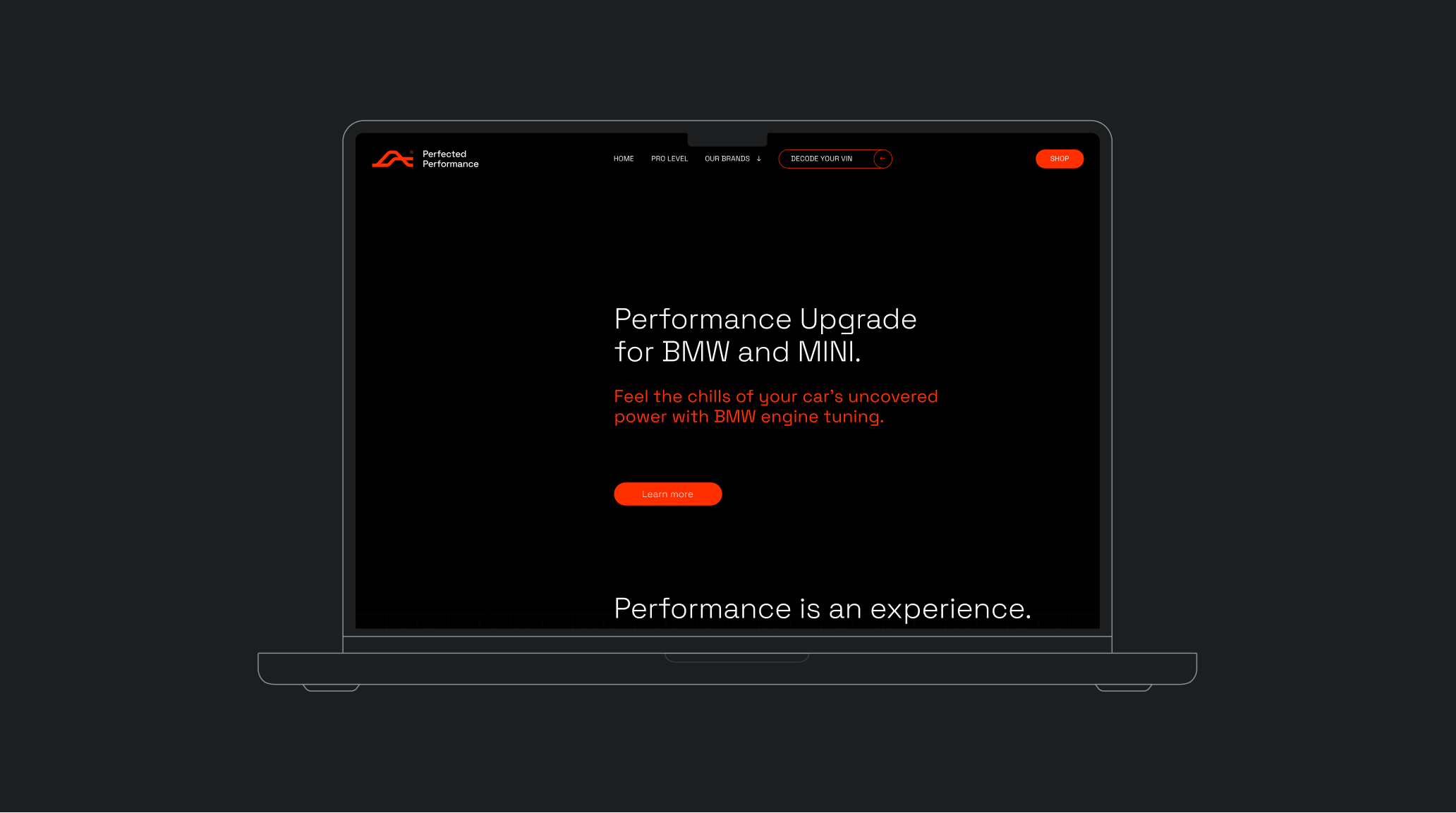
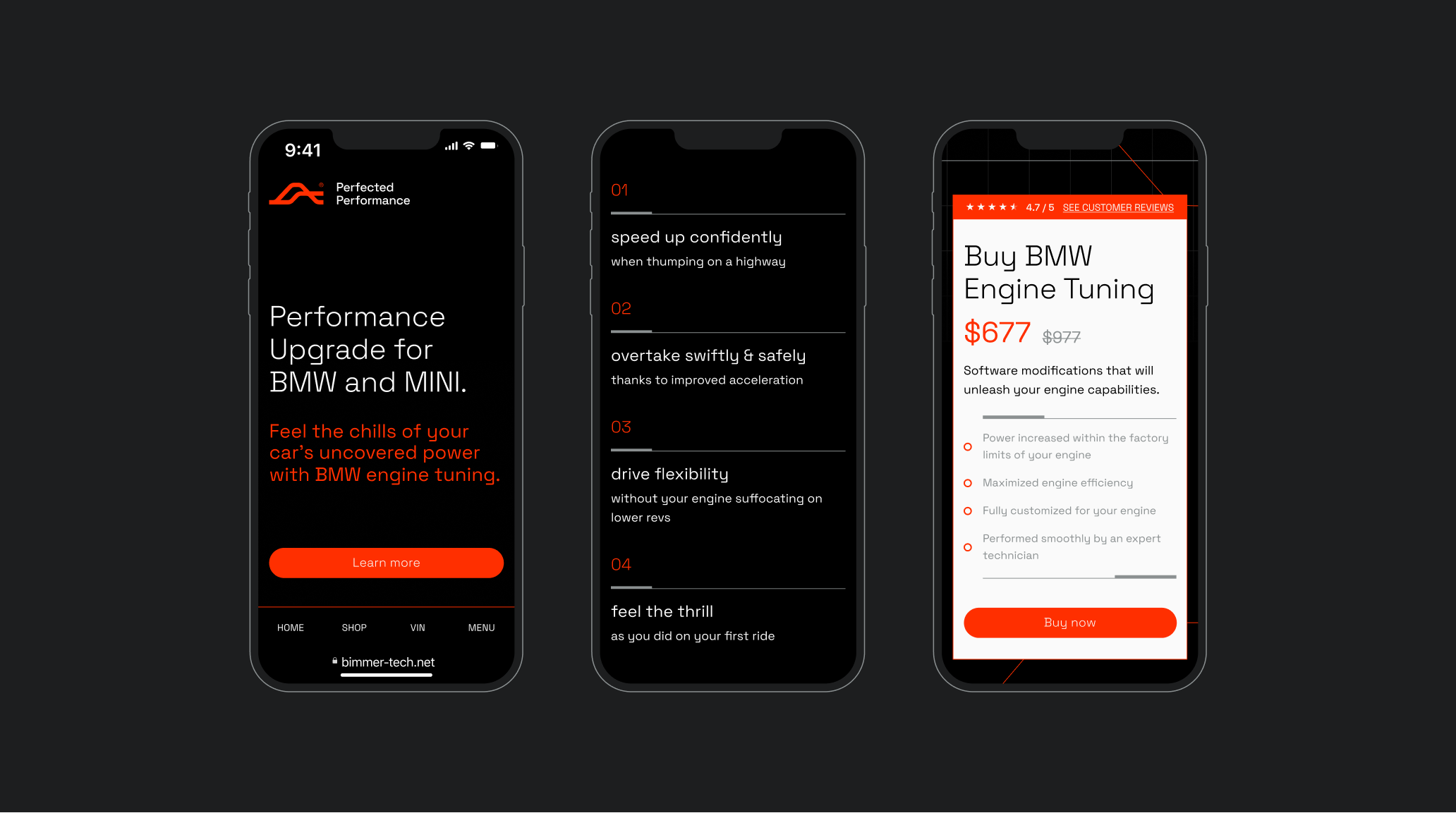
Website
At the center of our scope was the website. In the case of Perfect Performance, it is the most important form of communication with the customer, the main and first point of contact with the brand.
It is here that the customer will get the full package of information, but also will get acquainted with the brand’s narrative and attitude towards the services offered. It must therefore reflect the emotional approach we have proposed, both in visual and textual form.
Credits
Team Leniva° Studio
Concept and Key Visual: Neon Neonov
Design: Neon Neonov, Janek Mońka
GUI: Janek Mońka
Production: Lena Mitkowa, Saskia Mońka
Client’s Team:
Krystyna Beniger
Michał Owczarek
Alexey Karpenko