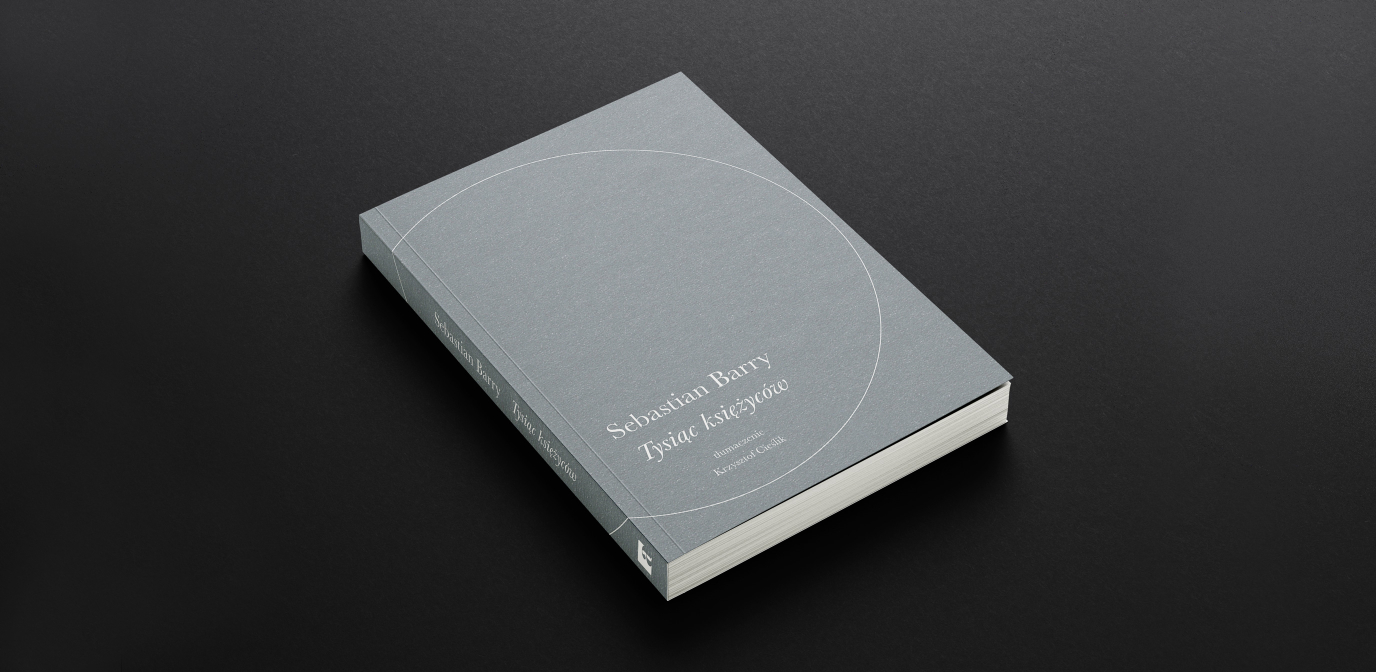
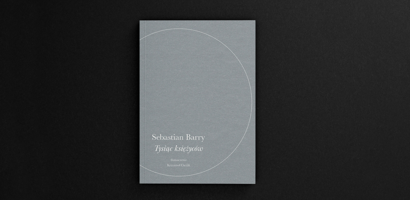
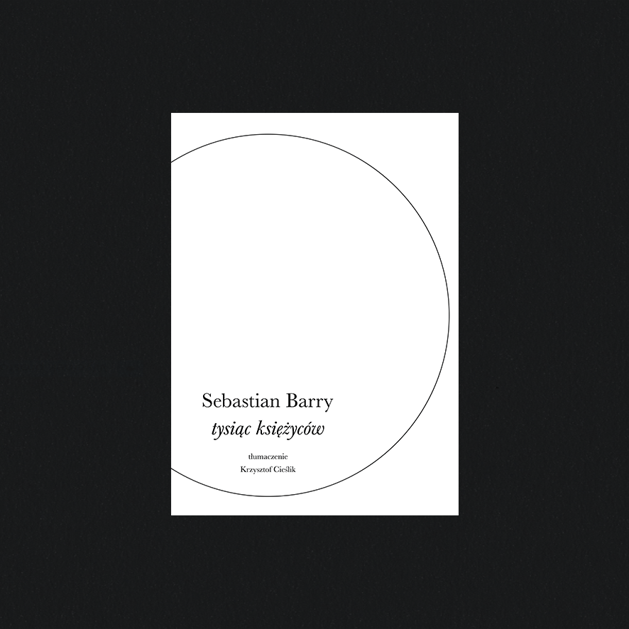
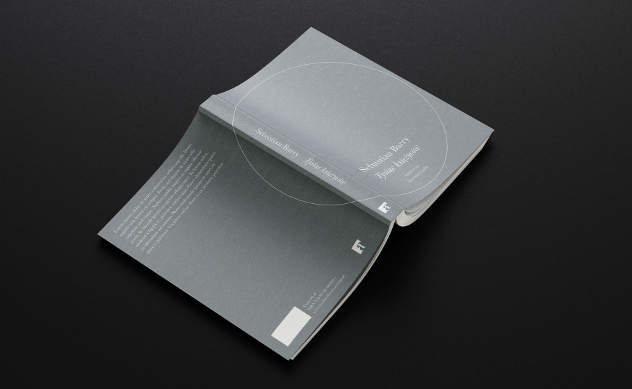
Sparing means of expression conveying the deepest possible message. The cover of the book “A Thousand Moons” by Sebastian Barry is an example of how the restrained use of design lets the content resonate.
Info ↘
The inspiration for the project was a quote from the English-language original: “A thousand moons ago was her deepest measure of time. (…) For my mother time was a kind of a hoop or a circle, not a long string.
If you walked far enough, she said, you could find people still living who had lived in the long ago. ‘A thousand moons all at once’, she called it. You could not walk so far, she said, but that didn’t mean they weren’t there.”
Scope
Book cover design
Tools
Photoshop / Illustrator
Client
ArtRage publishing house
Ideas
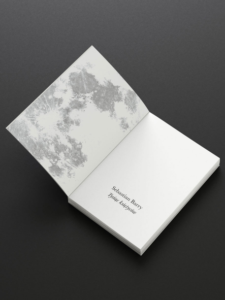
We presented three cover designs: minimalistic, selected in the end, one more literal (lunar topography) and one referring to the lunar calendar and the cyclical nature of the world.
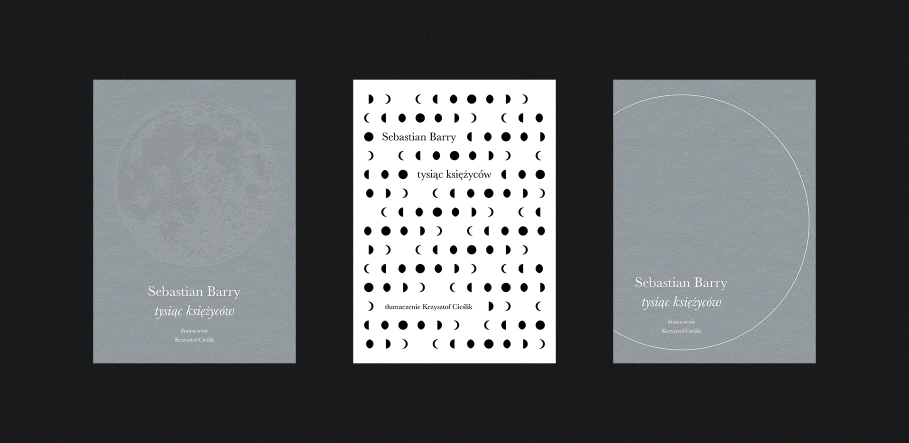
Just one more example of less is more. It worked quite nicely.
Credits
Team Leniva° Studio
Cover design: Marta Krzemień-Ojak
Art director: Neon Neonov
Creative director, consultation: Lena Mitkowa
Team Leniva° Studio
Michał Michalski