How we transitioned Remarkable Ones into the concept of Ro?
Info ↘
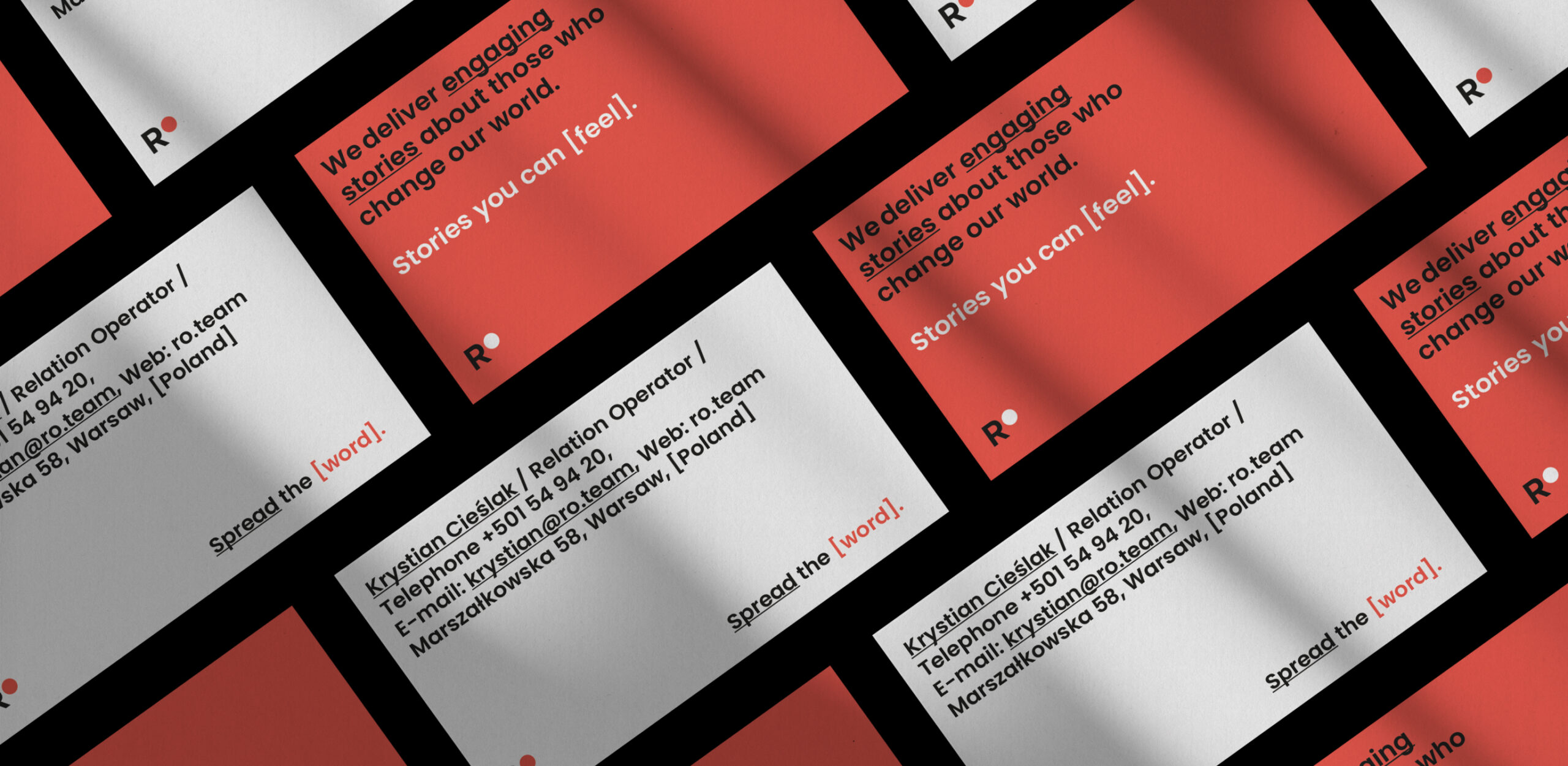
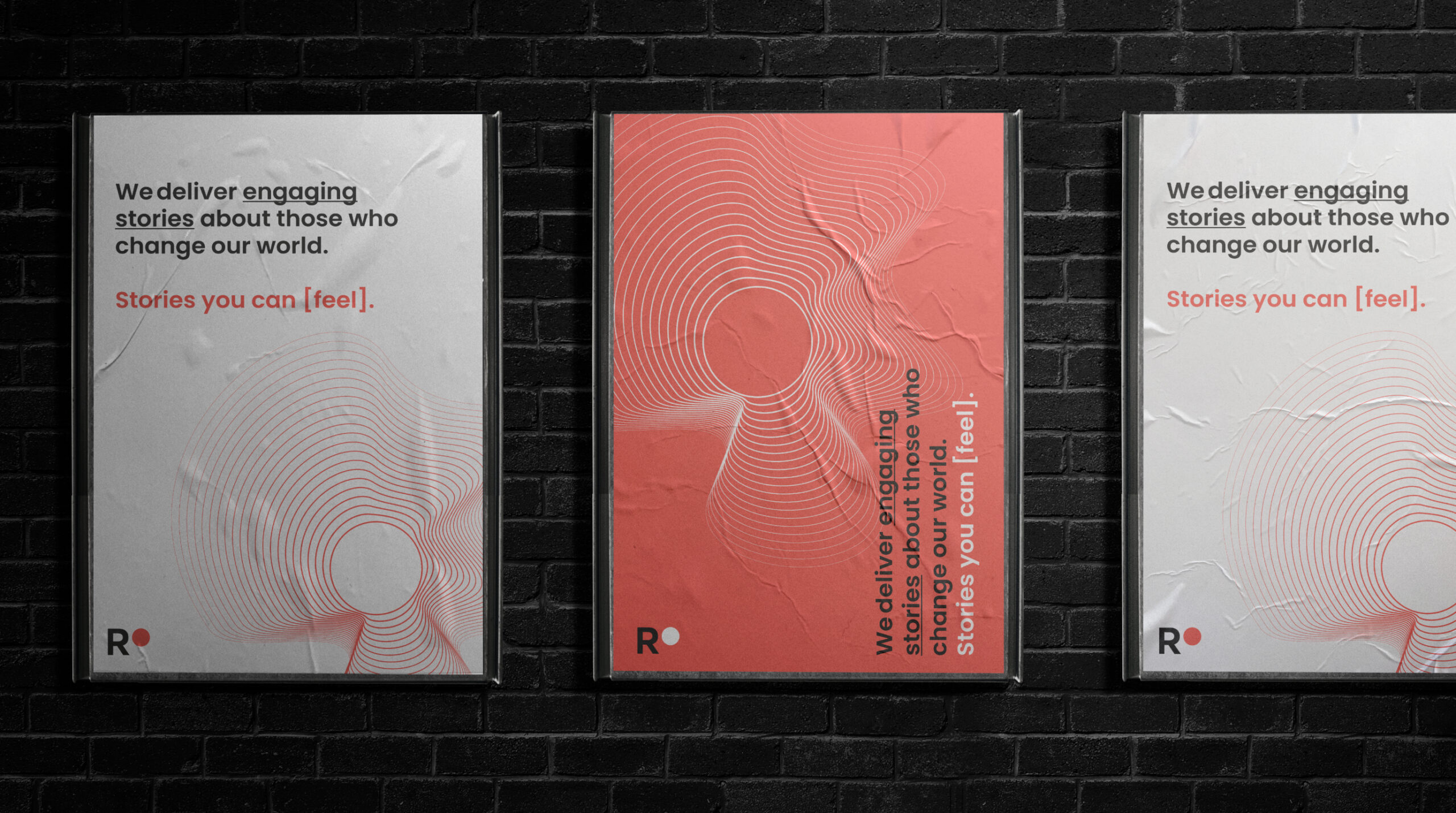
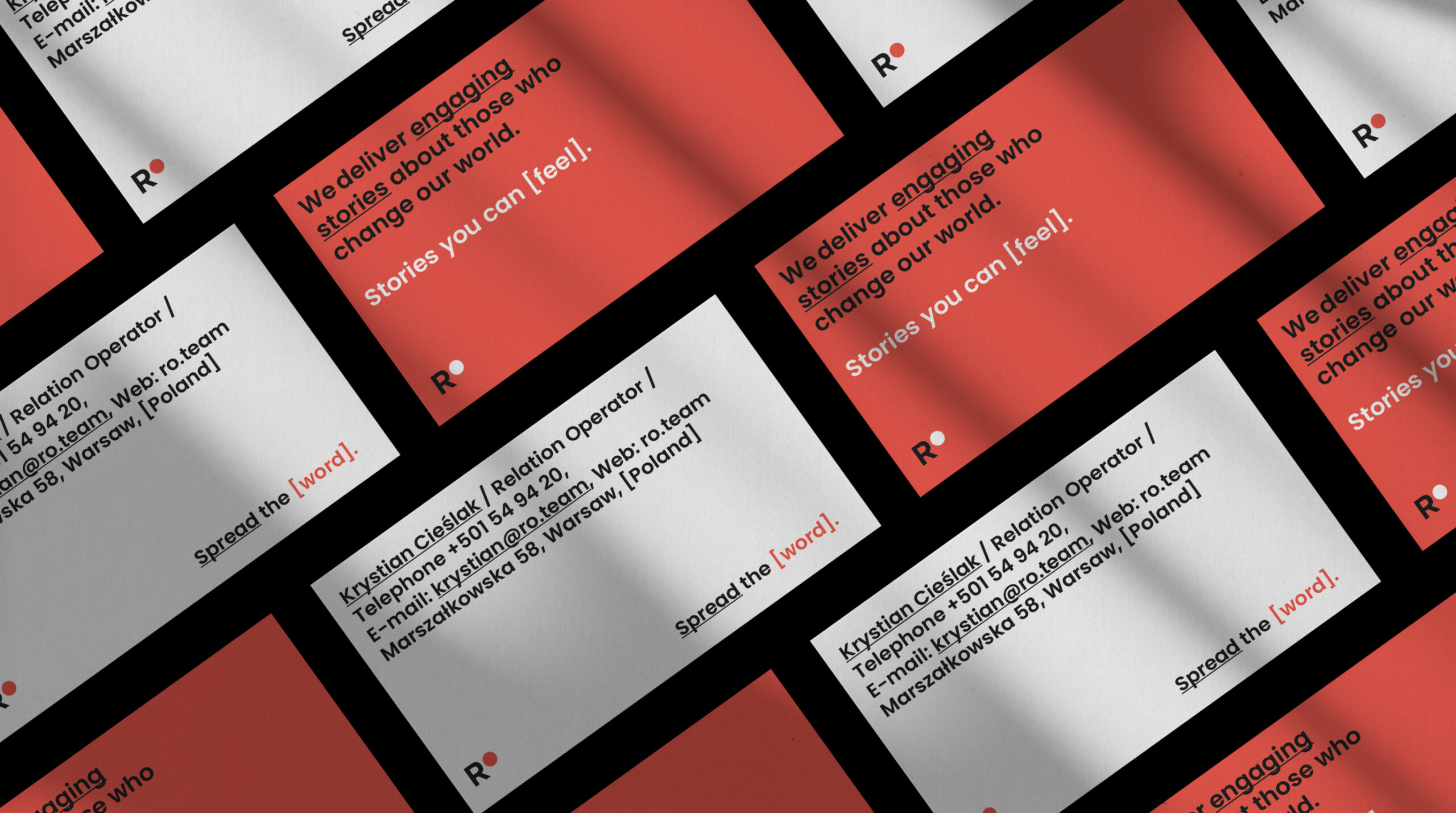
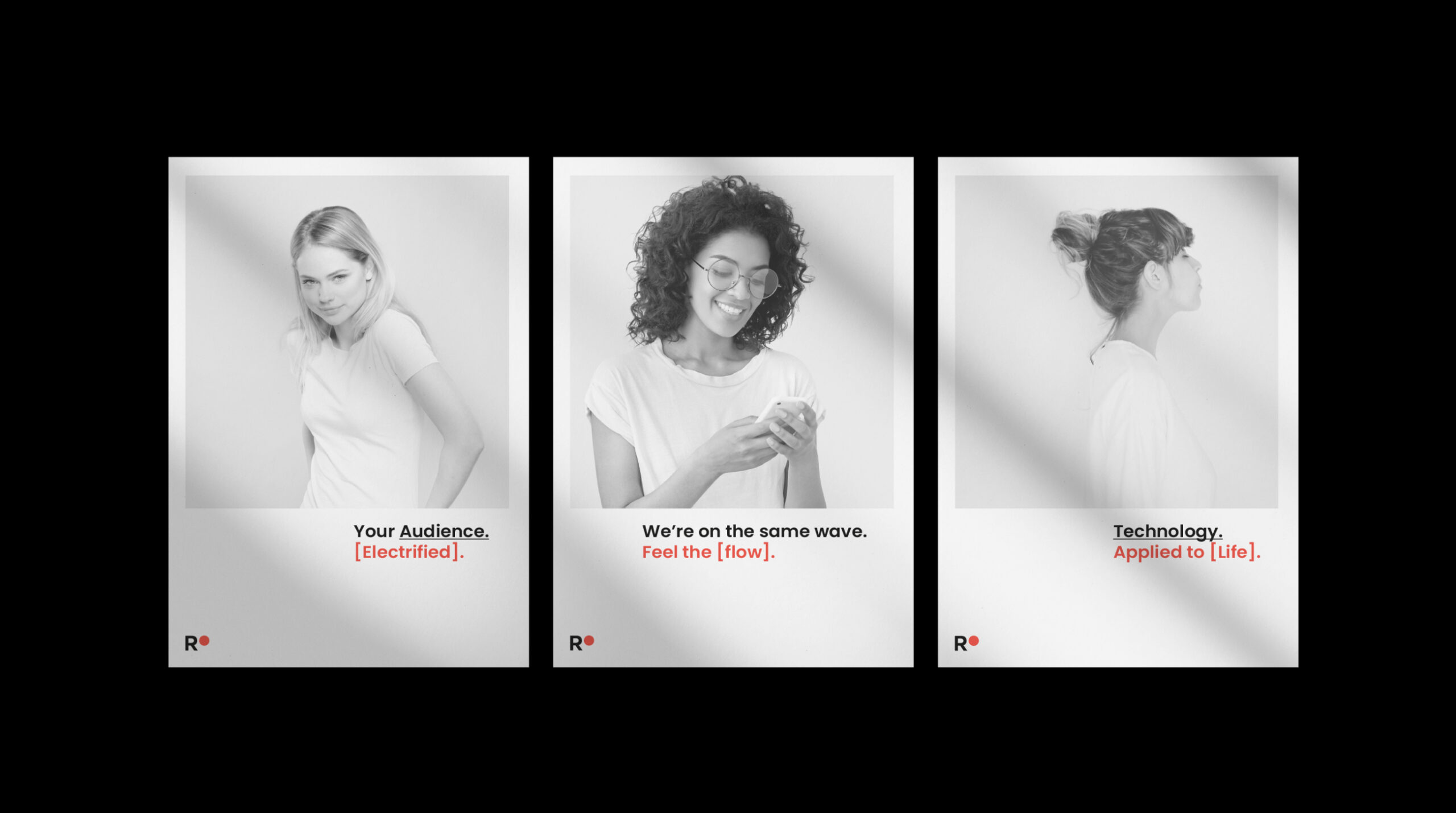
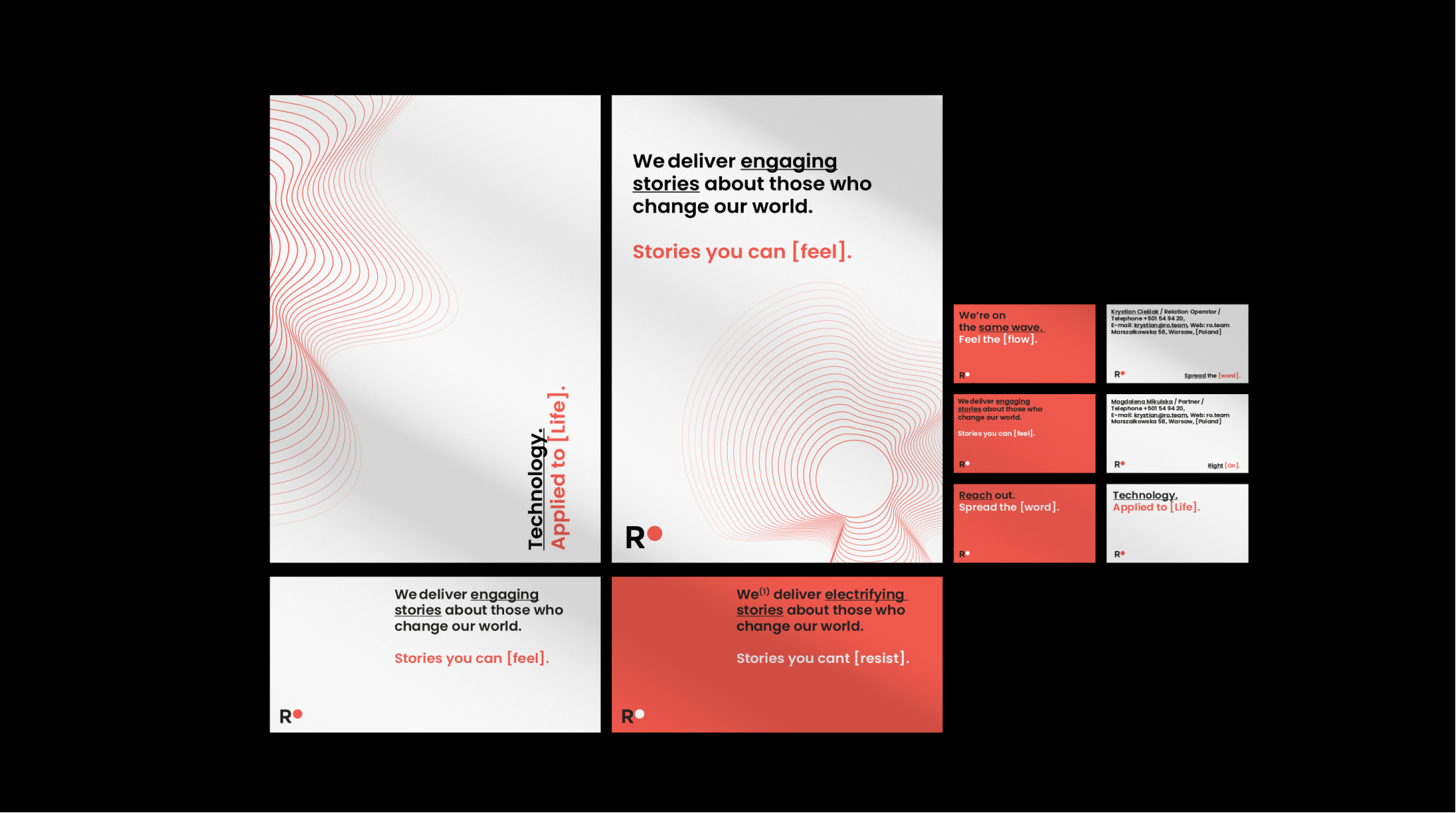
RO is an example of an organization whose visual identity did not reflect their modernity, agility, and fresh approach. However, they put their trust in our process, and that’s how Remarkables became RO – with a new name, new visual identity, juicy colors, and a strong tone of voice.
If you associate PR agencies with old-school press releases – take a fresh look at this industry and see what is happening in it in the third decade of the 21st century.
Scope
Rebranding / UX
Tools
Figma / Illustrator
Client
Remarkable Ones
Design task
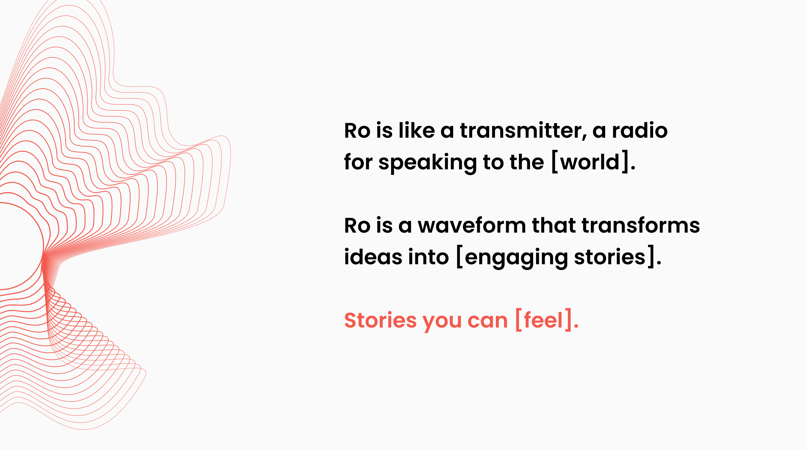
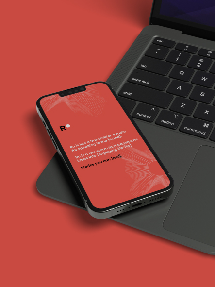
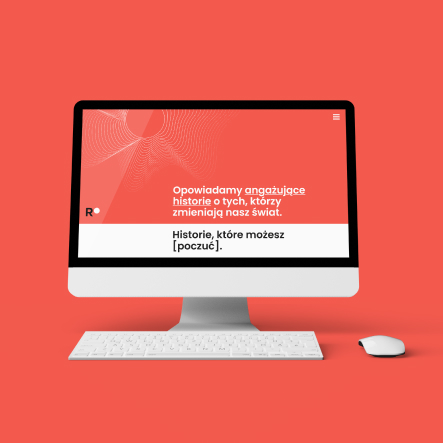
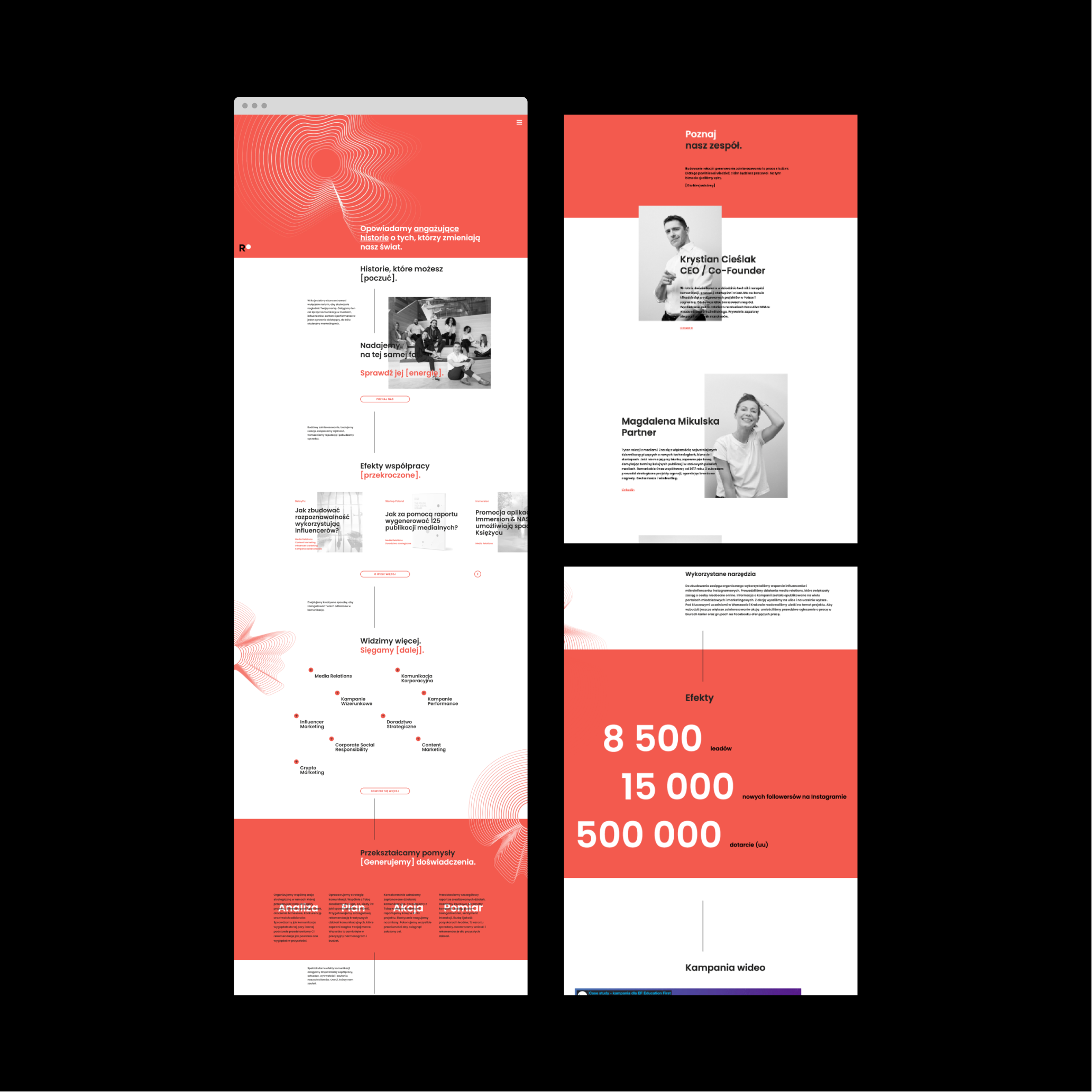
The concept was inspired by a physical property – Resistivity (electrical resistance) – a characteristic property of each material, useful in comparing various materials based on their ability to conduct electric currents. From here, it takes only one step to electrifying communication. RO is like a transmitter, a radio for worldwide broadcasting, an electrifying wave of engaging stories.
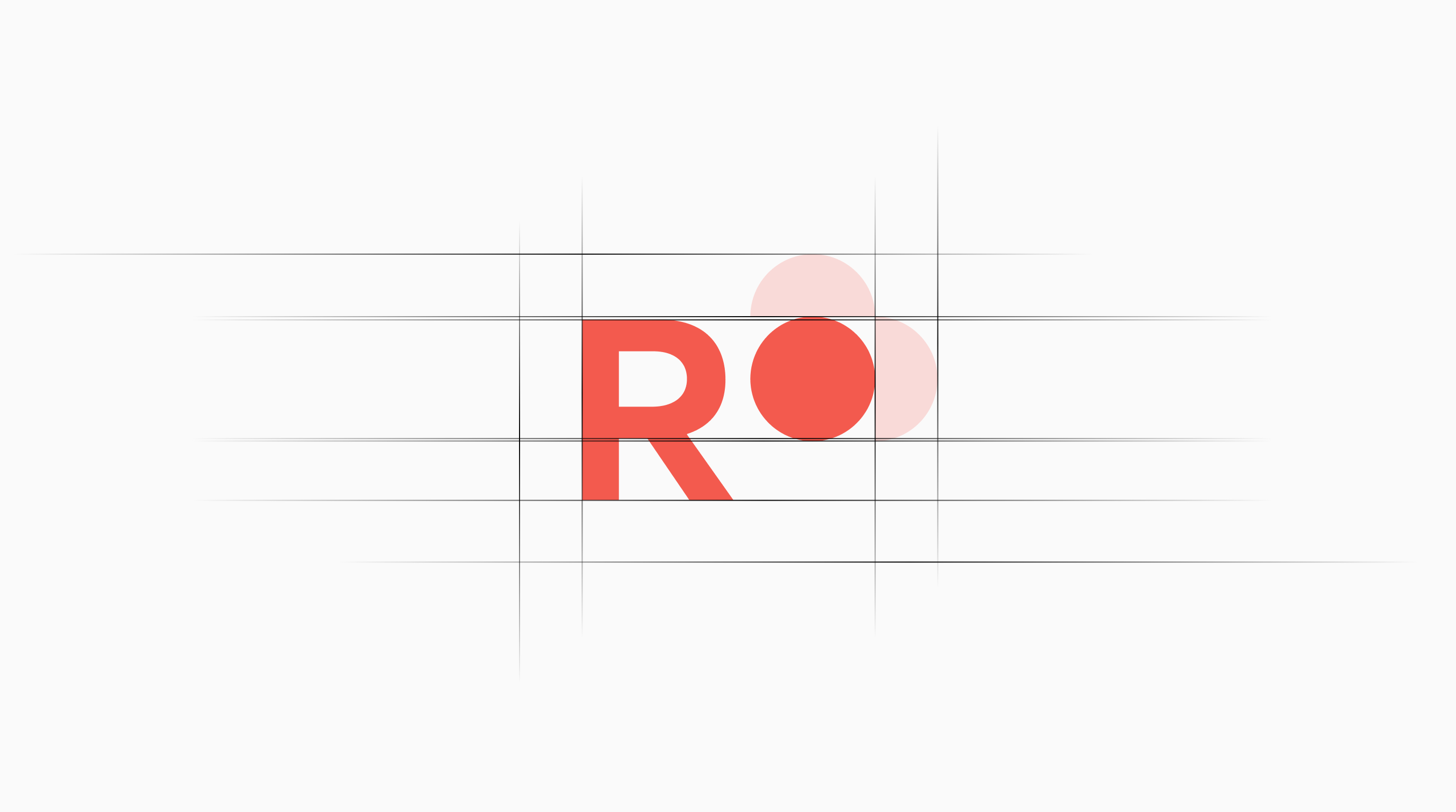
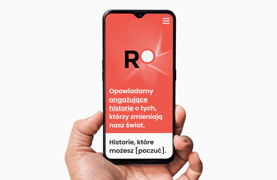
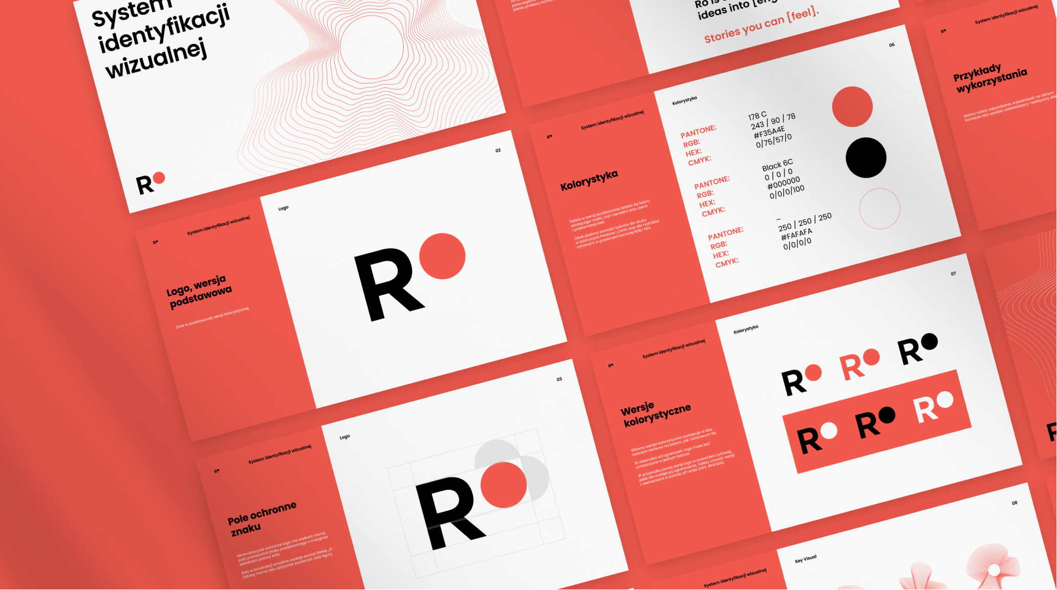
Considering the role they play towards their customers, we have designed a wave that is a symbol of how RO shapes customer perception by the audience. Also – thanks to its undefined form, adapting to the space and needs – it best reflects the agility spirit, which is the domain of RO. This simple-to-express symbol is enhanced with a vibrant color bordering of orange and red. The branding prepared this way is characteristic and strong, yet at the same time easy to implement on the client’s side.


Credits
Team Leniva° Studio
Concept and Key Visual: Neon Neonov
Production: Lena Mitkowa
UX / GUI and Implementation Supervision: Jan Mońka
Design Support: Kamil Przybyła
Client’s Team
Krystian Cieślak
Magda Mikulska