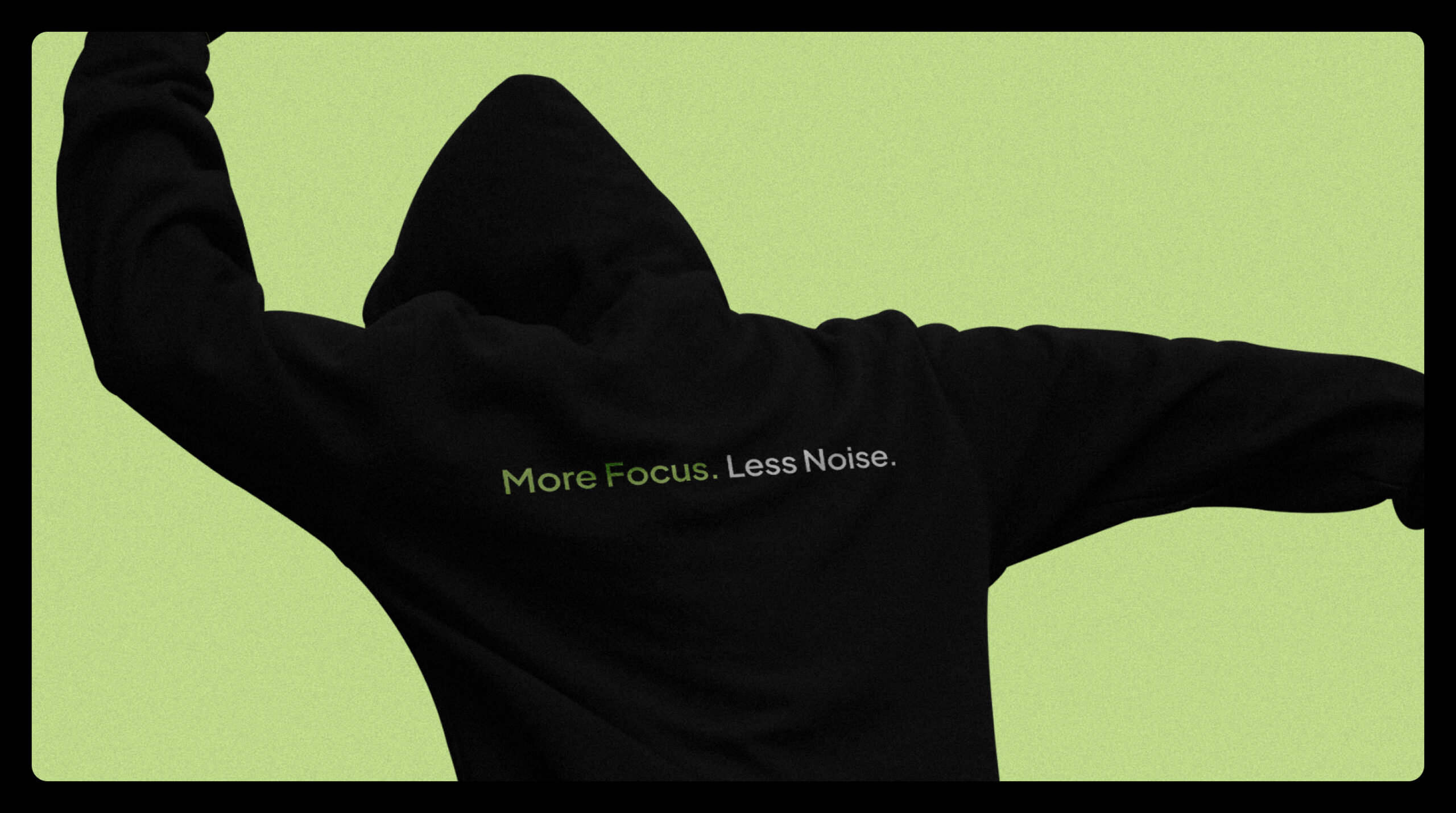
More Focus. Less Noise.
Info ↘
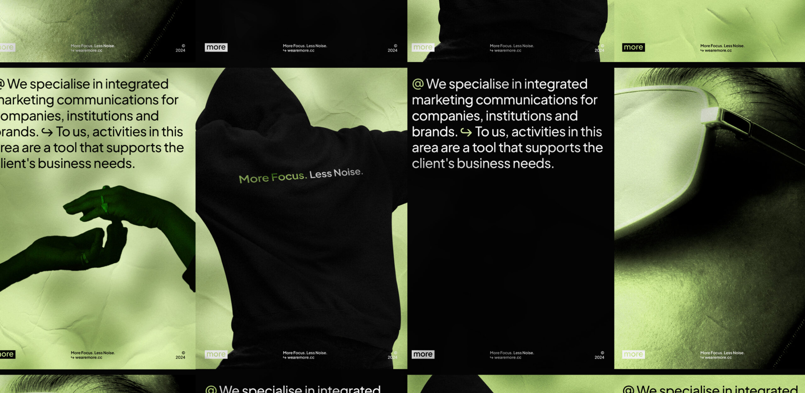
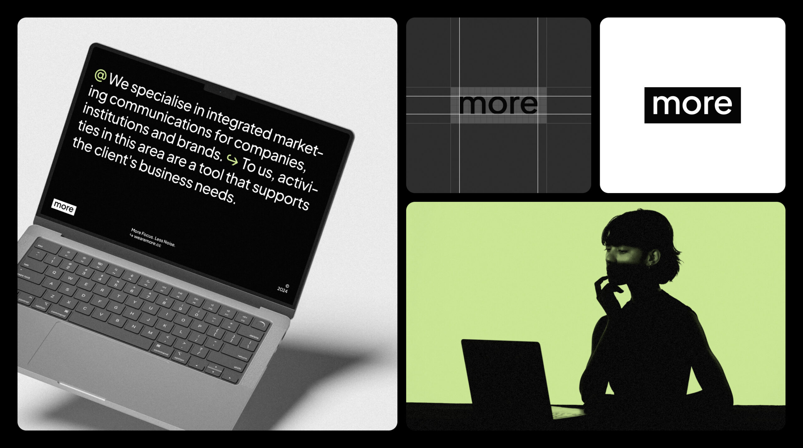
In communication, simpler and clearer always means better. That’s why, when we began our collaboration with PR agency More, the first step was to refine their name – from More Communication Agency to simply More.
This subtle shift was supported by a thoughtful redesign that centered on clarity and purpose. At the heart of the new identity is a minimalist logo that also acts as a highlight in text. This simple yet powerful element embodies More’s mission: to focus on what truly matters in communication.
Scope
Branding / Brand Materials /
Communication
Tools
Figma / MS Office /
Illustrator / Photoshop
Client
more
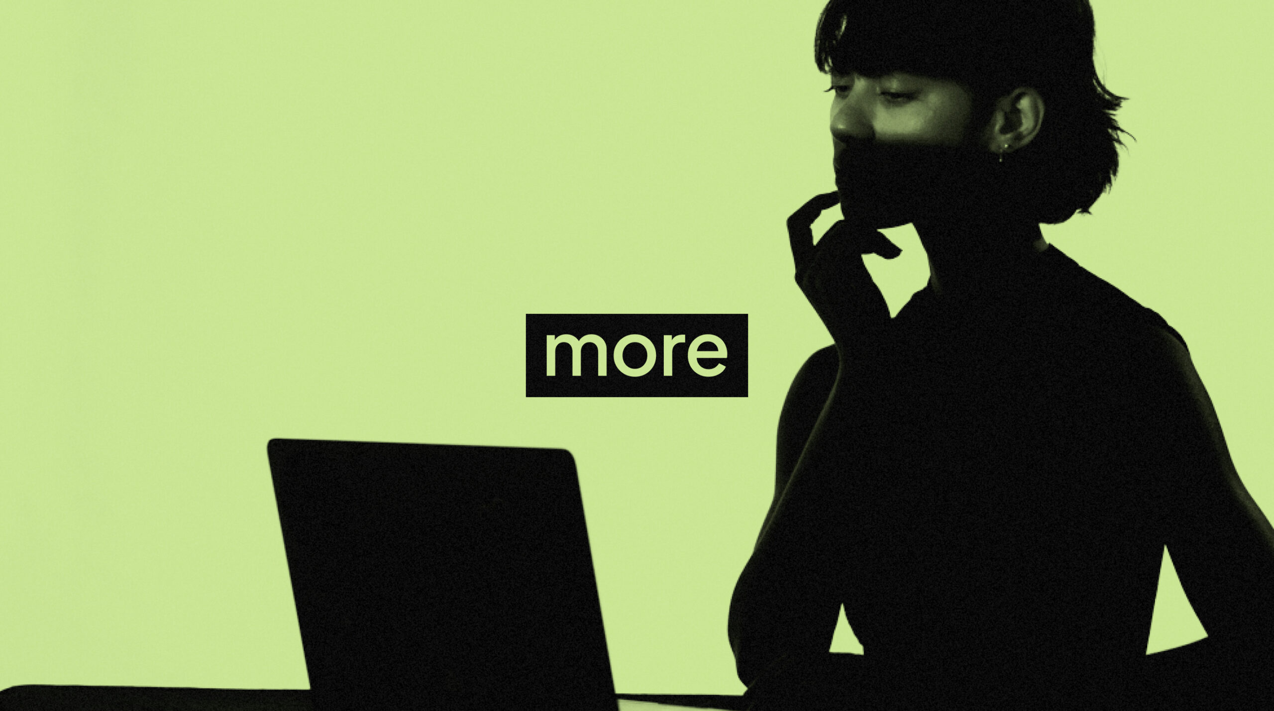
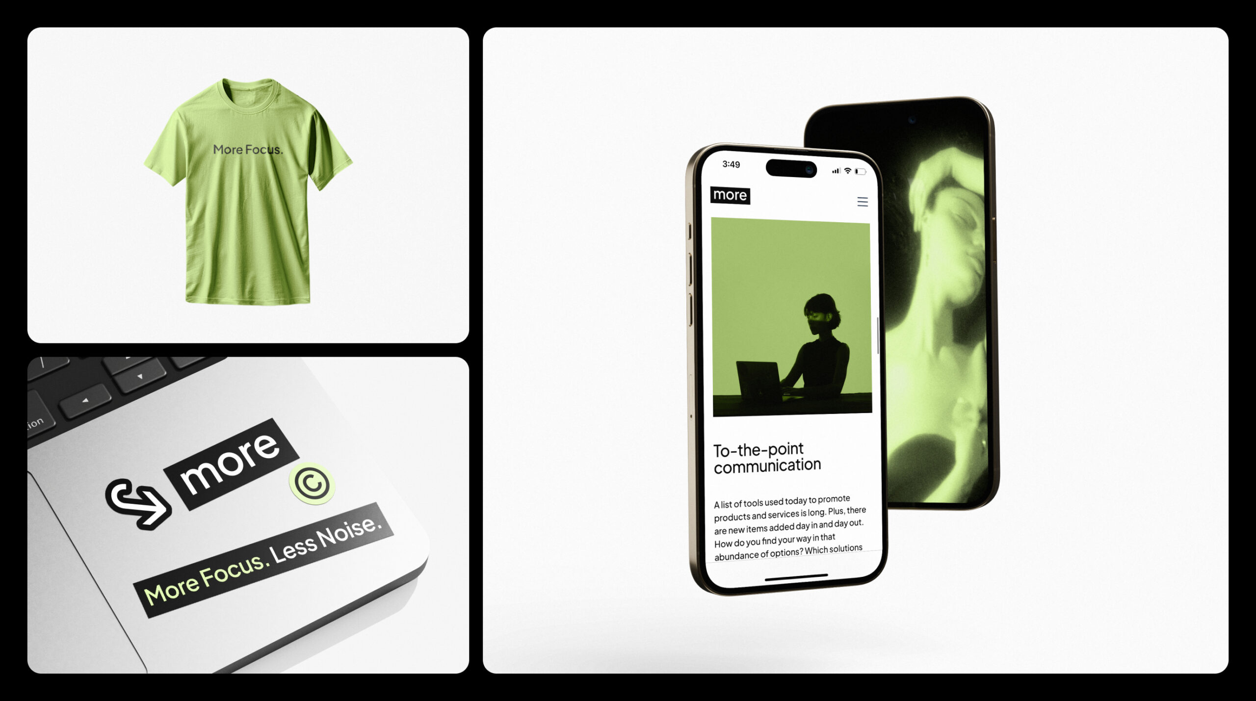
The visual identity system now features a carefully selected color palette, accessible typography, and an elegant typographic approach – allowing for a streamlined, flexible design toolkit that can be easily applied in everyday work.
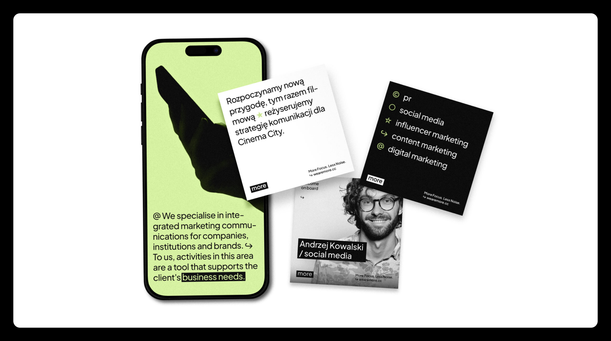
Beyond the foundational design system, we extended these updates to customer communication materials, as well as to all digital touchpoints (including the website and LinkedIn). The result is a cohesive and meaningful brand experience, one that cuts through the noise to underscore what’s most important.
Credits
Leniva° Studio
Concept: Lena Mitkowa
Art Direction: Neon Neonov
Brand Design: Kamil Przybyła
Webflow / UX & UI: Michał Witucki
Clients Team
Jakub Zajdel + Team