Our task was to carry out a comprehensive rebranding of the Altkom brand portfolio – Altkom Akademia and Altkom Software.
Info ↘
Altkom Akademia is one of the leading companies organizing IT training, as well as project management, law, finance and production processes. The brand is highly recognizable in Poland. We have carried it through transformation, while maintaining its original character, respecting the ideas and assumptions of the original visual identification.
Changes in communication and design are part of the dynamic development of the company – we wanted to emphasize its digital transformation and prepare it visually for global markets.
Scope
Rebranding / UX
Tools
Figma / Illustrator
Client
Altkom Akademia
Process
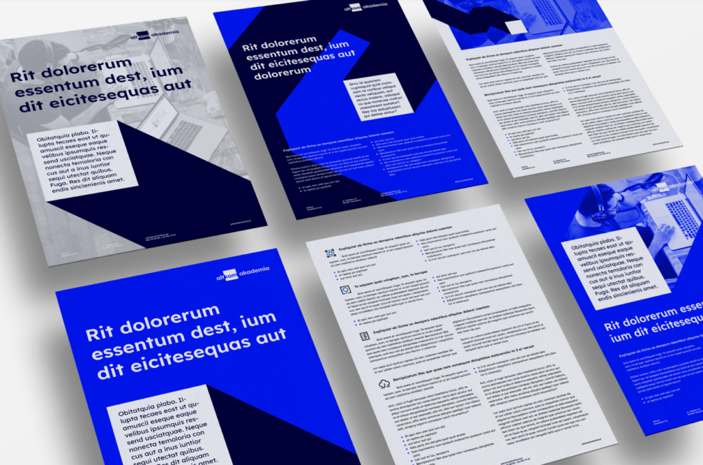
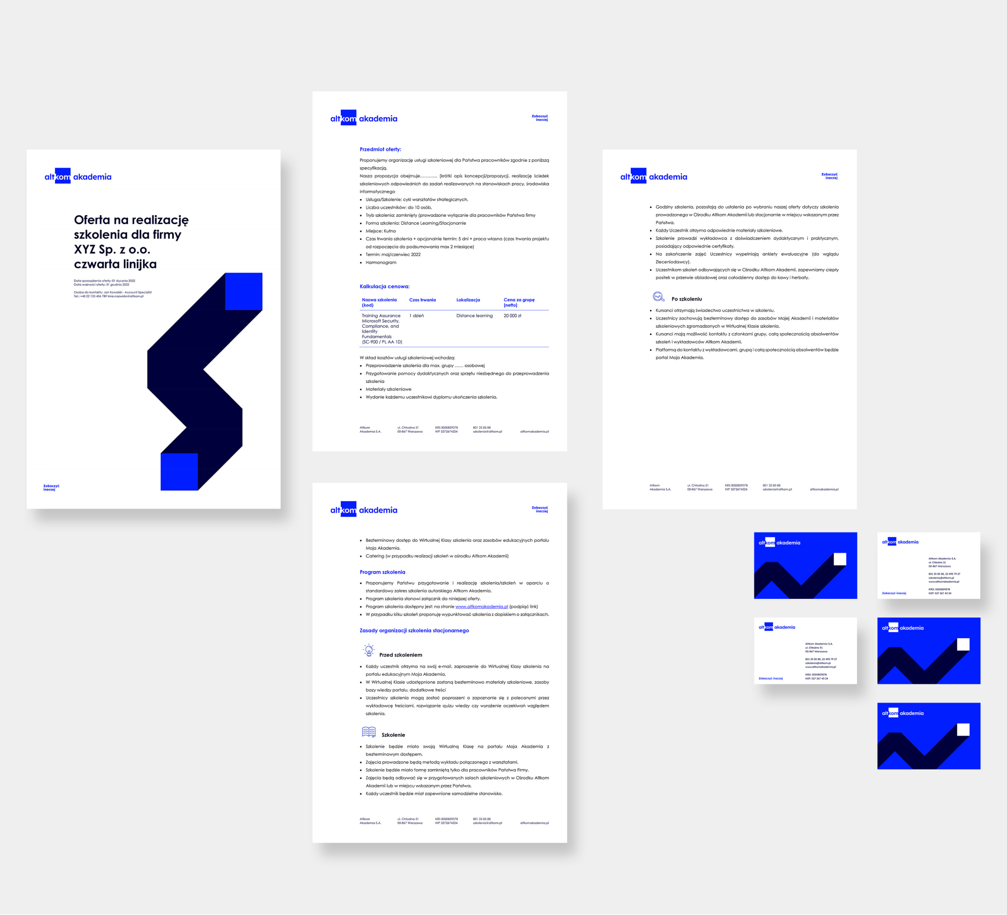
We have started by developing information architecture and defining the interdependencies between individual brands. The next step was to develop the essence of the brand’s visual recognition. We have designed a lightweight, playful, digital brand that is scalable. The set of materials is built as a design system, implemented on an ongoing basis in the organization.
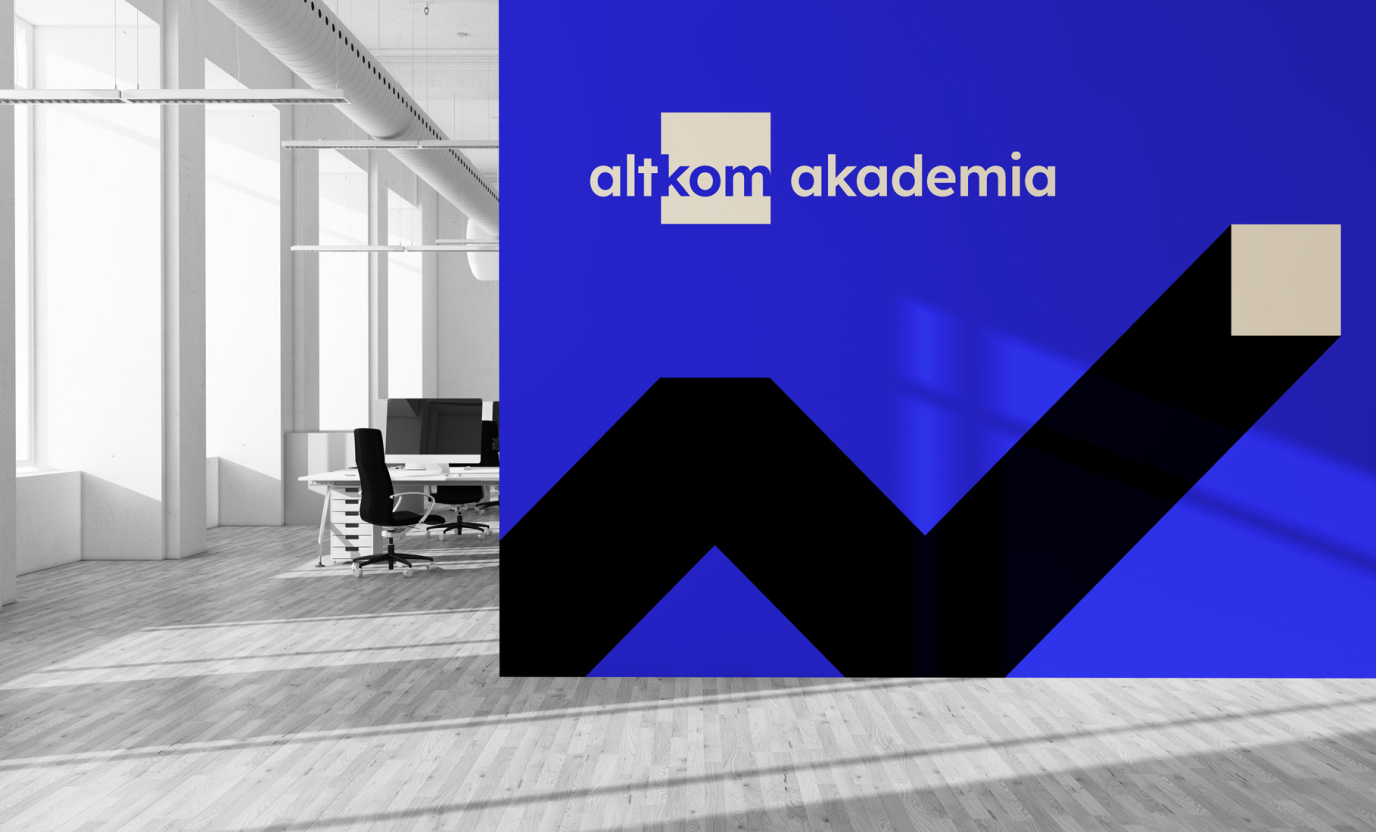
The change of the logo seems to be significant, but in fact it is a purely formal change. We have kept the idea of shifting the perspective and optical playfulness from the original logotype. We have supplemented its humanistic overtones with structure and modularity. At the same time, the geometric shape used in the signet ring begins to have functions that go beyond aesthetic assumptions. The square-pixel is a creative, causative element that starts the narrative. This is the first step in transformation.


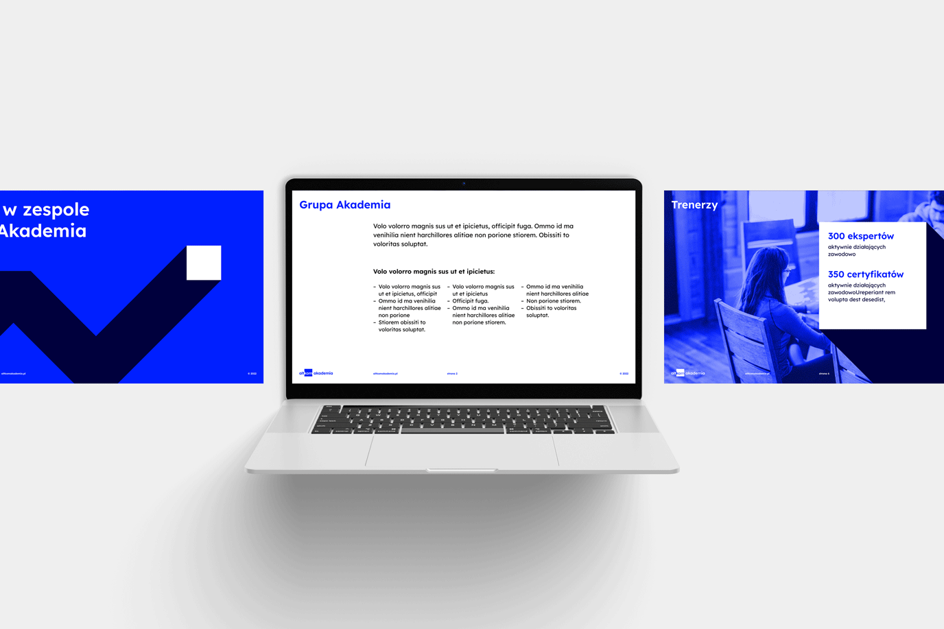
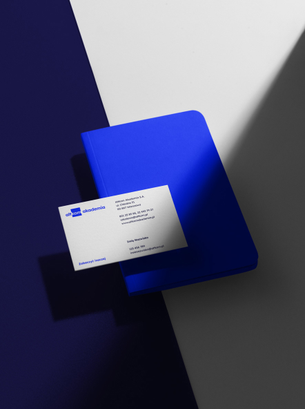
We have chosen strong, digital colors. We focused on electric blue/turquoise and deep shades of blue – a bit of a contrast to the previous identification in red. We have followed the principle of digital first, because the brand largely operates on digital media. In the case of analog media, we recommend 6-color printing in digital printing (e.g. on HP Indigo) or printing from the Pantone palette in offset printing for the best results.
Altkom Akademia is a large organization that independently develops marketing materials in its in-house team. It was all the more important to create a comprehensive design of the system and a set of ready-made templates and materials for implementation.
Project documentation has been created on an ongoing basis, with the active participation of the client. The implementation has been carried out in accordance with the principles of agile management.
Credits
Team Leniva° Studio
Concept and Key Visual: Kamil Przybyła
Art Direction: Neon Neonov
Implementation: Marta Krzemień-Ojak, Kamil Przybyła, Janek Mońka
Production: Lena Mitkowa, Saskia Mońka
Client’s Team
Michał Sterniński
Jacek Smolarz
Joanna Mihułka
Tomasz Kotermański