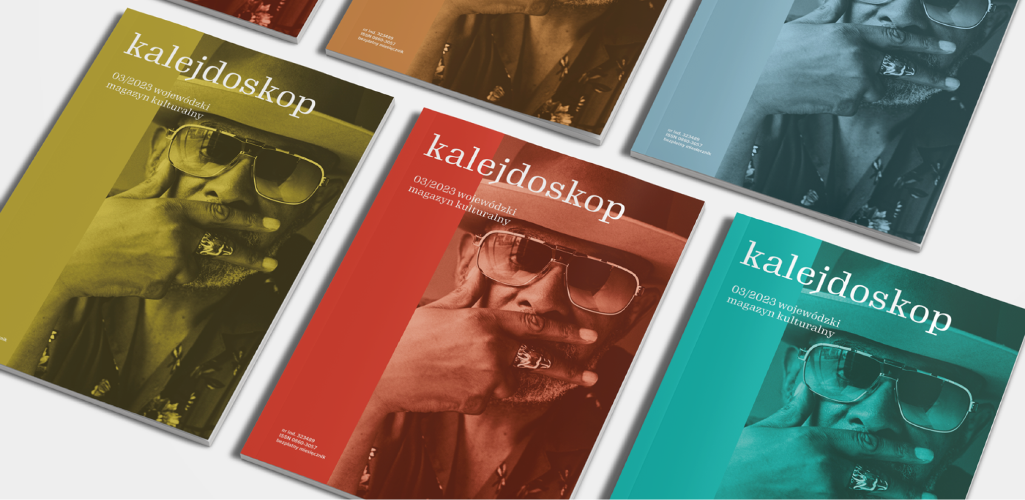
If software can be a service, so can branding.
Info ↘
When rebranding for Altkom Software, the process itself was one of the key elements. The identity was implemented in an agile manner, working closely with the client’s team. The Altkom brand is two independent entities: Akademia (see our rebranding) and Software.
The name of the latter says it all: it’s the world of custom software development, cloud services and process automation. Thus the rebranding of both brands included not only building a consistent brand architecture, but also working on independent sub-brands in parallel in different teams.
Scope
Rebranding / UX / GUI
Tools
Figma / Illustrator /
Photoshop
Client
Altkom Software
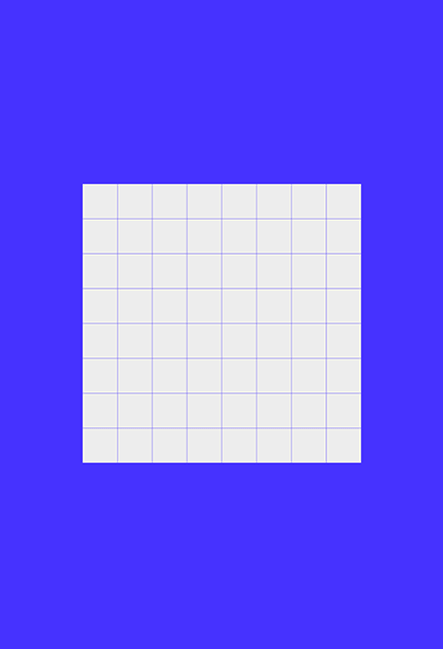
Follow the white pixel
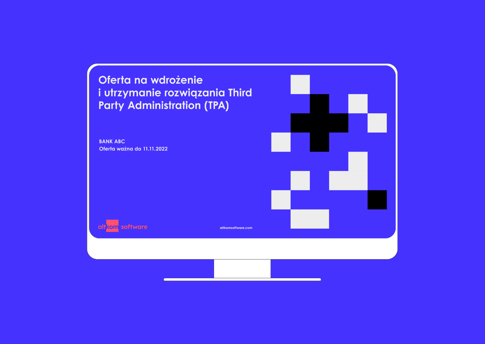
When rebranding, what is often important is not what changes, but what must remain of the previous identity. Altkom is the linking element between the two sub-brands – therefore, we left what was visually common to the brands in the old identity. In this case, it was a square. However, it started working differently in each project.
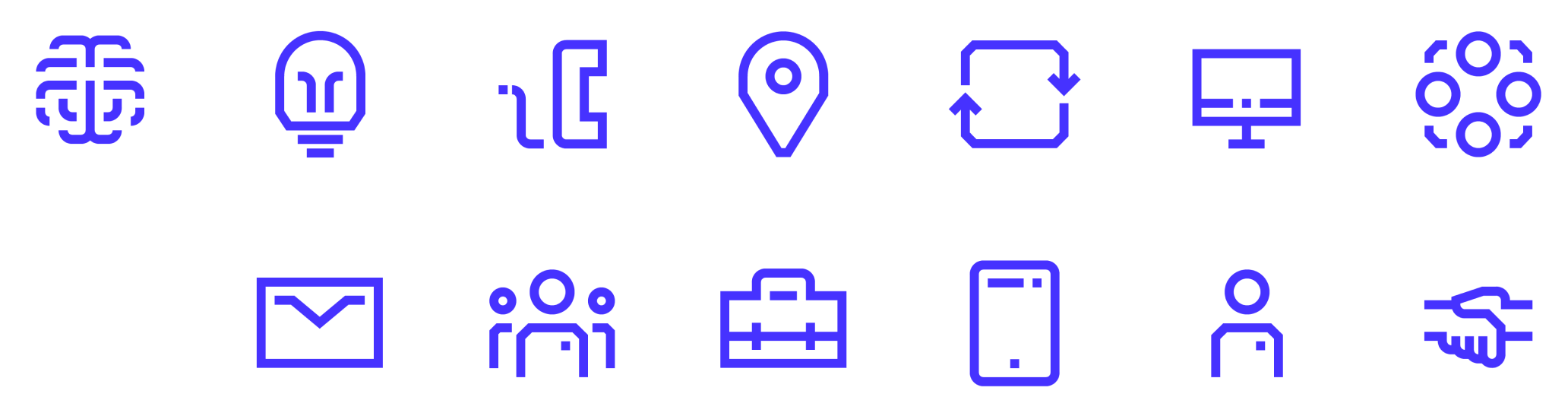
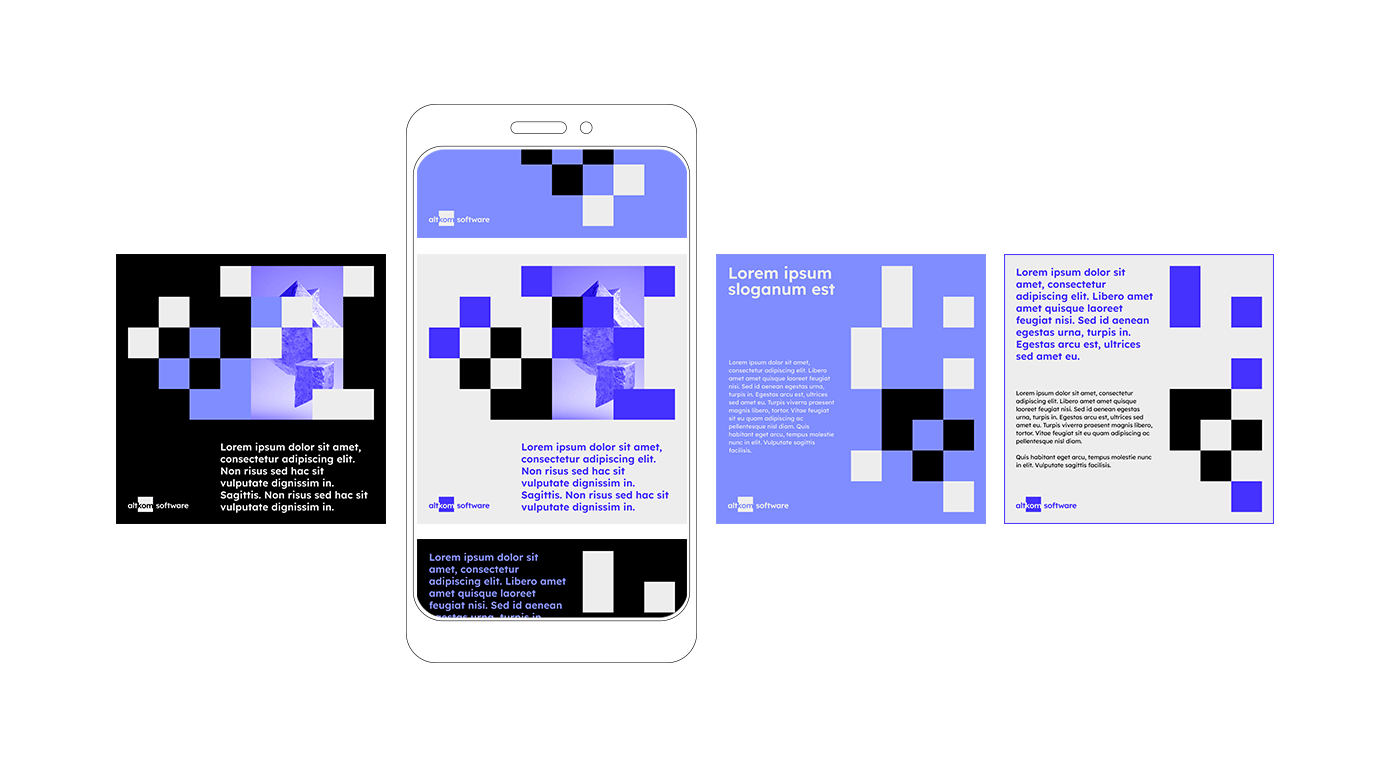
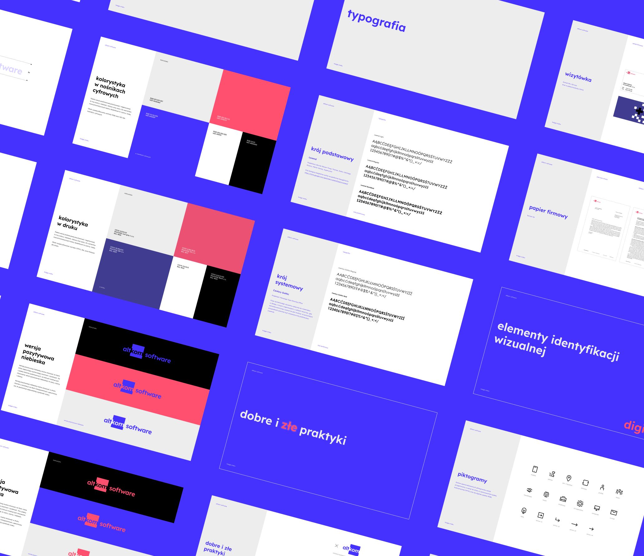
In the case of Altkom Software, the pixel and playing with it is the basis of the entire visual identity structure. We used its blockiness, right angles and sharp cuts. Playing with the pattern of negative and positive on an 8×8 grid, we developed a rather technical, mathematical graphic rule. We used the same methodology to develop a set of dedicated icons. The chosen font – Lexend – brings elements of humanism into the system.

Let’s add some bling
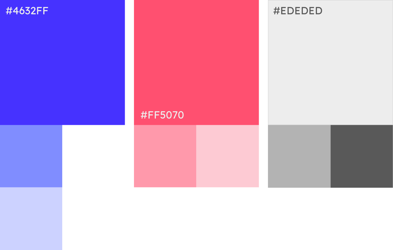
We decided on strong colors reflecting the character of the brand. Electric blue, refers to the common core with the Akademia sub-brand.
We juxtaposed it with a contrasting, glowing raspberry color, distinguishing Software from the Altkom brand family.
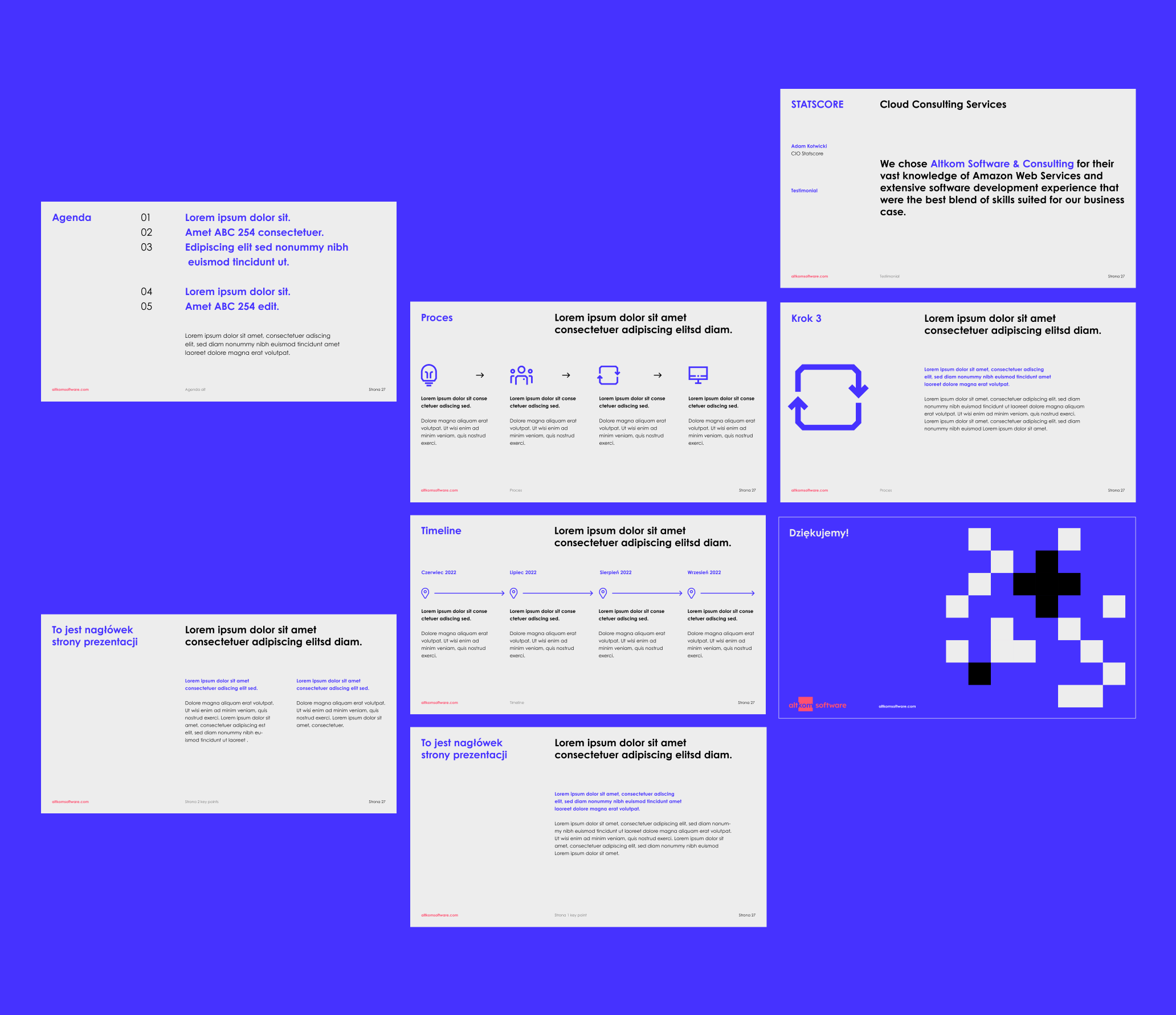
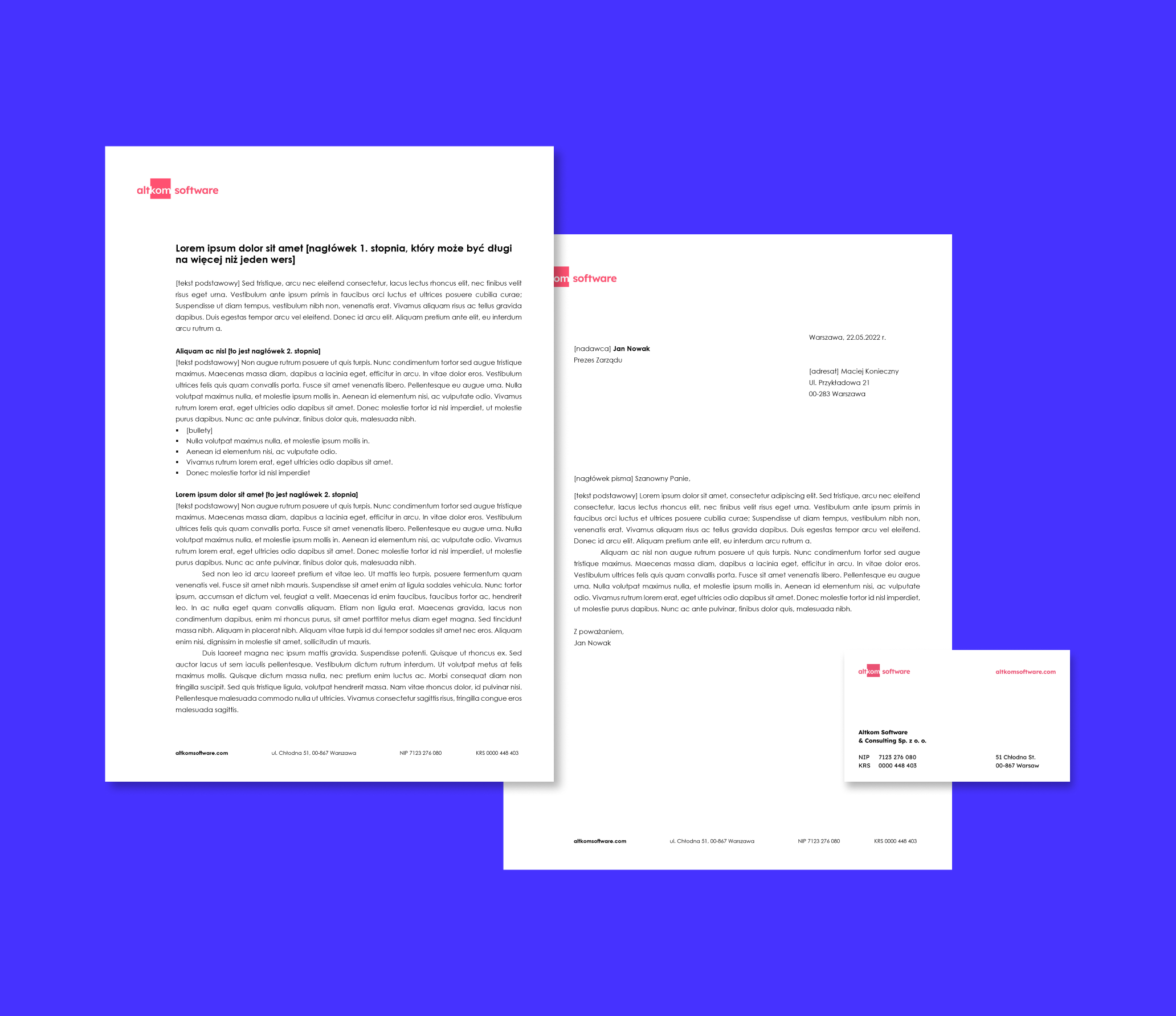
Consistency is a key
The cohesive concept is reflected in all the materials we prepared, both internal to the company (business cards, letterhead, social media templates, etc.) and external, such as the intro and outro animation.
We developed a comprehensive design system and a set of templates and materials, ready to be used by our client. The whole thing is summarized in a brandbook, which will allow smooth implementation of the new branding in the organization.
Credits
Team Leniva° Studio
Concept and Key Visual: Neon Neonov, Kamil Przybyła
Art Direction: Neon Neonov
Design: Janek Mońka, Kamil Przybyła
Design support: Marta Krzemień-Ojak
GUI: Janek Mońka
Production: Saskia Mońka, Lena Mitkowa