Precision
and approachability.
Info ↘
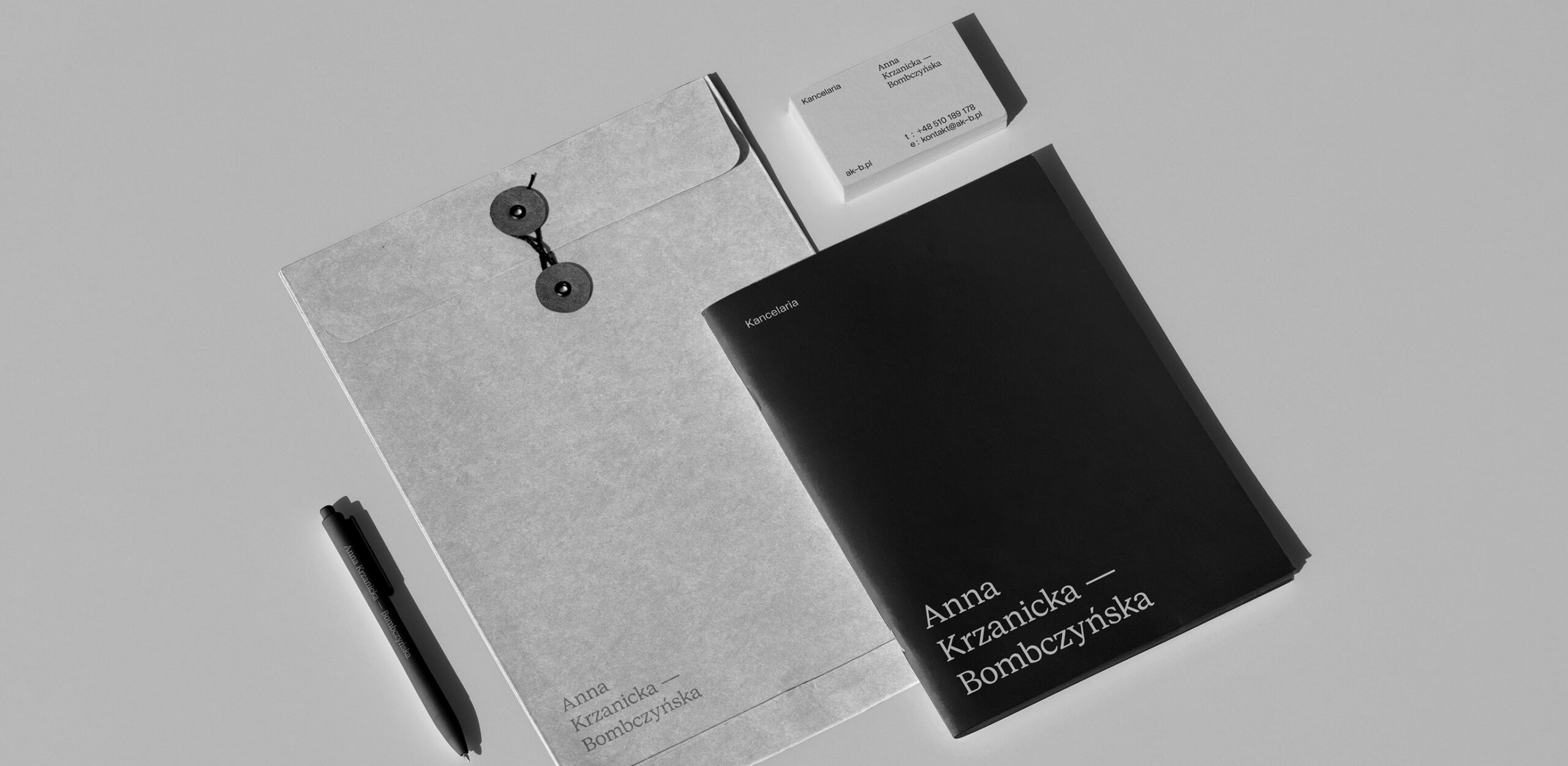
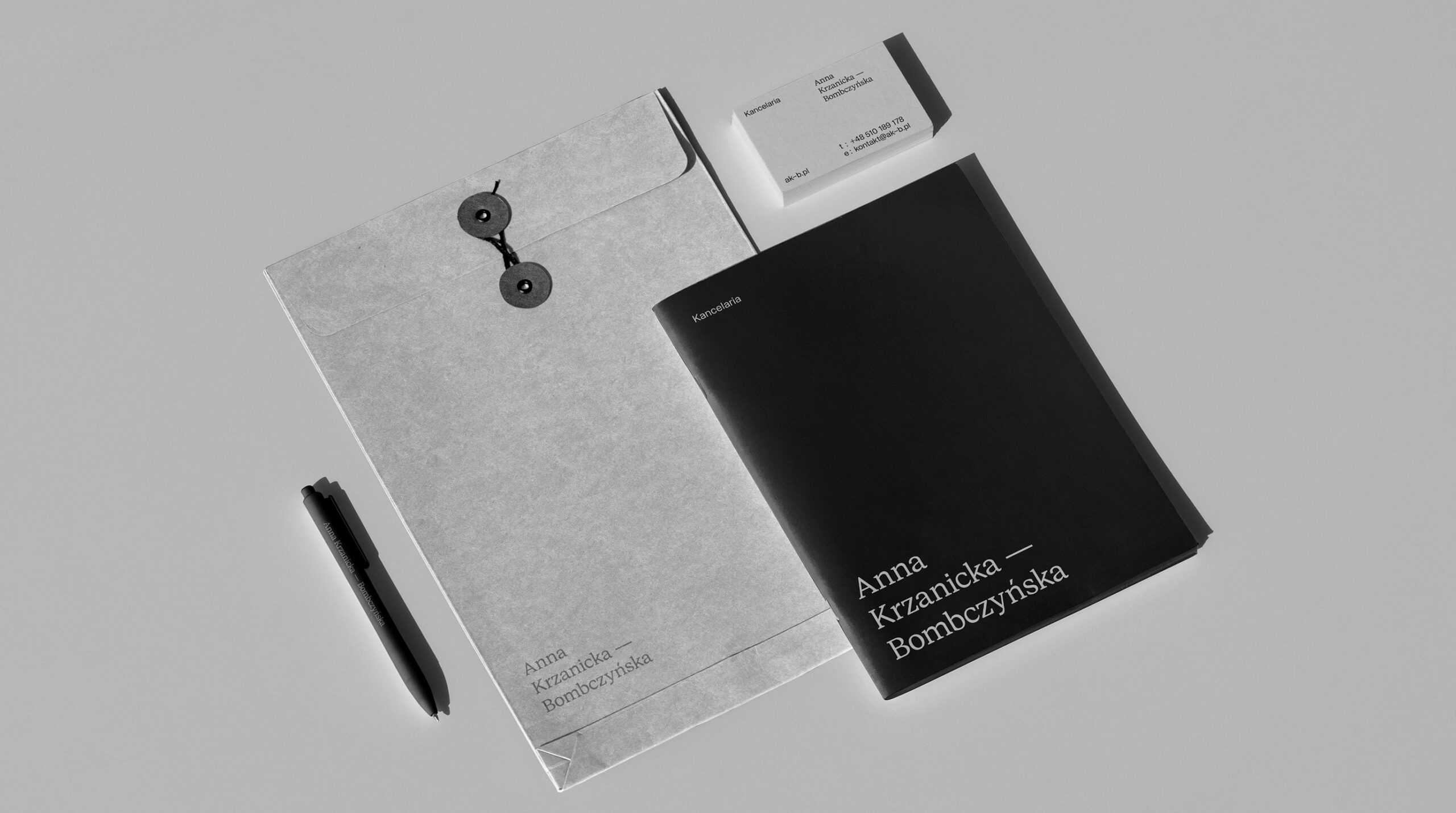
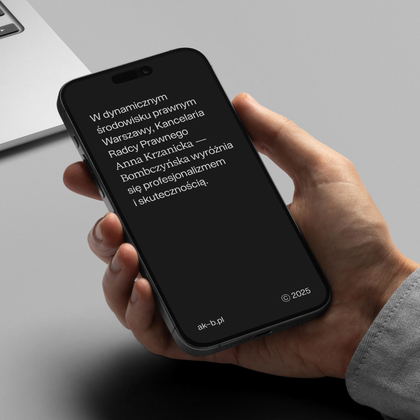
Design system balances serif and sans-serif type to reflect both precision and approachability – two traits essential in legal practice.
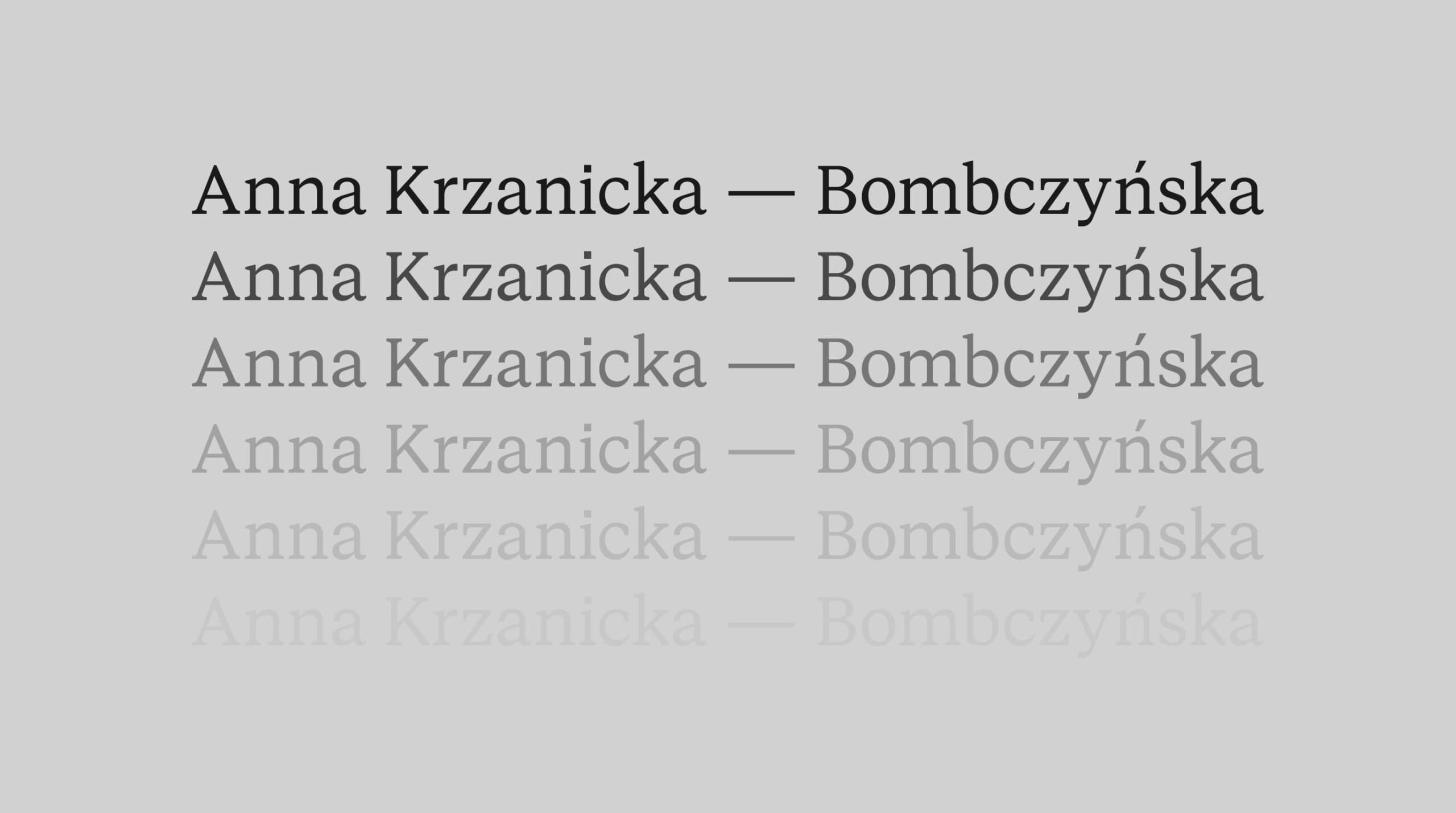
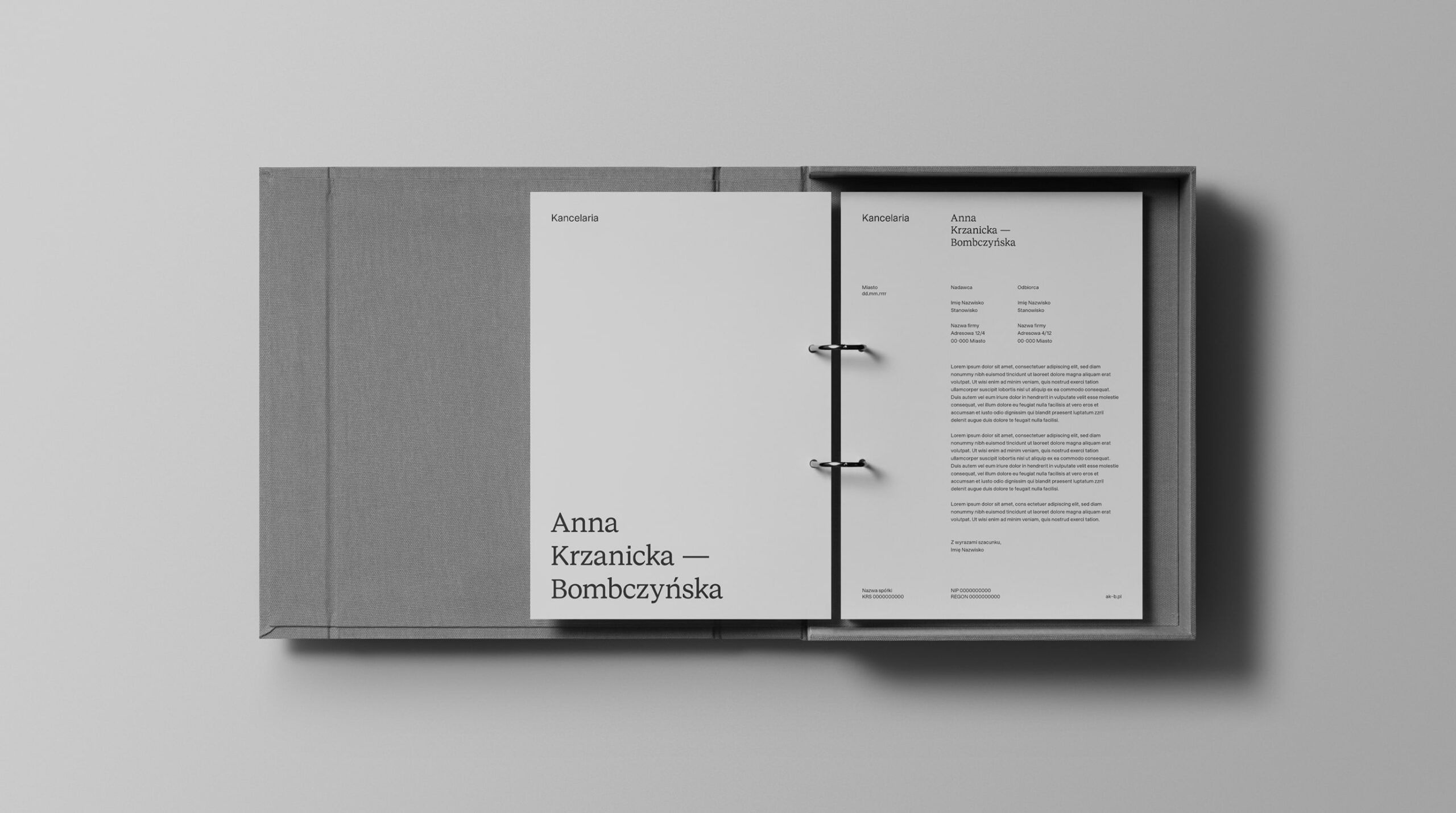
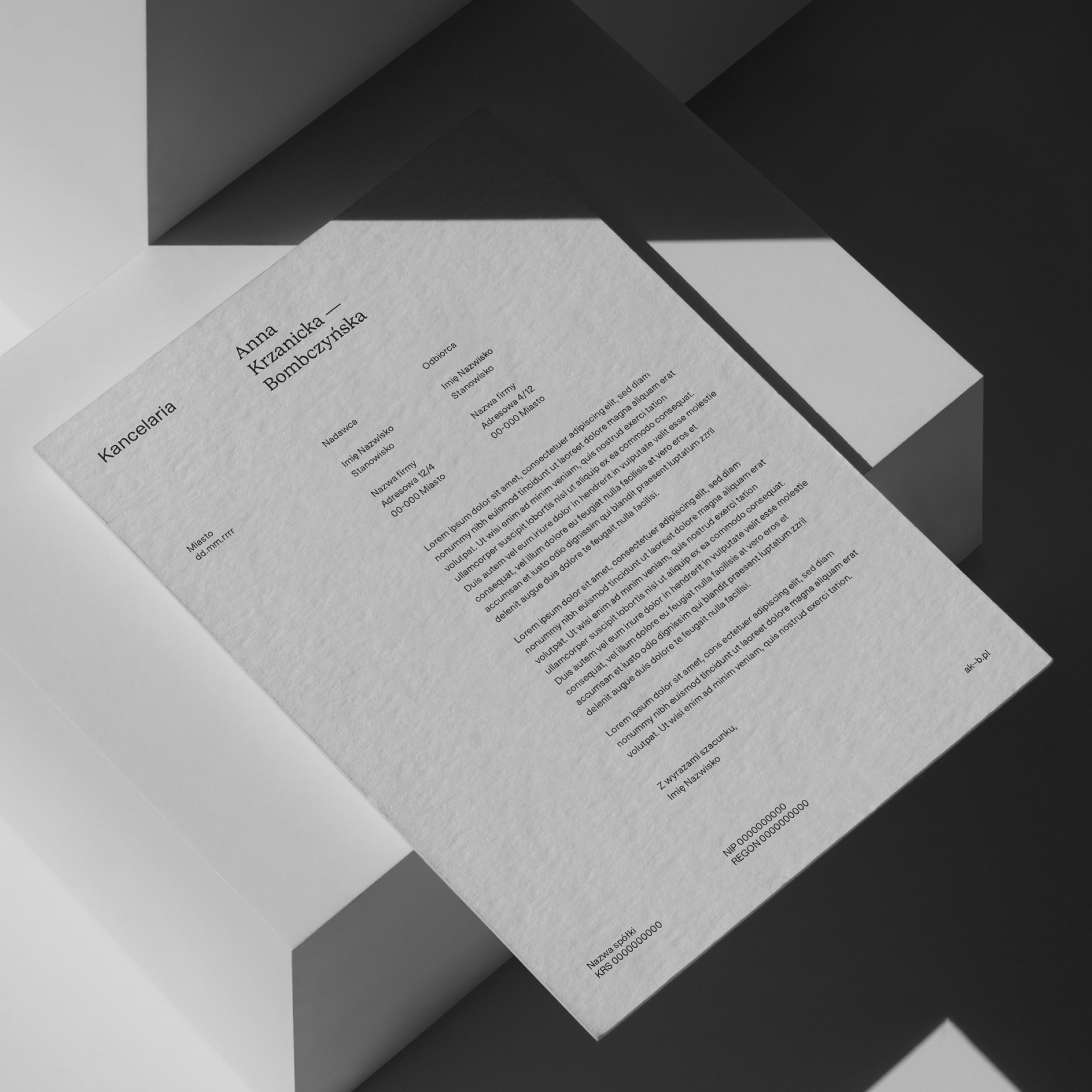
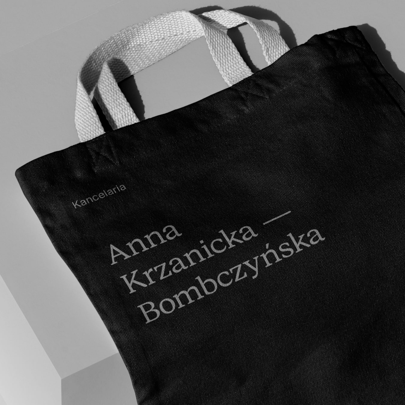
The logotype is built around the client’s surname and adapts to context: compact and personal on a business card, more formal
and spaced out in documents.
Instead of a hyphen, we use a pause – a subtle graphic gesture that gives the name space to breathe. The palette stays within soft, broken greys.
Nothing loud. Just a quiet confidence that holds its ground.
Scope
Branding / Brand Materials /
Communication
Tools
Figma / MS Office /
Illustrator / Photoshop
Client
Anna Krzanicka — Bombczyńska


Credits
Leniva° Studio
Concept: Lena Mitkowa
Brand Design: Kamil Przybyła
Brand Implementation: Krystian Sikoń
Client
Anna Krzanicka — Bombczyńska