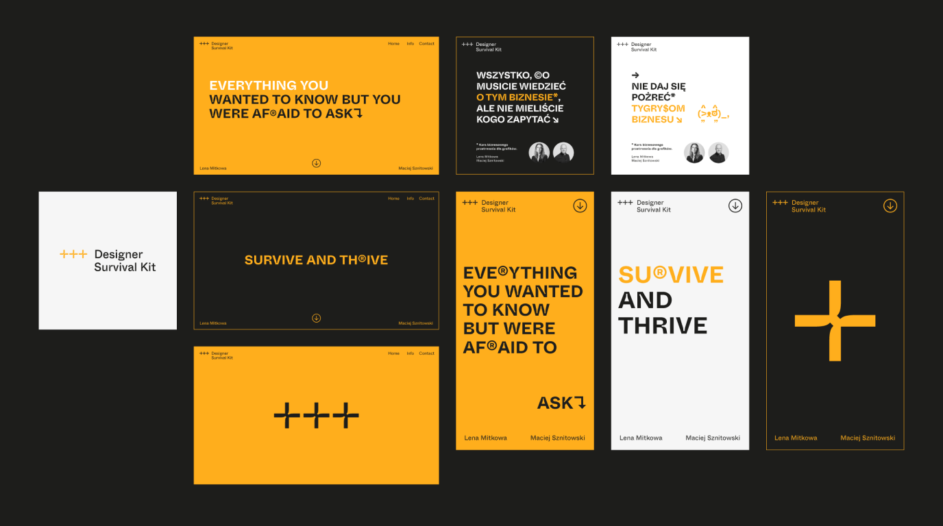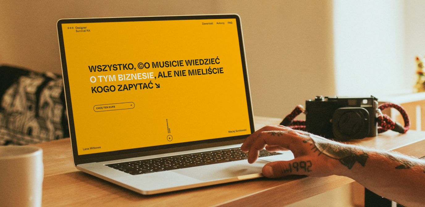
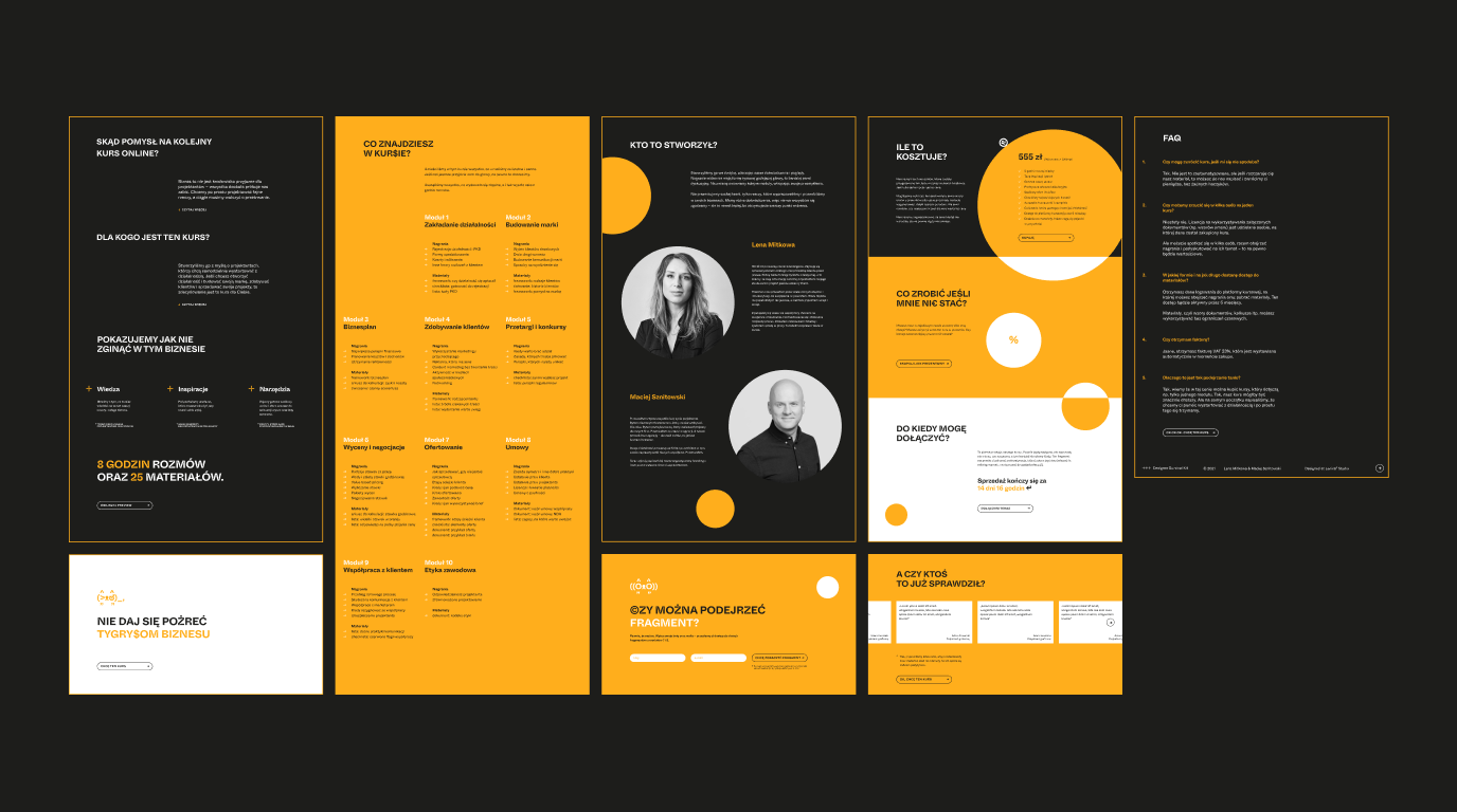
Designer Survival Kit is Maciej Sznitowski’s (Brandoholic) and, our creative director, Lena Mitkowa’s training project. It is a course designed for graphic designers (with particular emphasis on branding), both for beginners and for those who already feel comfortable on the market.
Info ↘
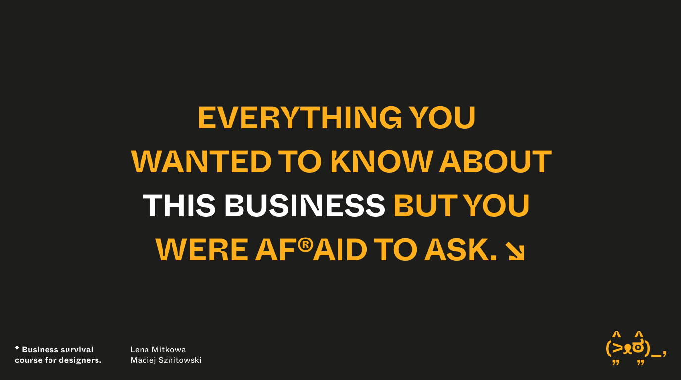
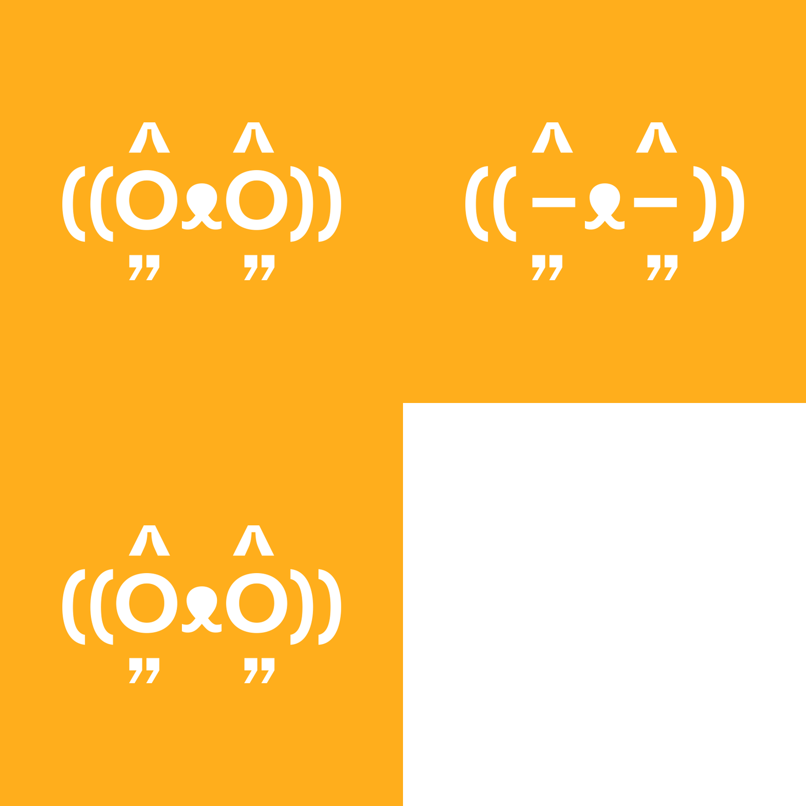
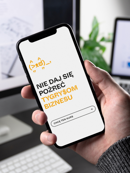
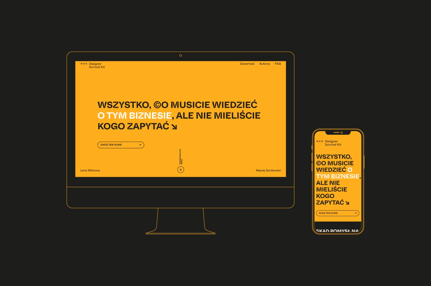
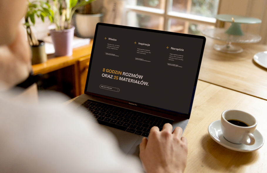
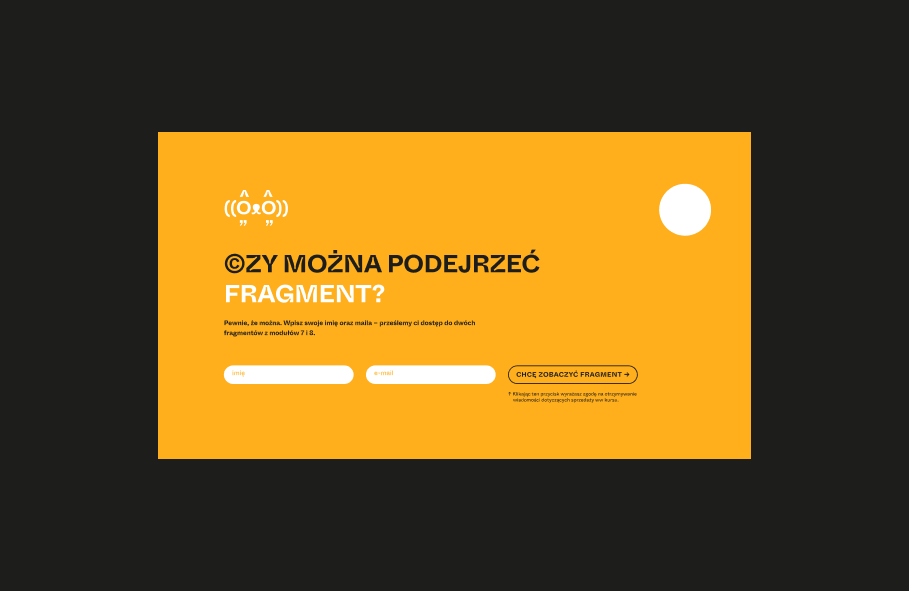
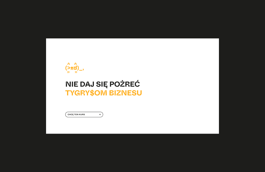
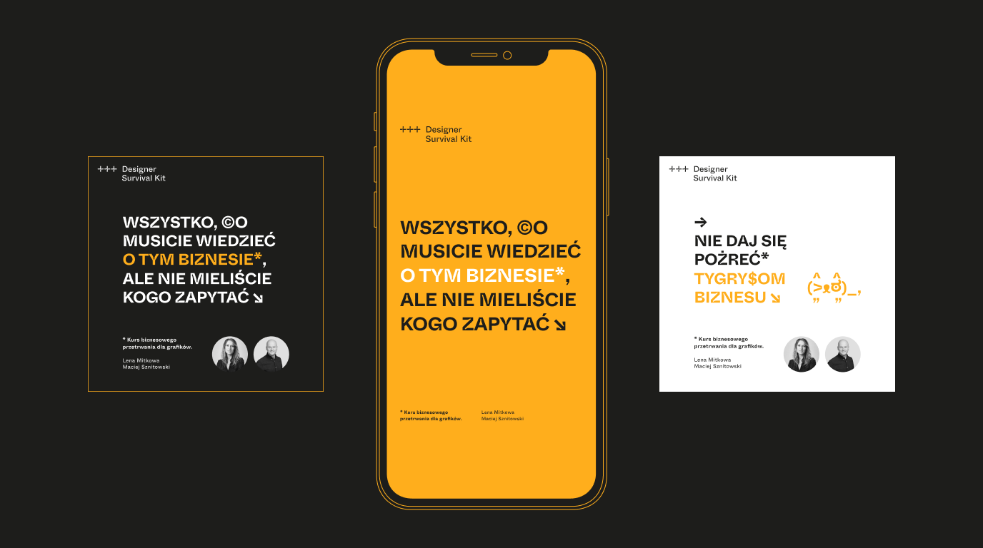
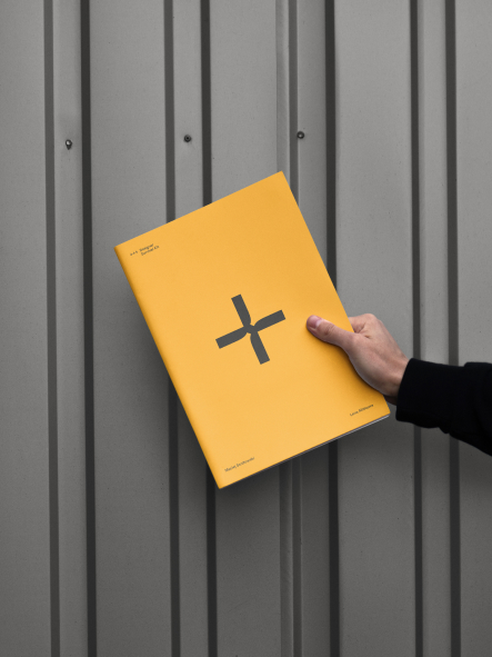
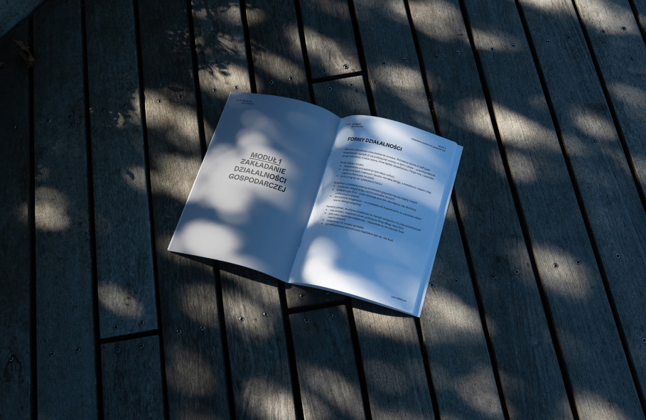
The entire course consists of over 8 hours of talks and lectures, as well as ready-made sets of solutions and templates for designers – contract drafts, billing tables, and frameworks. The branding we have developed for this service is based on bold contrasts and, above all, playing with typography. Minimum means, maximum effect. Plus a bit of humor and perversity. In terms of meaning, we wanted to move away from obvious, almost trivial associations, such as first aid, Swiss army knife, survival or stars awarded in crash tests.
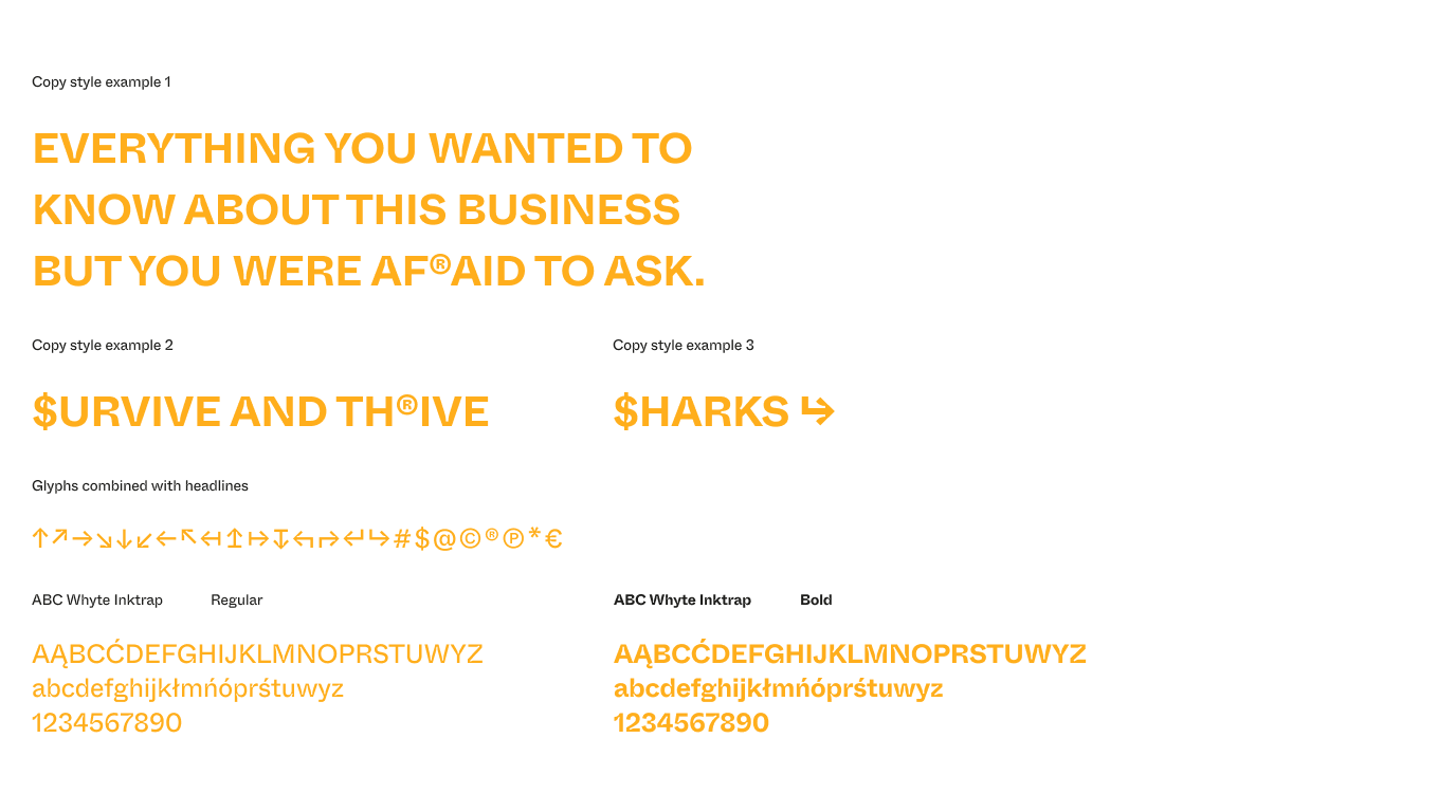
Formally, however, we wanted to maintain the strikingly utilitarian nature of the project. Hence the choice of crashtest/survival colors and the decision to use the expressive, contemporary grotesque from Dinamo Typeface – Whyte, in the version with inktraps. For some, it’s a trend, for us, it’s an opportunity for real-time marketing to the typesetting shop regulars. Because it is a non-obvious course, without an age limit. All this is the background for a narrative that is almost entirely verbal, simple, specific, but still done perversely and with a distance, treating its own call to action.
Scope
Design / UX / GUI
Tools
Figma / Illustrator
Client
DSK
Credits
Team Leniva° Studio
Brand concept, Key Visual: Neon Neonov, Kamil Przybyła
UX/GUI: Jan Mońka, Kamil Przybyła
Design Support: Marta Krzemień-Ojak
Production: Lena Mitkowa, Saskia Mońka
Client’s Team
Lena Mitkowa
Maciej Sznitowski
