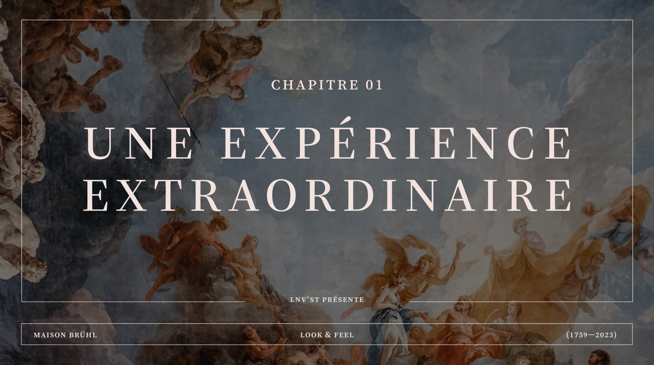
A light and frivolous brand experience. Under the patronage
of Countess Bruehl.
Info ↘
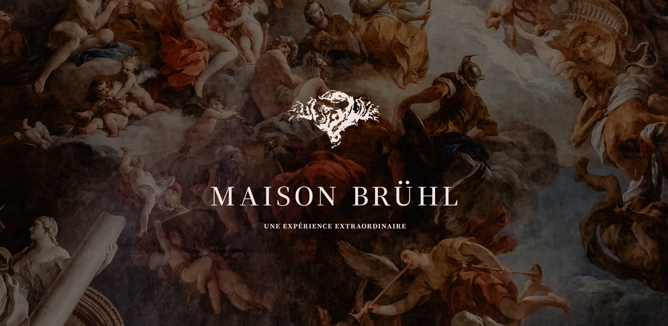
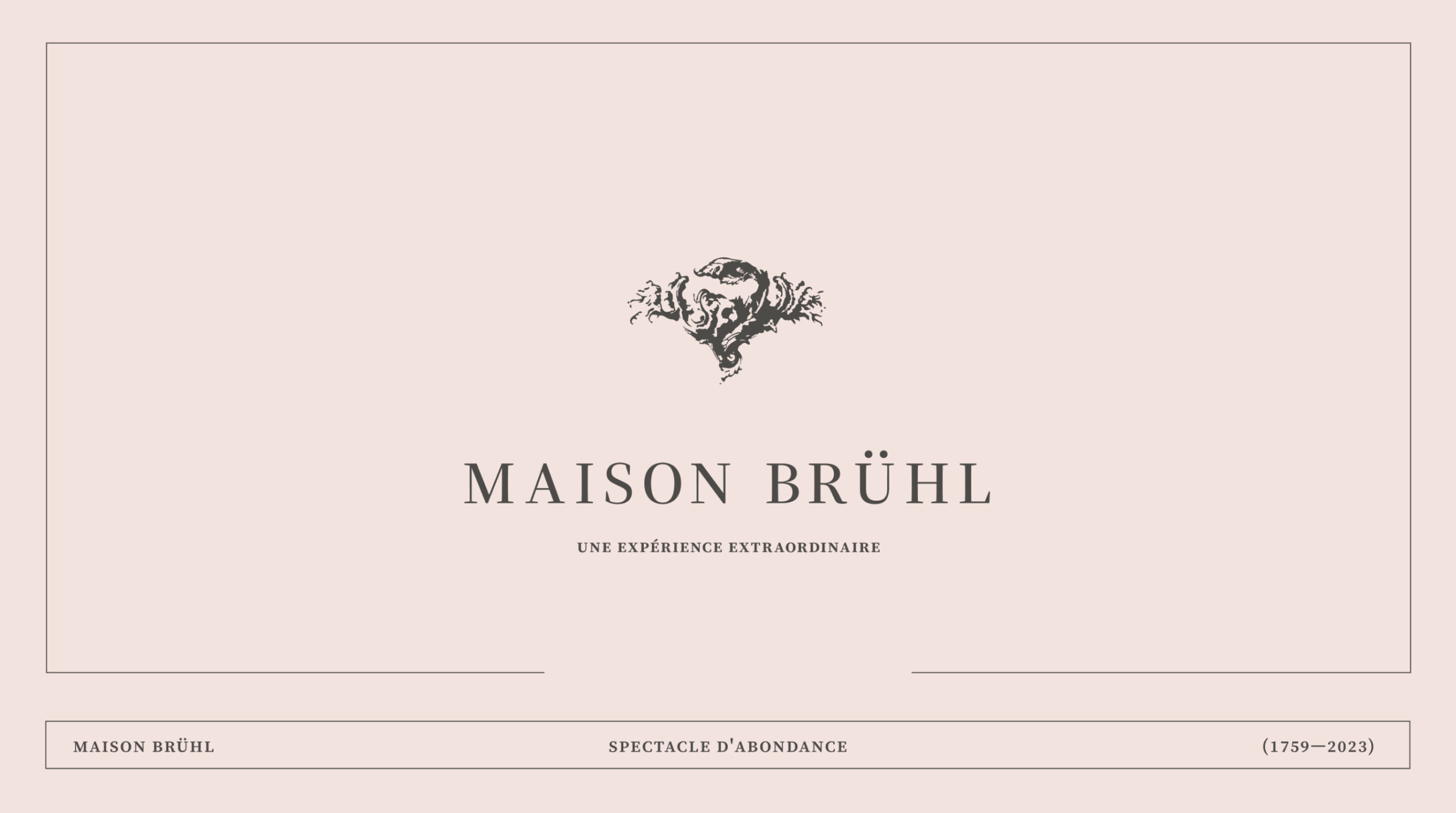
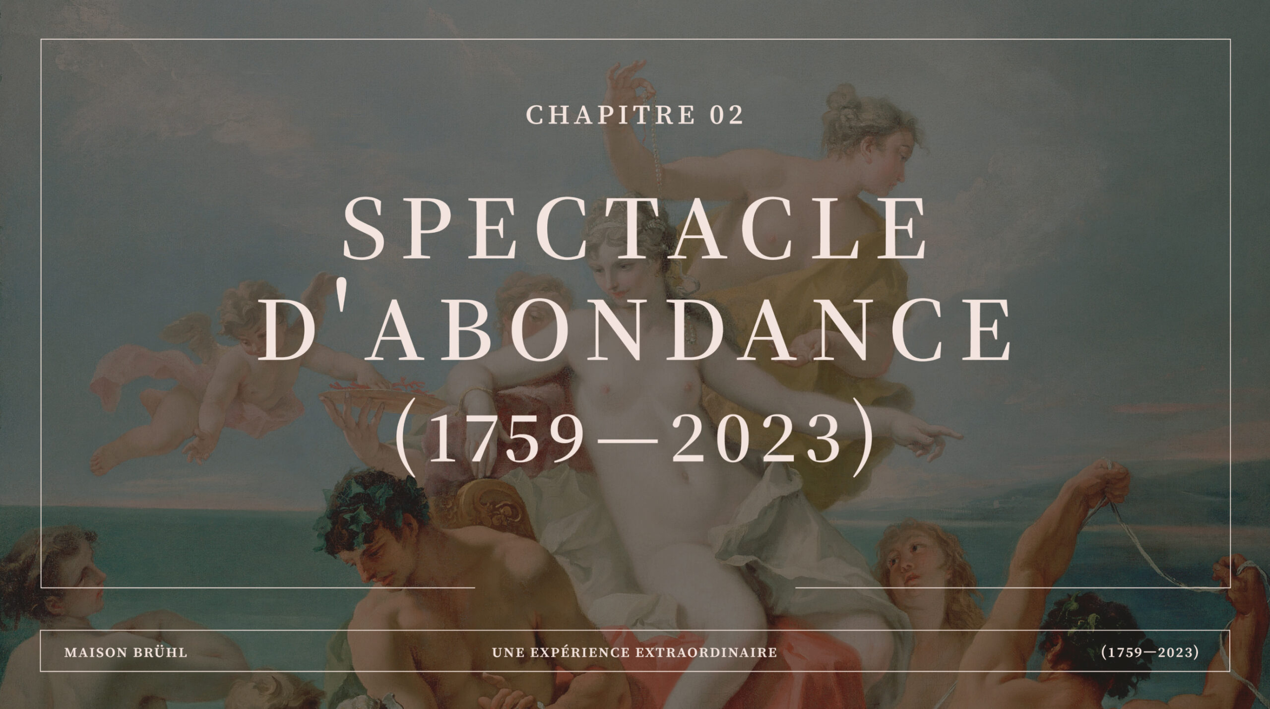
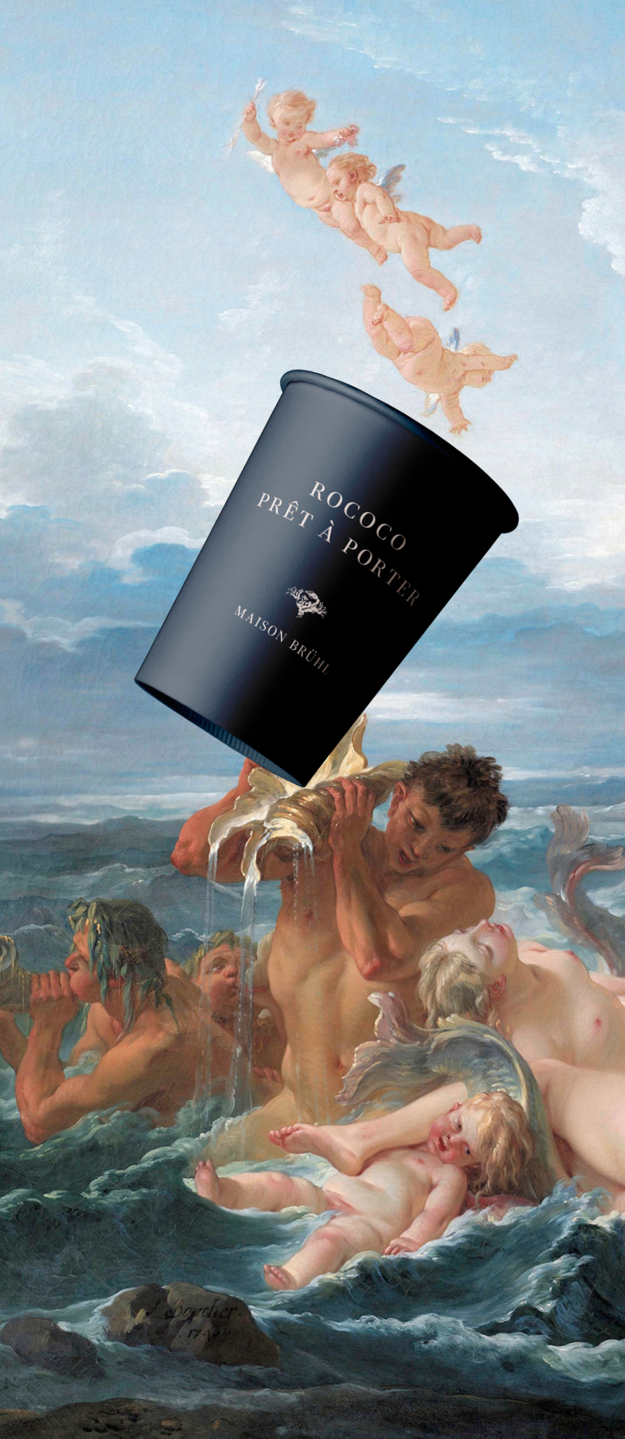
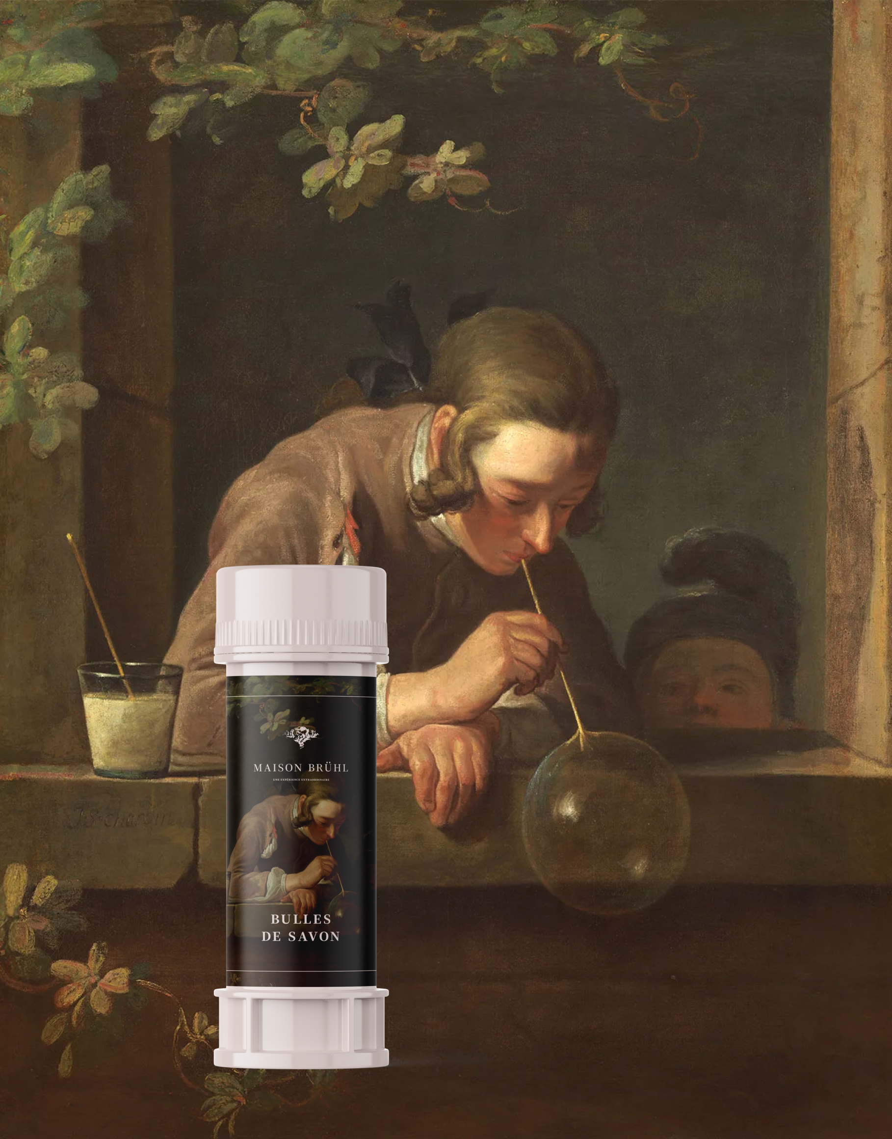
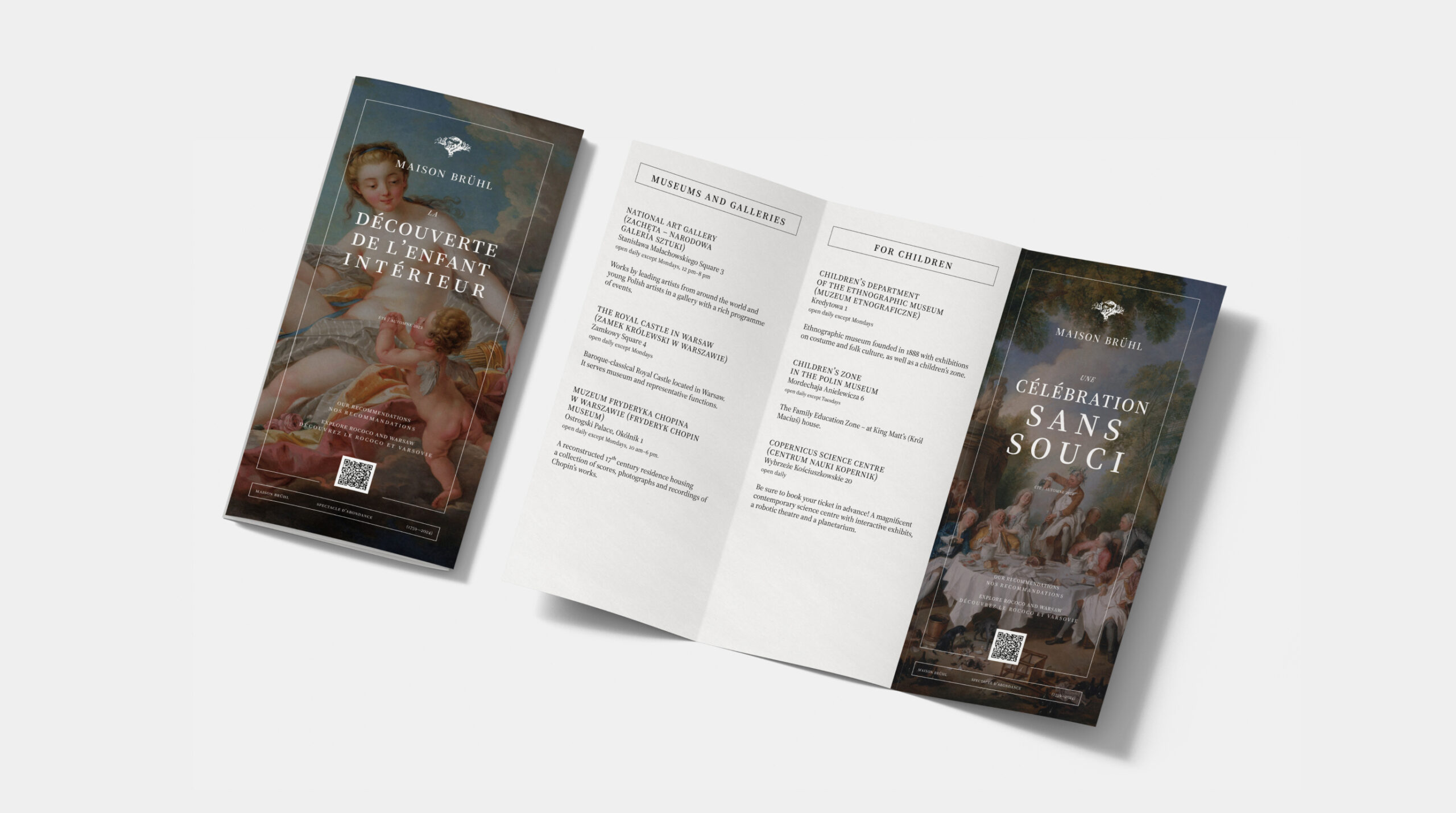
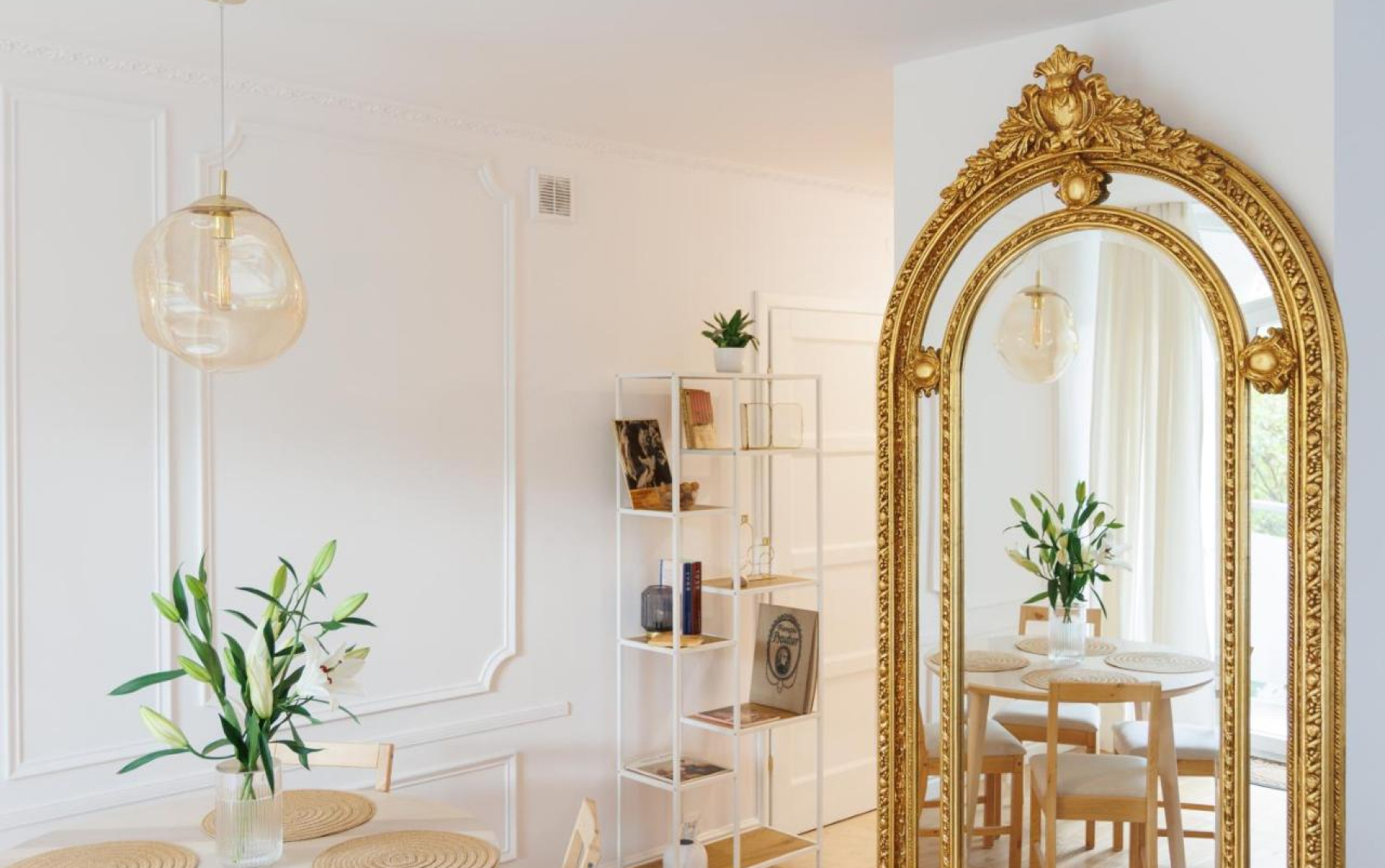
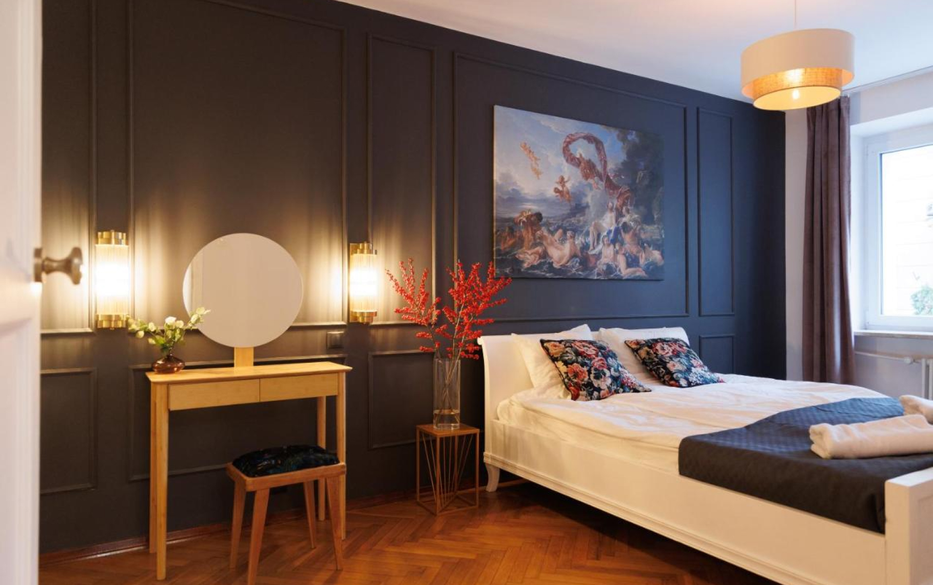
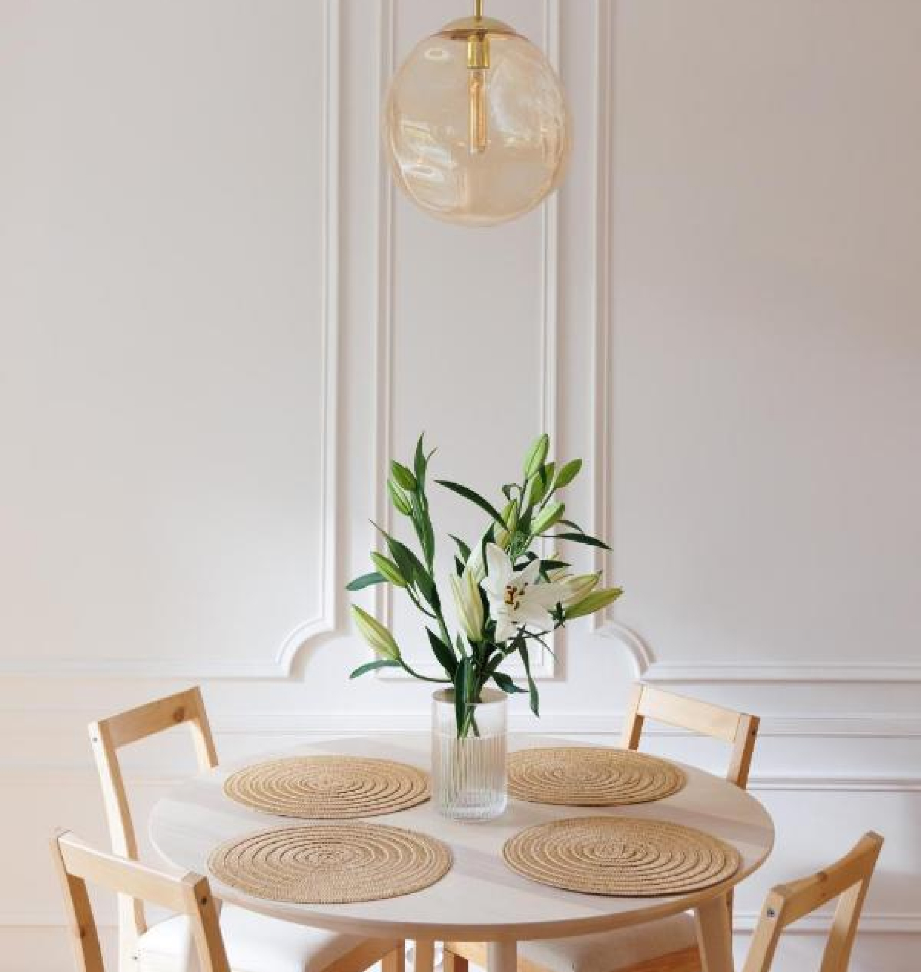
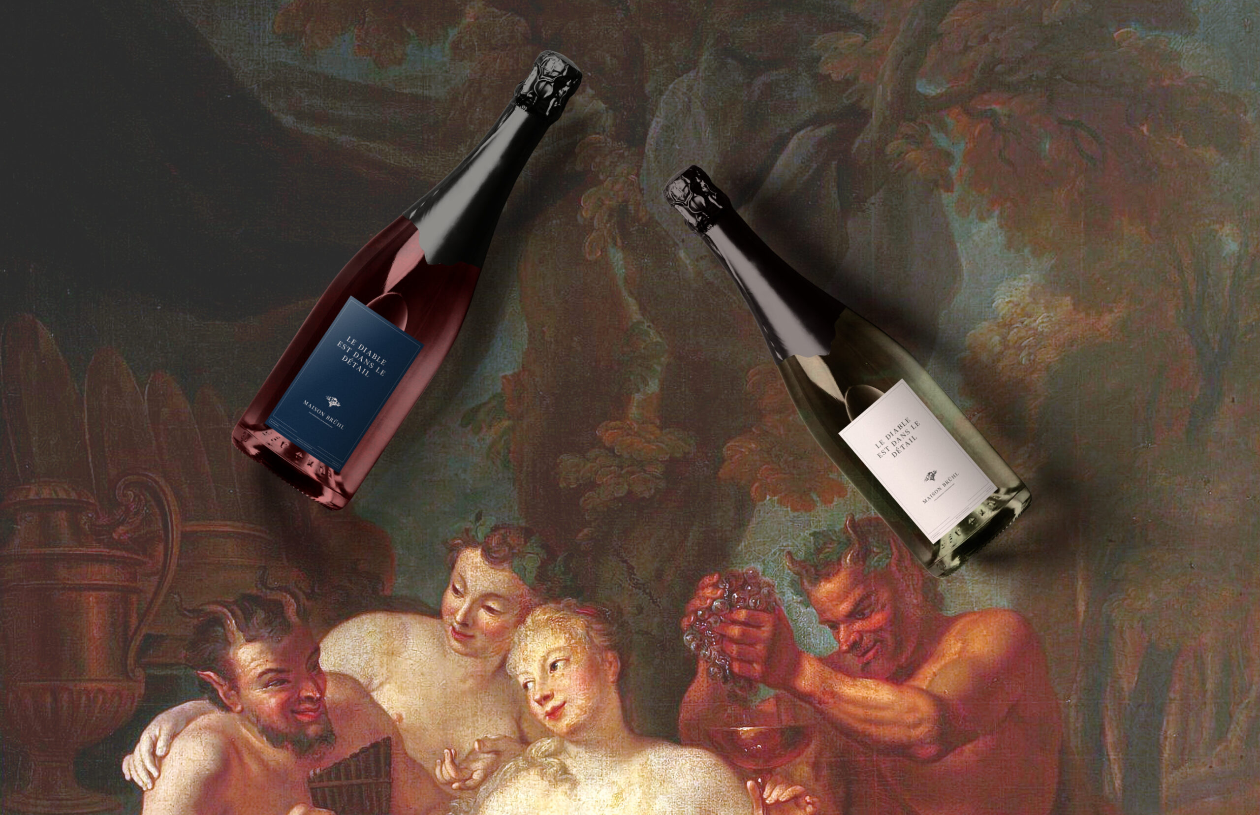
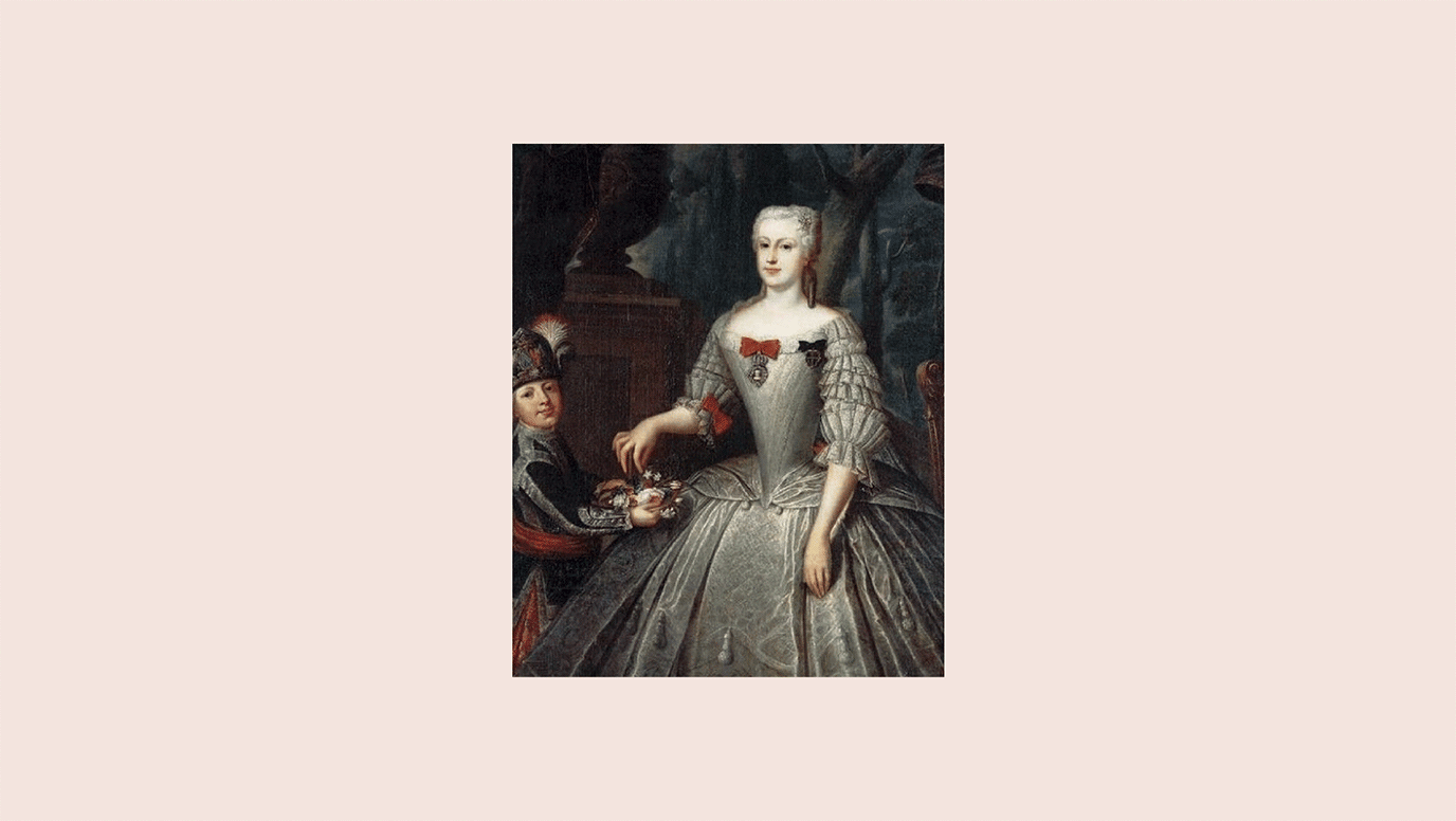
Maison Bruehl is not just an exclusive apartment in the heart of Warsaw, but above all, a unique invitation for connoisseurs wanting to experience the city from an unusual perspective.
Situated where the Bruehl Palace garden used to be, this suite takes its guests back in time, offering a Rococo aesthetic.
Scope
Branding
Tools
Illustrator / Photoshop
Client
Maison Brühl
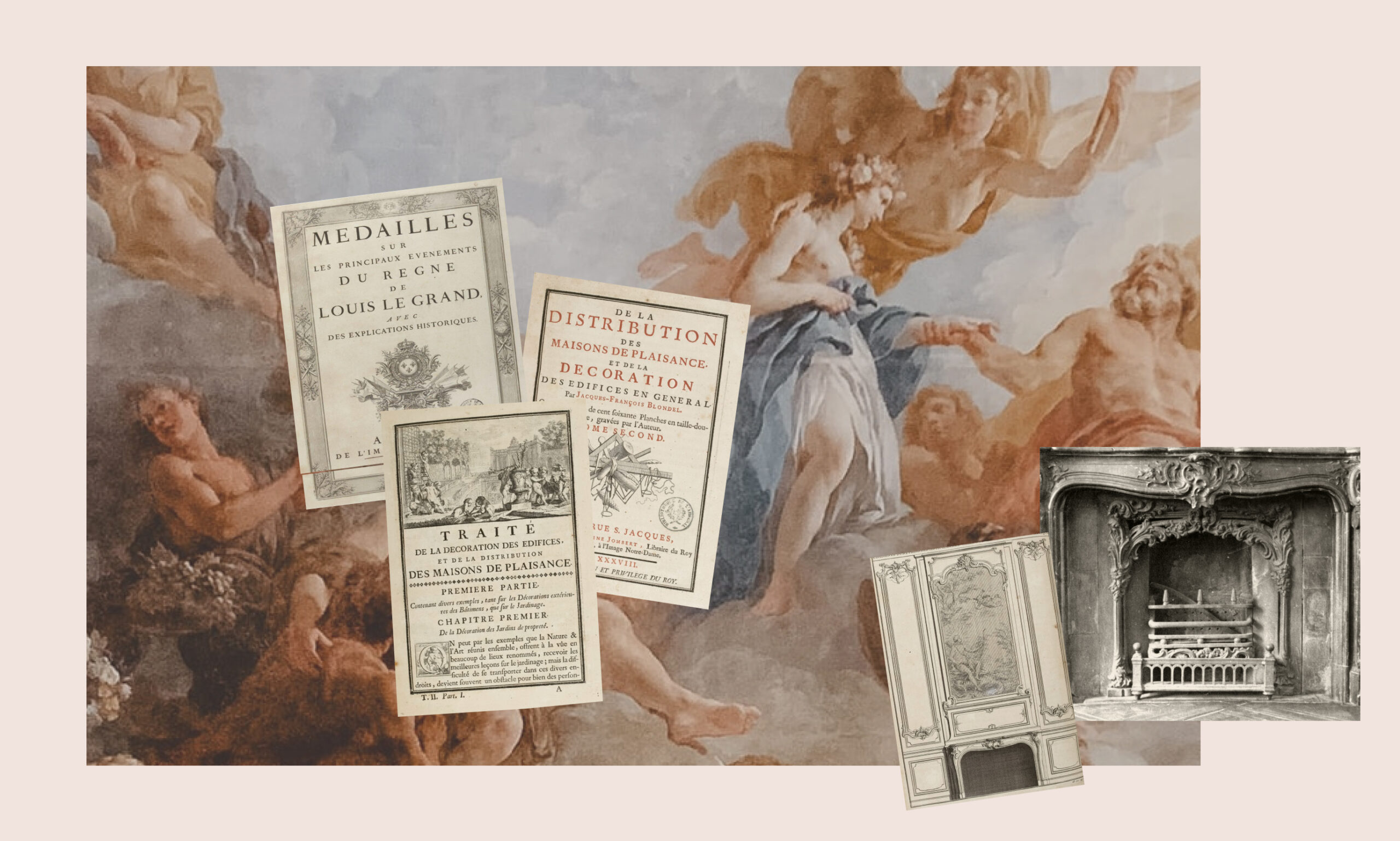
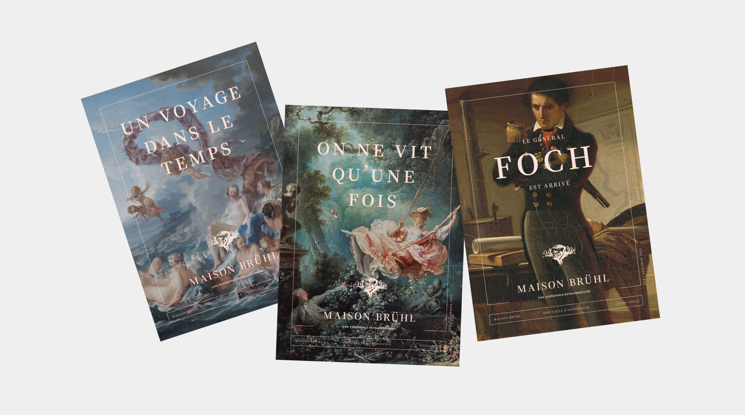
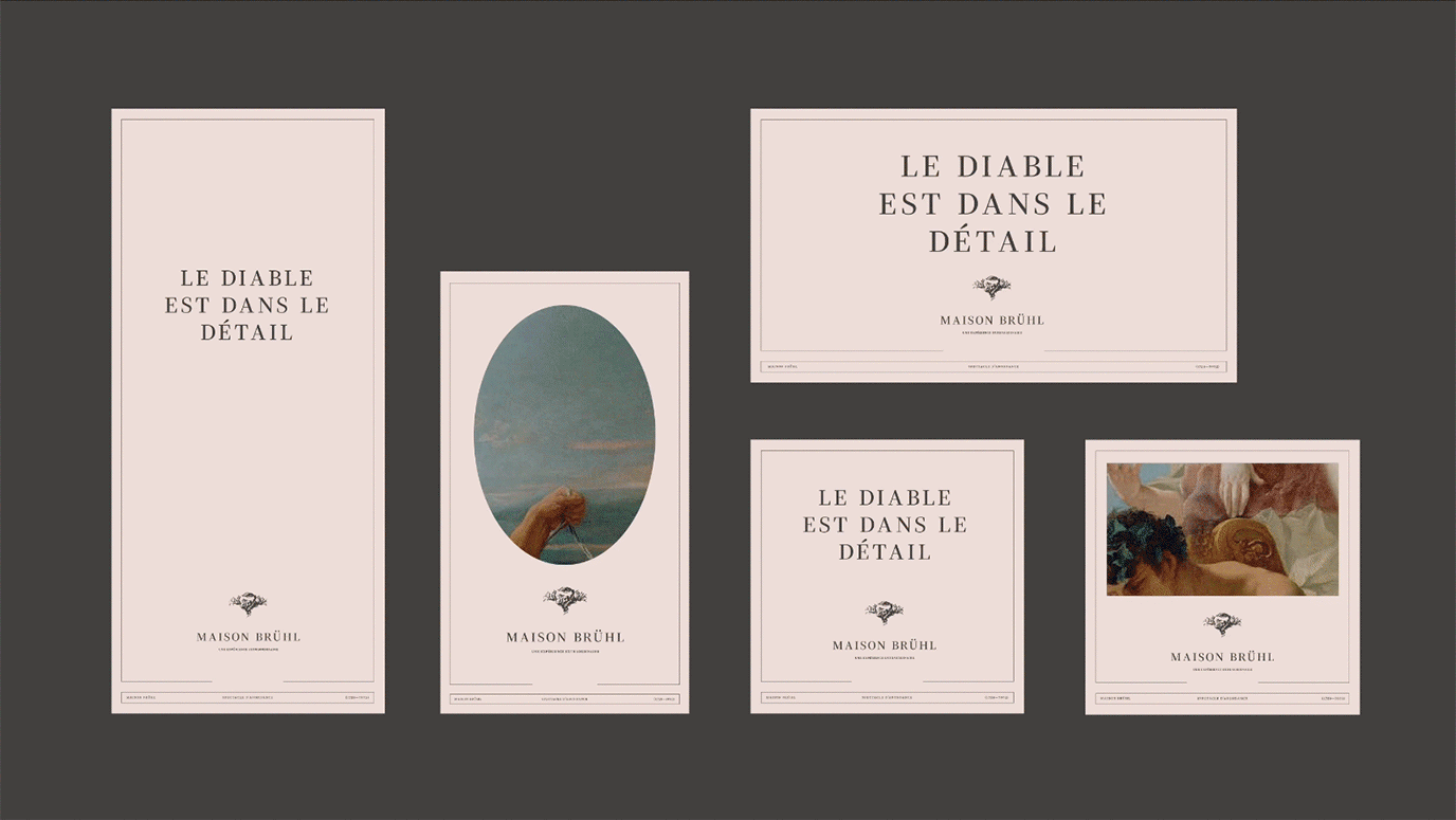
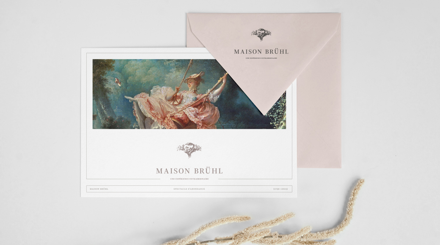
Our task was to create a unique setting for this place, which starts with the visual identity, incorporates the language of communication, and ends with unique gadgets. Every element of our work reflects the authenticity and history of this place.
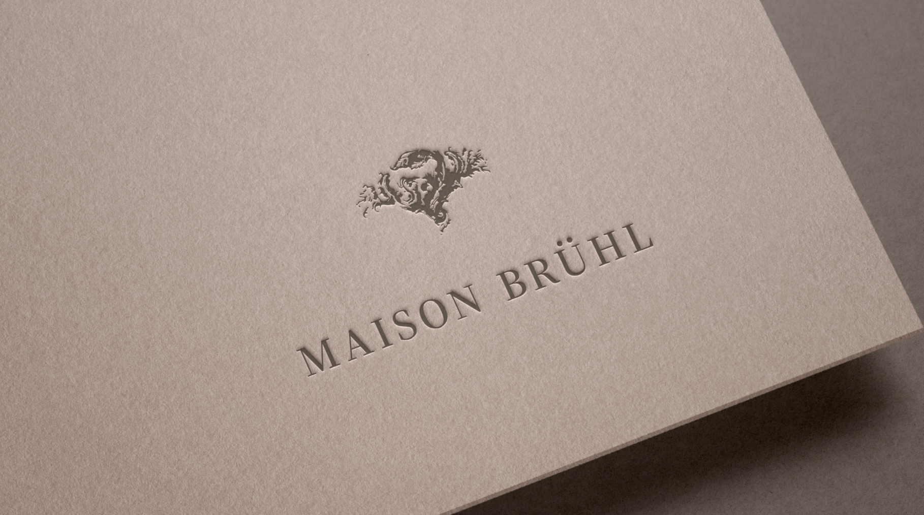
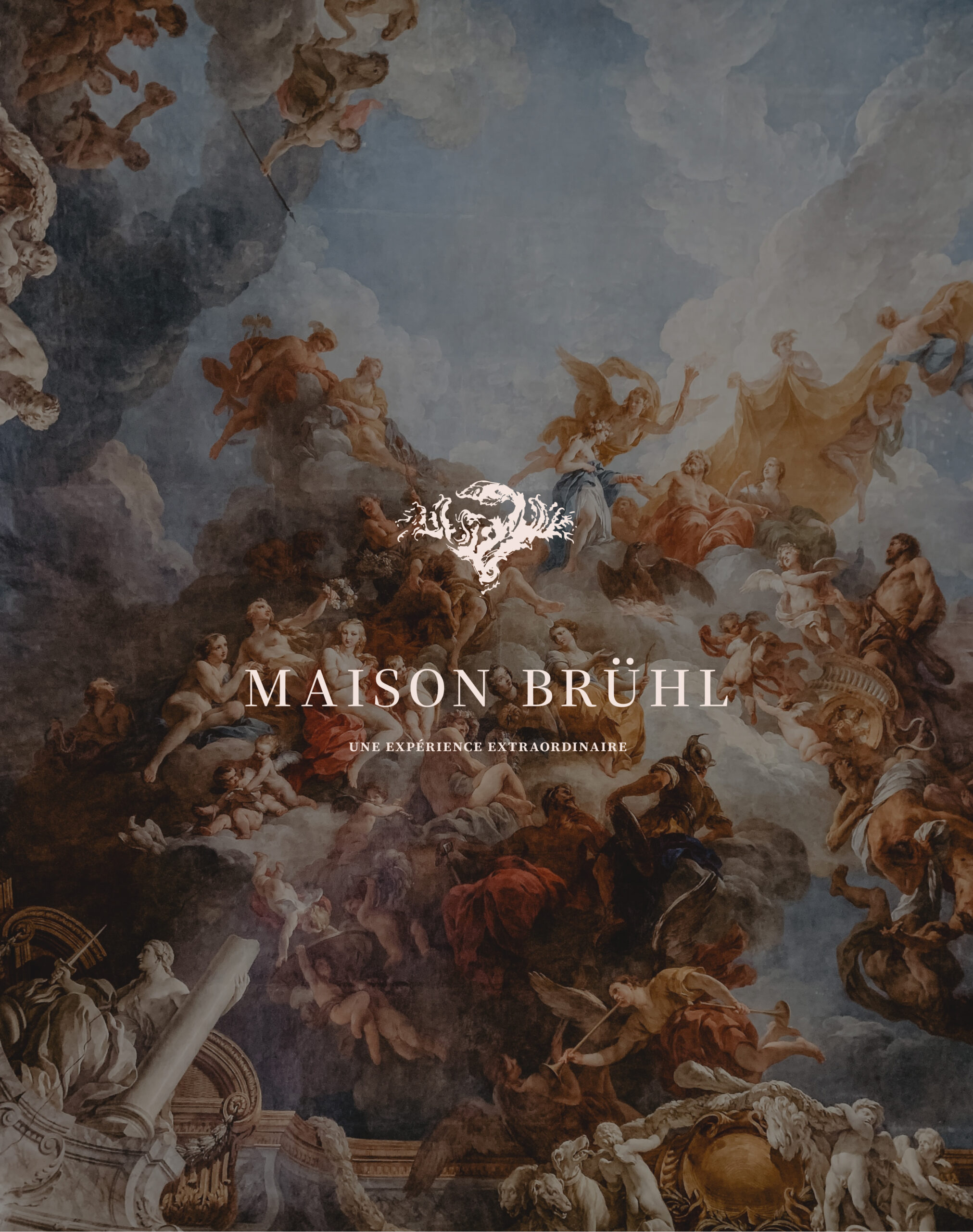
The logotype is an exquisite reconstruction of a fireplace stucco detail from the original palace – one of the few elements of the original Rococo interiors that survived in pre-war photographs.
Credits
Concept and Art Direction:
Neon Neonov
Logo reconstruction:
Kamil Przybyła
Design:
Marta Krzemień–Ojak
CX / Production:
Lena Mitkowa, Saskia Mońka
Photo courtesy of Maison Bruehl
Perfected Performance
Is it possible to take the relationship between man and machine to another level, beyond purely utilitarian? If you want to see how to implement an emotional approach to automotive-related design, check out our branding process for Perfected Performance (Awaken Performance). Because emotions can be as rough and brutal as going at full speed.
Read more

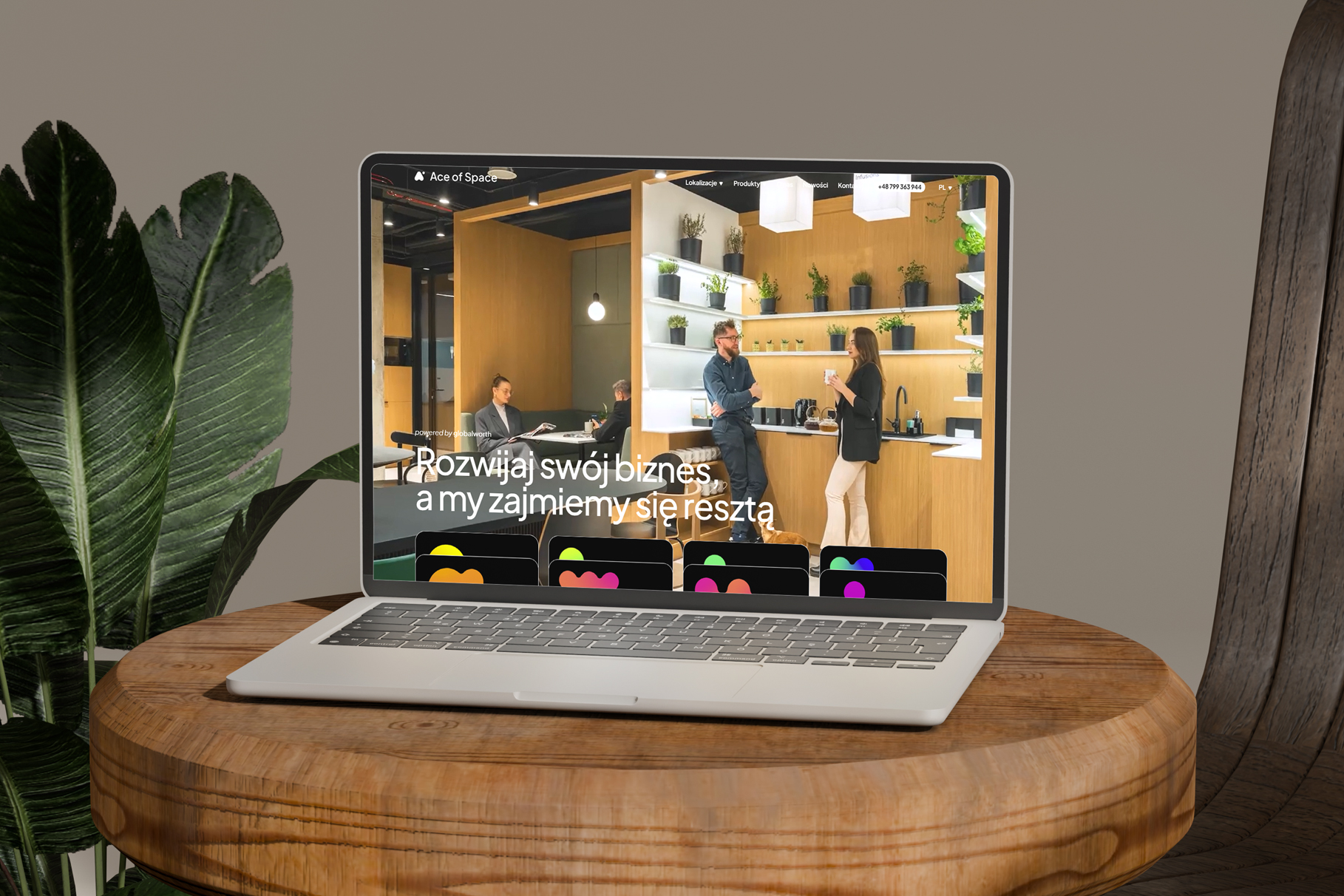
Ace of Space - Website
The Ace of Space website is more than just a modern layout and animations – it’s a comprehensive business tool that works for both brand image and sales.
We designed it to combine an engaging user experience with full content control on the client’s side.
Read more