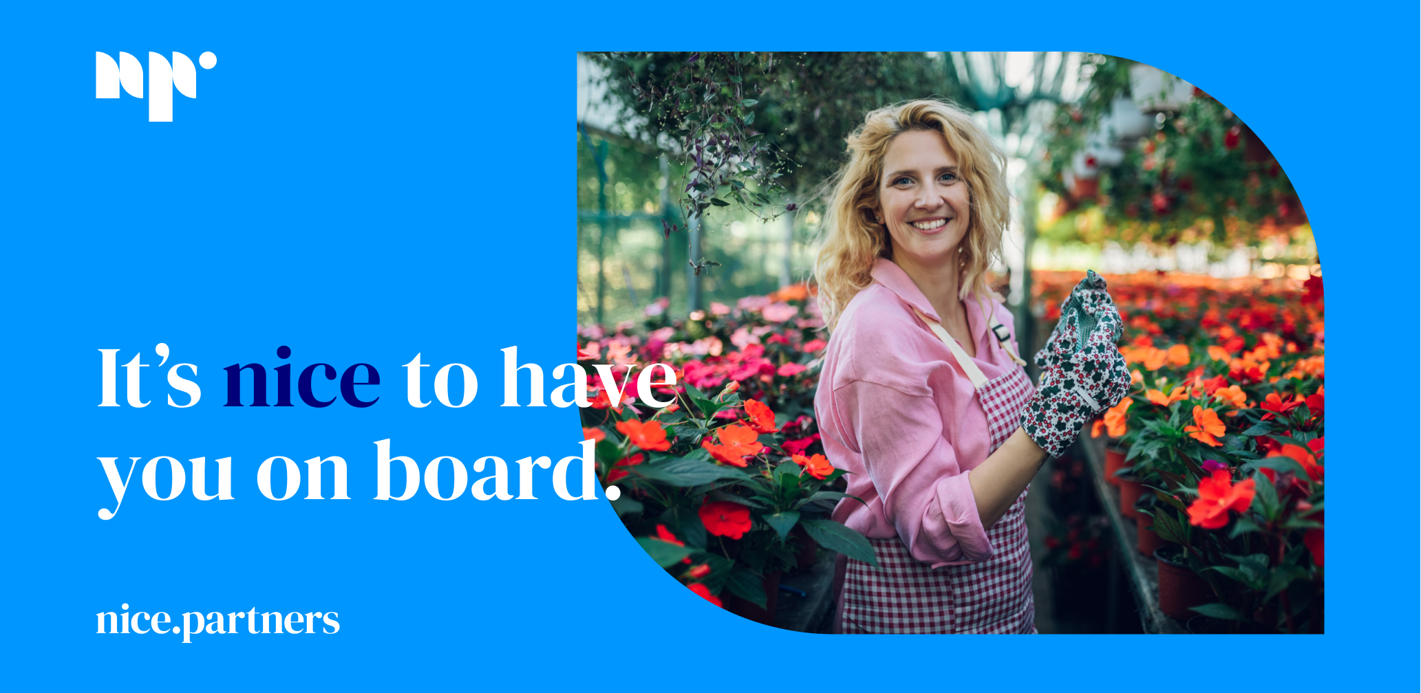
We are all different. We think, work and live in different ways. That’s why we need a better, kinder way to grow. The first place to offer job support that actually holds your back. Someone who can focus on finding the solution and not on a problem. In a kind, honest, friendly and direct way.
Info ↘
This was the goal that we envisioned for our client specializing in the recruitment services. His business consists of support in the search for employers and employees in Germany and Poland. But this is actually only the beginning of his task. At the center are always people and their needs.
What matters most is building a true relationship based on empathy, commitment and trust. It’s nice to be treated as an equal partner. It’s nice when someone offers you unconditional support in a new job, in a new place. It’s just nice to be taken care of.
Scope
Strategy / Naming / Branding /
Design
Tools
Illustrator / Figma
Client
nice.partners

Nice and easy
Nice.partners was meticulously crafted after a long series of meetings, workshops and research. We prepared the strategy and positioning of the brand.
The brand’s basic premises are: what matters most is people, how they feel and how we can help them. We suggested the name nice.parters – and luckily our client loved it as much as we did.

Customer’s always first
People come first – regardless of their age, gender or background. Nice.partners puts itself in a servant role – offering full support at all stages of the recruitment process, but also during the daily lives of employees and their employers.
We developed materials designed to make it as easy as possible for people to find their way in a new situation, helping them to avoid potential problems.
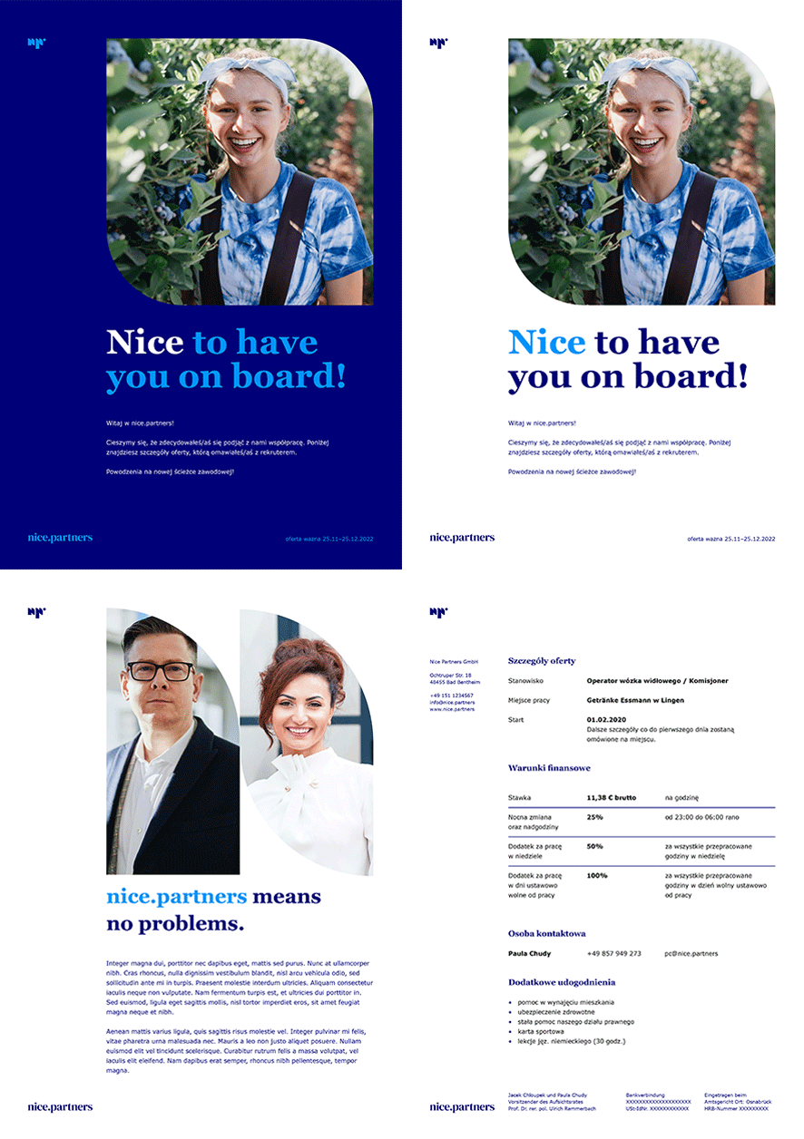
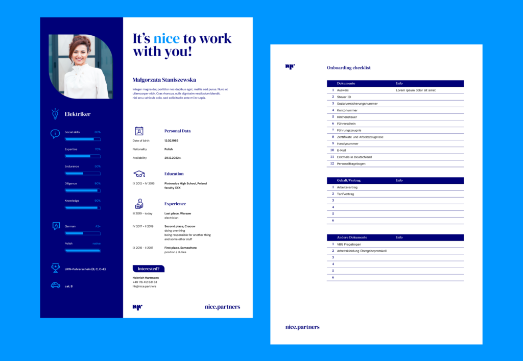
It’s nice to work with you
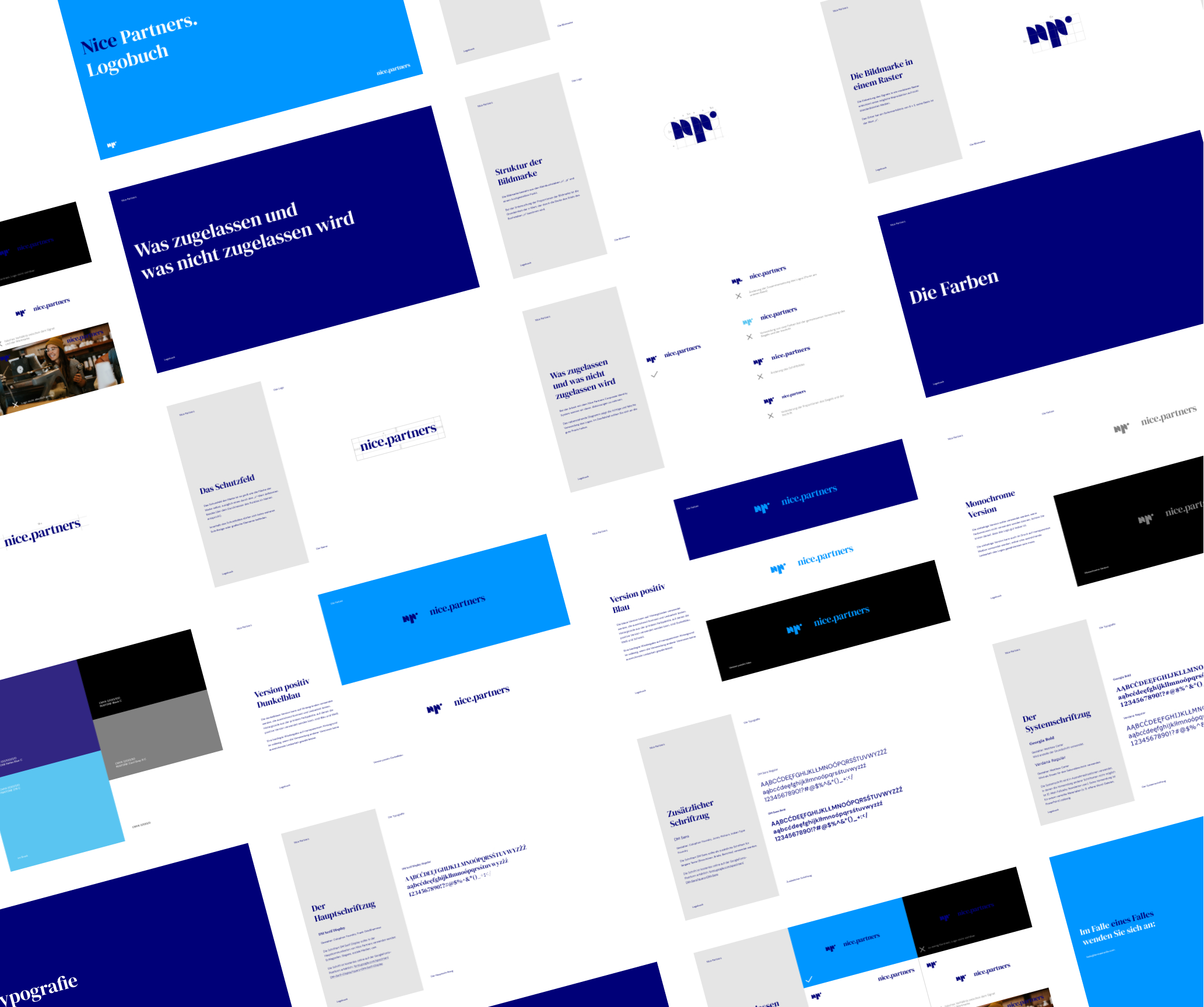
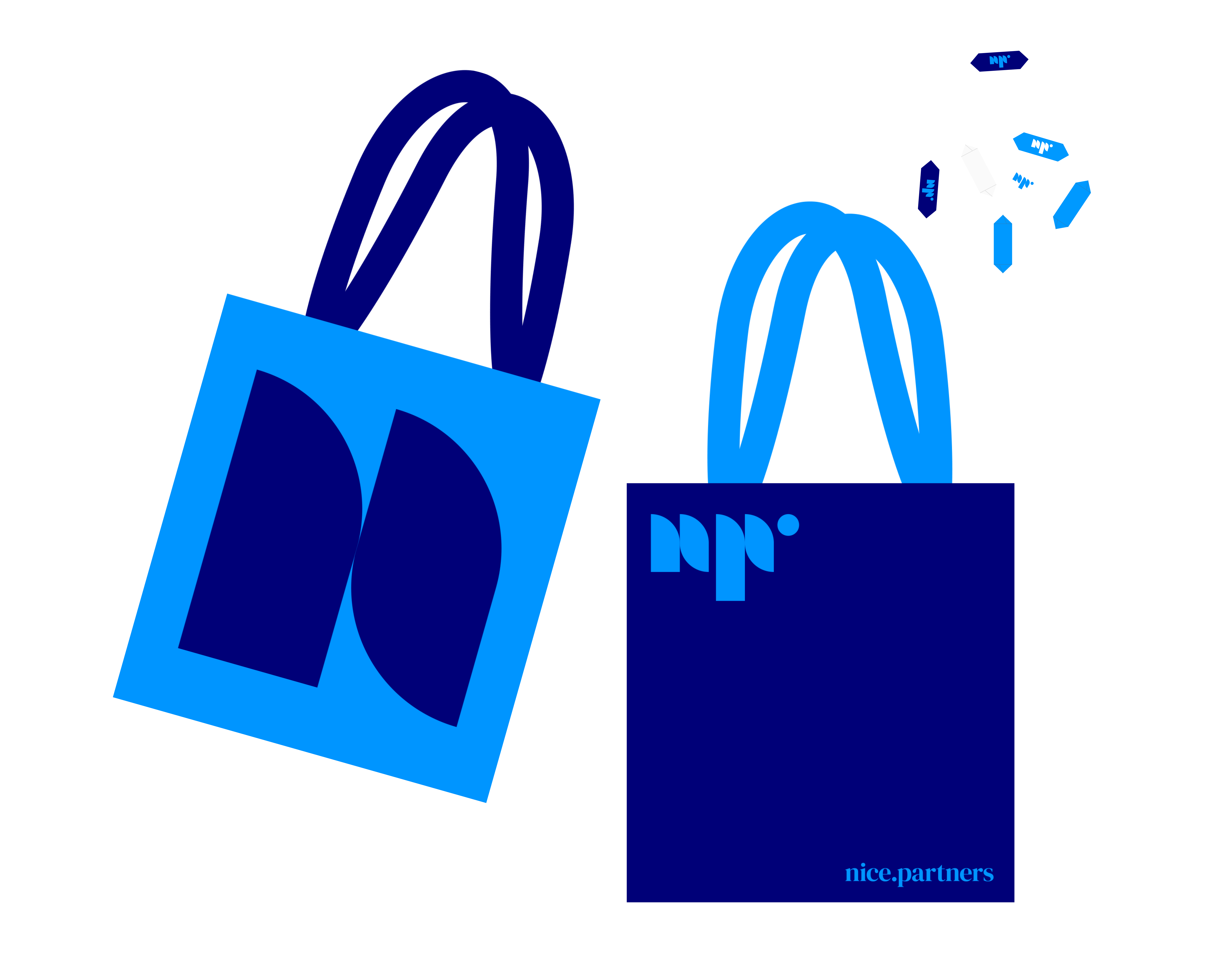
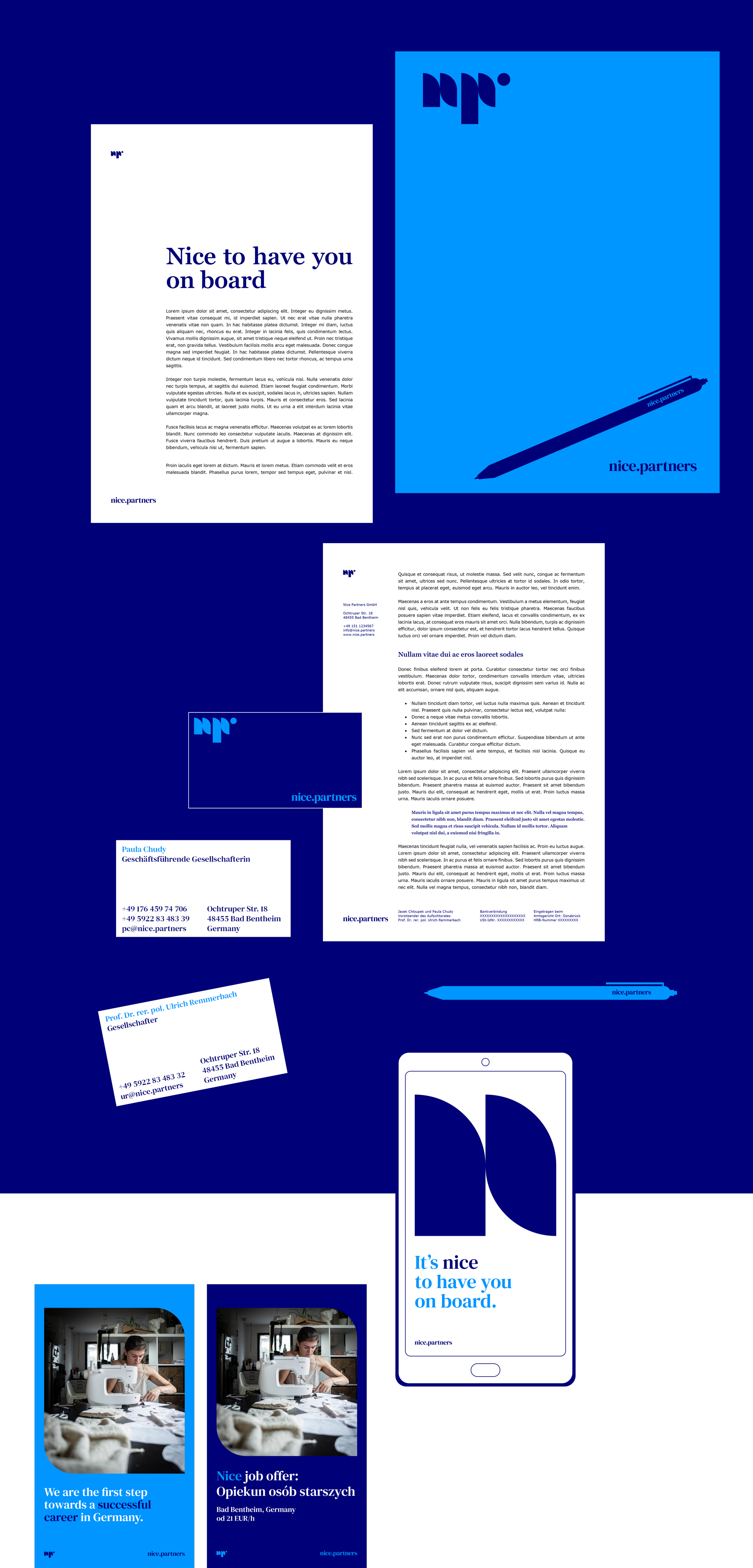
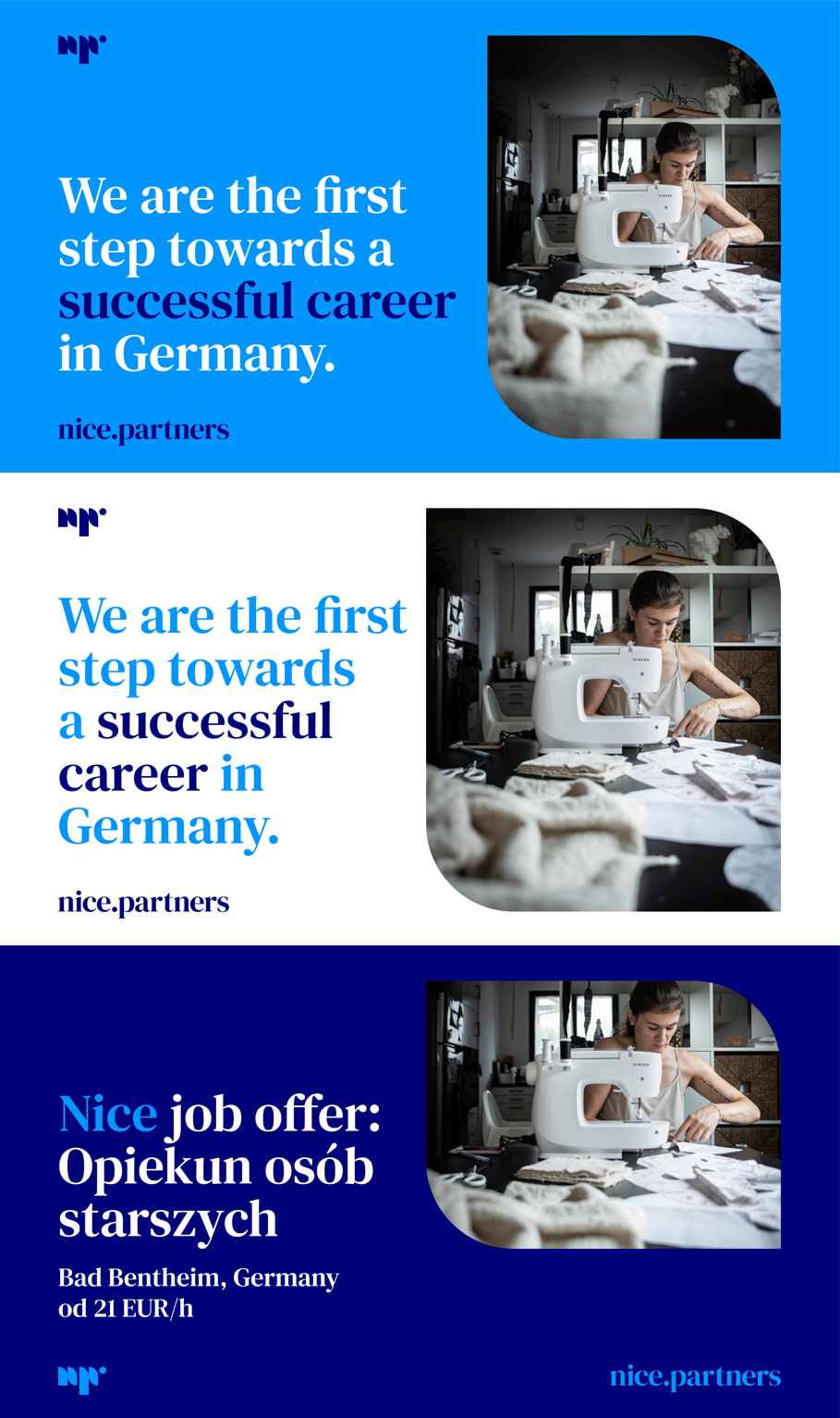
The naming and strategy development was just one step of the process. We created the brand visual identity. The complex yet easily manageable design system was prepared – starting with a business card, through letterhead and gadgets, and ending with social media templates.
It was made in such a way which enabled our client the seamless use of all materials on his own. Nice and easy.
Nice job!
Leniva° Studio Team
Concept and Key Visual: Kamil Przybyła
Art Direction: Neon Neonov
Design Support: Janek Mońka
Implementation: Marta Krzemień-Ojak
Production: Lena Mitkowa, Saskia Mońka
Client’s Team
Paula Chudy
Jacek Chloupek

