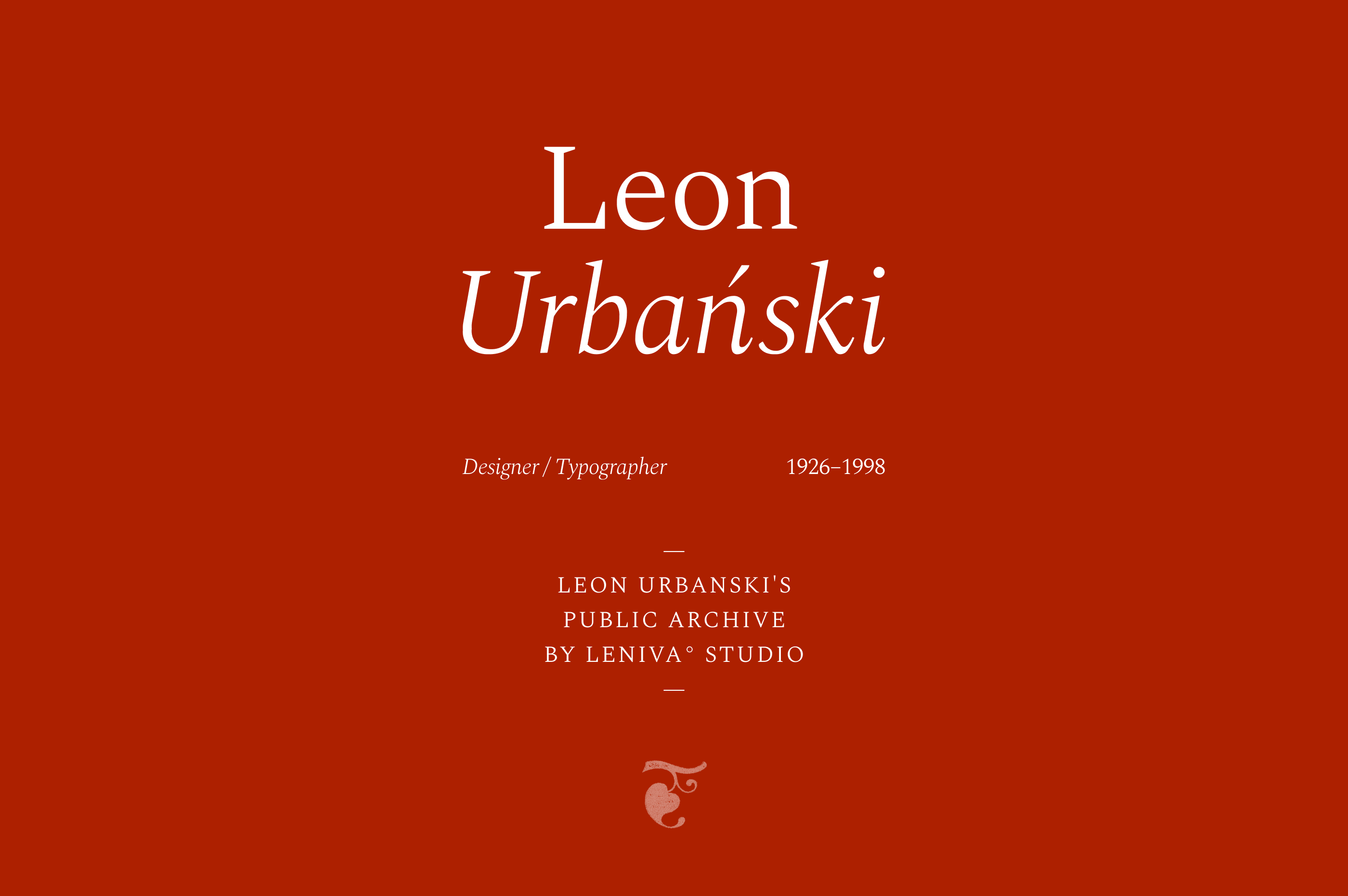
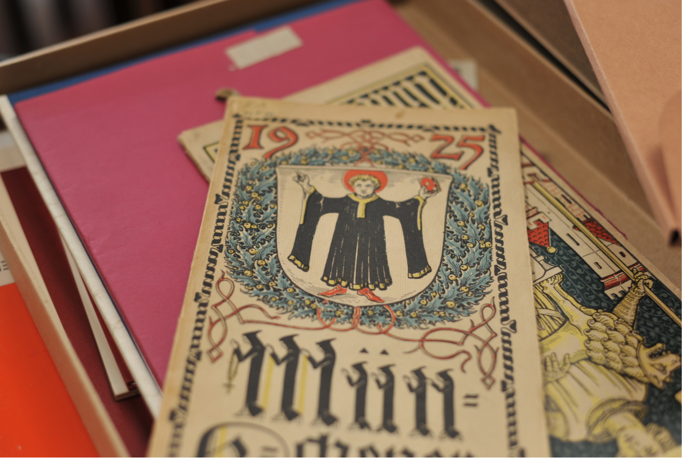
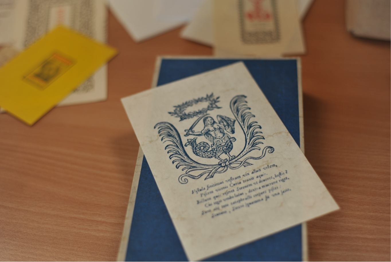
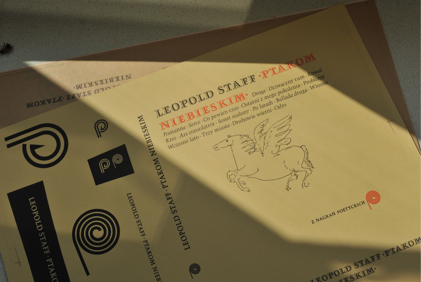
Leon Urbanski was an outstanding typographer, graphic artist and book designer. He was also involved in designing brandings and symbols as well as heraldry. He is a truly legendary figure in the world of Polish design.
Info ↘
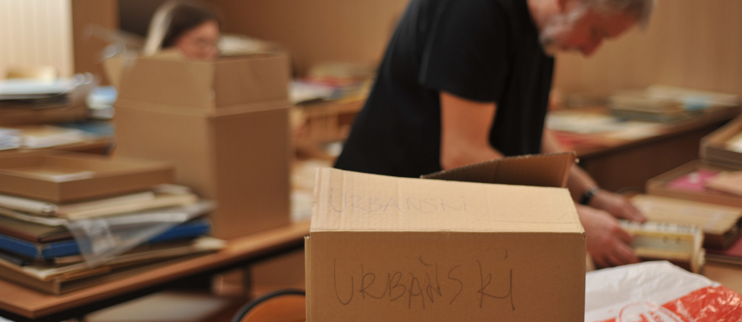
Leon Urbanski’s Public Archive is a project that our team had a hand in two ways. The first part of our doings – going beyond the activity of Leniva itself, was the digitization and preparation of Leon Urbanski’s collection as part of the Digital Culture (Kultura cyfrowa) program, which was carried out by our Creative in Chief – Lena Mitkowa as part of her activity in the Association of Polish Graphic Designers (STGU).
She was supported by Saskia, a member of our team. When the archive was prepared and it was ready to see the light, our studio sprung into action, preparing the base for it in the form of a website.
Scope
UI/UX / Design
Tools
Figma / Illustrator / Photoshop
Client
STGU
In print we trust
Leon Urbanski was an outstanding typographer, graphic artist and book designer. He was also involved in designing brandings and symbols as well as heraldry. He is a truly legendary figure in the world of Polish design. His elaborate designs, made with attention to the smallest detail, have gained an international reputation. Despite the passage of years – most of the works seem untouched by time and still delight everyone who comes into contact with them.
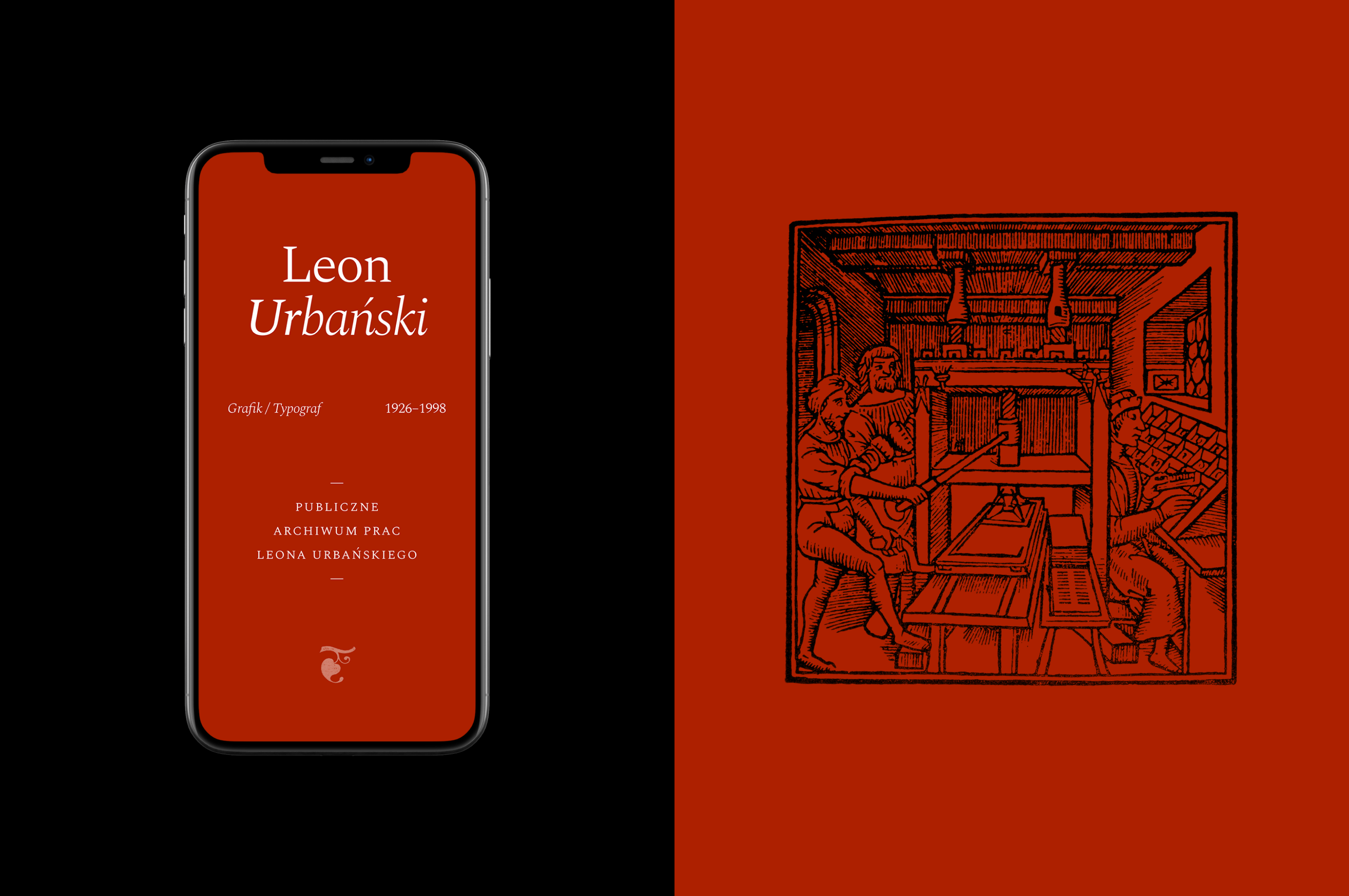
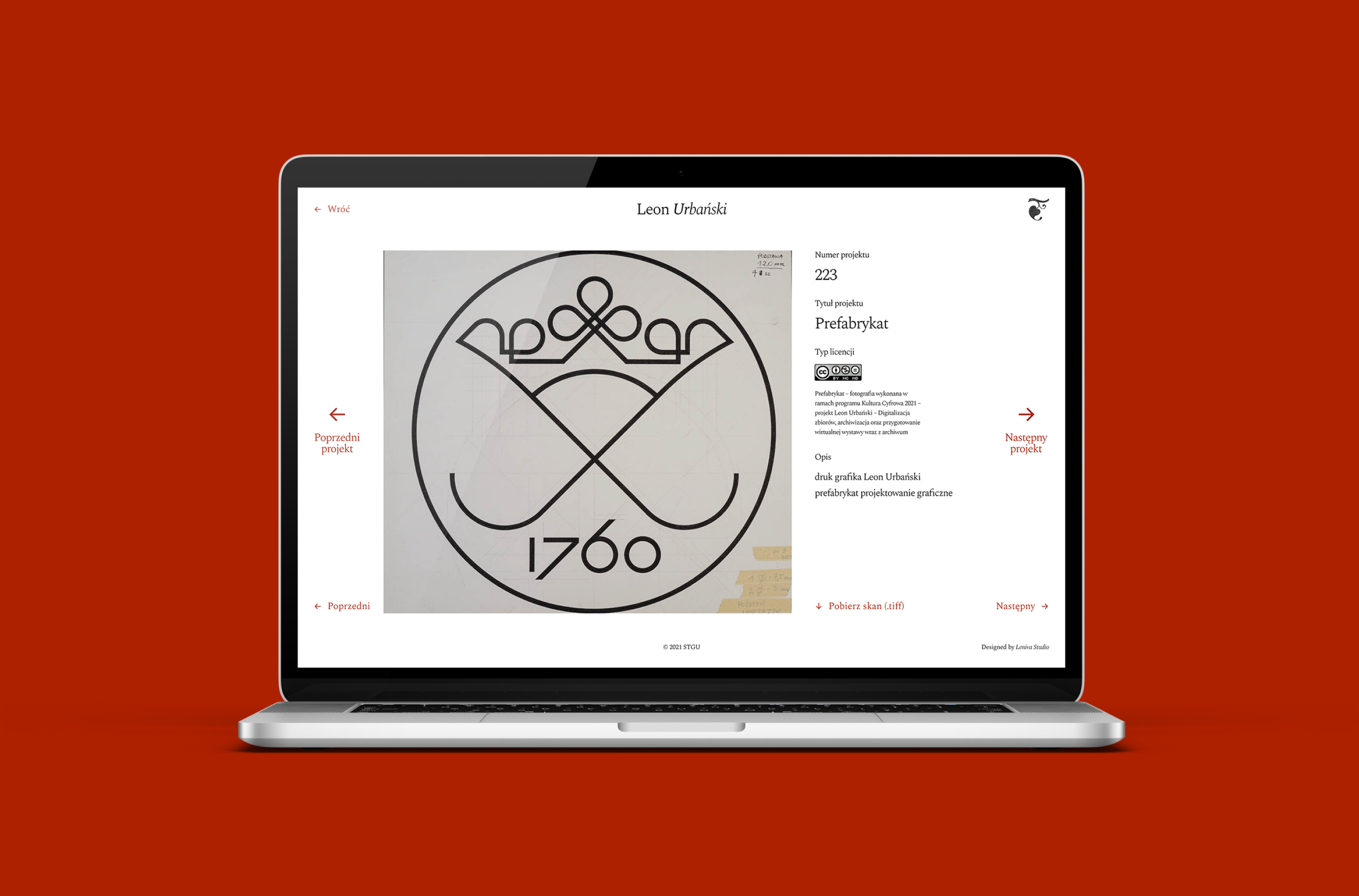
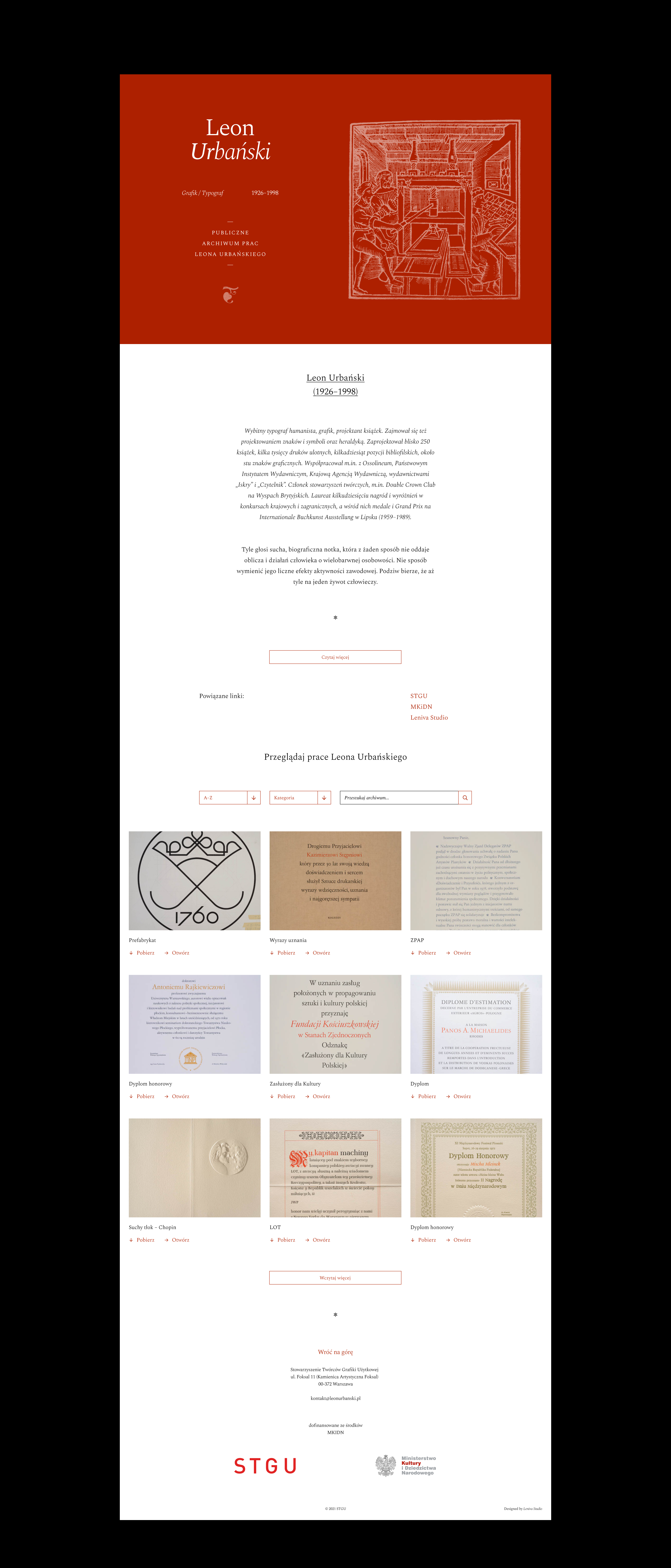
So it was obvious that the name of the project could not be complete without its main character. The term Public Archive, on the other hand, refers to the very form in which everyone can see digitized works. The archive is open to the public, posted on the website https://leonurbanski.pl/ so that virtually every person with access to the Internet can use it!

Figures, fonts, inspirations
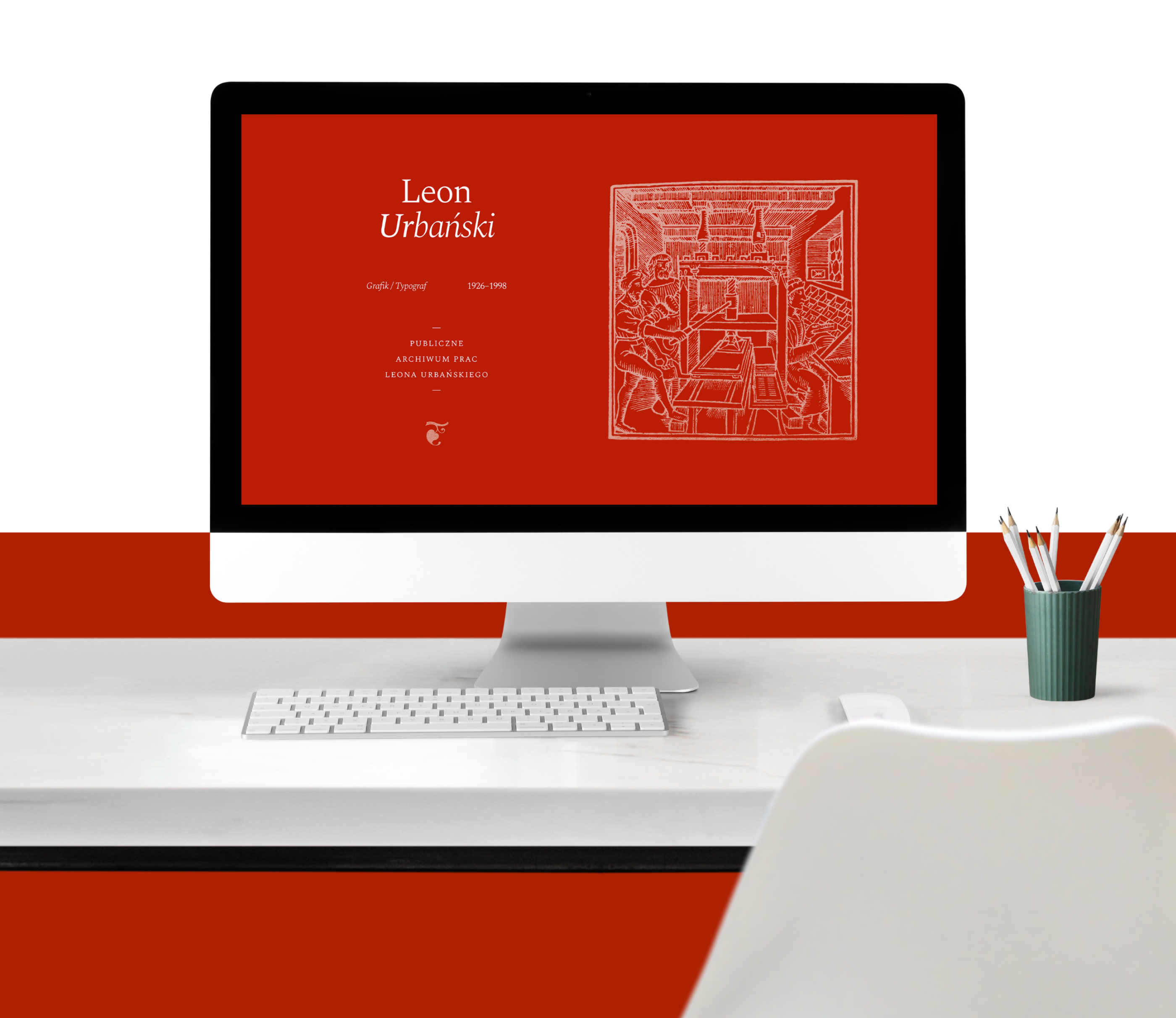
The biggest challenge in this project was finding a form of publication that would allow us to make the works available to a wide audience, but would not be boring at the same time. We wanted it to be a little bit cheeky and uncompromising, just like Leon Urbanski himself was. The website we have prepared is quite simple but full of references to the artist himself.
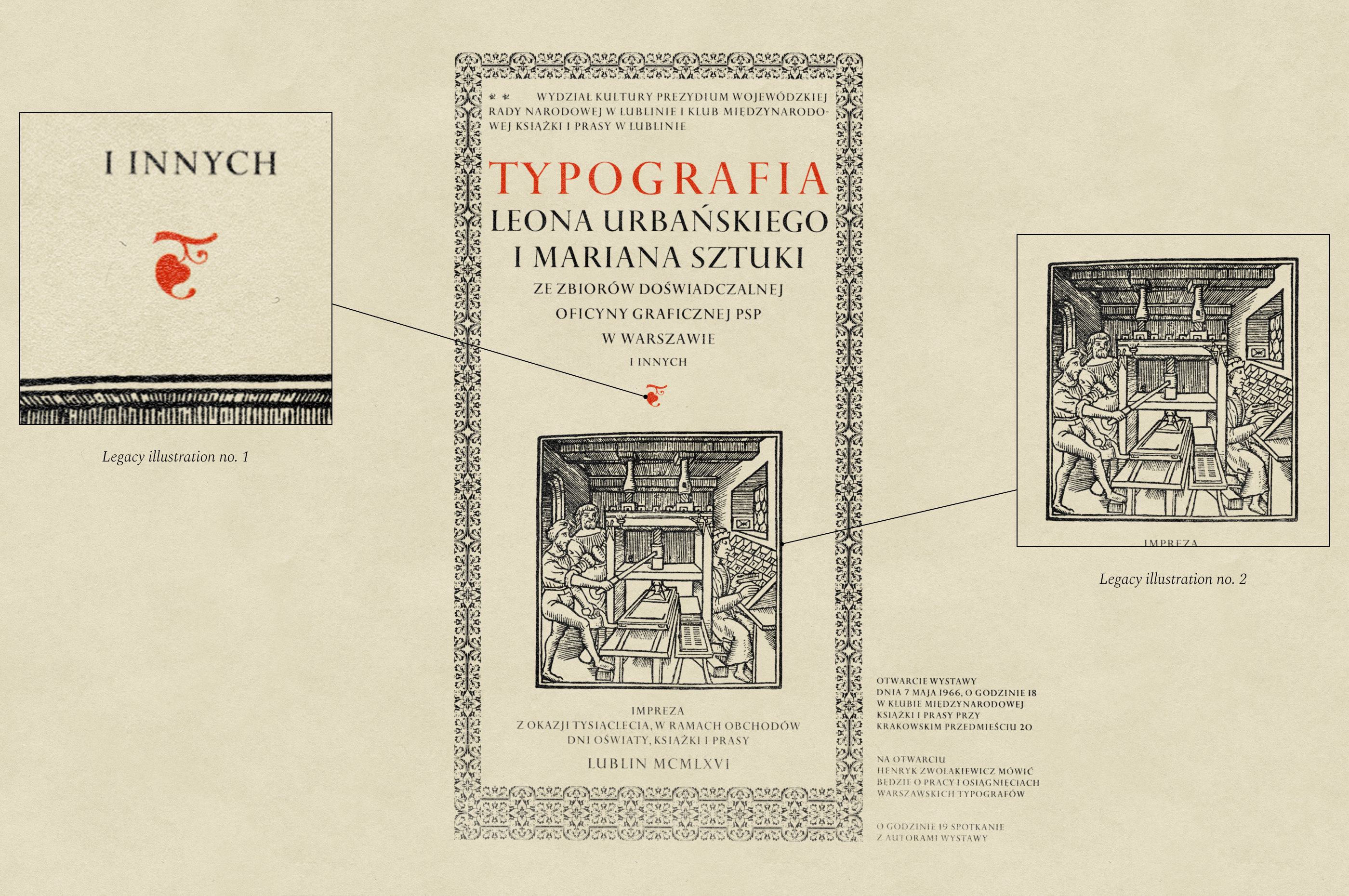
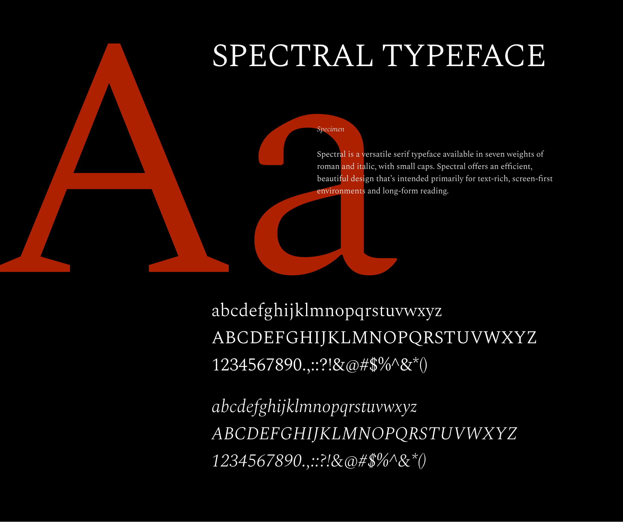
Used graphic motifs are motifs taken directly from his works. The fleuron, an ornament known also as a printers’ flower, is a characteristic symbol which – despite the passage of time – fits perfectly into the modern style. Combined with the slightly old-school Spectral Typeface, it creates a light, fresh composition reminiscent of old printing methods.
How it goes
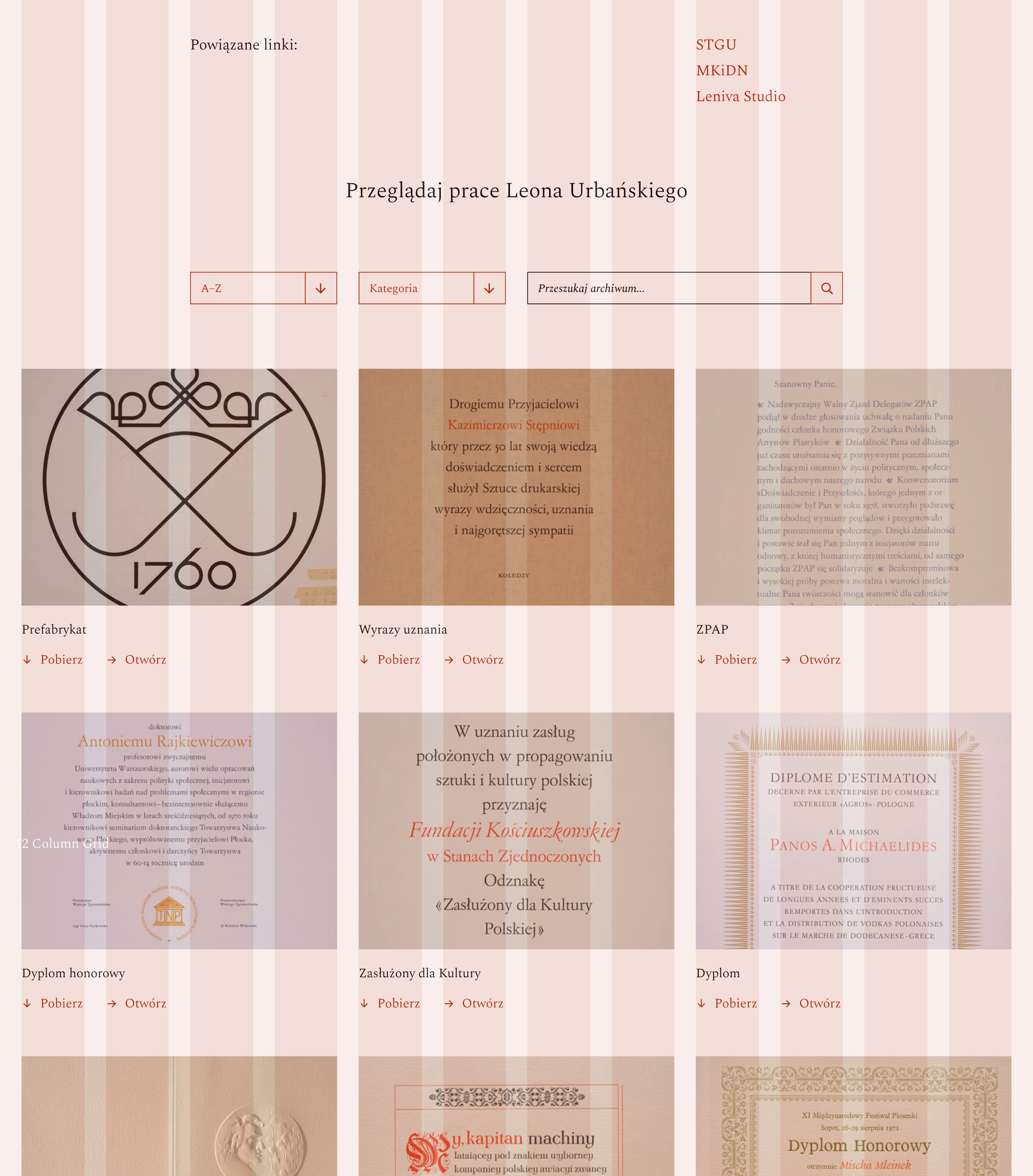
The website prepared by us contains a total of almost 200 works that came out of the hand of Leon Urbanski. Each of them has been described, categorized and tagged so that it is easy to track. In addition, each of the works can be downloaded in high definition (TIFF), which allows enjoying it to the fullest.
The website we have made is supplemented with promotional graphics, which were prepared for use in the press release and on the social media of the project’s partners. We have prepared two reformats – one for the STGU’s website and the other, in the form of a square, for wide use in the media.
Credits
Team Leniva° Studio
Concept and Key Visual: Lena Mitkowa, Kamil Przybyła
Production: Lena Mitkowa, Saskia Mońka
Implementation: Kamil Przybyła, Janek Mońka
Web Development: Michał Hossien
Guests:
Andrzej Tomaszewki (curatorial text)
Pro Tempus (digitization)