Nothing is standard.
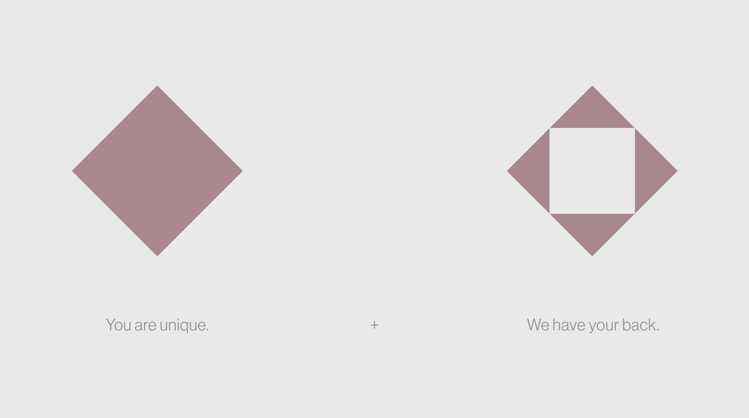
Every business is unique.
We know how to do it.
Info ↘
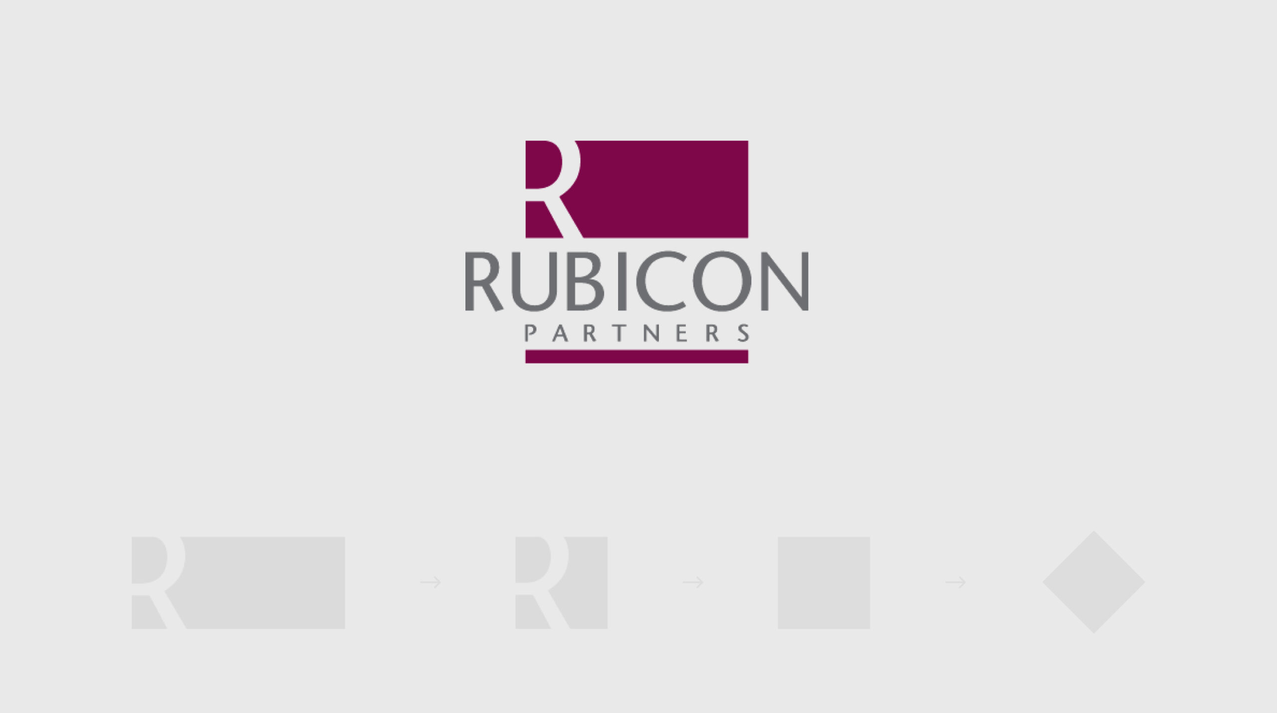
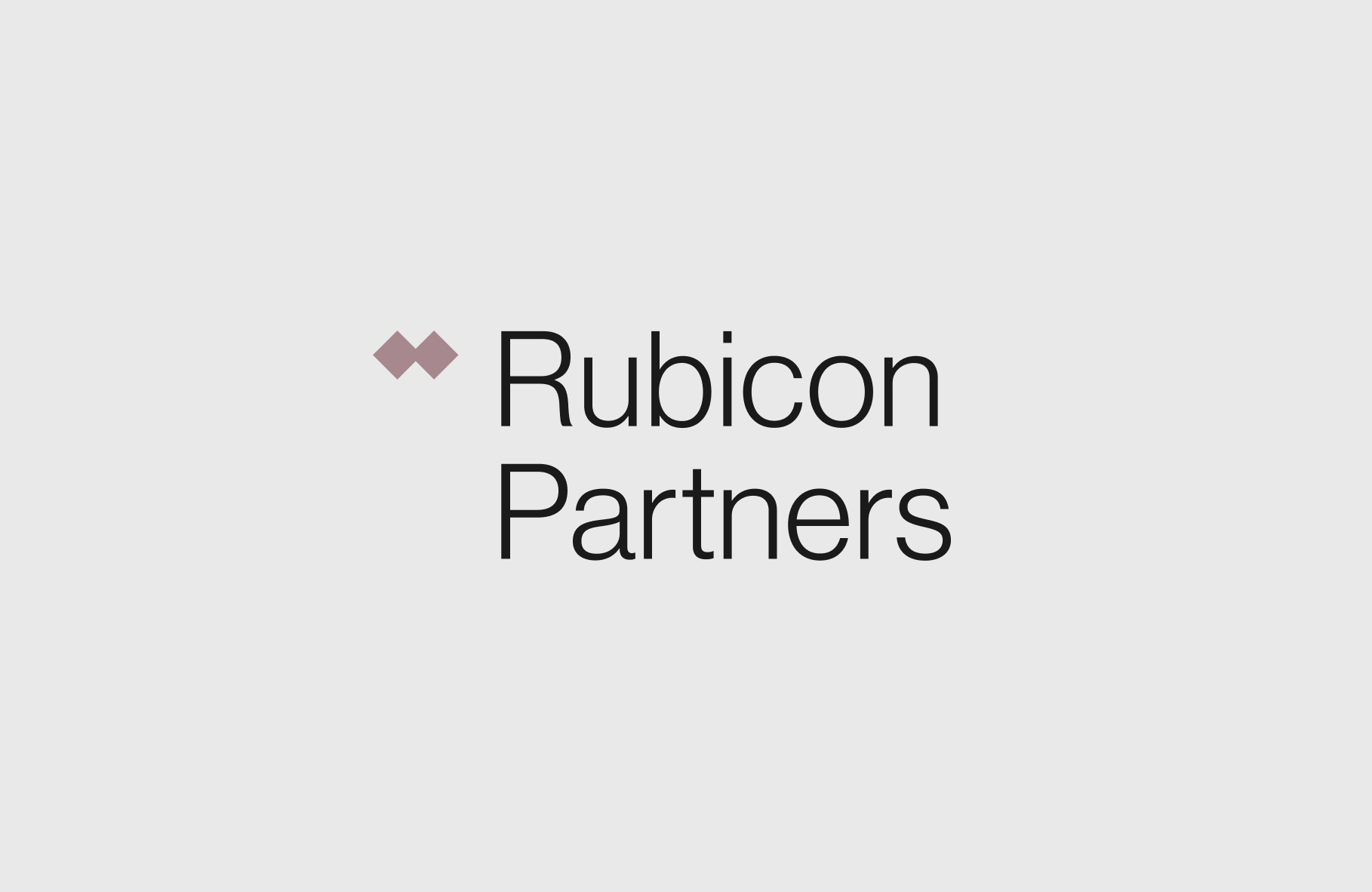
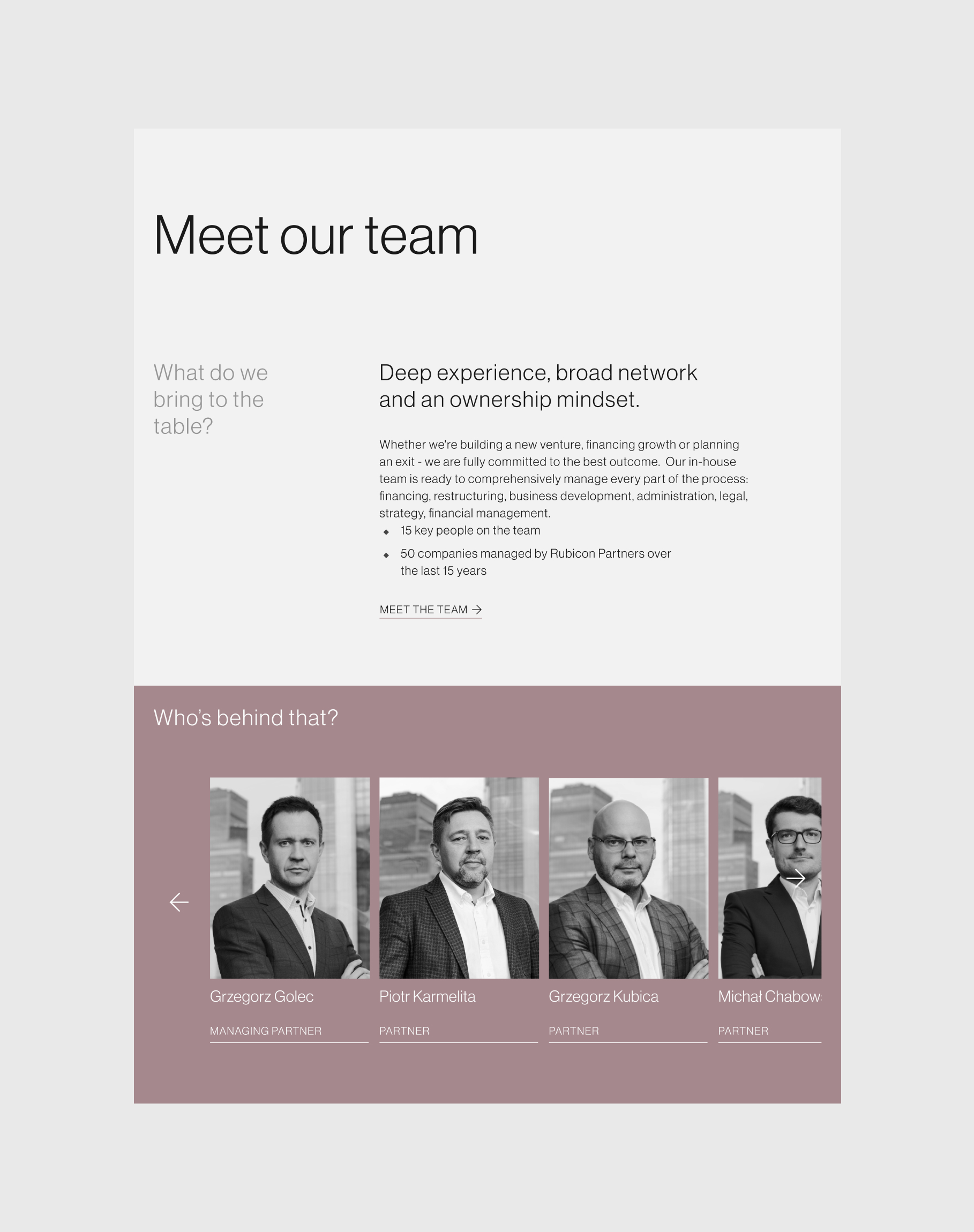
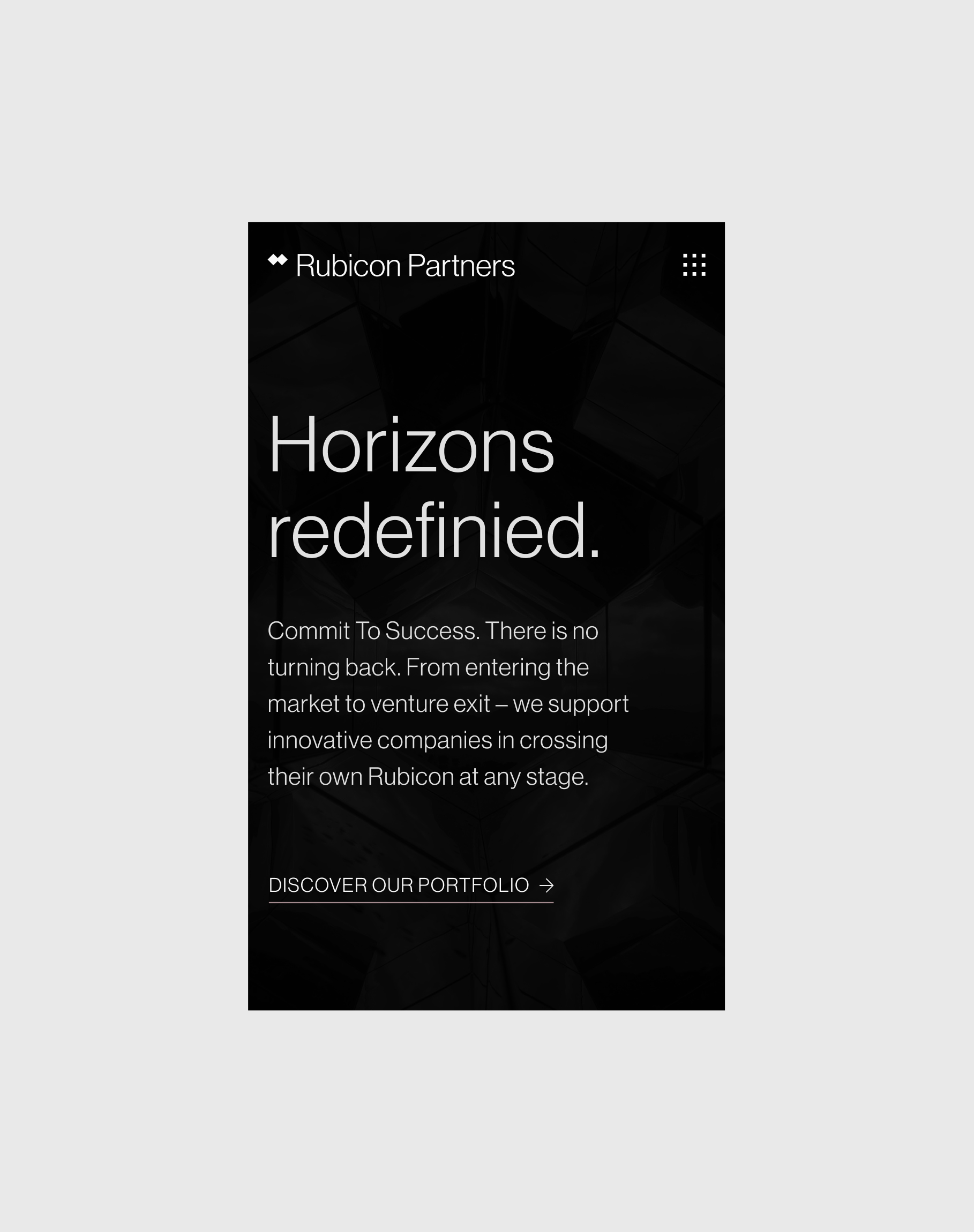
Rubicon Partners is an investment firm that operates in the private equity industry. It specializes in providing private capital to various companies and sectors, and works with companies in various fields, e.g. industry, technology, healthcare.
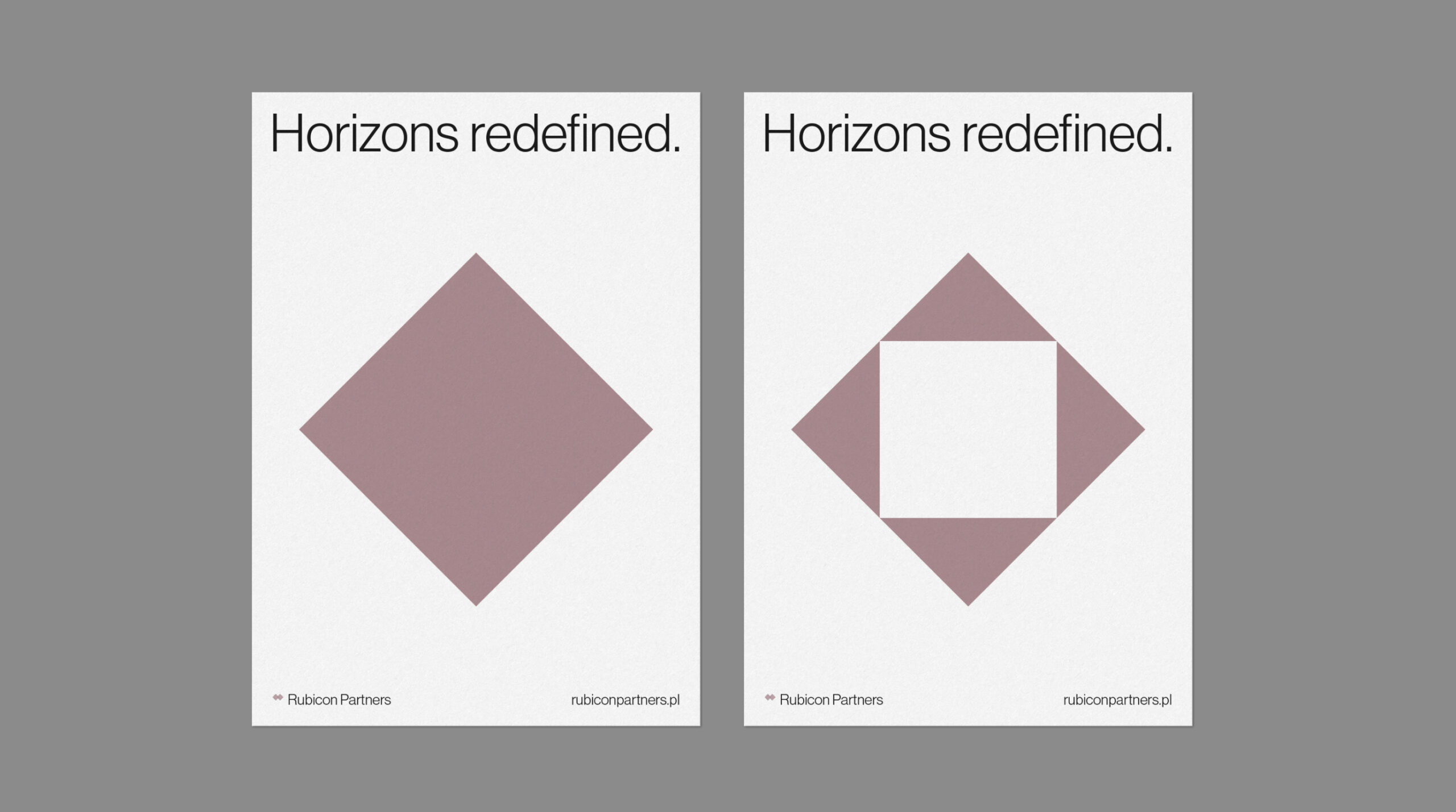
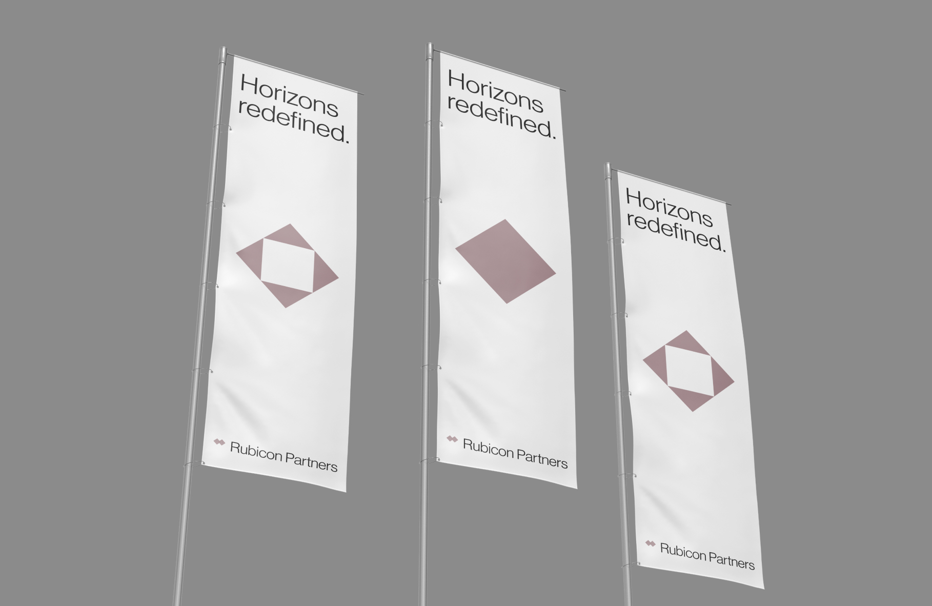
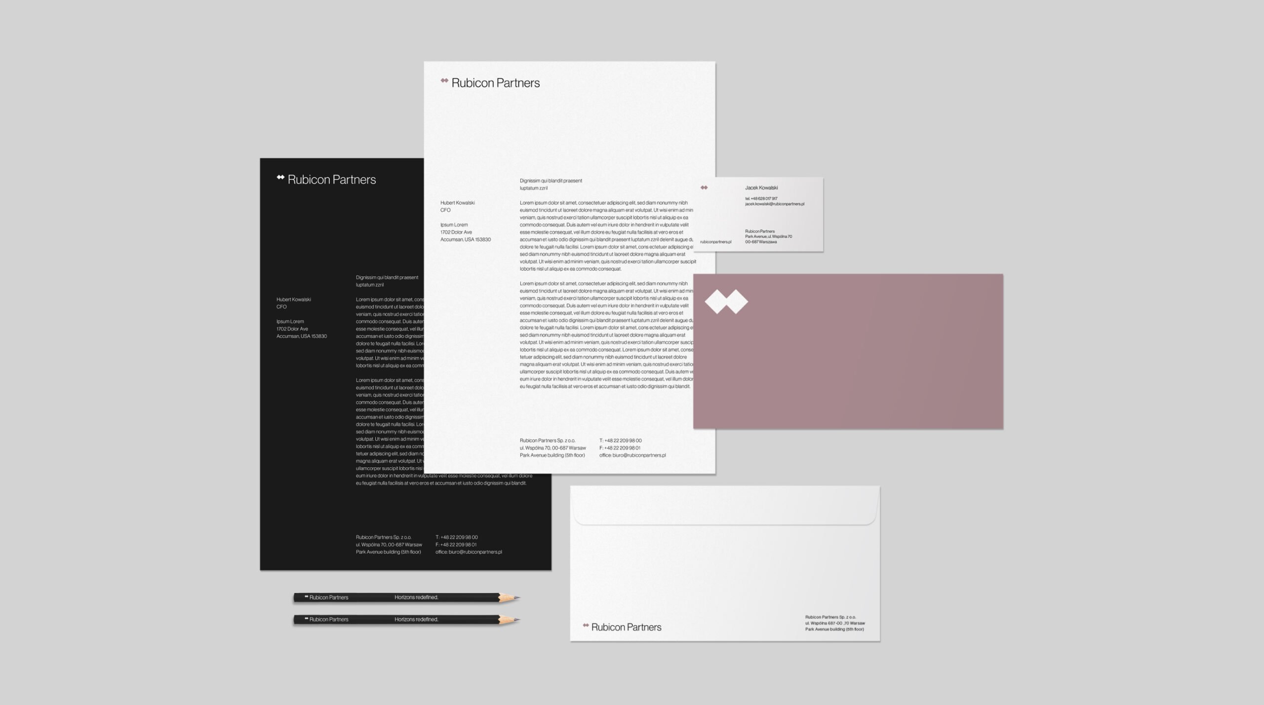
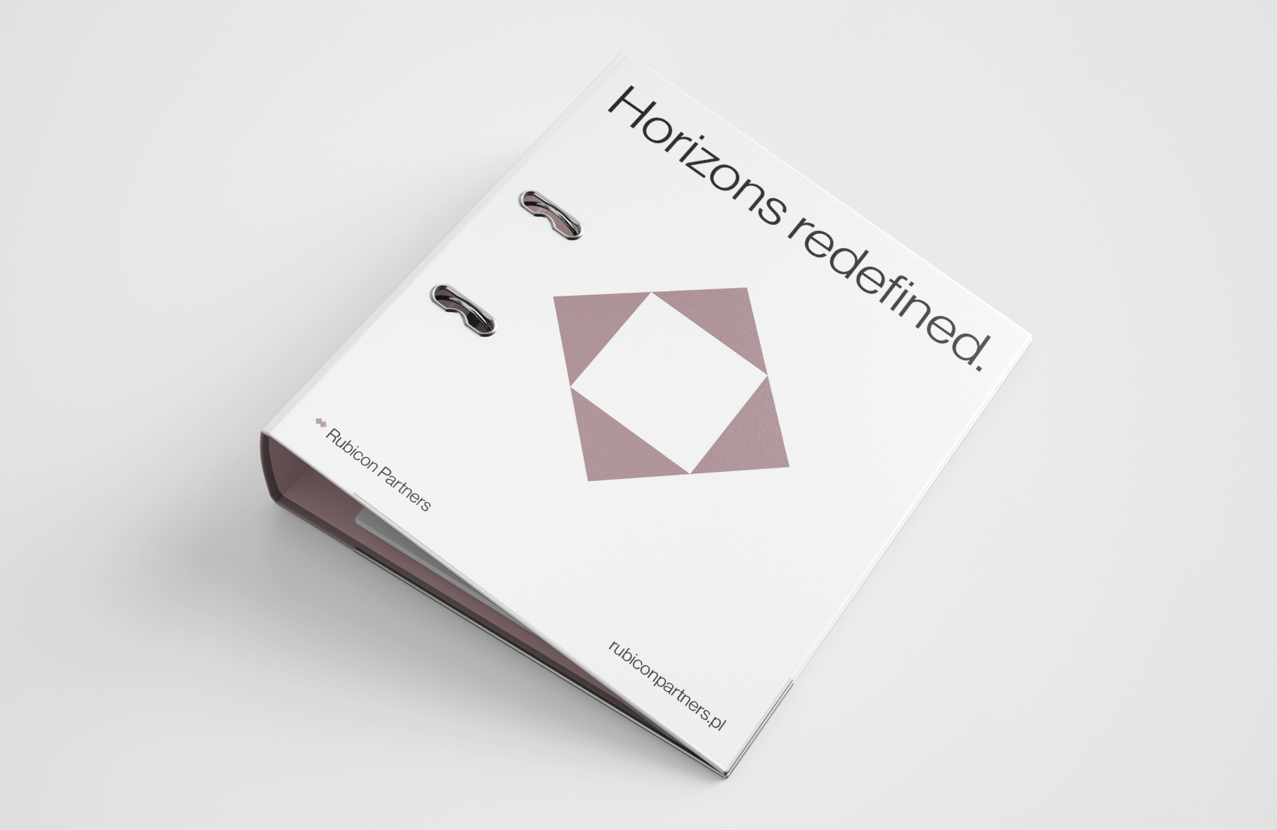
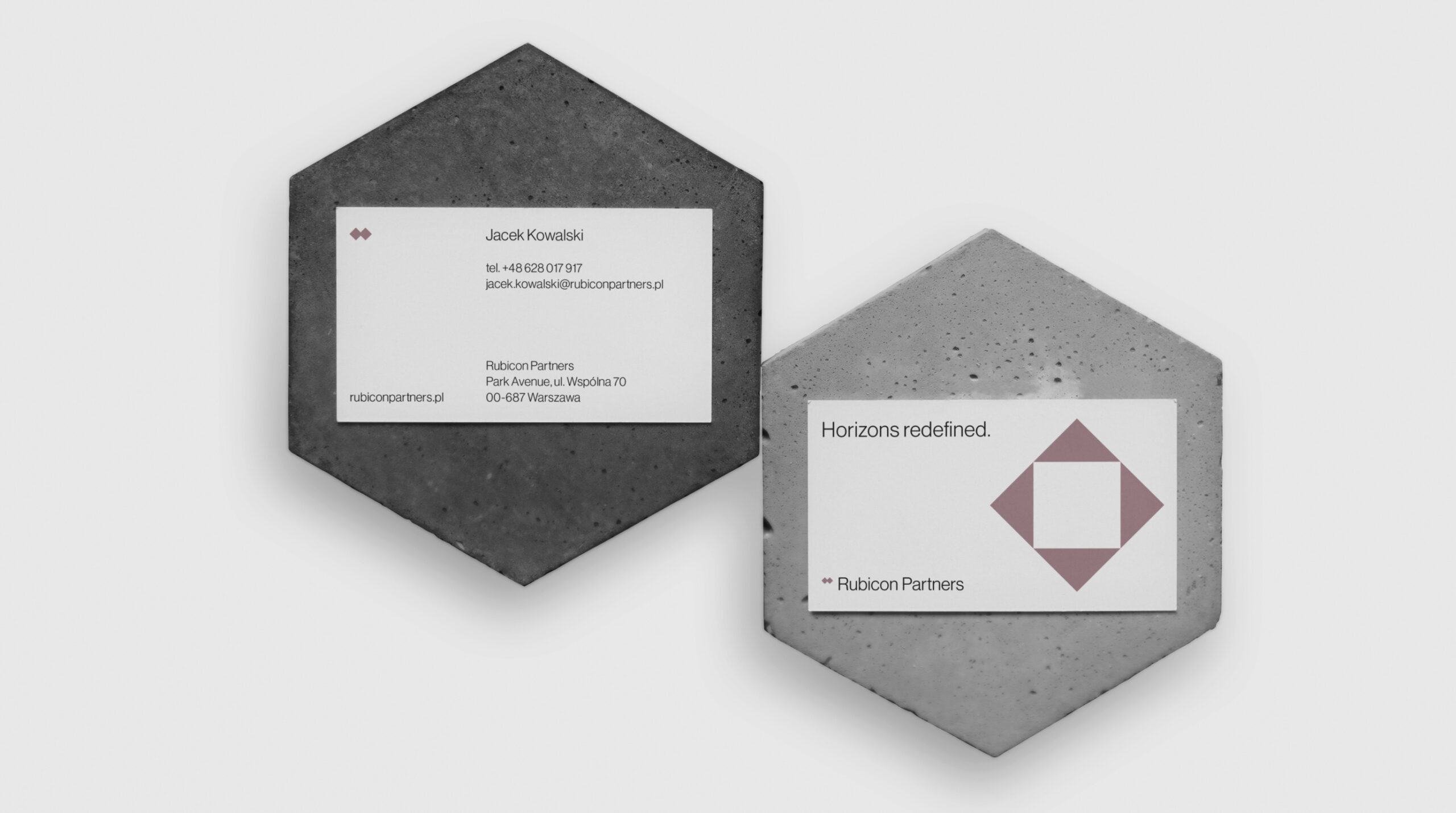
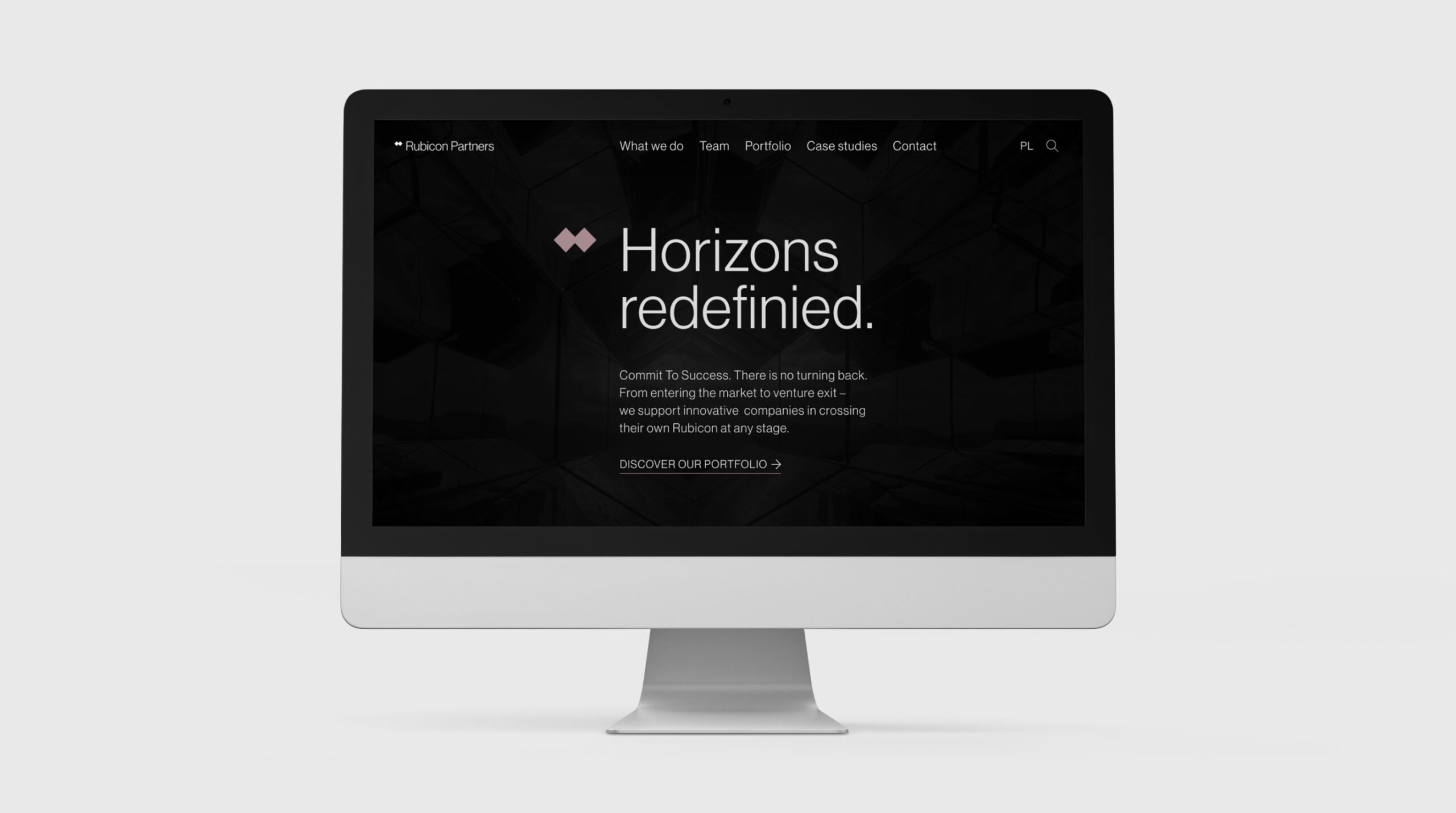
Our task was to develop a new, fresher communication language that would reflect what the Rubicon Partners brand is and remain as a communication style for a nice few years. We developed a new logotype, as well as a complete Look & Feel setting the framework for the new communications.
Scope
Rebranding / UX / Webdesign
Tools
Figma / Illustrator
Client
Rubicon Partners

Every business is unique.
We know how to do it.
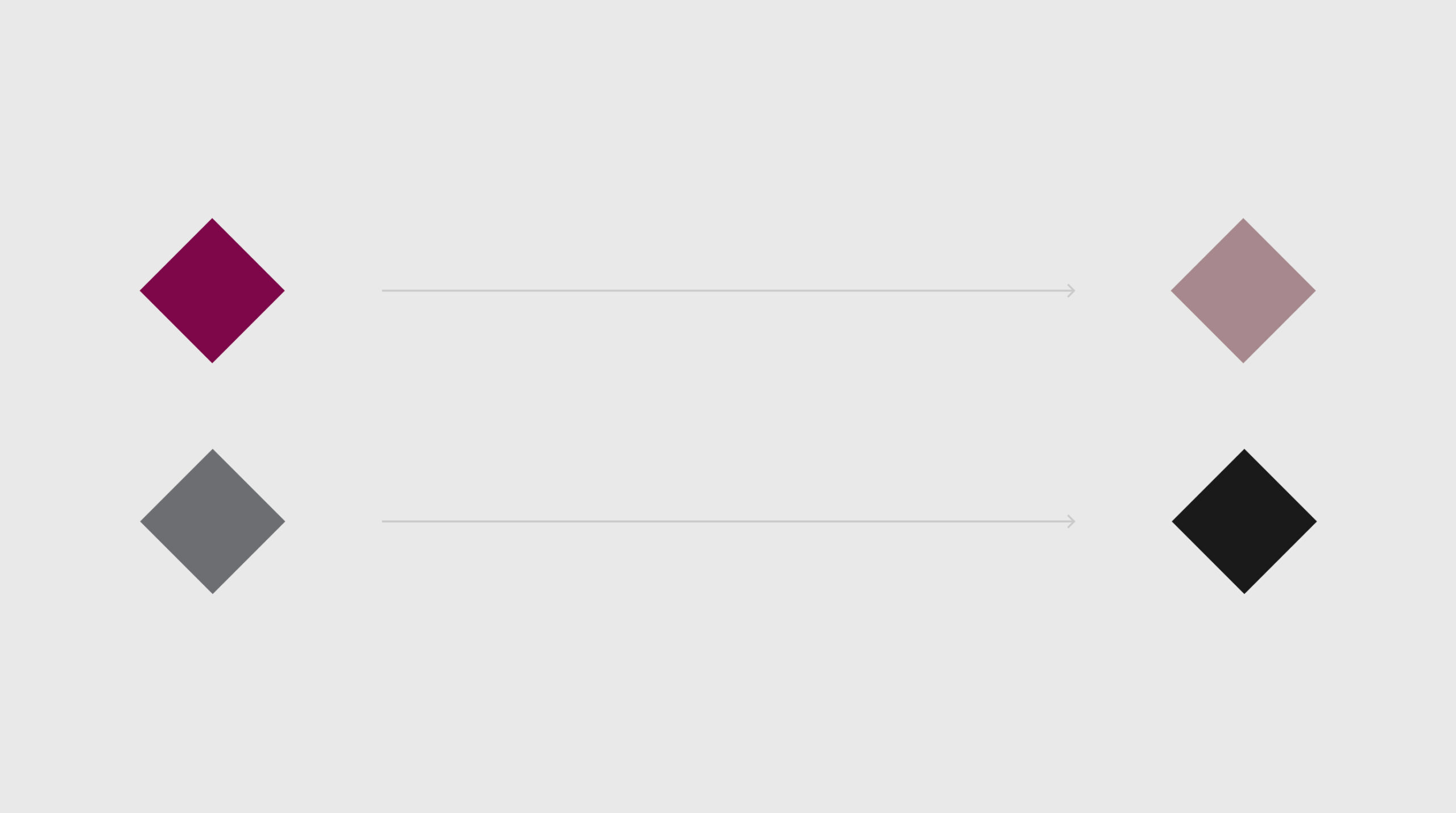
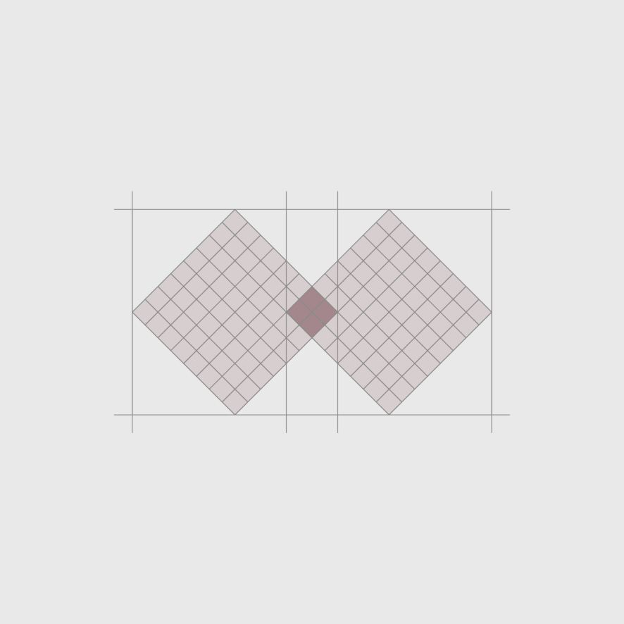
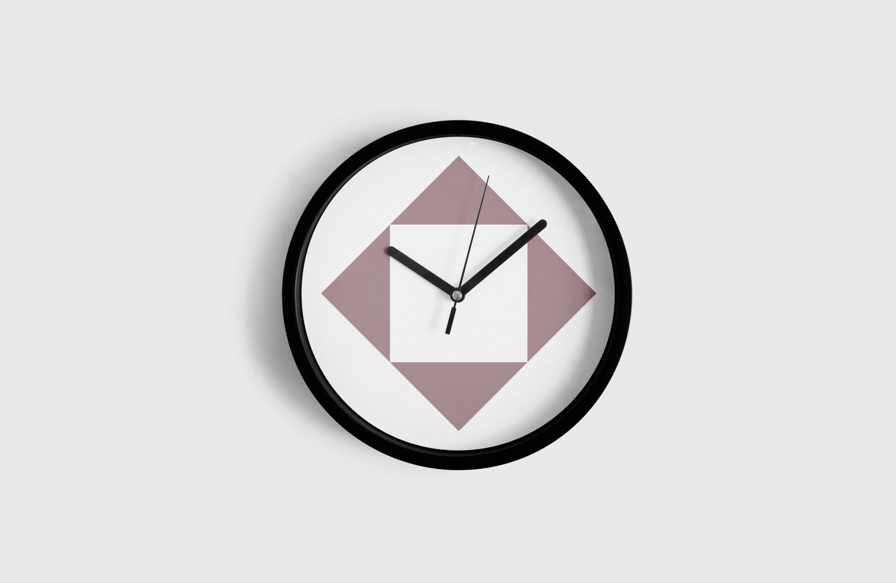
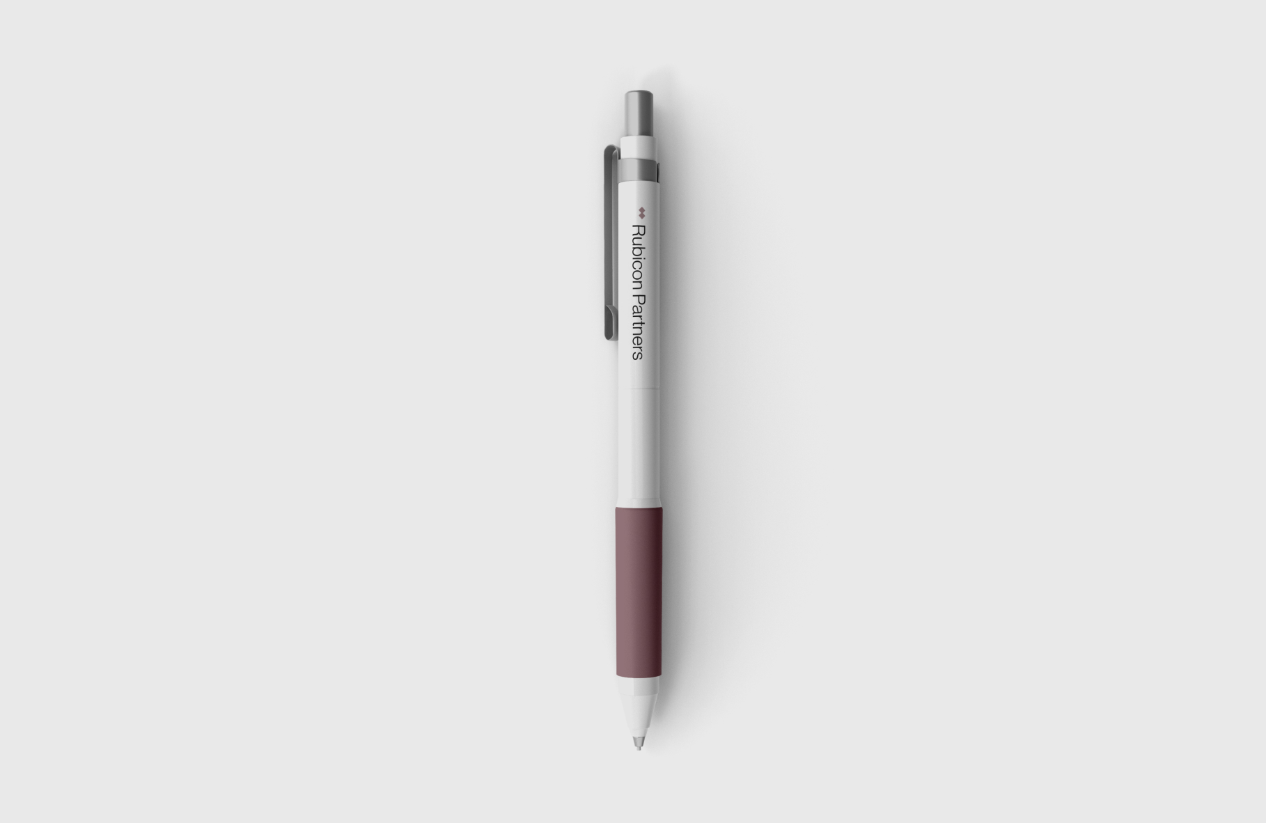
Rubicon Partners was attached to the maroon color that was present in their previous communications. Our color proposal takes this attachment into account, but is based on some reinterpretations.
The result is an elegant, minimalist and versatile color palette.

Spot what’s already there.
The approach.


Credits
Leniva° Studio Team
Concept: Kamil Przybyła
Art Direction: Neon Neonov
Design: Kamil Przybyła, Marta Krzemień-Ojak
UX/GUI: Agata Szewczuk
Production: Saskia Mońka, Lena Mitkowa
Client’s Team
Michał Chabowski
Grzegorz Golec
Paweł Madej
Małgorzata Sierpińska