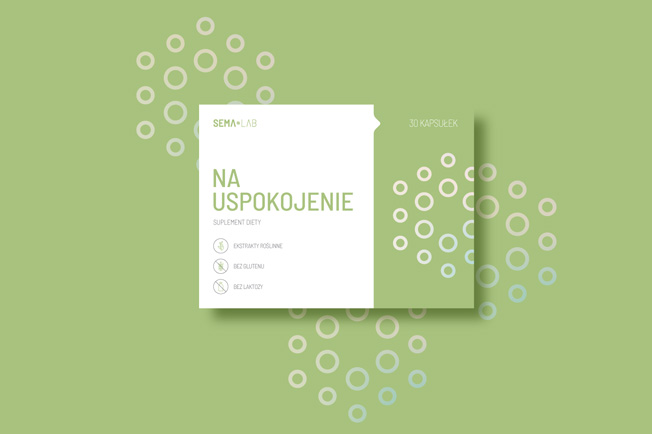
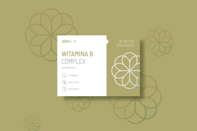
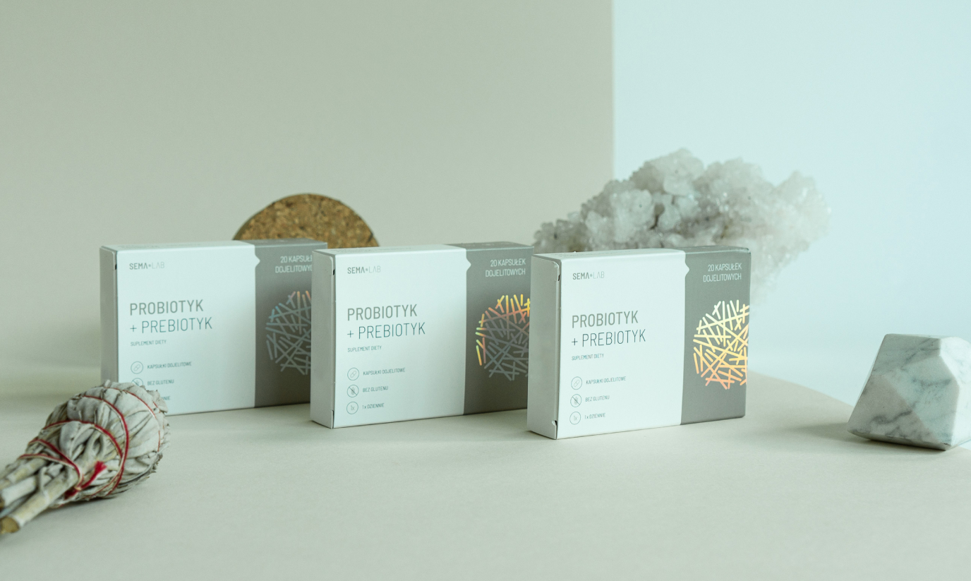
SEMA LAB is a line of supplements made by Gemini Pharmacies. These are simple, natural, high-quality products sold at a competitive price.
Info ↘
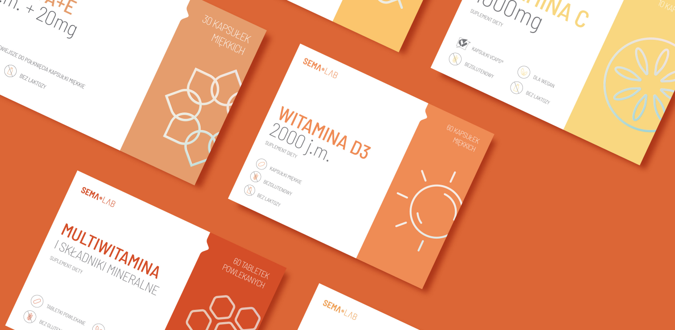
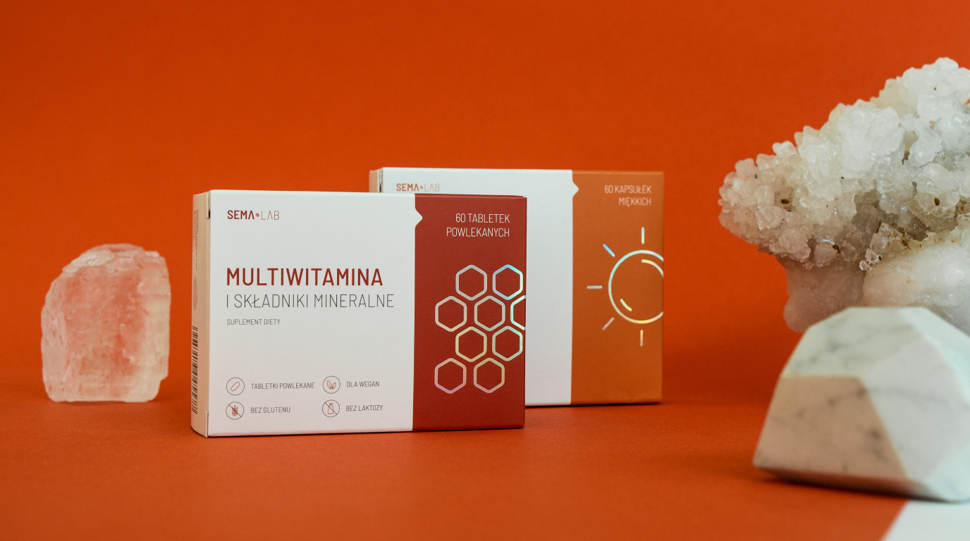
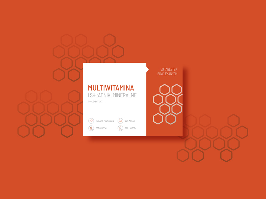
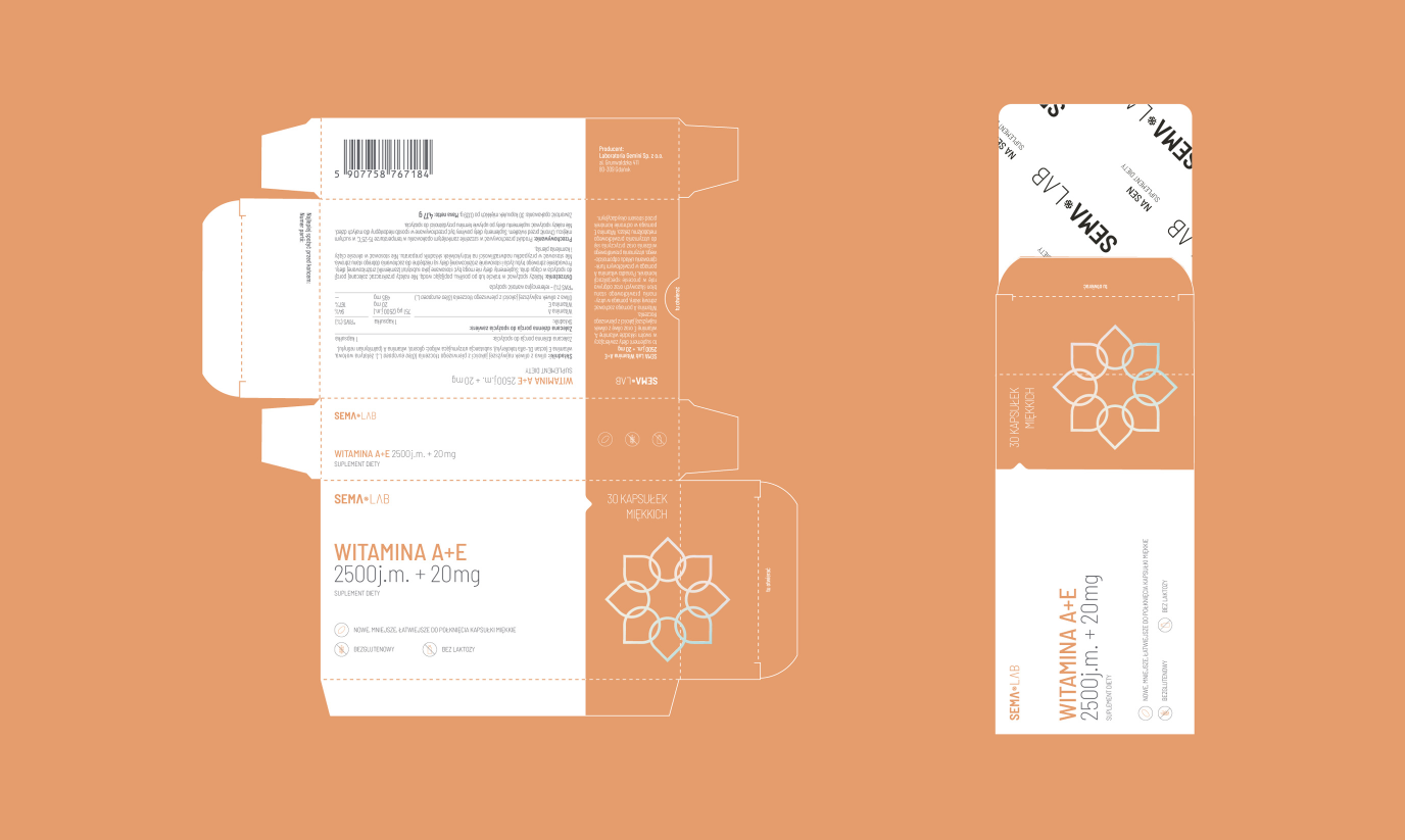
We’ve been working together with Gemini for several years now. Our task was to create a coherent, minimalist graphic language that can be adapted to various packaging formats – and we have prepared almost 30 versions of those!
We have also prepared labels used on the packages – they inform customers about matters such as the form of each supplement (pill/syrup/etc.), potential food intolerances and much much more!
Scope
Rebranding / Packaging
Tools
Illustrator
Client
Apteki Gemini
Customised
approach
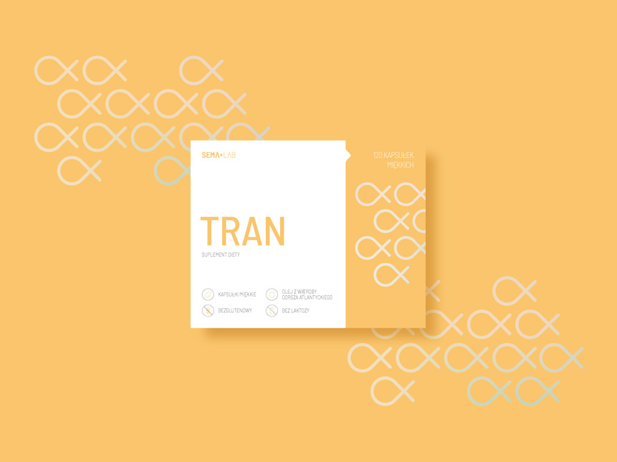
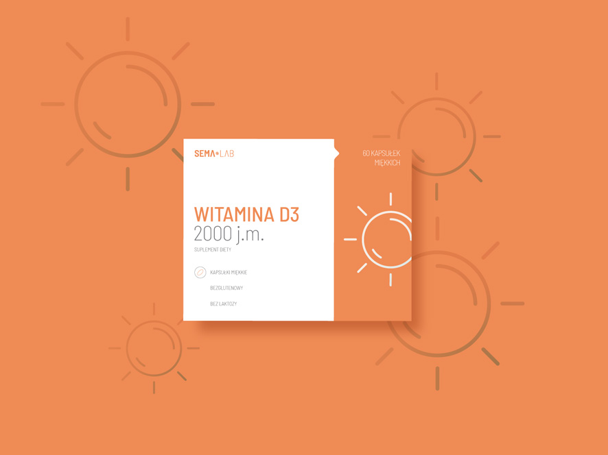
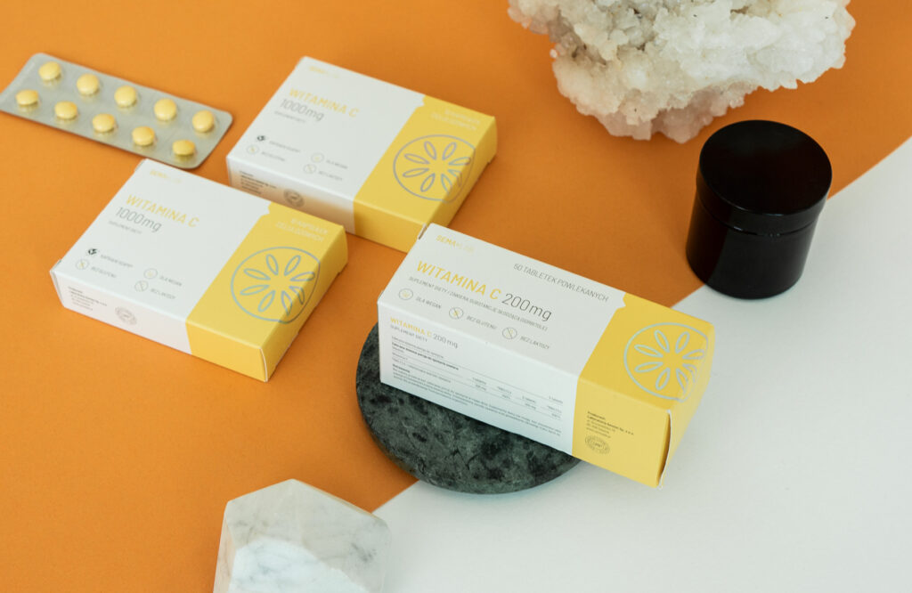
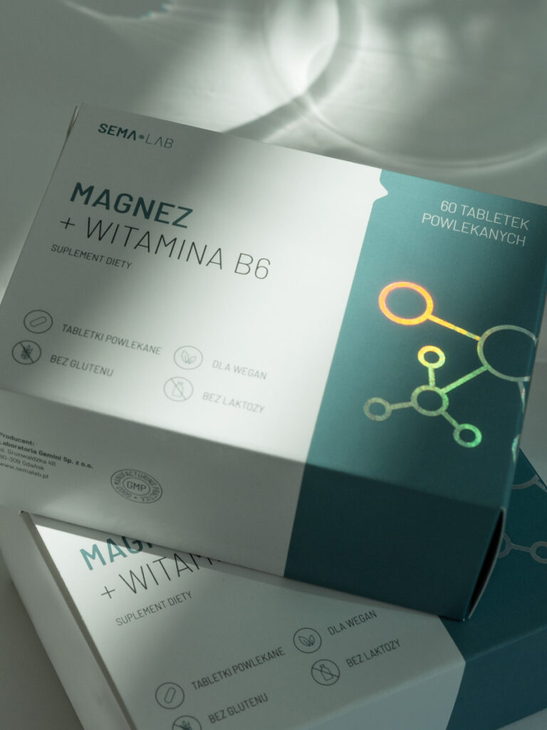
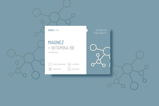
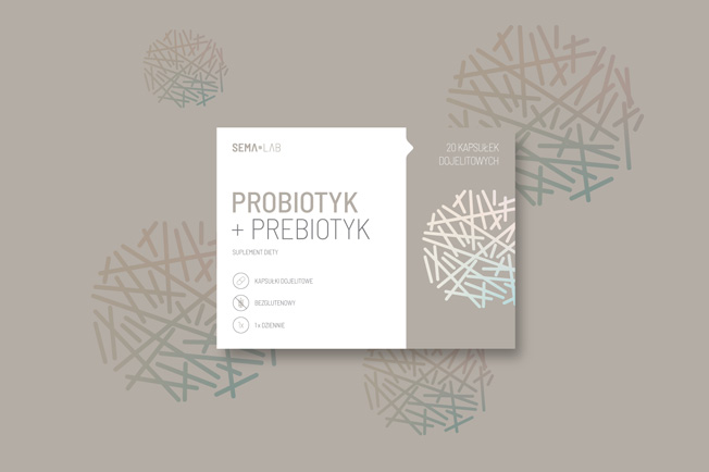
Each packaging shows an individual approach to the product. Each has a specific shade, which makes it easy to spot Gemini’s supplements on the store’s shelf.
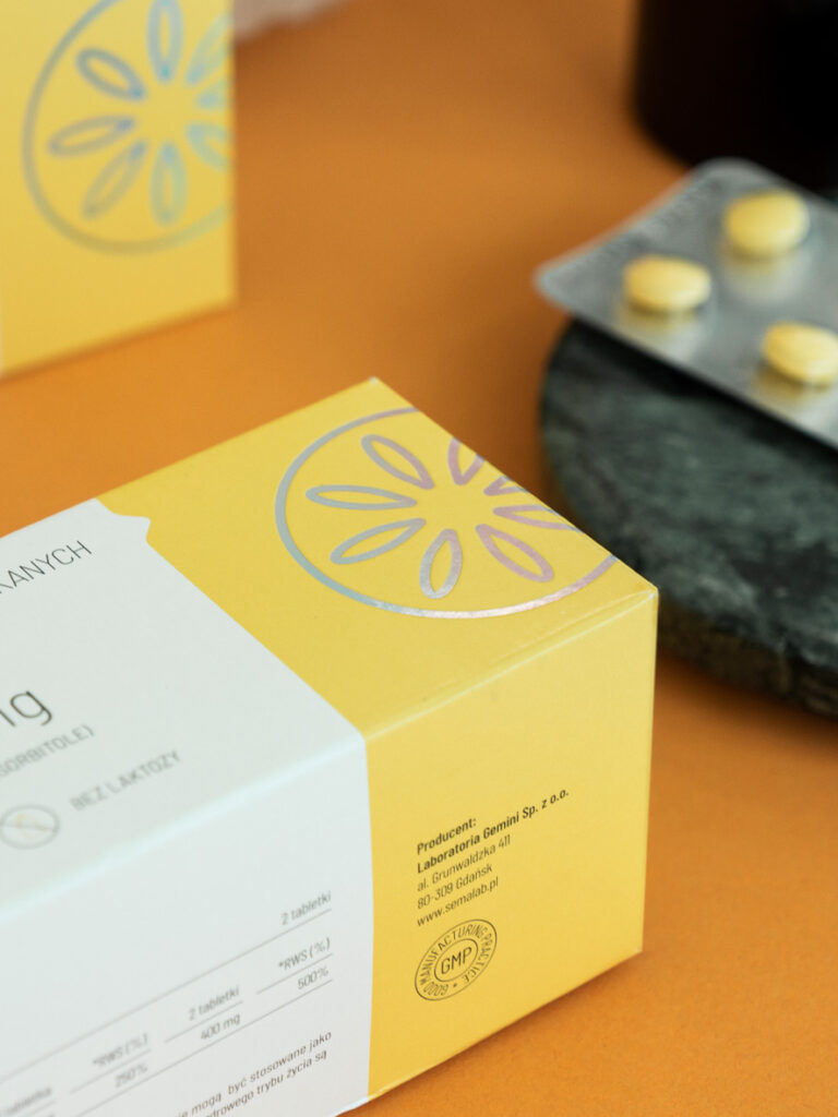
It’s individual character is also manifested by custom, simplified illustrations and eye-catching refinements made with holographic foil.

Mission accomplished
⟶ 30 versions of packaging formats
⟶ 50 custom icons
⟶ Smart and flexible layouts
⟶ Shining holo stamps


The goal was to create a recognisable, approachable and clear design with a tiny pinch of sophistication.
And our proposition met these expectations perfectly!
Credits
Team Leniva° Studio
Concept and Key Visual: Neon Neonov, Janek Mońka
Design: Janek Mońka, Kamil Przybyła
Client Service, Production: Lena Mitkowa
Client’s Team
Natalia Janiec-Michalska