When the experience goes beyond (the expectations).
Info ↘
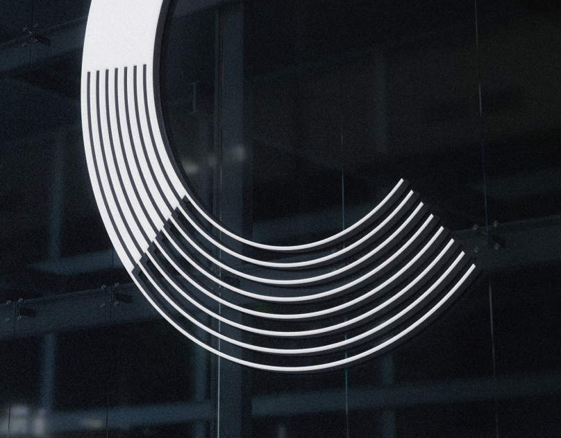
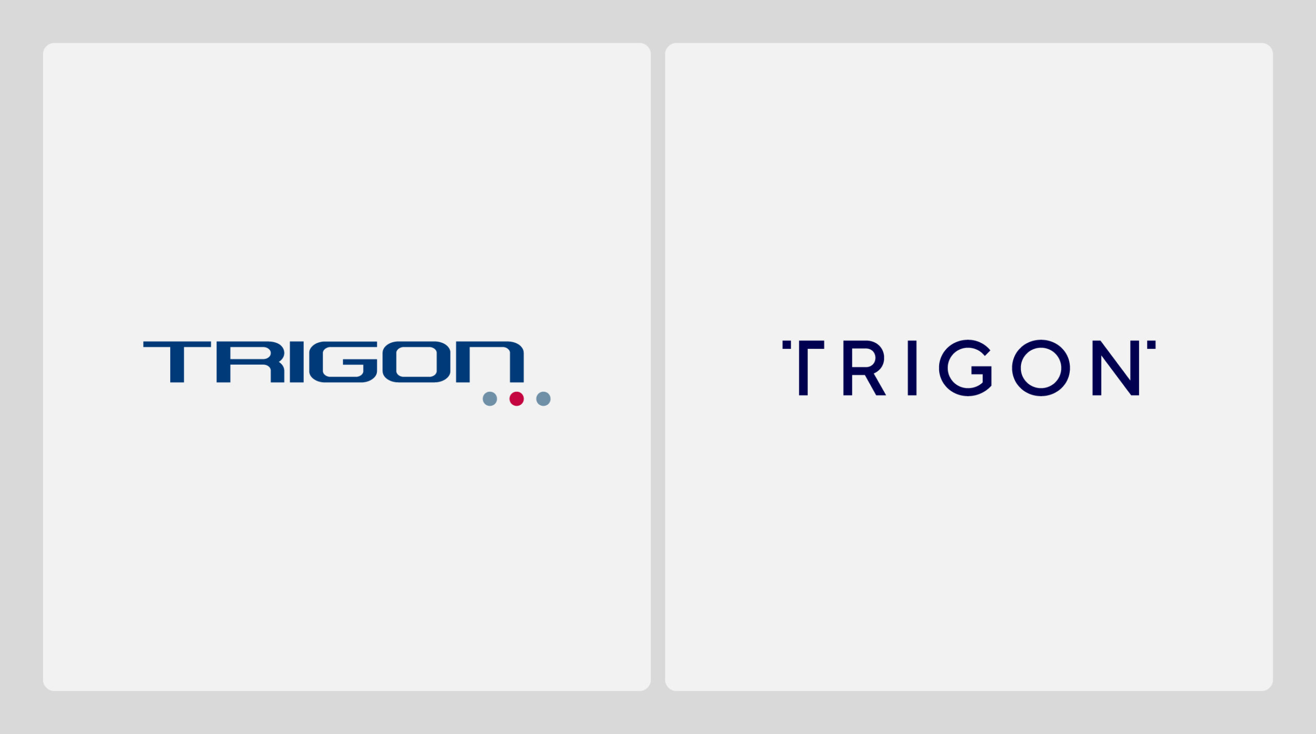
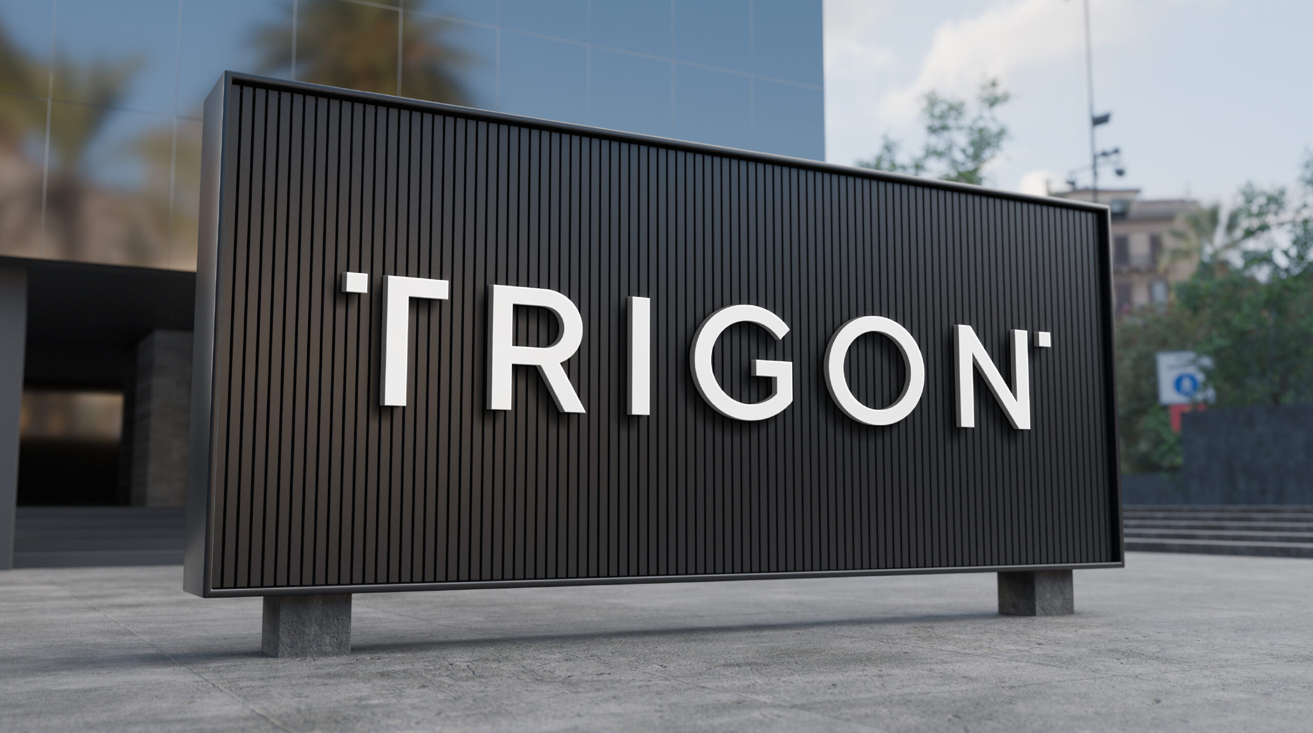
At first glance, the task seemed simple – just as simple as a rebranding brief can be: refreshing the logo. Indeed, the original brand reflected the spirit of the era in which it was designed while also revealing a certain makeshift quality in its execution.
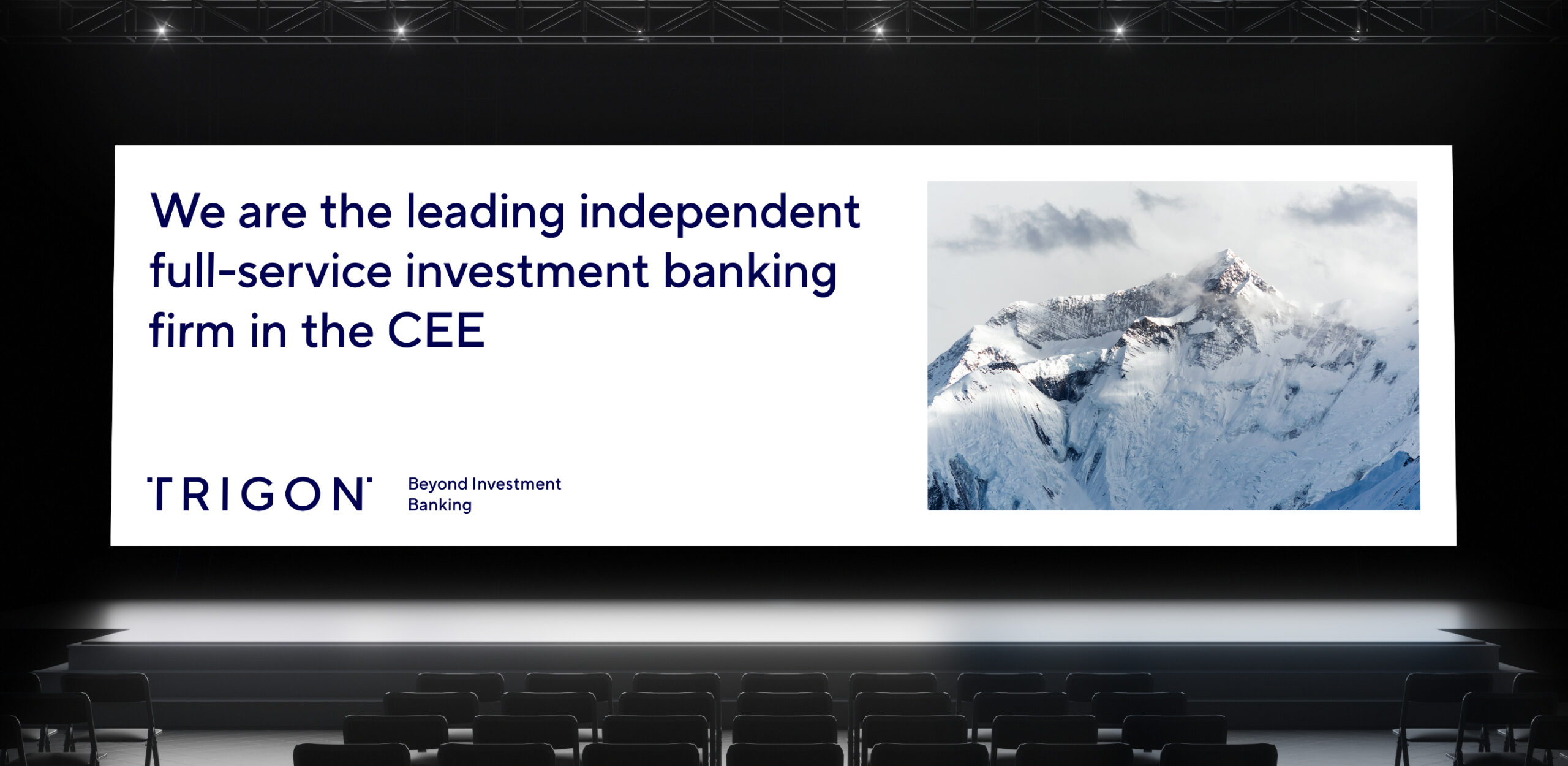
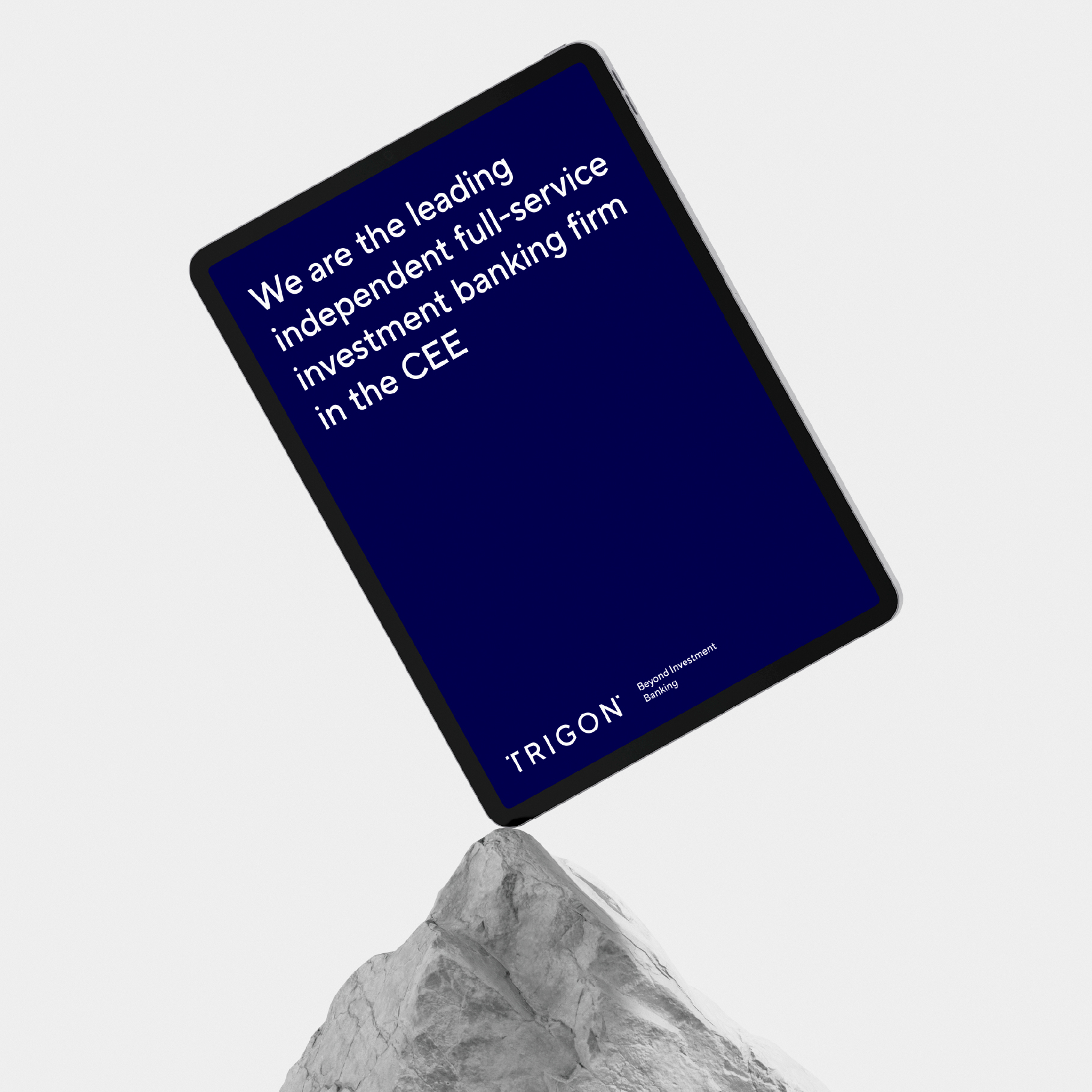
The rebranding of Trigon is a perfect example of what visual identity can mean for a brand. Yes, the assignment was to create a new logo. But a strategically planned process brings with it far-reaching consequences.
Scope
Brand Strategy / Rebranding / Communication Materials / UX & UI
Tools
Illustrator / Photoshop / Figma
Client
Trigon
The Process and Its Impact
A thorough strategic preparation of the process means not only proposing a strategy for the brand but also bringing real change to the organization and injecting fresh energy into a stable brand. It involves analyzing the existing situation, identifying the values that truly matter to the audience, and translating them into a message that can be quickly decoded by future recipients.
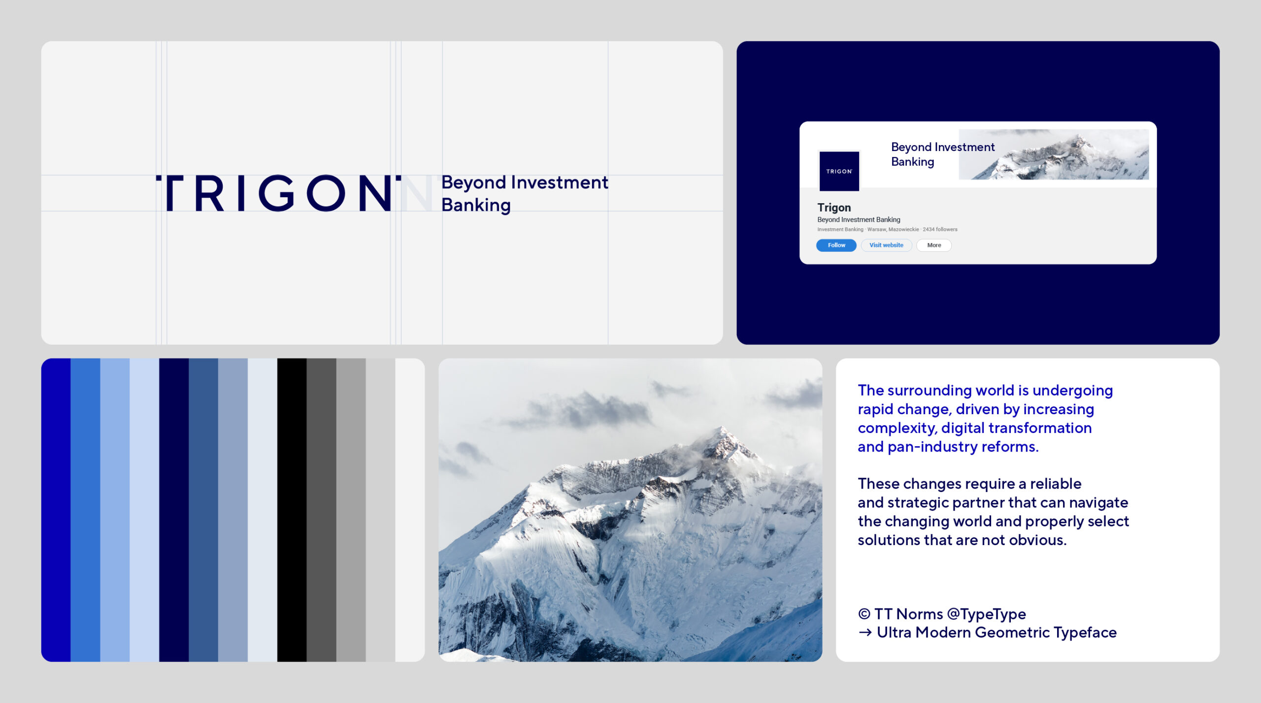
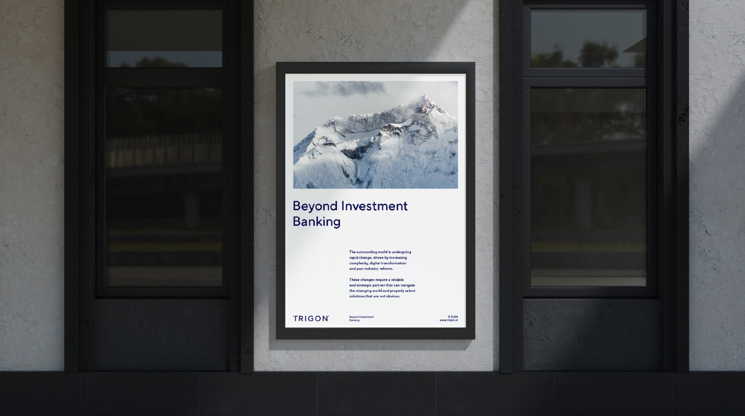
As part of our strategic work, we developed the overarching slogan for the entire brand: Beyond Investment Banking.
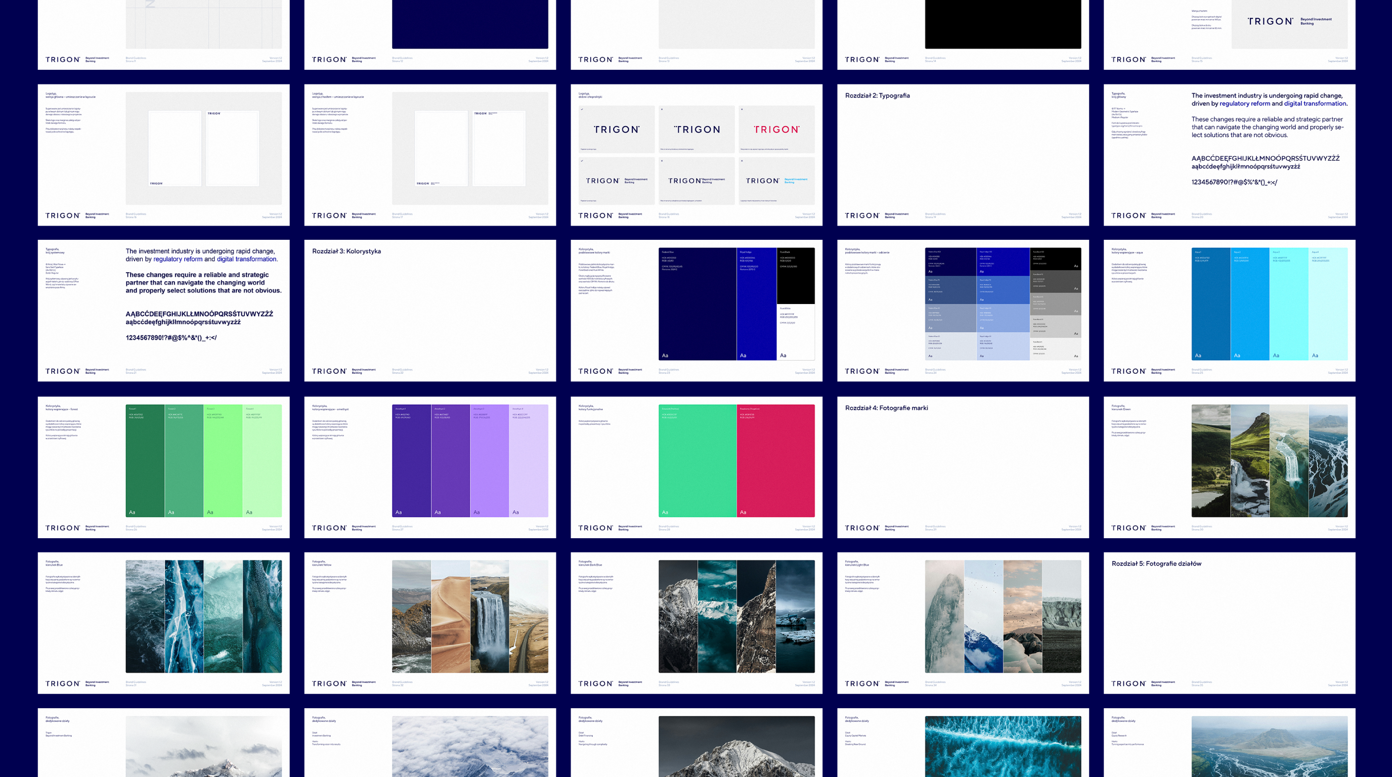
Templates – What Makes It Work?
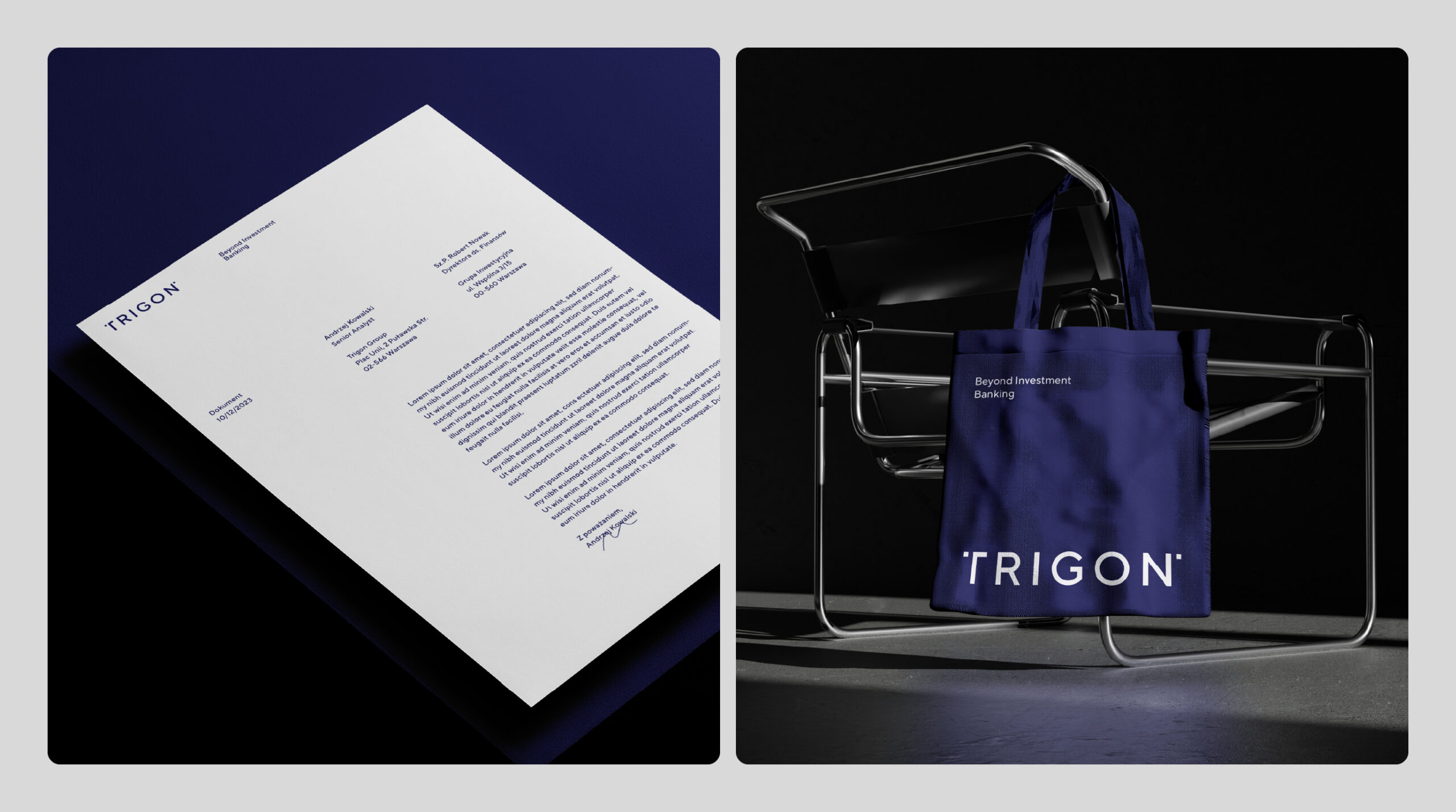
Refreshing a brand isn’t just about reconnecting with it emotionally and injecting new energy—it’s also about practical, everyday improvements.
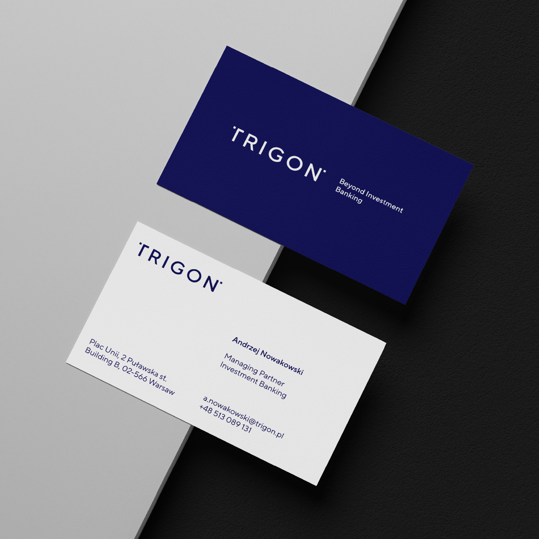
One of the less flashy but highly measurable and tangible outcomes of a rebranding process, especially for employees, is the implementation of new communication templates. This includes defining the brand’s value proposition and tone of voice, creating Office templates (Word + PowerPoint), and developing social media templates.
Here, the design system directly enhances both the quality of work and employees’ daily routines. We modernized brand materials by introducing functional templates.
A key aspect of this process is the development of complex Office solutions, such as presentations and reports. For social media materials, we always recommend automated templates, which significantly save time, streamline decision-making, and ensure brand consistency.
Brand-New, Exceptional Websites
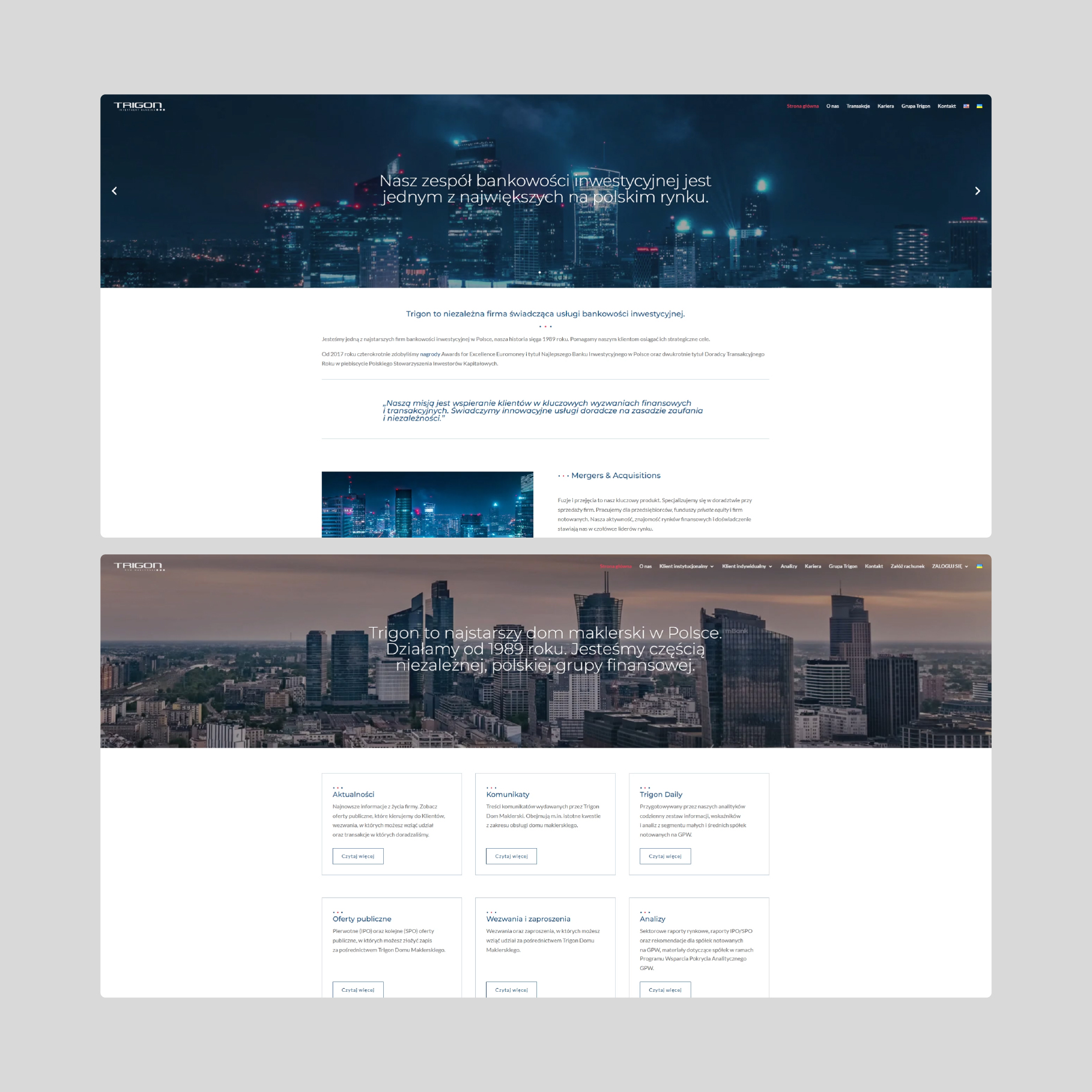
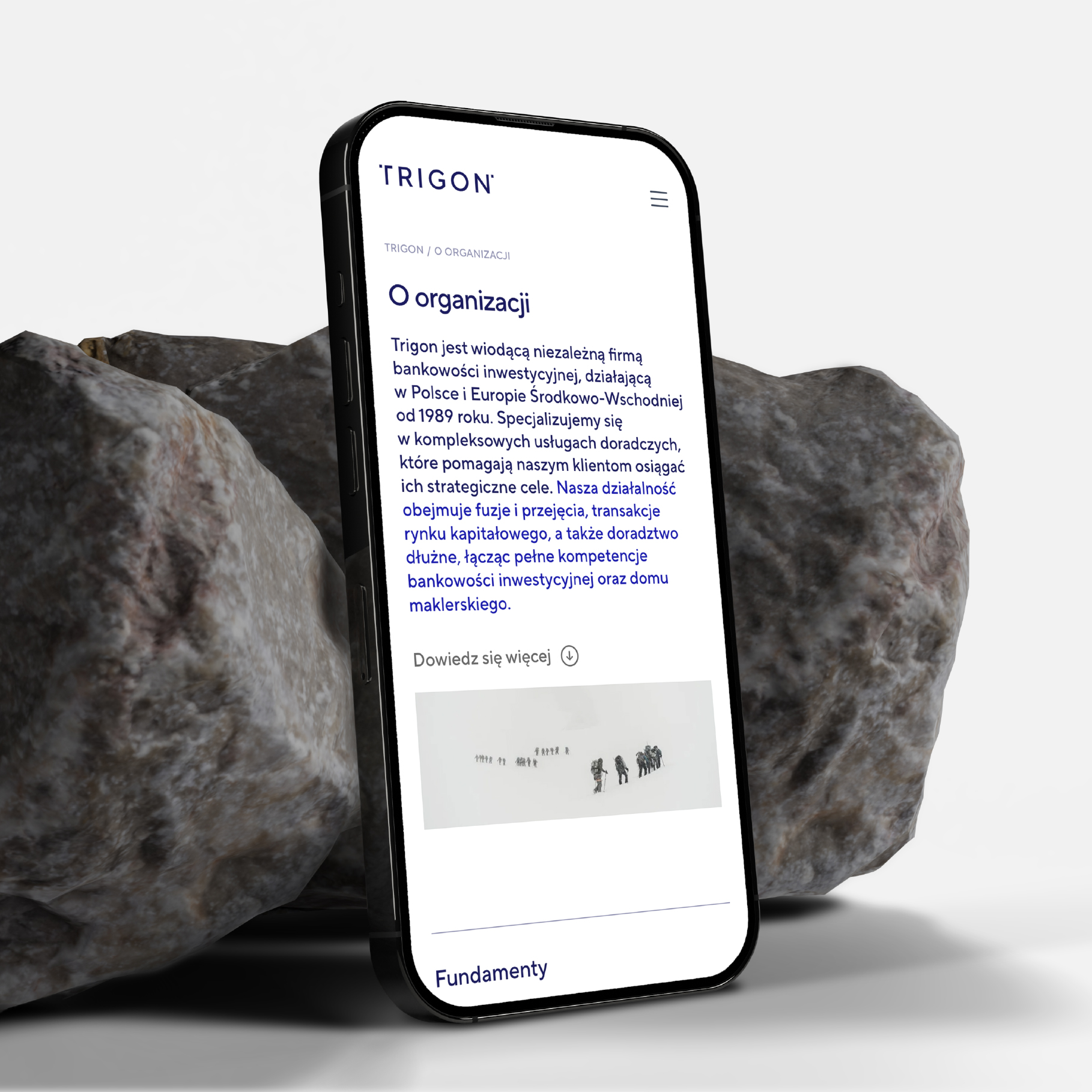
The most visible change for external audiences is Trigon’s new website—or rather, two new websites: one for investment banking and the overarching Trigon brand, and another for the Brokerage House.
We built both platforms from the ground up, from wireframing and visual interface design to implementation in the Webflow CMS and data migration from the previous site.
Strong messaging and compelling narratives form the core of the websites. A refined color palette, high readability, and a clear structure define the new look. Our primary goal was to simplify the site architecture while enhancing visual appeal.
Credits
Leniva° Studio
Art Direction: Neon Neonov
Strategy: Lena Mitkowa
Brand Design: Kamil Przybyła
UX & UI / Webflow: Michał Witucki
Implementation: Katarzyna Jasińska
Clients Team
Jakub Erdman
Michał Skuza