WXCA is an interdisciplinary design firm specializing in architecture, urban planning, and landscaping.
Info ↘
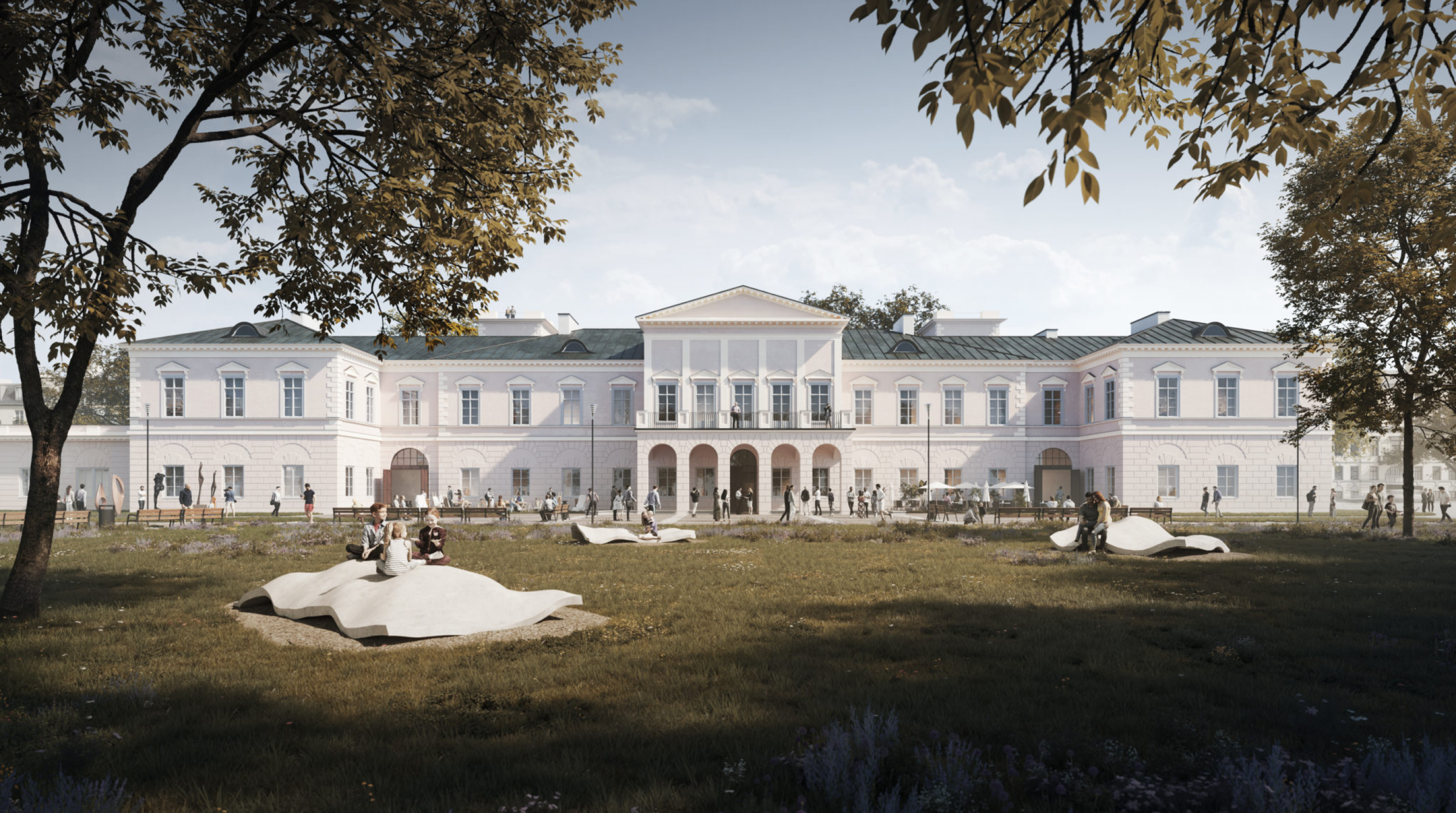
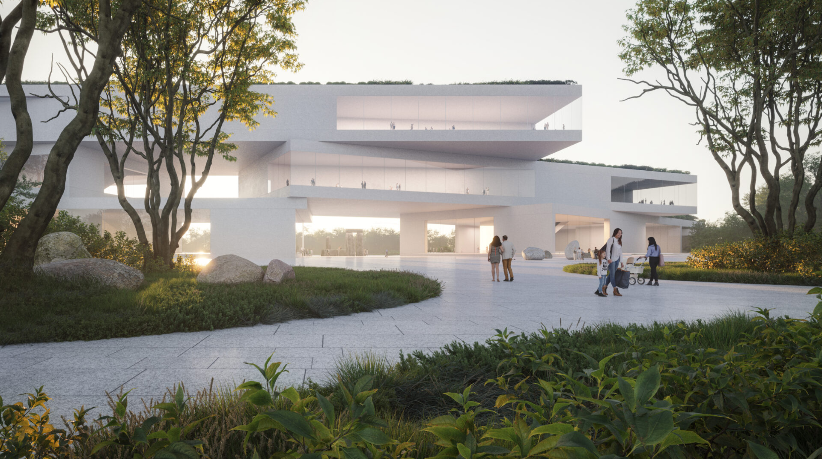
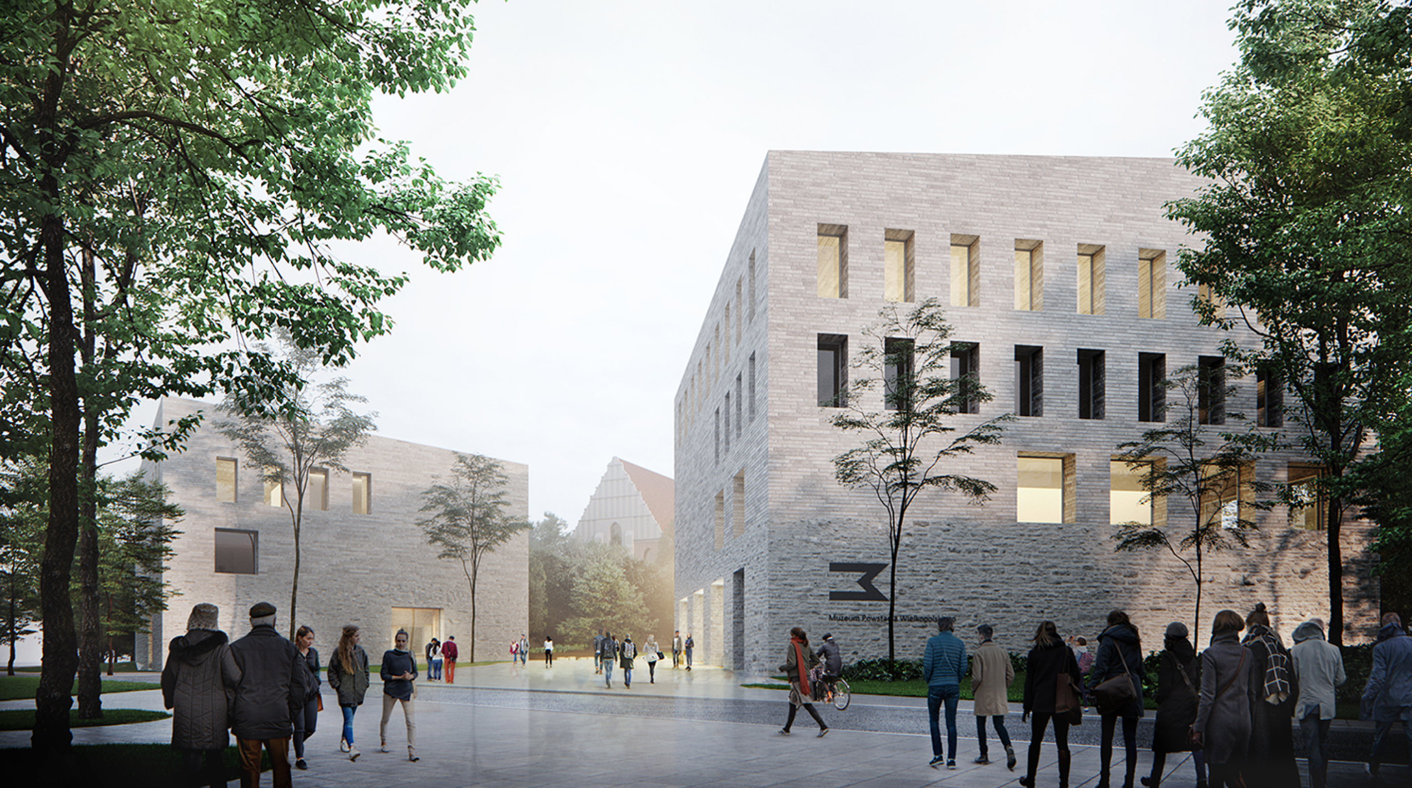
Architecture studio WXCA is an interdisciplinary design studio. What distinguishes them in the European market is not only their spectacular realizations (the Museum of Polish History in Warsaw, the award-winning design of the Polish pavilion at Expo 2020 in Dubai), but also their sensitivity and understanding of the context of the resulting realizations. Unusual projects that change cities – this is the essence of this brand.
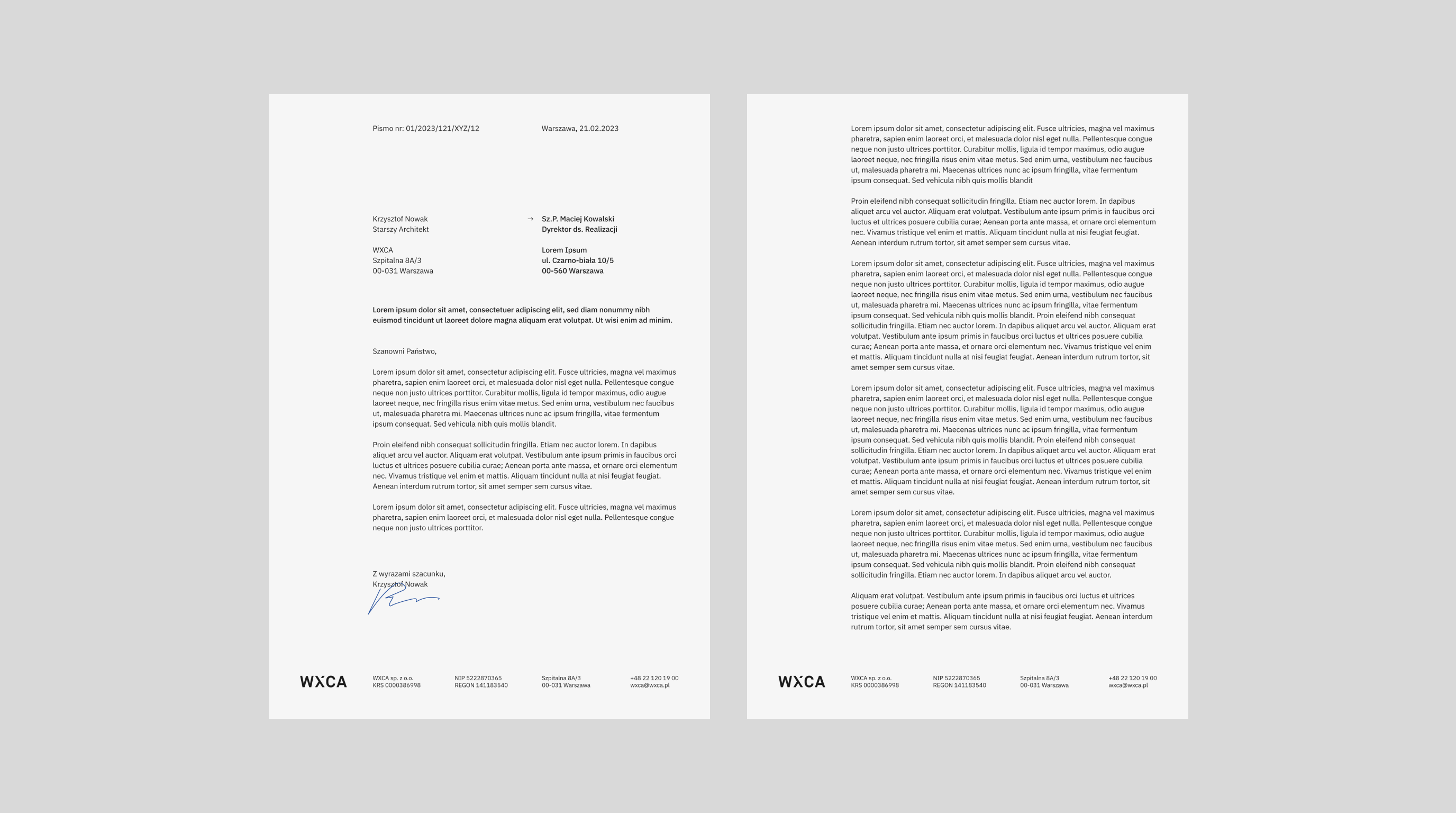
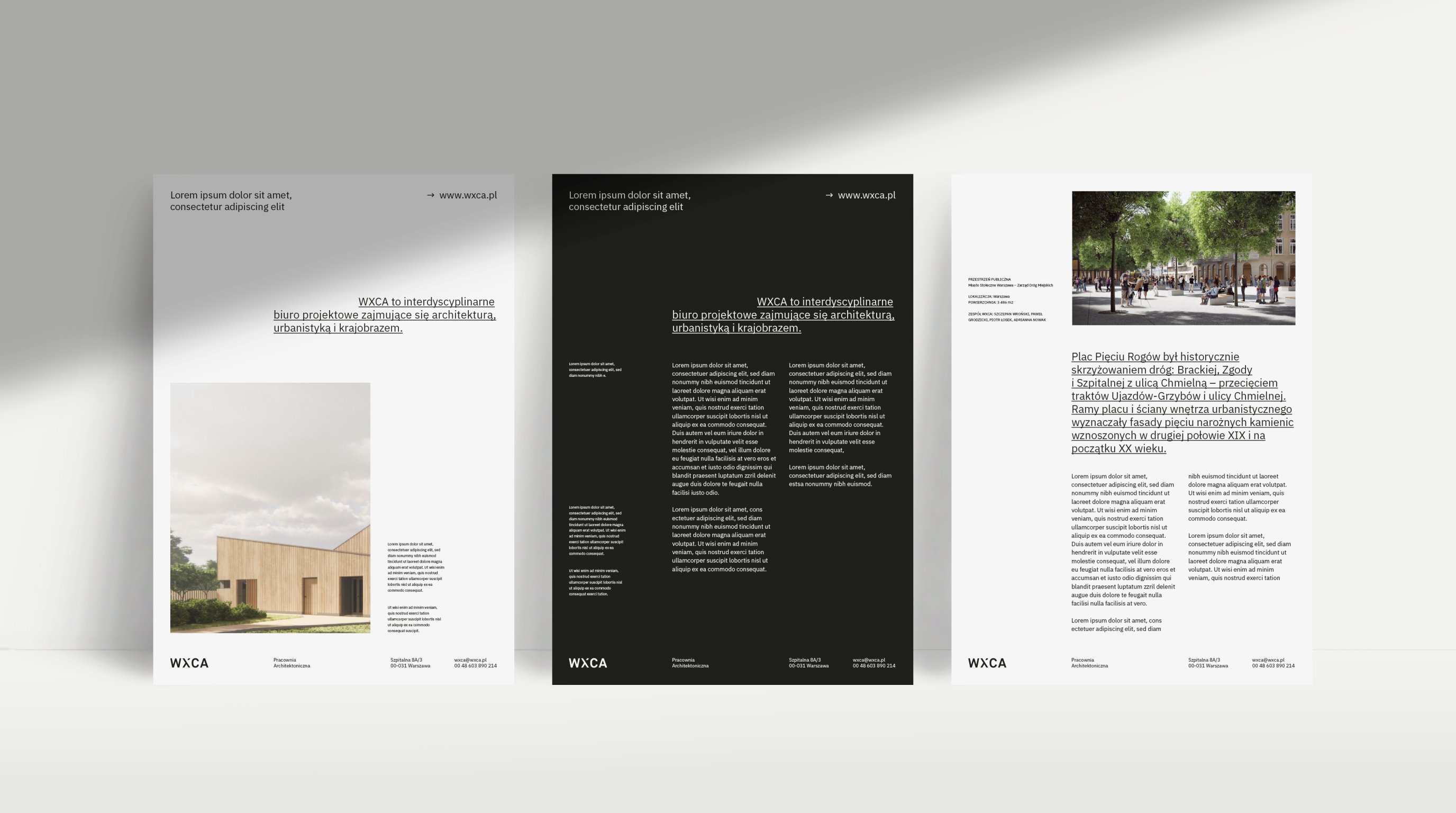
As part of our collaboration, we worked with the team to develop a brand strategy and positioning, and then refreshed the visual identity. Our main task was to build a consistent visual language – a system design that can be easily adapted by the team.
Scope
Strategy / Rebranding
Tools
Illustrator / Photoshop
Client
WXCA
WXCA is an interdisciplinary design firm specializing in architecture, urban planning, and landscaping. We create functional, distinctive spaces, both public and private. Space is both our medium and tool – we shape it to meet the most rigorous functional, aesthetic, and construction requirements.
We build a kind of bridge between society, space, and technology, and we believe that a good project can make the world a better place because we know that only through close collaboration can ecosystems, buildings, and their users thrive.

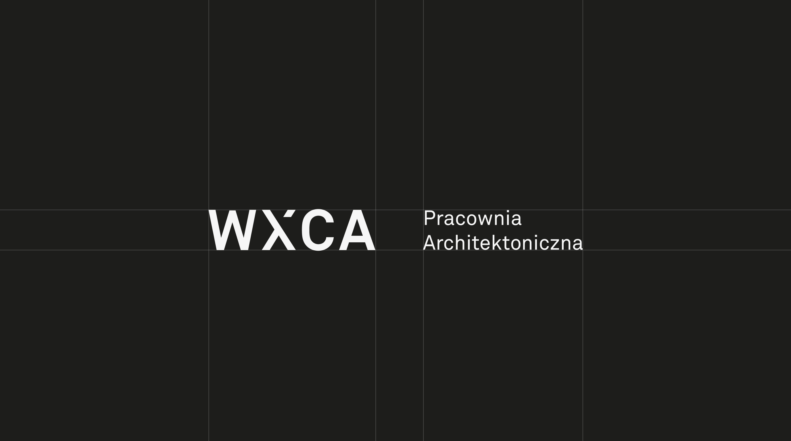
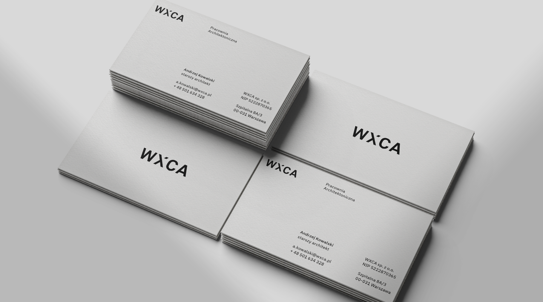
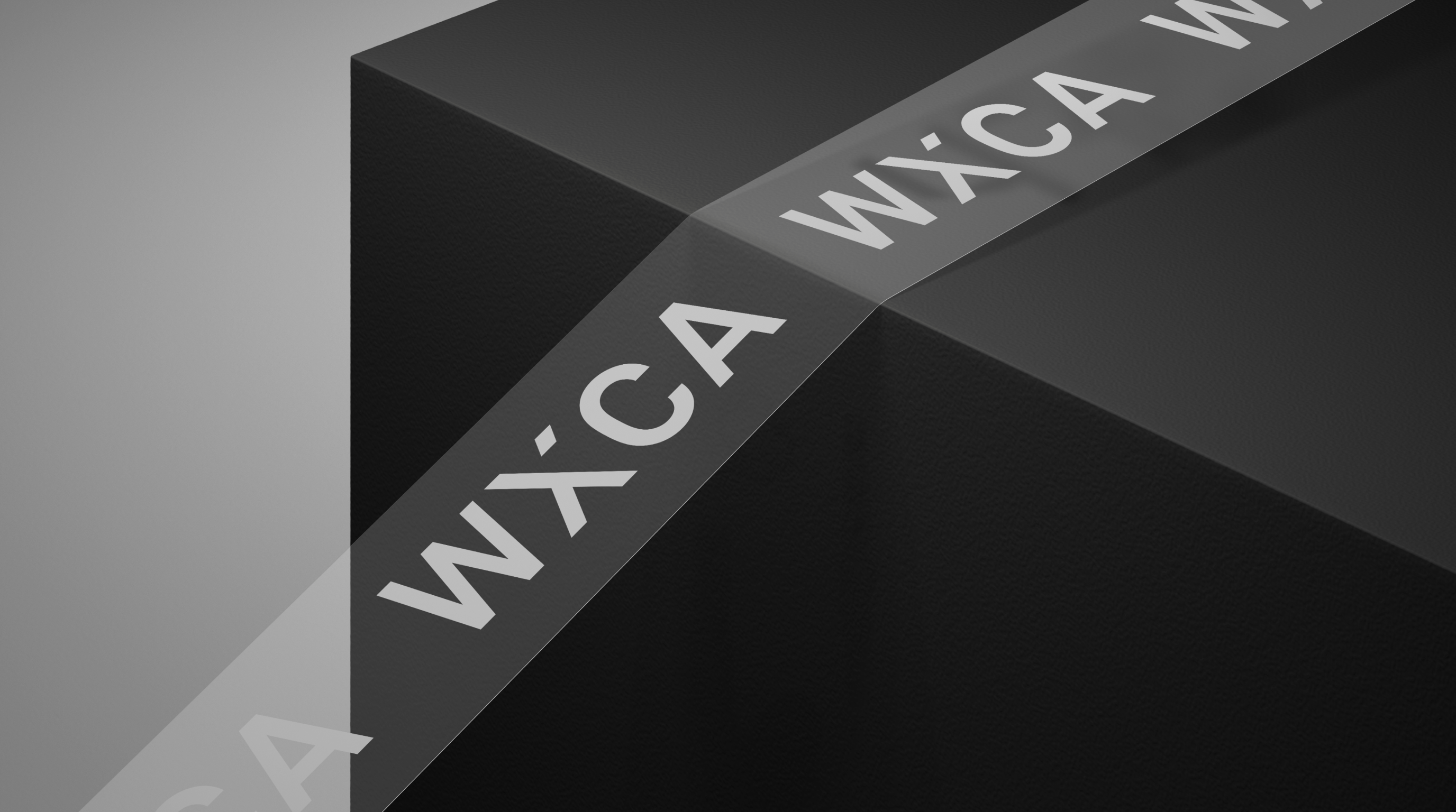
When we began work, we knew we wanted to keep the distinctive letter X in the logo – but give it a new, deeper meaning and character.
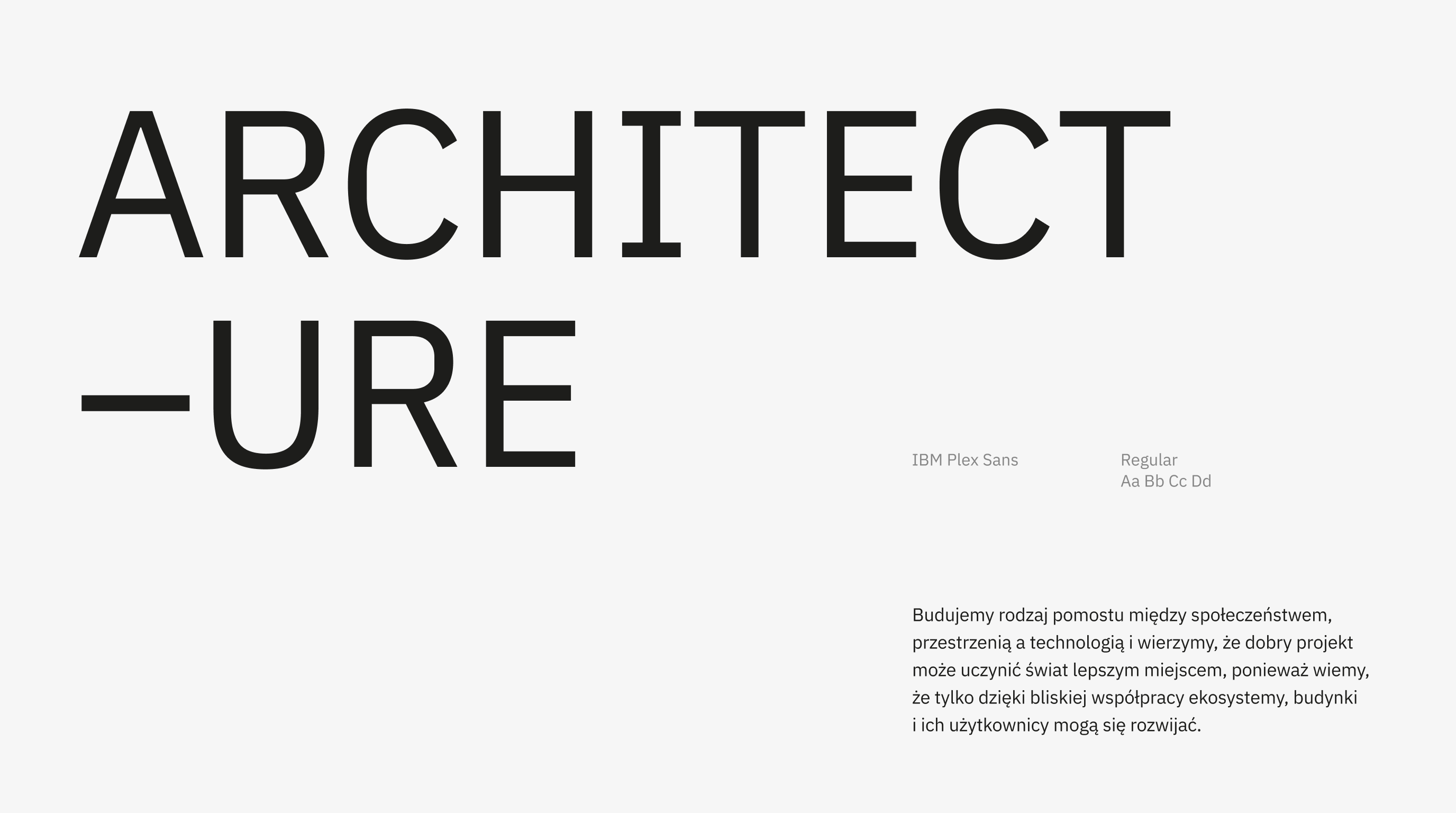
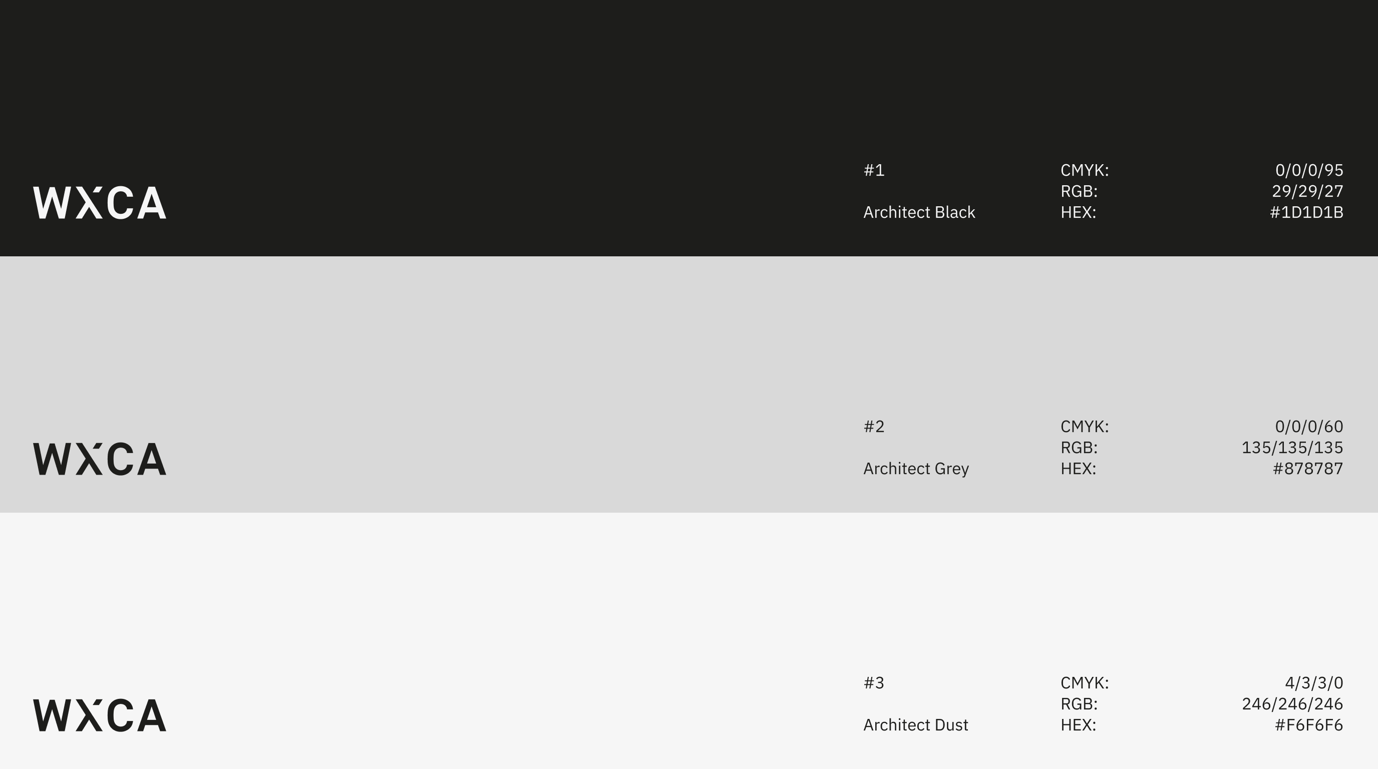
We modernized the brand’s style, keeping the achromatic minimalism, but taking it a step further. We chose typography that is both minimalist and unobtrusive, but also – has a strong, memorable touch.


Leniva° Studio
Art Direction: Neon Neonov
Brand Strategy: Lena Mitkowa
Design: Kamil Przybyła, Neon Neonov, Janek Mońka
Design Support: Marta Krzemień-Ojak
Production: Lena Mitkowa, Saskia Mońka, Janek Mońka
Client’s Team
Szczepan Wroński
Marta Sękulska-Wrońska
Piotr Łosek