Lights, camera, action!
Info ↘
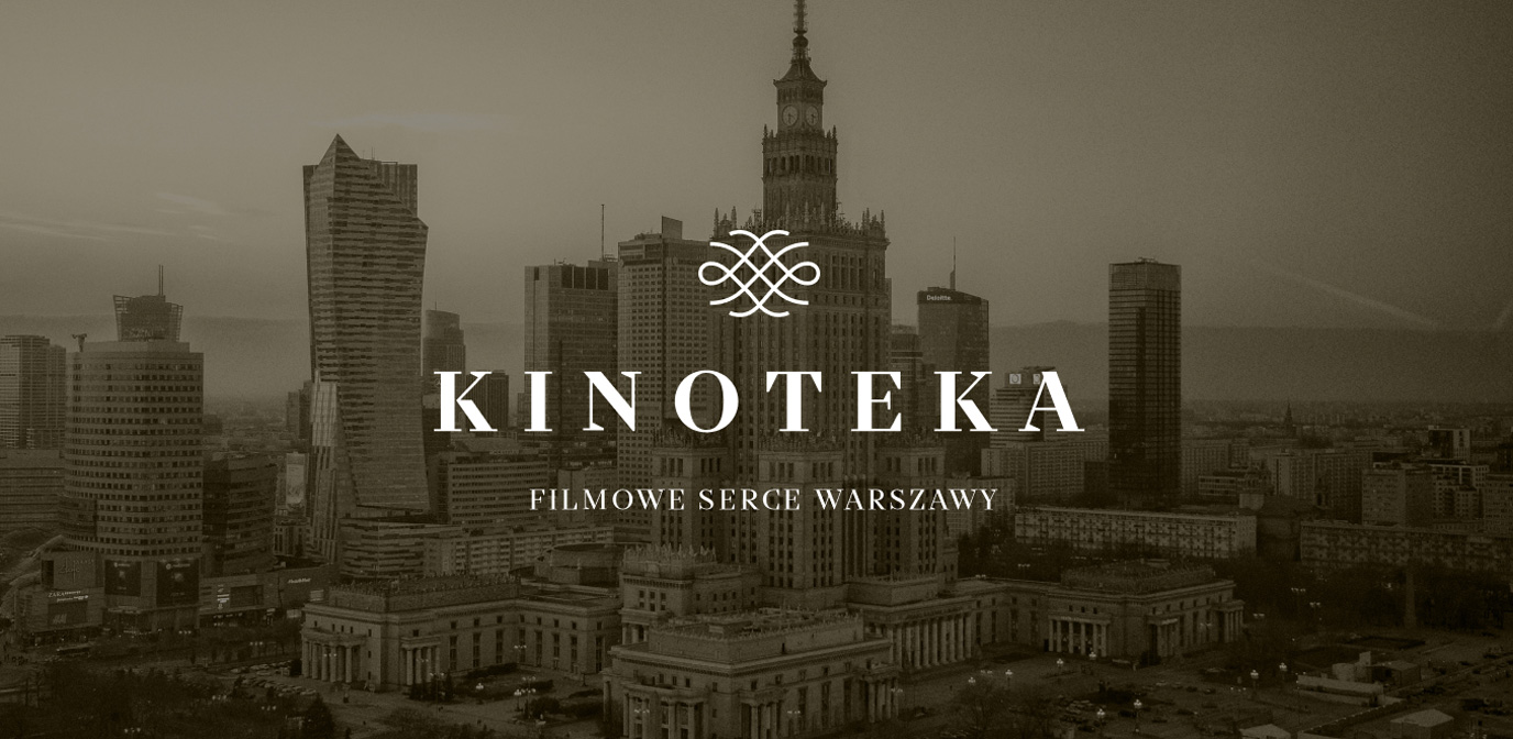
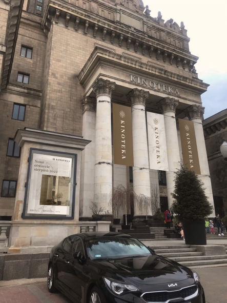
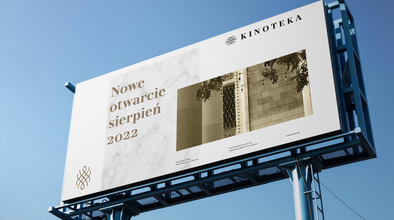
Kinoteka is a famous place on the map of Warsaw. It is not only one of the well-known studio cinemas, but it also stands out because of its location – in the very centre of Poland’s capital, in the building of the Palace of Culture and Science. Despite great recognition of the place itself, only a few recipients were familiar with its logotype – Kinoteka lacked a coherent visual identity. It was our task to change that.
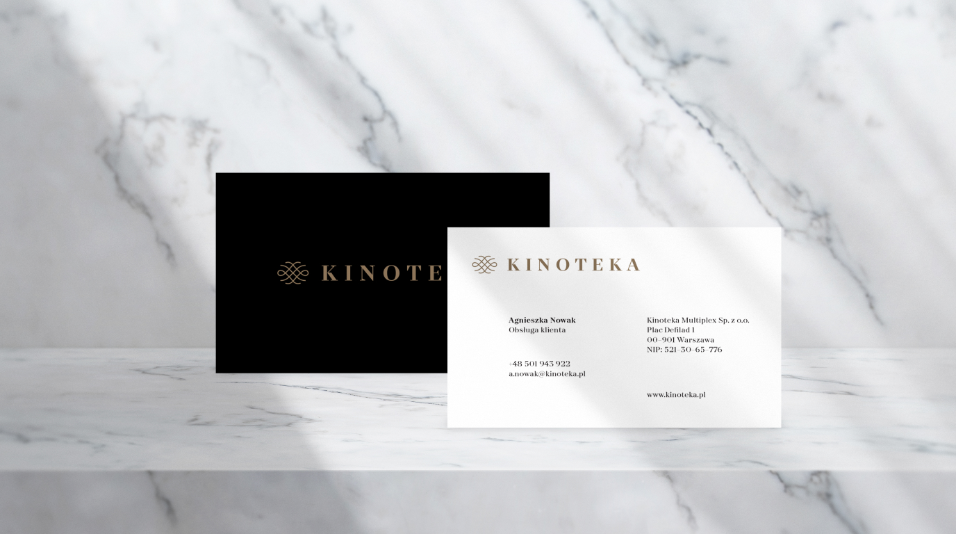
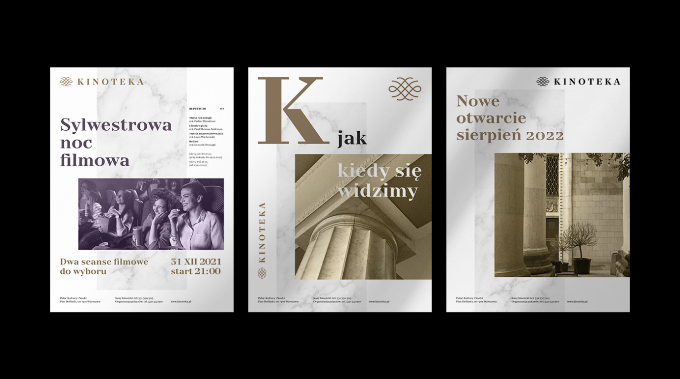
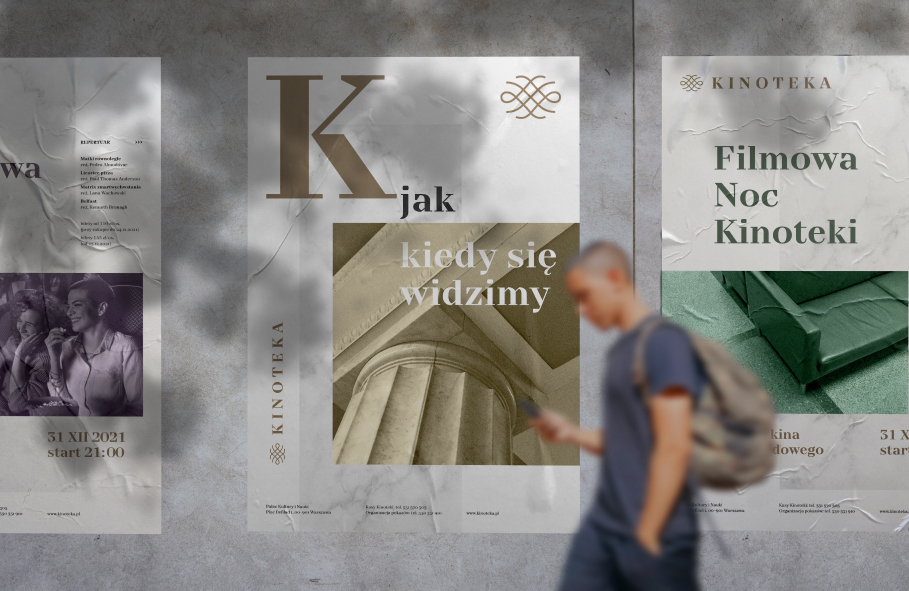
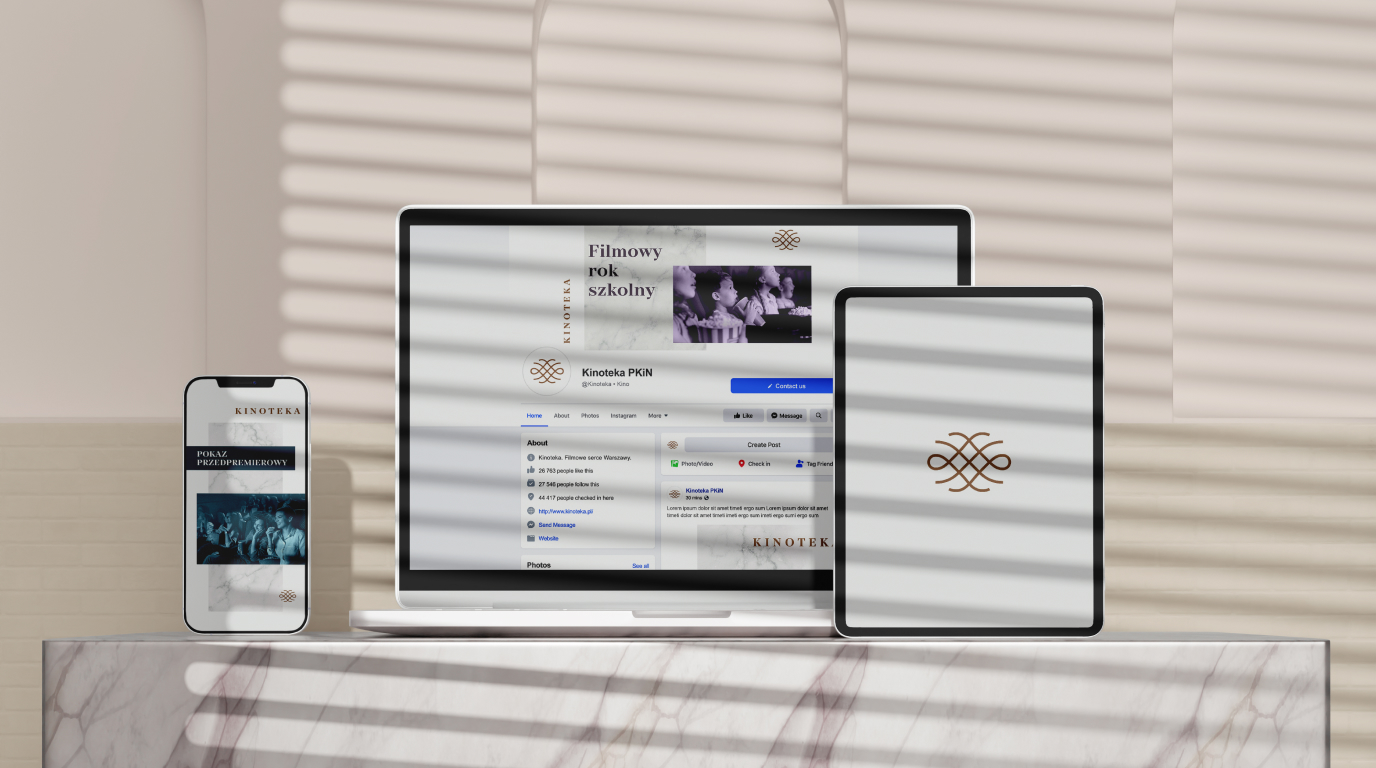
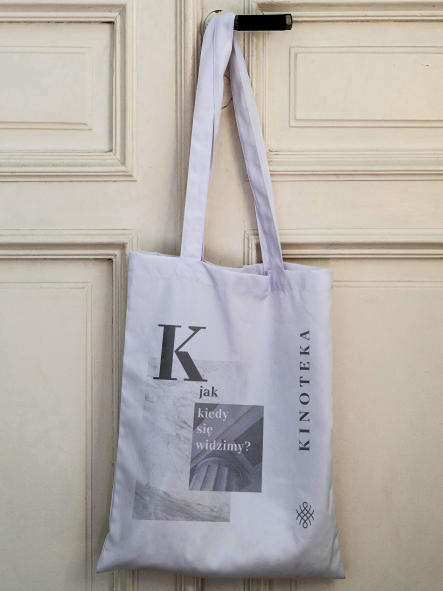
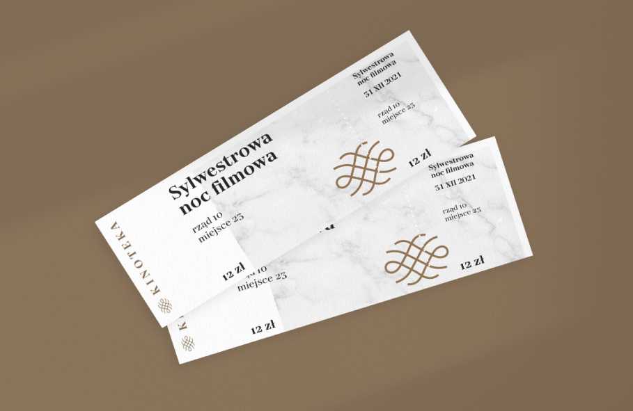
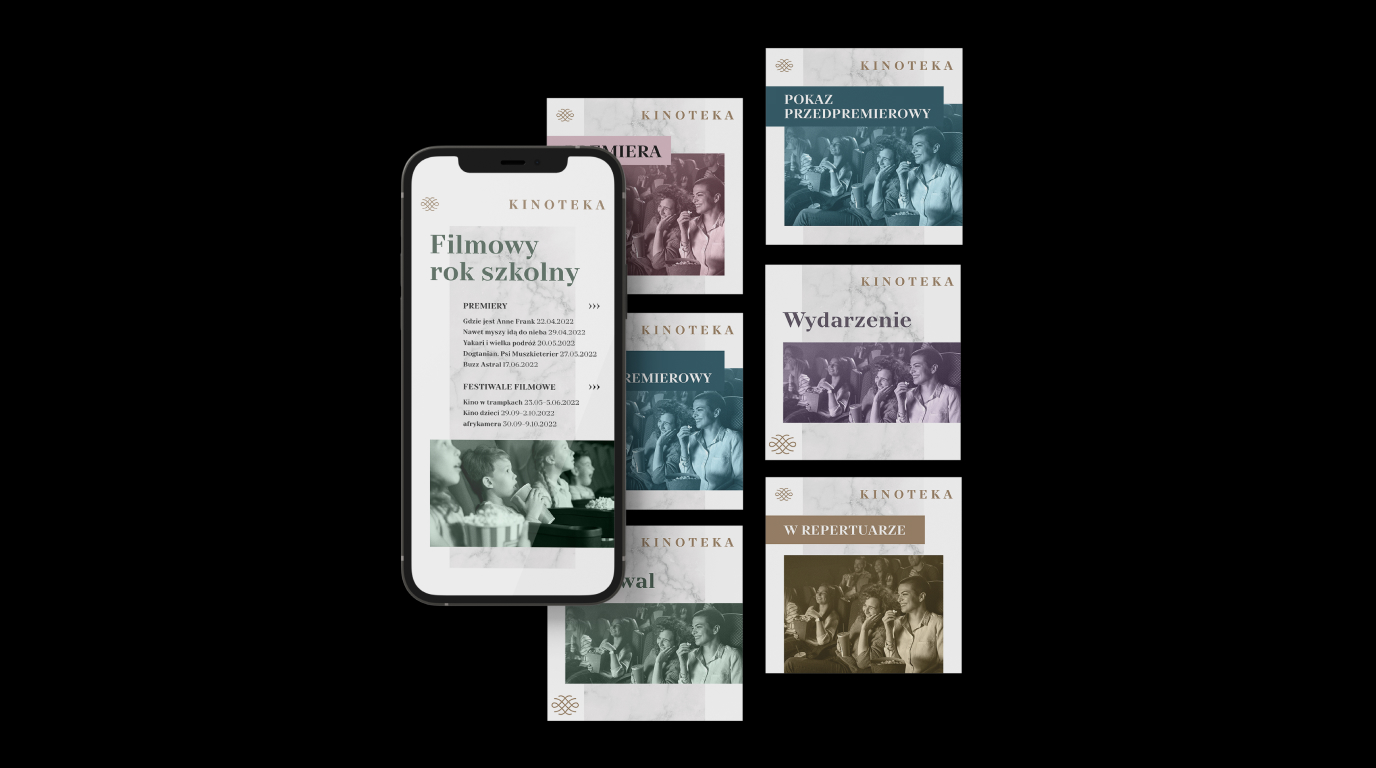
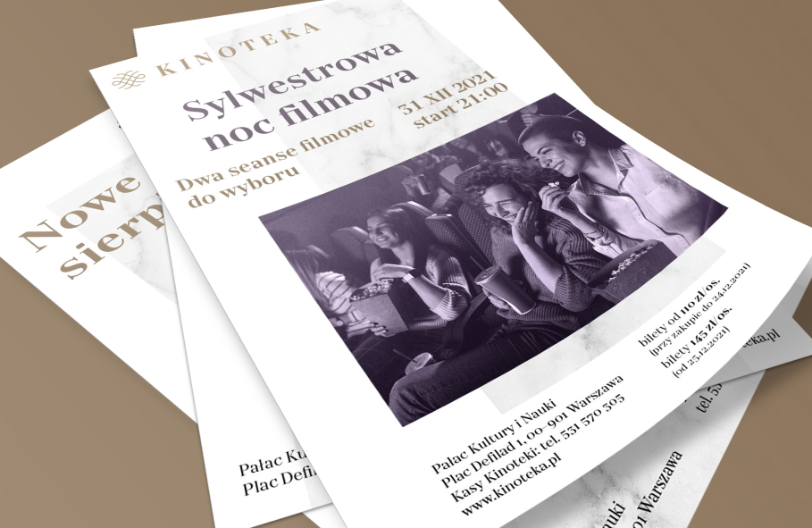
We were responsible for the preparation of coherent visual language of the brand (colours, typography, iconography, proportions), as well as its new copy language. In addition to developing the logotype, we prepared brand materials such as business cards or letterhead, as well as promotional materials, social media posts’ templates and online materials – newsletter and email footer.
Scope
Rebranding
Tools
Illustrator
Client
Kinoteka

Something old,
something new
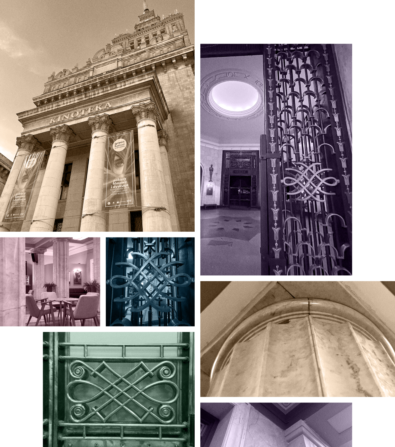
We compared the expectations of the new operators of this place with the expectations of the people who use it daily, namely cinema goers. During the process of devising identification and brand experience, we could not miss the crucial factor in this case – the architectural space of Kinoteka.
The socialist realism style of the Palace of Culture and Science and the characteristic décor of the cinemas’ interior, which combine the tradition of post-war Warsaw with modern times, are the hallmarks of Kinoteka. We kept that in mind while creating the new branding.


Mix’n’match
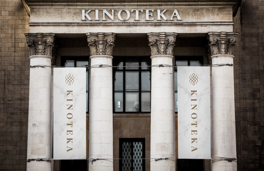
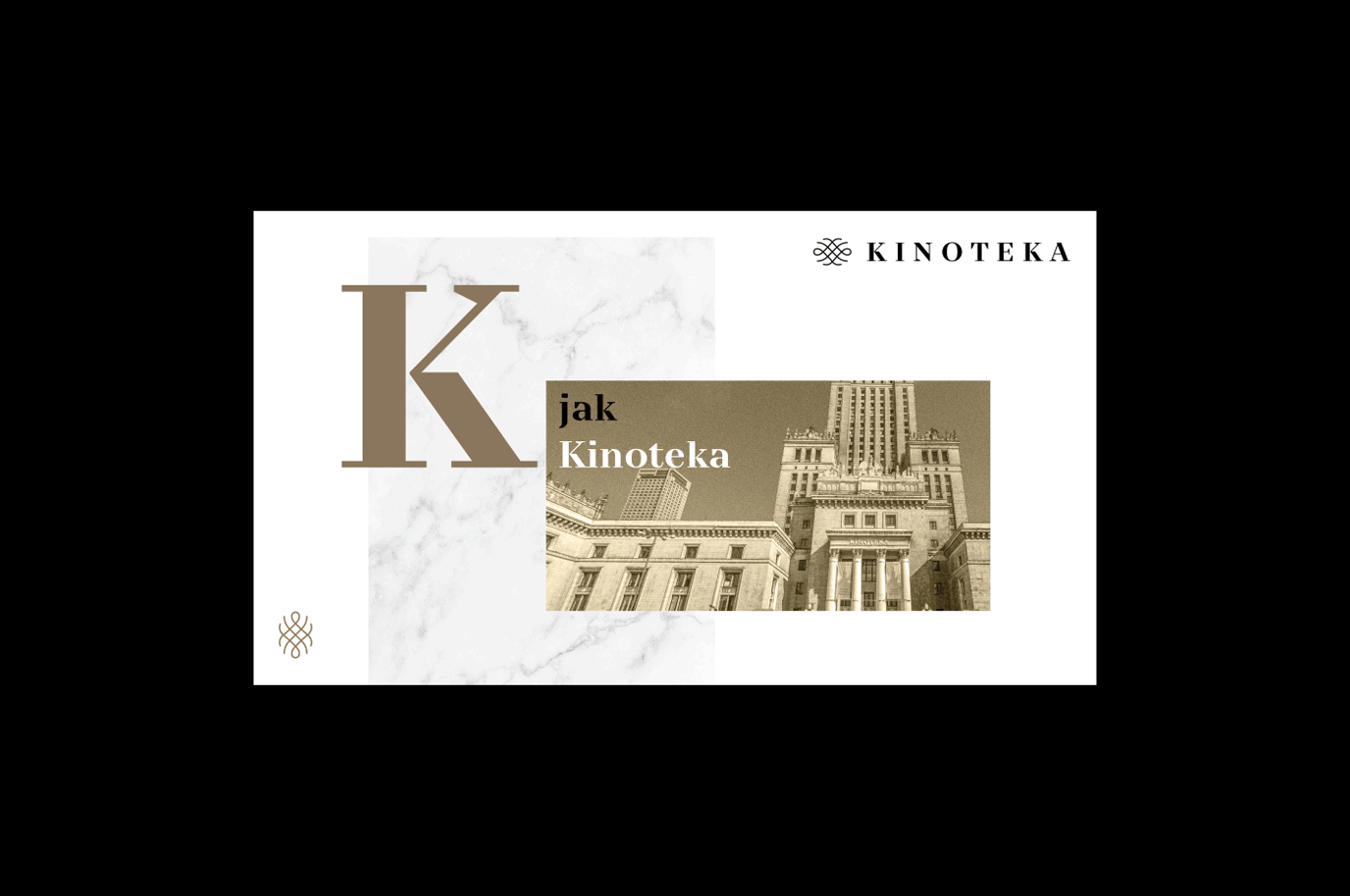
In the logotype, we focused on a bold, typographic sign that can function independently or in combination with a signet or a claim. The pattern of the signet is inspired by one of the patterns that can be found repeatedly in the decorations of the Kinoteka’s interior.
The font we used is TT Nooks, which – as it’s description from TypeType says – if it were a person, it would be an elegant lady with an independent and tough personality. And ladies like that surely belong to places like Kinoteka!
Marble is yet another elegant element – both traditional and modern at the same time – which has been used in abundance across the materials we created. Combined with photos set above a layer of tint and grain, rich in colour, the entirety is not only unique, but also combines a vintage vibe with the spirit of the 21st century.
Credits
Team Leniva° Studio
Concept and Key Visual: Neon Neonov, Adrianna Skotnicka, Kamil Przybyła
Production: Lena Mitkowa, Saskia Mońka
Design: Marta Krzemień-Ojak
Client’s Team
Katarzyna Majchrzak
Maria Majchrzak
Karolina Fornal