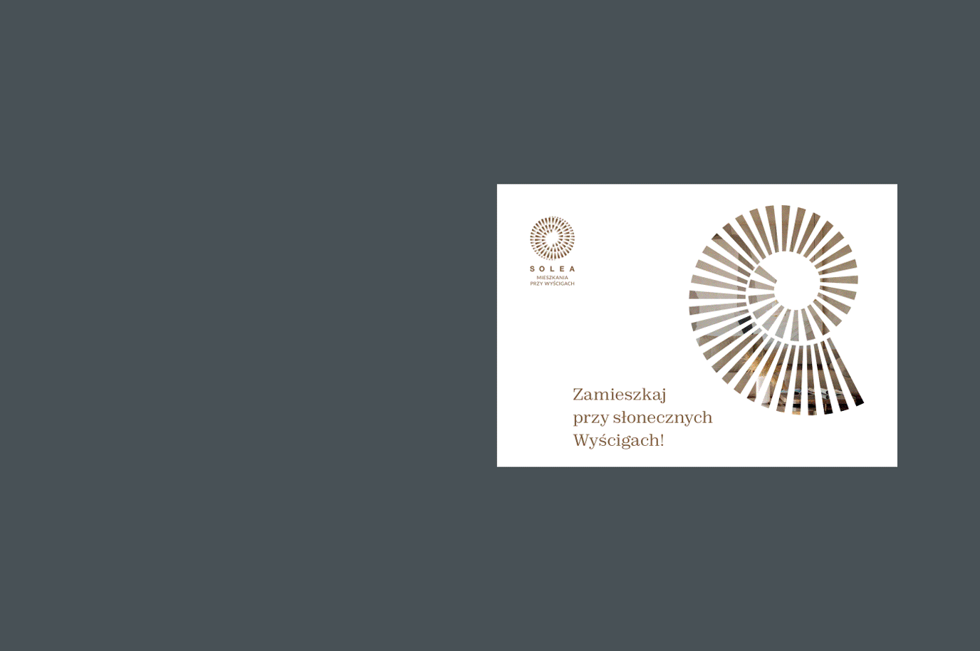
Solea is a name inspired by a Latin word meaning horseshoe. Ride your luck!
Info ↘
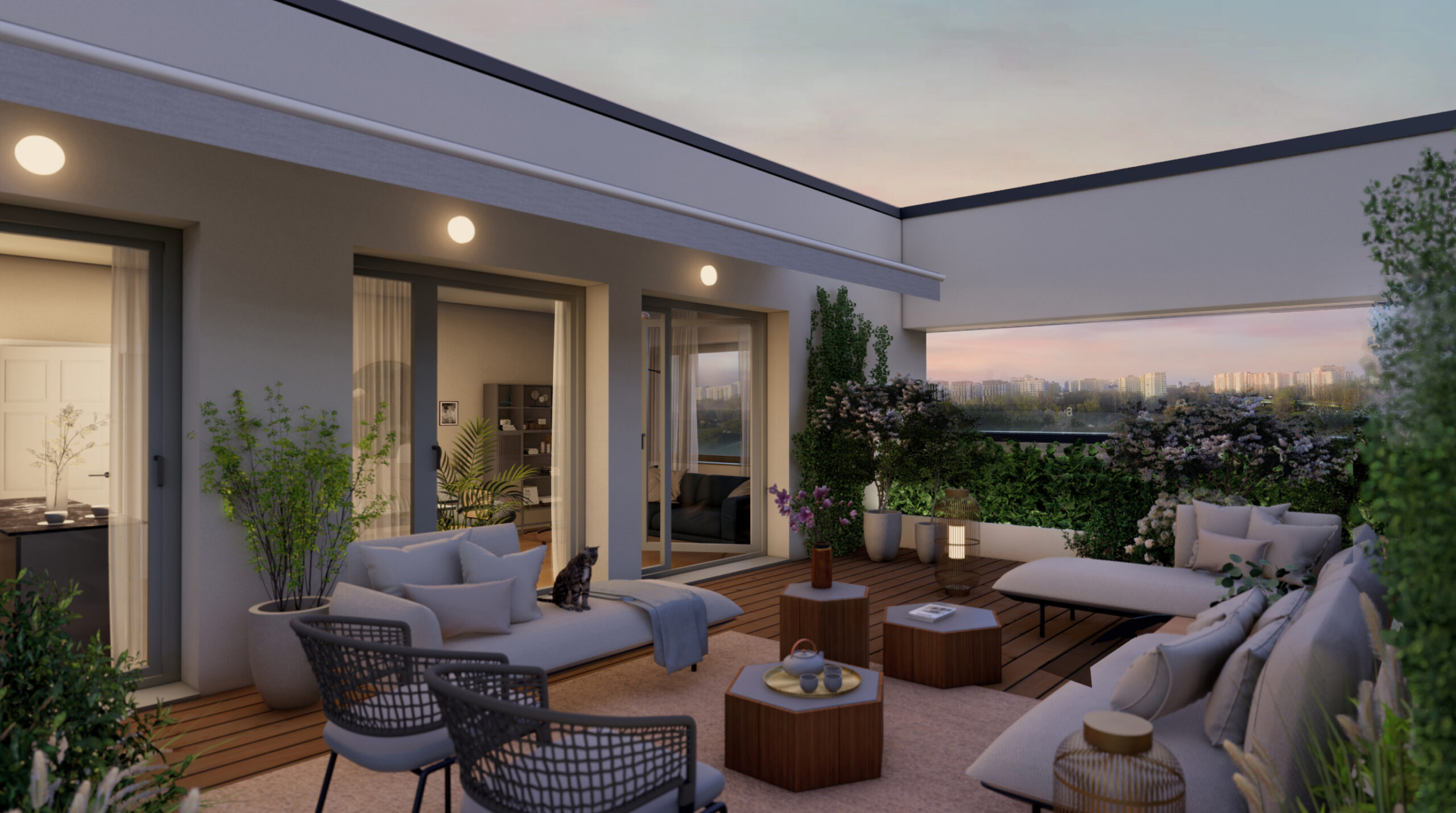
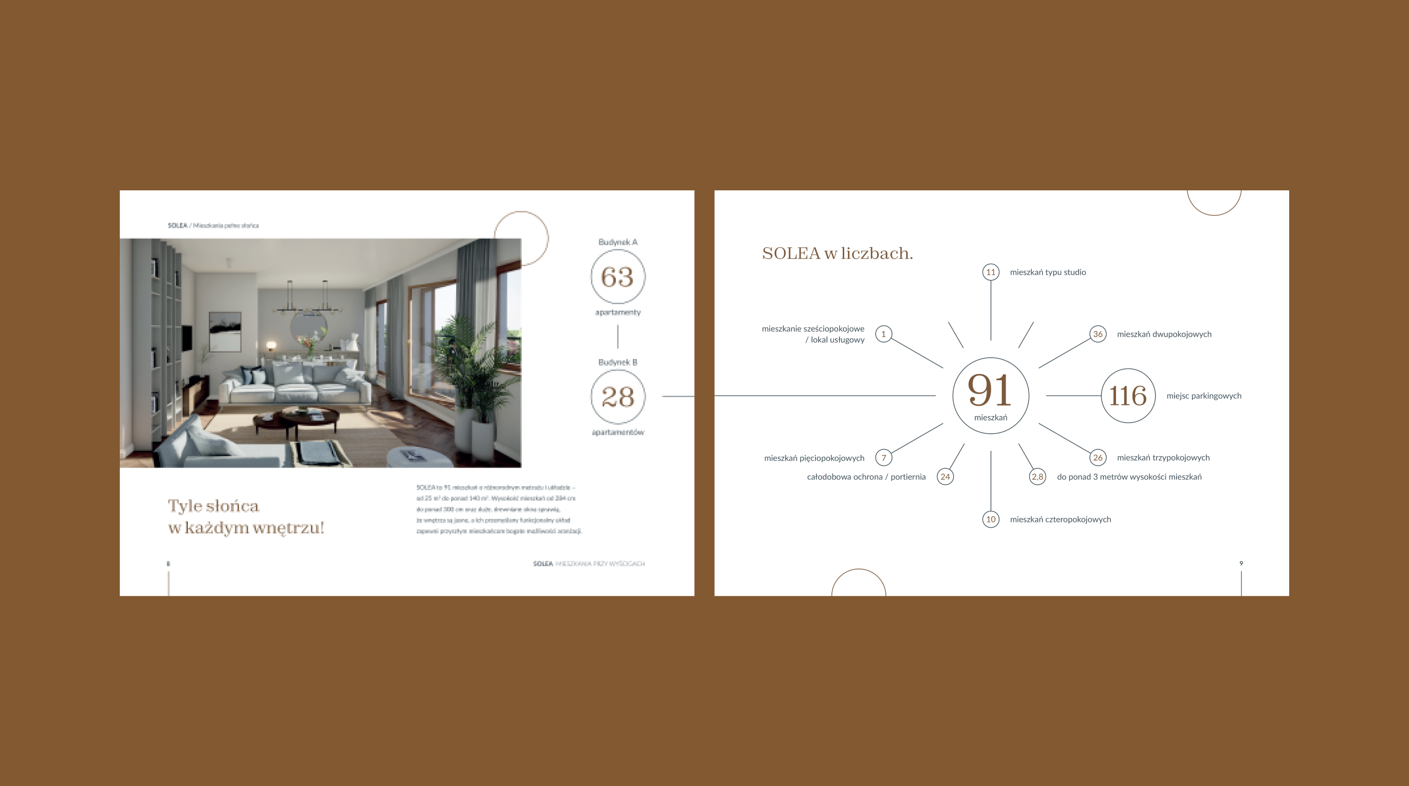
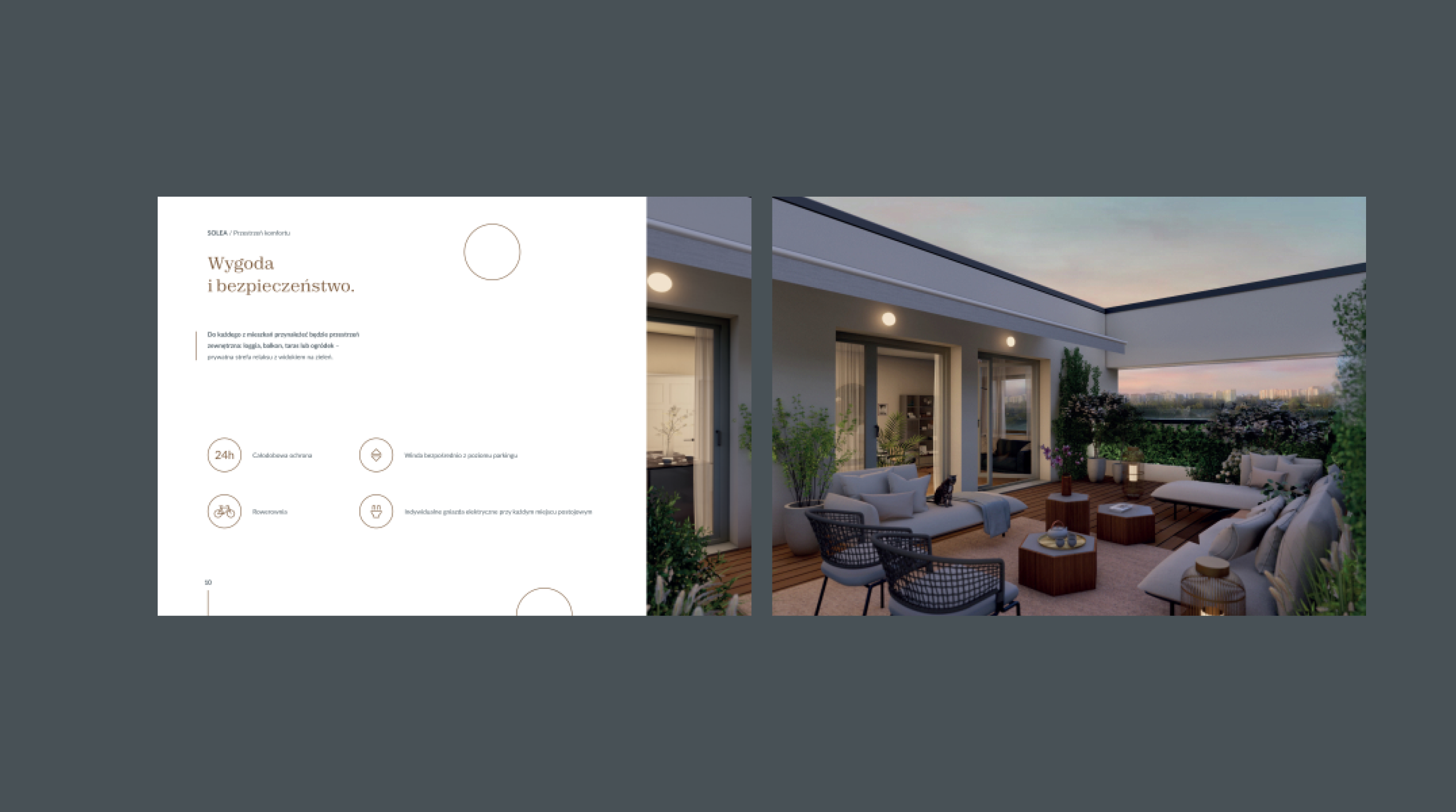
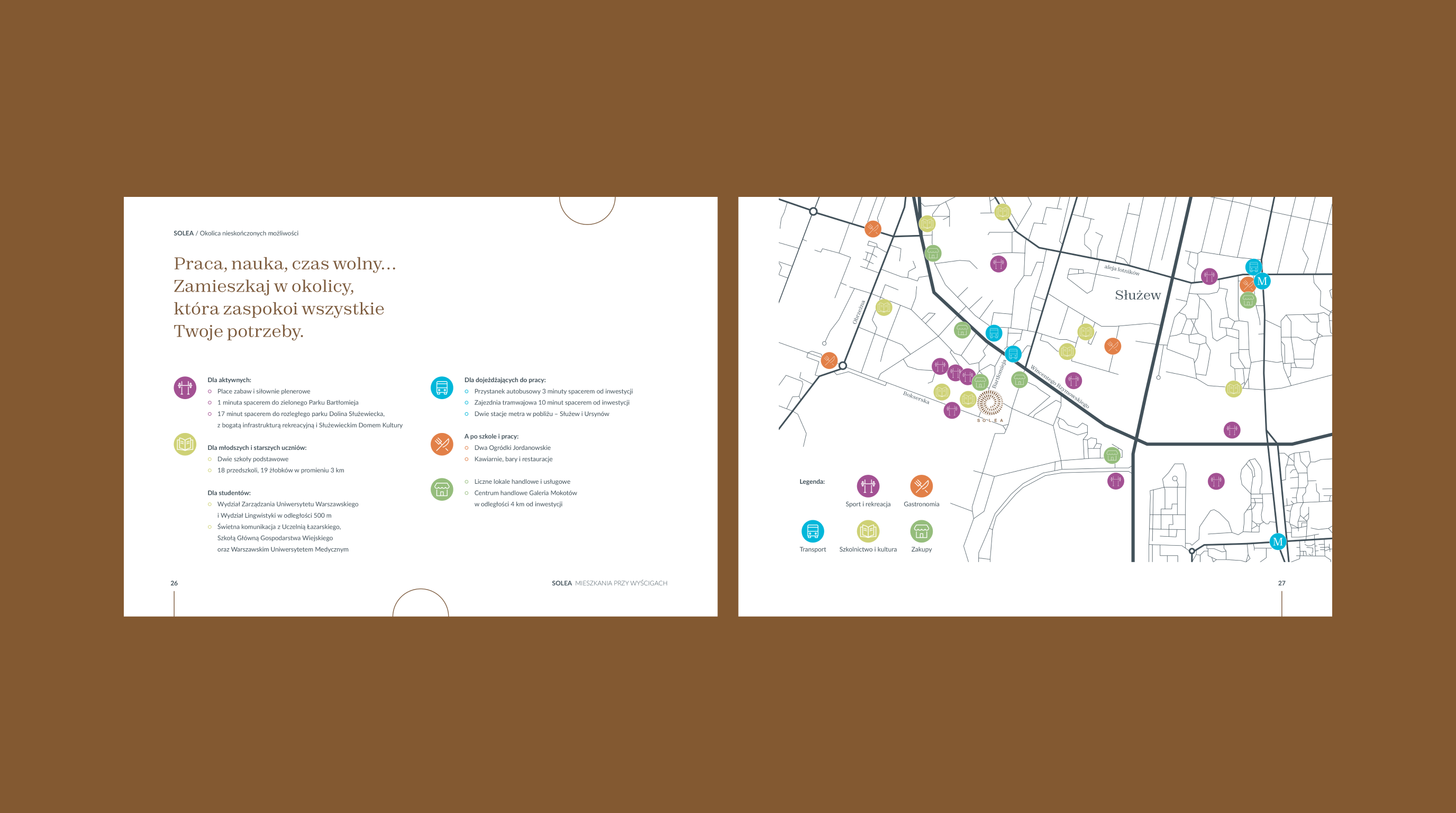
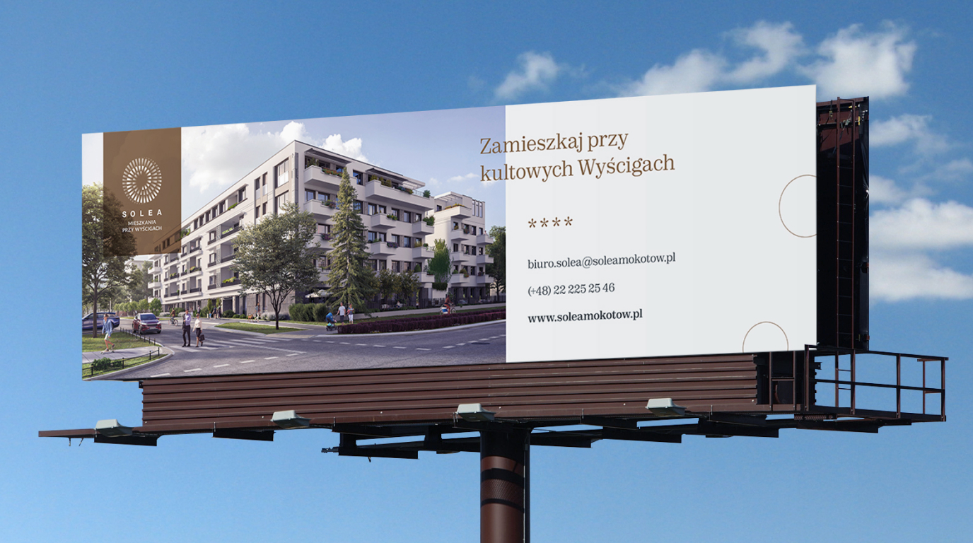
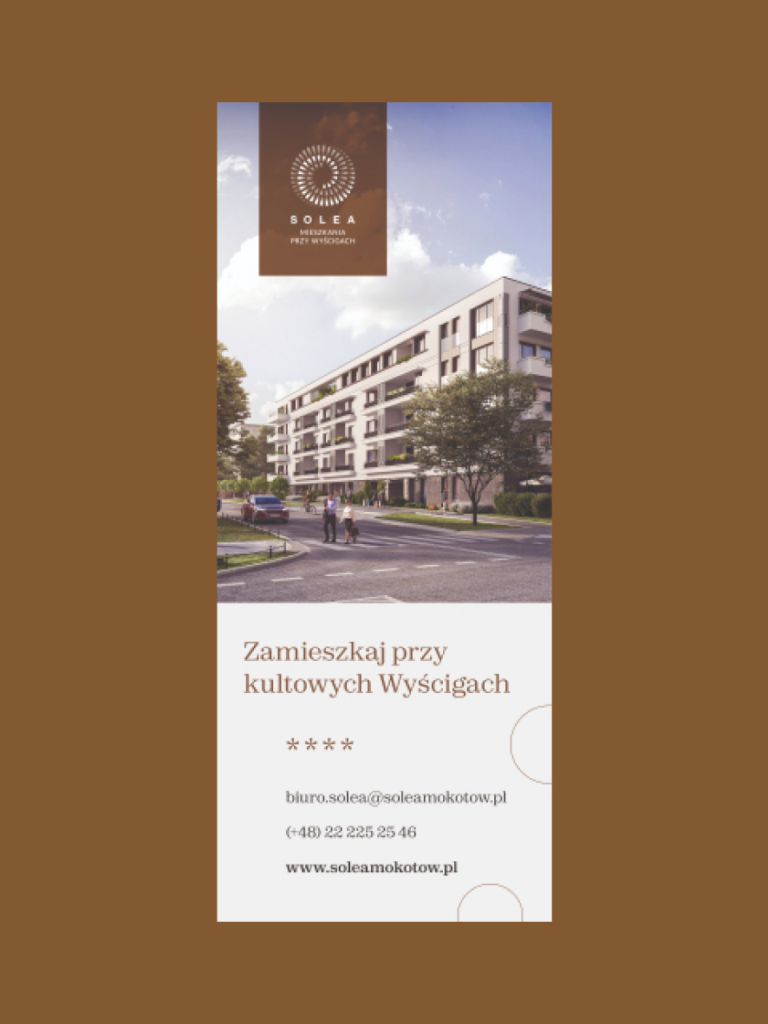
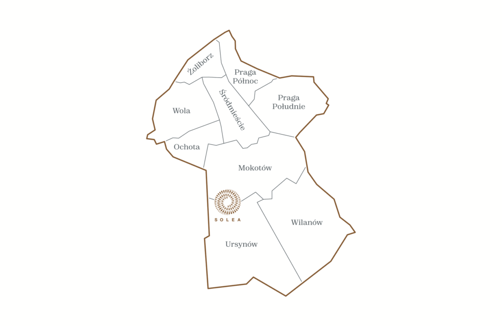
SOLEA is a boutique investment located in Warsaw’s Służewiec – two four-story buildings consisting of sunny apartments. Our task in this project was to prepare a brochure addressed to the developer’s future clients. We’ve also prepared some advertising materials destined for city space – banners and bus branding.
In addition to the main, obvious goal – encouraging customers to buy apartments – we wanted to reflect the unique nature of this investment. That’s why we’ve made an additional logo lifting. We’ve also supplemented the existing color palette with some complementary colors.
Scope
Editorial Design
Tools
Illustrator / InDesign
Client
Solea
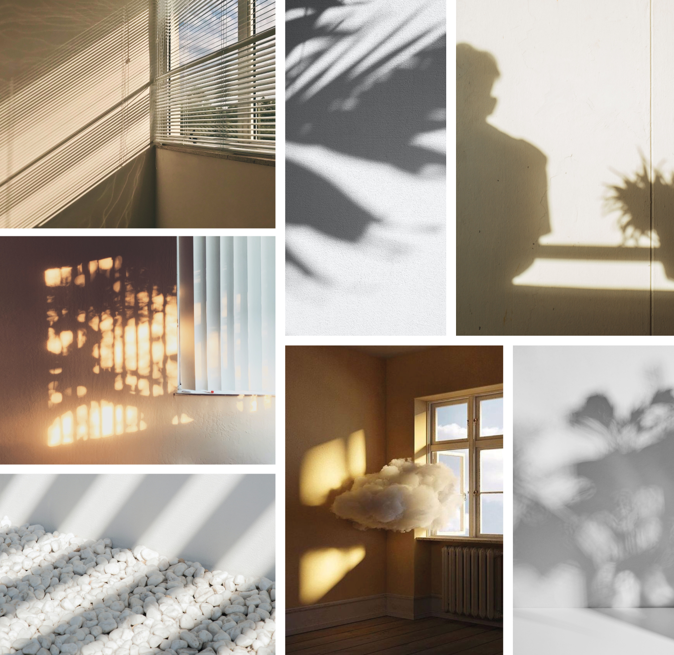
Moodboard
- ⟶ Nearby
⟶ Fresh Air
⟶ Rays of the Sun Spacious Apartments
⟶ Deep Breath At Your Fingertips
⟶ Well Connected Energy
⟶ Sun
⟶ Joy
⟶ Rapid Development Dynamism
⟶ Family
⟶ Positive Energy
Actual investment
Design task
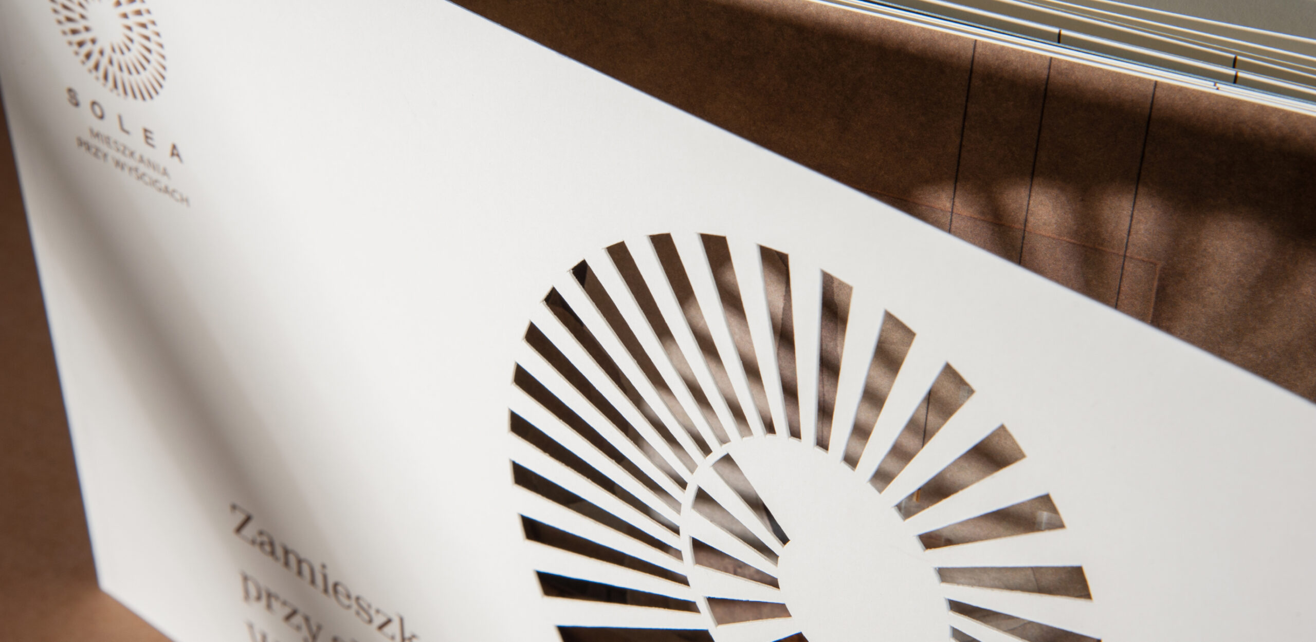
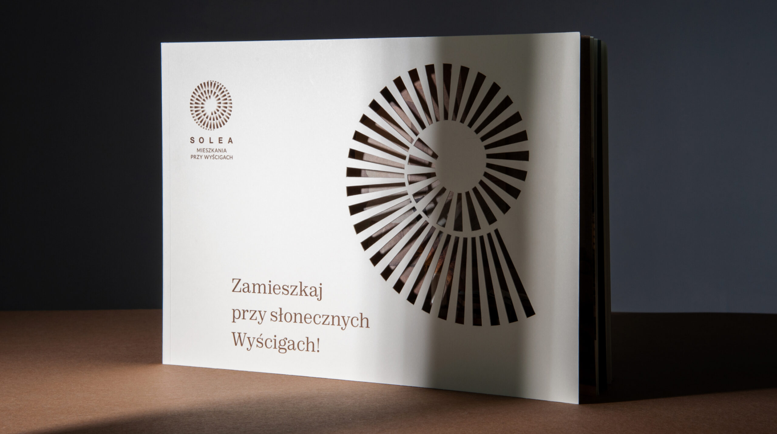
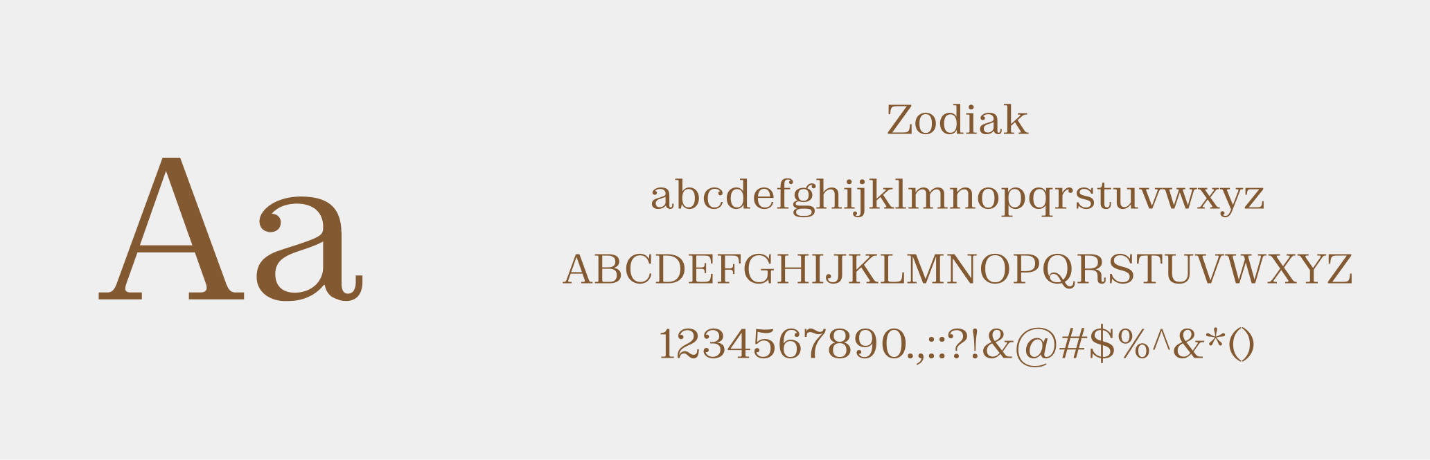
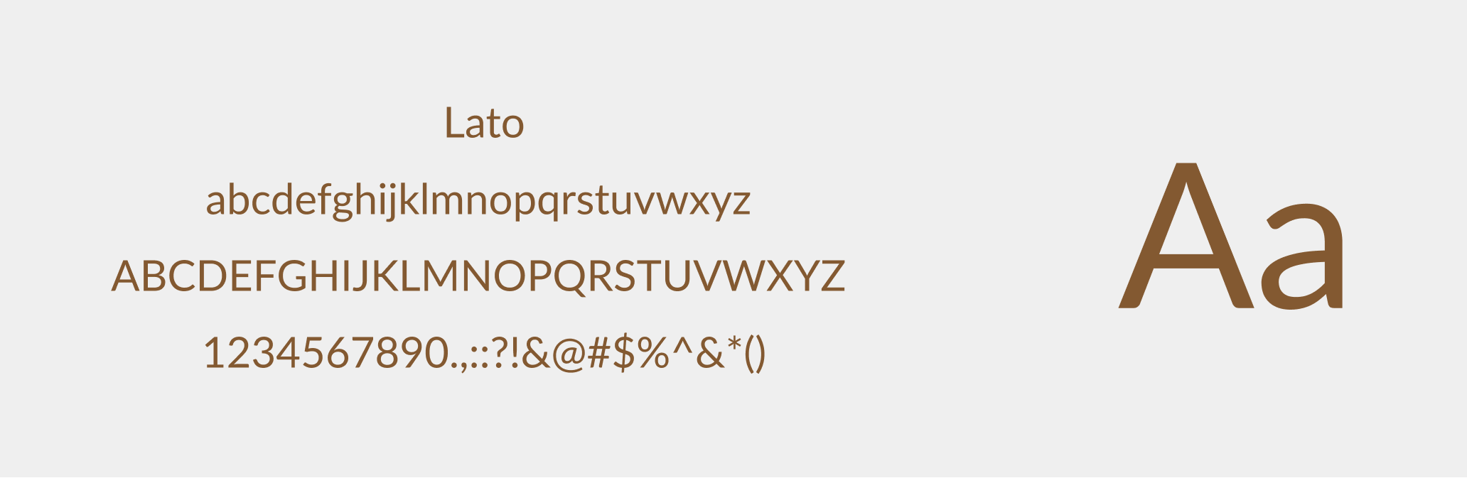
We started our work with a slight lifting of the logo. Colors such as yellow and blue, which were supposed to be associated with sun rays, were replaced with an equally luminous but slightly more subdued, elegant brown falling into gold.
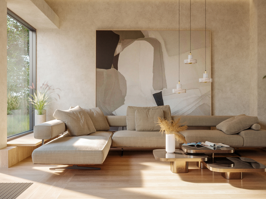
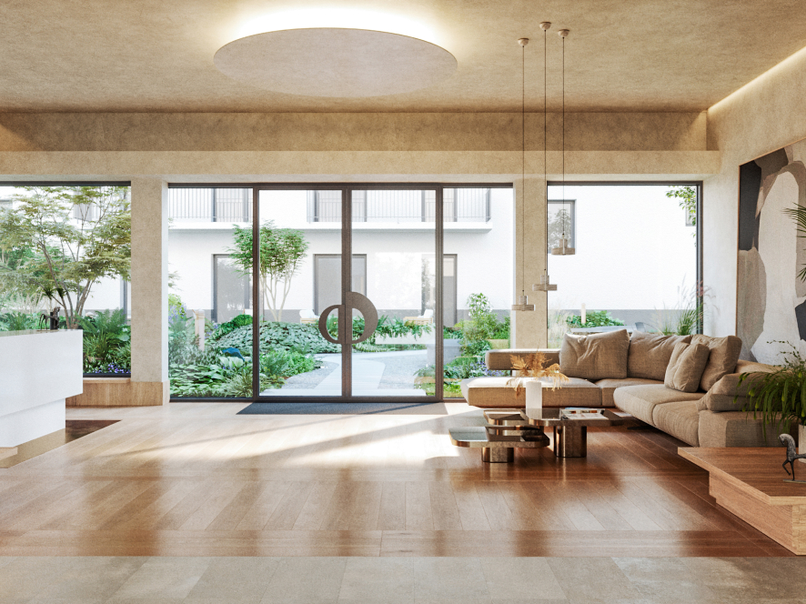
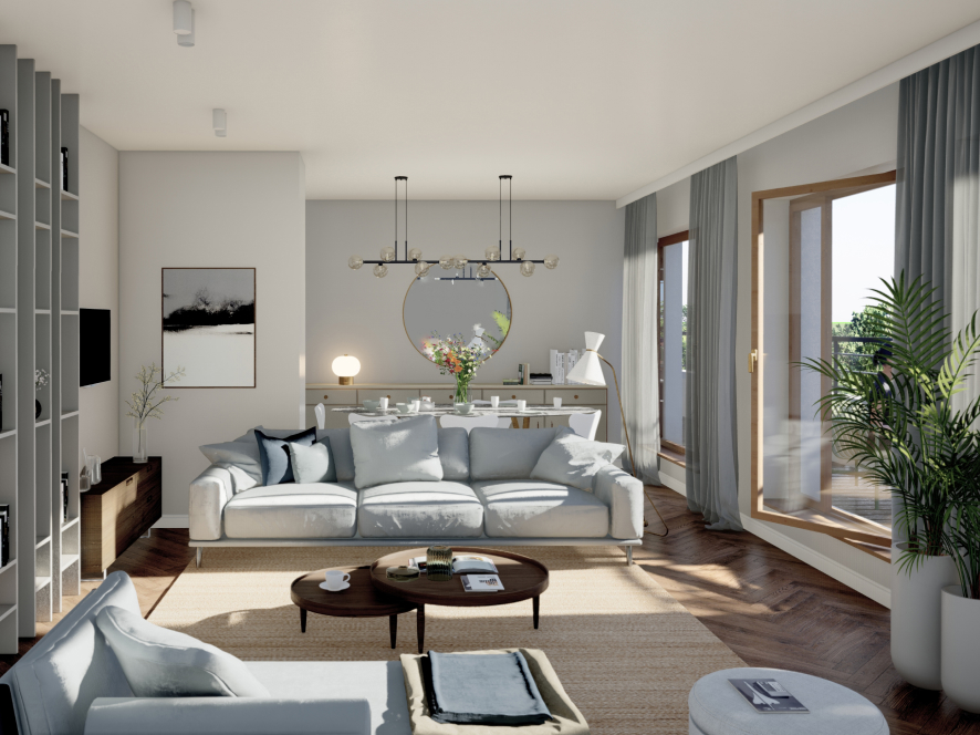
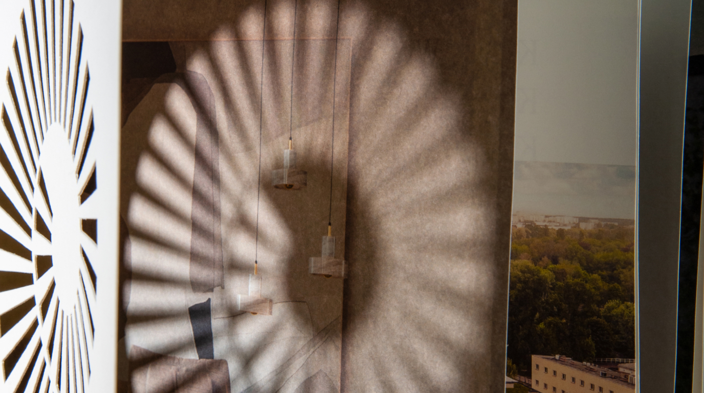
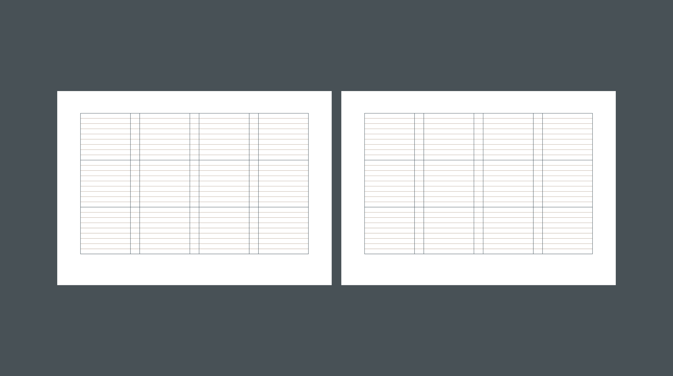
However, our main task in this project was to prepare a brochure addressed to future SOLEA’s customers. The catalog we’ve designed describes the investment, its surroundings, and related aspects.
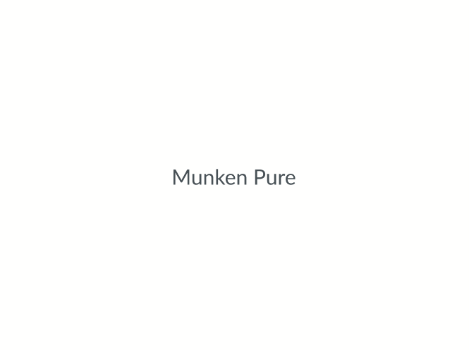
The whole, supplemented with attractive photos and visualizations, reflects the apartments’ elegant and quite prestigious character. The brochure was printed on the exclusive uncoated Munken Pure paper to complete the whole experience. We’ve chosen this paper not only because of it’s elegance but also because of its sustainability. Our projects were also visible in the city space – spot our banners and buses!
Credits
Team Leniva° Studio
Concept and Key Visual: Neon Neonov, Kamila Cembor
Production: Lena Mitkowa, Saskia Mońka
Implementation: Kamila Cembor, Kamil Przybyła
Client’s Team
Magdalena Czupryńska