We’re proud to present our first collab in which the alchemy of medieval and renaissance cartography meets ultimate vector precision.
Info ↘
Recreating ubi leones identity was something completely new and different for us. For the first time, we invited other designers to collaborate. We had a great pleasure to work with world renowned illustrator Marcello Crescenzi and a star of modern typography, Borys Kosmynka, PhD.
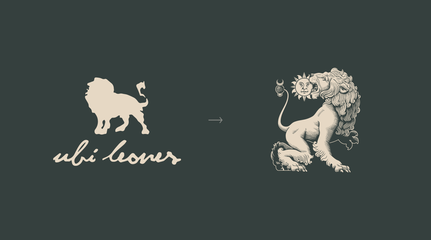
Our task was to redesign Ubi Leones brand identity. It’s a company that specializes in film production and legal services for the film production industry. We agreed to keep the imagery of a lion but wanted to go beyond its figurative representation to reach new meanings that only heraldic symbolism can offer.
Scope
Rebranding / UX
Tools
Illustrator
Client
Ubi Leones
Ubi Leones
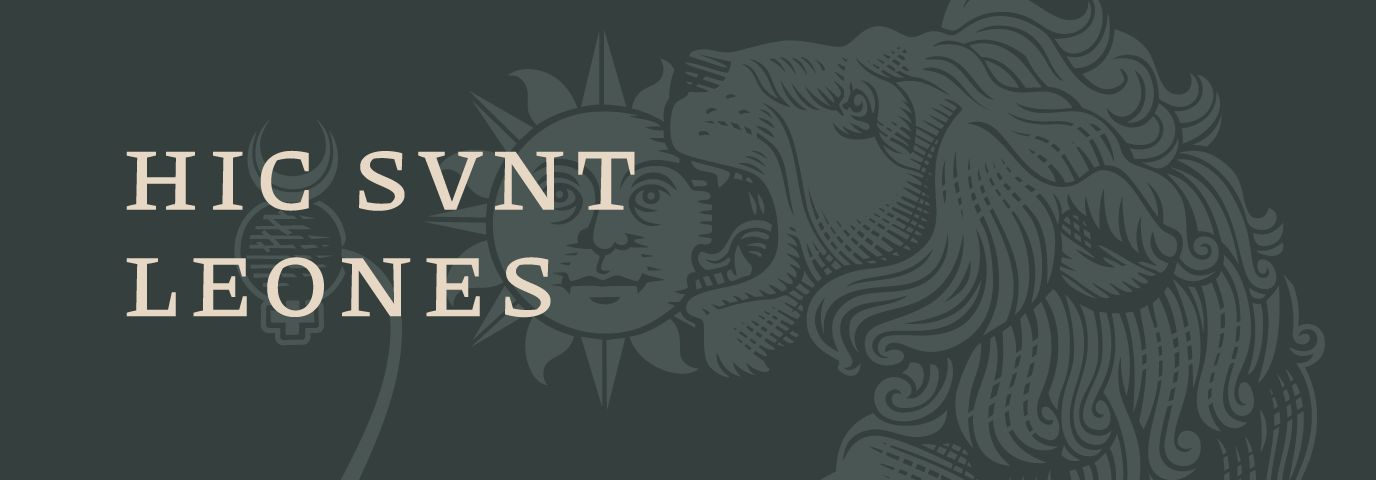
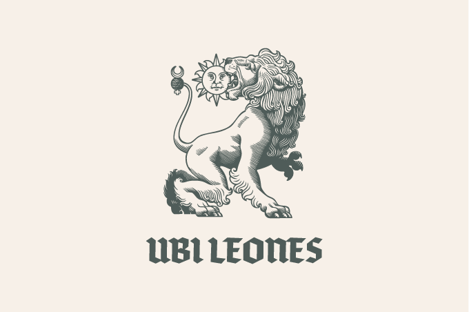
Ubi Leones – meaning: where lions live, classical phrase used by ancient Roman and Medieval cartographers (also used as hic svnt leones (literally, “here are lions”) when denoting unknown territories on maps.
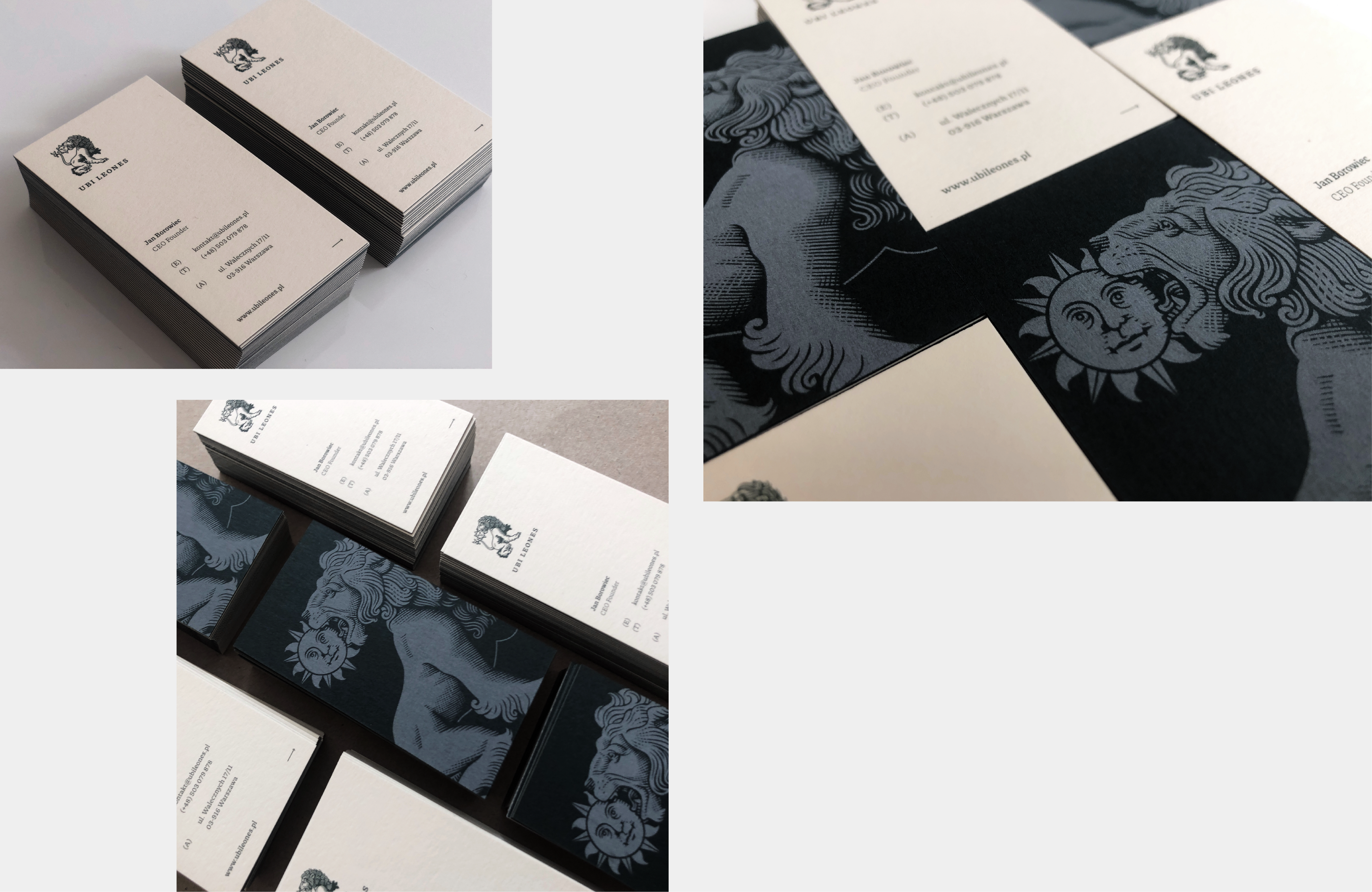
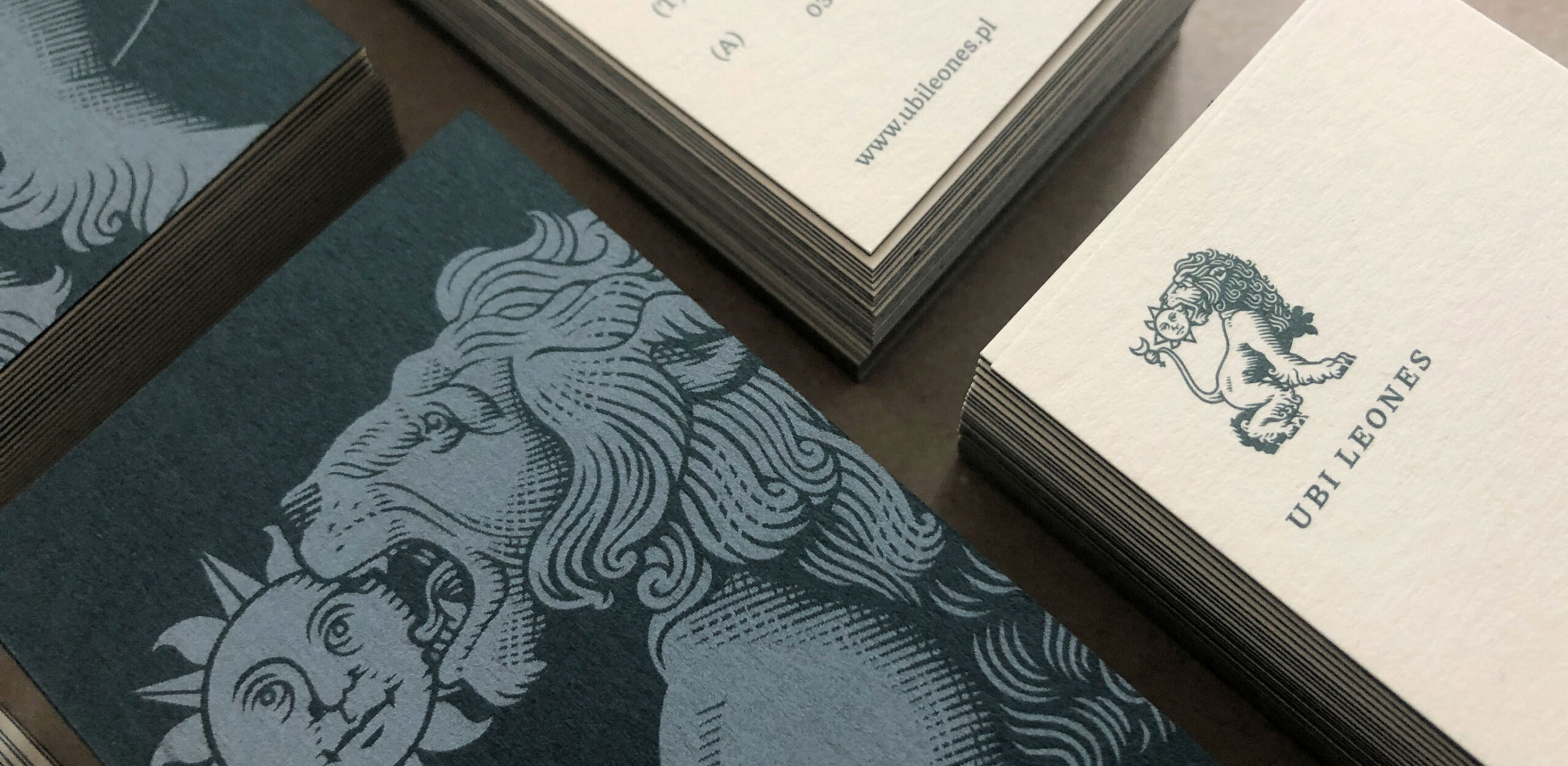
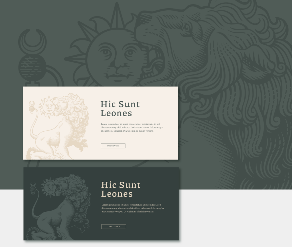
After a deep analysis of the brand values, we were sure we’d like to base the new design on something called the green lion, a motive of a lion devouring the sun – a common alchemy figure. The symbol is a metaphor for vitriol (the green lion) purifying matter (the sun), leaving behind gold.
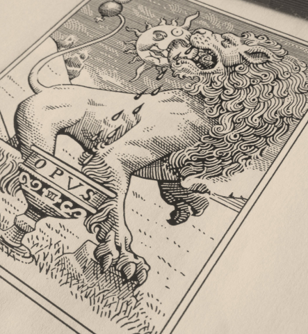
During the research we bumped into Marcello Crescenzi’s work. His alchemic lion gave us thrills and we were already sure that we wanted him on our team in this process.
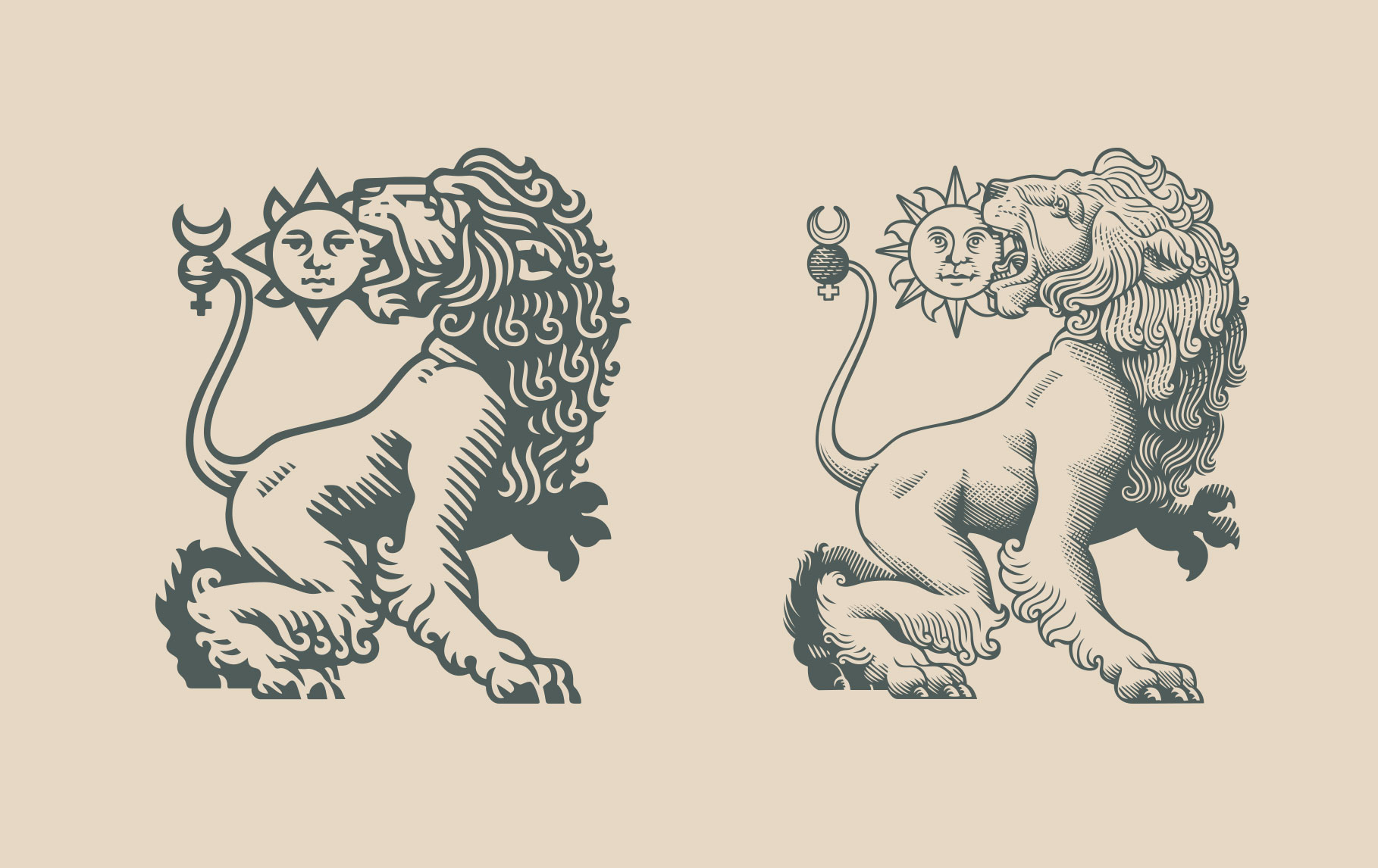
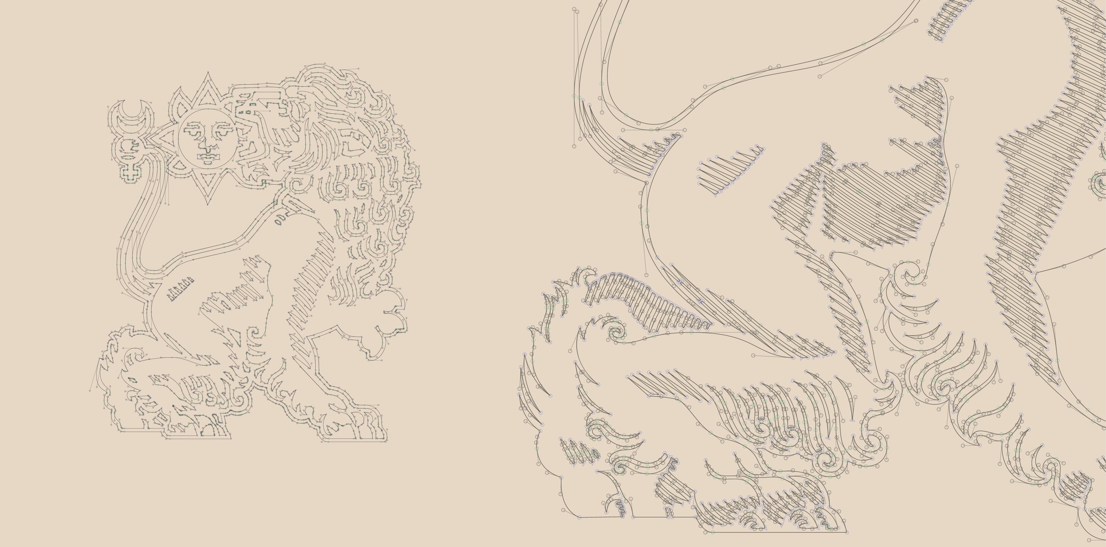
The Lion was drawn by Marcello in two scales: detailed version – large scale drawing and simplified version – small scale drawing.
Lions originally designed by Marcello and scanned as high resolution bitmaps were later reproduced in the meticulous and time-consuming process by typographer Borys Kosmynka using Glyphs. The outcome has perfect visual balance in both positive and negative versions.
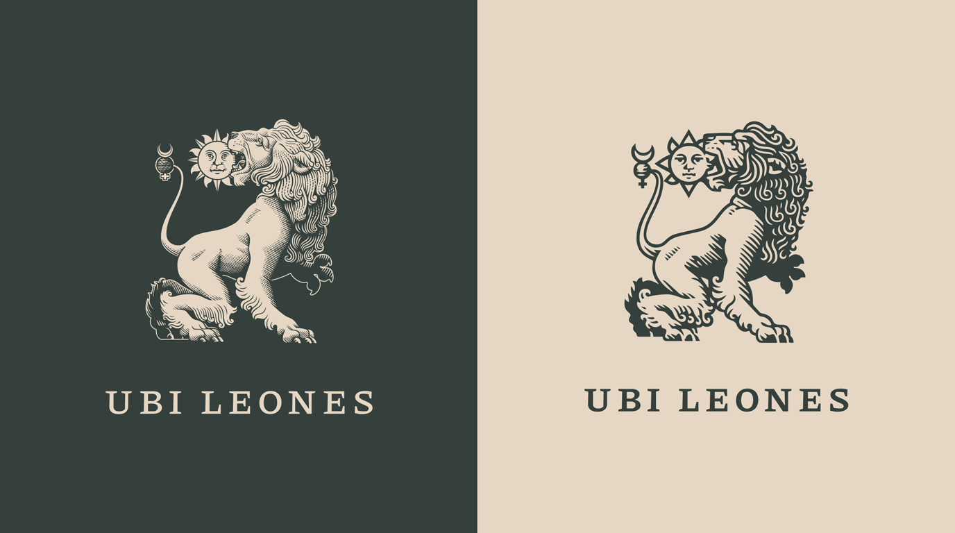
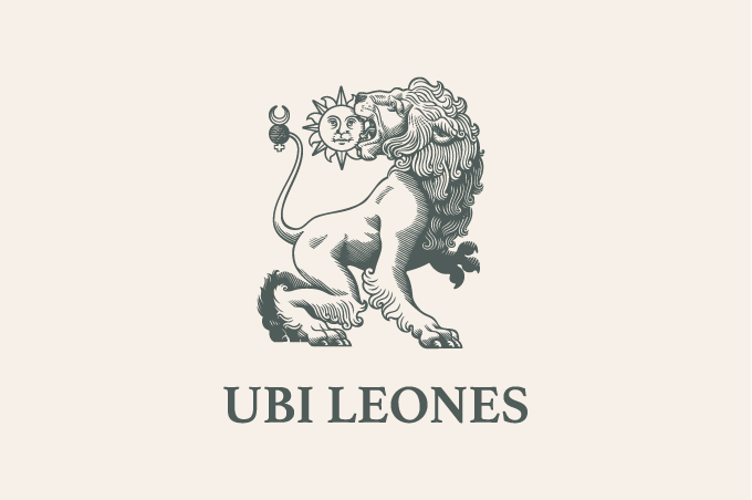
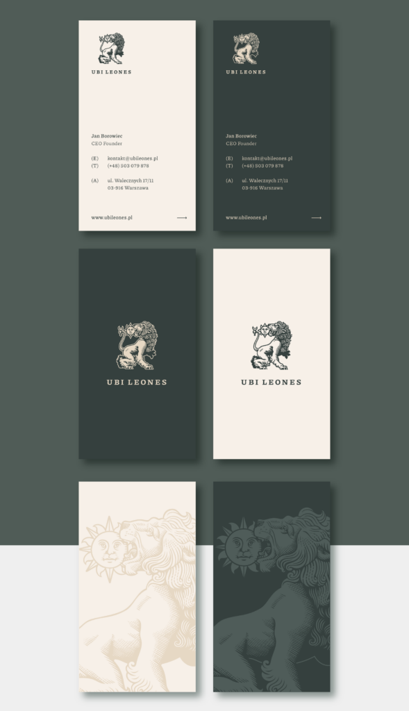
The sign is accompanied by wordmark ”ubi leones” set in small caps with distinctive tracking. We used Piazzolla typeface as its character combines renaissance flair with contemporary readability.
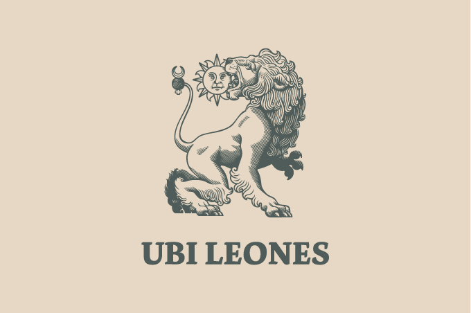
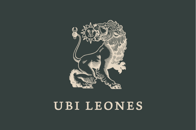
Brand colours continue the alchemic narrative – Titanium Buff (ivory) and Green Earth create a distinctive low contrast duo with a weathered aftertaste.
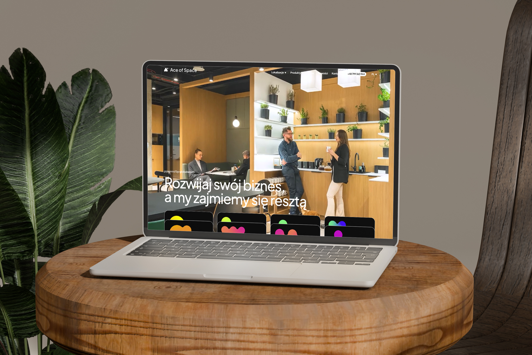
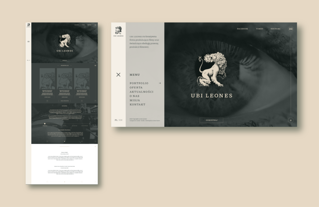
We used those characteristics when we designed and printed business cards, carefully selecting papers and technology to resemble those qualities in print. We also incorporated them into the website when we upgraded the client’s template, merging the alchemy with simple and clear ux.
Credits
Team Leniva° Studio
Concept and Key Visual: Neon Neonov
Production: Lena Mitkowa
Production Support: Kamil Przybyła
Guests
Illustration: Marcello Crescenzi
Digital recreation and optimisation: Borys Kosmynka