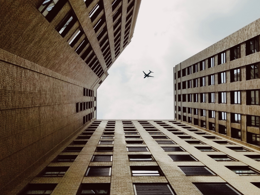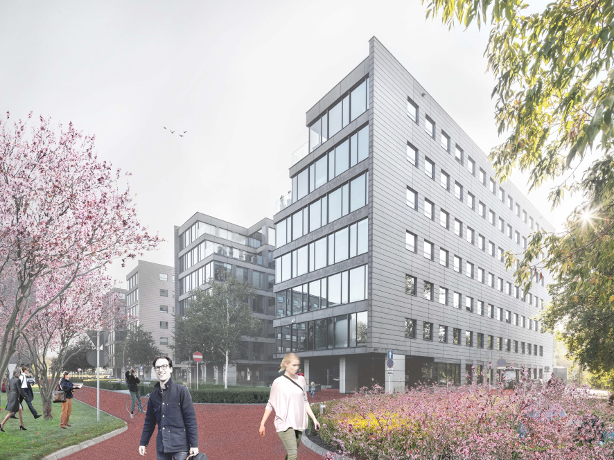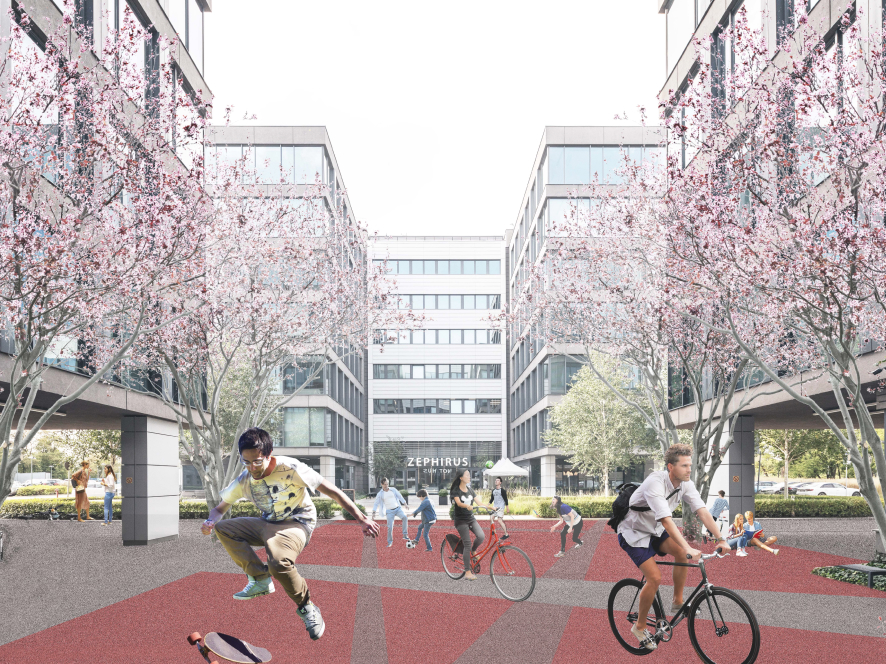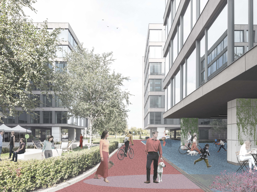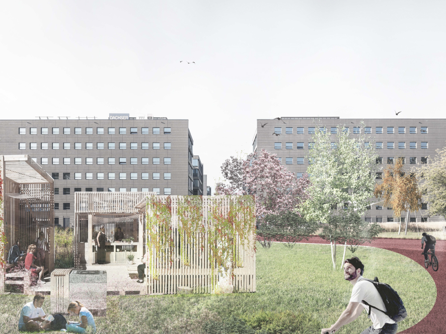
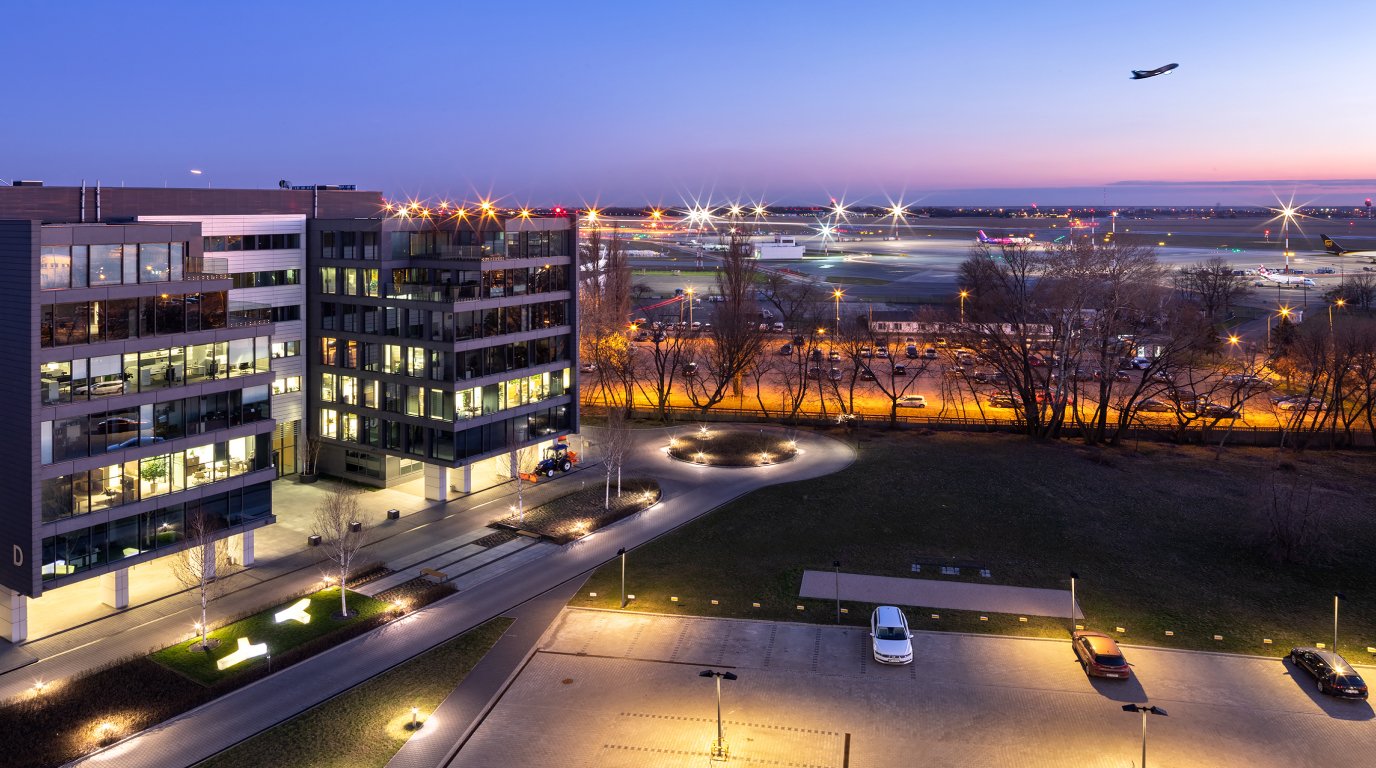
Designing visual communication for a common space is one of our favorite tasks. In the case of Aeropark, we were invited to cooperate with the WXCA architectural studio, whose task was to rearrange an office complex in Warsaw, near the Okęcie airport.
Info ↘
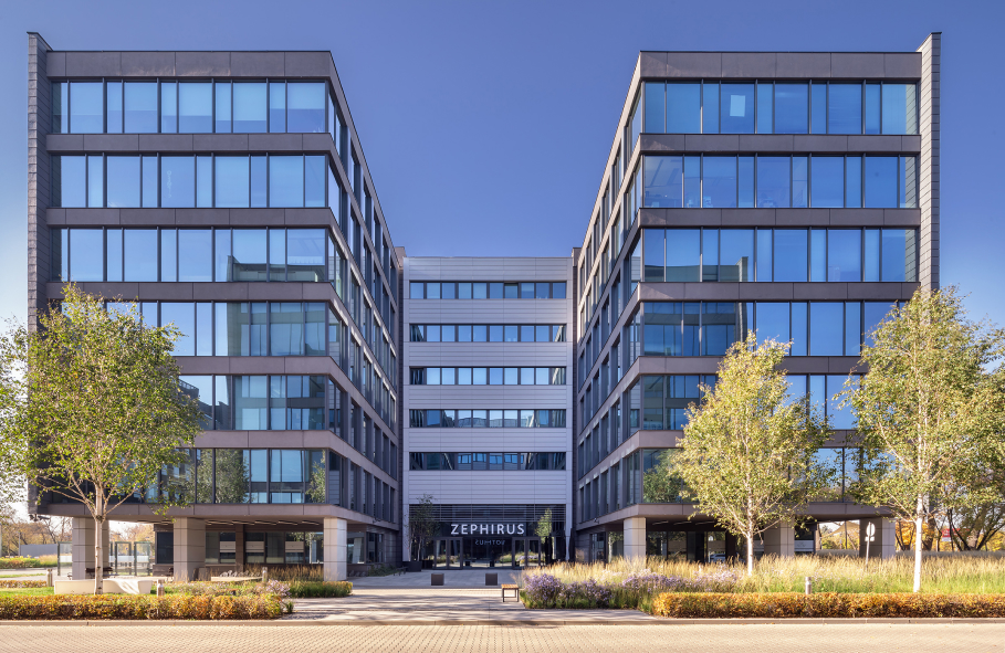
The Aeropark Business Center office complex belonging to the GTC concern is a sign of its times. It consists of serious, elegant buildings and a huge parking area.
It was working perfectly until the COVID-19 pandemic. During the post-pandemic period, the way of working has changed, as have the needs of employees and expectations towards the office space.
Scope
Rebranding / UX / Wayfinding
Tools
Figma / Illustrator
Client
Aeropark
We have started our work with workshops focused on customer experience. We have analyzed the needs of tenants and built paths for users. We have taken into account changes in the job market and trends related to office spaces, as well as an aspect of key importance to GTC, i.e. meeting ESG / sustainability standards.
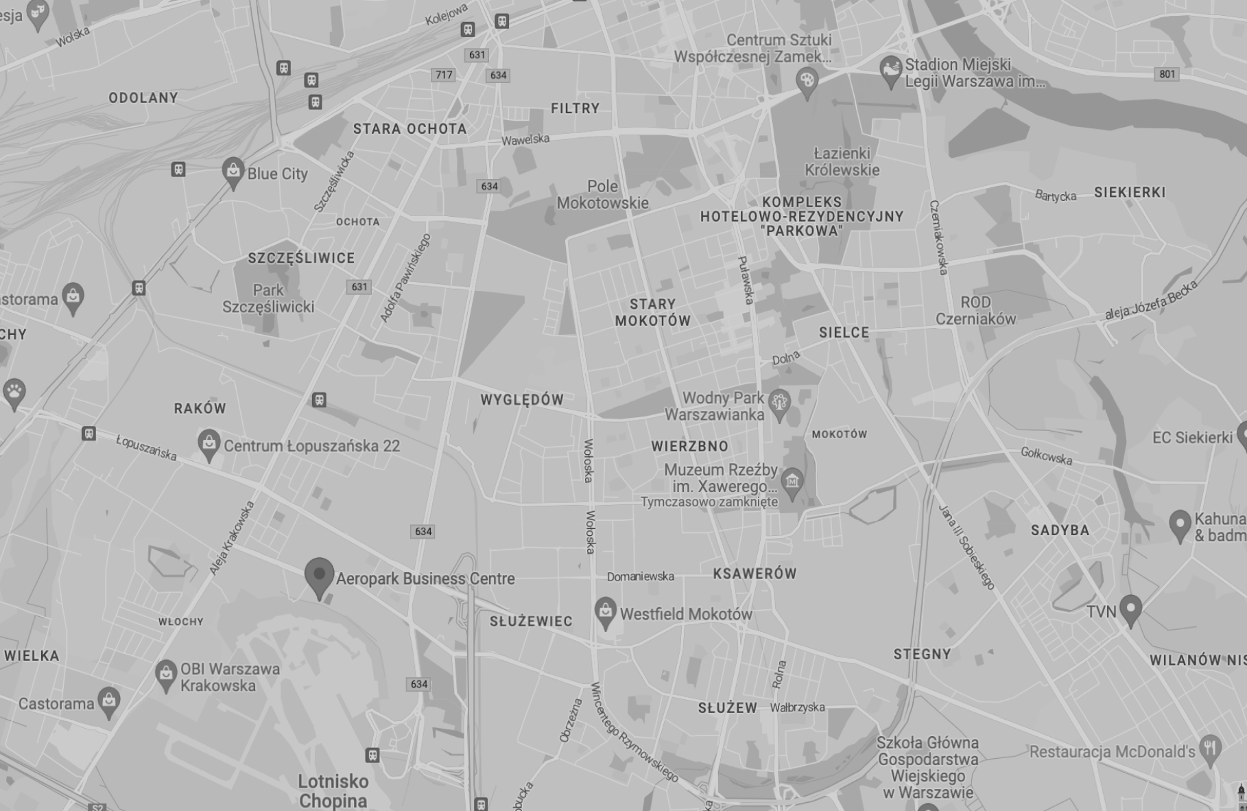
The Aeropark complex is located some distance from the city center – this means that employees spend a large part of their day there and may have problems with carrying out their daily errands on the way to and from work.
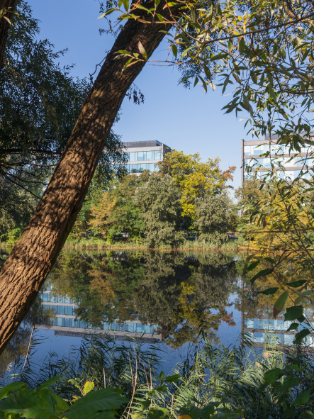
That is why we came up with the concept of Work-Life-Blending and the concept of a workplace that is not only related to office work, but also all the improvements that we may need on a daily basis – from getting a tasty lunch to relaxing in nature, to facilities for sports or for leisure.
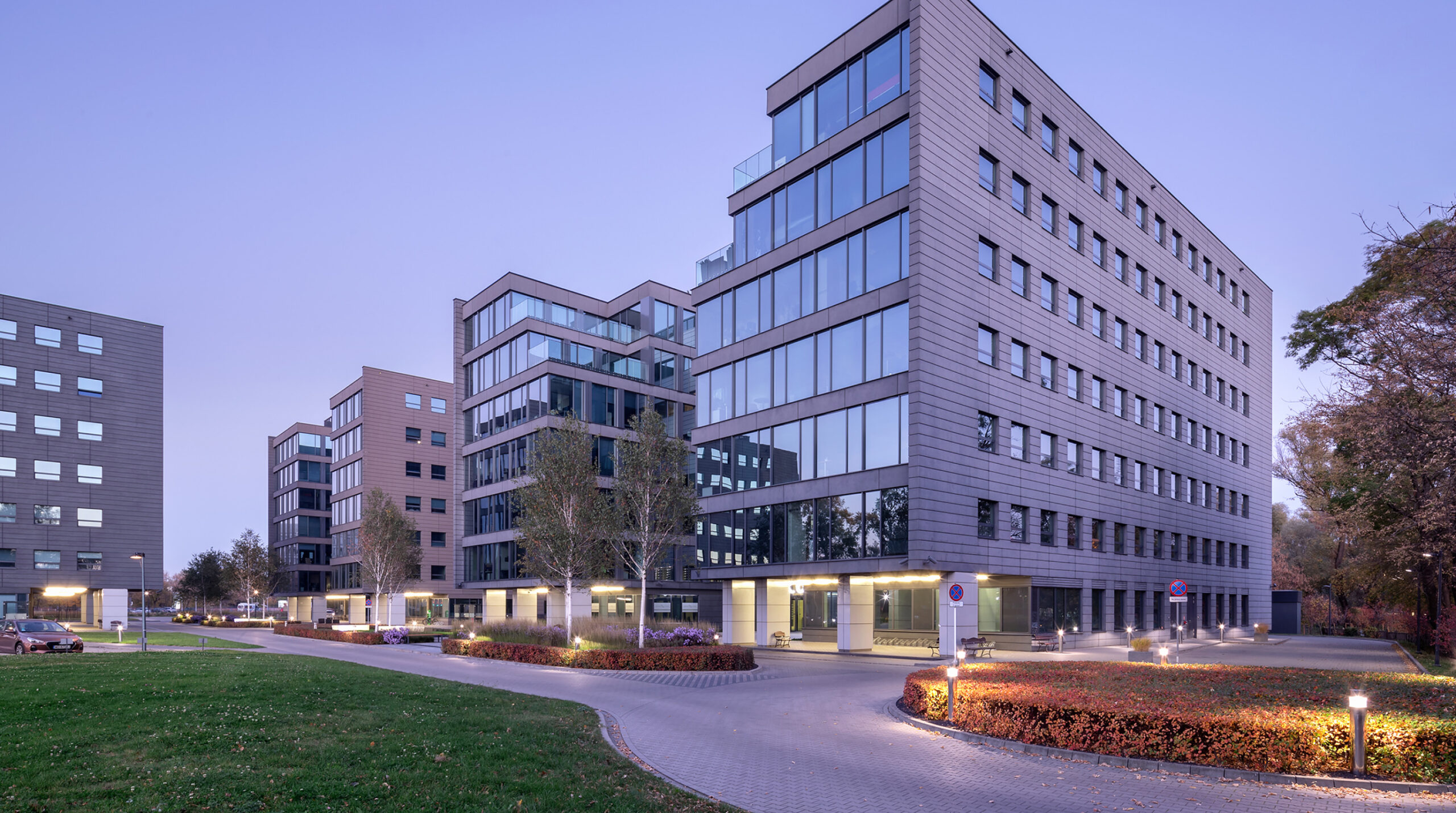
These solutions were already present in the complex to a large extent, but they were not fully used by the recipients.
So the crucial aspects were:
-> Access to information
-> Knowledge transfer
-> Clarity of the message
Think Green. Work Smart.
/ Work. Live. Play.
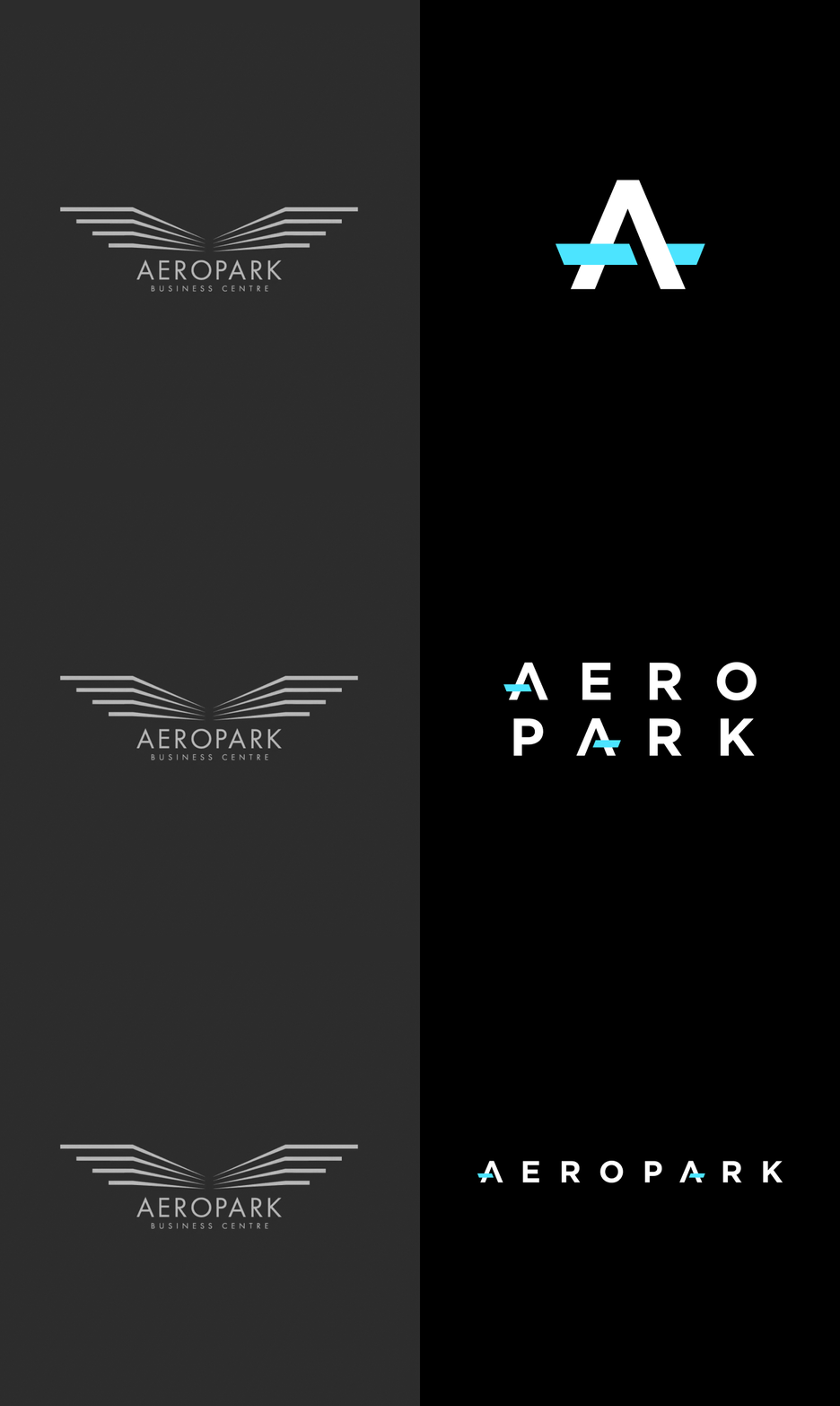
Visual identity
/ Elevating The Workplaces
Signage system
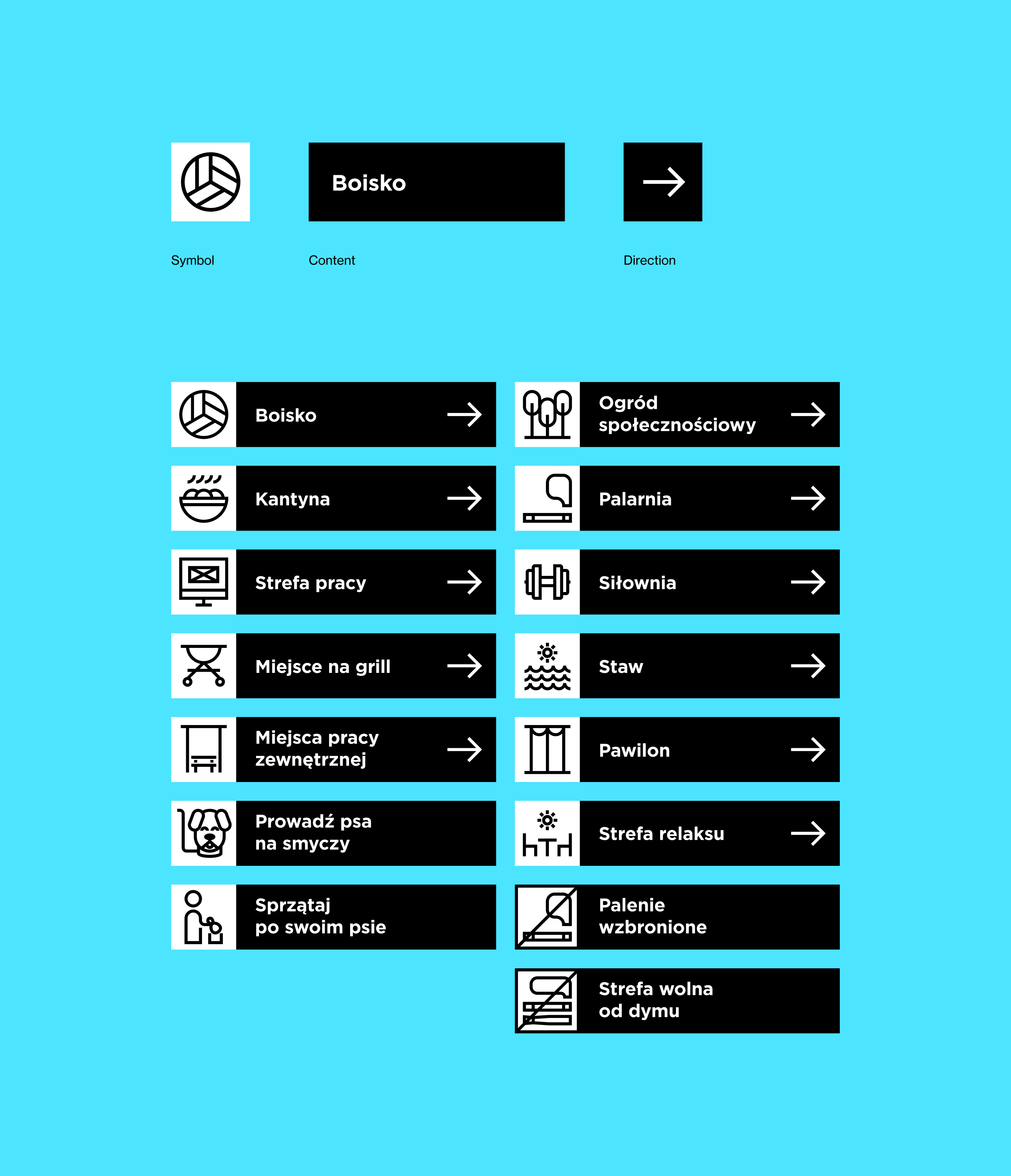
Look & Feel
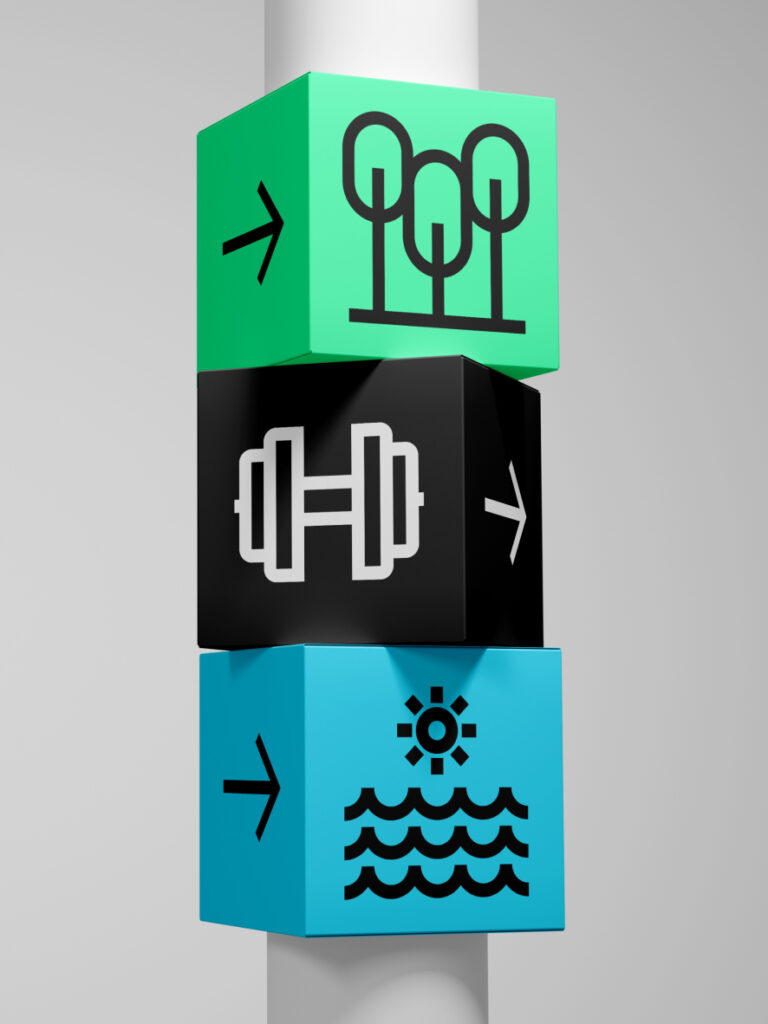
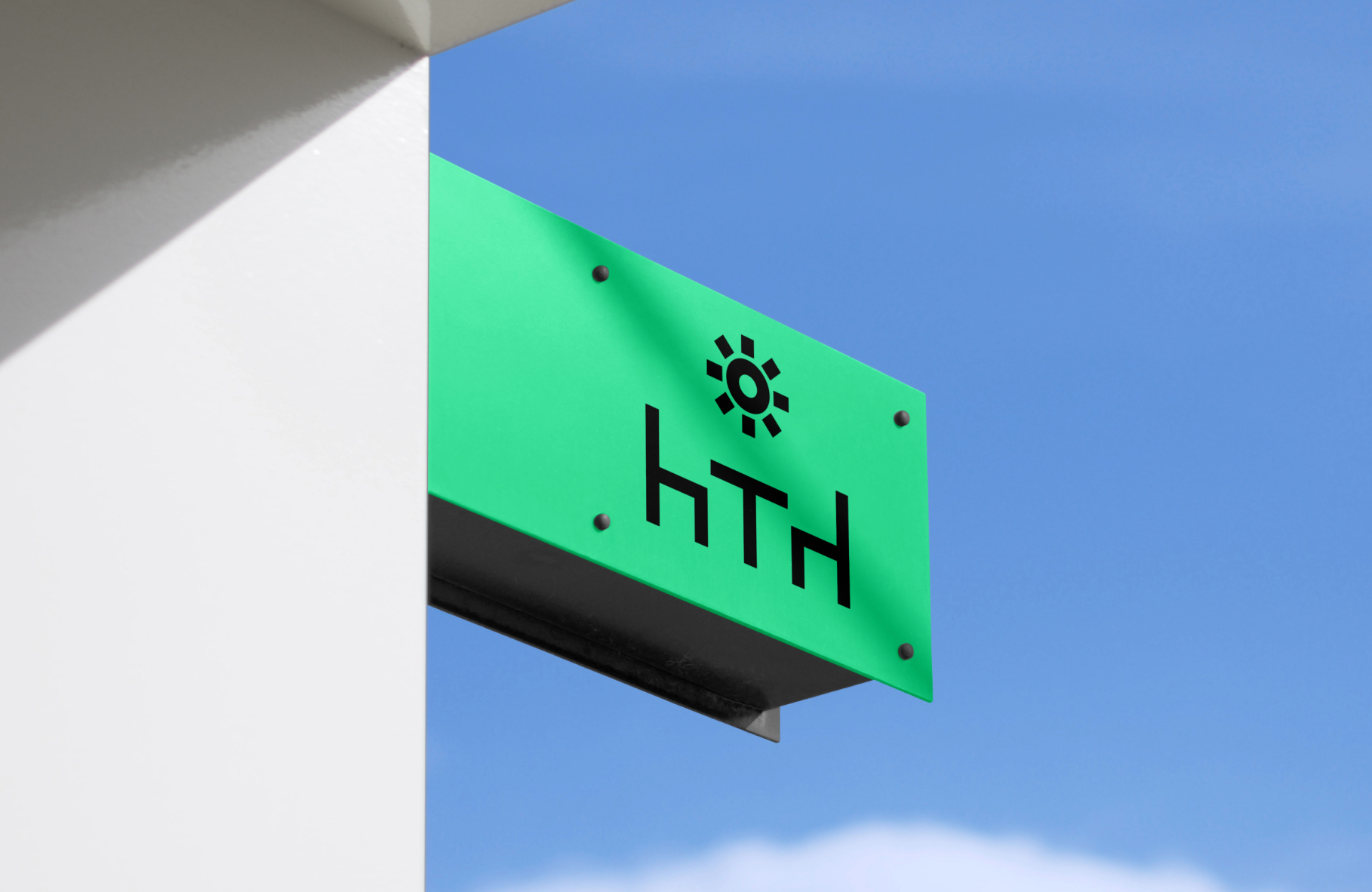
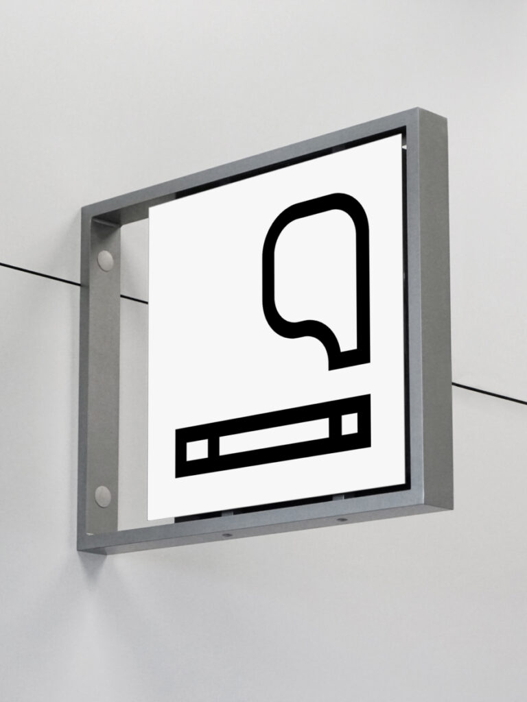
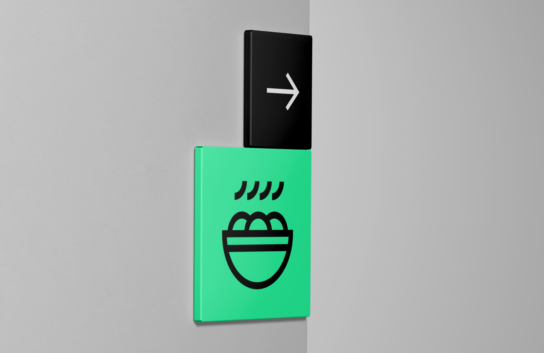
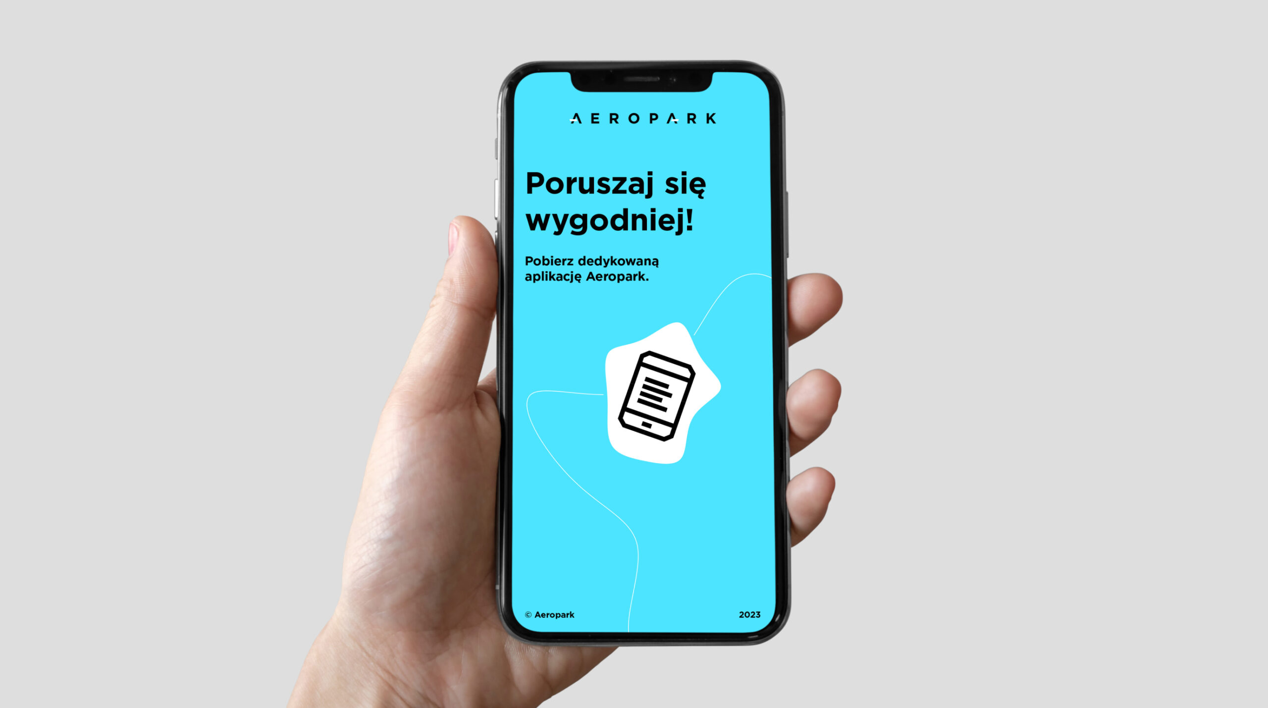
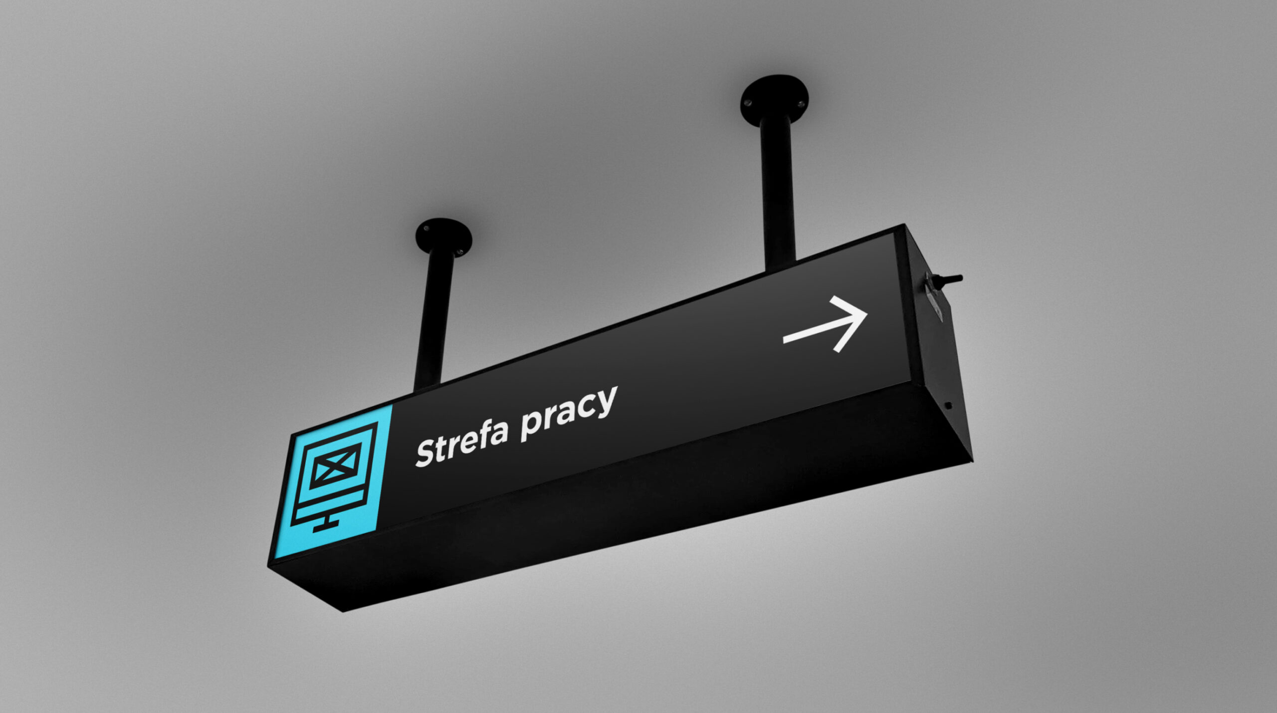
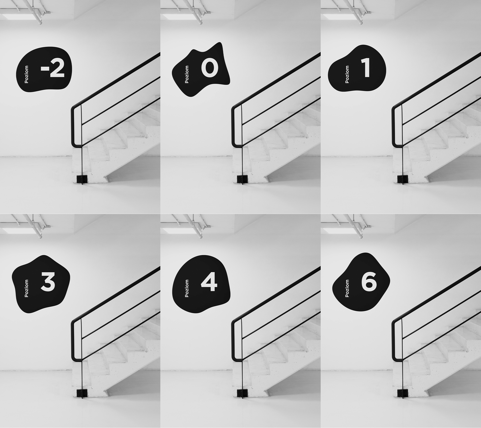
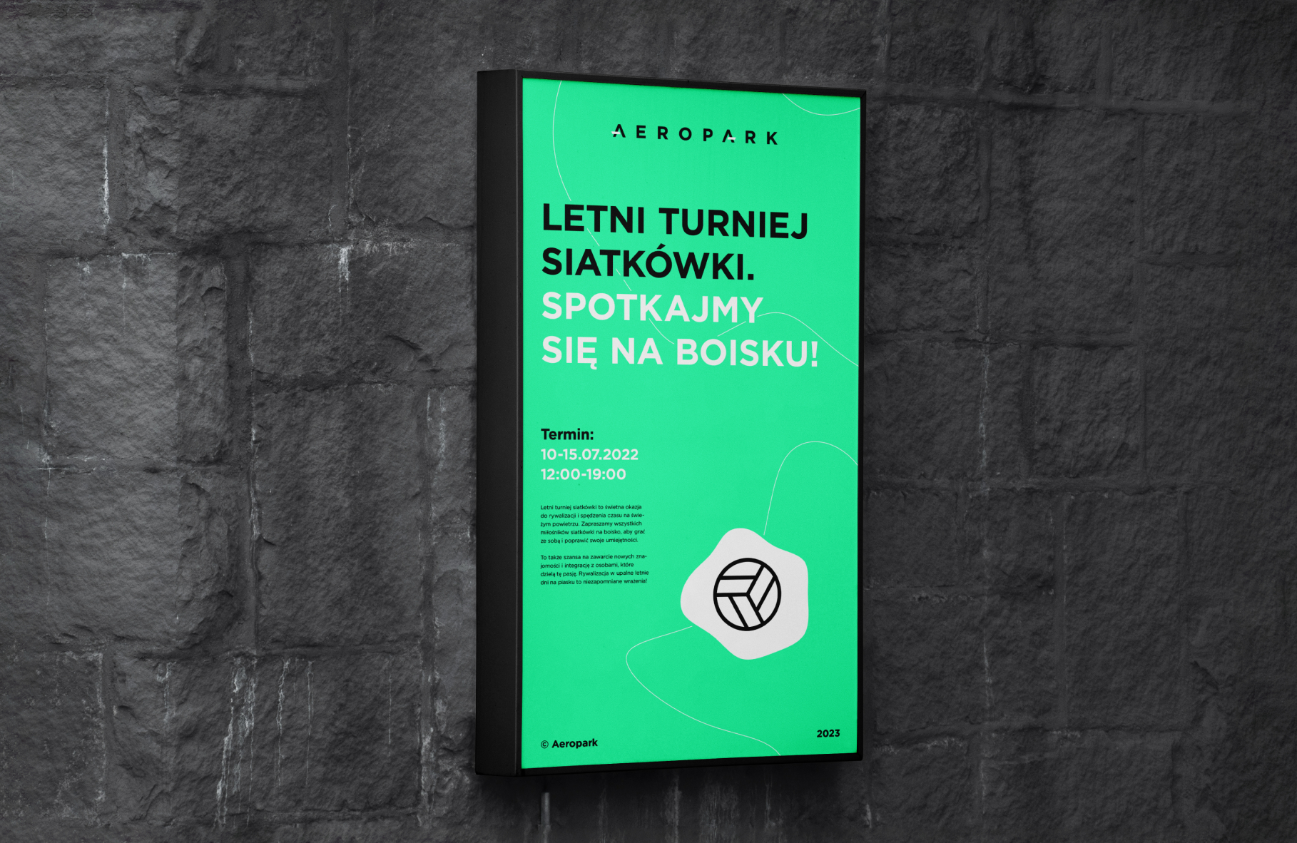
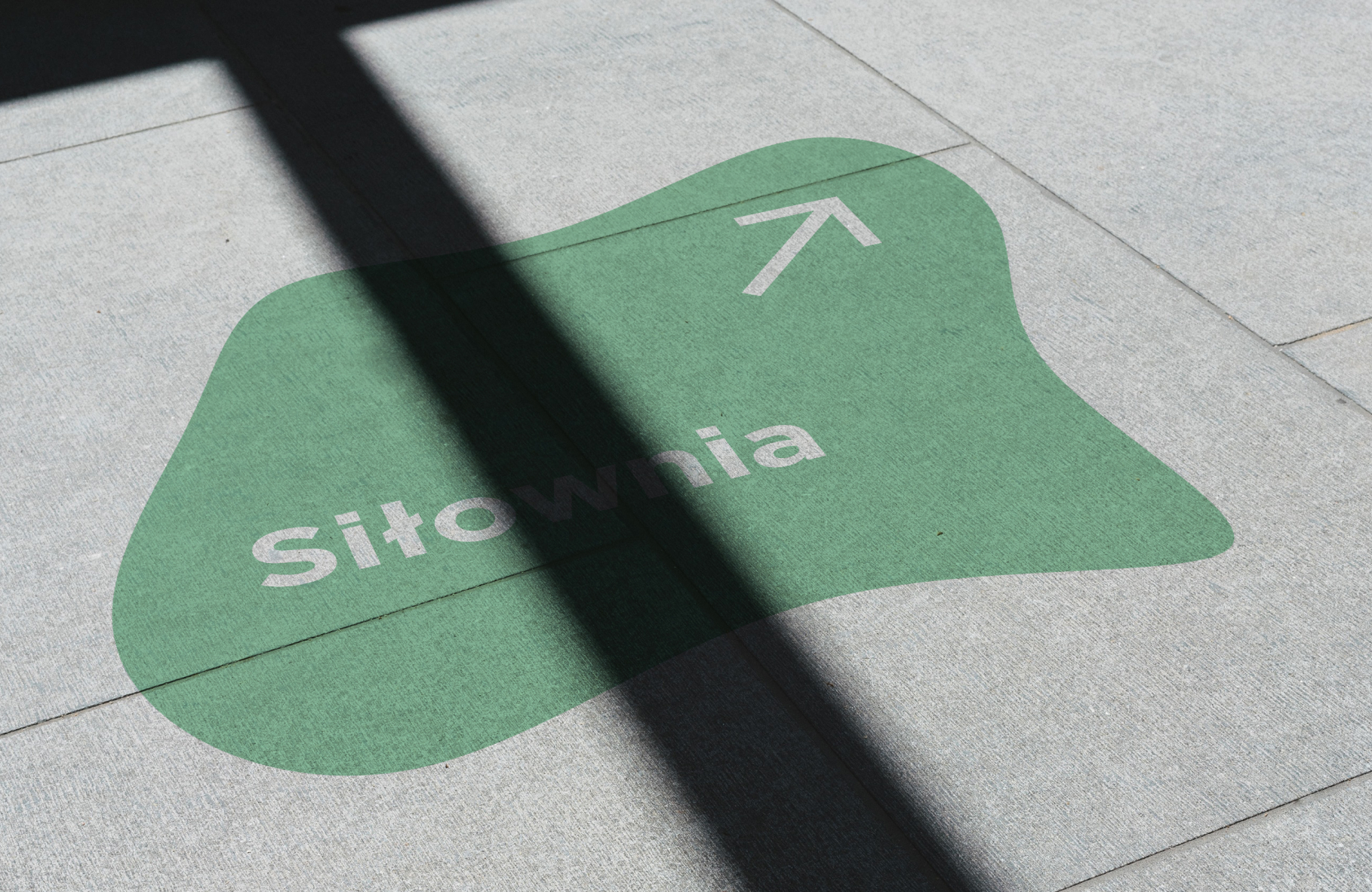
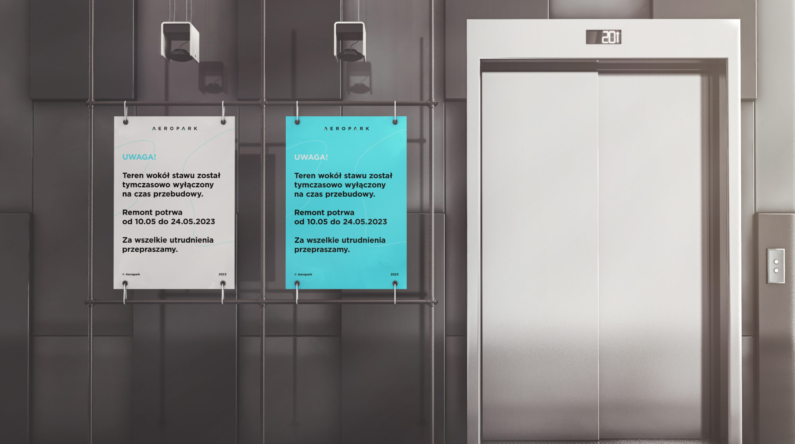
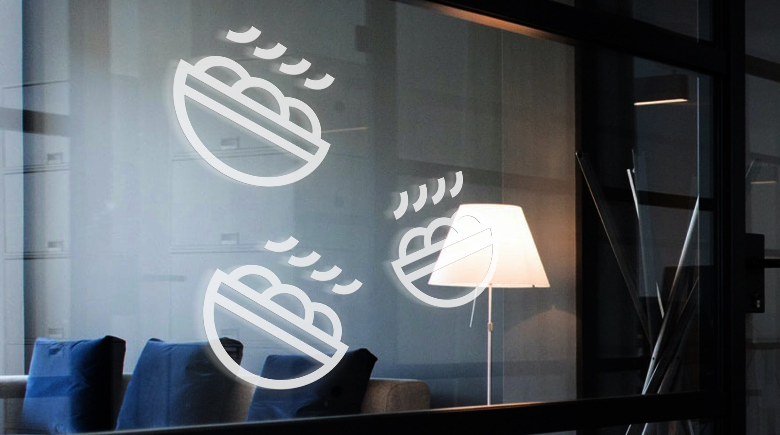
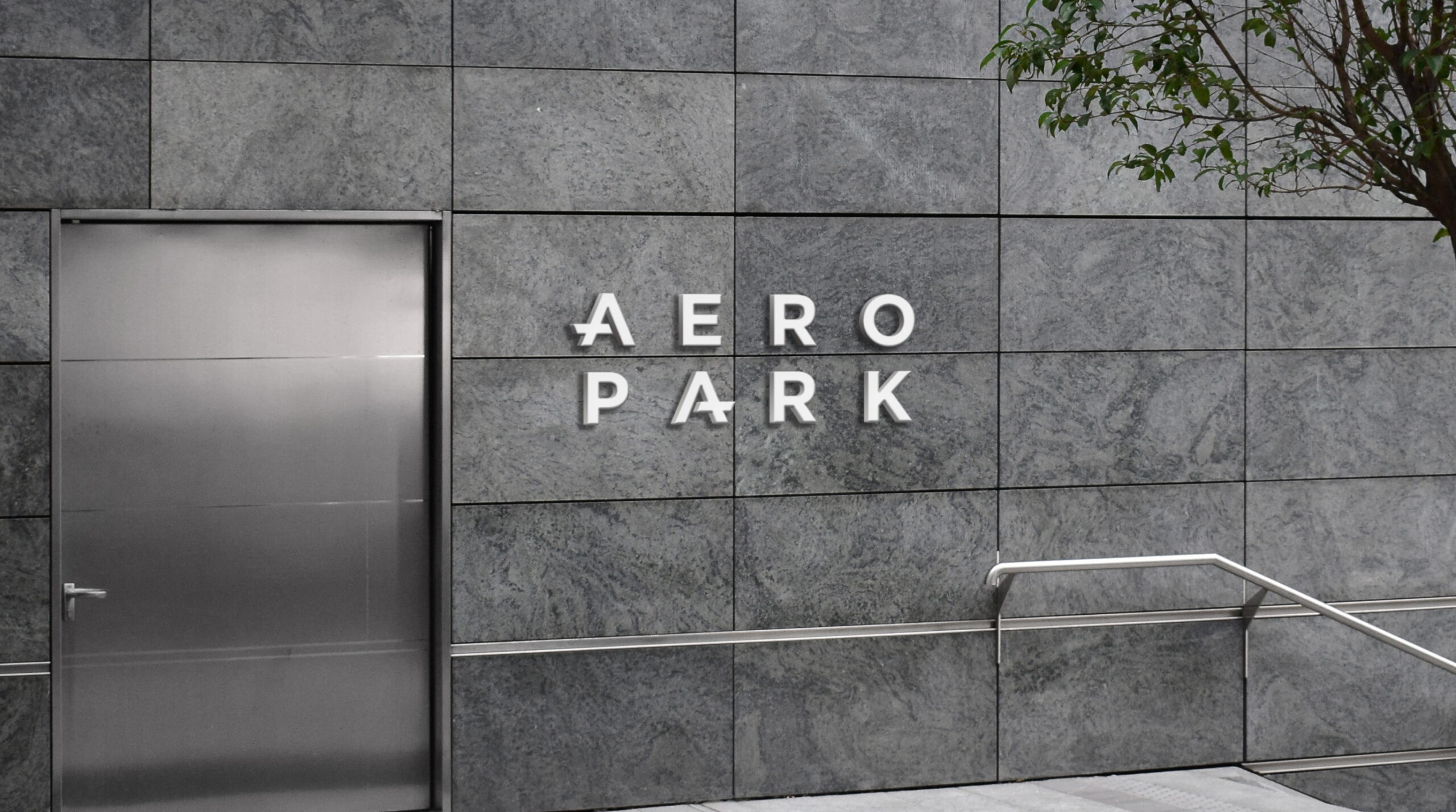
Our main task was to turn the new concept for the Aeropark into what is visible on a daily basis, i.e. signage and visual communication within the facility.
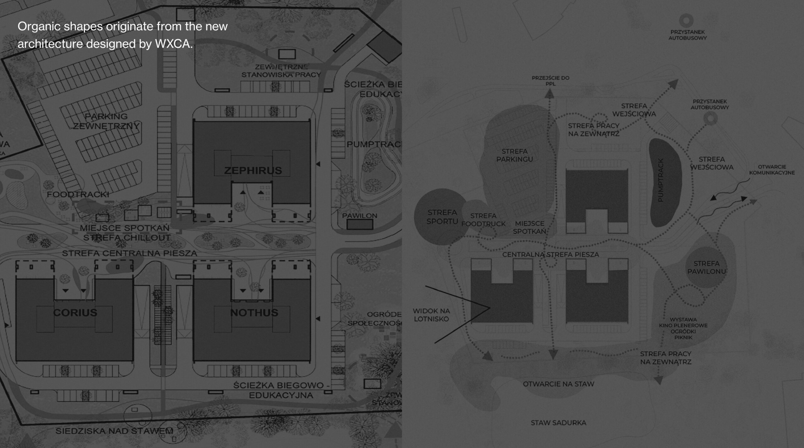
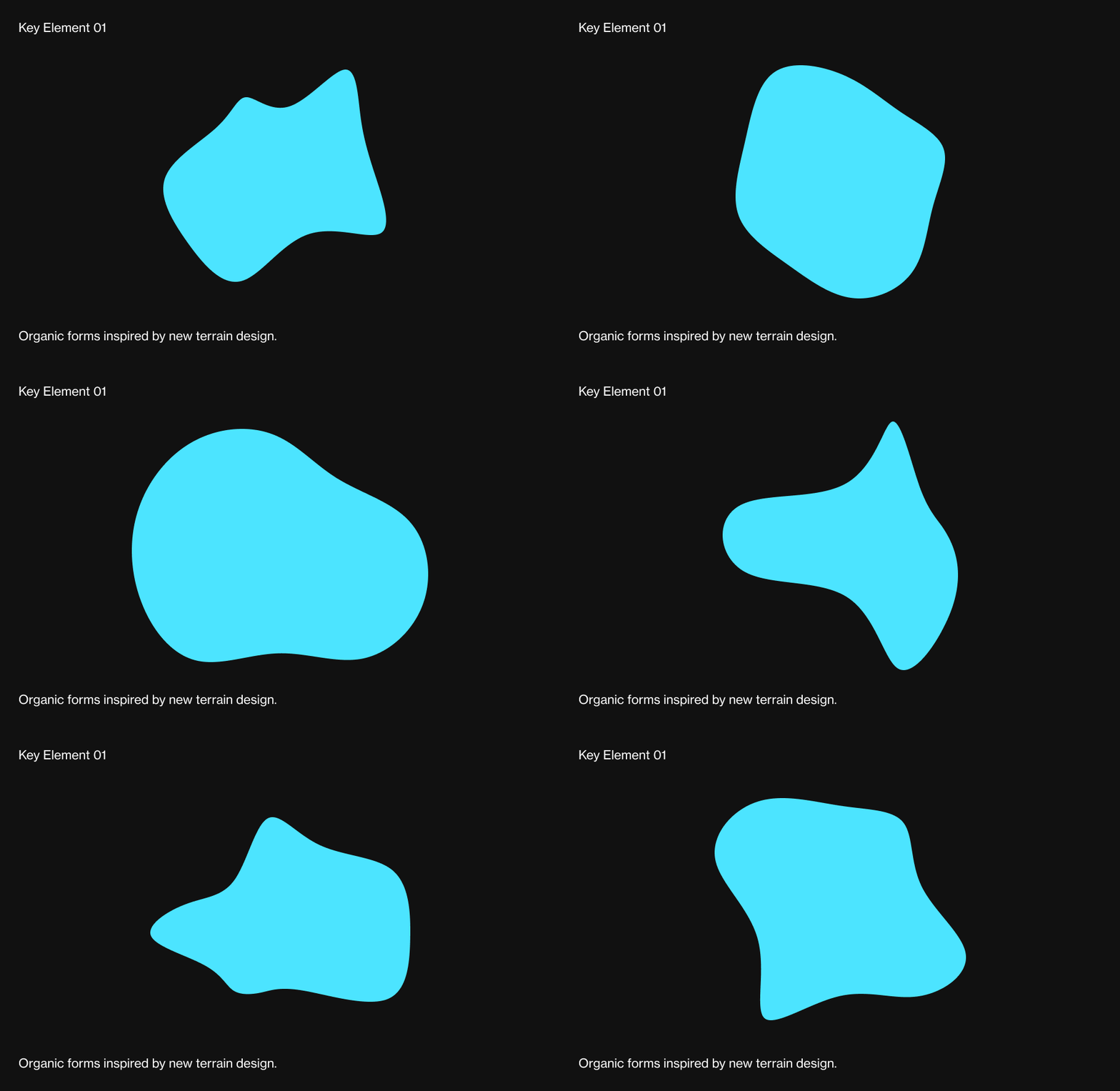
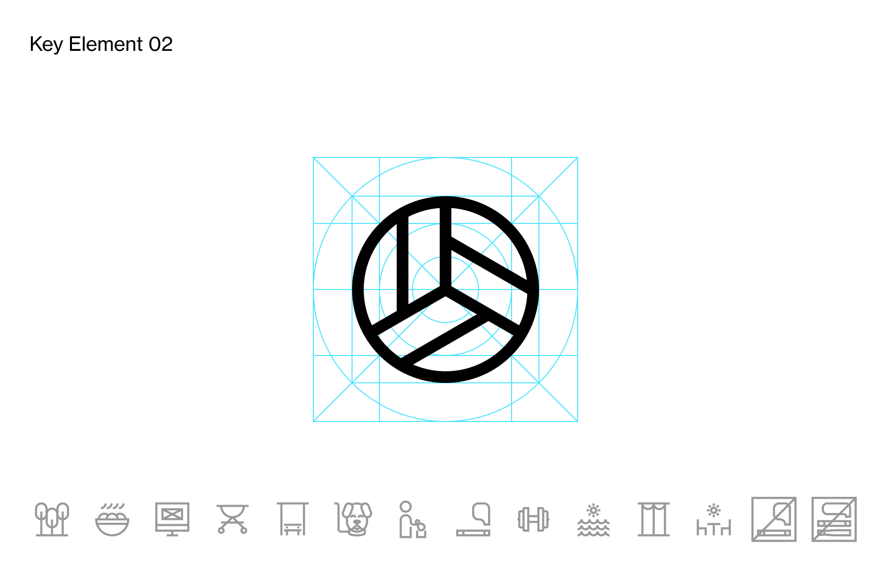
The austere space of the Aeropark has been warmed up with organic forms and strong colors. Playful pictograms complete the work.
The space itself is undergoing changes – hence we have proposed a solution:
Big Concept –> Branding Idea
–> Scalable Design System
The visual identification system, developed along with the evolution of needs, is successively implemented in the space.
Leniva° Studio Team
Concept and Strategy: Lena Mitkowa
Art Direction: Neon Neonov
Illustrations: Neon Neonov
Design: Kamil Przybyła
Production: Saskia Mońka, Lena Mitkowa
Client’s Team
Malwina Pawłowska
Seweryna Afanasjew
Paweł Choiński
Dominika Mrowińska-Bolka
WXCA Team
Marta Sękulska
Monika Lemańska
Paulina Kucharska
