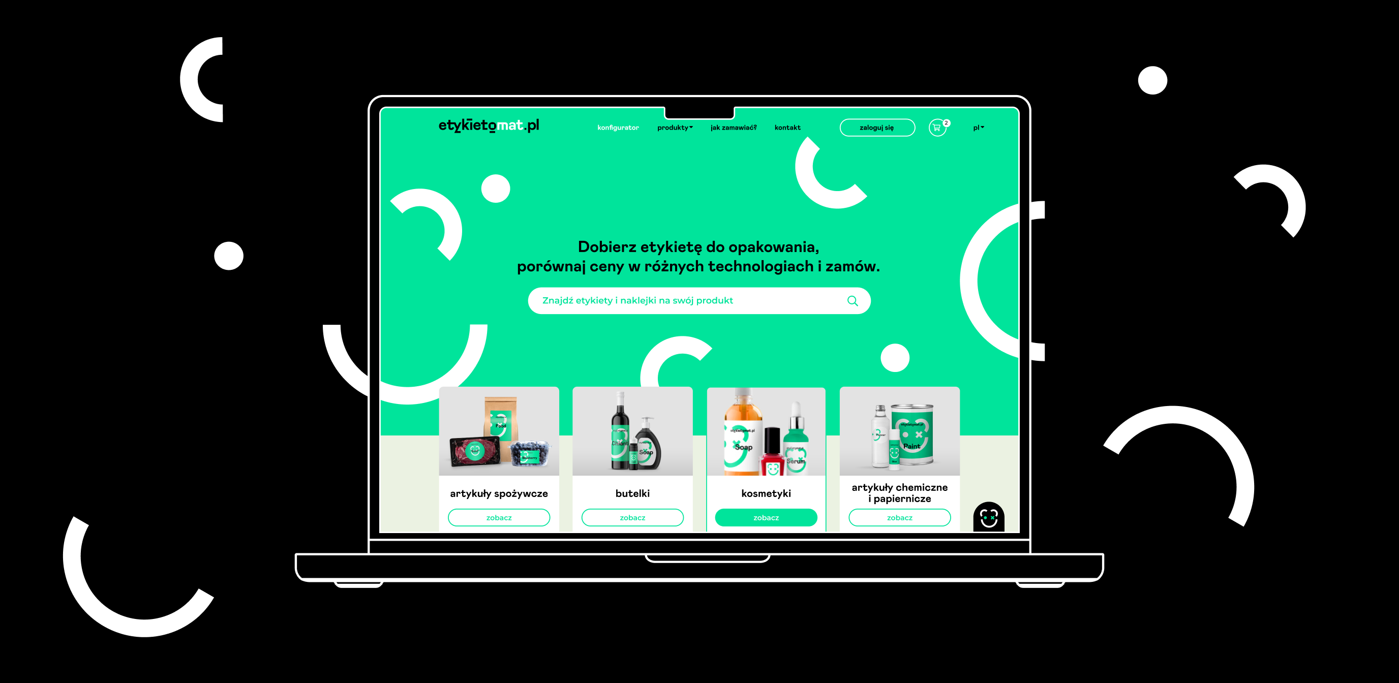
See our new case study of the UX process for etykietomat.pl
Info ↘
Etykietomat.pl is a web portal that allows for quick and intuitive ordering of product labels.
The task of a UX designer is to respond to the challenges posed by the project. In the case of the labelmaker/etykietomat, we have had several challenges.
Scope
Branding / Strategy / UX
Tools
Figma / Illustrator
Client
Flexon
Challenge 1
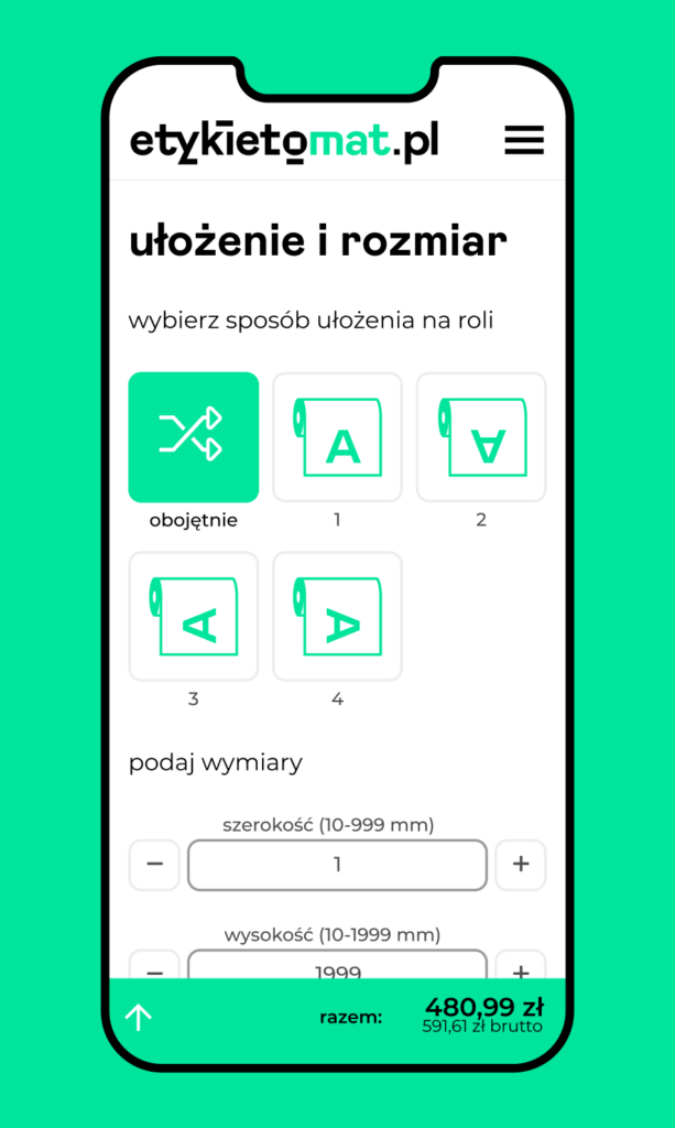
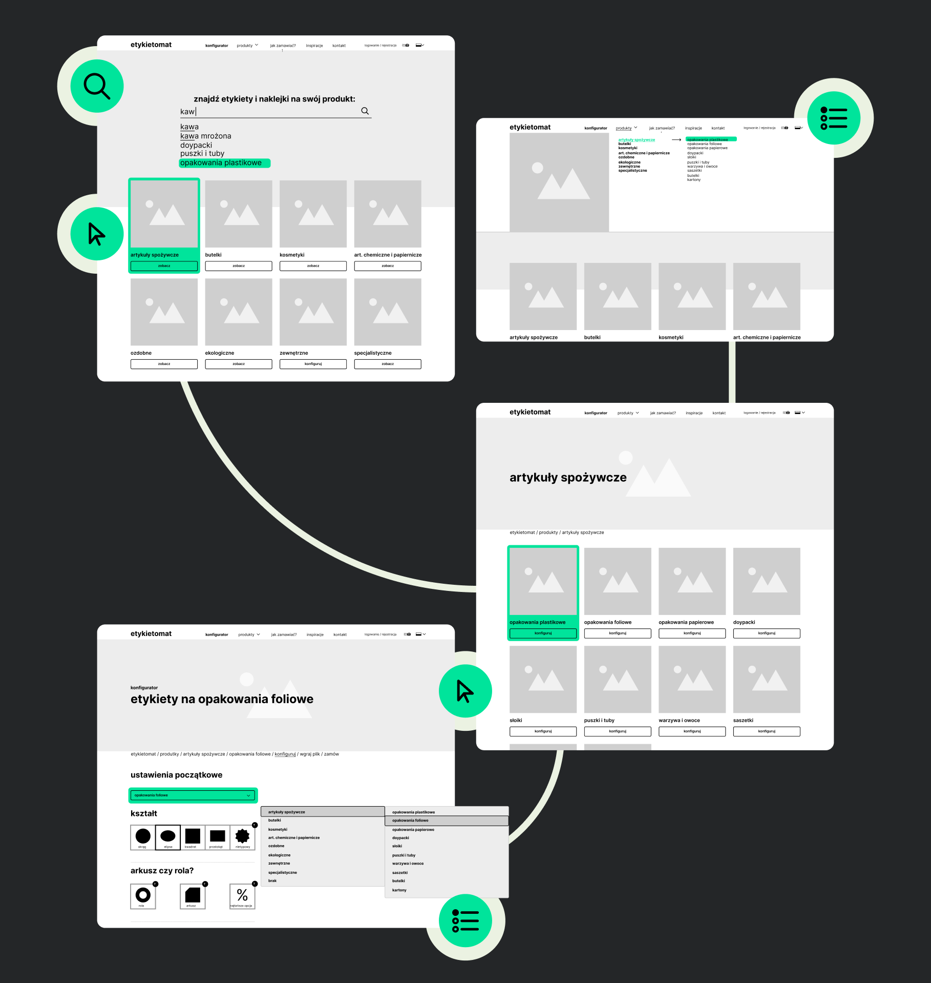
The first challange was to shorten the user’s path from selection to placing an order and make it easier for him to choose the right label for his product. The difficulties we have encountered were mainly caused by a wide range of applications, variants and technologies from which the user can choose when ordering a label.
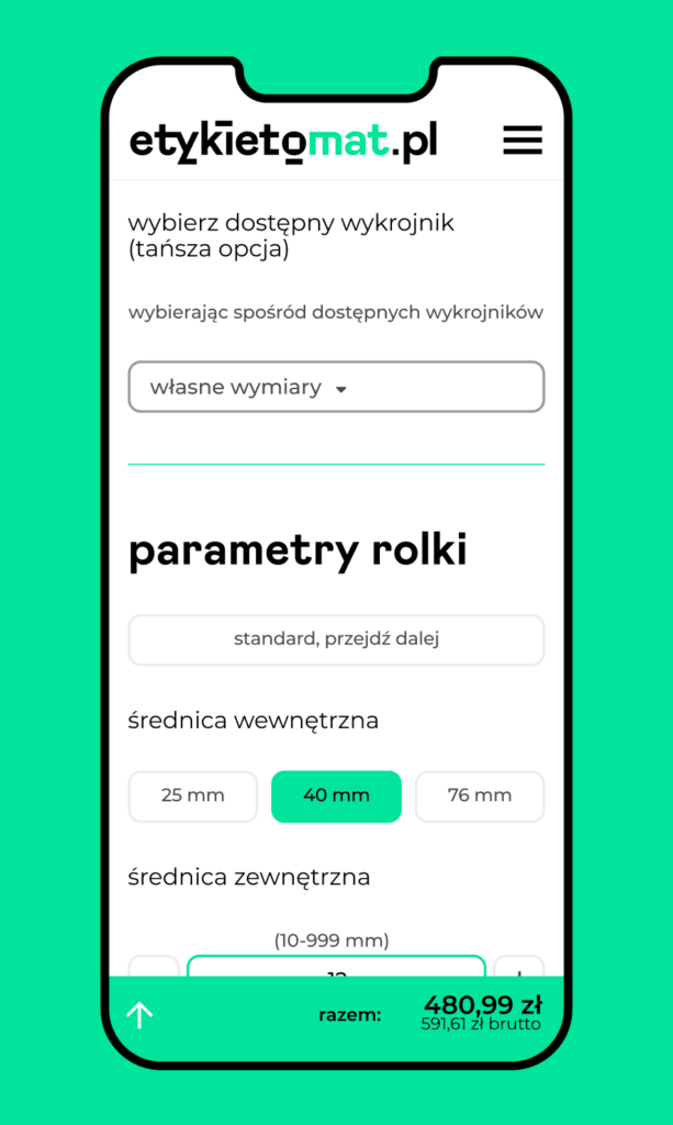
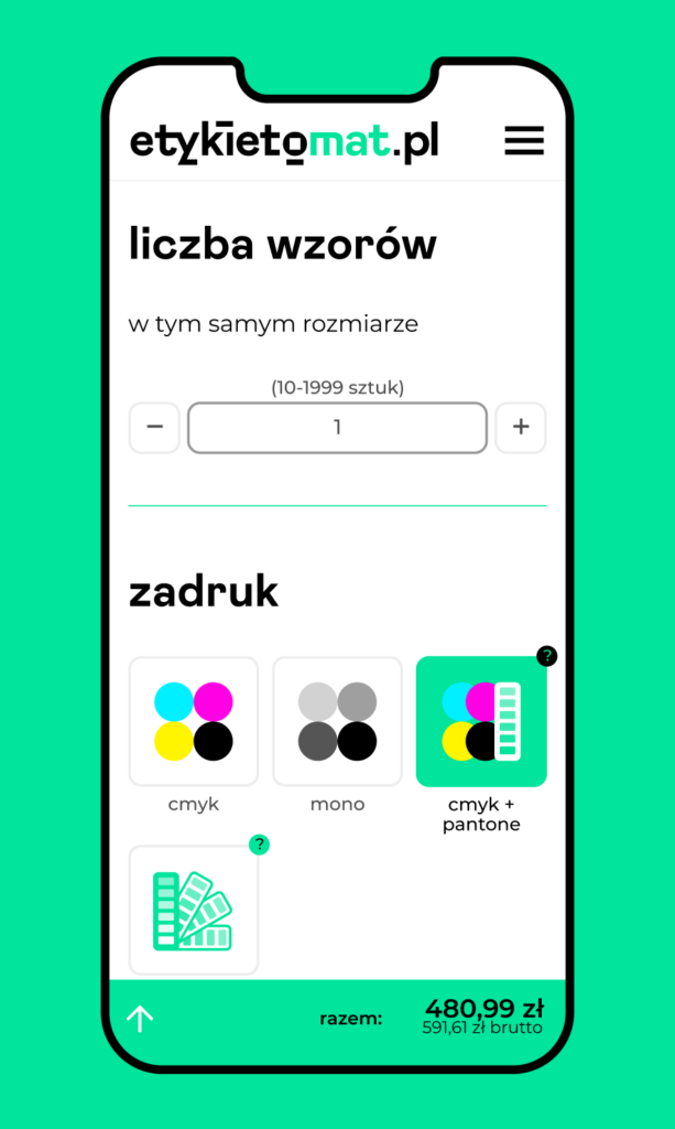
The solutions we have proposed are smart search, a custom drop-down menu, shortened user paths and predefined configurator settings prompting the user for the optimal experience.
Challenge 2
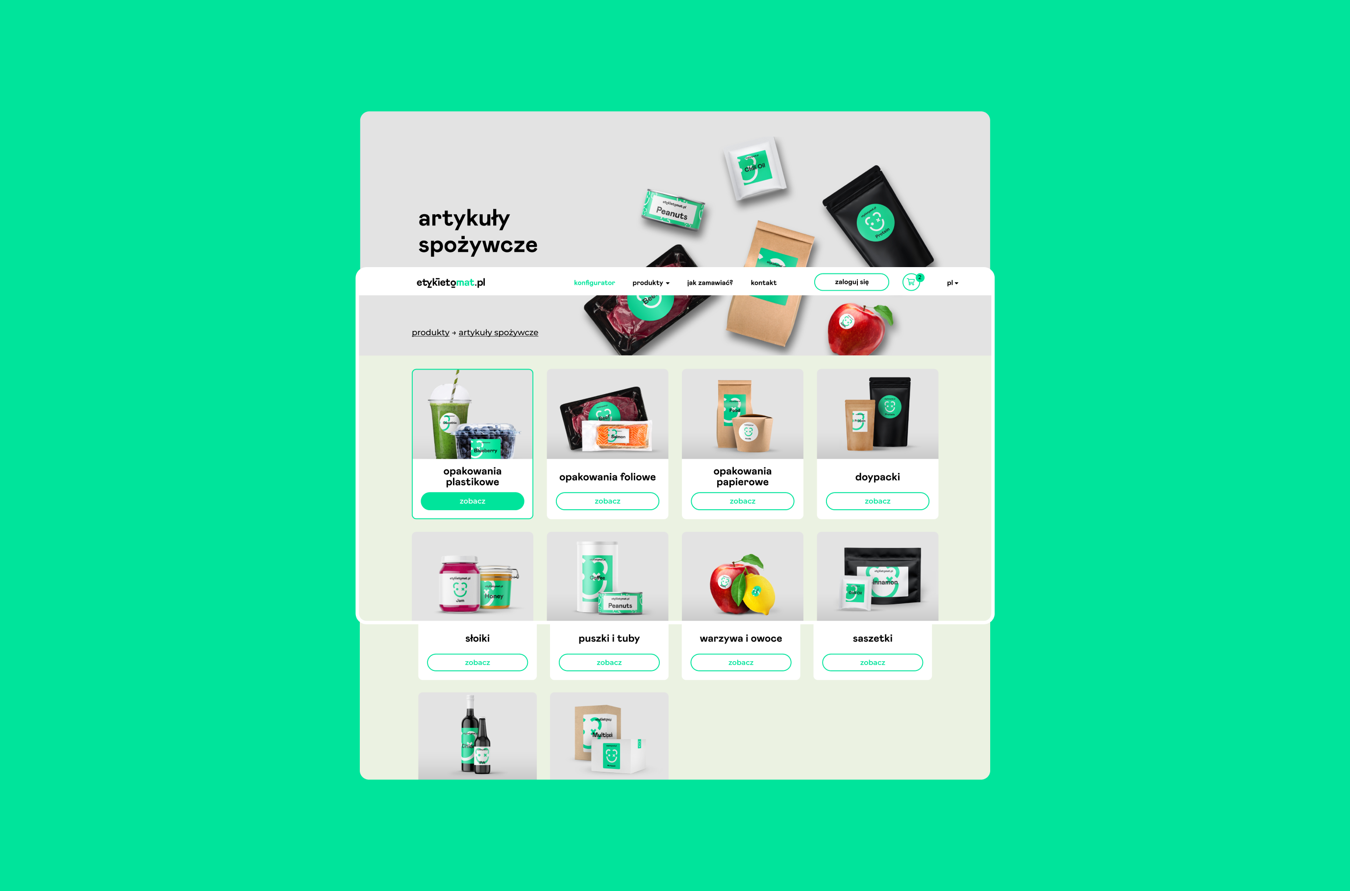
What’s the best way to deal with the complicated and multi-step process of setting up your own label?
It’s simple – simplify it and shorten user paths so that they can achieve their intended effect as fast as possible.
… and challenge 3
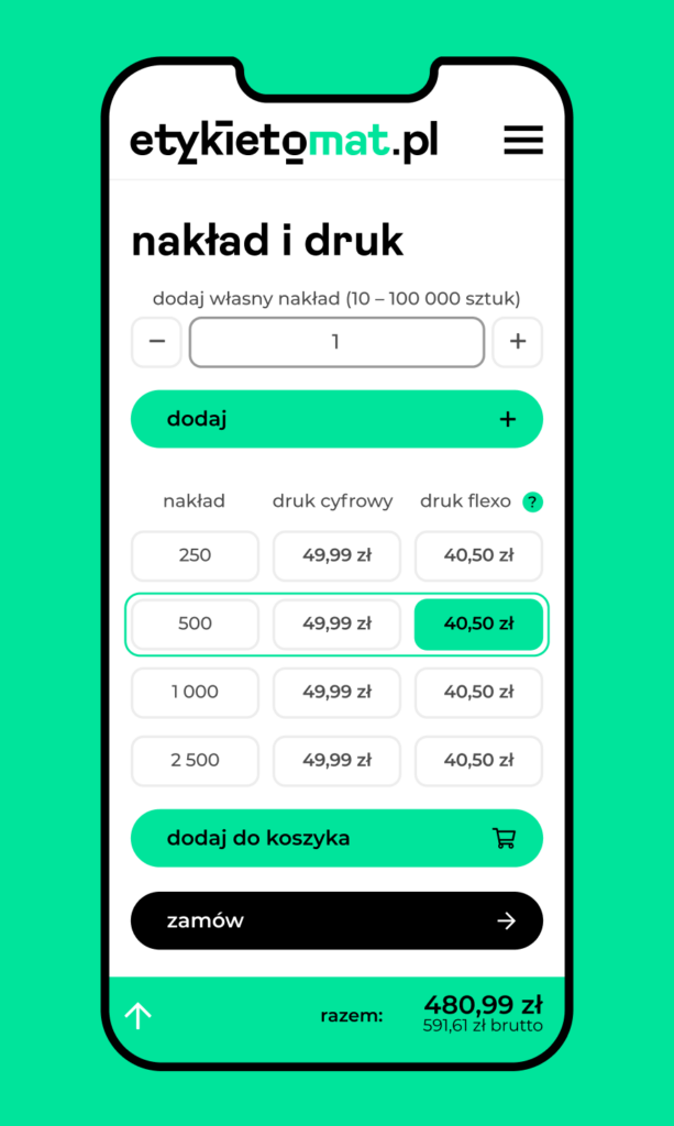
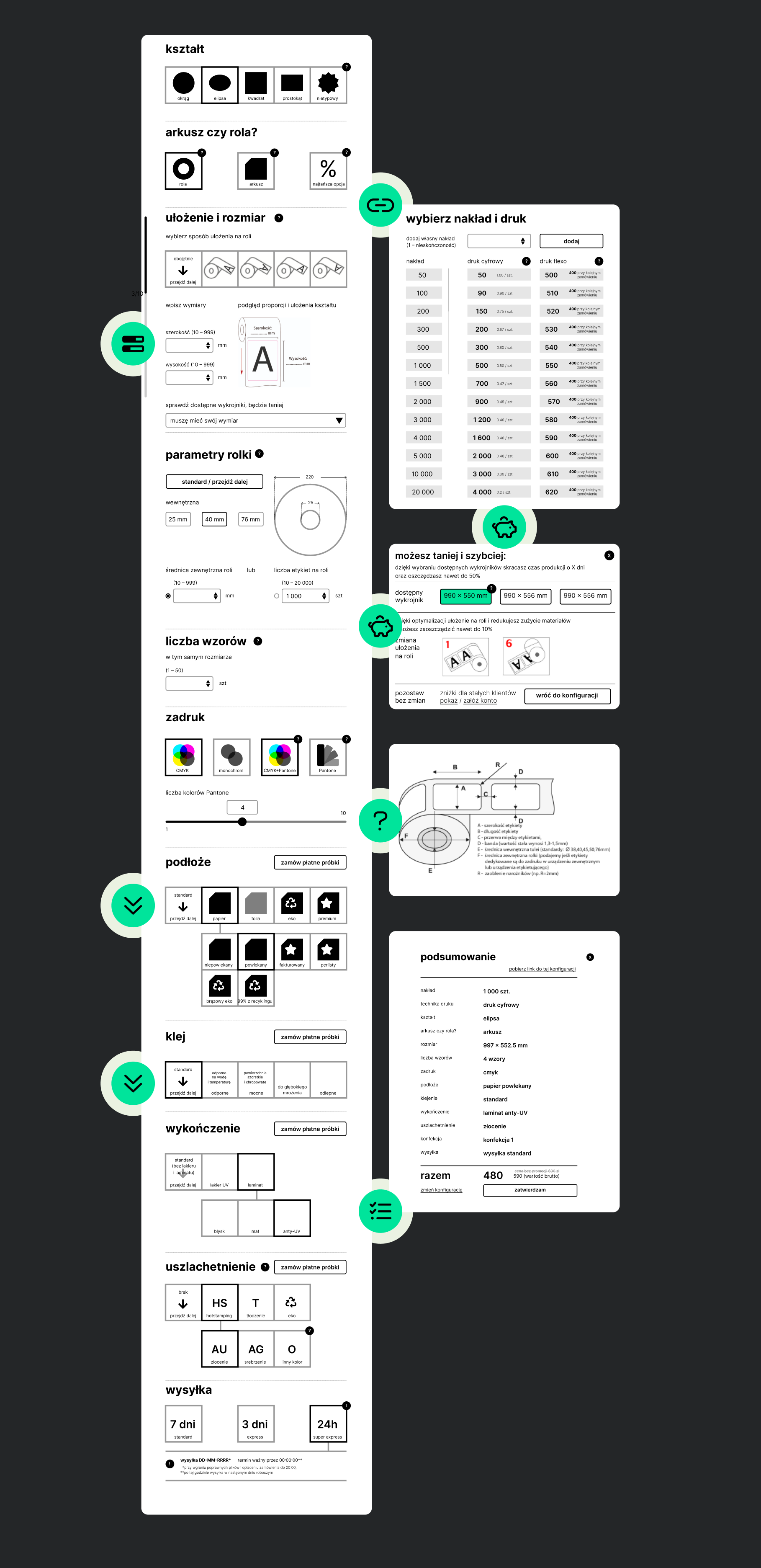
Etykietomat.pl offers two printing technologies – digital and flexo. To make it easier for the user to choose the most optimal – the cheapest and best suited – technique, we have introduced a number of improvements. The anchored pricelist compares two printing technologies, calculating the configuration on an ongoing basis for sample runs (and optionally for custom runs). The progress bar clearly shows where the user is in the ordering process.
Recommendation of elements such as the label backing, arrangement and size or type of print, combined with a proposal to optimize the pricing make the process clear and intuitive. Any ambiguities are dispelled by the ongoing support in complex selections, and full control over the order is guaranteed by access to its summary. The implemented solutions also help to convince the user to flexo printing – recommending it at appropriate times.
Features included anchored pricelist comparing two printing technologies, calculating the configuration on an ongoing basis for sample runs (and optionally for custom ones), price optimization proposal, recommended / default choices, access to the current order summary… and many others!

Credits
Team Leniva° Studio
Strategy, Concept, UX Concept: Lena Mitkowa
Concept and Key Visual: Neon Neonov
Design: Janek Mońka, Kamil Przybyła
UX/UI: Janek Mońka
External Support
Customer Experience, User Experience:
dr Iwo Zmyślony
Concept & Client Service:
Marcin Zaporowski
Client’s Team
Michał Pabiasz
