Our task was to develop a brand experience that fully conveys the essence of a woodworking factory – emphasizing the scale of operations and the industrial nature of the brand.
Info ↘
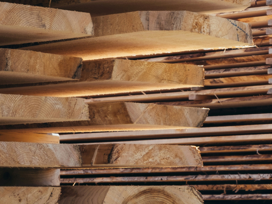
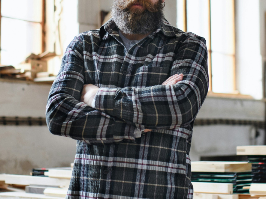
Fabra (formerly JJT Elementum) is a manufacturer of wooden finishes. In practice, this means industrial-scale wood processing. Our primary focus was on the client’s scale and scope of operations, as well as aligning the brand with its target audience (B2B, including developers, furniture manufacturers, architects, and finishing crews).
Key Objectives:
Keep it simple / Proper brand positioning within the category / Brand industrialization / A functional and scalable system for independent application by the marketing team
Scope
Naming / Branding / Brand Materials /
Communication
Tools
Figma / MS Office /
Illustrator / Photoshop
Client
FABRA
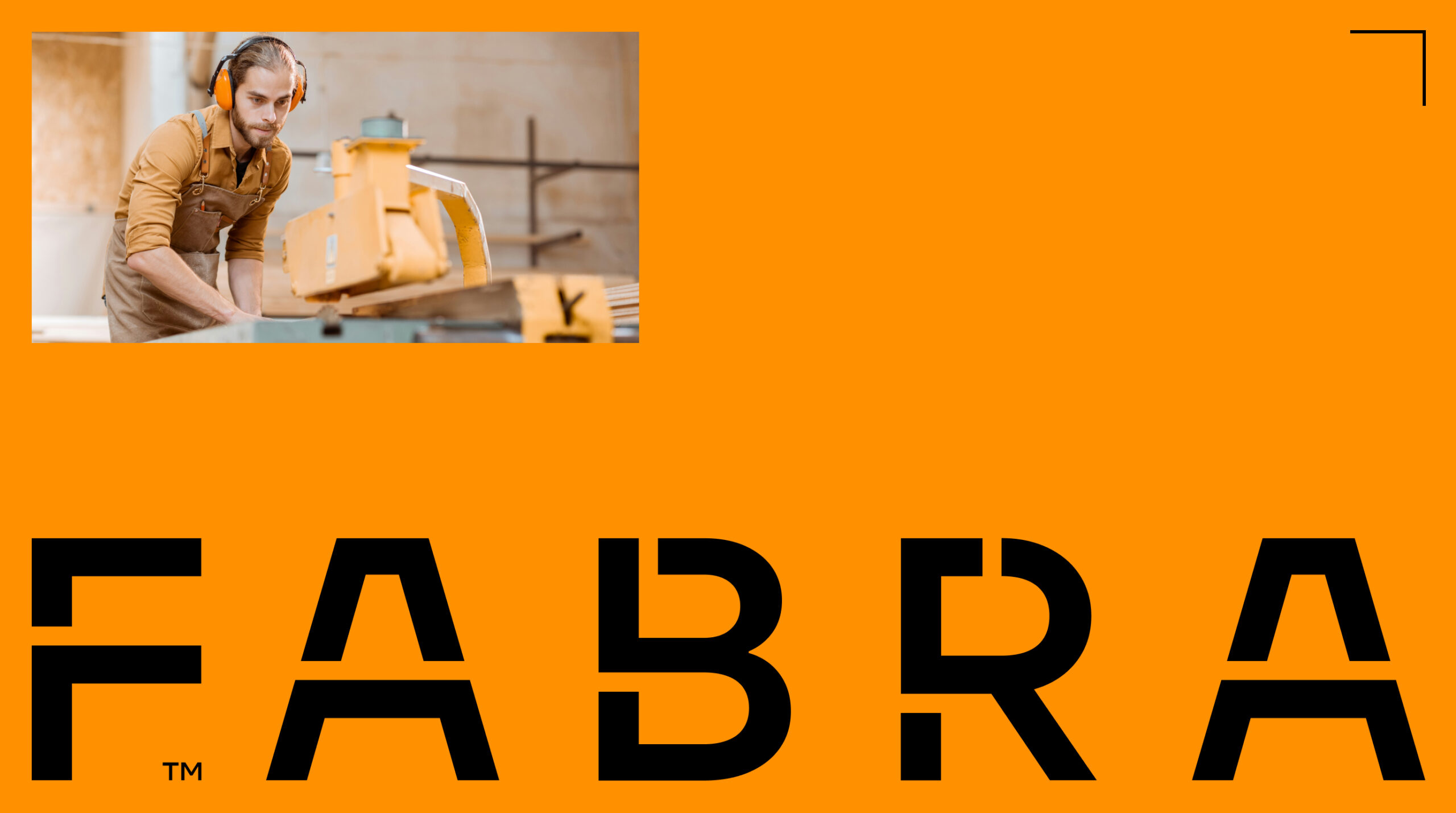
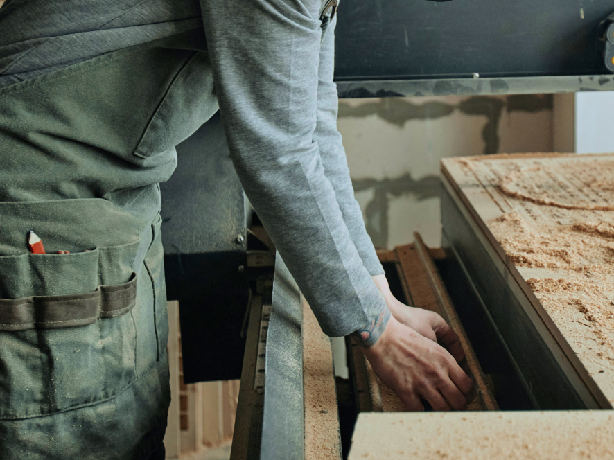


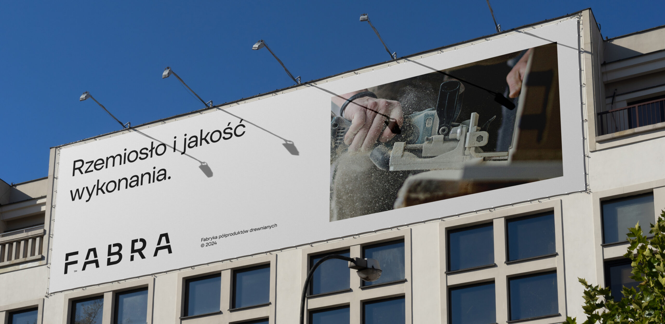
We aimed to capture the industrial character of the company and communicate it using the language of its target audience.

Summary
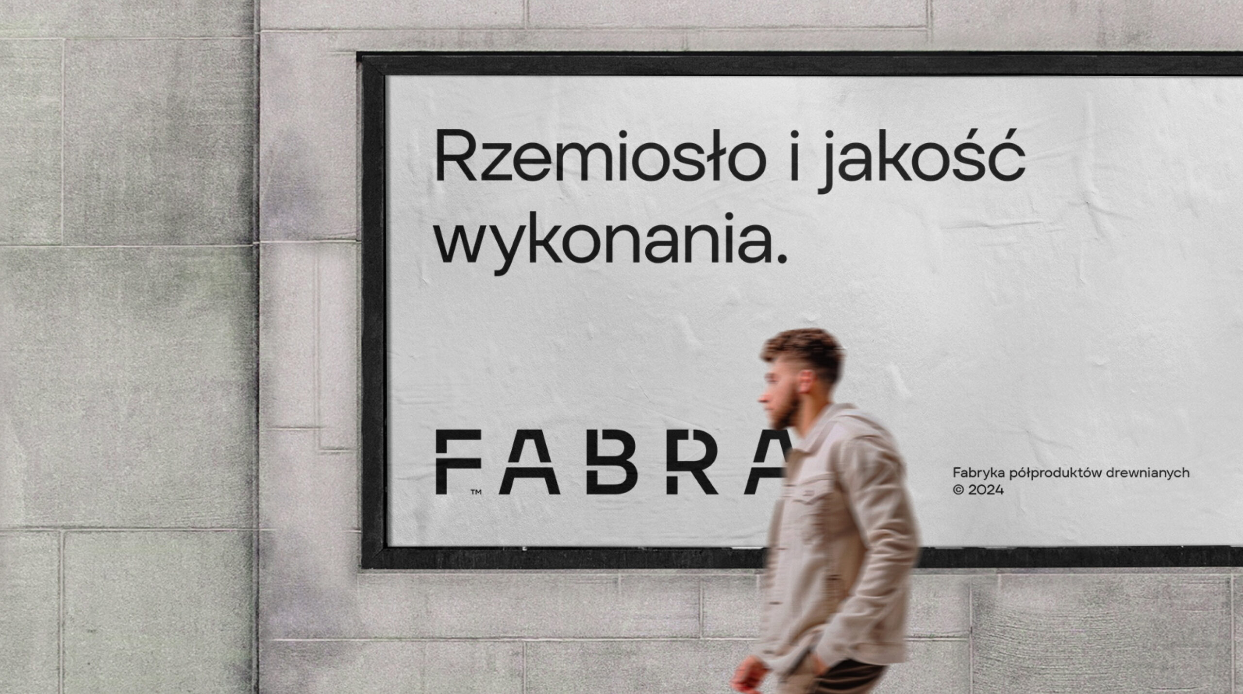
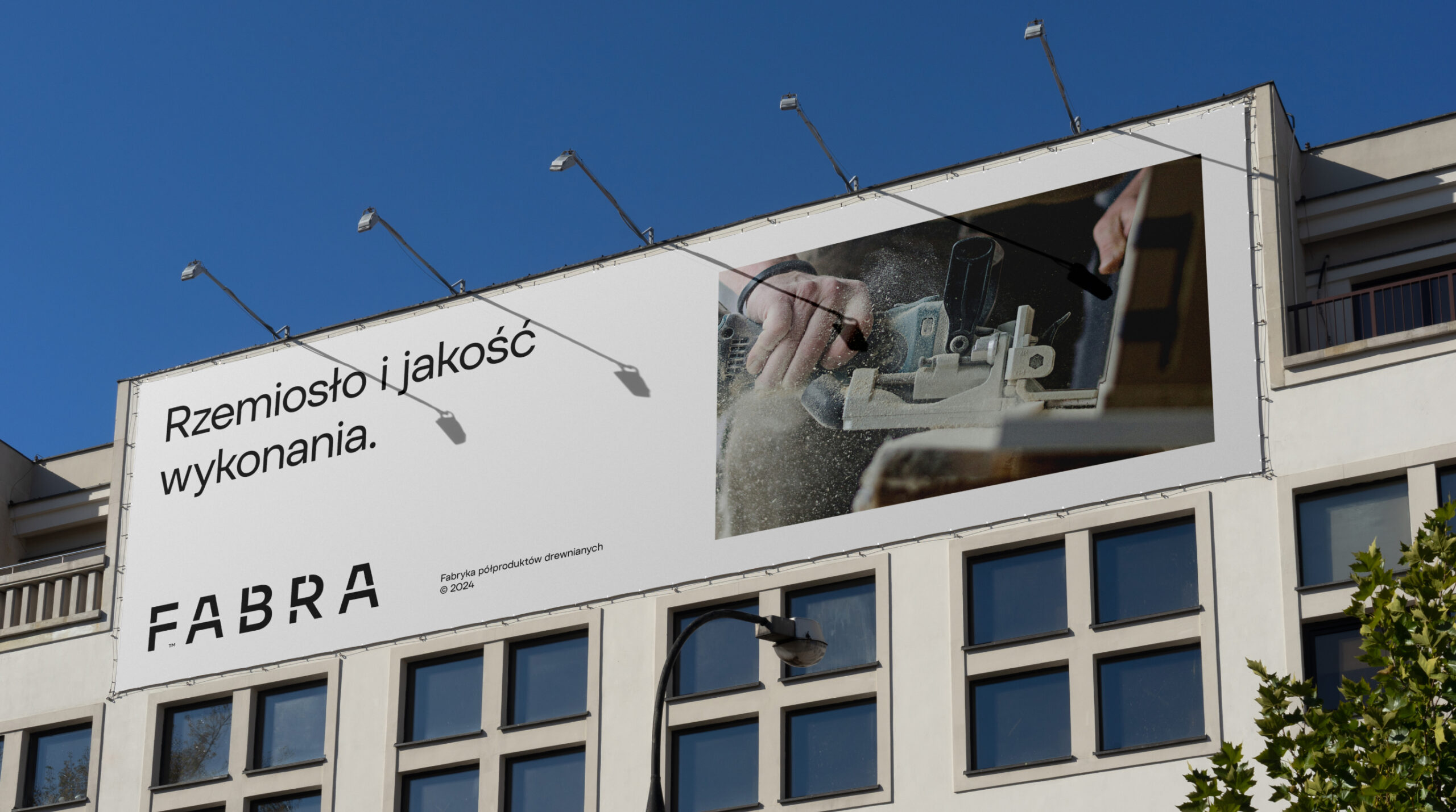
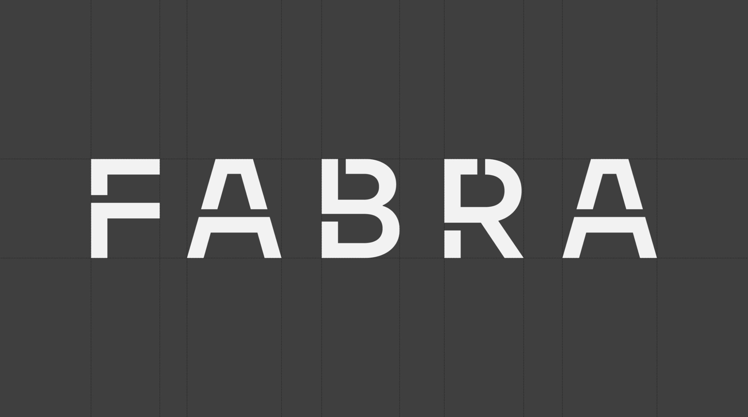
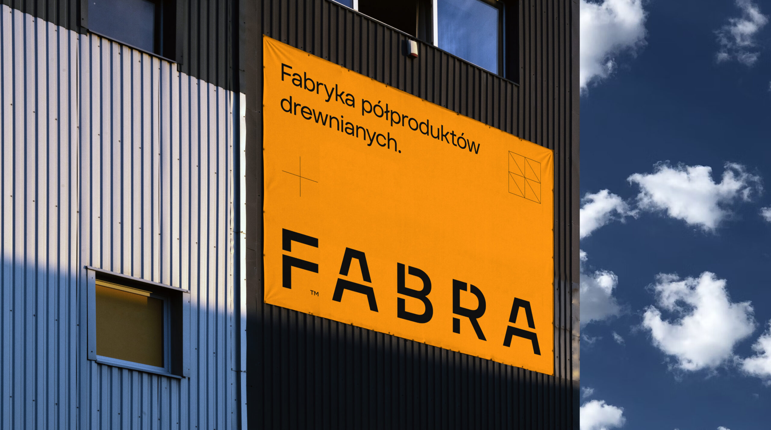
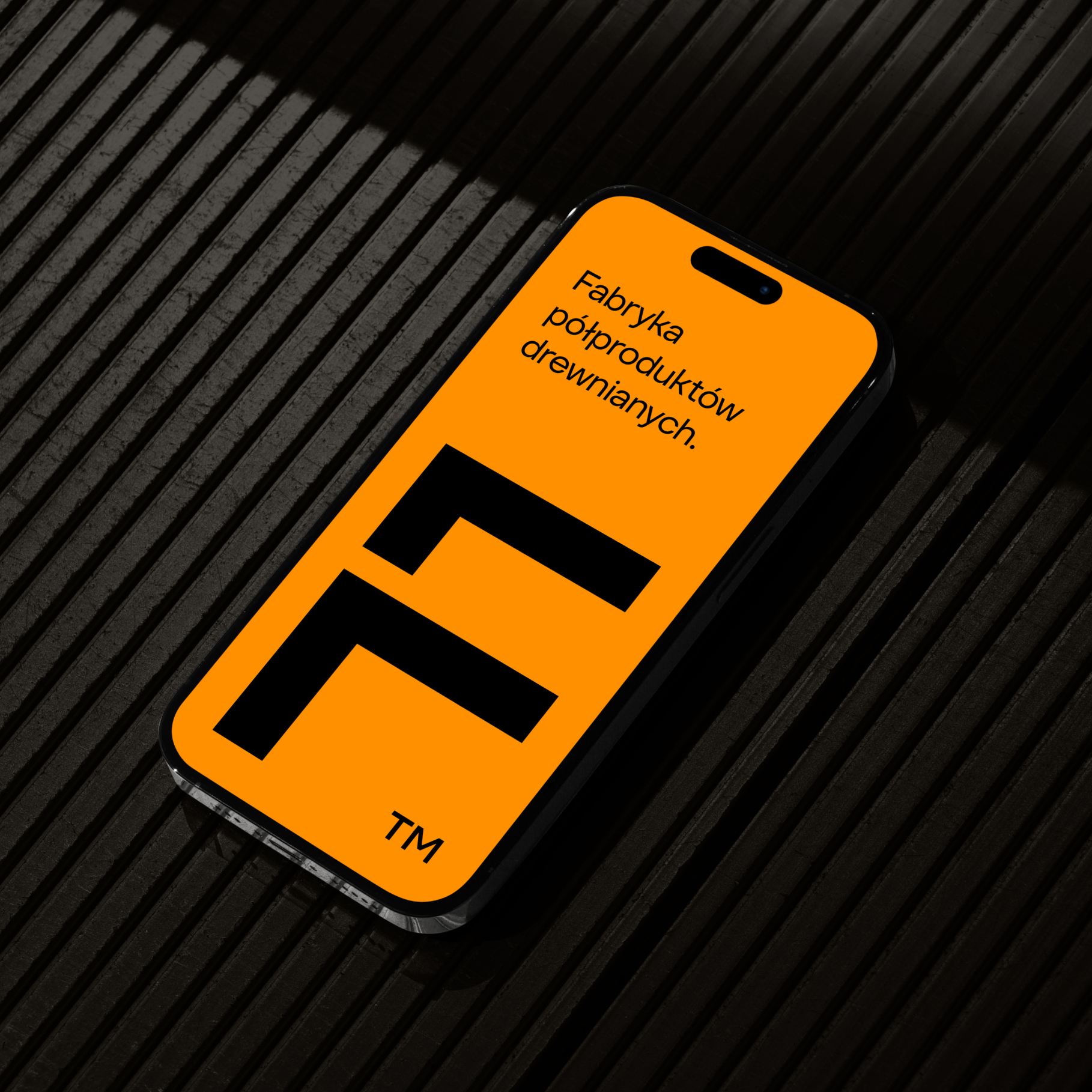
The first step was creating a new name. JJT Elementum transformed into FABRA. The name reflects our brand concept – it’s simple, technical, and focuses more on the process and machinery than on the wood itself. Technology and industry take center stage.
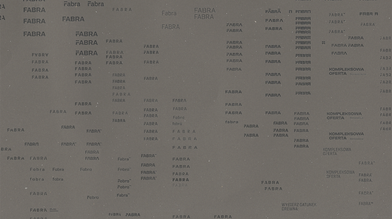
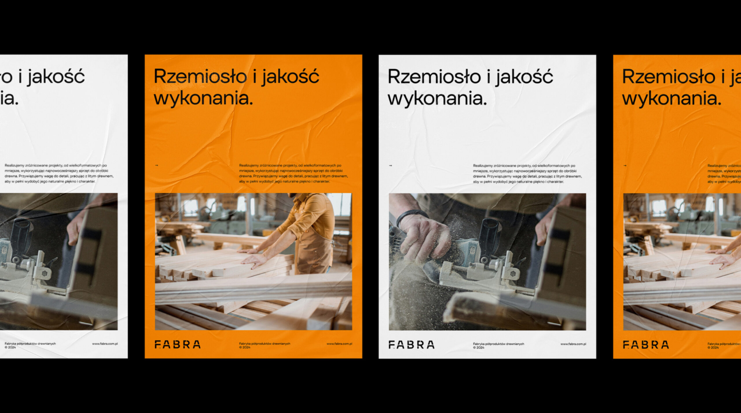
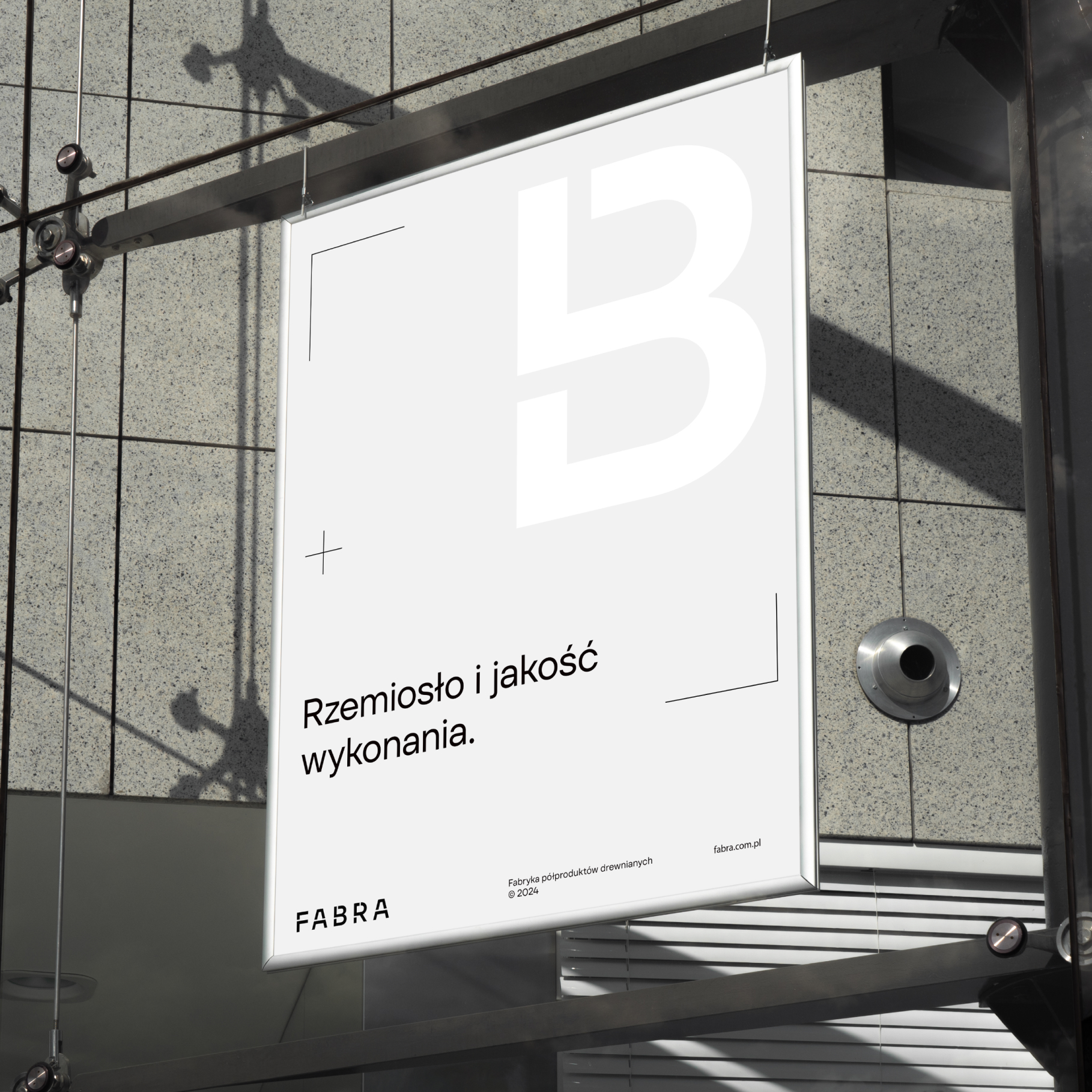
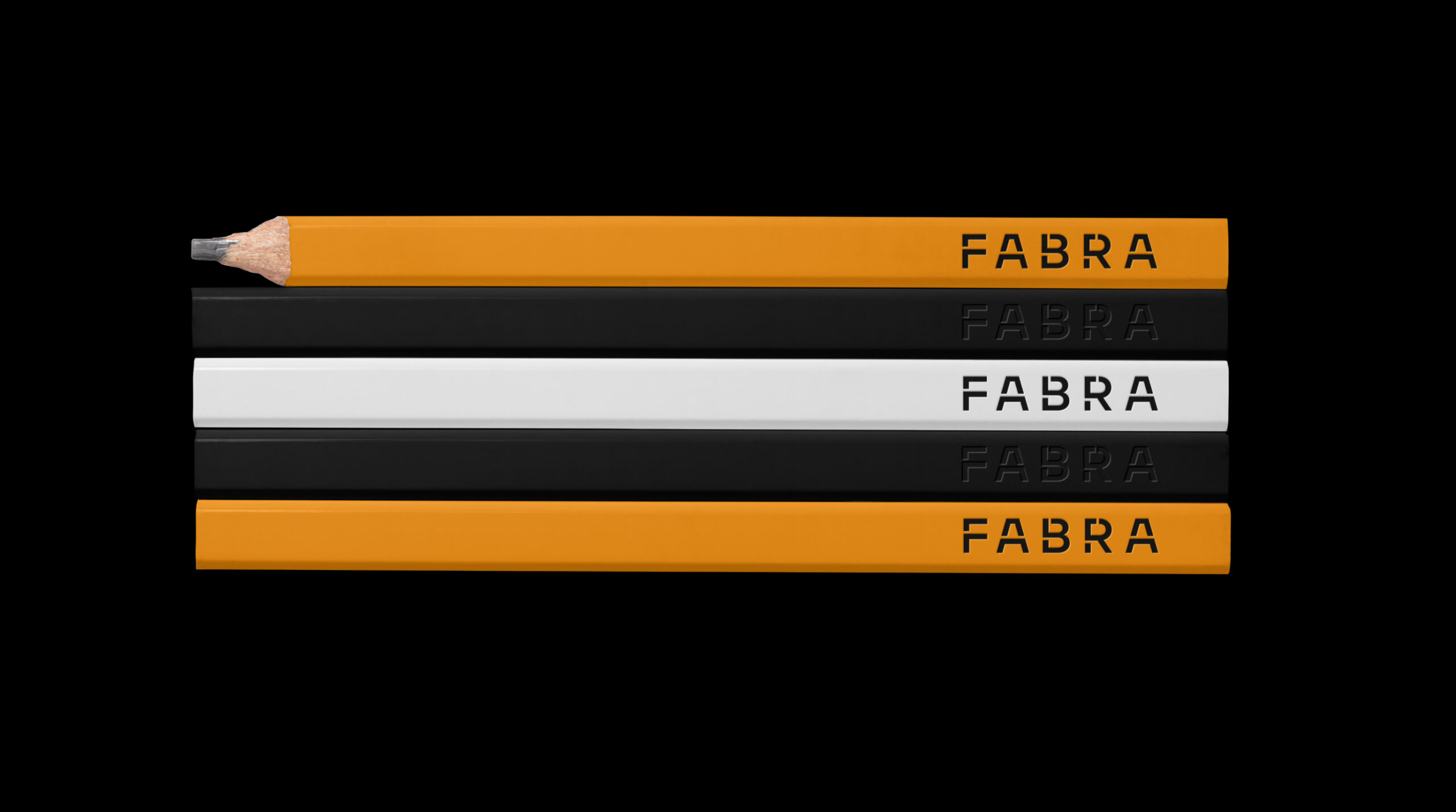
This also meant adopting functional, clear typography. The brand’s main typeface is TT Firs Text. Its universal, minimalist character allows it to be treated almost like wood.
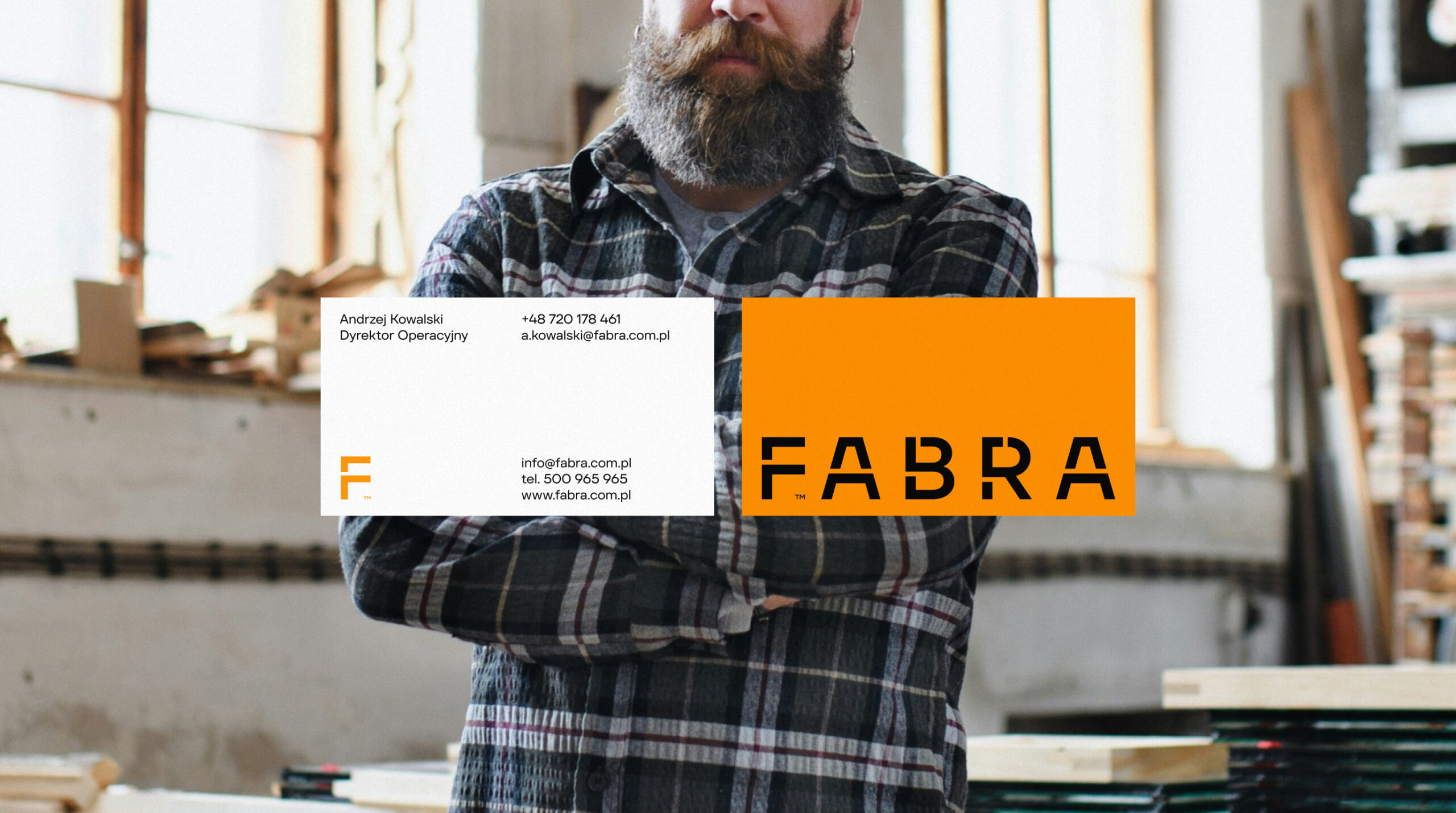
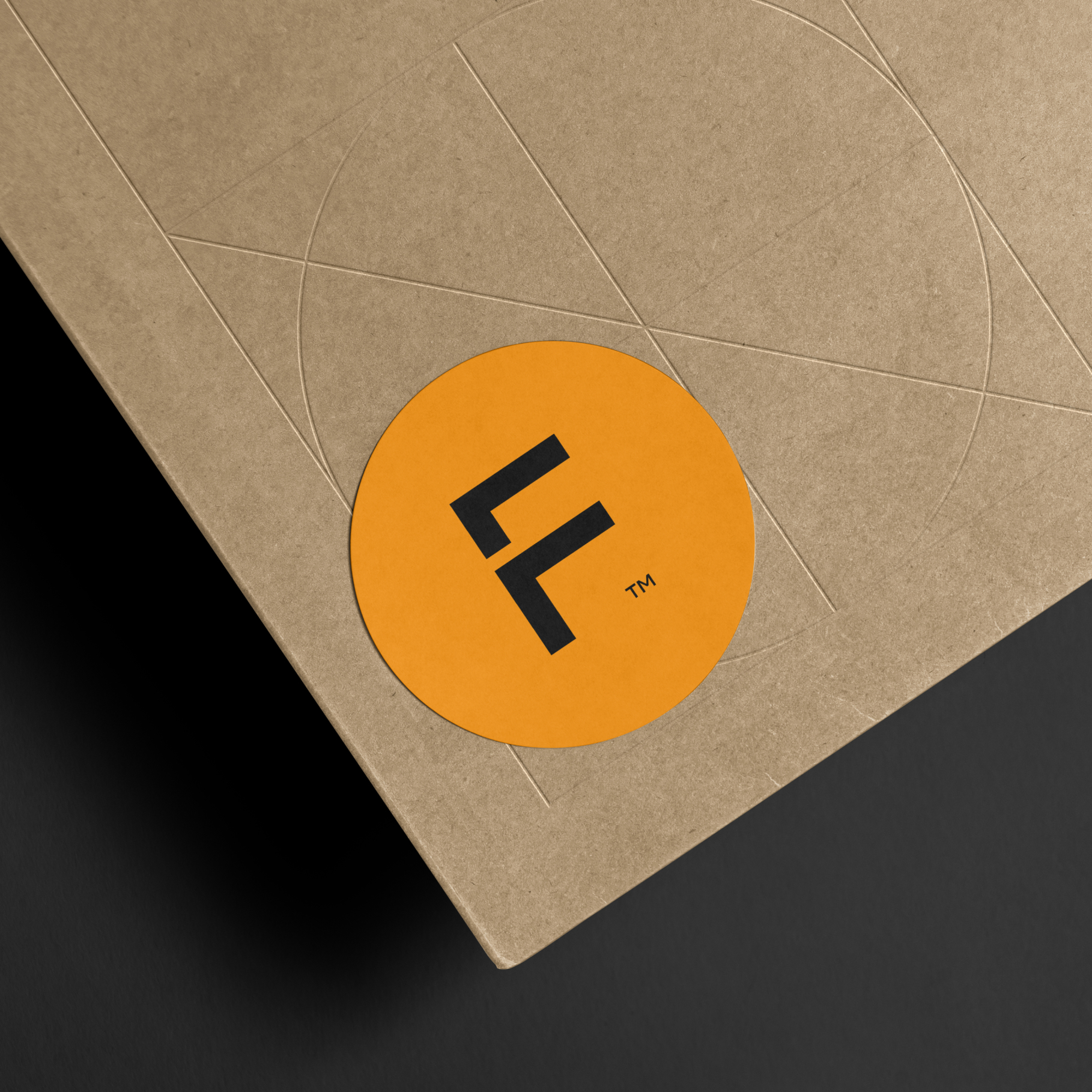
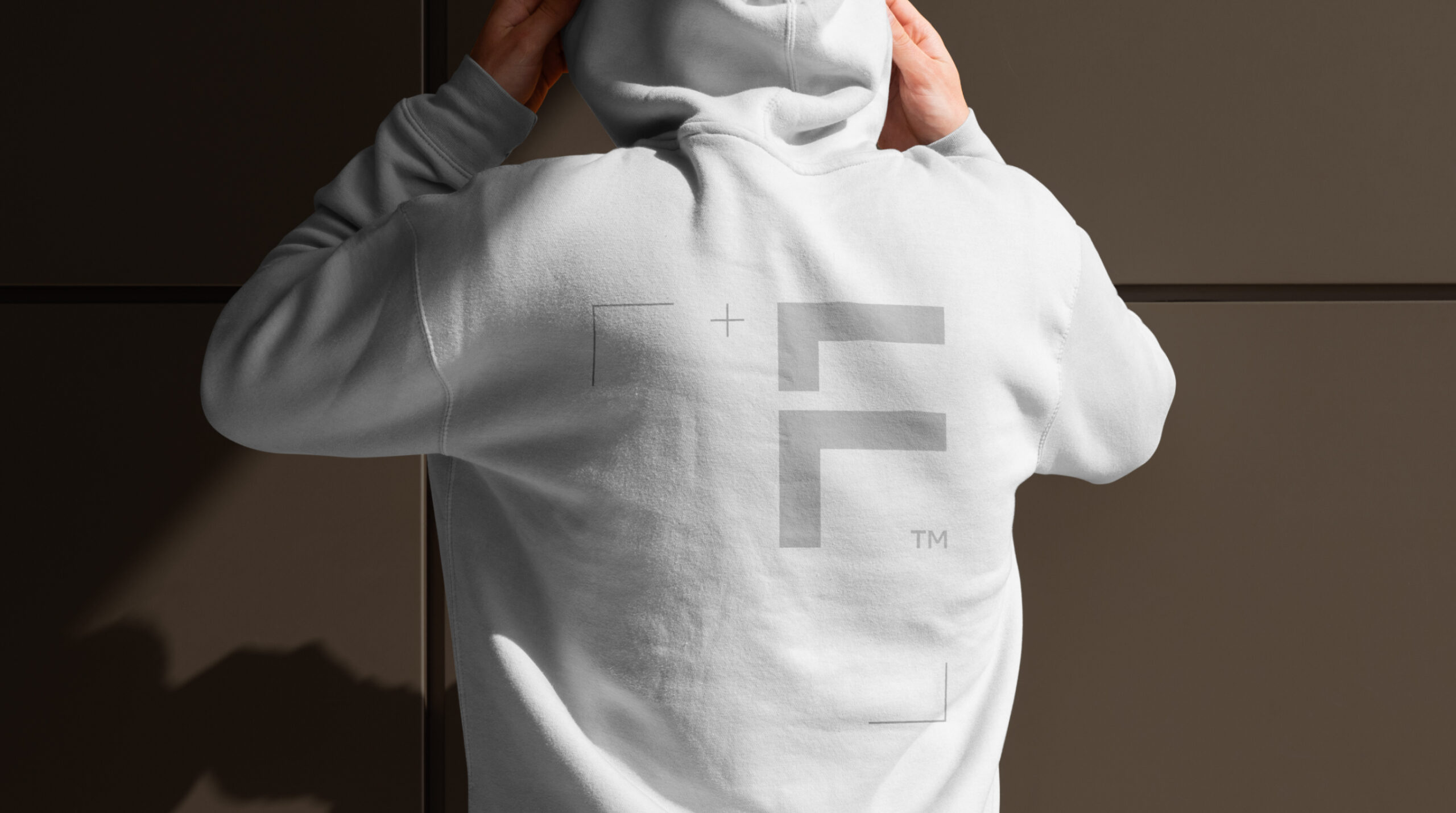
In the logo, we modified the typography stylistically to clearly reference mechanical wood processing. The shapes suggest standardization and repeatability while maintaining the highest attainable quality. At the same time, we allowed for a visual nod to wooden letterpress blocks.
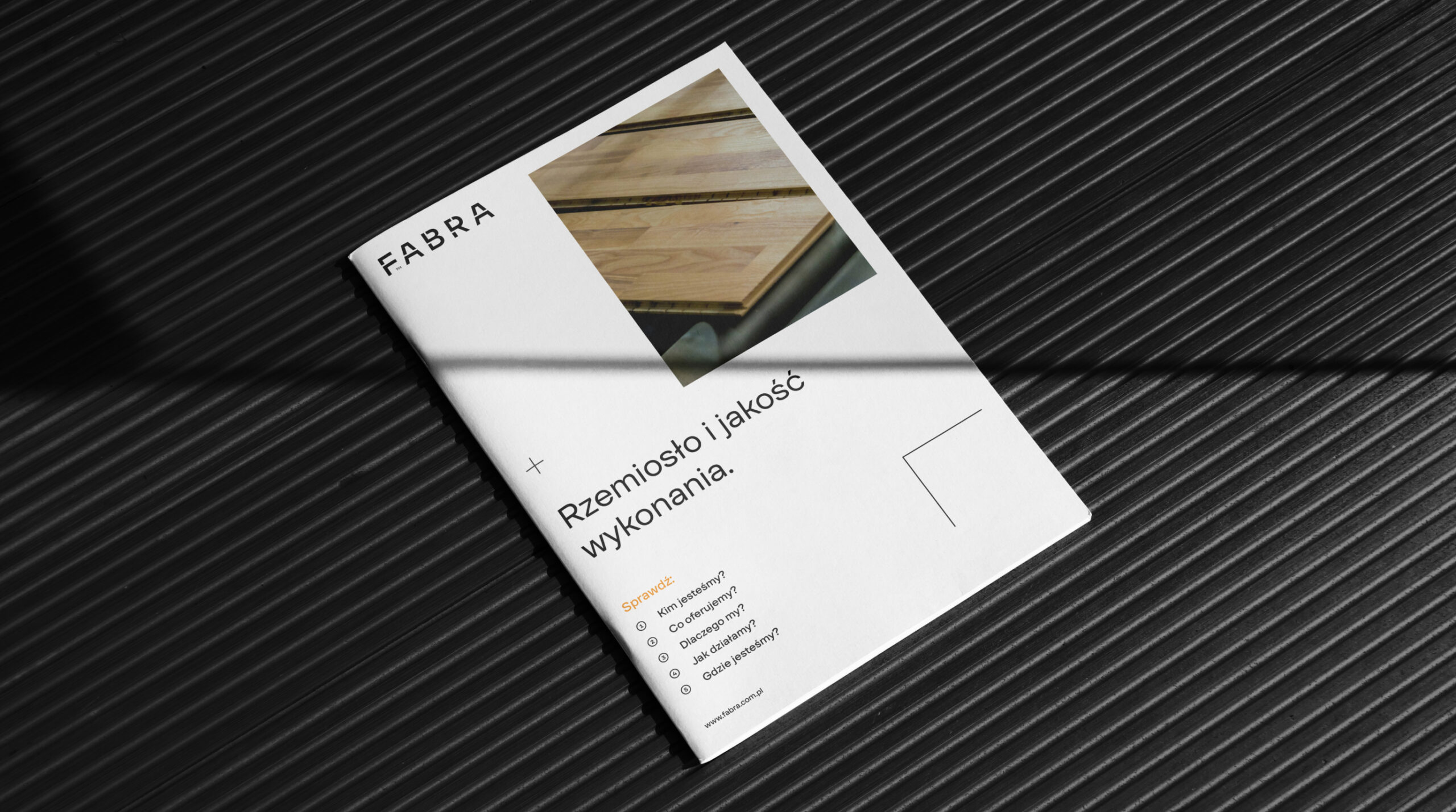
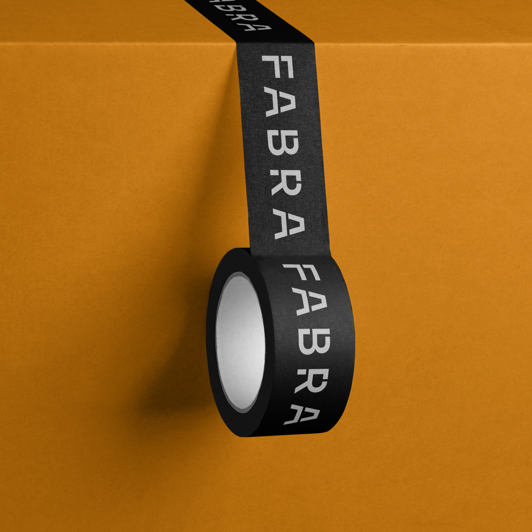
Another component of the brand are bold, recognizable colors that maintain high contrast, but also support calm, expert communication when needed.
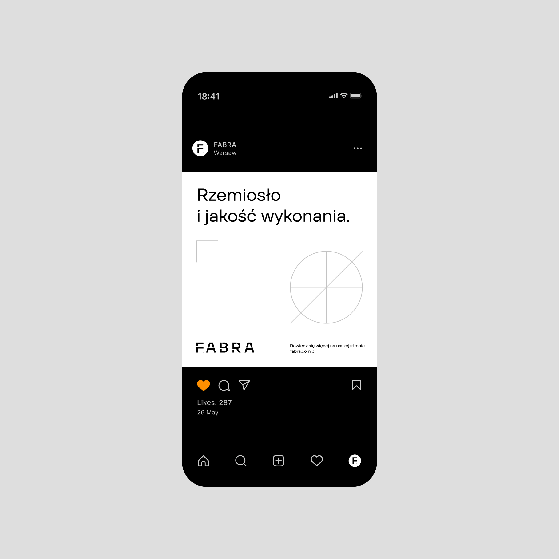
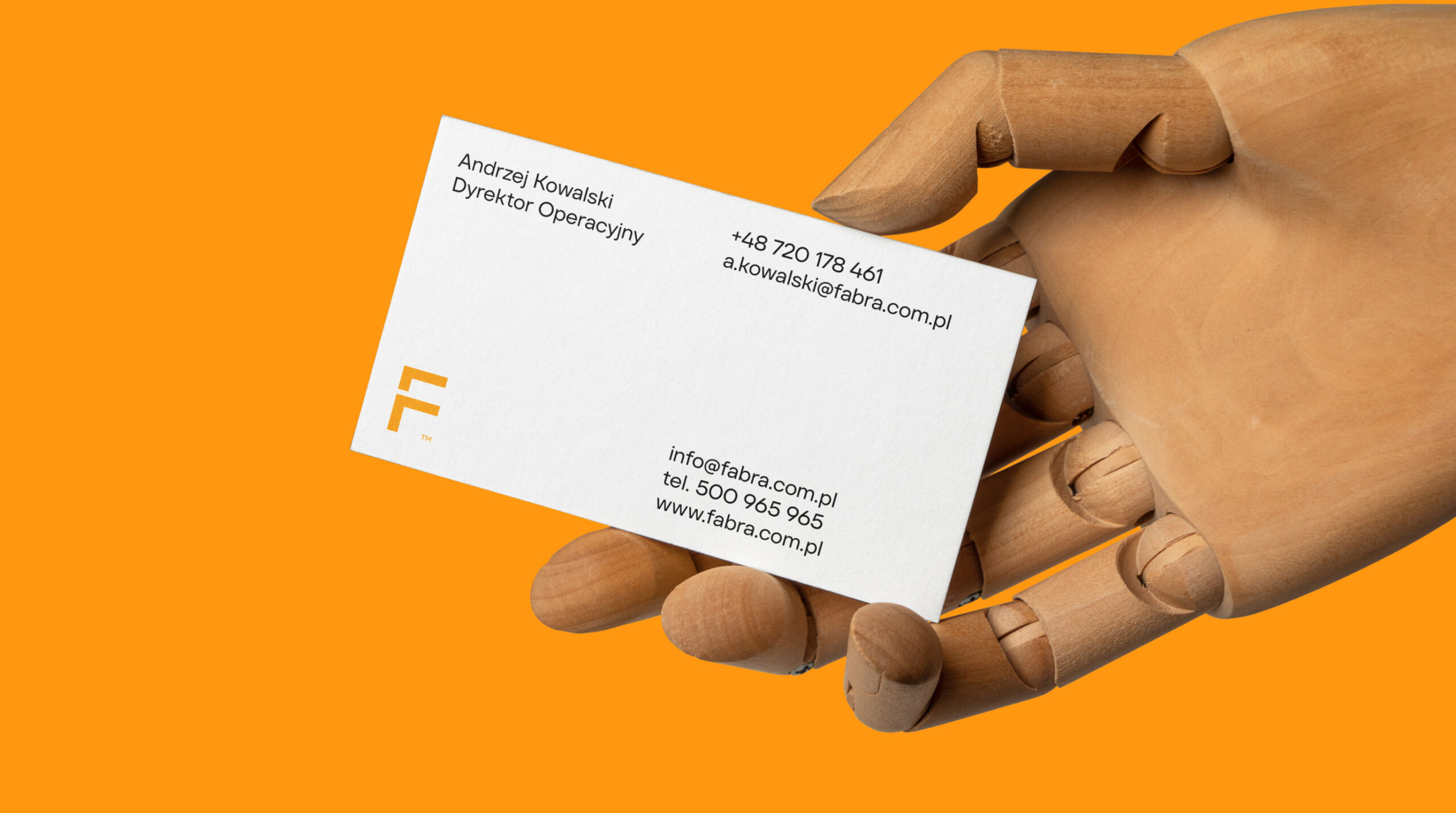
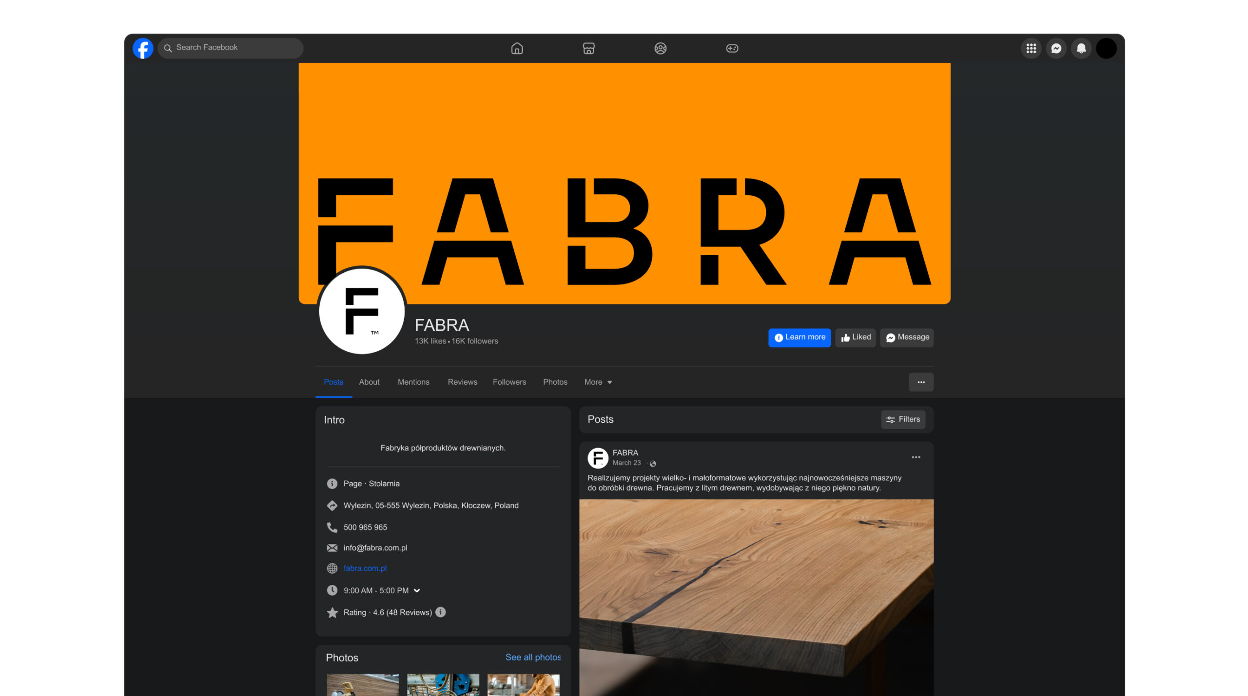
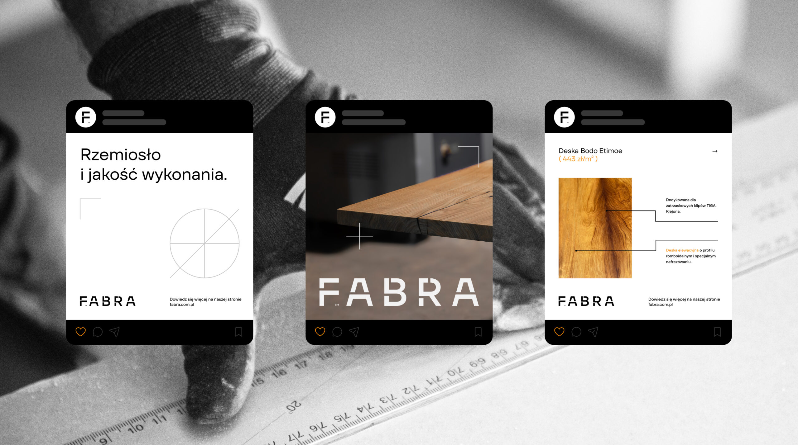
Finally we have technical drawings and icons, along with the use of a construction grid as a visual element. A crucial part of implementing the identity is a set of files/design system for social media communication and materials for sales communication.
Credits
Leniva° Studio
Naming & Art Direction: Neon Neonov
Brand Design: Kamil Przybyła
Brand Implementation: Zofia Stybor
Client Service: Lena Mitkowa
Figma Implementation: Agata Szewczuk
Clients Team
Strategy, Marketing, Brand: Michal Sterninski
Brand Owner: Janusz Pytlak
Brand Implementation: Justyna Szewczuk