Ever checked Screen Time on your mobile phone and realised you became a techjunkie? That was our first thought after meeting the people from Dbam o Mój Zasięg Foundation. The name simply means “I care about my range” and it couldn’t be more explicit about what their domain is.
Info ↘
The aim of the foundation is to educate about the disadvantages of digital technologies overuse. They talk to kids, teenagers and grown ups. They focus on studies of digital media overuse and share simple solutions everyone can apply. You can hire them to give a speech at your school, university, in your company or just read their articles about how to take some time offline.
After we finished our brand workshops and research we knew one for sure – these guys are not against the technology at all, and their approach is not against our current lifestyle, it just shows how not to sink to deep into the online world and eventually have a digital burnout.
Scope
Rebranding / UX
Tools
Figma / Illustrator
Client
Dbam o mój zasięg
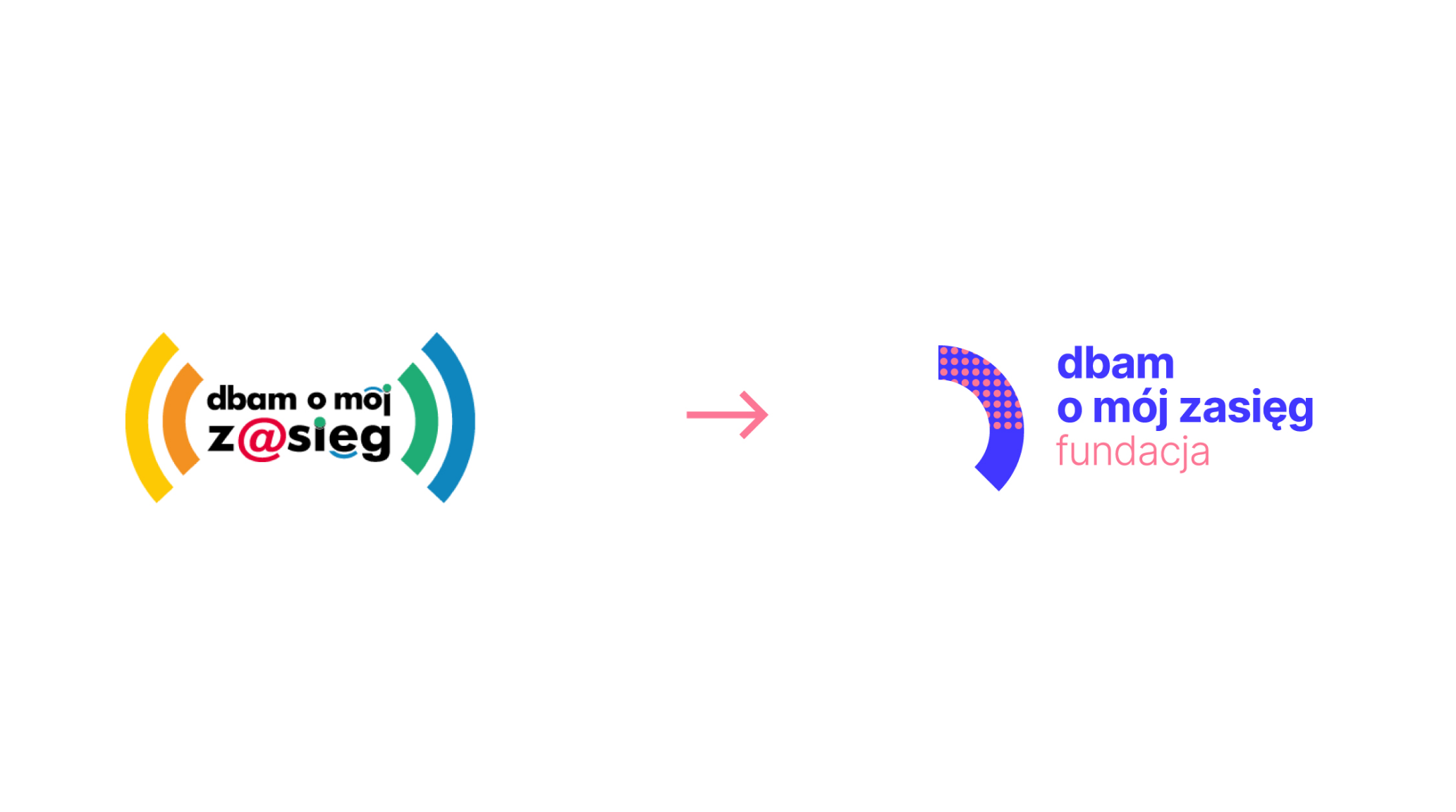
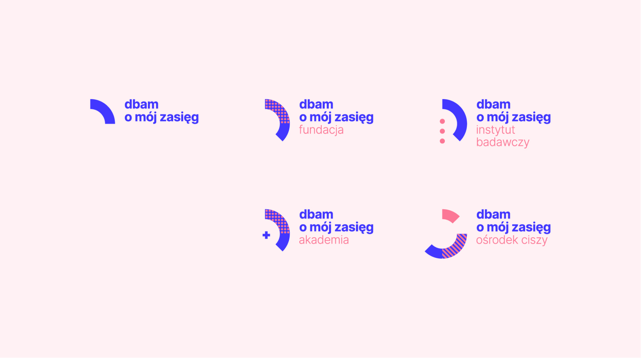
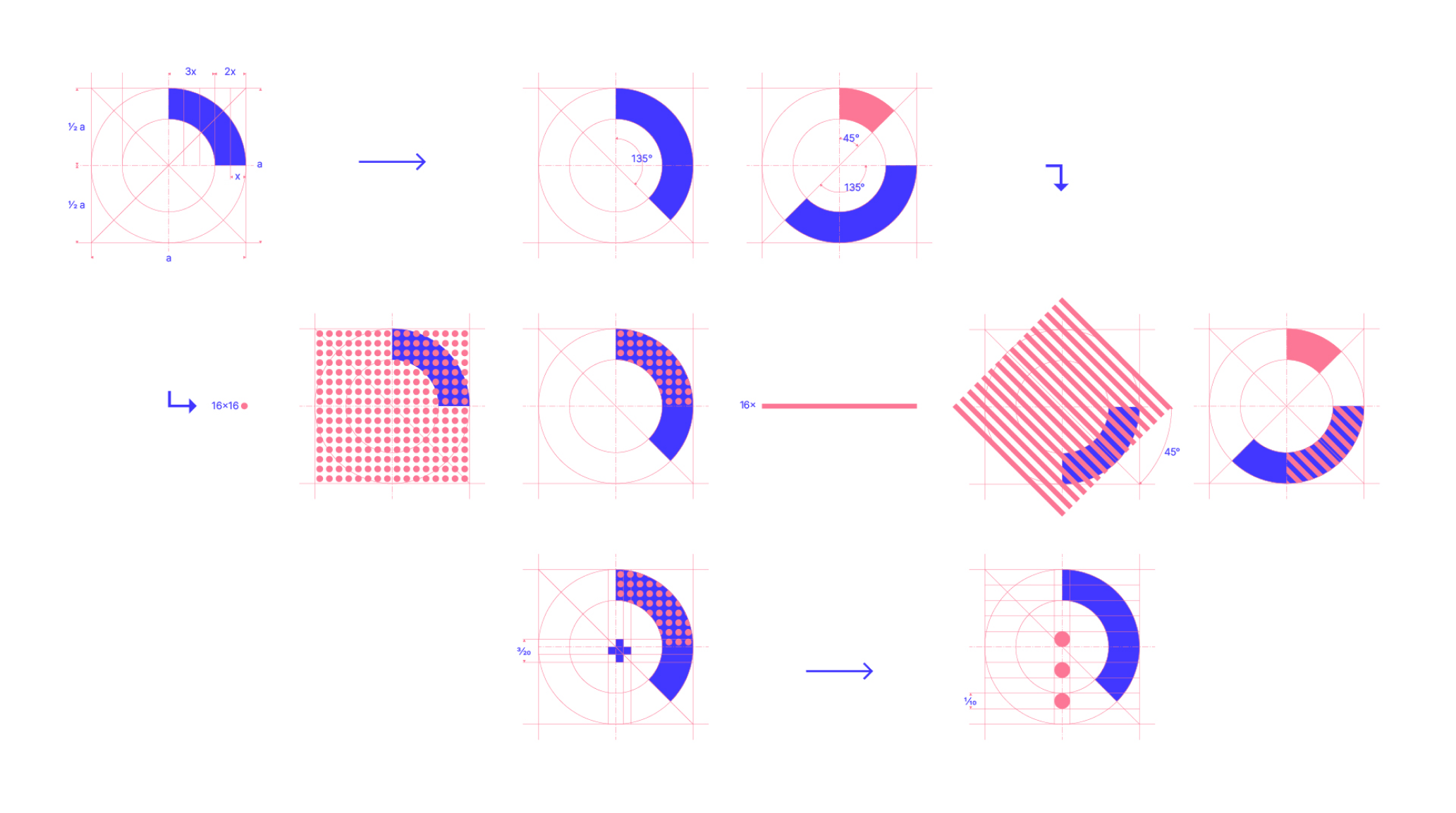
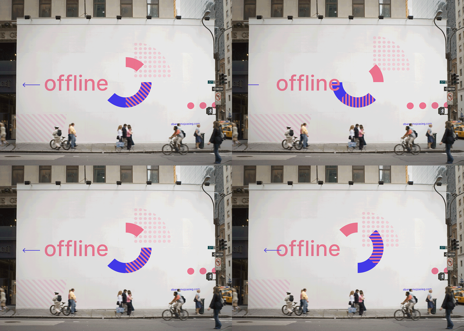
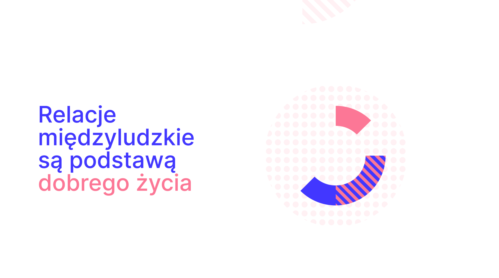
We knew, the new logo should be fresh and digital – Dbam o Mój Zasięg uses mostly online communication. We’ve also learned they need easy-to-use tools that will help them to build trustworthy yet playful brand. We wanted it to be bold and cool – that’s exactly how they work and operate.
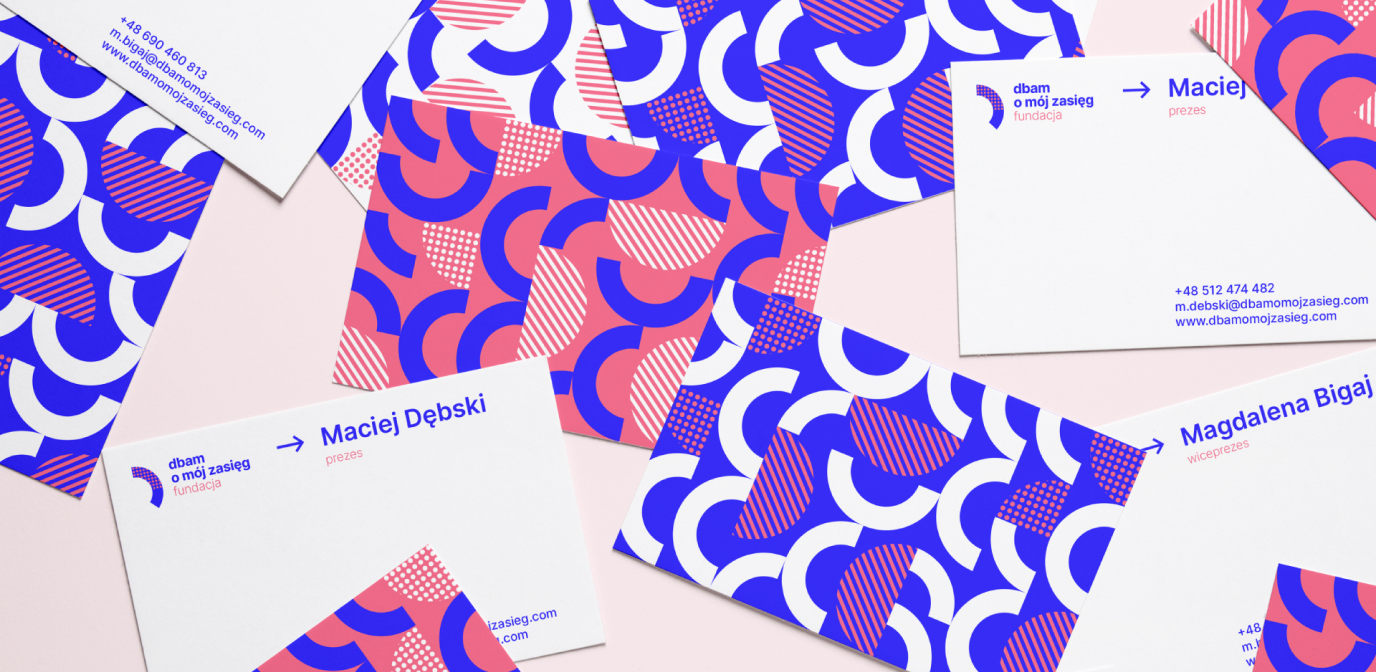
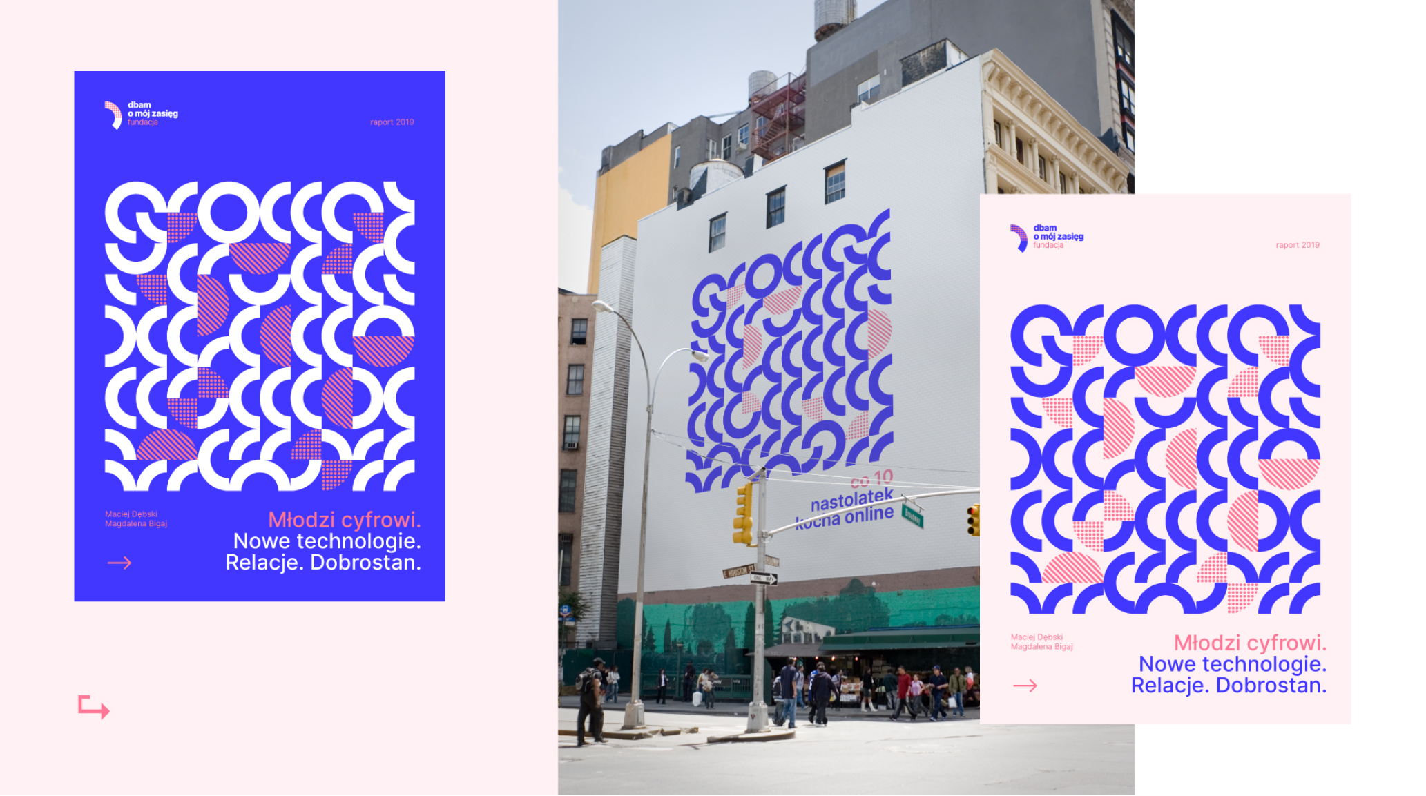
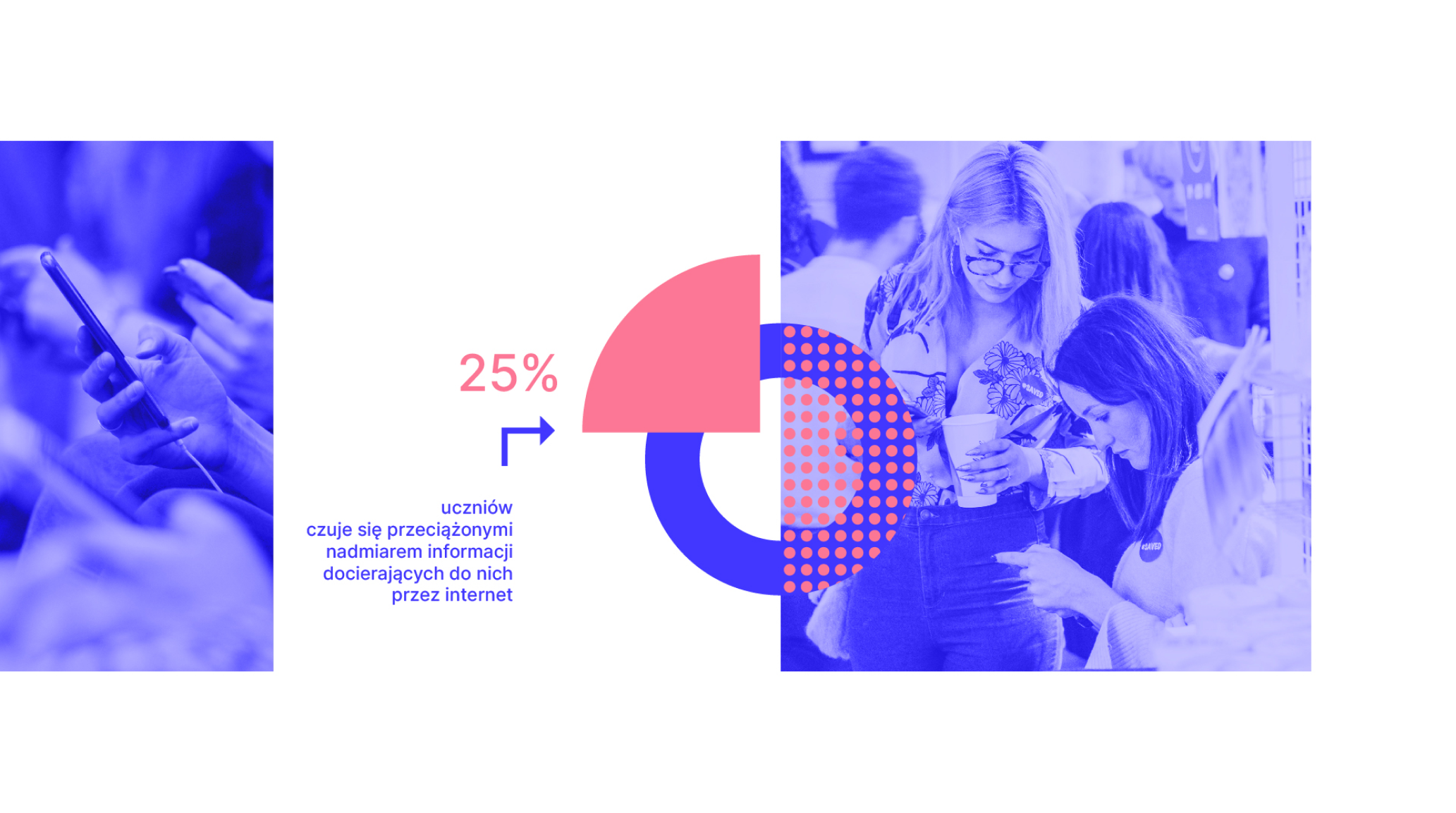
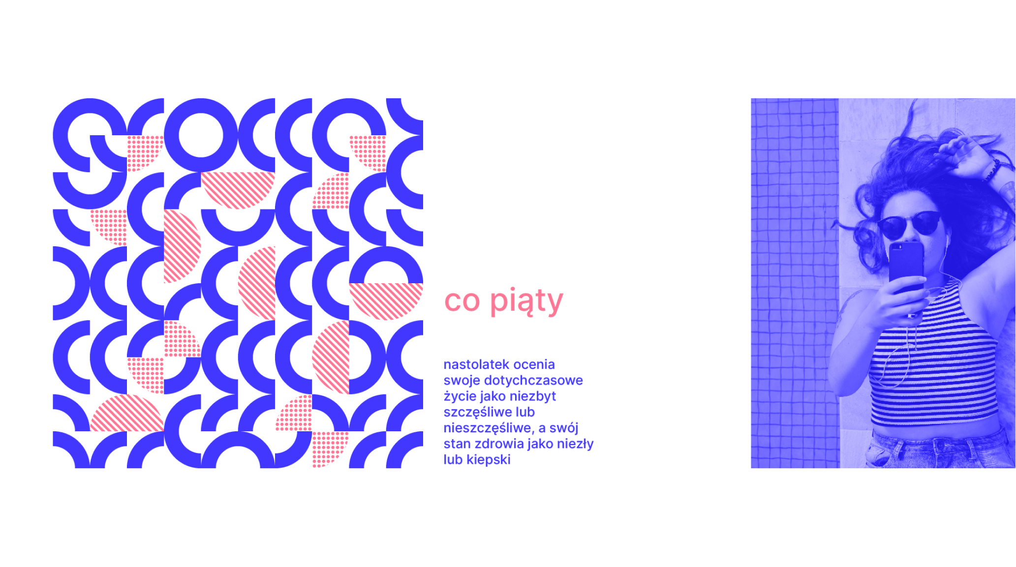
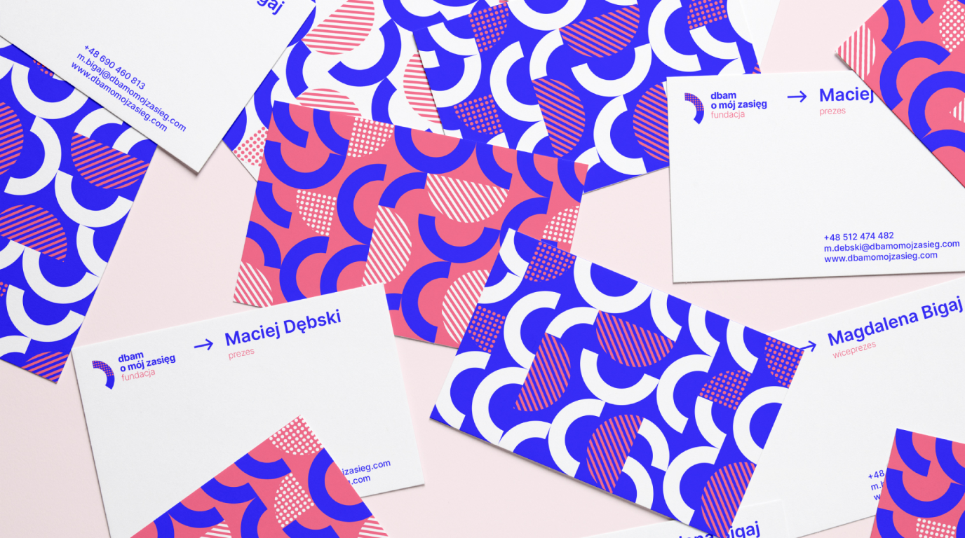
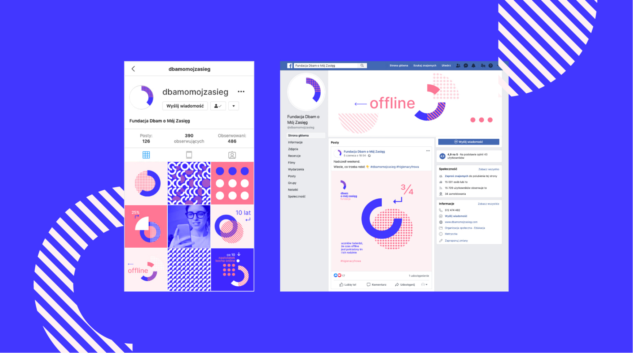
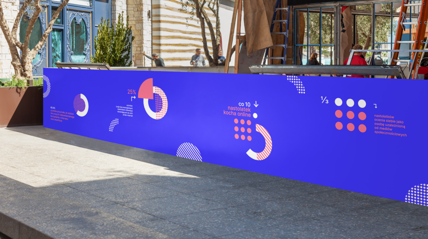
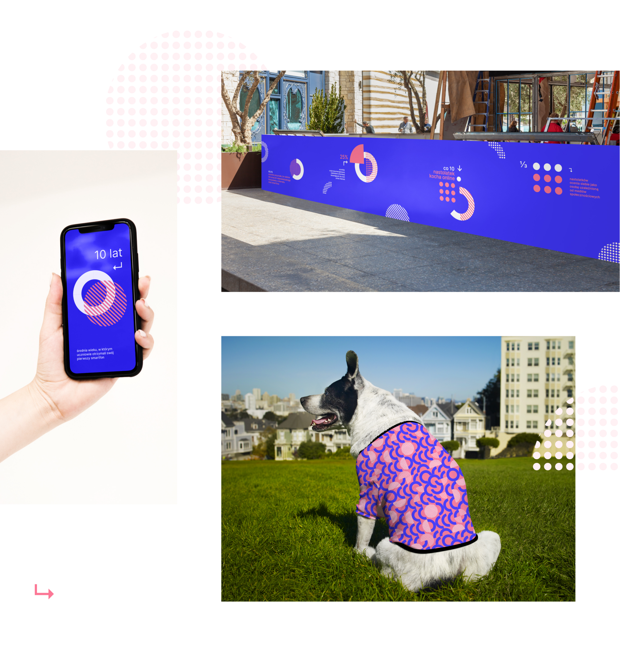
We’ve created a visual identity that consist of simple pattern-like elements that we use in the main logo and the logo derivates as well as in the key visual. The system is easy to apply and gives plenty of opportunities. It’s designed digital-first, but we managed to keep bright and vivid colours by using RGB profiles in print (we used HP Indigo system / printed on FSC and PCF certified paper Mohawk Superfine).
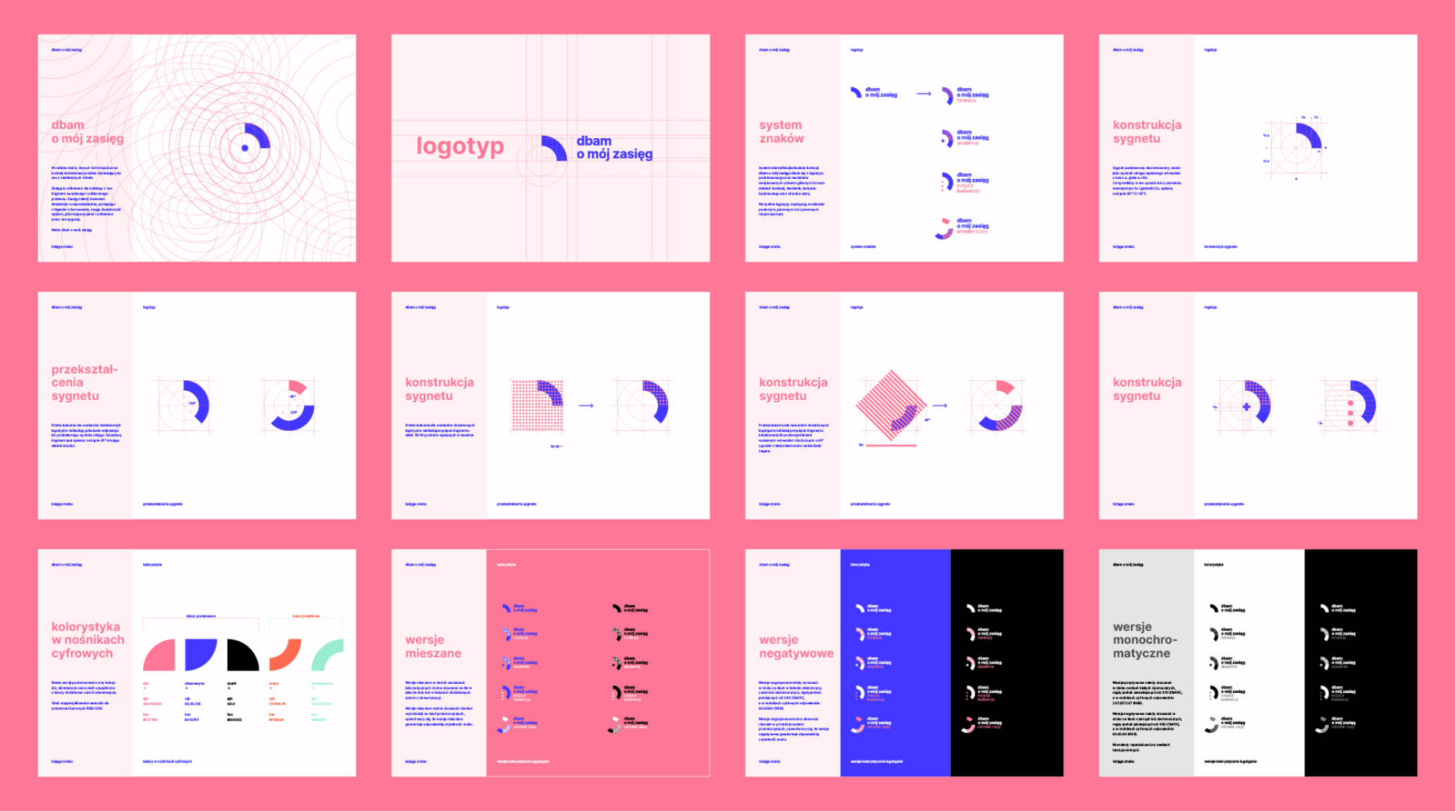
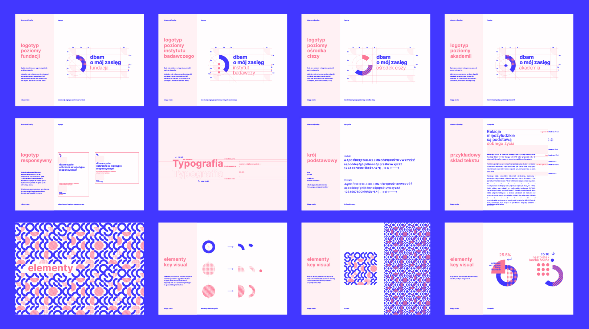
As a result, we’ve got a fresh, consistent brand and as an addition – we really started to care about some offline-time.


Credits
Team Leniva° Studio
Strategy and Production: Lena Mitkowa
Concept and Key Visual: Neon Neonov, Janek Mońka
Design: Janek Mońka
Client’s Team
Magdalena Bigaj
Maciej Dębski
