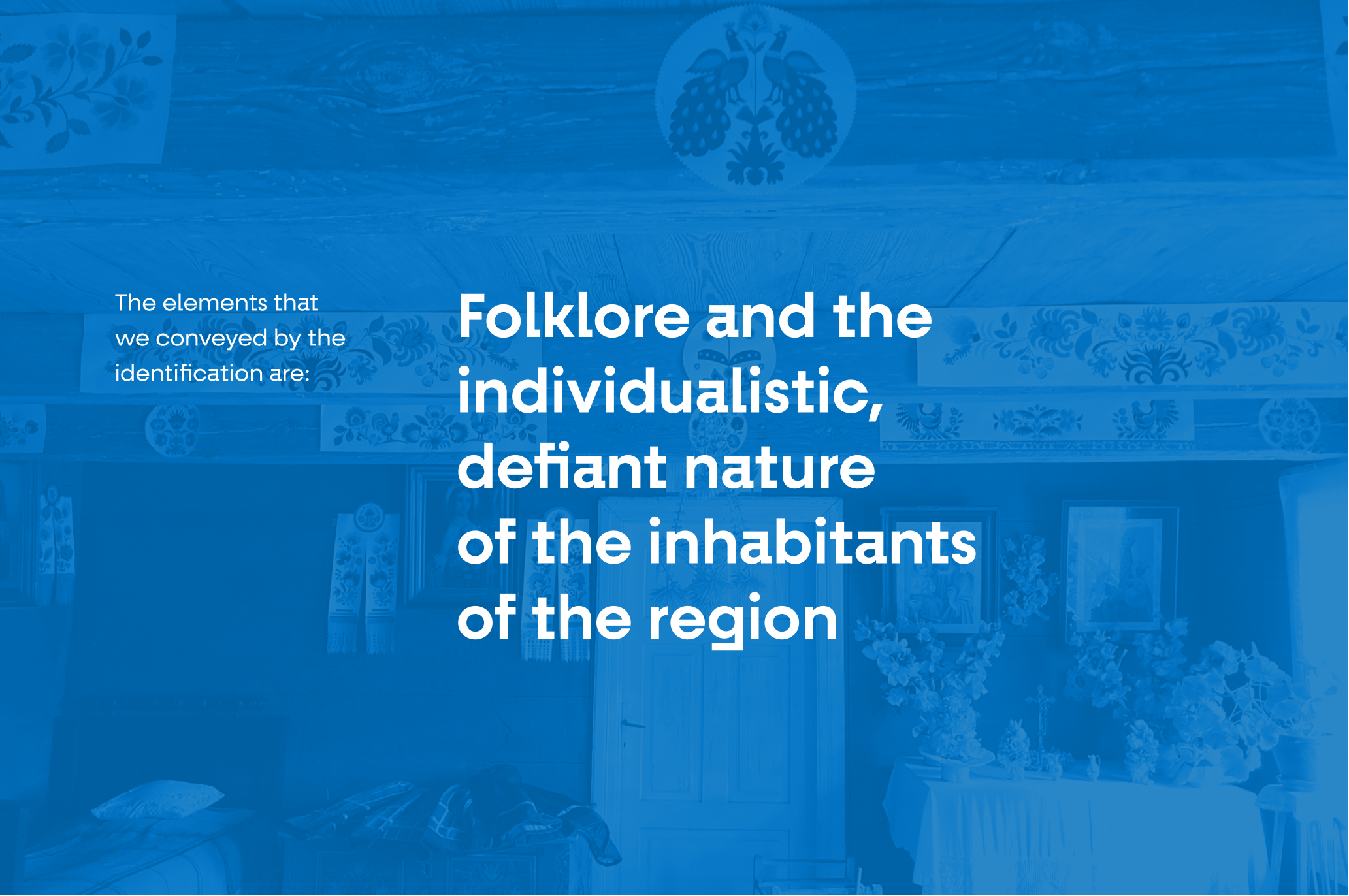
What is very characteristic of the Łowicz district are its inhabitants – defiant, individualistic – and their local pride. How to give the residents their specific flair while maintaining cohesion? The solution was the functional use of a cut out from Łowicz.
Info ↘
When we think about visual identity for a region, communication for tourist purposes comes to our minds. We think about eye-catching advertising. In the case of visual identification for the Łowicz district, however, the starting point was the implementation of a functional design system to be used by both, the institutions in the region as well as its inhabitants.
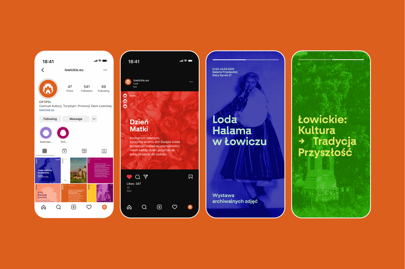
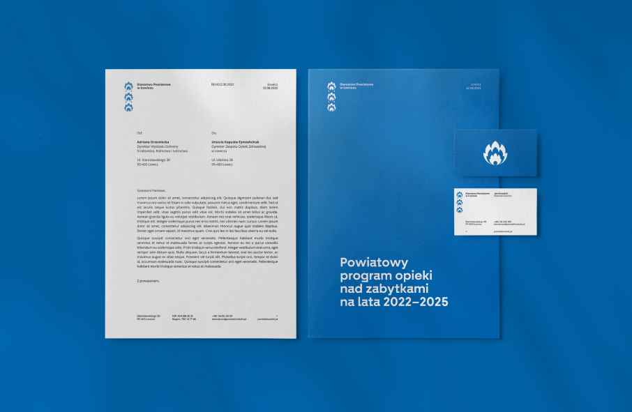
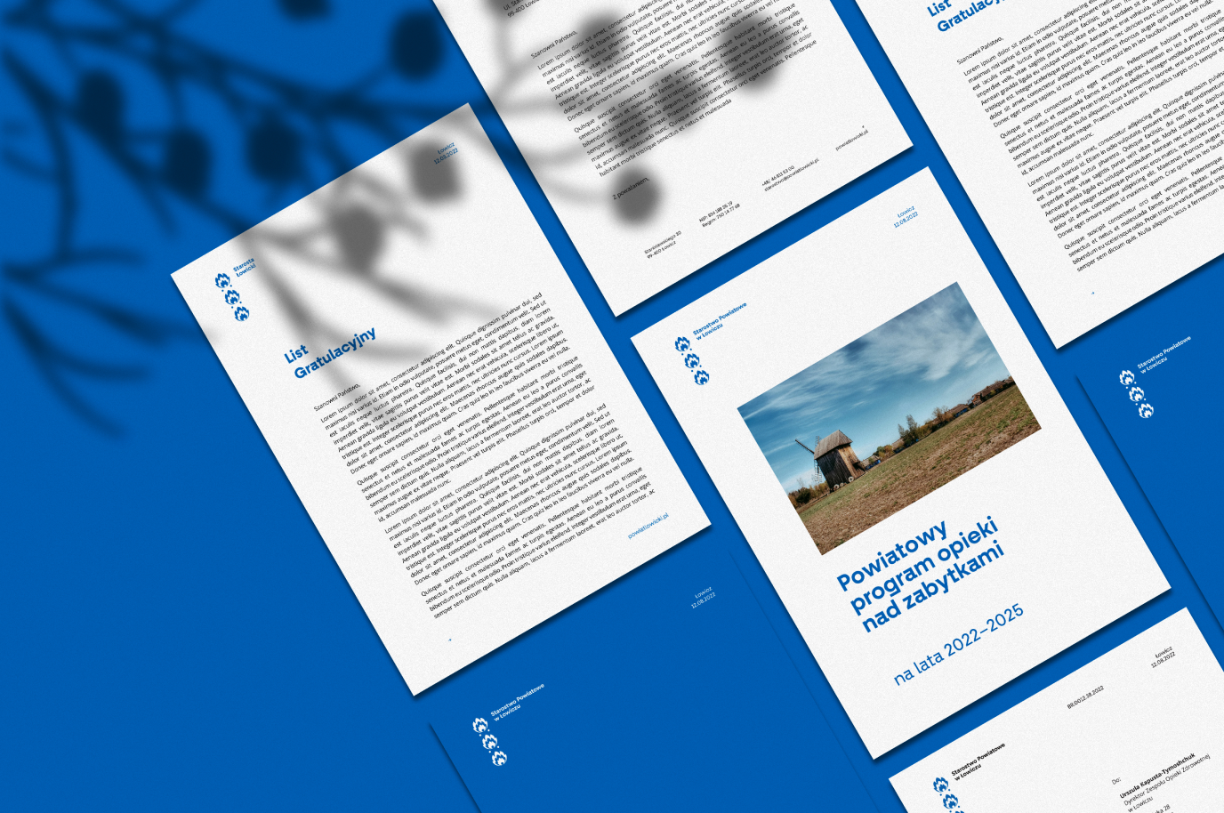
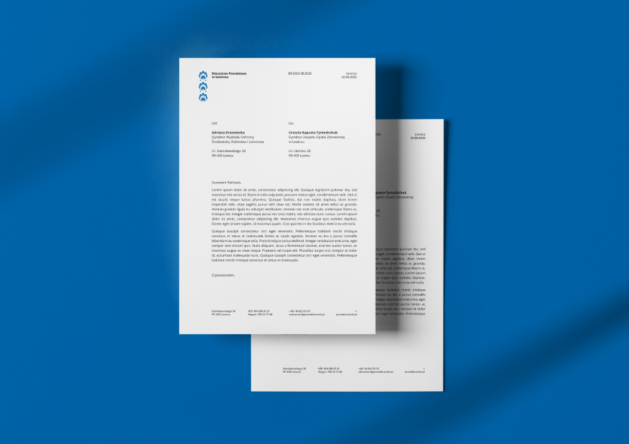
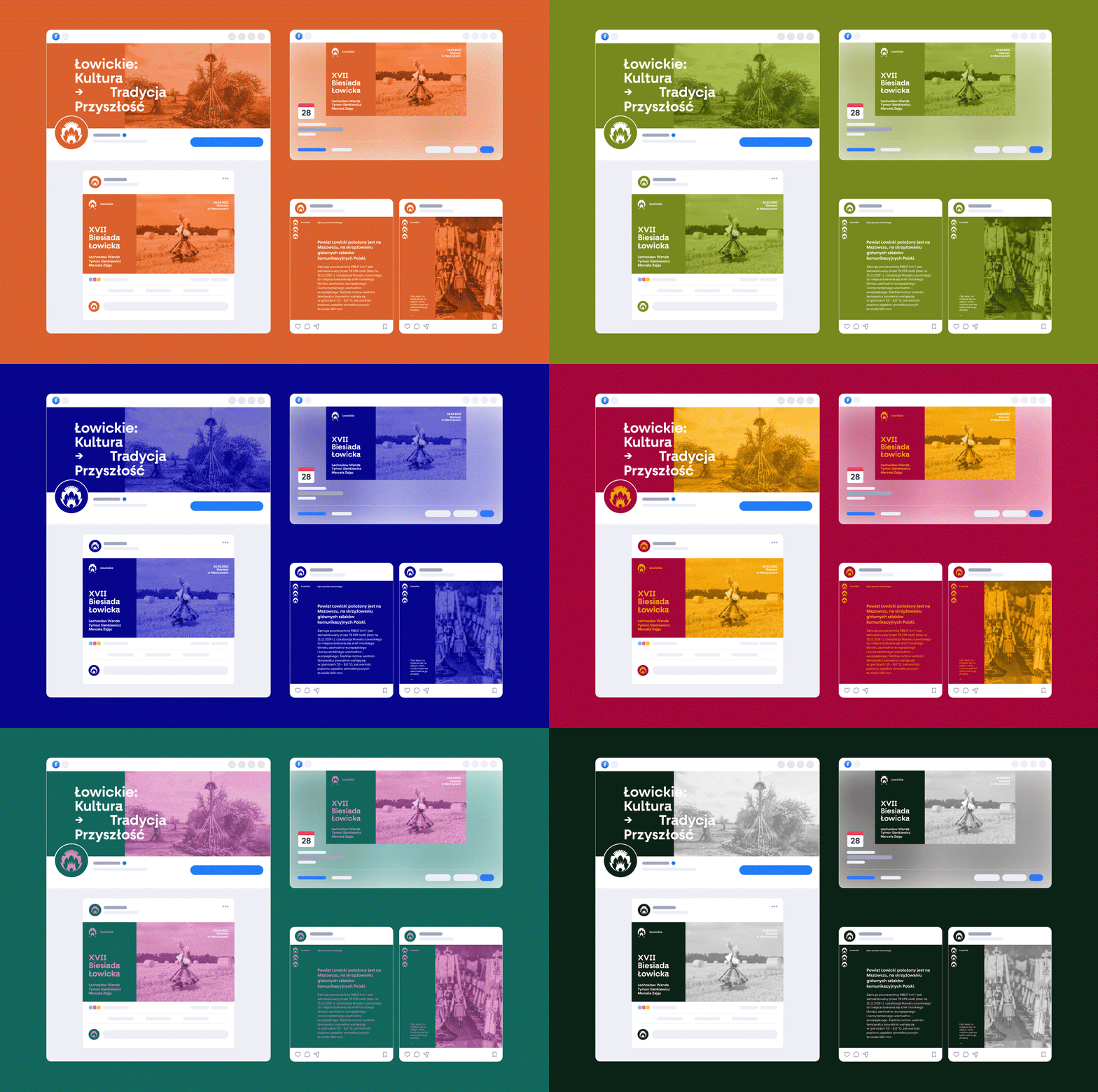
The system developed by us allows for consistent communication between the local government unit – the district office, as well as other offices and subordinate institutions. Branding is used in official and internal communication as well as in messages to residents and business partners. It also reflects the most important aspects of positioning the region – culture and folklore.
Scope
Rebranding / UX / GUI
Tools
Figma / Illustrator / Photoshop
Client
Łowicz District
The key values guiding
us in the process
Firstly, identifying and addressing the needs of recipients – that is, both local authorities and residents. Secondly, visually reflecting the spirit of the local community and the values of the district. And lastly, developing functional tools that will allow for consistency in communication.
Part of our work was field research, investigative trips and examination. Above all, however, talks, talks, talks and getting to know the characteristics of the region. In Poland, the elements of Łowicz folklore are widely recognizable – this is the essence of what we call folk art.
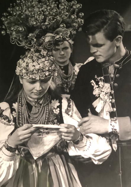
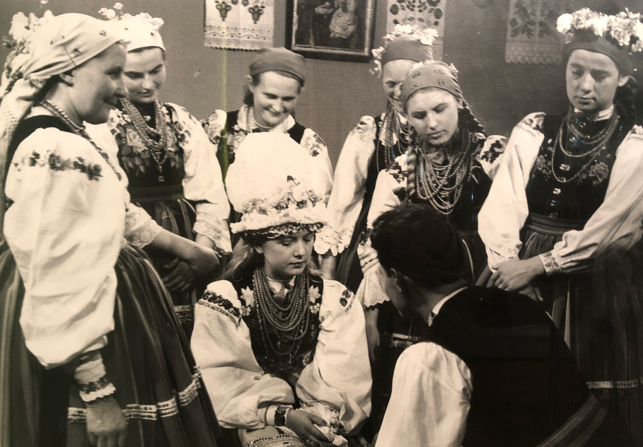
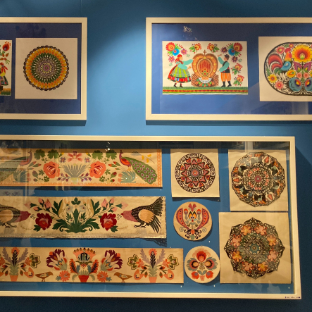
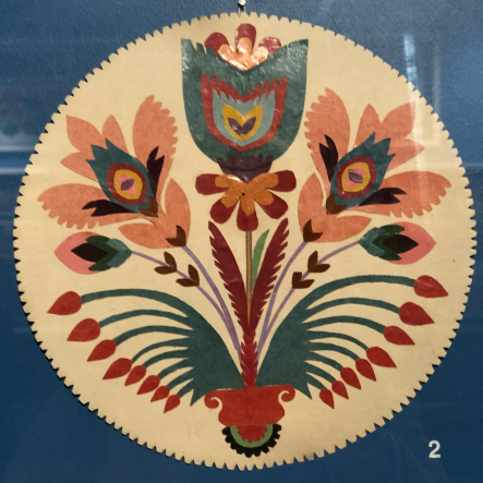
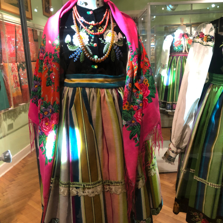
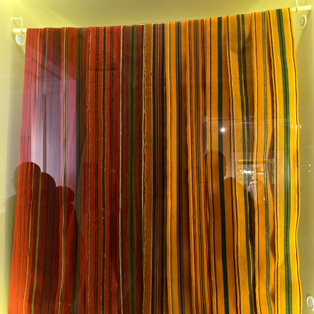
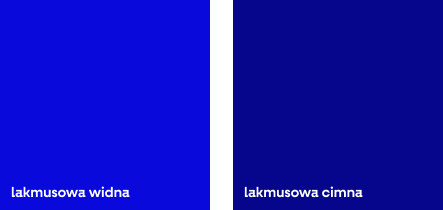
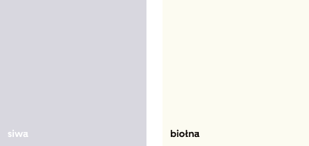
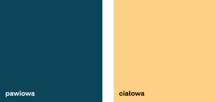
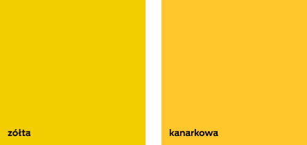
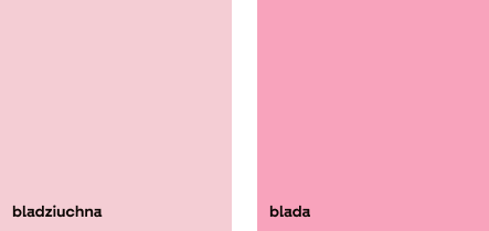
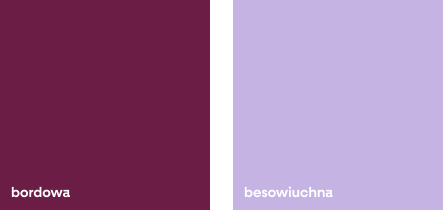
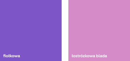
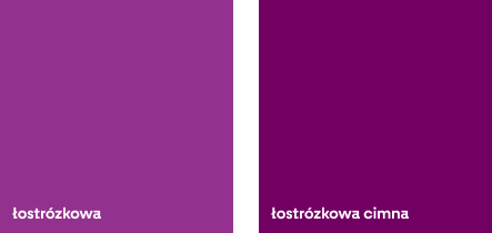
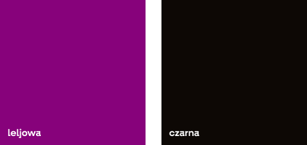
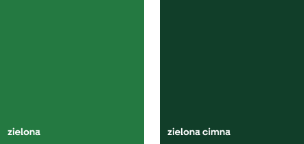
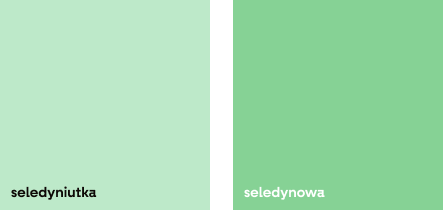
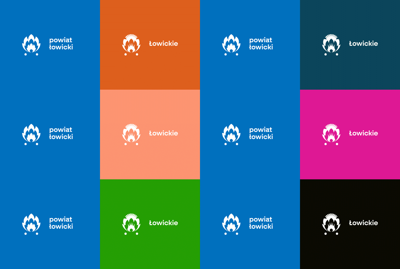
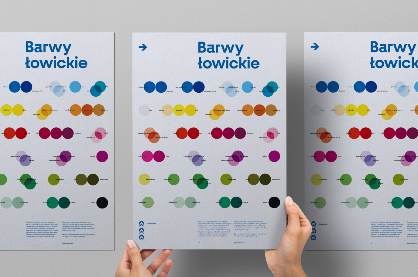
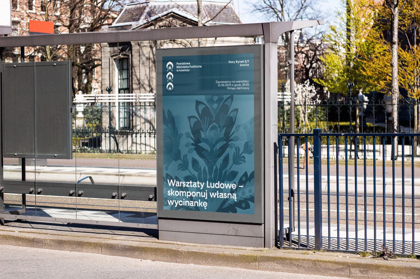
For the Poles, the folklore of Łowicz is, first and foremost, a blaze of colors visible on folk costumes and paper cutouts. These elements, i.e. the color palette and cut out shapes, play a primary role in our design system.
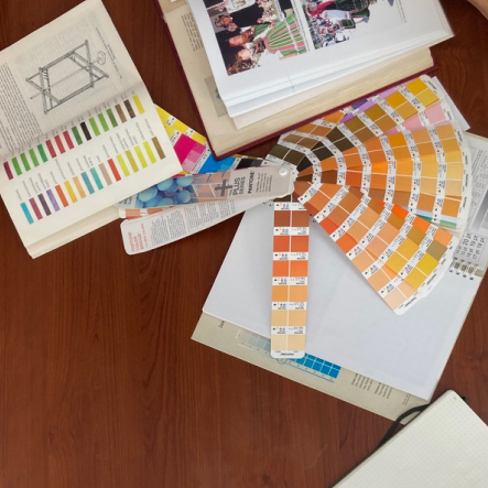
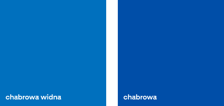
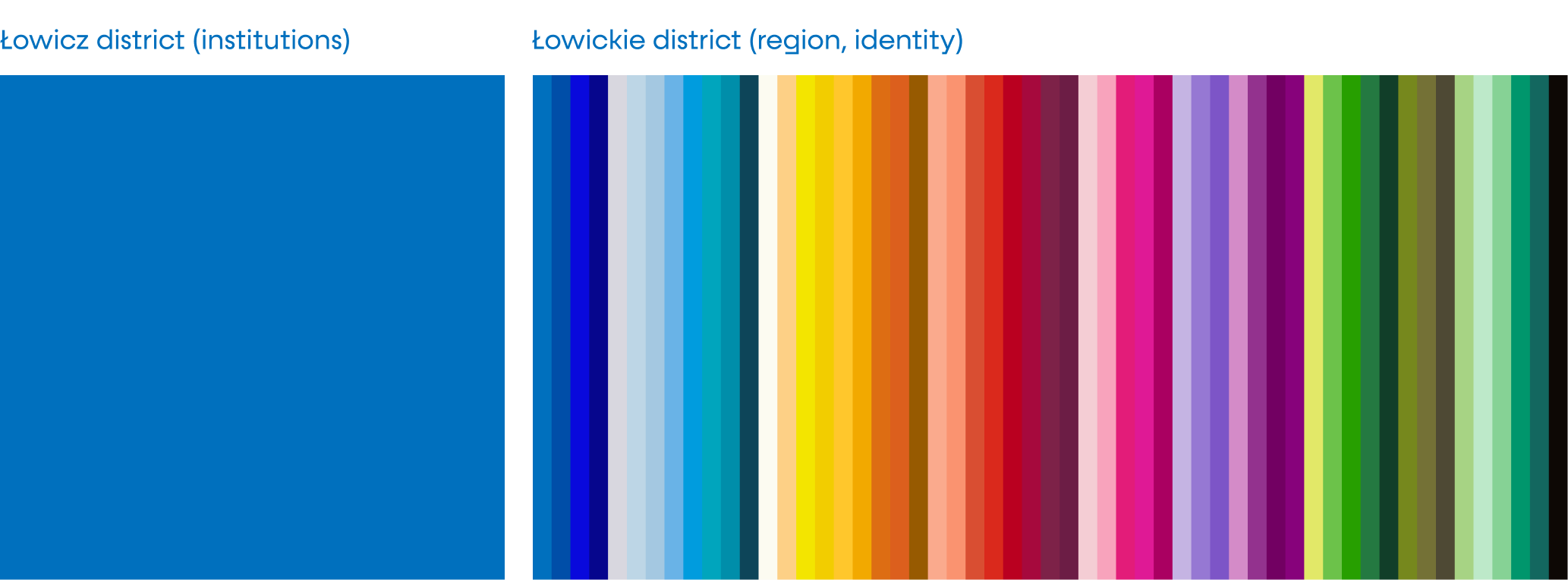
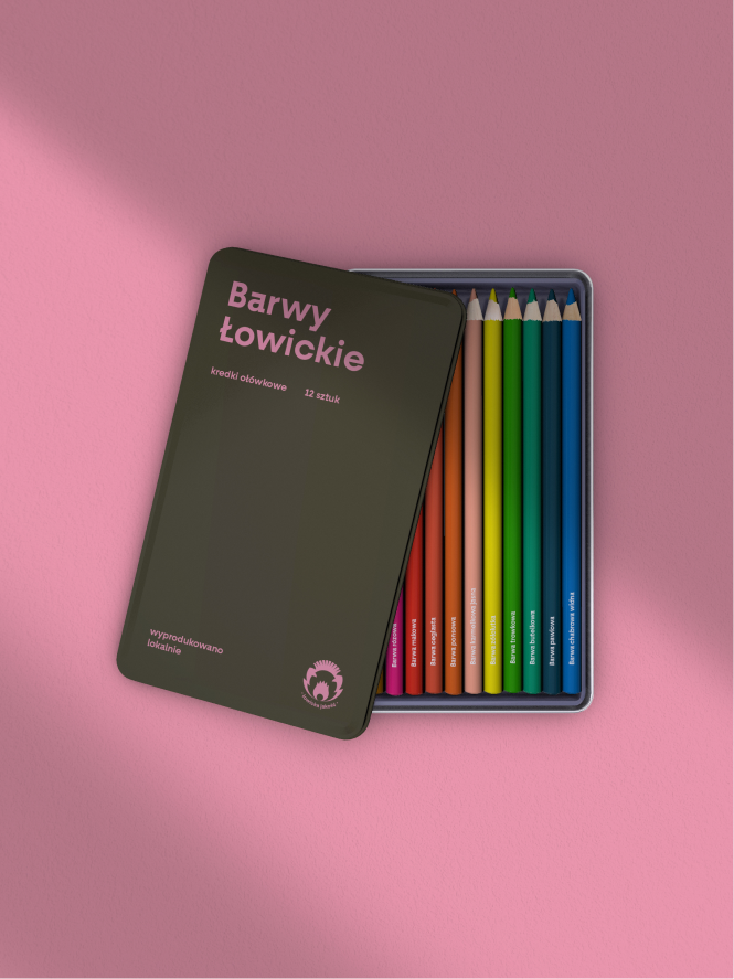
The full visual identification uses the entire palette of specified colors from Łowicz. We have developed them based on the analyses of publications from the collection of the Łowicz Museum, as well as on the knowledge of Anna Staniszewska – a folk artist. Names of specific colors were taken from folk names derived from the local dialect, which are a globally unique, intangible cultural heritage of central Poland. The basic color of communication in the district is cornflower light, i.e. a shade of cobalt.
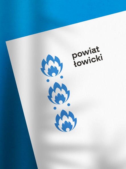
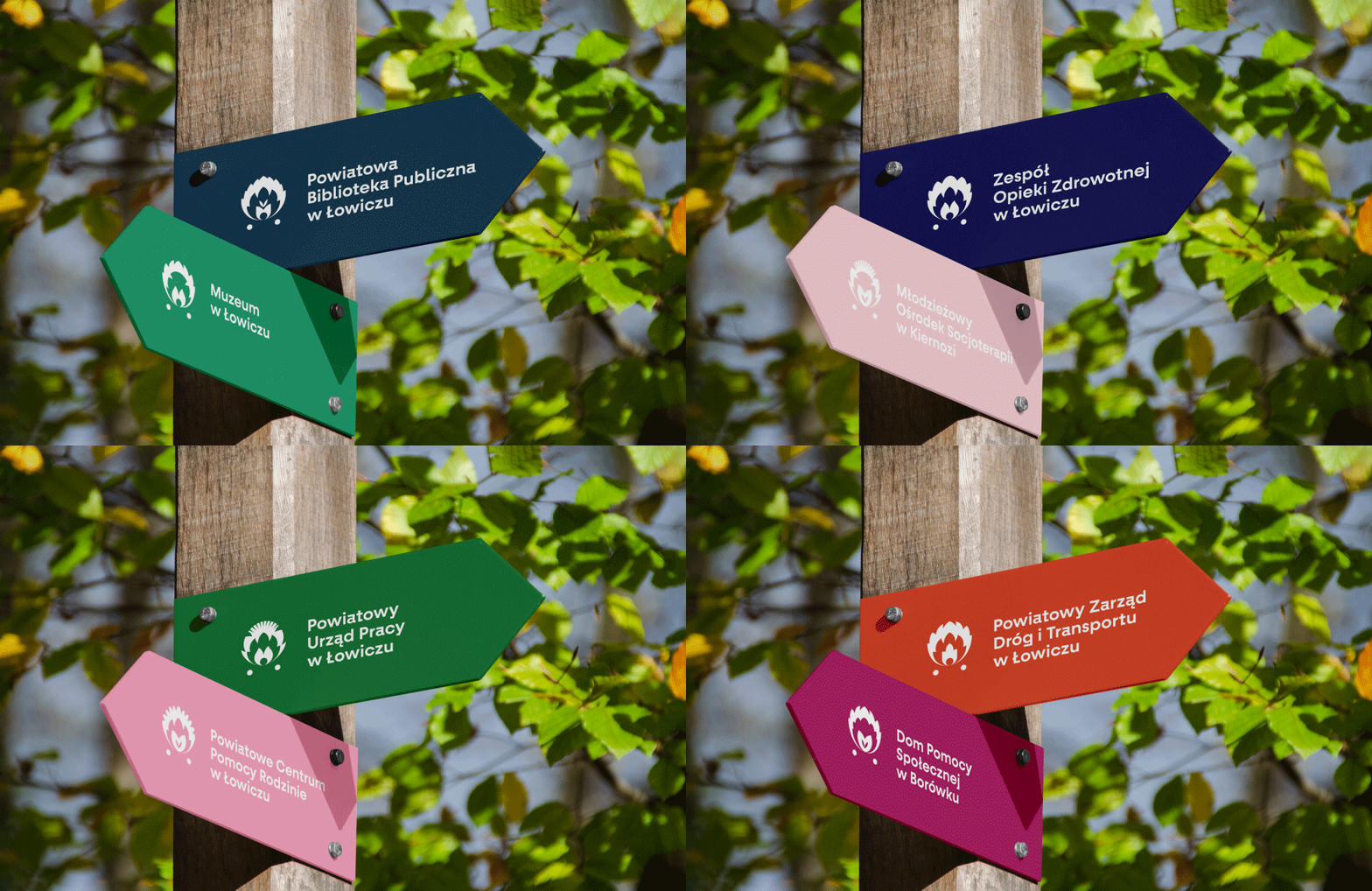
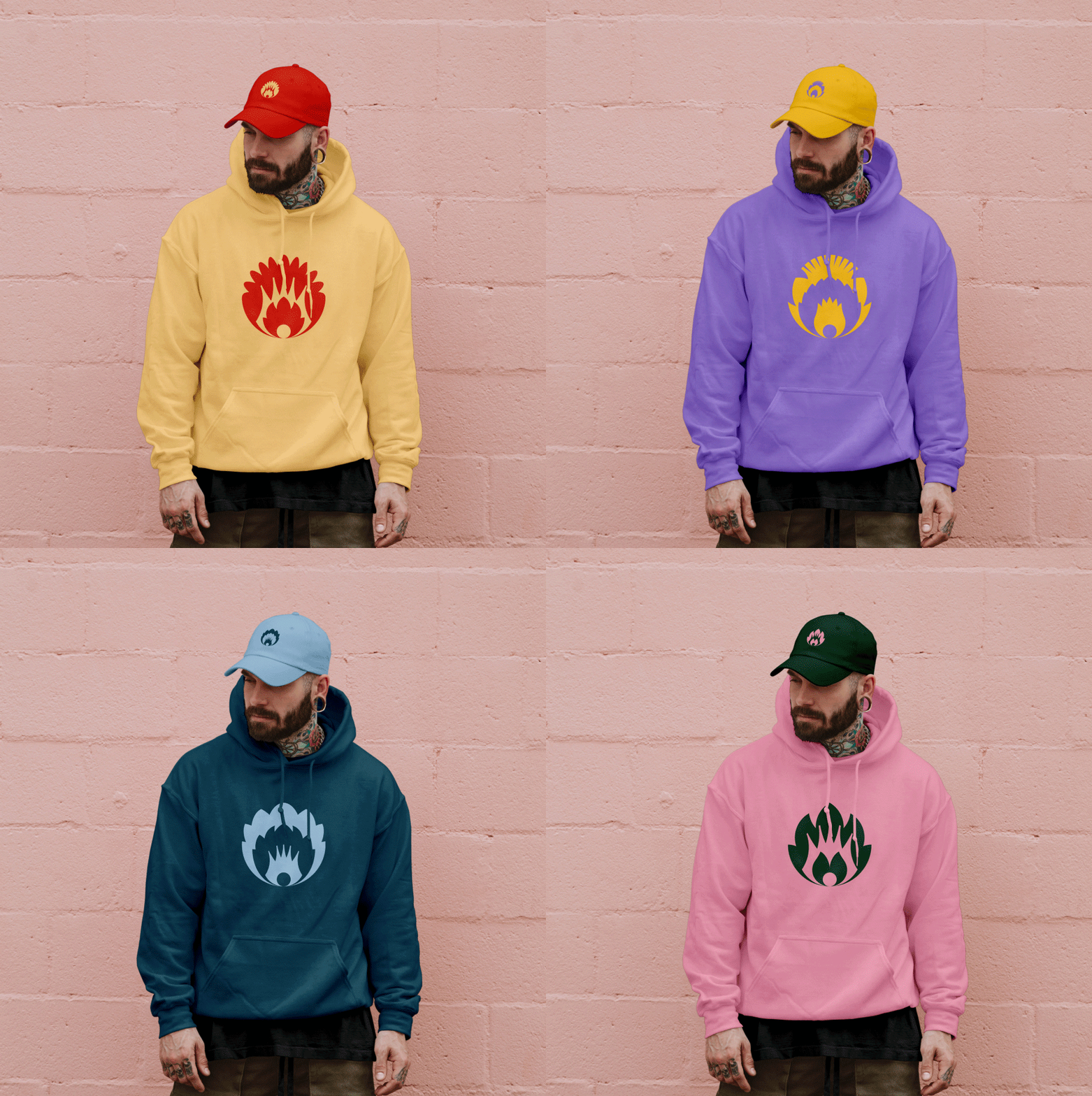
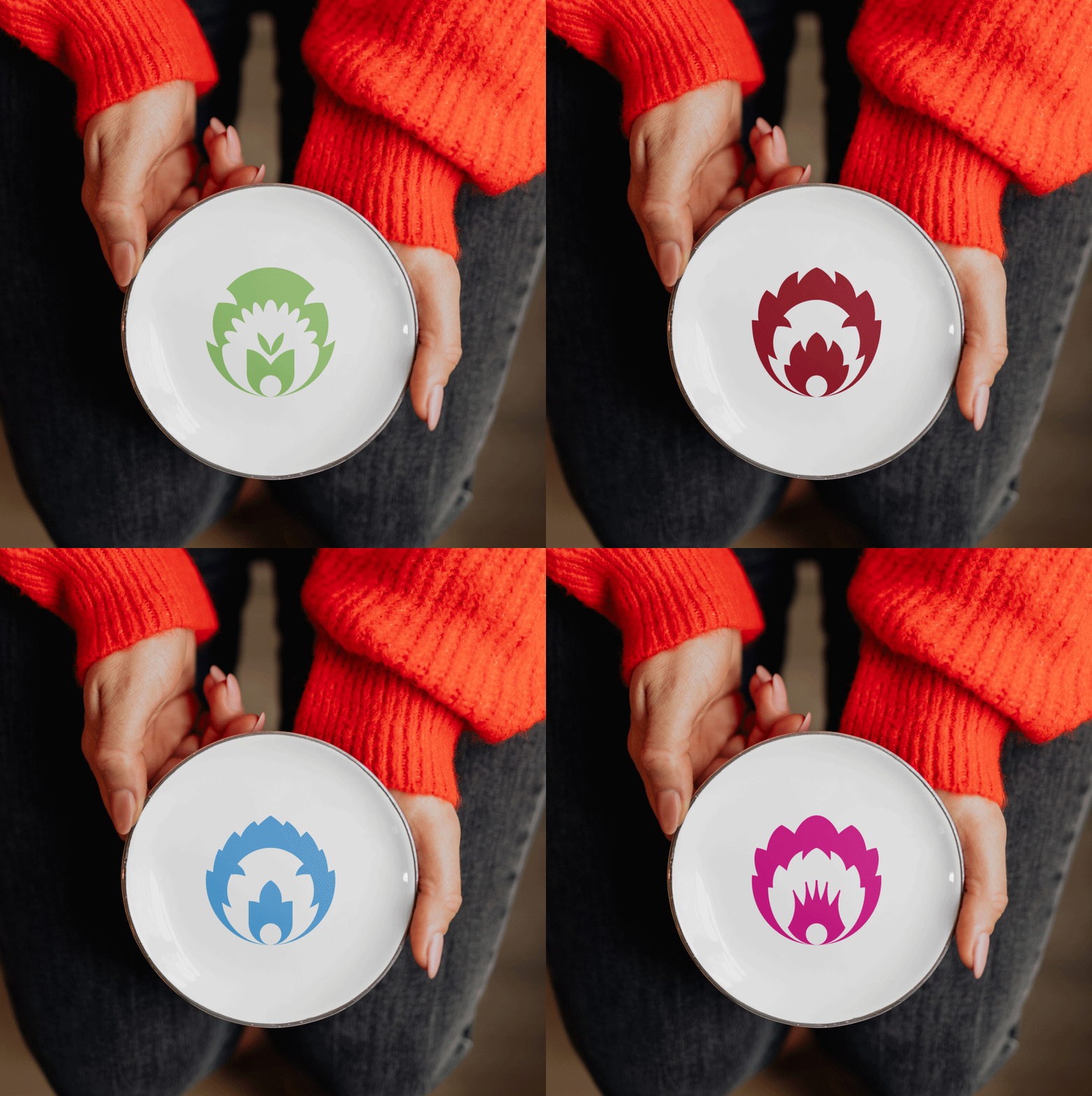
And here we had the opportunity to reflect the character of the inhabitants of the region – defiant, individualistic, who like to have everything “their own way”. During the research and investigative visits, we have discovered that what is very characteristic of the district are its inhabitants and their local pride. Practically every place emphasized its separateness from its neighbors. How to give the residents their individual flair while maintaining cohesion? The solution is the functional use of a cut out from Łowicz. We have created a set of modular signs.
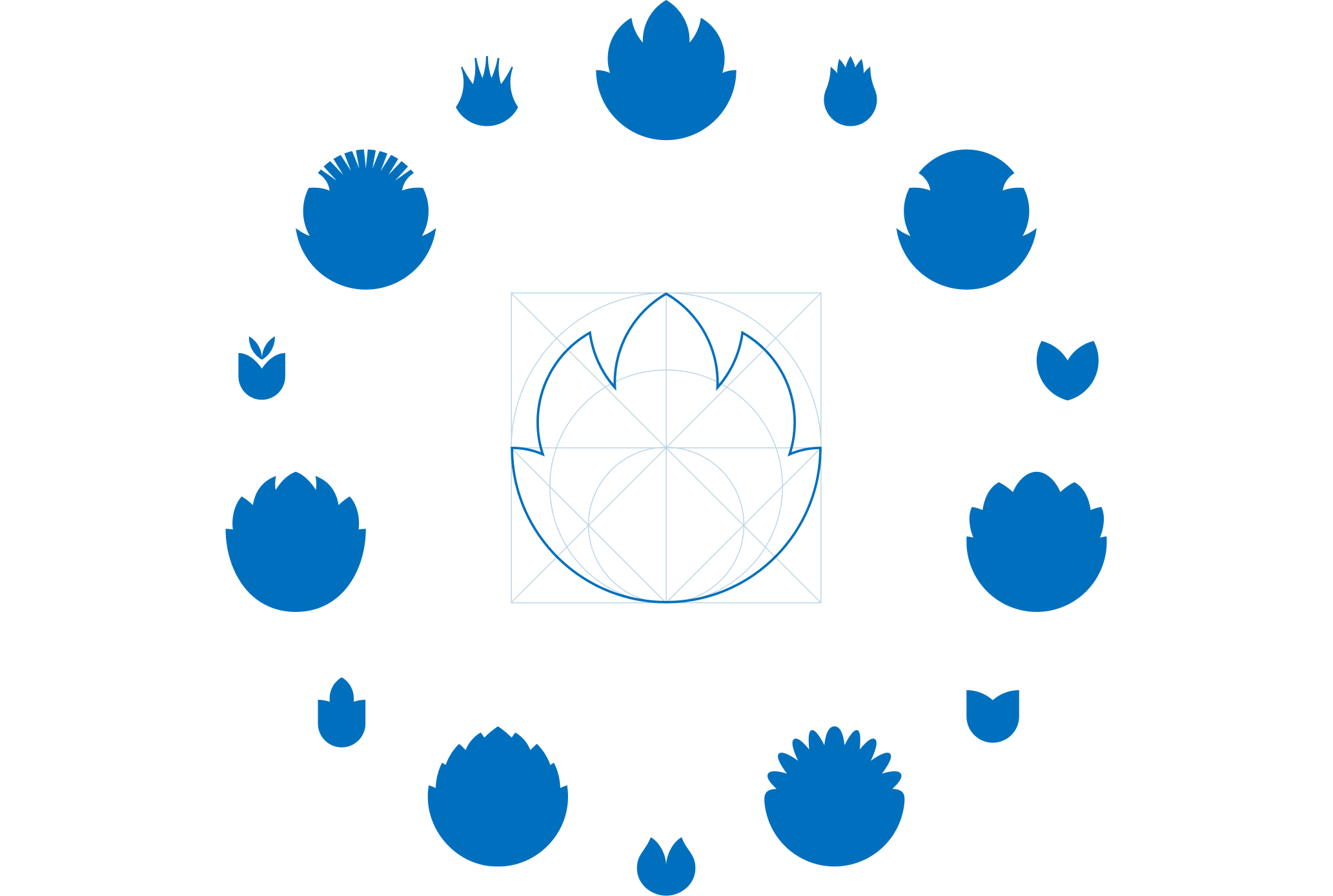
Cut out generator
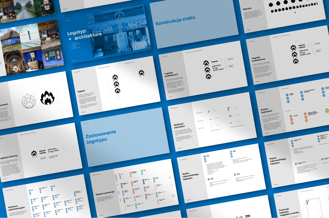
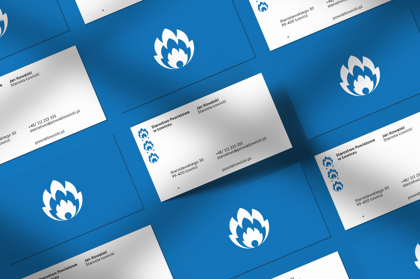
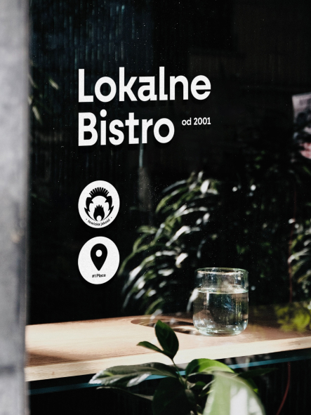
This solution gives the opportunity to create variants of signs and various solutions, in accordance with the needs of local institutions and with respect for the residents’ flights of fancy. We have created a generator that allows for over 40 characters, derived from a common core, to be built.
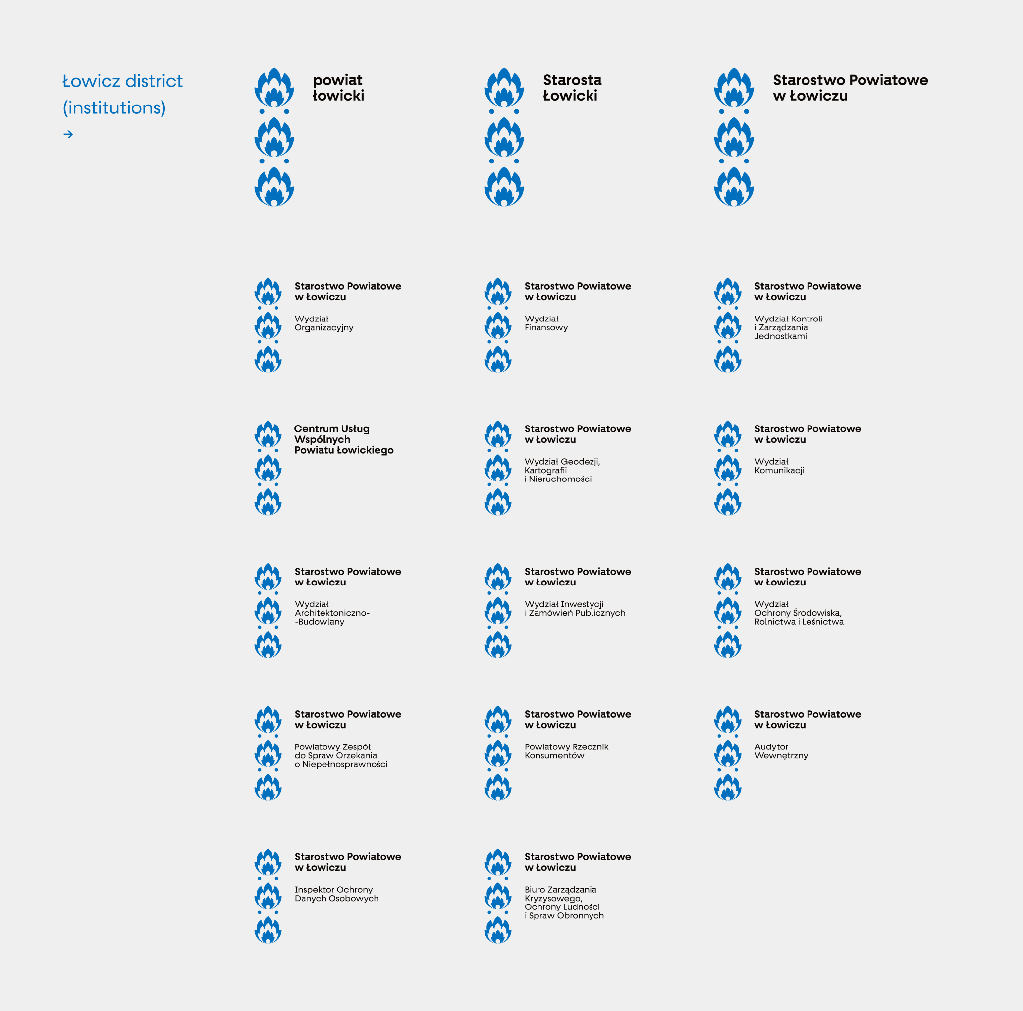
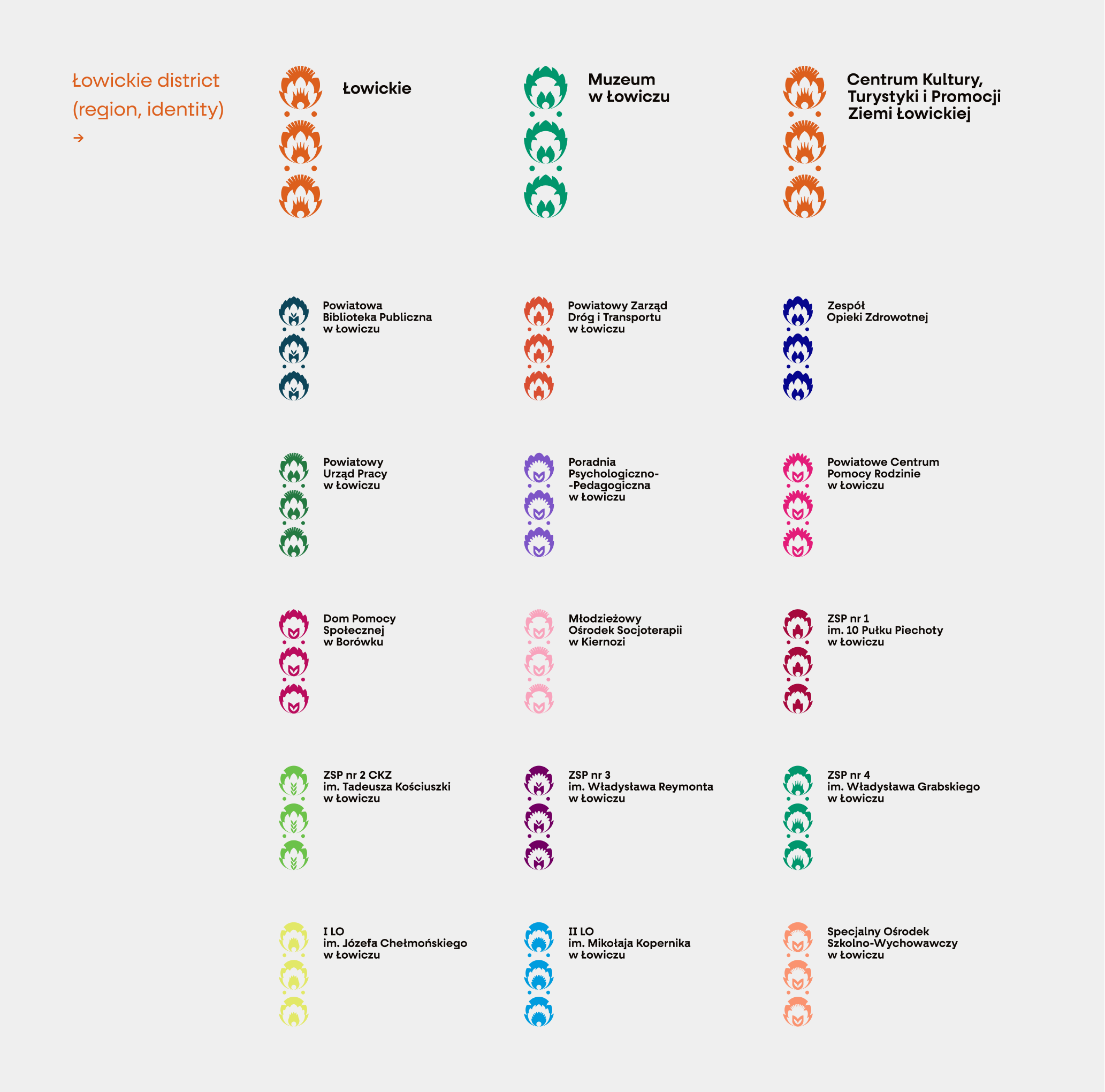
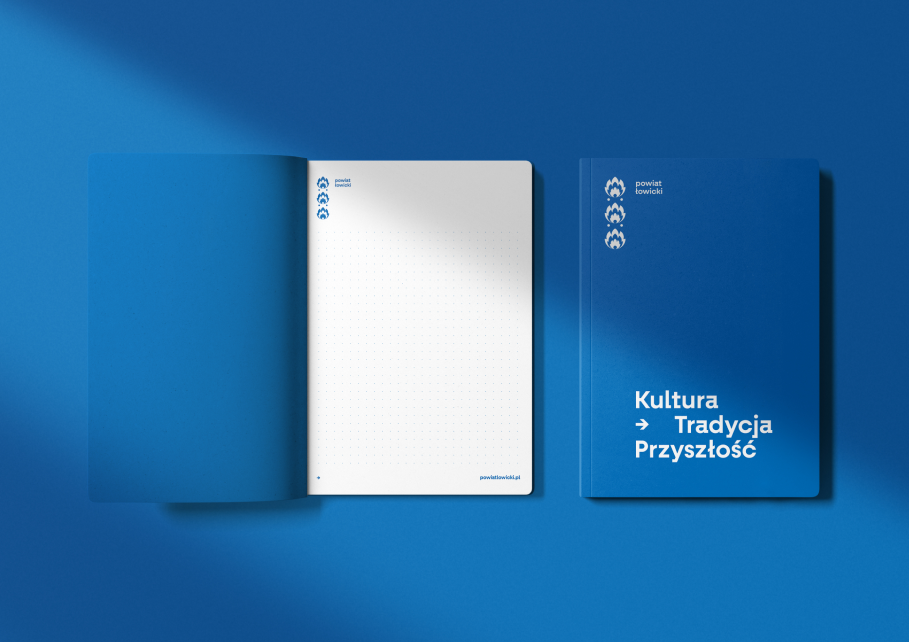
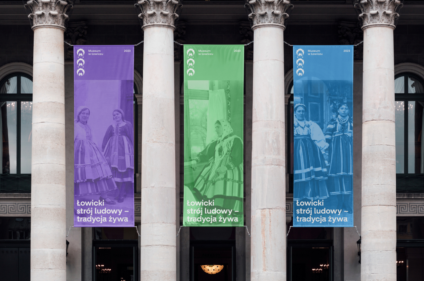
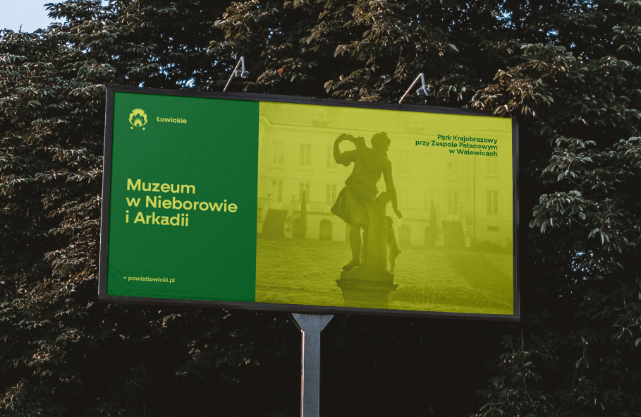
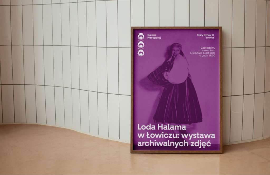
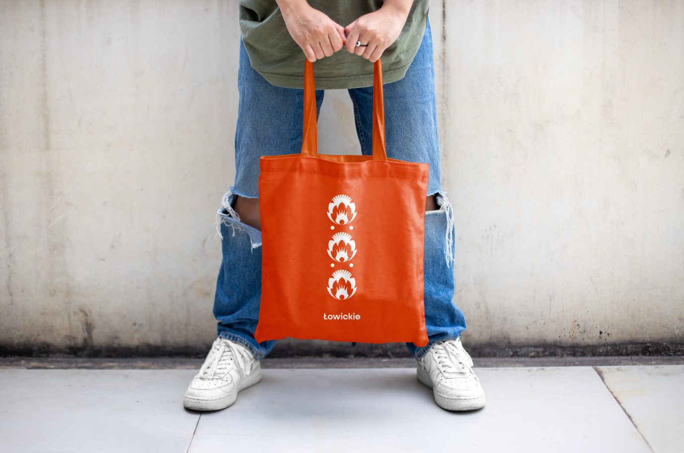
The branding itself has been divided into two coherent, yet different parts – the Łowicz district (institutions) and the Łowickie district (region, identity). The comprehensive system, in addition to the logotype, also includes office and promotional materials, as well as communication in social media. Branding will be consistently implemented in everyday use in the coming months.

Credits
Team Leniva° Studio
Strategy: Lena Mitkowa
Concept and Key Visual: Janek Mońka, Neon Neonov, Kamil Przybyła
Art Direction: Neon Neonov, Janek Mońka
Design: Janek Mońka, Kamil Przybyła
Design Support: Marta Krzemień-Ojak
Production: Lena Mitkowa, Saskia Mońka
Client’s Team
Center for Culture, Tourism and Promotion of the Łowicz Region:
Jacek Wiśniewski, Karolina Antoniak, Michał Kordecki
District Office:
Marcin Kosiorek, Agata Tracz, Joanna Idzikowska,
Folk artist:
Anna Staniszewska
