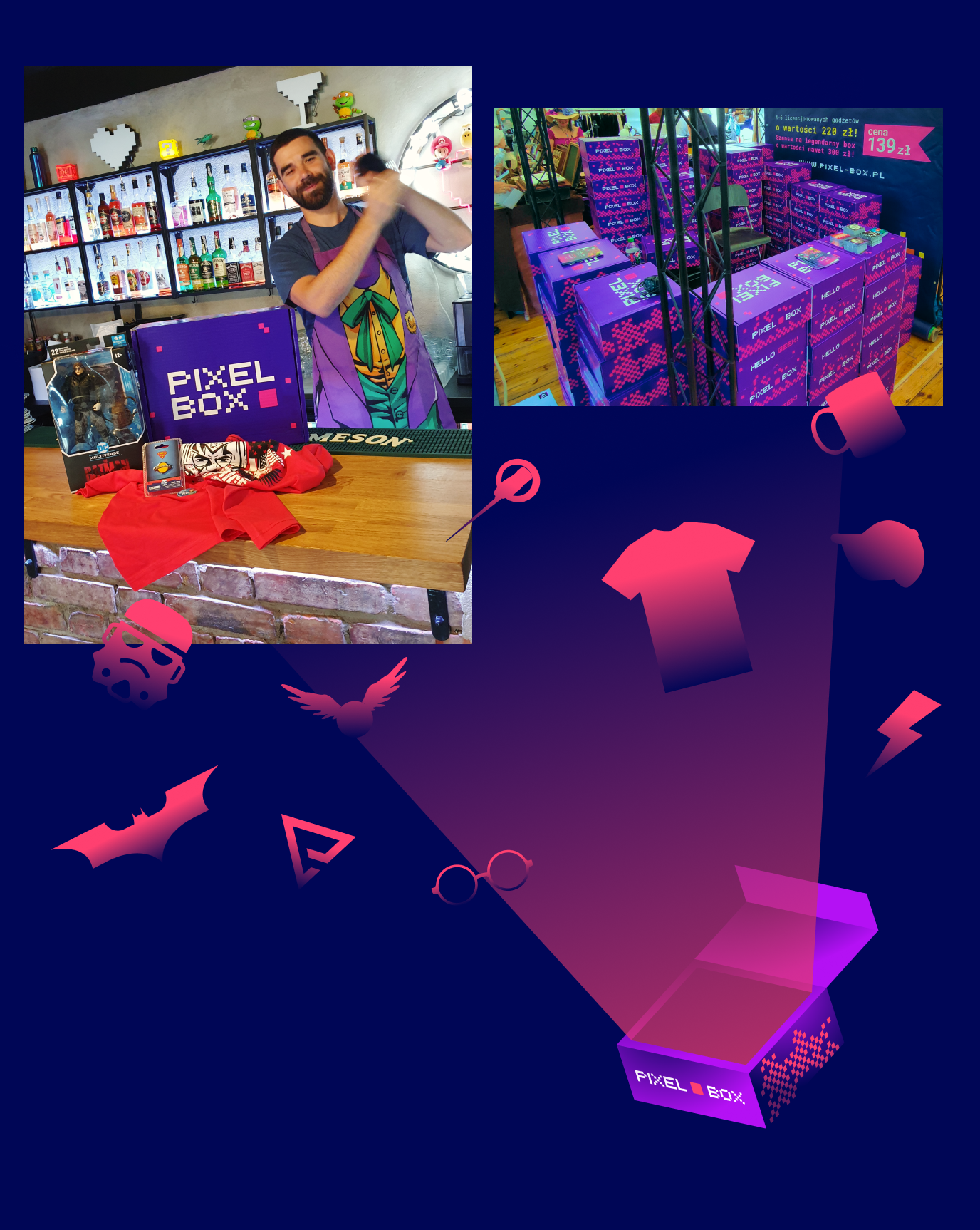
What’s in the box?
Luckily, not pain.
Info ↘
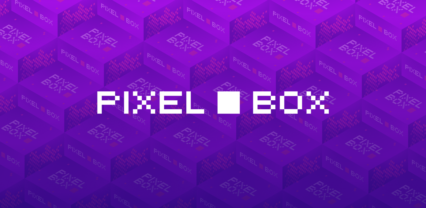
Pixel Box is a box full of gadgets for geeks. The creators of Pixel Shop (whose rebranding can be found in our portfolio), under the Pixel Box brand, have prepared a place where you can buy original gadgets from games, movies and TV shows, photos of which can be found on the Internet, that you have always longed for; all delivered right to your door.
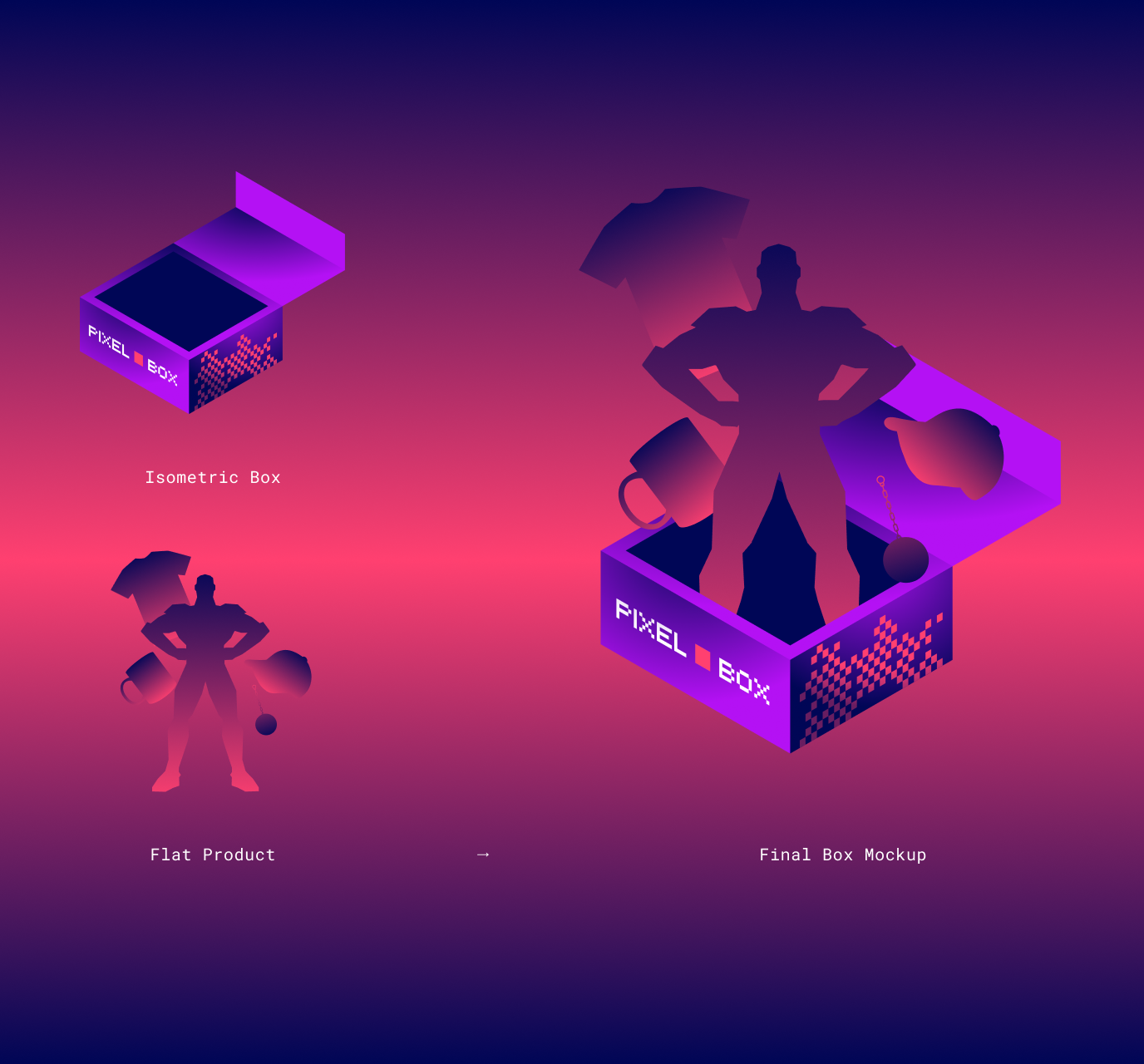
The boxes contain unique sets – from figurines to T-shirts. Everything is based on official licenses (e.g. in a given box you will find DC and Marvel gadgets or just Star Wars) and they are also available in the form of a monthly subscription.
(Photos: courtesy of Pixel Box)
Scope
Rebranding / UX
Tools
Figma / Illustrator
Client
Pixel Box
Design task
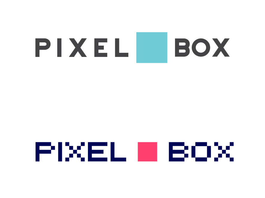
Our main task in this project was to refresh the Pixel Box logo, as well as to give it a new form, consistent with the Pixel Shop. Below you can see our starting point – the previous identity elements.
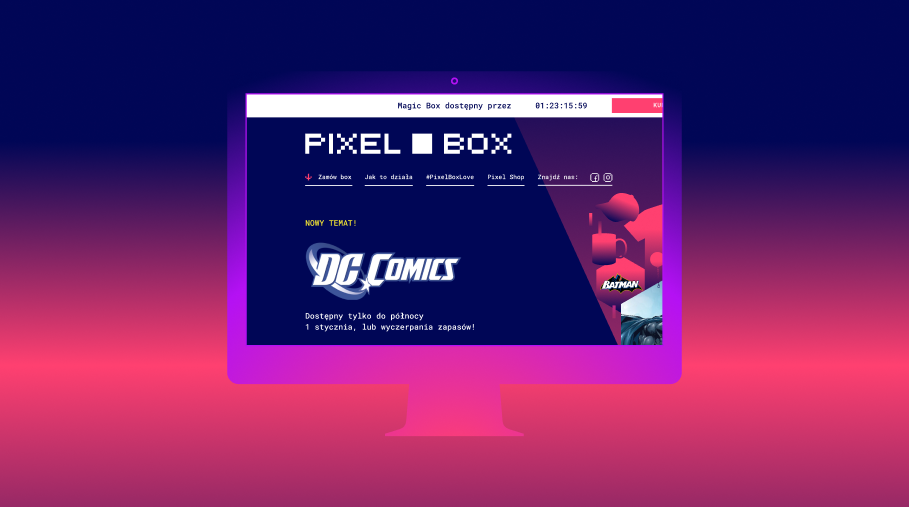
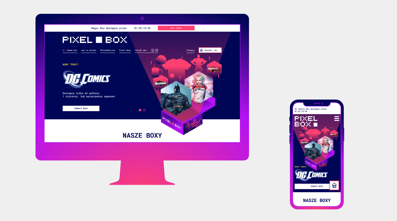
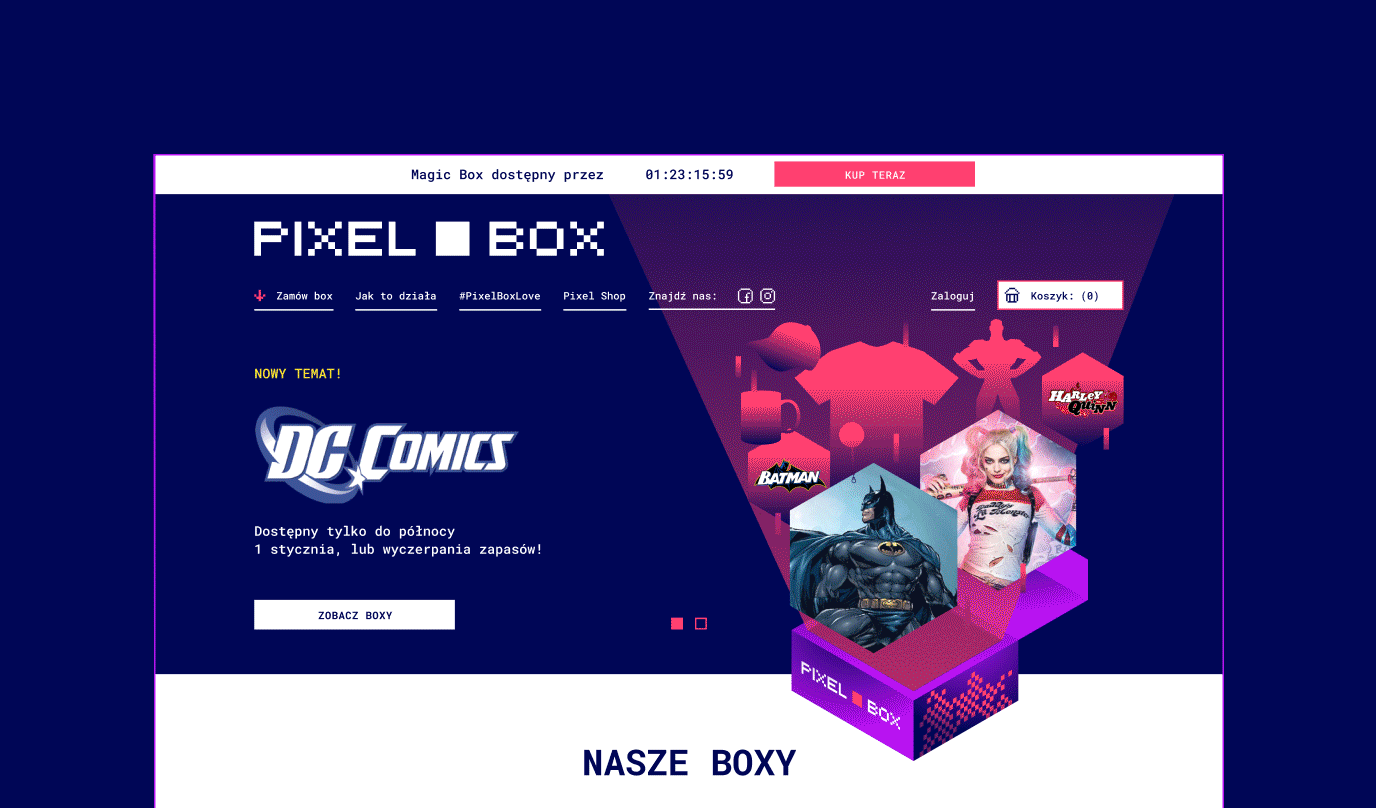
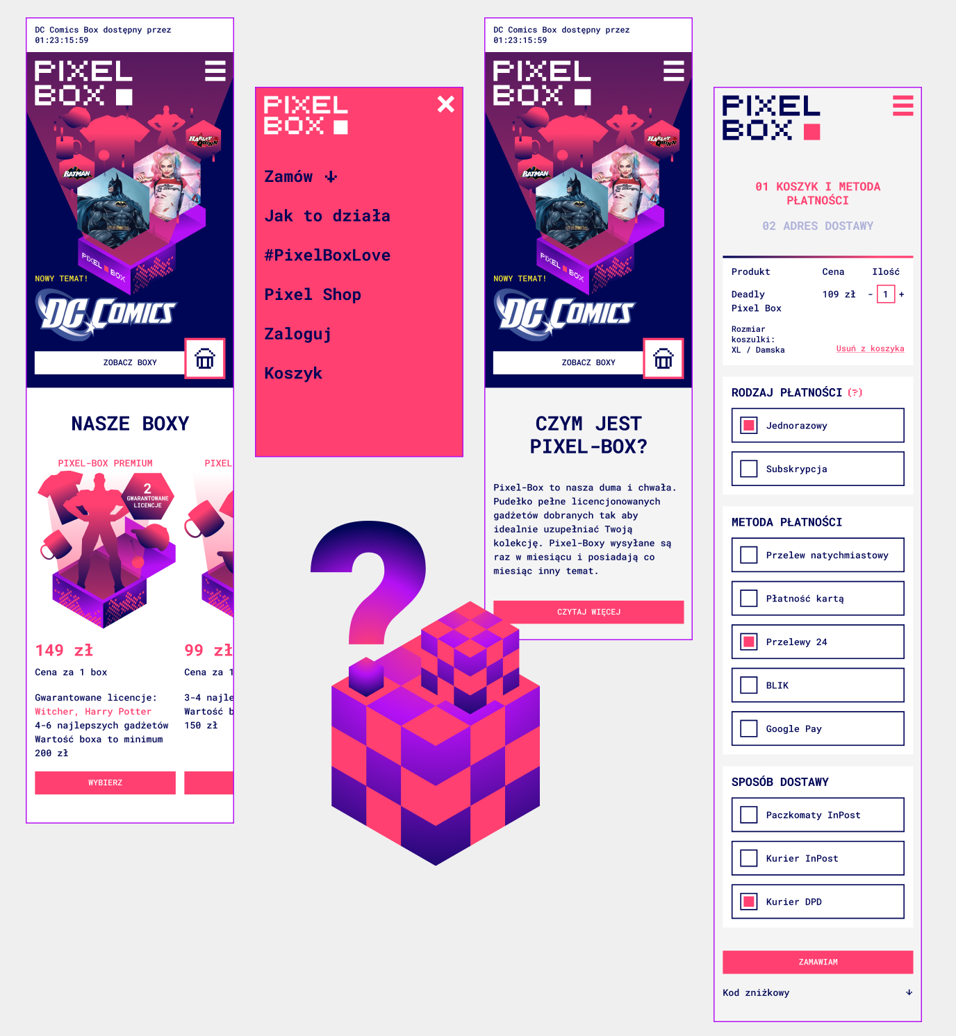
As part of the branding work, we have comprehensively developed the design of the new Pixel Box website. The work on the UX mock-up – its functional interior – was supported by an appropriate analysis. In the graphic layer, consistent with the new concept, the website is full of flavors and accents referring to pixel aesthetics – animations and complementary graphics.
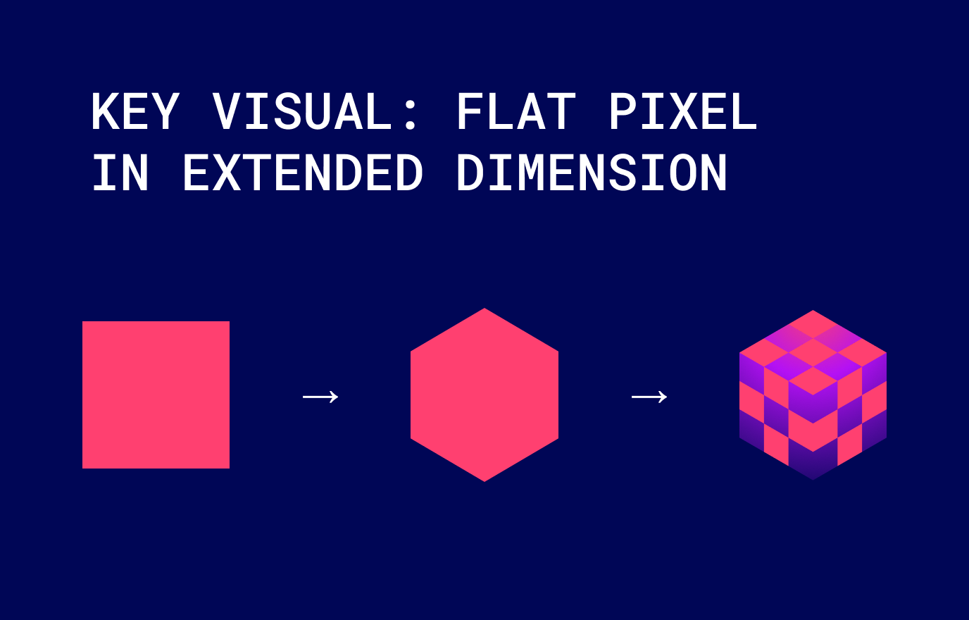
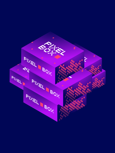
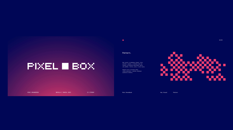
We have built the new branding on the basis of a pixel, but showing it on an isometric grid has allowed us to give it a new dimension. It was important for us to refer to pixels – after all, the name obliges us somewhat – but we wanted to depart from completely old-school associations and present the subject in a new, fresh way.
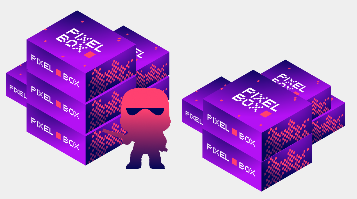
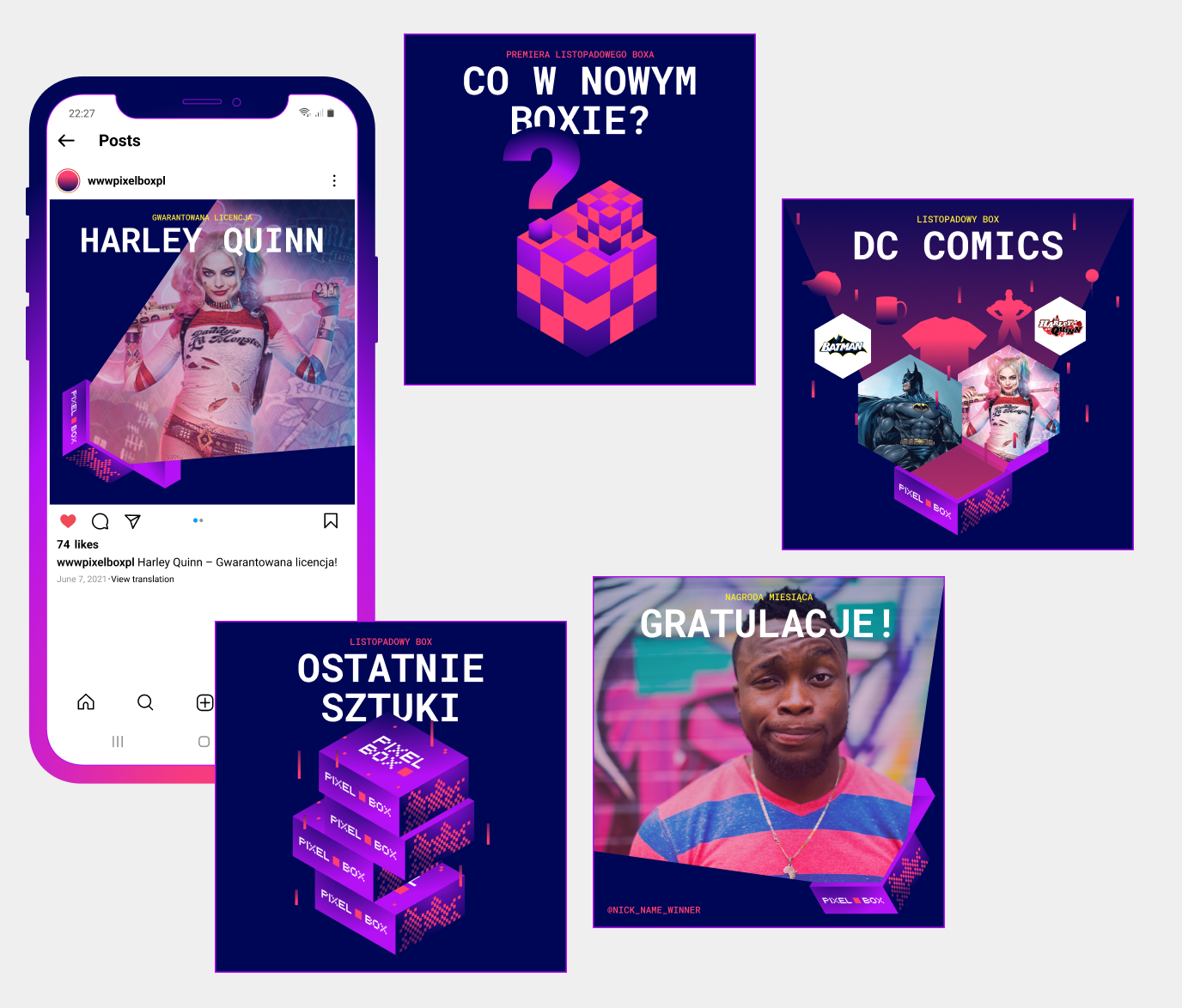
The visual identity of the brand is not just the website where we order boxes but most of all the boxes themselves and the associated unboxing process. We have designed a new experience for the client.
Thanks to the printing technique used, we have managed to obtain an intense, almost glowing effect that catches the eye of everyone – from a courier to a random passer-by to the final recipient.
Credits
Team Leniva° Studio
Concept: Kamil Przybyła, Janek Mońka, Neon Neonov
Production: Saskia Mońka, Lena Mitkowa
Design: Kamil Przybyła, Janek Mońka
UX: Janek Mońka
Client’s Team
Tomasz Bosaczyk
Krzysztof Bieńkowski
The shine of
excitement when you
order the box.