Polish Society for the Protection of Birds (OTOP) is a non-governmental organization for the protection of wild birds and their habitats. It brings together bird lovers from all over Poland and works with them for their benefit.
Info ↘
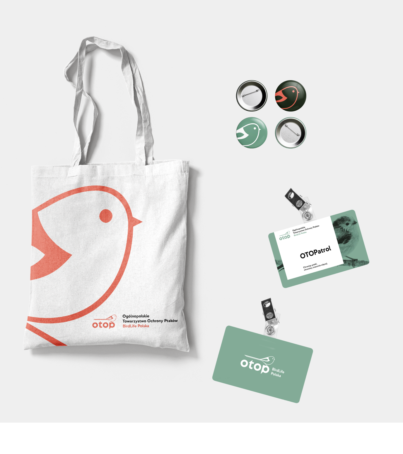
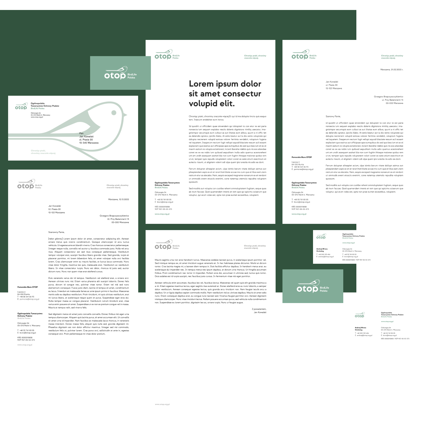
The scope of the work we undertook encompassed comprehensive rebranding – from redefining the logotype, through the selection of new typography and color palette, to the devising of brand materials in accordance with KV.
The previous OTOP logo was created by Jerzy Desselberger – Polish ornithologist, visual artist, designer of postage stamps. When proposing a new logo, we knew that we did not want to ignore such heritage.
Scope
Rebranding
Tools
Illustrator / Photoshop / InDesign / Figma
Client
OTOP
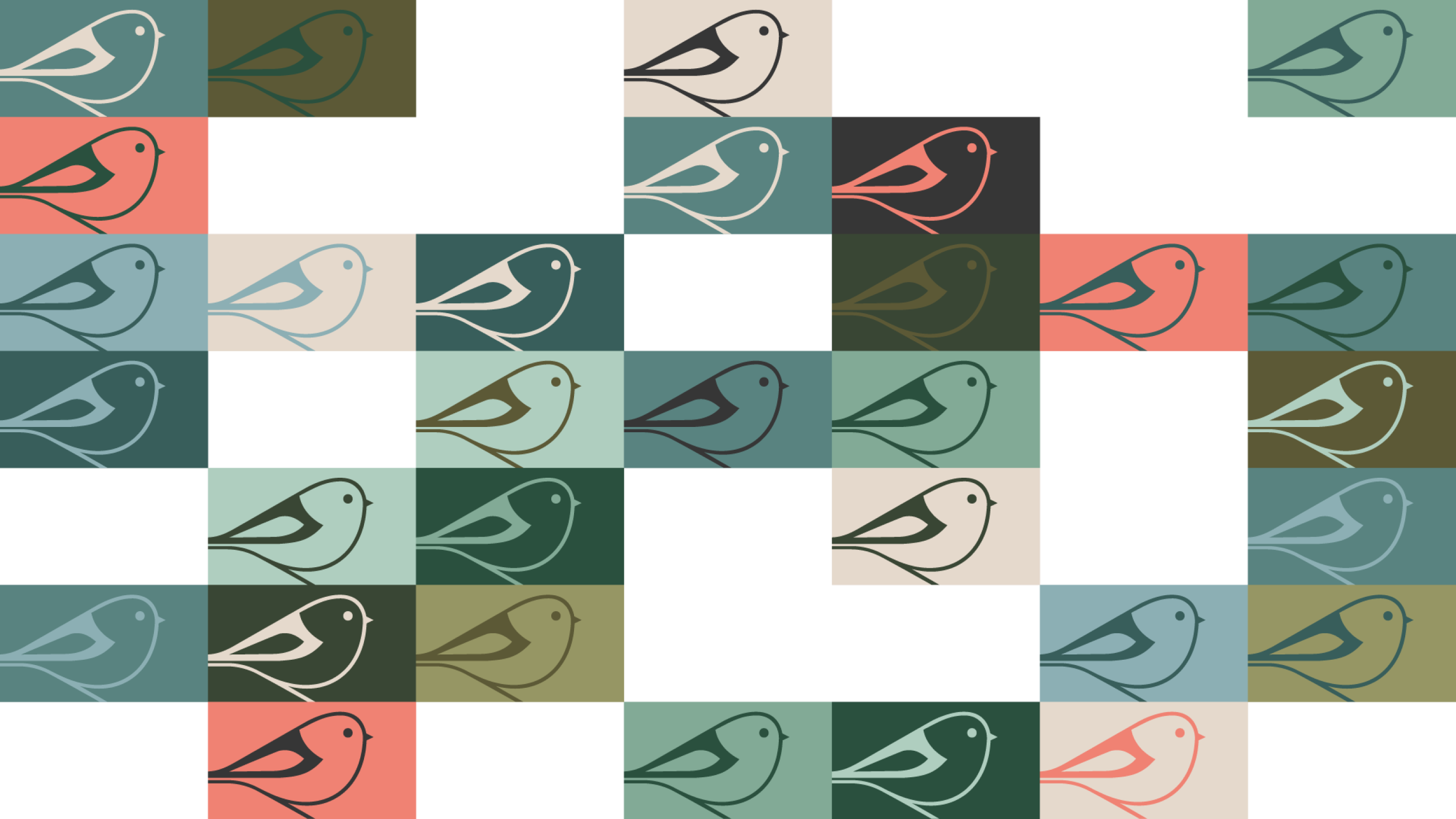

Redefining the geometry
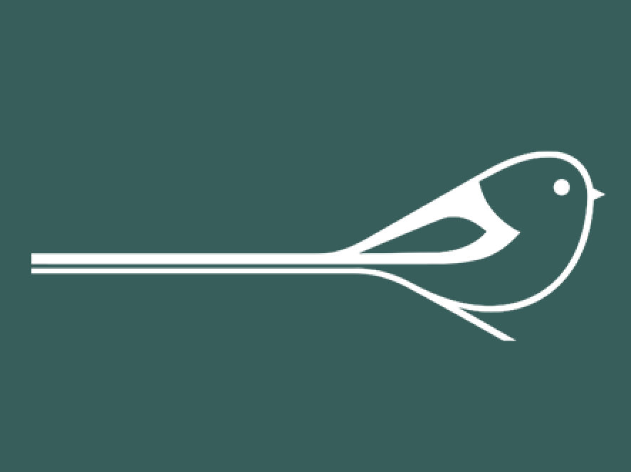
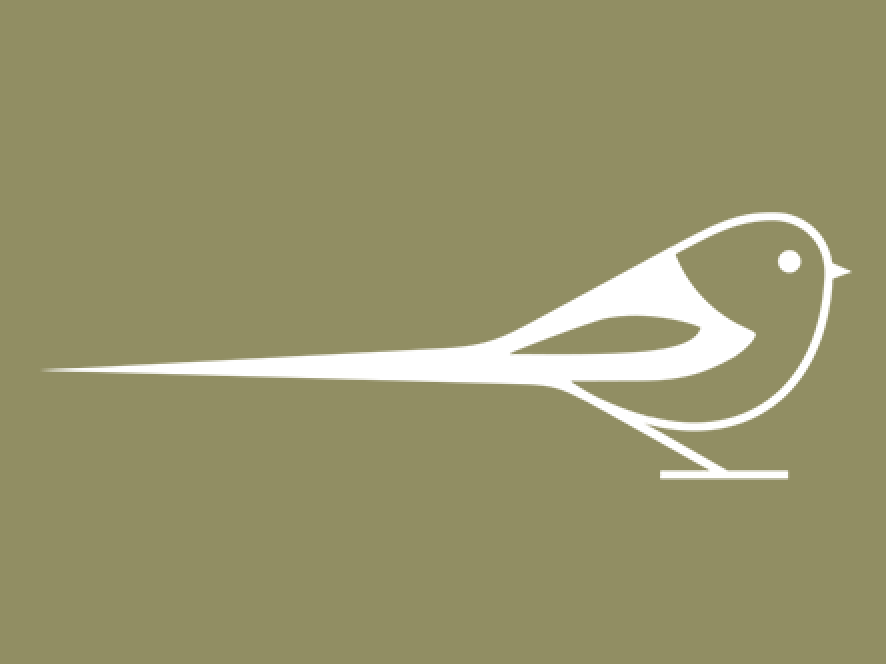
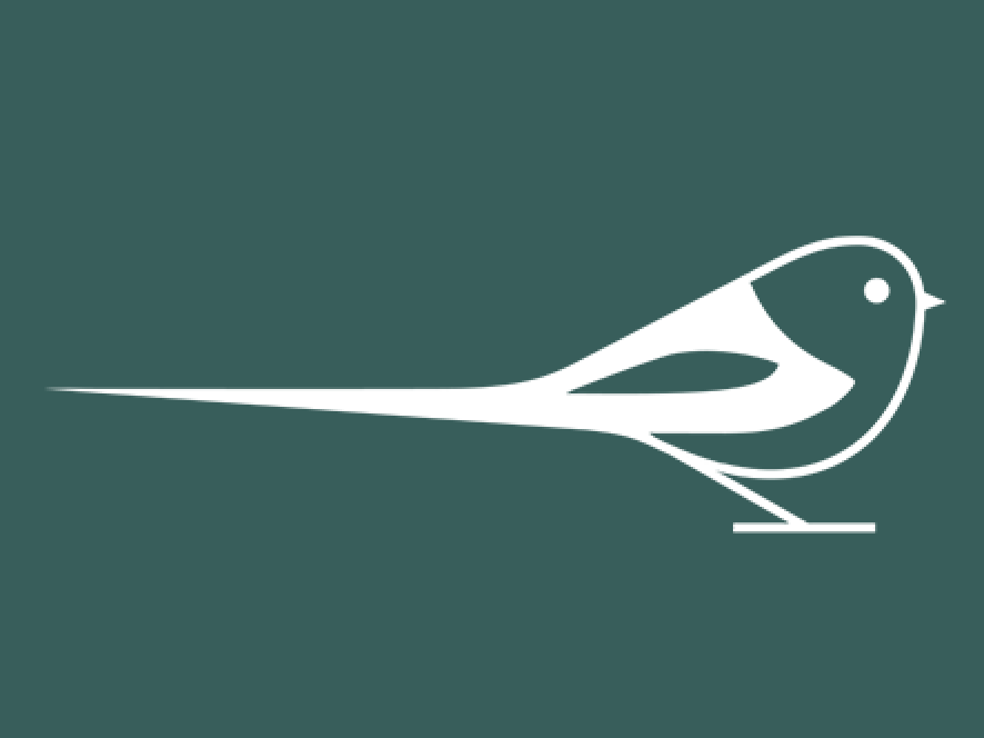
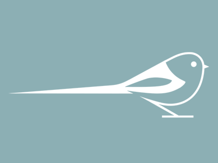
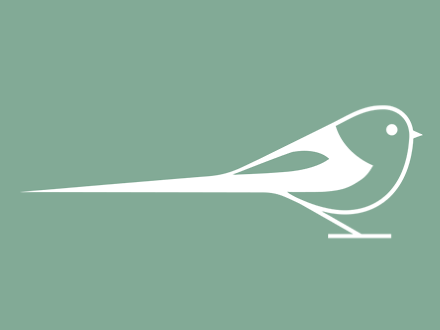
The OTOP ornithologists actively participated in the process of redefining the bushtit bird – we consulted them about tearing the beak, positioning flight feathers or cutting the bird’s tail in order to maintain the best possible representation of its actual appearance, even if in such a minimalist scope.
Where possible, the form was simplified and the balance of positive and negative spaces as well as the thickness of the outline were selected in a manner which ensured that the new logo would meet the requirements of legibility, both in print and on screens. Our variation of the Bushtit visual representation refers to its predecessor. However, it has been simplified by us and drawn with geometric precision – its silhouette fits into the geometry of figures and lines.
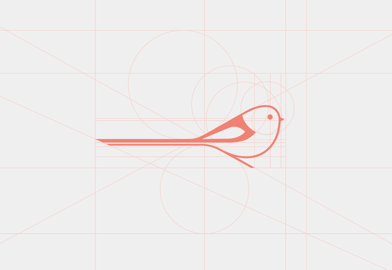
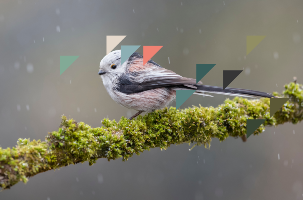
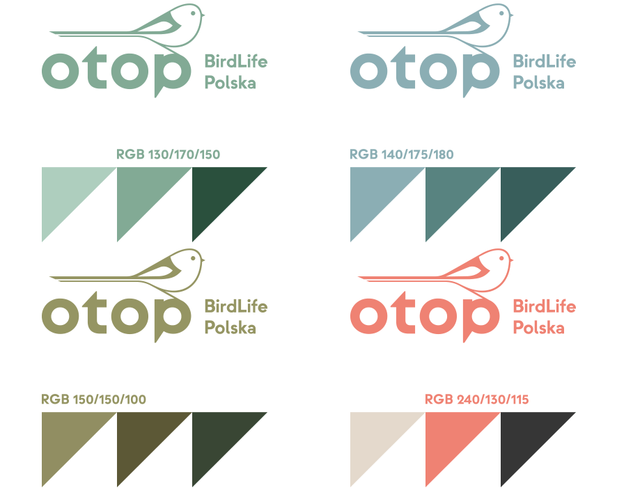
The colour palette we proposed has been inspired by the colours of the long-tailed tit, but also by the breeding grounds of birds. We have synthesized air, water and vegetation into blues, greens and earth colours.
In addition, we have specified special colours whilst their contrasting warning character reminds of the OTOP mission. The palette – similarly to the bushtit study – has been consulted with the ornithologists on a regular basis.
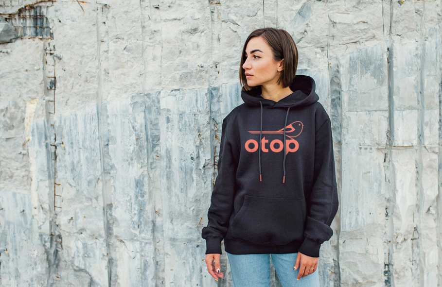
The typographic OTOP notation itself has also been given a new look. The Strawford font which we proposed combines mathematical precision with the soft, intuitive nature of the drawn lines. The writing in minuscule in addition to minor styling touches, such as truncated lengthening of the letters, allude to the original logotype and history of OTOP. The overall project has thus become a fresh composition, resembling birds nesting in a natural habitat.
How it goes (flies)
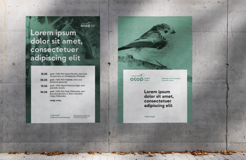
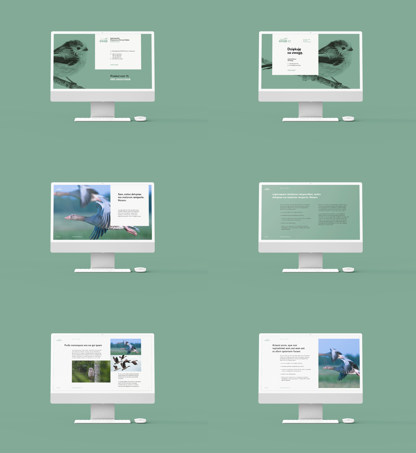
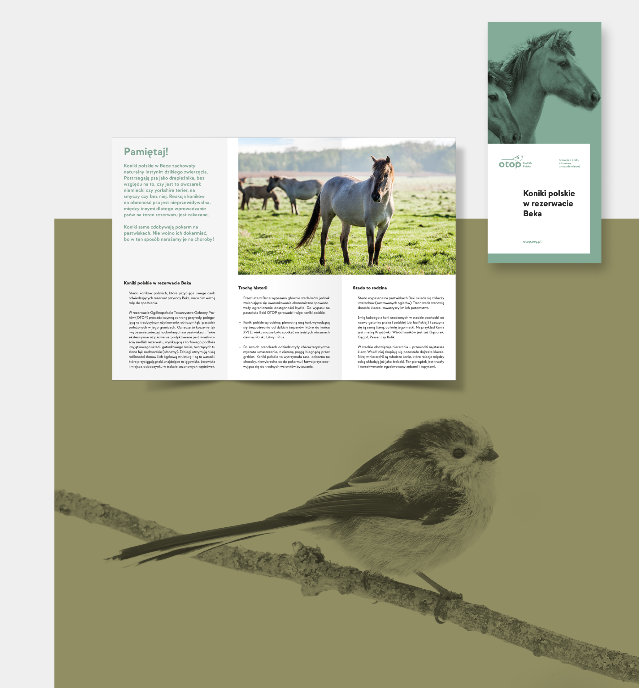
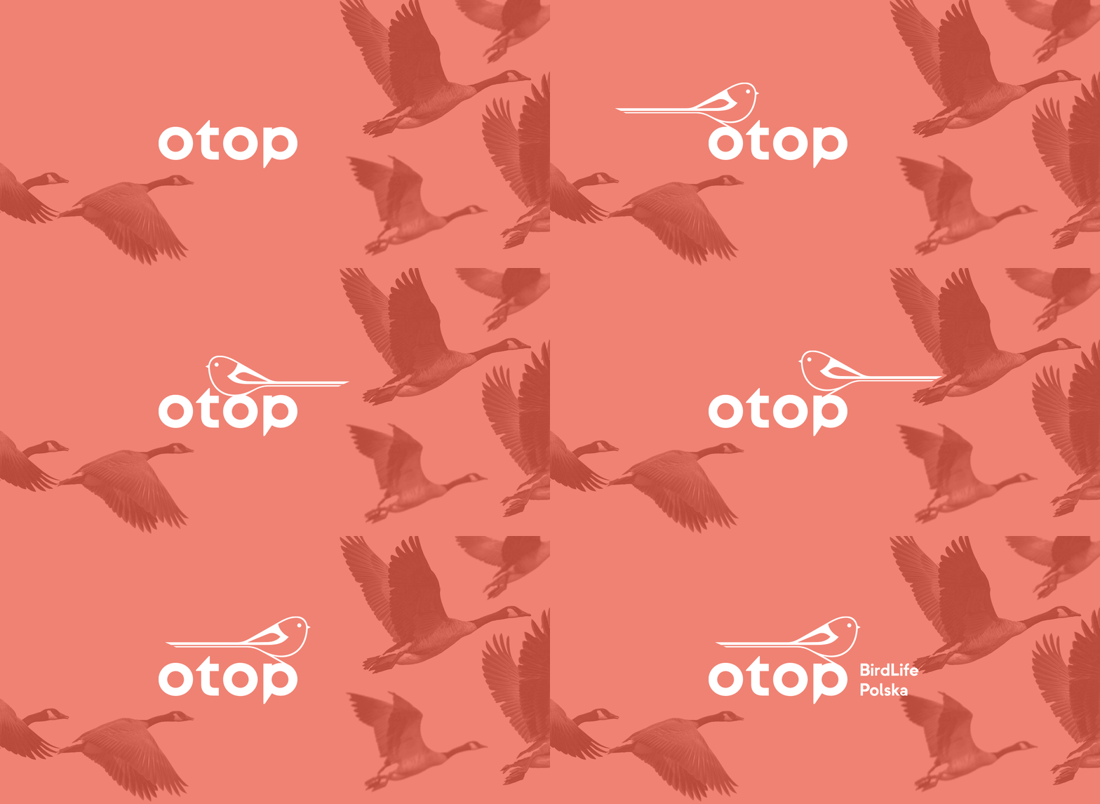
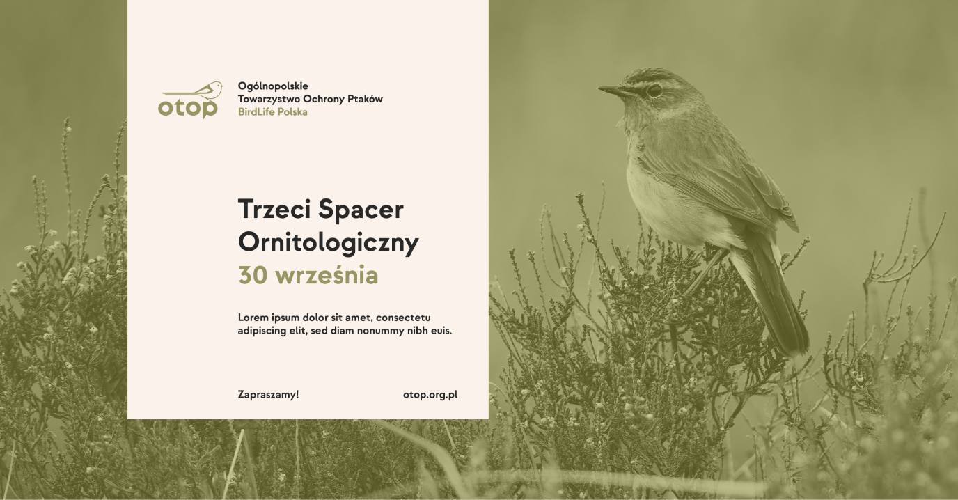
The basis for creating key visual is the assumption that everything in nature is inextricably linked. By protecting birds, OTOP protects the entire ecosystem, which is why the graphic layouts are based on bird photos on a tint which serves as the background for placing the key elements of the project.
This veil symbolizes care for the birds and the protection of their natural habitat, suggesting that a certain temperance is necessary even if we are avid ornithologists.
