Creating new places is always exciting. See our logotype for Sport Stacja – a green relaxation zone belonging to a shopping centre Port Łódź. We also came up with its name – cool, isn’t it?
Info ↘
Creating new places is always exciting. There’s surely one thing a place like that needs for a start – and that is a graceful name. In the case of Sport Stacja, a green relaxation zone belonging to a shopping centre Port Łódź (INGKA Centres), our main task was to come up with a new name and a logo that would not only be a signature of this place but would also create a sub-brand coherent with Port Łódź.
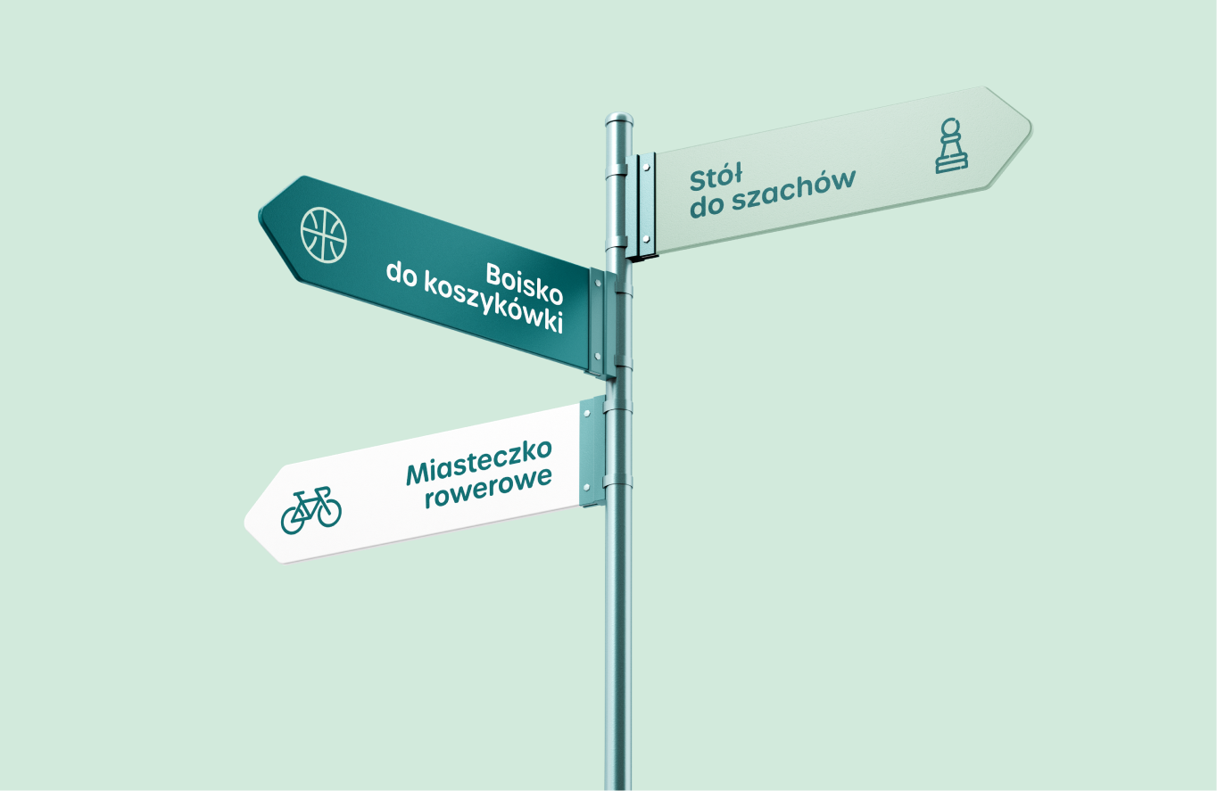
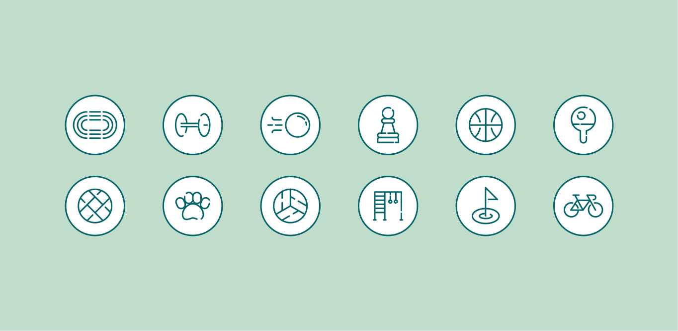
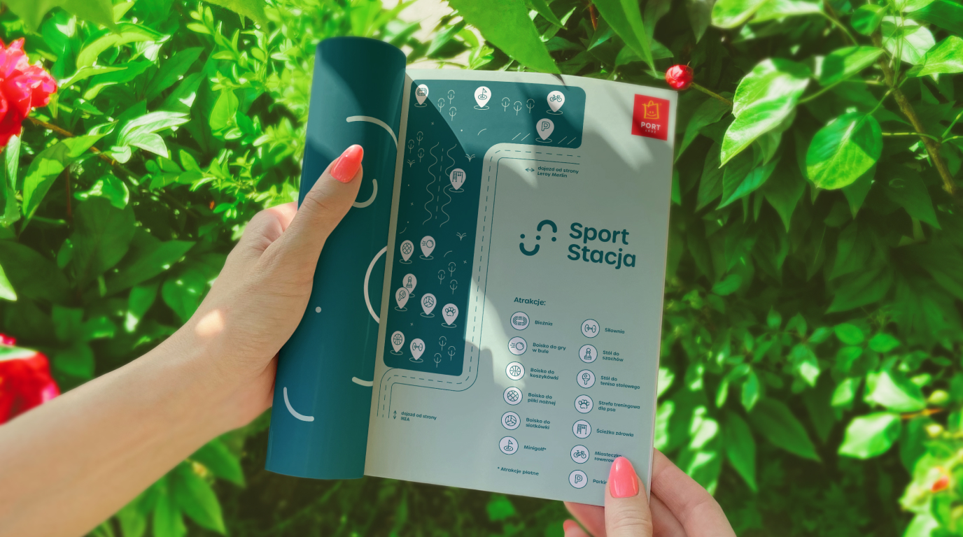
We started our work with big brainstorming. The space of Sport Stacja consists of zones such as a training area for dogs, a running track, a basketball court, a football pitch, a beach volleyball court, a health path, a mini-golf field and also – a bicycling track will soon be added. It’s easy to see that it’s a spot perfect for those who seek a way to spend their leisure time activity and that’s what we wanted to communicate with the new name.
Scope
Branding / Naming
Tools
Illustrator
Client
Port Łódź

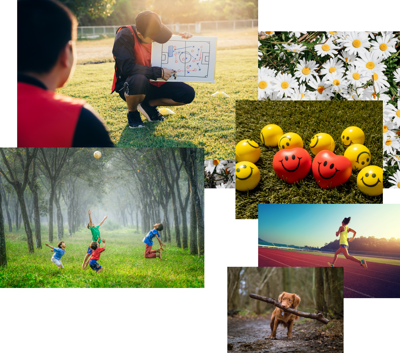

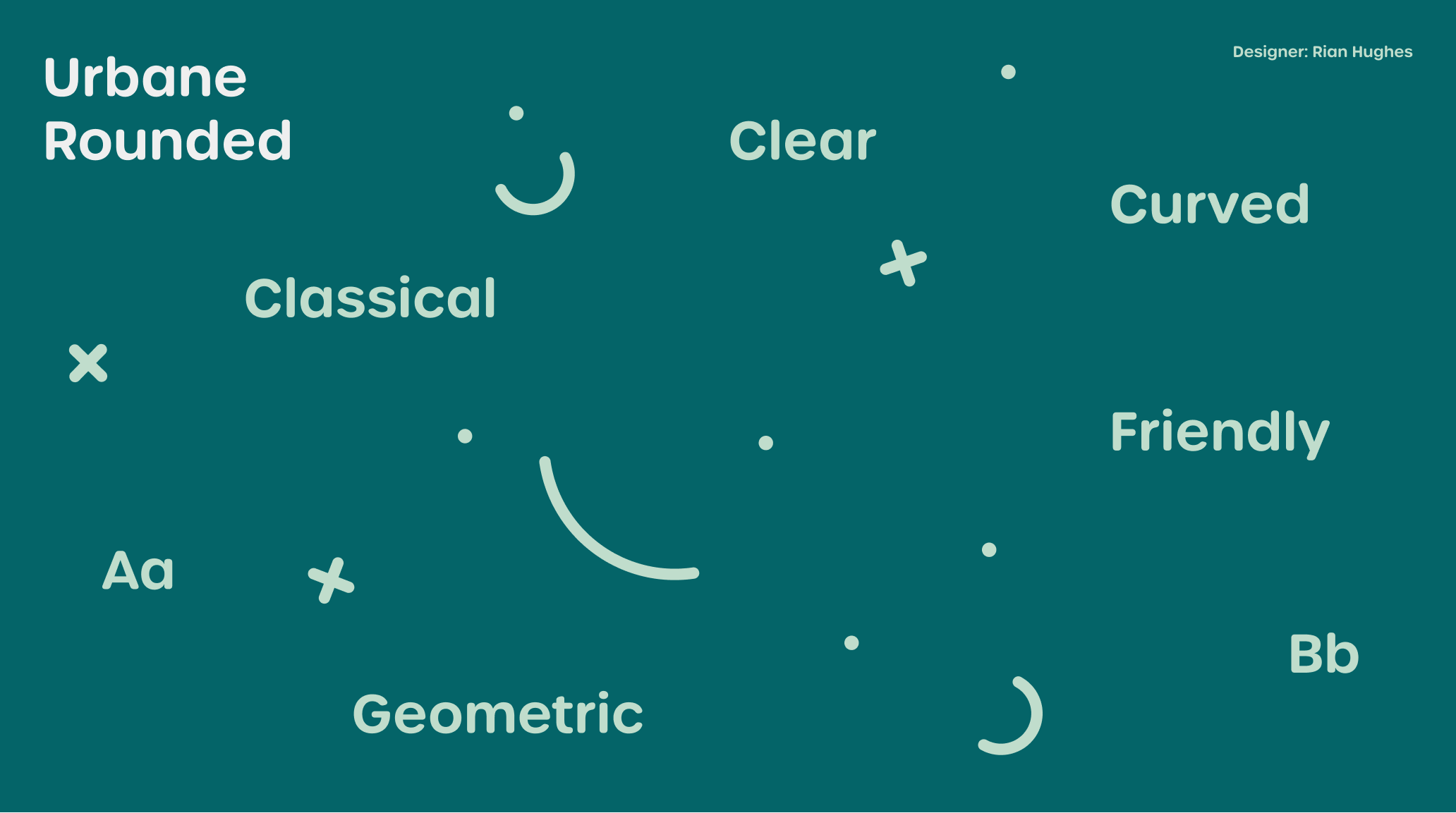
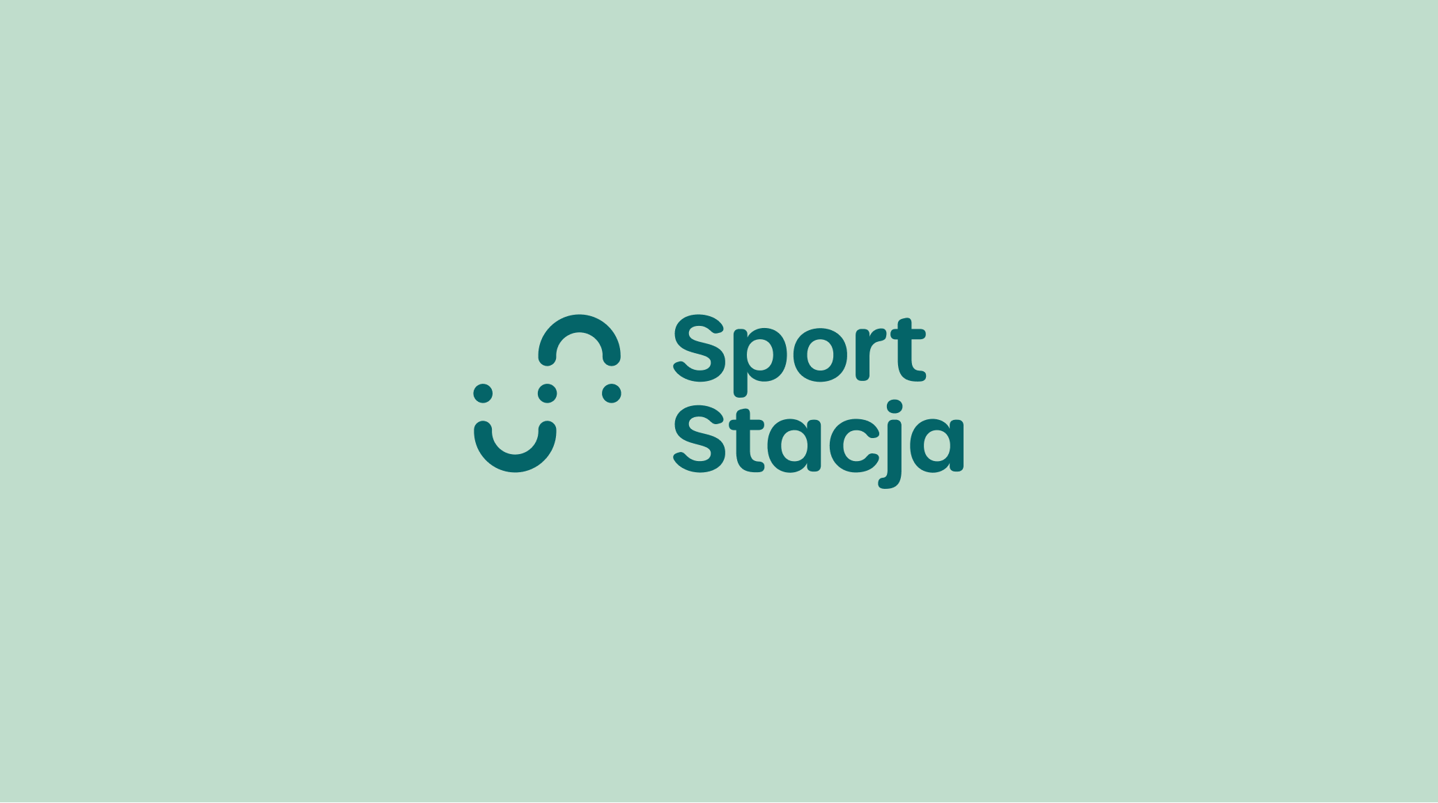
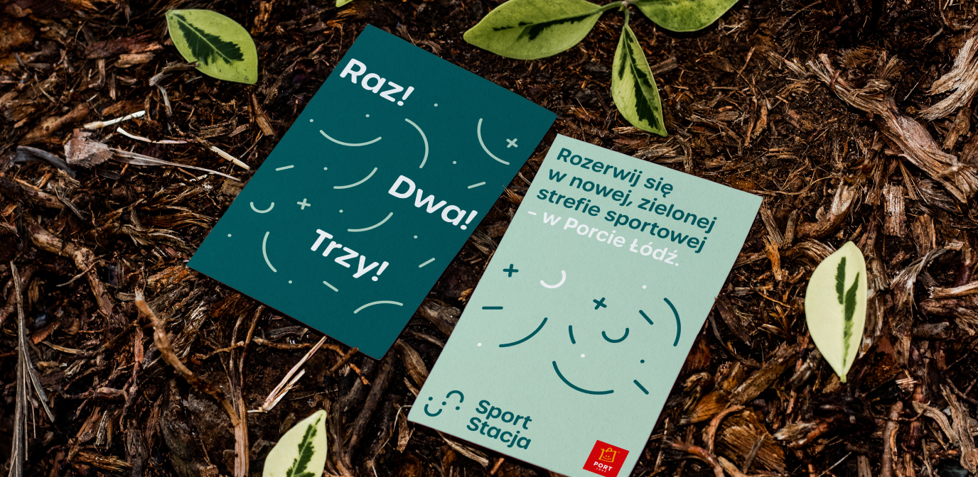
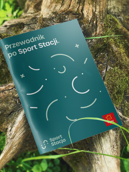
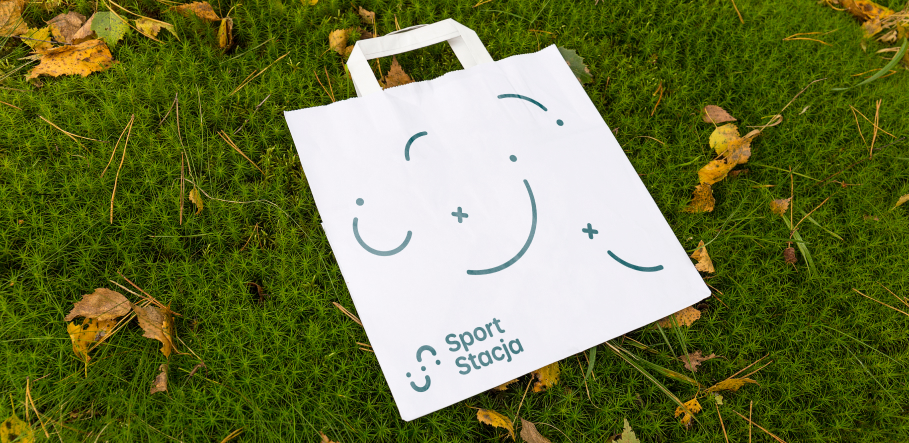
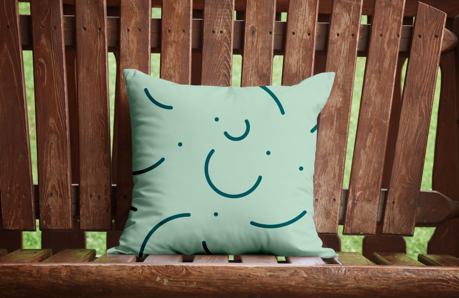
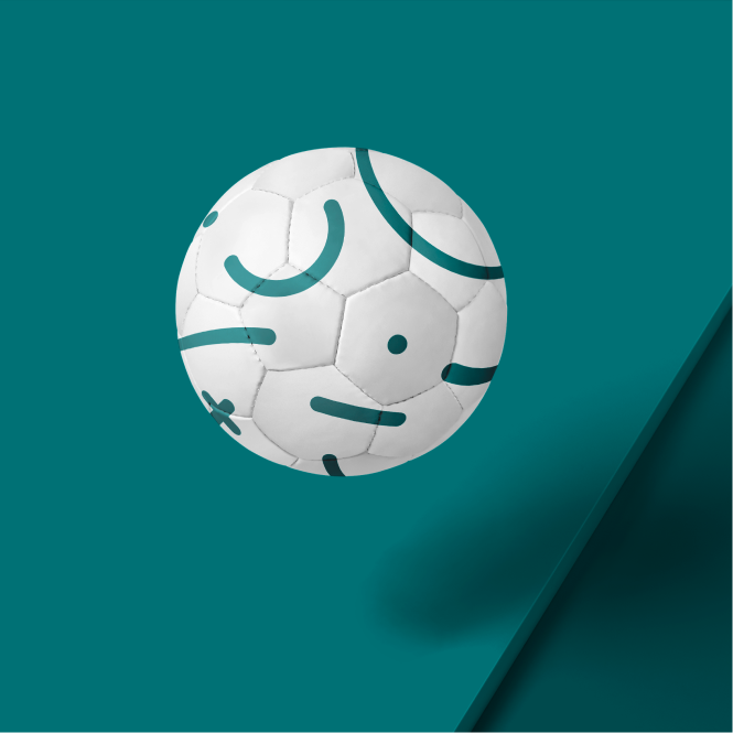
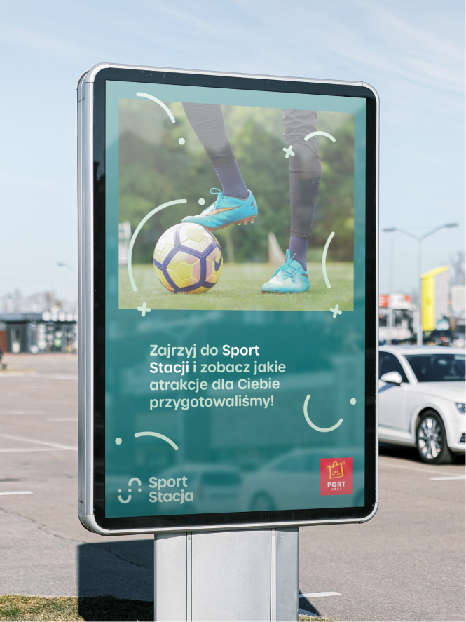
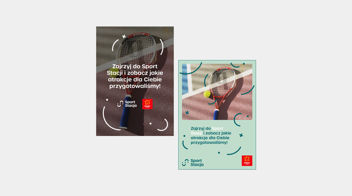
We came up with the name Sport Stacja (Sports Station) which in its simplicity reflects all of the features of the space that we wanted to show. It’s also very neat in further use. The logotype that we proposed can be interpreted in two ways. One of them relates directly to sports and the way we spend time moving around as the letter ‘S’ is constructed from running tracks and sports balls. The second way of interpretation is based more on the way that playing sports make us feel – it’s all smiley faces and joyful shapes. The proposed colour palette is based on shades of green, which is unobtrusive but it suggests the atmosphere of the place.
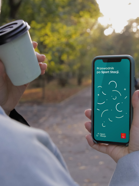
How can we work with that? The answer is simple – comfortably. As our proposed pattern is based on a simple, uncomplicated grid and rules, it’s easy to recreate and implement for further use. It’s playful and comes to mind quickly. Thanks to that it can be widely used in communication within Port Łódź, where it’ll catch visitors’ eyes.
Credits
Team Leniva° Studio
Concept and Key Visual: Neon Neonov, Kamil Przybyła
Production: Lena Mitkowa
Implementation: Kamil Przybyła
Client’s Team
Jagoda Olesiak
Maria Szwed