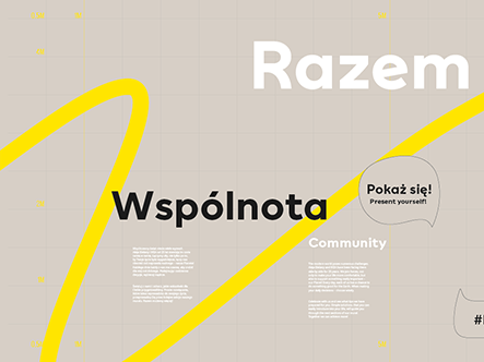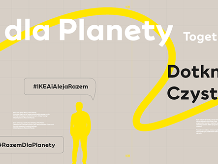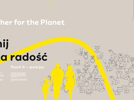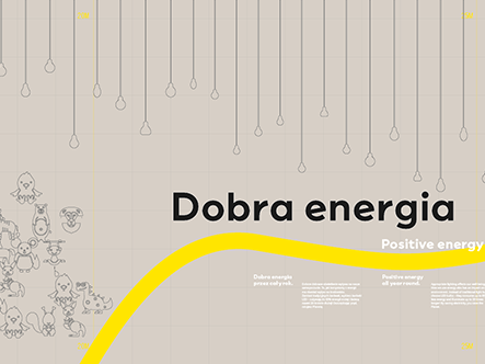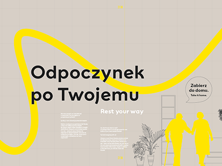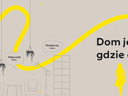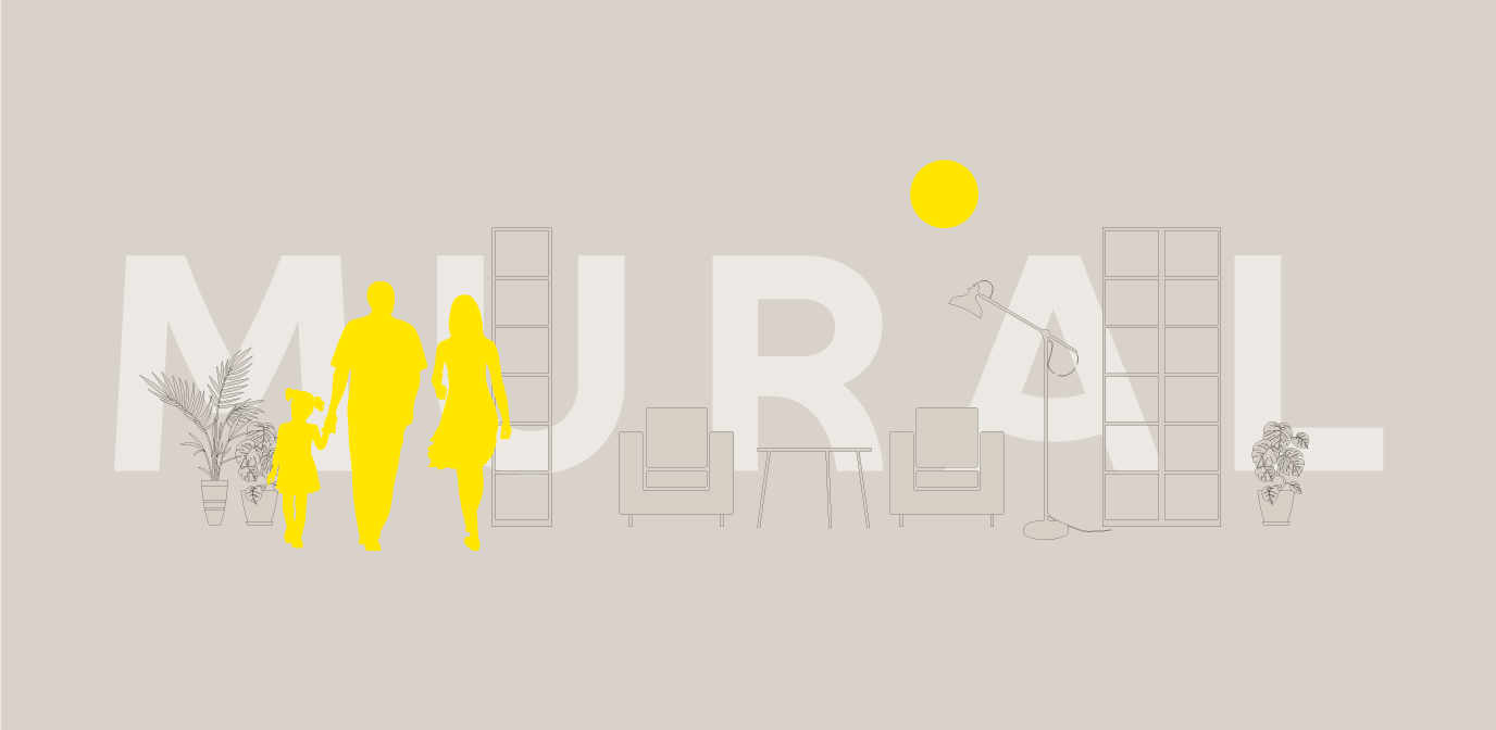
We like uncommon projects. Communication is not only what happens under designer-controlled conditions. It is also, or perhaps most of all, an interaction here and now with the recipient – even the random one. That is why the design of the mural for Aleja Bielany in cooperation with IKEA was so important to us.
Info ↘
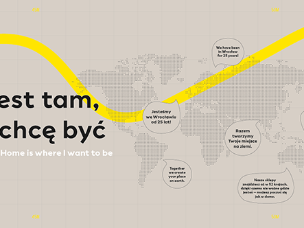
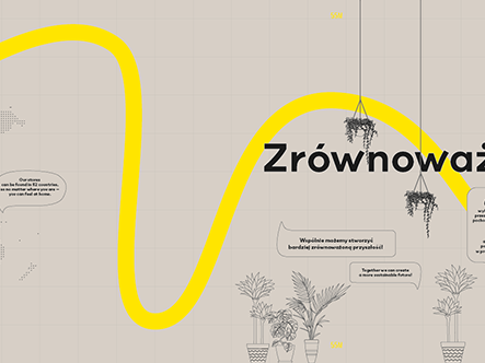
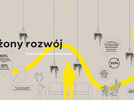
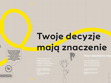
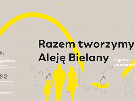
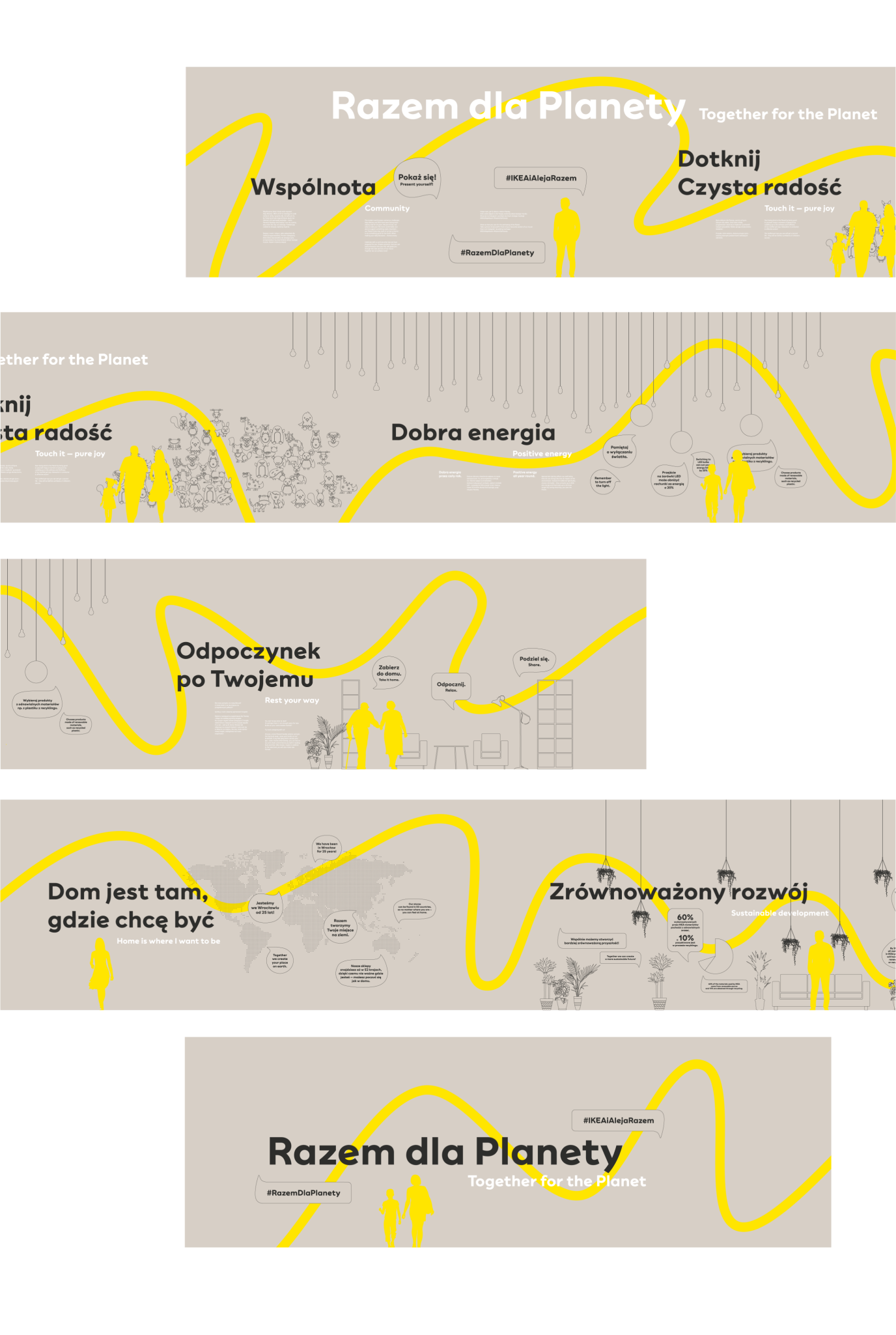
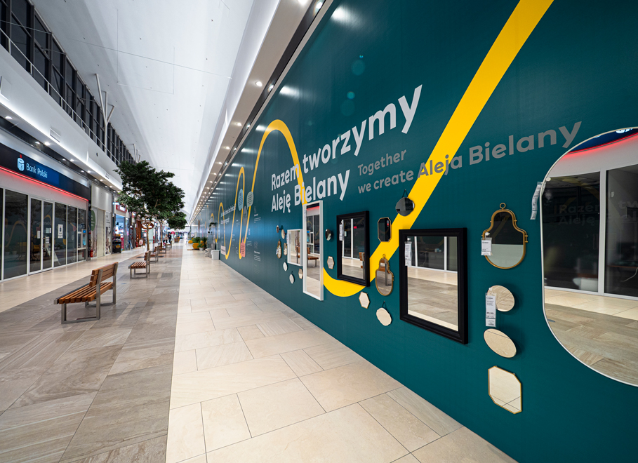
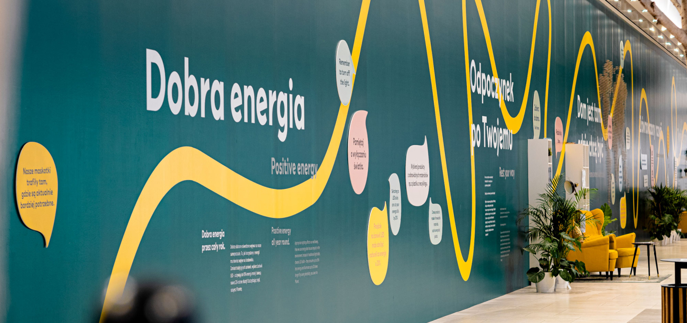
The mural was not only decorative but was primarily intended to shield the reorganized part of the shopping centre. We have divided 150 m of the wall into individual sections, maintained in the spirit of sustainable development.
IKEA is all about sustainability – in theory, and in practice. Our task was to develop the concept, but also to prepare the texts and to create experiences that recipients would come across while exploring the mural.
Scope
Art Direction / Infographics
Tools
Illustrator
Client
Aleja Bielany
How it started
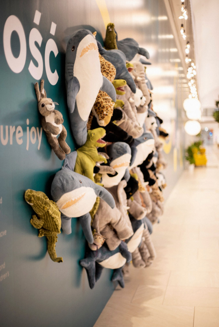
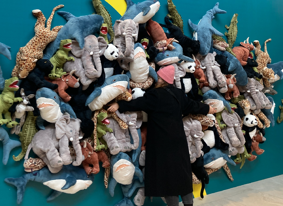
Each section has been supplemented with elements that would encourage interaction with the user. We wanted it to intrigue people and to draw them to it. For the youngest (and not only!) we have prepared a whole wall made of stuffed animals, which – with their softness and fluffiness – made you wanna cuddle up to them and stay like that forever (trust us, we tested them ourselves!).
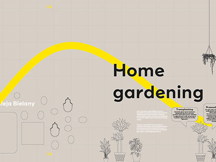
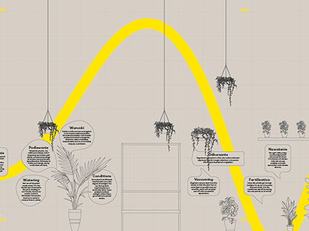
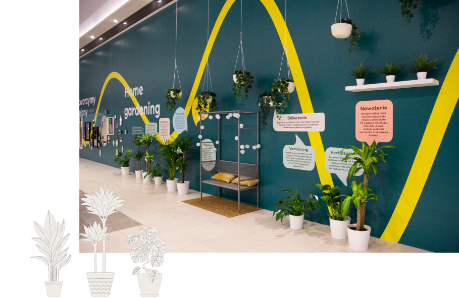
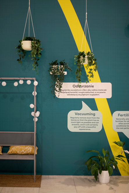
Every plant-mom and every plant-dad could find something for themselves – we dedicated one of the sections to home gardening. They could not only rest on a bench immersed in the greenery of the surrounding plants, but also learn a few tips for watering, transplanting or even vacuuming their favourite ones!
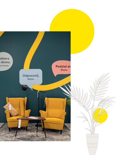
Do you know what fika is? It’s a Swedish term for a coffee break during which one can stop for a moment in the rush of the day. Our mural did not serve coffee, but comfortable armchairs and a couch awaited those who were tired and were looking for a moment to rest, also the books standing on the shelves encouraged them to try book swapping!
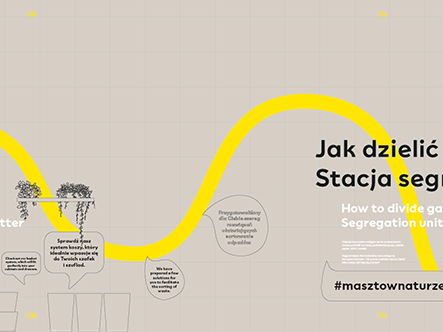
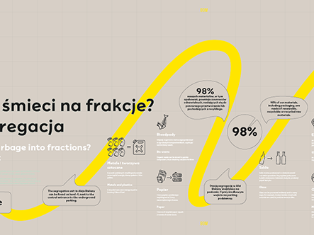
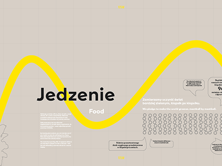
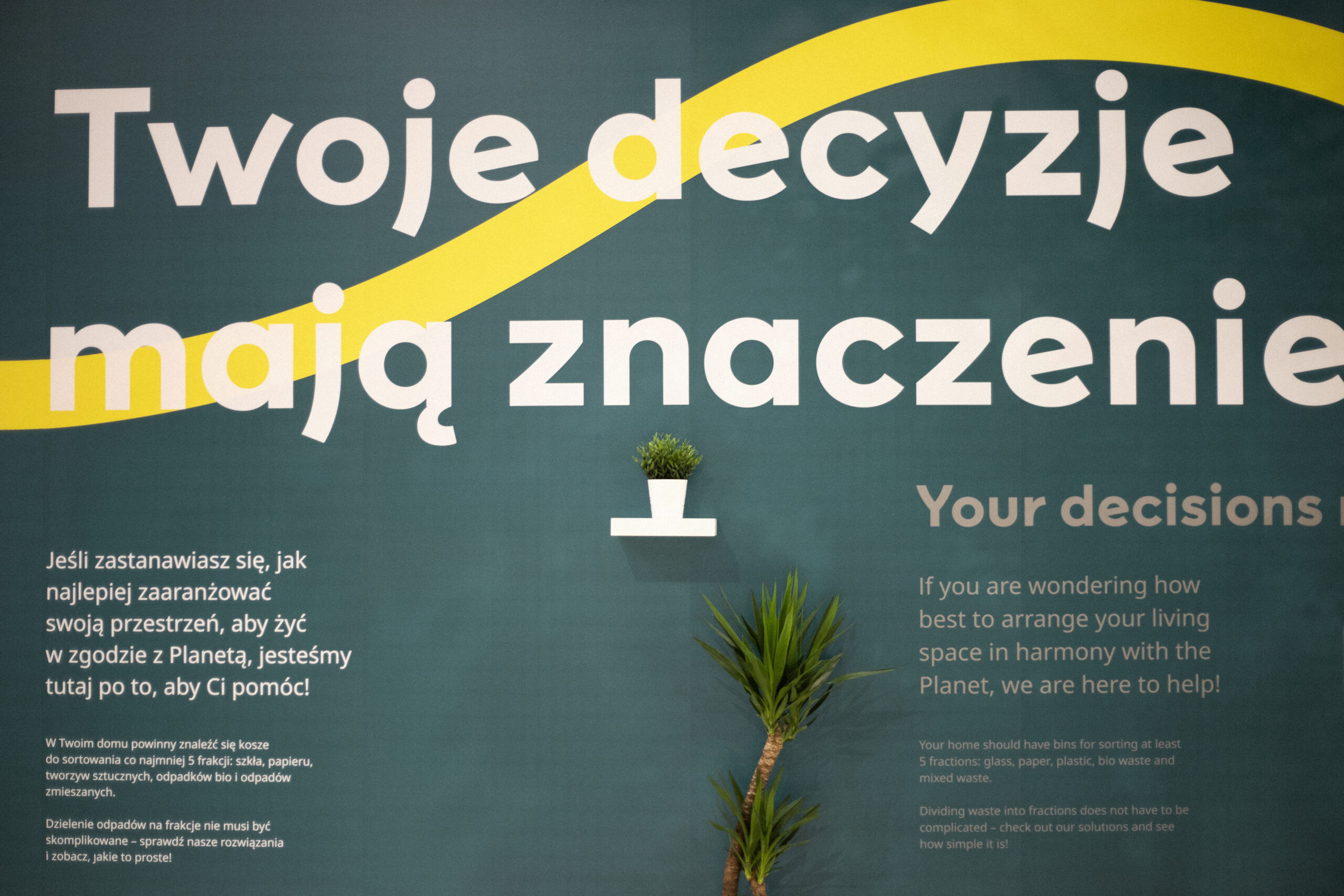
Garbage segregation and conscious diet are topics inherent in sustainable development, which is why our mural included a section devoted to dividing garbage into fractions, as well as a section in which, in the form of a meatball infographics, we showed how giving up meat can reduce the carbon footprint we produce.
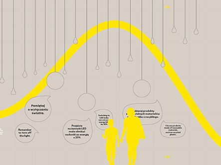
After dark, our mural was beautifully illuminated by the section devoted to energy and conscious use of its sources in our homes. Did you know that switching to LED bulbs can cut your energy bills by as much as 20%?
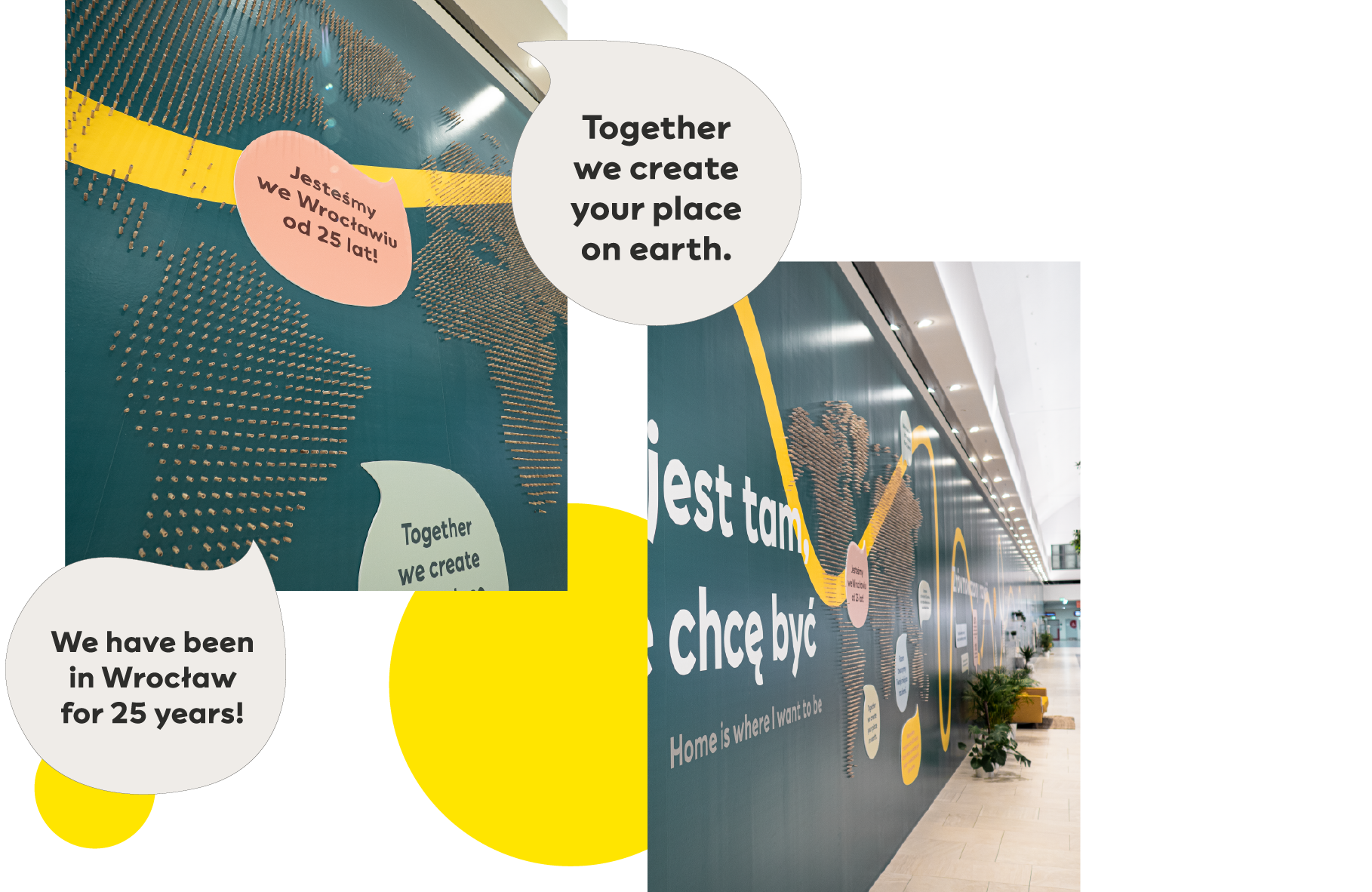
However, one of our favourite sections featured a world map entirely made of IKEA wooden pencils. Its execution was not easy, but the final effect exceeded our wildest expectations!
We would like to thank IKEA and Aleja Bielany’s team for lending us a helpful hand with accessing furniture, plants and other elements that we could use in our work.
Credits
Team Leniva° Studio
Concept and Key Visual: Lena Mitkowa, Janek Mońka, Saskia Mońka, Neon Neonov, Ada Skotnicka
Design: Janek Mońka
Design support: Kaja Kaja (Młode Studio), Ada Skotnicka
Production: Lena Mitkowa, Janek Mońka, Saskia Mońka
Photos
Media Company
Client’s Team
Katarzyna Konat
