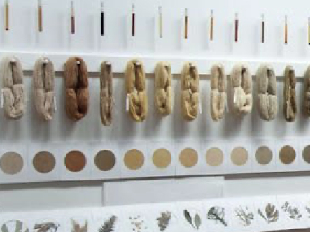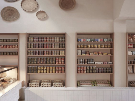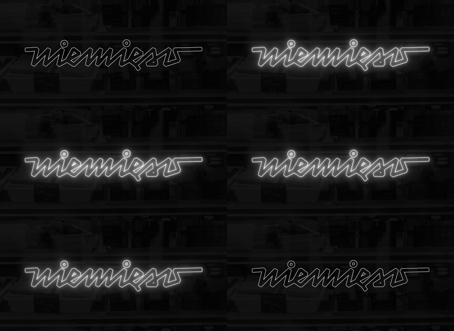
See our branding for Niemięso, a vegan delicatessen based in Warsaw. The nostalgia of the 70s/80s combined with geometric typography and a delicious color palette. Yummy!
Info ↘
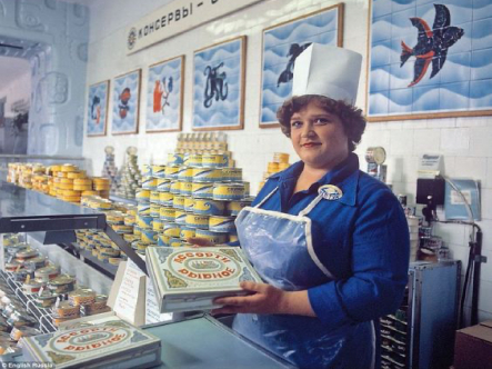
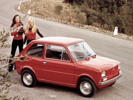
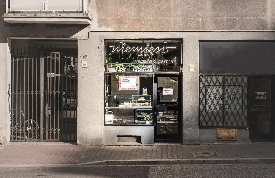
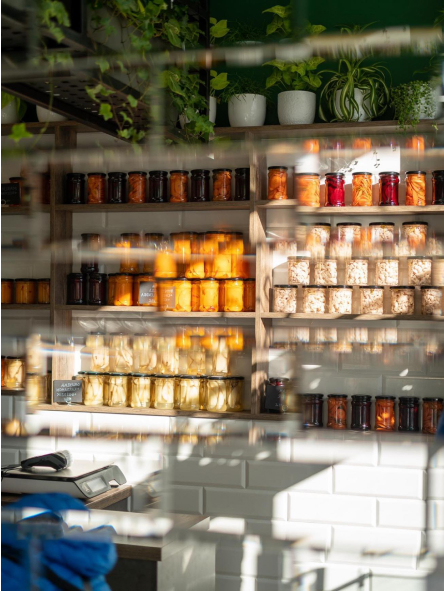
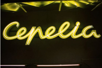
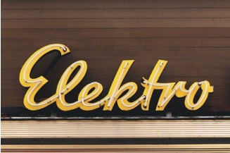
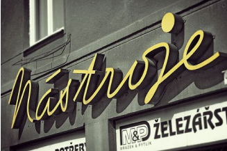
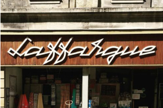
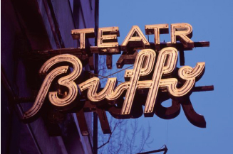
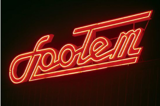
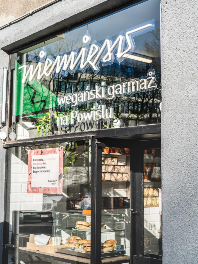
Niemięso is a vegan delicatessen in Warsaw’s Powiśle. To create this branding we went back to the 1970s/80s and its atmosphere. We mixed the memories of old-school delicatessen shops with the characteristic neon typography decorating the numerous streets of Warsaw at that time.
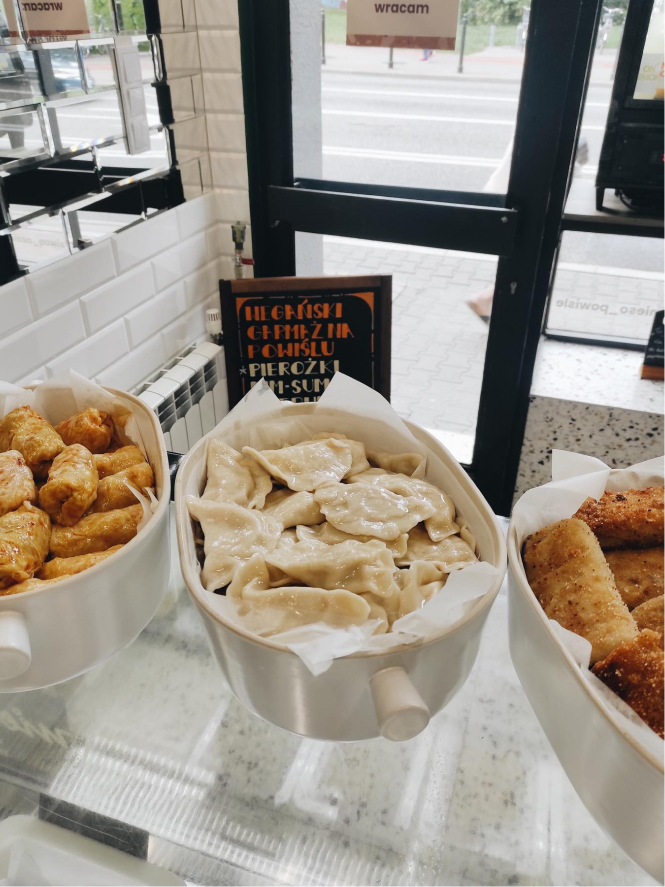
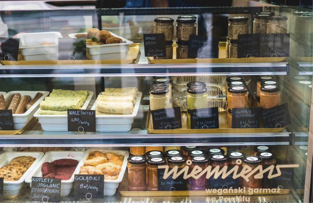
It was then that delicatessen triumphed – ready-made meals and semi-finished products facilitating the preparation of dinners for hard-working citizens.
Scope
Branding / UX
Tools
Figma / Illustrator
Client
Niemięso
Travel into
an ancient era
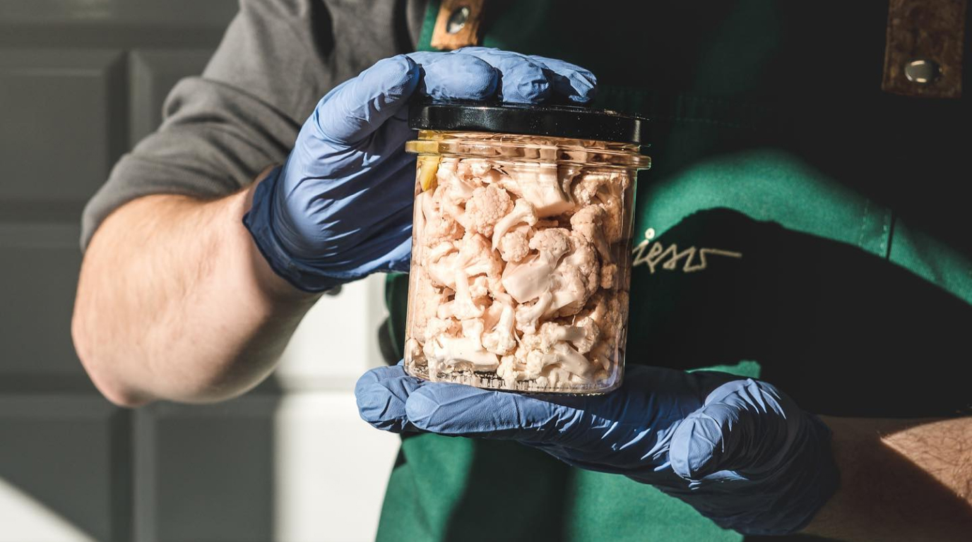
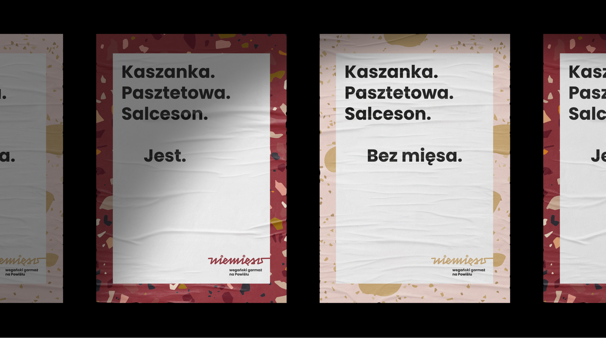
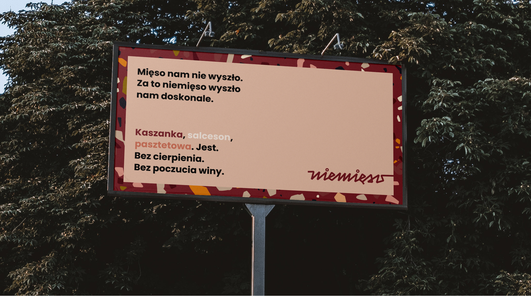
Niemięso is a modern concept with a hint of nostalgia, harking back to the atmosphere of yesteryears. Winking at today’s recipient, it simultaneously familiarizes with vegan alternatives to meat.
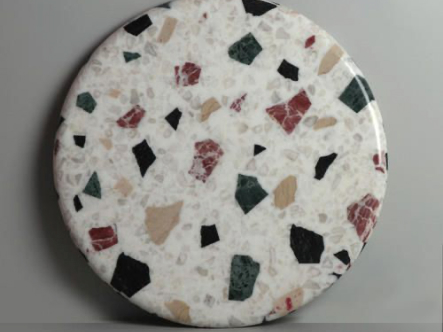
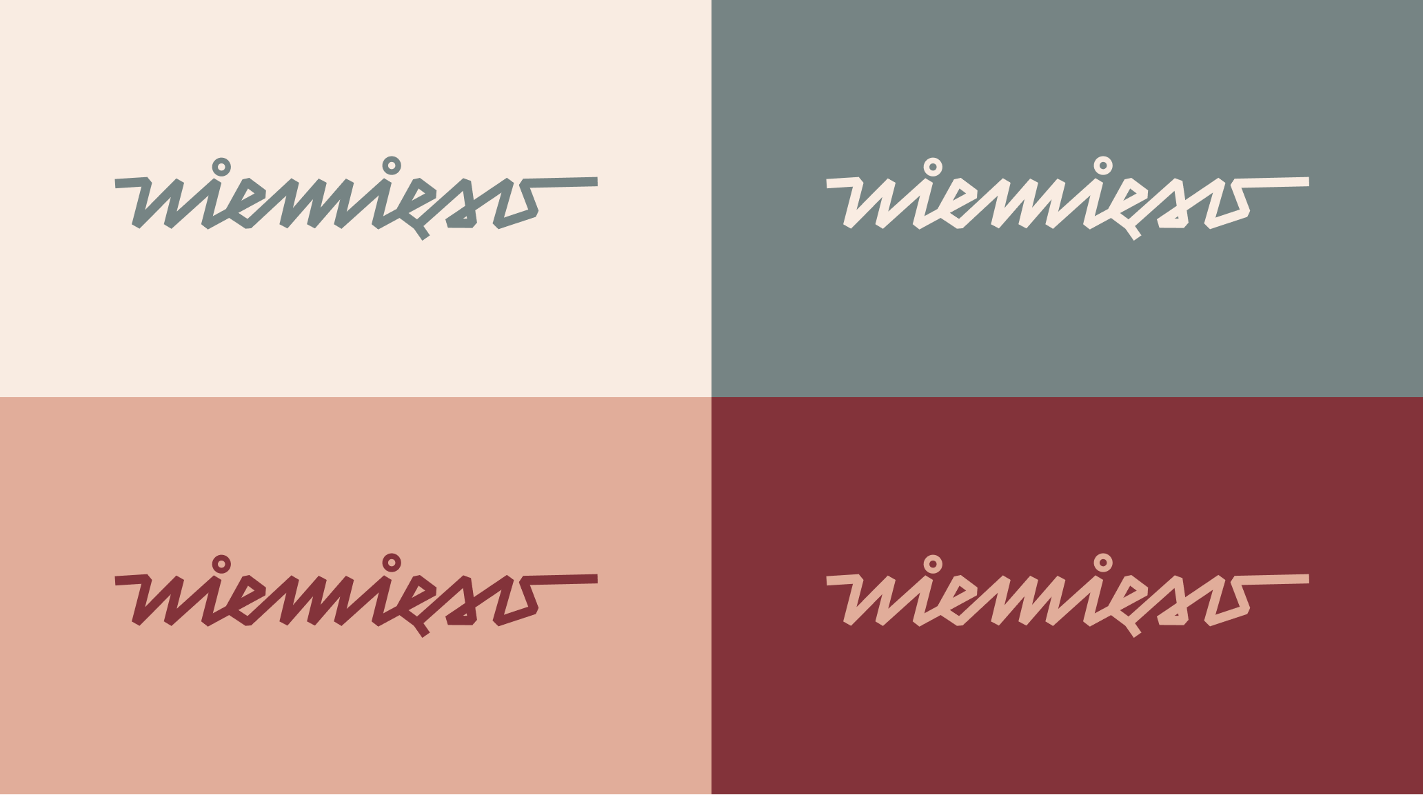
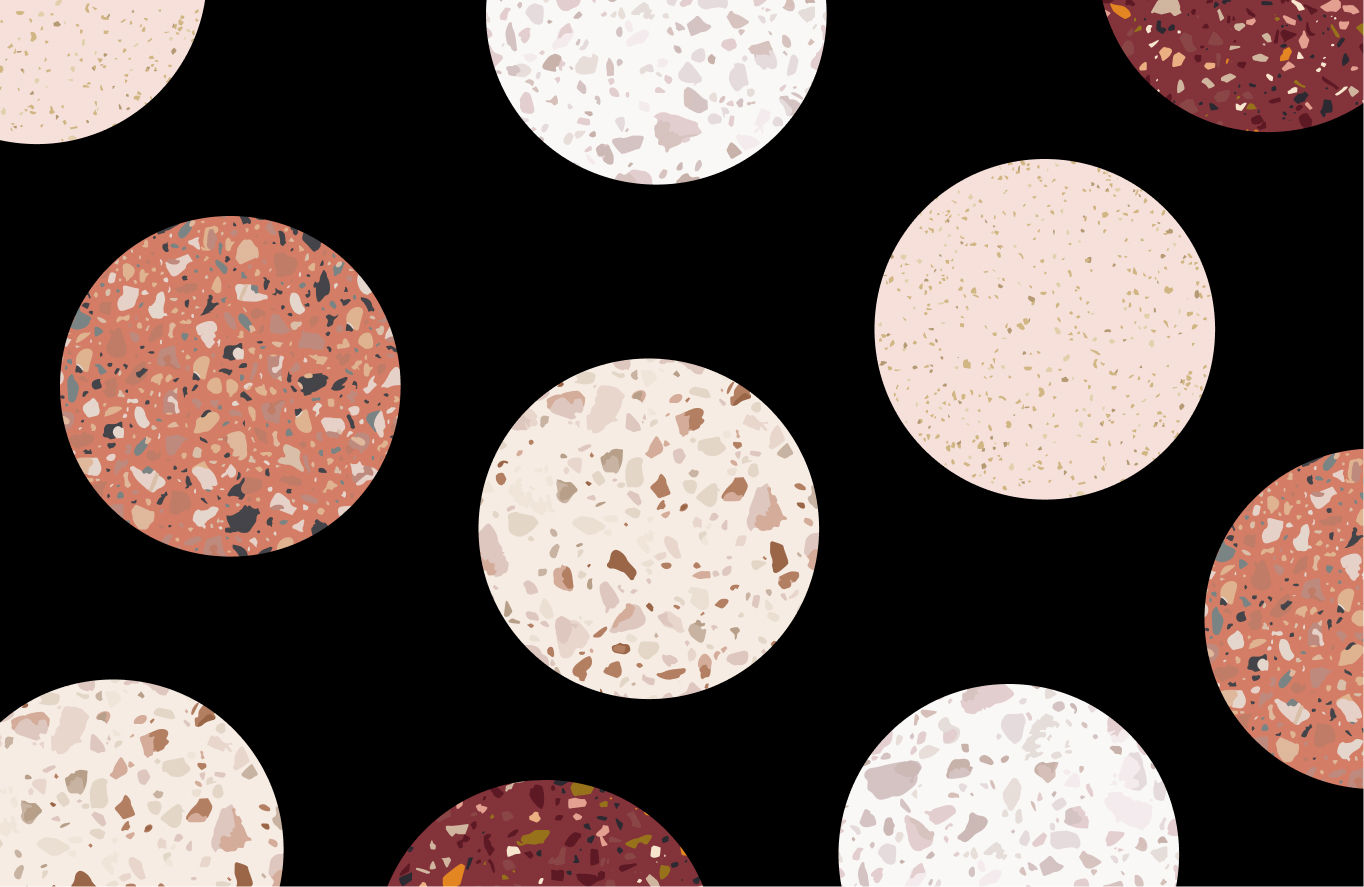
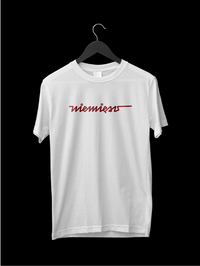
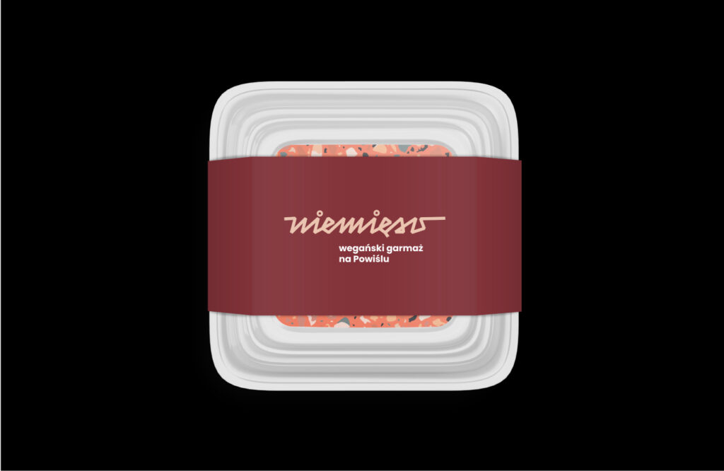
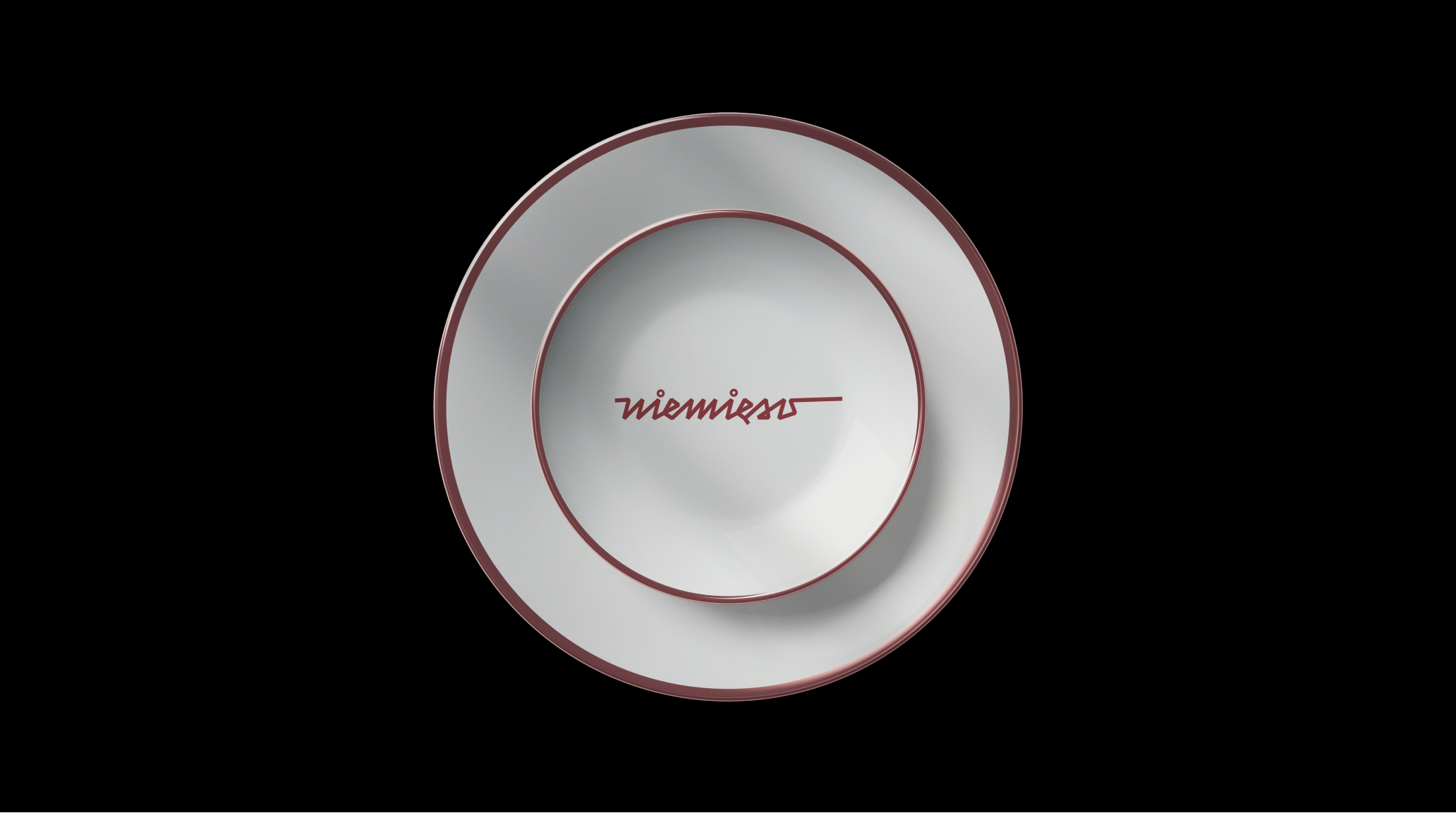
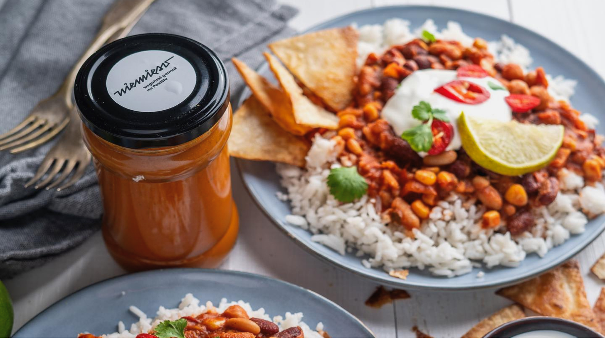
We draw the recipient’s attention with the name as well as the logo itself. The sign is a handwritten notation of niemięso/unmeat – supplemented with a geometric font and colors taken straight from behind the counter which, when processed, create a mix resembling a small work of art rather than food.


Credits
Team Leniva° Studio
Concept and Key Visual: Neon Neonov
Production: Lena Mitkowa
Design support: Kamil Przybyła
Client’s Team
Krzysztof Bieńkowski
Photos from the store:
Courtesy of the Client’s Team
